Pirate metrics: how to create an AARRR email campaign from Dave McClure. Part 1
On Pechkin's blog on Habré, we write a lot about interesting techniques for working with email newsletters . Earlier, we considered common mistakes when creating forms in mail letters, and today we bring to your attention an adapted translation of the note from the Sendwithus service team about which approaches to the development of letters help to increase their conversion. The second part is published here .
This article describes the development of trigger letters that will help your customers go through the sales funnel and become satisfied, interested, and paying buyers.
')
Most likely, the letters that you send now do not affect the conversion. Our article will help you fix this. In drawing up this plan, we used the Dave McClure model “AARRR: Metrics for Pirates” because it is a great conceptual scheme that is easy to apply in your work. At each stage of this model, we will provide clear and workable examples that you can use to create your own series of transactional letters aimed at completing a conversion.
Why pay attention to transactional letters? Sometimes your best, new marketing channel is not new at all.
Transaction emails are sent automatically in response to a user action on your site, enhancing the effect of all your other marketing channels at once. When fewer users fall out of the funnel on the way to the last stage (“Income”), you get much more time and money, spent primarily on bringing the customers to the last stage.
You are sending these letters for a reason, and people are waiting for them, opening and reading them, so why not make these letters useful to you?
Transactional letters are the mechanism by which you keep in touch with your customers, and the fact that they are created automatically does not mean that they should look like they are made by a robot.
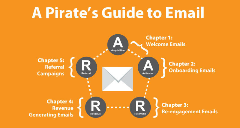
There are many good explanations of the “pirate model”, including the original explanation of Dave McClure (in which letters sent automatically are mentioned by chance), but if these concepts are not familiar to you, you will find below a brief summary of what we will talk about.
The “metrics for pirates” model is called so because it is based on five stages of the user's life cycle: attraction, activation, retention, recommendations, income - the first letters of the stages in English are added to “AARRR”, similar to the battle cry of pirates.
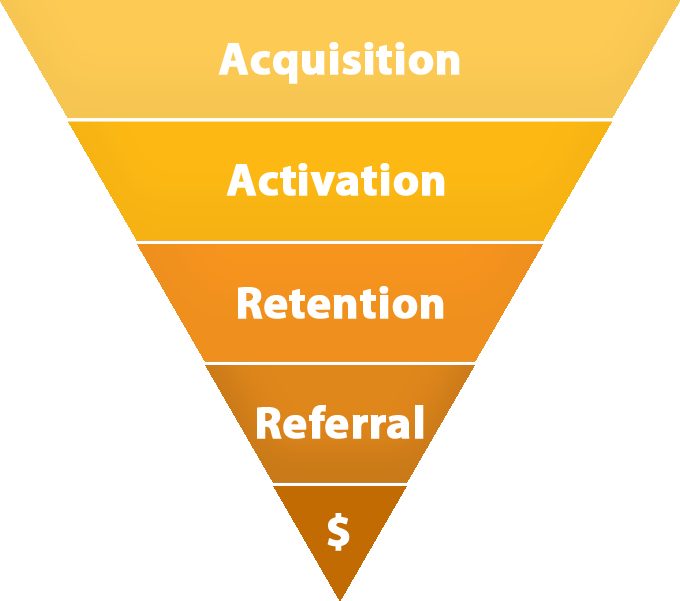
People find out about you and go to your landing page. In order to schedule email distribution, we do our best to get the visitors email address.
People are starting to use your product. Everything becomes clear to them when they study the value proposition offered to your companies.
People are returning. They are true to your product and already understand how to use it, and why they like it.
People recommend their friends to try your product. They famously describe it and offer others to buy your product, they also share your content, or perhaps invite friends for a reward - this is also considered.
You get the money.
Everything is very simple. We like this model because it provides marketers and CEOs with the basis for planning and studying growth strategies. Next, we will carefully consider all stages to the smallest details, and for a start, a general understanding of the process will suffice.
You have just got a new client: he visited your page and subscribed to the newsletter. He wonders what you write to him, and he left his email address. What to do next?
Welcome letters are compiled and sent in order to provide the new user with the first positive experience associated with your product or service. These letters connect the first stages of the onboarding process (escorting new customers) - attracting and activating a user - it is important to go through them during the first personal contact with customers, when they are most likely ready to open your letter, read it and follow the link in it.
In fact, the welcome letters are opened 4 times more often and click on the links in them 5 times more often than the letters from the regular mailing list (caution: the link is boring marketing research in pdf), so the welcome letters are a chance to implement cross-promotion , increasing the amount of the purchase or even collecting information. So let them start working for you.
This chapter describes 10 proven strategies (writing welcome letters) for conversion. If your company has already set its goals and has planned certain actions to activate users (after the attraction phase), skip this part and go directly to the strategies.
If not, then this part will help you step by step to form the process of activating new users.
Ask yourself: “What to do with the user next?”
People subscribe to the newsletter for various reasons: someone is knowledgeable enough about your product to use it, but most subscribers do not know anything about you.
Take screenshots of each page that your user has visited since the subscription, while he uses your product. Save them.
Make a list of activation goals - specific actions that your user must perform in order to immediately start using your product. In this case, the user must receive all the necessary information about the product, as well as know what to do.
Grasp this opportunity and get rid of the optional (or intermediate) steps.
This process will help you determine the ultimate goal of your welcome letter (and, in the second chapter, the goals of your onboarding strategy). The meaning of the welcome letter: the visitor must complete the first goal of the activation phase for as few actions as possible on his part.
Take a look at this example:
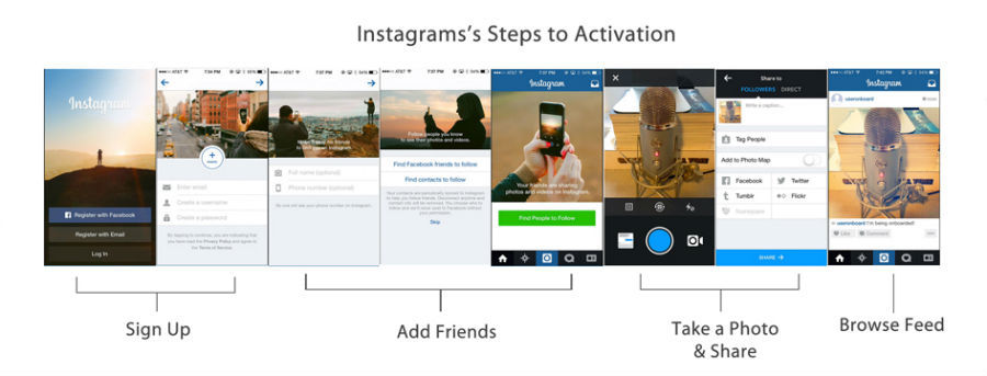
Instagram activation goals are simple: Login, Add Friends, Take Photos, View Ribbon. After entering the service, it becomes clear that adding friends is the most important action to activate a user (three pages are intended for this purpose at once). First of all, a welcome letter from Instagram will definitely prompt the user to add friends.
All companies have different activation goals. Your goals may be simple, for example, the user must read something, try to make the first order or subscribe to the service. Most importantly, your welcome letters should be related to your goals.
To make it easier to understand, the following are illustrative examples with clear and simple goals:
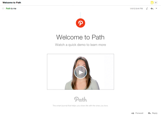
Path Action Required Action - watch this video.
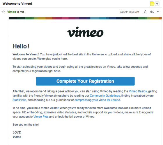
The big blue CTA button in the Vimeo welcome letter makes the next step extremely obvious.
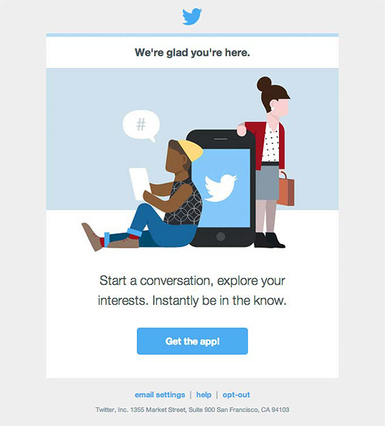
Twitter picture shows the benefits of downloading their application and offers to go through the CTA button.
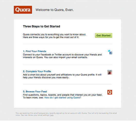
In the Quora welcome letter, all activation targets for a new user are indicated at once.
Now that you have decided on what your user should do, encourage him to action with a welcome letter.
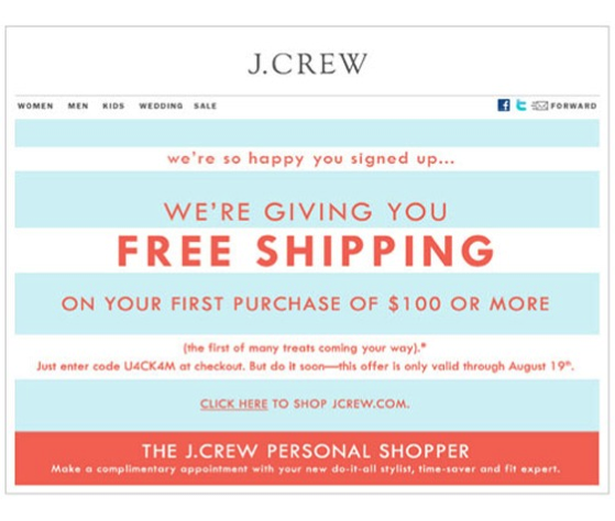
Each letter should pursue a specific (read as "one") goal. Perhaps you want to fill the letter with a bunch of CTA buttons - but don't do it. When Whirlpool reduced the number of STA buttons from 4 to 1 - their clickability (CTR) increased by 42% (caution: another boring link to confirm this fact).
Focus on your first activation goal. The purpose of Speek , an online conferencing service, is to prompt the user to make the first call. Speek does not waste time activating users in its welcome emails.

Speek's next step is clear - “Try calling!”
Letters - is the transition back to your website, where you can complete the sale or activate the client. Perhaps you would like to offer to make a purchase in a welcome letter, but if at the first contact you request too much feedback, the user may turn away from you. The large green button stands out against the general background and encourages the commission of a simple action, without requiring serious efforts from the client.
This is exactly what SendGrid tested in a letter promoting one of their webcasts. They created two versions of the welcome letter. In one, the CTA button's caption read: “Register and get a free webcast” (Letter A), in the other - “See our offer” (Letter B).
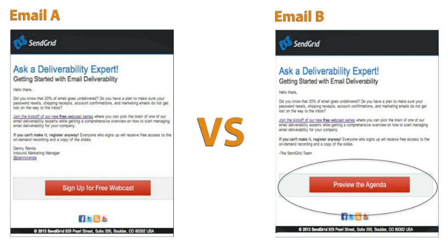
Letter A is so simple and direct - it asks for a conversion right now. Letter B does not offer anything other than viewing the offer, just "that's what we have for you."
And the letter B received 83% more clicks!
Why? There are two reasons:
This can be done in two ways:
Add a 20% discount coupon, product description with reference to the page, offer a 30-day trial version, whatever. Make sure that it really pushes the client to activate.
There are many ways to get email addresses: events, orders, campaigns to attract potential customers, social media and more. In the process, you may find out the name of the client, his place of work or something else. Use it!
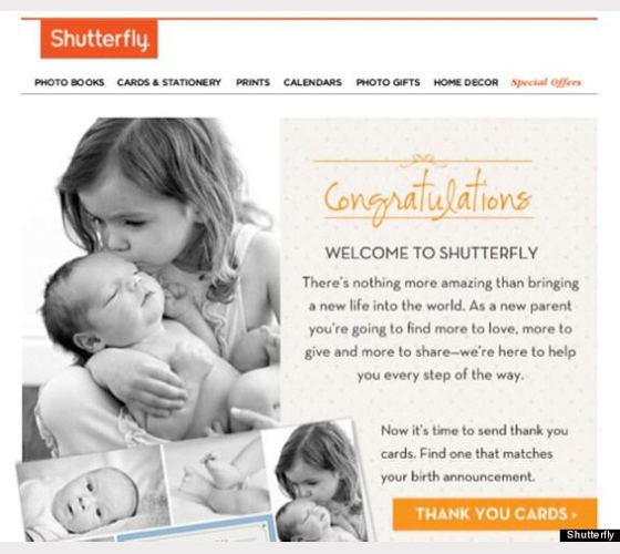
Add a pleasant personal message in the letter by writing the name of the client in the subject line or in the text. If you have data, segment all subscribers into groups: how and where they subscribed, so you can use a welcome letter to reinforce the interest of users.
Shutterfly , an image printing service, absolutely correctly composes welcome letters aimed at the group of users who ordered cards for the first birthday of the baby. Shutterfly's welcome letters were tailored to the specificity of the groups in order to recommend a product intended for a specific group of customers - in this case (in the picture) these were greeting cards for couples awaiting replenishment in the family.
Instead of simply suggesting that users reach your next activation goal, think about what might matter to them.
Welcome letters - no instructions to register with your service! Treat the welcome letter as an opportunity to communicate with the client and learn more about it - avoid the phrase : “Do not reply to this letter.”
Maybe your product is too complicated for intuitive use, maybe users need reference information. In the welcome letter, leave the link to the user guide for your product, or even connect them directly to the support service.
In a very simple Groove application, this is pretty well implemented. After the subscription, new users receive welcome letters in clear, concise, and natural language, which offer hints and instructions on the next activation steps.
This letter is written on behalf of a real person with a real phone number. (We know for sure because we tried to call [Sorry, Adam]).
Welcome letters should be made in the same style as the landing pages of your site. Brand integrity in all media will leave a strong (positive) customer impression of your company.
Go back to the exercise above, where we set our activation goals using screenshots in the onboarding process. Does your welcome letter match your landing page style? It is likely that your website does not have ugly designed web pages, so why do you send ugly decorated welcome letters then?
HTML layout is not only to make letters look more attractive. When your welcome letter and website not only look, but also react to actions in the same way, you simplify the way for the user to activate.
Finally, if your value proposition is difficult to express briefly, illustrate it. Pictures and large bright STA buttons are hard to miss.
Readerrr visualized the value proposition and clearly marked the next step for the user in the form of a CTA button.
Please note: it is worth mentioning the long-standing opposition to HTML-layout and text without formatting in letters. Some claim that text without formatting conveys information better and provides high clickability. In fact, it depends on your target audience. Sometimes text without formatting really works better, but you should not generalize. Test your letters on your target audience to determine which type of letter brings the best result.
This section was written by our dear friend Jillian Wohlfarth of SendGrid. You have only one chance to make a first impression. By saying “thank you”, you show that you value the interests of your users. Do not forget to show your concern - this simple word will be remembered for a long time, and not only in letters.
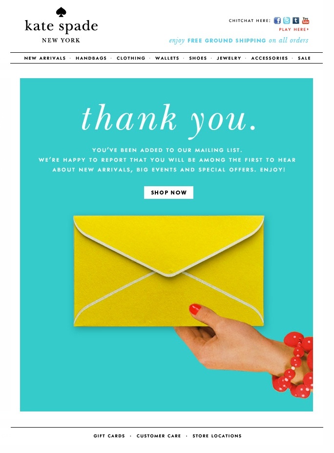
Thank you, Kate Spade.
The presence of the “Unsubscribe” button forms trust between you and customers. Although it is rather unusual to include such buttons in the text of transactional letters, we still recommend inserting them, because this way you will learn much more about what letters your customers do not like.
Of course, you must have thought: "I am afraid that people will unsubscribe from my newsletter." Yes, but the alternative is even worse - they will mark your newsletter as spam. By giving the opportunity to unsubscribe, you can at least follow the actions of your subscribers and get information from them. If you are marked as spam, the problem will remain - you will not know anything.
Please note: since July 1, 2014, Canadian anti-spam legislation (CASL) has approved that the "Unsubscribe" button is required to be present in every letter. This is another reason to allow your readers to unsubscribe from your newsletter. But even if you don’t send emails to Canadians, we advise you to turn on the “Unsubscribe” button and test your newsletter to find out your mistakes and figure out how to write letters better.
It’s very unpleasant to wait for the letter to arrive. Try not to bring this up.
Step 1: Make a plan. Step 2: Tell the client about it.
You create a target audience for the sake of long communication, so your welcome letters should meet the client's expectations. It doesn't matter what you send, whether it's newsletter or newsletter or product use guide in four parts, you need to plan what exactly you will be sending out.
How often do your subscribers expect to receive emails from you? Creating a clear distribution schedule allows you to build trust between you and your audience.
Remember, the welcome letters are just the beginning. Be sure to send relevant information that satisfies user expectations. Your business depends strongly on this stage (at which you send such letters). There are two tricks:
People who receive your welcome letters are interested in your suggestions, so continue the conversation that started on the landing page. Make the next step simple and obvious.
Understandable and friendly welcome letter will help protect your users from being thrown from the attraction stage to the activation stage.
Introduction
This article describes the development of trigger letters that will help your customers go through the sales funnel and become satisfied, interested, and paying buyers.
')
Most likely, the letters that you send now do not affect the conversion. Our article will help you fix this. In drawing up this plan, we used the Dave McClure model “AARRR: Metrics for Pirates” because it is a great conceptual scheme that is easy to apply in your work. At each stage of this model, we will provide clear and workable examples that you can use to create your own series of transactional letters aimed at completing a conversion.
Why pay attention to transactional letters? Sometimes your best, new marketing channel is not new at all.
Transaction emails are sent automatically in response to a user action on your site, enhancing the effect of all your other marketing channels at once. When fewer users fall out of the funnel on the way to the last stage (“Income”), you get much more time and money, spent primarily on bringing the customers to the last stage.
You are sending these letters for a reason, and people are waiting for them, opening and reading them, so why not make these letters useful to you?
Transactional letters are the mechanism by which you keep in touch with your customers, and the fact that they are created automatically does not mean that they should look like they are made by a robot.
The Metrics for Pirates model - short version
There are many good explanations of the “pirate model”, including the original explanation of Dave McClure (in which letters sent automatically are mentioned by chance), but if these concepts are not familiar to you, you will find below a brief summary of what we will talk about.
The “metrics for pirates” model is called so because it is based on five stages of the user's life cycle: attraction, activation, retention, recommendations, income - the first letters of the stages in English are added to “AARRR”, similar to the battle cry of pirates.
Attraction
People find out about you and go to your landing page. In order to schedule email distribution, we do our best to get the visitors email address.
Account activation)
People are starting to use your product. Everything becomes clear to them when they study the value proposition offered to your companies.
Hold
People are returning. They are true to your product and already understand how to use it, and why they like it.
Recommendations
People recommend their friends to try your product. They famously describe it and offer others to buy your product, they also share your content, or perhaps invite friends for a reward - this is also considered.
Income
You get the money.
Everything is very simple. We like this model because it provides marketers and CEOs with the basis for planning and studying growth strategies. Next, we will carefully consider all stages to the smallest details, and for a start, a general understanding of the process will suffice.
Chapter 1: Attraction Stage and Welcome Letters
Introduction
You have just got a new client: he visited your page and subscribed to the newsletter. He wonders what you write to him, and he left his email address. What to do next?
Send a welcome letter
Welcome letters are compiled and sent in order to provide the new user with the first positive experience associated with your product or service. These letters connect the first stages of the onboarding process (escorting new customers) - attracting and activating a user - it is important to go through them during the first personal contact with customers, when they are most likely ready to open your letter, read it and follow the link in it.
In fact, the welcome letters are opened 4 times more often and click on the links in them 5 times more often than the letters from the regular mailing list (caution: the link is boring marketing research in pdf), so the welcome letters are a chance to implement cross-promotion , increasing the amount of the purchase or even collecting information. So let them start working for you.
This chapter describes 10 proven strategies (writing welcome letters) for conversion. If your company has already set its goals and has planned certain actions to activate users (after the attraction phase), skip this part and go directly to the strategies.
If not, then this part will help you step by step to form the process of activating new users.
At the stages of attraction and activation
Ask yourself: “What to do with the user next?”
People subscribe to the newsletter for various reasons: someone is knowledgeable enough about your product to use it, but most subscribers do not know anything about you.
Take screenshots of each page that your user has visited since the subscription, while he uses your product. Save them.
Make a list of activation goals - specific actions that your user must perform in order to immediately start using your product. In this case, the user must receive all the necessary information about the product, as well as know what to do.
Grasp this opportunity and get rid of the optional (or intermediate) steps.
This process will help you determine the ultimate goal of your welcome letter (and, in the second chapter, the goals of your onboarding strategy). The meaning of the welcome letter: the visitor must complete the first goal of the activation phase for as few actions as possible on his part.
Take a look at this example:
Instagram activation goals are simple: Login, Add Friends, Take Photos, View Ribbon. After entering the service, it becomes clear that adding friends is the most important action to activate a user (three pages are intended for this purpose at once). First of all, a welcome letter from Instagram will definitely prompt the user to add friends.
All companies have different activation goals. Your goals may be simple, for example, the user must read something, try to make the first order or subscribe to the service. Most importantly, your welcome letters should be related to your goals.
To make it easier to understand, the following are illustrative examples with clear and simple goals:
Path Action Required Action - watch this video.
The big blue CTA button in the Vimeo welcome letter makes the next step extremely obvious.
Twitter picture shows the benefits of downloading their application and offers to go through the CTA button.
In the Quora welcome letter, all activation targets for a new user are indicated at once.
Now that you have decided on what your user should do, encourage him to action with a welcome letter.
10 strategies for creating incredible welcome letters
1. Create simple STA buttons.
Each letter should pursue a specific (read as "one") goal. Perhaps you want to fill the letter with a bunch of CTA buttons - but don't do it. When Whirlpool reduced the number of STA buttons from 4 to 1 - their clickability (CTR) increased by 42% (caution: another boring link to confirm this fact).
Focus on your first activation goal. The purpose of Speek , an online conferencing service, is to prompt the user to make the first call. Speek does not waste time activating users in its welcome emails.
Speek's next step is clear - “Try calling!”
Letters - is the transition back to your website, where you can complete the sale or activate the client. Perhaps you would like to offer to make a purchase in a welcome letter, but if at the first contact you request too much feedback, the user may turn away from you. The large green button stands out against the general background and encourages the commission of a simple action, without requiring serious efforts from the client.
This is exactly what SendGrid tested in a letter promoting one of their webcasts. They created two versions of the welcome letter. In one, the CTA button's caption read: “Register and get a free webcast” (Letter A), in the other - “See our offer” (Letter B).
Letter A is so simple and direct - it asks for a conversion right now. Letter B does not offer anything other than viewing the offer, just "that's what we have for you."
And the letter B received 83% more clicks!
Why? There are two reasons:
- Limit the number of tasks for your letter and CTA buttons. Let the action that will be performed by pressing corresponds to the rest of the letter’s content and the purpose of the activation.
- Do not bind the STA button to the transaction, make its [transaction] conclusion on the landing page.
2. Reward users for registration
This can be done in two ways:
- Encourage your activation goals with incentives or
- Surprise and delight your new visitors with pictures of funny kittens. Seriously, do not underestimate the effectiveness of time sent pictures with kittens.
Add a 20% discount coupon, product description with reference to the page, offer a 30-day trial version, whatever. Make sure that it really pushes the client to activate.
3. Personalize your newsletter: send different greetings to different people
There are many ways to get email addresses: events, orders, campaigns to attract potential customers, social media and more. In the process, you may find out the name of the client, his place of work or something else. Use it!
Add a pleasant personal message in the letter by writing the name of the client in the subject line or in the text. If you have data, segment all subscribers into groups: how and where they subscribed, so you can use a welcome letter to reinforce the interest of users.
Shutterfly , an image printing service, absolutely correctly composes welcome letters aimed at the group of users who ordered cards for the first birthday of the baby. Shutterfly's welcome letters were tailored to the specificity of the groups in order to recommend a product intended for a specific group of customers - in this case (in the picture) these were greeting cards for couples awaiting replenishment in the family.
Instead of simply suggesting that users reach your next activation goal, think about what might matter to them.
4. Set the tone for the conversation and speak on behalf of real people.
Welcome letters - no instructions to register with your service! Treat the welcome letter as an opportunity to communicate with the client and learn more about it - avoid the phrase : “Do not reply to this letter.”
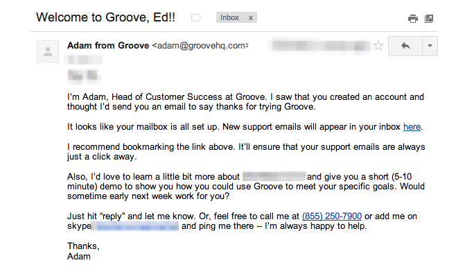
Maybe your product is too complicated for intuitive use, maybe users need reference information. In the welcome letter, leave the link to the user guide for your product, or even connect them directly to the support service.
In a very simple Groove application, this is pretty well implemented. After the subscription, new users receive welcome letters in clear, concise, and natural language, which offer hints and instructions on the next activation steps.
This letter is written on behalf of a real person with a real phone number. (We know for sure because we tried to call [Sorry, Adam]).
5. Use HTML for smooth transitions.
Welcome letters should be made in the same style as the landing pages of your site. Brand integrity in all media will leave a strong (positive) customer impression of your company.
Go back to the exercise above, where we set our activation goals using screenshots in the onboarding process. Does your welcome letter match your landing page style? It is likely that your website does not have ugly designed web pages, so why do you send ugly decorated welcome letters then?
HTML layout is not only to make letters look more attractive. When your welcome letter and website not only look, but also react to actions in the same way, you simplify the way for the user to activate.
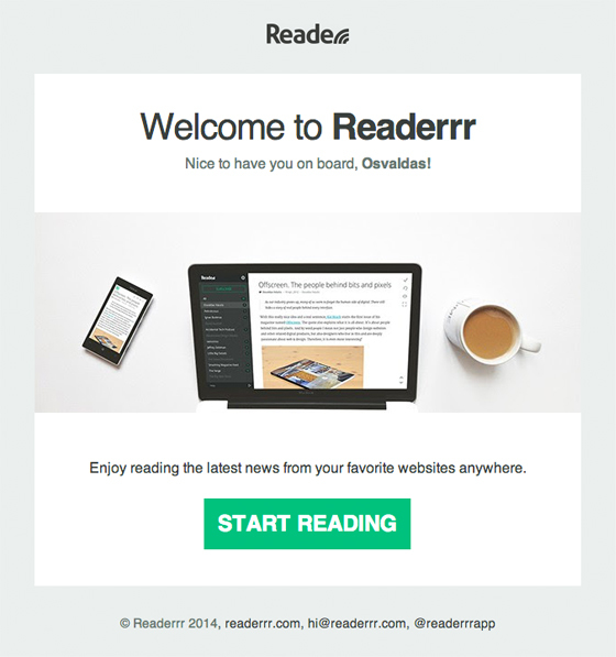
Finally, if your value proposition is difficult to express briefly, illustrate it. Pictures and large bright STA buttons are hard to miss.
Readerrr visualized the value proposition and clearly marked the next step for the user in the form of a CTA button.
Please note: it is worth mentioning the long-standing opposition to HTML-layout and text without formatting in letters. Some claim that text without formatting conveys information better and provides high clickability. In fact, it depends on your target audience. Sometimes text without formatting really works better, but you should not generalize. Test your letters on your target audience to determine which type of letter brings the best result.
6. Do not forget to thank
This section was written by our dear friend Jillian Wohlfarth of SendGrid. You have only one chance to make a first impression. By saying “thank you”, you show that you value the interests of your users. Do not forget to show your concern - this simple word will be remembered for a long time, and not only in letters.
Thank you, Kate Spade.
7. Insert the "Unsubscribe" button where it can be easily noticed.
The presence of the “Unsubscribe” button forms trust between you and customers. Although it is rather unusual to include such buttons in the text of transactional letters, we still recommend inserting them, because this way you will learn much more about what letters your customers do not like.
Of course, you must have thought: "I am afraid that people will unsubscribe from my newsletter." Yes, but the alternative is even worse - they will mark your newsletter as spam. By giving the opportunity to unsubscribe, you can at least follow the actions of your subscribers and get information from them. If you are marked as spam, the problem will remain - you will not know anything.
Please note: since July 1, 2014, Canadian anti-spam legislation (CASL) has approved that the "Unsubscribe" button is required to be present in every letter. This is another reason to allow your readers to unsubscribe from your newsletter. But even if you don’t send emails to Canadians, we advise you to turn on the “Unsubscribe” button and test your newsletter to find out your mistakes and figure out how to write letters better.
8. Send letters within five minutes (from the moment of receiving the user's email address)
It’s very unpleasant to wait for the letter to arrive. Try not to bring this up.
9. Tell users what they will receive from your emails.
Step 1: Make a plan. Step 2: Tell the client about it.
You create a target audience for the sake of long communication, so your welcome letters should meet the client's expectations. It doesn't matter what you send, whether it's newsletter or newsletter or product use guide in four parts, you need to plan what exactly you will be sending out.
How often do your subscribers expect to receive emails from you? Creating a clear distribution schedule allows you to build trust between you and your audience.
10. Keep in touch
Remember, the welcome letters are just the beginning. Be sure to send relevant information that satisfies user expectations. Your business depends strongly on this stage (at which you send such letters). There are two tricks:
- Use the Fibonacci sequence. No one argues that this sequence is the key to the divine secrets of the Universe, but setting up a schedule for sending letters in accordance with the Fibonacci sequence (1, 1, 2, 3, 5, 8, 13 ...) is a good way to organize an email campaign. Letters should be sent with greater frequency when the client is most interested in you, that is, at the beginning of communication. Then you can send letters less often, but you should not abandon your customers.
- Begin active activities in the first week from the moment of receipt of the mailing address of the client. During this time, users will get used to the new newsletter and enjoy the fact that they have subscribed. Try to take them through the activation phase, do not miss such a wonderful moment!
Conclusion
People who receive your welcome letters are interested in your suggestions, so continue the conversation that started on the landing page. Make the next step simple and obvious.
Understandable and friendly welcome letter will help protect your users from being thrown from the attraction stage to the activation stage.
Source: https://habr.com/ru/post/269381/
All Articles