Gyro and accelerometer in web design
Support for using accelerometer and gyroscope indicators with javascript is a technology ahead of time. Then, back in 2010, the mobile web was not so developed. Adaptability of the layout was not a mandatory item (especially in runet), and indeed the sites were intended primarily for viewing on conventional monitors. Now everything is different, and the share of mobile traffic is almost 50%, but for some reason, very few people remember about this extremely interesting and effective technology. Let's try to correct the situation.
I will not repeat and describe in detail what's what - the details can be found in the publication “Access to the gyroscope and accelerometer from javascript” from 2011. I'll tell you in brief.
Each modern smartphone is equipped with a gyroscope and an accelerometer. The readings of these sensors can be read not only by native applications, but also by web pages, using javascript. Moreover, no permissions, requests, security exceptions and other things are needed - the readings can be read immediately. We can obtain data on the acceleration of the device along three axes, on the rotation of the device along the same axes, and on acceleration taking into account gravity. Unfortunately, for well-known reasons, we can not get data about the speed of the device in space.
')
For our purposes, in JS there are events DeviceOrientationEvent and DeviceMotionEvent . You can read about their use in the above article. I prefer a slightly more convenient approach - the gyronorm library. What is better than using regular JS? The library allows you to customize the received data. Namely: the frequency of obtaining data from sensors, the normalization of values, the number of decimal places. It is very convenient, and this approach allows you to make the animation more smooth and pleasant to the eye, without jerks. In combination with CSS3 and jQuery, you can achieve impressive results.
Actually, about the very use of these indicators. The first interesting attempt on Habré was published in 2012: “Pseudo 3D or parallax using javascript” . The author tries to make parallax, but due to the dampness of the technology and poor support, the attempt is not very successful. Analogs of some mobile applications also come to mind - games with a ball and a labyrinth, a building level, etc ... A long time ago there was a funny application on an android, where a gun or machine gun was displayed on the screen, and with a characteristic shaking of the phone, a shot was heard - I remember it its time very impressed. But today is not about that, but about how to impress visitors to the site using their own mobile devices.
Well, pick up phones or tablets, turn off automatic screen rotation (optional) and go ahead!
The first demo is minimalistic parallax , which was inspired by the home screen of ios devices. For simplicity, the parallax is made only along the horizontal axis - while holding the phone in front of you, move it to the right and left. At the same time, on ios-devices it will be impossible to notice jerks or jerking, but on less powerful phones they can still be observed.
This was a simple example. Here is an example more complicated - a combination of indicators of sensors and css-filters. When your phone is lying horizontally on the table - a clear picture is displayed. As soon as you begin to tilt it towards yourself, the picture starts to blur and when the device reaches 45 degrees, the inscription appears smoothly. This simple technique is quite possible to impress users who have come to your site. You can also use other filters - the choice is limited only by your imagination (well, and a little, browser support for filters).
More about the combination of filters and a gyroscope - an example with shades . Put the phone on the table, wait for the page to load and rotate it in the plane of the table - the picture will change its color as if you moved the hue / saturation slider in Photoshop. In principle, one could add a change in brightness and saturation when rotating along two other axes - an interesting tool for designers would have turned out (but it is not clear how usable it is).
By the way, all the pictures are loaded from unsplash.it, they are random, so if the effect is subtle, try updating the picture.
An example that is not related to filters, but is quite applicable on most sites - a slider controlled by the tilt of the phone . Try to tilt the device left and right - the pictures will move in one direction or another. I'm not sure that this is a brilliant solution in terms of usability, but it can create some wow effect. It can be tied to any existing slider or carousel, and use their effects. However, this is only a concept that can be developed as you please.
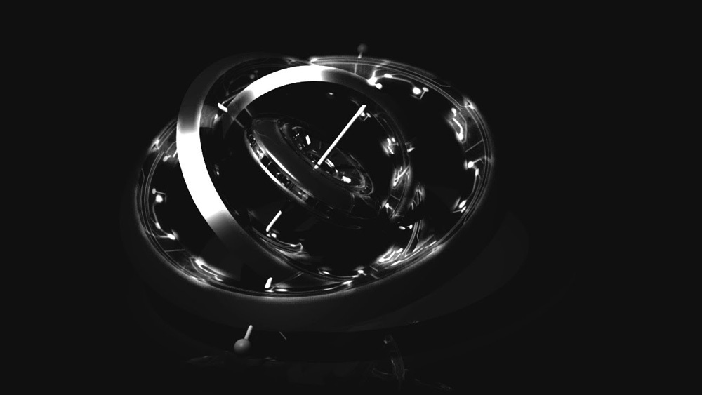
Well, the last example is just for fun. The picture hangs on the virtual wall in the phone, swing the phone - the picture swings. I do not know how this can be applied on the site, but the thing is funny, in my opinion.
With this modest review, I want to say that the time has come to use the capabilities of mobile devices on websites. We do not use very much - here, for example, the article two years ago: “Frontend trends. Javascript APIs for mobile devices . Even then it became possible to use the battery status, camera or vibration on the site. How do you feel a slight vibration when you press a button on the site or when a pop-up notification? All this is done by a couple of lines of code, but for some reason it is not found anywhere. But I am positive, and I think that soon the sites will become much more fully utilize the readings of devices during mobile surfing.
Thanks for attention!
Source: https://habr.com/ru/post/269369/
All Articles