Illusion of time

My grandfather was a watchmaker. When I was a child, I could sit for a long time near his large wooden table, watching how he assembles all these mechanisms, consisting of dozens of the smallest details. All his patience, determination and accuracy, which he put into every detail of his mechanisms always amazed me.

Watching the working mechanism at first you feel some kind of magic. While the electronic clock looks somehow cold and boring, seeing the watch engine is immediately fascinated by it and the skill that made it all work. I myself had a watch only at the age of 12, when my grandfather offered one of his works. And putting them on my wrist, he said something that I will never forget:
Remember, time is the most precious gift for everyone.
It may not be as dramatic as Uncle Ben in his last words from Spider-Man, but his words always pop up in my head when I think about the design of something. Time is the most significant and limited resource we have.
The value of time in the digital age
Creating digital interaction comes with an ingrained panacea, which is speed and performance. Amazon has calculated that if the download time of their site increases by just one second, it will lead to a fall in sales of $ 1.6 billion annually. Google will lose almost 8 million searches and results for them, if their page loses one quarter of a second in speed - unbelievable!
So what do we do?
We create a budget view, trying not to get beyond its scope, launch image optimization, minimize our Javascript and CSS, cache our assets located on servers in the most exotic places on the globe.
')
But there is one "but." First, speed does not mean better interaction. And secondly, the importance of time is a very subjective quantity, as Einstein aptly noted:
“When you spend time with a beautiful girl for an hour, it seems to you that only one minute passes, however, when you sit on a red hot stove for a minute, it seems to you that an hour has passed.”
Remember yourself when you have not turned out to be the “most successful” day lately? Time suddenly suddenly slowed down, and the only thing you are thinking about is: “Why am I not sitting on my couch yet, watching the last episode of Game of Thrones. And this is just one of the thoughts that just fill your head at such a moment.
When you look at your watch, you literally feel like time is slow. Sometimes it even seems that the hands of the clock stop for a second.
But here comes the weekend, and the perception of time is changing dramatically. An incommensurable amount of new impressions changes your sense of time. And why are working days so slow, while weekends just fly by.
Time <> Interactive Design
Time is the key criterion for interactive design. At the end of the day, users have to wait for the absolute minutes and seconds for what it is. Amazon opens the veil of this magic on how people interact with the design and memorize it.
Research UIE conducted a comparison of the perception of users with the speed of web pages. The results showed that Amazon users rated responsiveness faster than About.com, although the full page load of the first one was about 36 seconds , versus 8. This is amazing! Users are not looking for short cuts ...
When users perform only what they intended, then the site is perceived by them as a quick resource.
How is this possible?
We do not perceive time as an absolute value. His perception is more dependent on the individual state and context. When we get pleasure from the process itself - we barely have time to keep track of time. This rule applies to user interfaces. Well-designed interfaces are perceived by us as faster, being not really like that.
Let's look at what types of design strategies we can resort to in order to change the perception of time and perhaps create more dynamic user interaction.
1. Maintain user employment
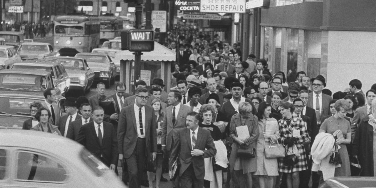
Have you ever been to Manhattan? When you are standing near a pedestrian crossing, waiting for the green light, you become an observer of surprising patterned behavior of a person. People greedily press the signal button in the hope of somehow reducing the waiting time. The frequency of pressing these buttons usually proportionally increases the level of irritability of other pedestrians.
Although most people just do not know that:
About 90% of all Manhattan pedestrian buttons simply do not work.
So why are all these buttons still in place? Why the metropolis does not get rid of them, if they are just pacifiers?
In fact, the only question is what we mean by operability. People pressing this button often subconsciously shorten the waiting time than it actually is. These buttons work, and work amazingly. Just not the way we think.
Maintaining user employment is one of the oldest and most effective strategies to reduce waiting time. This is the basis of the fact that in our elevators there are mirrors; why there are always books and a yellow press in the waiting rooms, which is why we tend to constantly pull at our mobile phone, checking the time, waiting for the upcoming meeting.
And what about the web?
In those good old days when people used Internet Explorer as their browser, we always observed a white canvas before a new page was loaded.

The whiteness that fills the entire space of the page created some sense of self-reflection and uncertainty.
The minor changes introduced in later versions were able to correct this situation. By saving the current tab view before the new page is loaded, IE created the illusion that the sites load much faster, simply because users continued to interact with the content.
Disney Land is well known for rethinking the presentation of the usual lines in the direction of a pleasant pastime. Borrowing the basic principles of architecture, they are confident that if a person sees its ending at the beginning of a line, then he will never be demoralized. You move through the different stages of the queue, which opens up more and more new "magic". Some people go as far as Disney Land employees say that they just stand in a queue because they are pleased with the process itself.
Summarize; signal buttons, discussed by us earlier, do their work from the point of view of user interaction. Although technically they do nothing, they function perfectly in terms of psychology.
If you want to create a smoother interaction, stop treating technology as a panacea. So let's make the waiting time shorter by offering people useful tips, links, quotes, etc., adding a touch of meaning.

2. Perform actions with optimism
Today's web and mobile apps are stuffed with microstatus. Whether it is a heart like a Instagram or a retweet button in a microblog; applications just need to constantly communicate with servers.
Each such interaction requires a connection to the backend, which in turn carries potential delays in the operation of the interface. Let's take a look at what we can do to get rid of the latter and allow our applications to feel multi-edited.
Research returns us to 1968, assuming that we conditionally divide the response time into three categories:
100 milliseconds
Any response that lasts within 100 milliseconds is considered instantaneous. Check it out on your phone. Most mobile websites have an annoying click delay of up to 300 milliseconds. These additional milliseconds can create a perceptible barb in the opinion of the speed of the interface.
1 second
The user continues to find "one-on-one" with the application, but the feeling of control over the instantaneous reaction of elements is lost.
10 Seconds
Represents an absolute limit before the user begins to think about the great.
In all ways we try to meet these sweet 100 milliseconds of time. The design strategy from Mike Krieger reads: “Perform actions with optimism,” trying to solve this problem.
Instead of showing the download indicator, like a photo in Instagram, the user sees the instant awakening of the heart icon, while a connection with the server is set up behind the scenes. This makes the interaction more smooth, since the user’s work will only be interrupted when an error occurs.
Twitter uses the same technology.

Summarize; develop and create more lively user interfaces that will only enhance the presentation of the stream, providing people with instant response.
3. Use transitions in the interface.
Animation has become a key element of modern user interface design. And if time and space are an integral part of interactive design, then animation is the key to its expression. We present animation as nothing more than a decoration for our application, but it is an incredibly powerful tool for teaching users the right interaction, storytelling, enhancing streaming perception, but also for creating a corporate style of interaction.
When it comes to using animations, time is crucial. Tighten with it - and you will simply force users to view your miracle transitions. Make it too short, and users can easily miss important details. There are a sufficient number of articles on this topic, so here I will not go deep.
However, in the context of the perception of time, there is an important point that we must take into account. We can use animation to reduce perceived latency. See the example below:

This animation is pretty slow, isn't it? If we constantly see her, then not unknowingly she will annoy us. But using this kind of animation, we will be able to gain additional time while new content is being downloaded. Slow animations can shift the focus from latency to application usage interaction. The critical factor here is that moment, if we face this trick again and again.
Summarize; the more consciously we experience the waiting time, the longer it becomes. Like a conjurer, using animation, we can intercept the attention of users and focus it on what we want.

4. Avoid modal spinners.
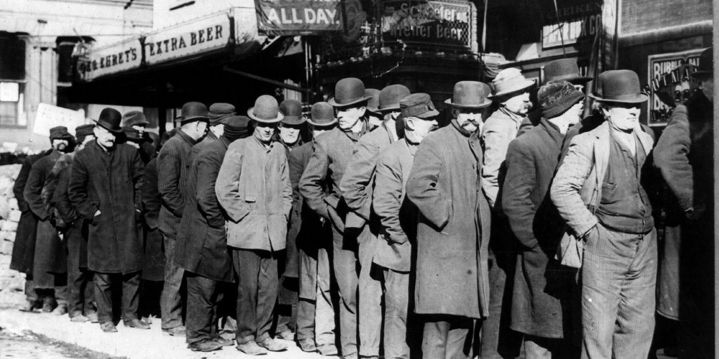
You never wondered why you always get into the longest line in the store? The reason for this lies in significance.
We are constantly faced with slow bursts. We then tell the others about our sad experience during casual gatherings after work. Moreover, the more we talk about this, the more importance we attach to this event in our memory. The next time in a similar situation in our subconscious, the same moment will surely pop up, and after it, negative emotions. As a result, we have a completely biased assessment of what is happening and are forced to think that we find ourselves in such situations more often than all others.
The same applies to ajax spinners and other activity indicators.
It does not matter how beautiful this indicator will be, after you meet hundreds of such elements, different in shape and color, you will definitely think: "This guy just eats my time."
“The idea of showing the progress indicator is certainly good, but ultimately the result may not turn out for the better, because, by definition, such elements make you pay attention to the fact that you have to wait.”- Luke Wroblewski.
For the sake of justice, it should be noted that spinners are not always a bad decision. The bad solution is how we use them. Let's look at two approaches when creating a chat application.
Approach A
Whenever the user presses the message sending button, a modal spinner pops up on the whole page, indicating that the message is being sent.
Approach B
Whenever the user presses the message sending button, a small indicator appears next to the message being sent. And as soon as the server returns a response to the request, the indicator will disappear.
So which approach do you think is better? It's obvious, isn't it? While Approach A creates friction, forcing the user to look at the indicator whenever a message is sent, Approach B carries the perception of non-disconnected interaction.
Compare this with the “Add to Favorites” microblog button discussed by us earlier. Just imagine how annoying users would be if every time you clicked on this button, you would have to wait for the moment when the request is fully processed on the server. In this case, you would immediately abandon the use of this feature.
Although this solution is not only applicable to the chat application. It applies to all kinds of interactions associated with microstates. Approach B is obviously better, but nevertheless, people resort to approach A, considering that it is easier to implement.
Summarize; use of indicators is acceptable. But you should avoid fullscreen spinners that block the rest of the user interface.
5. Report long wait times
Sometimes, long waiting times are simply inevitable. The way in which we present this greatly influences how people perceive it.
For example, let's consider visiting a restaurant. In the case of waiting in a restaurant, several factors come into play at once:
- Will they serve me immediately? Will I be given immediate attention?
- Do I know the approximate waiting time and is it advisable?
- Do I first understand why I need to wait?
- Did I honestly be warned about the waiting time, or would I have to wait longer than the others?
- Do I like the flavor of food in the air?
All these factors create a list of environmental criteria for our further actions. In fact, creating a reality that does not meet expectations, you can easily rotate even the most loyal visitor by 180 degrees.
The same rules apply to the digital environment, where a small tactlessness regarding a poorly chosen button color can turn a seemingly modest and calm person into the most malicious troll. Let us avoid such moments by helping people use their time more productively.
Progress bars
The tool that first comes to mind when the user needs to display the progress of actions - this is the good old progress bar. It turns out that there are good and bad progress bars. So when is this tool bad?
In short, when he lies.
Recall the procedure for installing applications on older versions of Windows, which starts incredibly fast, and after 99% of the time, it stakes for an inappropriate amount of time. If you knew from the very beginning how long the installation process would take, you would be better off drinking coffee. But you can't afford it.
Displayed progress has wrong expectations. And instead of enjoying the beautiful latte, you are hanging around the monitor, waiting for the last install percent to complete. Not inspiring, is not it?
And this is no secret to anyone. Progress bars deceived us for many years. The task of creating an "honest" progress bar, reflecting the real state of the system, is by no means trivial.
But perhaps we ourselves have received "bad" progress bars. Maybe we should rethink why we use them in the first place. Perhaps their mission never included the ability to provide accurate information. And maybe their real advantage is to build reasonable expectations and provide a visual way to monitor the progress of the assessment.
One of the ways to build an “honest” progress bar is to make sure that your component moves at a constant, predictable speed. But that is not all.
Acceleration progress bars
As mentioned earlier, time is very subjective. What if we try to change the perception of speed and time, using small designer buns? Will we fly away with such an invention? Research conducted by Chris Harrison is trying to answer this question. Here is the result of research.
The frequency and rhythm of changes, as is known, affect the perception of time. Studies have shown that a flashing indicator is perceived more quickly than an ordinary static one. The temporary illusion became even more intense when they changed the direction of movement of the edges of the loading strip in the opposite direction. All these small changes make the progress of the bar to perceive it 11% faster.
Other studies have shown that users are more sensitive to the progress of the component itself. As Daniel Kahneman states: “Users prefer loading lanes which are faster at the beginning and at the end of the procedure, in fact coinciding with one or another phase of the process itself”.
Some may argue, saying that all these designer things are very deceptive and manipulative. I would say that it is beautiful. Like the traffic light buttons in Manhattan, these design tricks reduce time perception and improve the overall picture of user interaction.
Try this simple trick: the next time you move a large file to your computer, resize the window with the progress bar. The wider this window is, the faster the progress indicator will be perceived.

Countdown / Estimated End Time
While the progress bar is a visual display tool, often this is not enough. Especially long waiting times require a more accurate indicator. For this, there is a countdown .
David Meister’s not quite honest studies on waiting queues showed that knowing the approximate waiting time, a person perceives it more quickly. On the other hand, providing incorrect information can only exacerbate the situation.
“Imagine a pilot who tirelessly repeats:“ Just a few more minutes ”, pouring salt only on the wound, when the wait continues and continues. Passengers are not only forced to wait, but they are already losing faith in his words. ”
Users can greatly benefit from displaying such information during a long wait. This unleashes their hands for the rest of the cases in order to return to the current one a little later. Again, accuracy is not as important as it may seem. Users need at least approximate information about how long this procedure will take. Can he leave the screen for a minute or two, or more than 10?
Summarize; Speed up your progress bars. Take advantage of countdown components for long waits, let the user use their time more efficiently.

6. Download content progressively.
A few months ago, I was in London at a conference. Whenever I visit this city, I visit one of my favorite places: Joe & Juice. I just really like the atmosphere of this place. Unobtrusive music, a lot of work space, fresh orange juice, great espresso and obviously - an excellent Slayer 3-group coffee machine.
This time, my visit to this cozy corner was slightly different. It was a sunny Friday afternoon, disappointing me with a sign on the doors of this store about repairing. It was just huge, saying: "We are updating for you." I am sure you have encountered similar. The point is to warm up the waiting, it is necessary that people know exactly what innovations you will have in a short time.
In recent times, there has been a lot of debate about whether to use the progressive method of drawing images, or stick to the linear one. The difference lies mainly in how the images are loaded:

While the progressive approach uses several stages to display a distinct image, the second approach loads the image linearly from top to bottom. The main idea of the progressive approach is to improve user interaction by detailing an object already present on the page, while letting the user know what is happening.
Although this approach is applicable not only to images. Facebook took the idea of progressive image uploads and applied it to its posts. A post that has not loaded yet uses this prototype:

Such prototypes set expectations. When you go to facebook.com, user interaction becomes smoother, because there is already something on the village. As soon as the content of the post is fully loaded - the prototype is replaced by the full text of the post.
Pinterest uses a similar strategy. Only they fill the pin with the predominant color of the image, until the last one loads onto the page.

The transition from a prototype to a real object is a more seamless load, from the point of view of user interaction, and as a result, it seems to us to be faster.
Similarly, we must prioritize those assets of our page that are located above and above, relative to the bottom of the web page.
Summarize; Gradual loading of content is as important as the user interaction itself, it should be as fast as possible.
Finally
Our perception of time, as well as every interaction of people with something, we put into this world in the form of various circumstances, in the course of which we cannot be. And as long as technology can not completely eliminate the expectation, we can use our subjective perception of the world, and make it more vivid, seamless and beautiful.
Because time is the most valuable gift. So let us brighten it up a little!
Source: https://habr.com/ru/post/269113/
All Articles