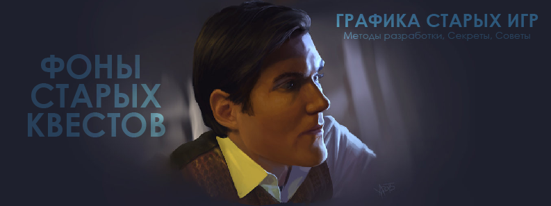
Backgrounds of old quests - development methods, secrets, tips
Today we are exploring the issue of developing backgrounds “as in old adventure games”. This is not exactly what you expected of me. However, the next part of Pixel's Gallop is delayed for two serious reasons. First, chapters on animation require high-quality animation, otherwise they will not be able to claim the laurels of teaching material. Secondly, the “gallop” needs another publication before the beginning of the animation cycle, which is already under development. This is due to the fact that I am engaged not only in classic pixel art, but also because it goes beyond the limits of canonical resolutions, and I definitely have something to share. Unfortunately, this type of pixel art is now more fashionable than a classic, judging by the responses of the public.
Let us, however, return to the topic of today's publication. I think this is a small discovery, and I certainly need to share it with those who are going to connect a certain segment of their life with what may be called a classic adventure game. Perhaps this will help to return to the market the games that will push the “hipster pixel” a little bit, replacing it with something that can remind you of the times of the best games from “Westwood Studios”, “Sierra” and “Lucas Arts”. I suppose in passing that many artists already know this. And, nevertheless - I did not notice the publications on this topic. Our brethren are in no hurry to share their secrets, while retaining a certain monopoly on their own discoveries.
')
I wanted to match this article to the beginning of the development of its own adventure. But who knows when this will happen? And this information can help you now. Should I postpone? I think no. Spade in hand.

Prelude
I have been doing pixel art for a long time, because I really like old games. It seems to me that in old games there are significantly more souls than in today's games. I am inclined to compare old games with sincere feelings, with love and I don’t regard them as a passing hobby. We can say that old games are love. Modern games are a passion. Frivolous and fast sex, not burdened with affection, any obligations or deep respect for the partner.
Since I do not approve of fleeting connections, my eyes are increasingly turning back to the past. And the further I move along the river of time, the sweeter and more attractive for me is what I call the classics. Classic in my understanding - the game until the moment when the whole world switched to the SVGA mode, leaving and forever leaving the residence of the lesser resolution - VGA. Most often, games of that time used a resolution of 320x200 pixels.
I was always interested in the question of how exactly these backgrounds were made. As an example, I will give images from the games "Westwood Studios". This is my favorite. The office that influenced my work is so strong that I decided to make games in this particular style. Artists which determined the type and colors of my work for decades to come. I often heard about these backgrounds - “what a marvelous pixel art”.
Let's go straight to the climax not characteristic of my publications. I'm not sure that this is pure pixel art. I came to this conclusion two months ago. Came finally. Formed an explanation. Developed a similar technique. Now I will present my work to you, and you will determine for yourself whether I am right or not. I want to immediately note that this applies only to backgrounds. Undoubtedly, the interface of games, design, fonts, game characters and their animation is one hundred percent pixel-art, not diluted and of good strength. Here I have no doubt. And even if I am mistaken in my theory, this will in no way prevent you from making backgrounds similar to those of old games.
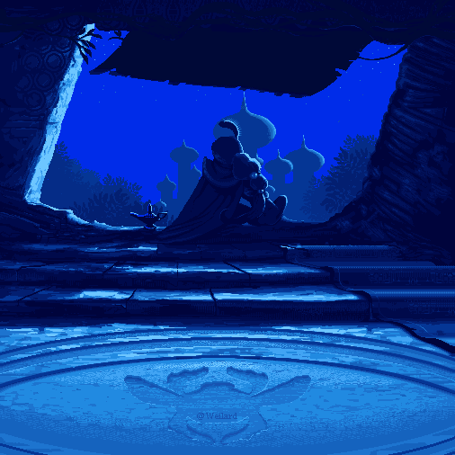
As a foothold, we will take a few images from the legendary games "Legend of Kyrandia" and "Lands of Lore". I consider them to be the peak at that time, in terms of artwork, in terms of animation and color. Not to mention the technical performance.

Soft warm colors, smooth gradients and amazing study of the smallest nuances of facial expressions. That is what distinguishes these works. For a very long time I tried to reproduce them in the original resolution - and nothing worked out for me. There was always a difference. My images did not reach the accuracy of Westwood artists. There, as they say, “every pixel lay in its place”, was always the right color and nowhere was there any apparent dissonance between the colors.
Over time, I switched to 3D, participated in dozens of projects, the specifics of which involved using me as a specialist in 3D, textures, and hybrid techniques for creating graphical content. But for many years this path led me away from the world of visual art, and for a good ten years I wandered in the darkness of commercial games.
When it came time to return to drawing, I was once again thought that, perhaps, the backgrounds of these games are just art. Reduced and processed. But it was only when I began to engage in pixel art vigorously, began to draw again - the concept gained clarity.
Way
Let's quickly analyze what pixel art is typical for and what images of old games are typical for. First, a limited palette, rarely going beyond 256 colors at one time on the screen. Secondly, sharp shapes with virtually manual smoothing of a few pixels along the contours of these sharp shapes. Thirdly, the resolution is 320x200. How do we get something like that?
The first thing that comes to mind is to reduce the image. Let's do an experiment. Take one of my early works. And reduce it.

Automatic anti-aliasing and filtering keep the image as close to the source as possible. But this is not very similar to the graphics of old games (thumbnails are displayed with an increase of 2x so you can see the results more clearly).

Now we try to save the image in an indexed palette by saving images for the network (Save as Web). No matter how many colors we choose, this does not give us the necessary image, although it looks like something old. Very remotely, it should be noted. Even if you keep Jim in 32 colors, he doesn’t look like pixel art.

There is a filtering mode - no smoothing. Otherwise Nearest Neighbor (preserve hard edges). That is, the image is saved as close as possible to the original. Without anti-aliasing, without image adaptation. Without any filtering.

Note: This is your door to the old world. Not that it will immediately bring where it is needed, but without it you just can not do. No

The result is already better. We, at least, got rid of the smoothing, which is not typical for pixel art. Again, save the image with an indexed palette.

The paradox of the situation is that if you get pixel art from an image or an art you have prepared, you are a scoundrel and a crook. But if you do the same thing in the style of “pixel by pixel”, then you will be great and a good guy who has done a lot but could do the same work, manicly setting pixel by pixel on a virtual canvas. Of course, the image transformed in this way is not yet pixel art, any artist works more carefully doing everything by hand. And yet ... let's say you are a game developer. You have tight deadlines, and you need to release the product in a month. Is there someone who thinks that your cries “but I did everything honestly” will excite the public around you? Excite your consumer? He does not care how you do it. But he easily eats you with herring under vodka, and does not even choke if you fool around, and delay the release.
Thus, making pixel art to prove that your pixel is larger, and making pixel art as content delivered to the stream as part of the development of a large-scale project is two big differences. No one needs to be honest. It is necessary on time, at a good price, so that the consumer’s pocket does not crack, and that it is delicious. It was precisely in time and tasty that led me to the thought sounded above. The fact that the images of old games are often prepared on the basis of art.
Theoretically, Jim could be turned into pixel art, just by working with the image. In three or four hours, he would be completely different. But our task is different. We need to understand exactly how the backgrounds for the old adventure games were made, and not to do something similar, after significantly improving the result. For a long time I had confidence that the images were practically not processed additionally, because it would extend the game development cycle, and this is not profitable. The main motive of the developer is profit. The most important motive is the development time and the absence of intermediate stages. The concept of benefits can be interpreted as you like. And this is not necessarily a monetary or material benefit. I spent less time on content development, released two or three months for another task - a benefit.
What does this lead us to? To understand the fact that the original image is complete - not the case. Not in the artistic style that, when compressed, would look like old backgrounds. What remains in this case, given that when reducing any art, the strokes are averaged, and it is not possible to identify exactly how the work was created? What was the source. What to do when you don’t understand whether the brush strokes were applied, was the brush technique in general, or were gradients used, or something else?
The answer is simple. Search. Try different stylistics and chase them through the process of reducing and then saving in an indexed palette.
It was a rather long stage that did not lead to the desired results for a long time. Every now and again. Last year I began to draw heavily. I tried different styles and gradually began to lean towards the classical scheme of drawing concepts and graphics. Without using 3D, without any tricks and tricks. As in the case of pixel art, I sank to the very bottom, to the roots. And he suggested that it would be nice to learn how to paint with a single brush, making it so that it resembled traditional painting.
The traditional brushstroke approach led me to the following images. Saving them by the above method led to the following results.

Rough smear technique did not fit, but some pulse had already begun to be palpable. I added detail and got the following "background". Which also turned out to be wrong, since excessive photo-realism in the work was not very good.

After analyzing the artists of Westwood, I decided to soften the sharp strokes, to make them smoother. It was the first background, which finally gave a normal result. It was practically what you need. This background no longer needs to be processed. Is that add interactive objects.

Note to the picture: The integration and comparison of backgrounds will be carried out a little lower, immediately after the end of the presentation of works on characters (similar to the characters of the game “Lands of Lore”)
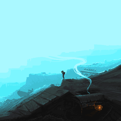
It can be said that it was important to choose the size and character of the strokes so that when decreasing they give the necessary “pixel noise” in the final image. Having developed a scheme, it is possible to make a background for three to four hours, and even without subsequent post-processing it will be presentable and can be used in your game. It's funny that in order to find such a seemingly simple solution, I had to try different styles and conquer a variety of heights.
After that, I attended to the issue of characters. You remember what they are. Almost photographic. With good color and light accents. Warm and cold colors. Hollywood. The final point in this study was Dr. Simon Temm from Firefly. It is symbolic that the doctor is responsible for the healing of the image, and for the final.

I painted it intentionally leaning towards that palette, which is characterized by many images of quests from Westwood Studios. Soft gradients on the skin, clear and cool backlighting with neat strokes where necessary (hair, accents on the eyes). That is, even in the source, Simon already reminds one of the heroes of “Lands of Lore”. Final chord - reduction.

Then a small party performed by an ensemble of an indexed palette.

Being connected to classic pixel art in those places where an interface is added to this non-existent game, we have a complete illusion of the graphic content of old games. If “Westwood Studios” did the game for our beloved “Firefly” then it would most likely look like this. But we have to make sure that everything is so and not otherwise, right?
Let's integrate our images into the interface and layout of the games “Westwood Studios” - “Legend of Kyrandia” and “Lands of Lore”.

On the left is the desaturated version (bleached), and on the right with a bright, welcoming gamut. Simon is also reduced and placed in the place where the Conrad icon was previously (the character of the game “Lands of Lore”). It is quite obvious that such art could be in the game, and that it looks quite harmonious. In principle, it would be possible to save it in a significantly smaller palette of colors, and then work a little with a brush so that the art was quite similar to the art of artists from Westwood. The queue for the background.

In the same way - we reduce the image in the corresponding mode, and we save in the indexed palette. The upper version is too pastel, so it makes sense to turn up the brightness of the colors, and you can see that Brandon (the character of the game “Legend of Kyrandia”) could well wander around this world. That is, the picture does not look something foreign.
The final
From the foregoing, it can be concluded that the backgrounds of Westwood Studios artists were originally classical paintings. Then digitized and saved in the palette that the game used. After that, the interface, characters and other elements were added. Animation was also made on the basis of these works. It did not contain a lot of staff, but was extremely detailed. How? Now we know.
I wrote this article under the impulse of sharing with you this little joy of a small, but very important discovery for me. I also quite often met online questions, how exactly are images made that look like old games? What you need to do to make the image so? The answer is simple. The progress has gone far, the colors have become more, and the principles of working with the image have changed. It was no longer necessary to save, it was no longer necessary to fit within low resolutions, and the appearance of the games changed. Therefore, in order to imitate them, it is necessary to bow to the sources, namely:
• Reduce images to the size of old resolutions (320x200)
• Reduce the image to produce in the appropriate mode.
• Save the image in an indexed palette, imitating the limitations of those years.
• Prepare the original image in a specific style.
Amazingly, the lessons of pixel art stimulated me to study the classical pattern. It can be said that in many cases it is pixel art that prompted me how best to draw in high resolution. And this is not the only one of my little discoveries. A similar article will follow. Where we learn to prepare the graphics as in «Fallout». Not modern, of course. And in that. Old
Of course, this publication will not help make such backgrounds man technical, not clothed with the ability to draw. However, it can tell which artist you should contact, from whom you should order art, and how it should look. In recent years, I have been approached many times by various programmers who knew what they wanted to do, but did not know how. This, by the way, is a rather frequent phenomenon when a technical person is at the head of the project. I lack technical savvy and practical mentality. But at least I can share with you the knowledge that I have.
We translate the spirit
The last chords died down, the end of the performance was nearing, and I would like to add some practical lyrics to the article. It took me more than one month to arrive at a definite solution. I do not want to say that years have passed, because my classes in digital painting were not regular. However, in order to complete this quest, I needed to learn how to draw somewhat better than I could do before.
Why am I doing this? You might get the impression that all the above and shown is difficult. By no means. For a person who is just beginning the path - yes. But for the one who draws - no. Each of these backgrounds can be created in one working day (those about which I wrote above). Eight o'clock. It will not be the most honest kind of pixel art, but it is a working day. It is important. Two works below are another thing ...
Pixel art produced from scratch takes significantly more time. These two works were created, approximately, for 16-20 hours each, could take more if there were no relevant experience. Of course, they cut their applause at the appropriate resources. But this is “my pixel more”, and not anything else. Public proof - "I can." I dare to remind you that such ambitions and waving squares has nothing to do with the development of content for games.
I will give an analogy. Knight Tournament. On it knights fight among themselves, but somewhere on top sits a noble lady, and, in general, the victorious knight may break something. If he behaves ugly, then most likely his fight will not please either the lady or the public around. So you need to prove yourself in all its glory, show all the beautiful techniques that you know how to do, somehow fall into a picture, jump up again, strike a couple of spectacular blows, parry the opponent's blows ... in a word - to arrange a wonderful performance.
Work games is not a fight for the fun of the public and not a joust. This is a slaughter. Battle. And your task is to survive in this battle. When you need to survive, believe me, you are not up to beautiful punches. You will do anything to go home. Your "return" is a game that went into print. No one will see your suffering, your sweat and blood spilled in battle with her. Everyone will see only the final result.
Why am I doing this? Take care of yourself. Optimize your work. Find solutions to speed development, keep it at the required level of quality. Well, sometimes go to the tournament ... wave a pixel. Maybe you too break off.
P.S
Ingratitude is the worst form of inattention. Therefore, here and now I want to thank those who support me in Patreon. Almost all people from here are Habr's readers and I am immensely grateful to them for that. Their support allows me to free up at least one day off per month. The day itself is not so great. But if you distribute it on other busy days, that is, at least five days in each month, when I can afford a couple of hours of creativity - it becomes a breath of air. And it is very valuable. And it was these watches that became a point in my research. It cannot be said that without them this would not have happened, but it will be true to say what would have happened much later.
Their attention to my work gives me strength. I understand that I am not alone, and that what is being done is not only interesting to me. Any scribe, artist or representative of the creative community needs viewers. Those who appreciate, support, and be near, as the creator energizes not only from the sky, the sun and music. In other words - thank you all! This is valuable to me, and this article is not only mine. She is ours.
Comments in hindsight, as it was, in the Herr-Text bunker, and additional information in the Infosphere. Thanks for attention. And see you soon!
Note: Infosphere and Bunker will be filled after the publication of the article, because the most important thing has already been done - the package has been delivered.
Bunker Herr Text
Note one , indignant.
Not so long ago, I was written by various people, middlemen and those whom I publicly call speculators, and mentally call scavengers. Offering to record lessons and sell them on different sites. Mediators and rogues, offering not to share different secrets and techniques, leaving them for private lessons. Our conversations with them ended very quickly.
The worlds of the Strugatsky brothers are close to me. They say - "Happiness for all for nothing, and let no one leave offended." Not daring to rephrase, I will say at last that the word happiness I often practice on the word “knowledge”.
Note two , suggesting.
If anyone is interested, you can record video creating such backgrounds with explanations. But it will be clear from the results of the comments on this publication.
The third note is favorable .
I began to record the video process of creating the simplest pixel art in support of the articles "Gallop Piksel". Not being a specialist in sound, and other things related to editing, I recorded them as is. Welcome to my channel (YouTube): www.youtube.com/user/Weila777/playlists you need to watch the section “Weilard Pixel's”. The last video looks something like this. Everything is very simple, at home.
Thanks again, thanks for reading the notes, and see you soon!
A backdated note: (date: October 9, time: 11:27) I apologize, but the Infosphere section will be filled only on Monday-Tuesday. My family finally got sick, and I need to hurry home, for I slept classically at my work. I will try to find time at home to respond to comments, if they will to answer questions. Have a great weekend and good health.
Source: https://habr.com/ru/post/268477/
All Articles