4 rules of content management interfaces that no one observes
This is the first post in the blog of the project Floxime - Russian open-source CMS, which is developed by our team. Very soon we will open the beta version and tell you why the world needs a new CMS, what we can offer to users and developers, and what plans we have. And in this article I will talk about our approach to content management and try to prove that this is really important.
This article is called "4 rules of content management interfaces that no one observes." By the word “nobody” I mean, first of all, developers of popular technical platforms - site management systems and site designers, and secondly - site developers on these platforms. Users do not complain simply because they perceive these interfaces as a given, nobody asks them how they would like to manage their project. It is believed that the unprepared user himself does not know what he wants. “If I asked people what they needed, they would ask for a faster horse” (c) Henry Ford
Meanwhile, one can ask not directly, but in imagination, with the help of Customer Journey Map . It is usually used to audit online stores or even offline / hybrid businesses, but you can also use it to design interfaces. In the usual case, we go all the way to the target action (for example, shopping) and look at each page (or interface), asking ourselves the question: what prevents you from going to the next step? In our case, we look at the “naked essence” and ask: what is there to be? For example, how would I want to edit this blog entry or add a map after the phone?
')
With the help of such mental experiments, we formulated our four rules.
Suppose we need to add news to the site. Let's see how different CMS offer us to do this:
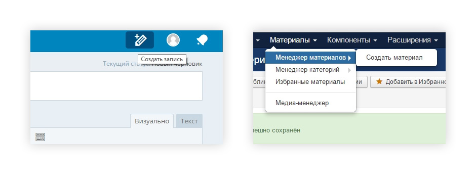
We understand why, instead of news, we suggest adding “material”, “record” or “post”: for a CMS, this is just an object with some data structure in the SQL table and a display template. And for the user it is just “machine language”. Why not add the entity name in the accusative case to the entity responsible for the block structure? Just because the English-speaking developers of this CMS do not know about the Russian cases?
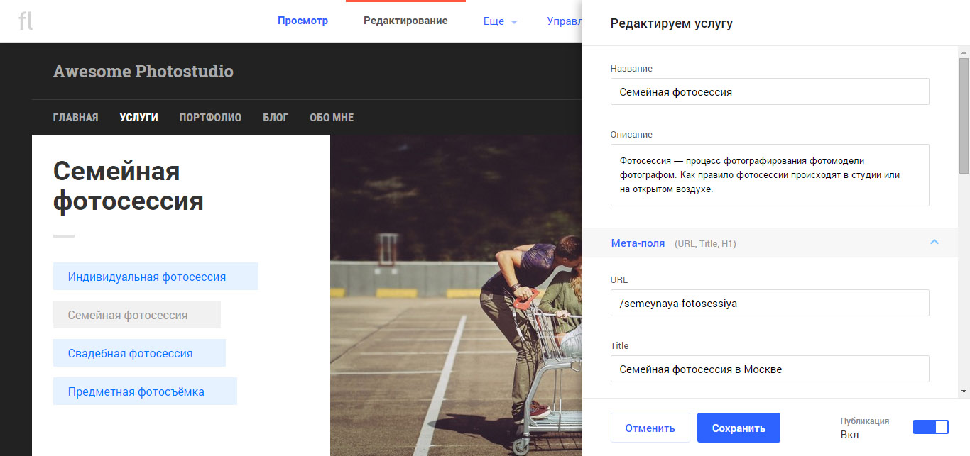
Another example of how software architecture has a pernicious effect on the user interface: setting up a web form. The user must at least specify the address where applications will come from this form. In one of the CMS we encountered, this problem was solved as follows:
Such interfaces are a consequence of professional deformation. We (developers, designers, designers) know too well that a site consists of a structure, blocks of content, templates, etc. A logo is a property of the entire site, so to change it you have to go into the site settings. The form for sending feedback is a property of the block on the page, so you need to look for this block in the admin panel and change its settings (and this is at best, or even in the component code you need to climb).
We in Phloxime when designing a site / page management interface use multi-layeredness to visualize the page architecture:
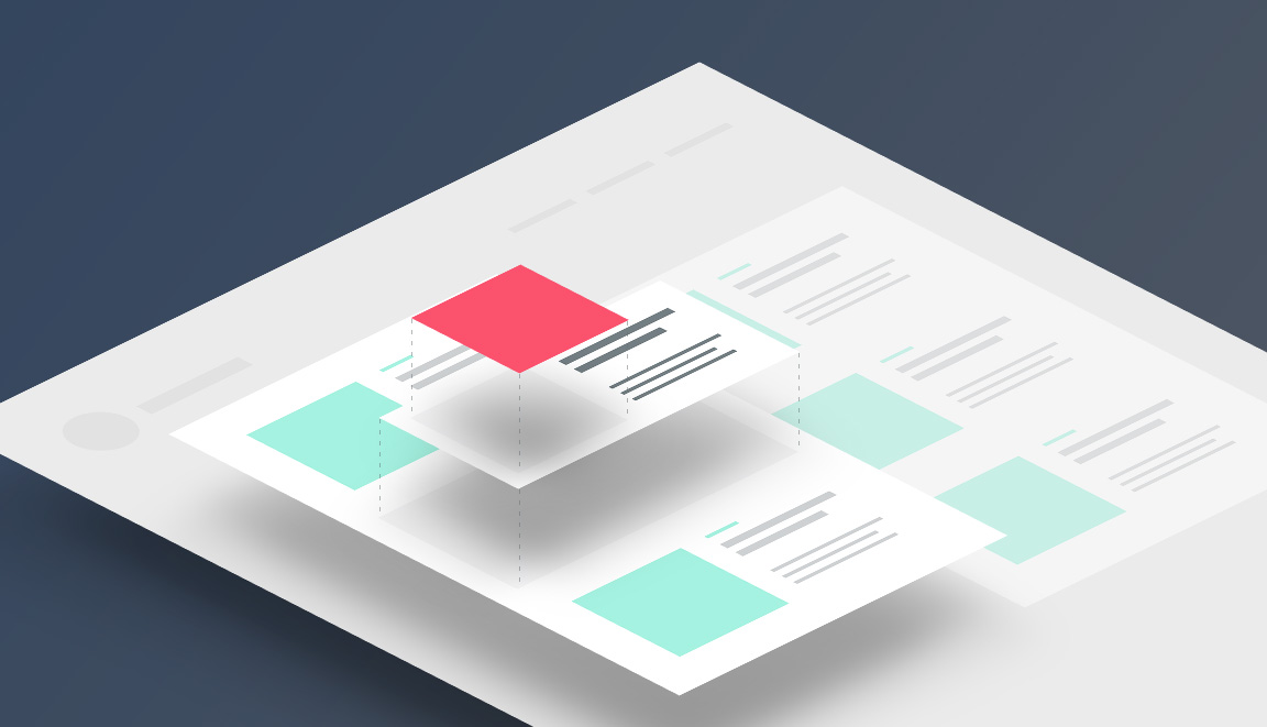
Different elements belong to different entities (website, page layout, content block, record) and to a different set of pages (only this page, the branch of the structure, the whole site), but the management of them for the user is maximally universalized. Each visible element can be selected, and an edging will appear in it, as well as contextual icons of actions: editing, setting, deleting, switching on / off, transfer, etc.
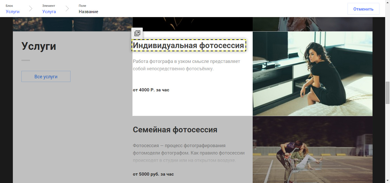
And wherever possible, apply edit-in-place with a maximum pixel-perfect (sorry for anglicism).
One of the main signs of a good interface is predictability. The user must clearly understand the consequences of his actions. Let us examine a few examples.

How long should a new menu item be to fit into the line? What will the block look like if it doesn't fit in anyway?
In Floxime, before the addition process is completed, you will see how the block where you are adding content will look:
If I insert a long title here, will the tile increase vertically or will part of the text not appear? And what part, suddenly important?
Here you can see the result of editing and you can make a decision before saving:

If I add the “News” block here, will it definitely look good? Or do I need the Articles block?
Here you will see a preview of the block and you can play around with its settings before saving it.
For those entities that cannot be changed in WYSIWYG (title, block properties, non-displayable parts of the content), we use traditional modal windows.
Many website designers upload user-modified pages only by pressing the “Publish” button:
To understand the anachronism of this approach, try to justify it to the user with the help of an analogy from the real world. For example, we are making up a wall newspaper: we pretend the arrangement of individual frames and headings, after which we glue and hang on the wall. Or we are a video studio; we post the video only after selecting a material from the captured fragments, editing, color correction. But in these cases it is not clear why it would be necessary to re-glue an already finished newspaper or re-compile an already released video, if it is not an emergency.
The same with the site. Routine operations on a working site: add news, replace the title, edit the price of the goods. Global changes are extremely rare, usually only at the very beginning. But in this case we can not be afraid that visitors will see a mess on the site - we do not have them yet.
As for random errors, the best protection against them is the button to undo recent actions. (We, however, do not have such a button yet, but it will definitely appear, and then we will get rid of the terrible dialogs “Do you really want to delete it?”)
By creating an extra buffer between user actions and the result, we create extra friction in the interface. If the previous principle (WYSIWYG) works well, changes on the site should occur in real time.
On the topic of user access to the design of pages, there are two polar opinions:
Both approaches have obvious drawbacks, the “right” approach, apparently, lies somewhere in the middle. But it was very difficult to find this golden mean. At the moment, we give the user two types of design controls:
However, we already see some situations where the user really wants to give a choice of indentation size or color. The key reason for this is that the designer / developer cannot foresee all the needs of the user. Therefore, we assume that we will have to deviate from the rule of “not giving the user fine tuning”.
***
As far as we are able to comply with these rules - you can make an opinion yourself. We invite readers to try Floxim, without access to the source code. And about the opening of a full-fledged site, we will inform all registered on our site, as well as in the blog on Habré and on our pages on Facebook , VK and Twitter .
We really like the concept of MVP , and this is the first iteration of the development of our project, the objectives of which are:
- get feedback on our interface solutions;
- begin to form a professional audience interested in our product.
Therefore, if you are interested in our views and decisions, it will be very cool if you try Phloxime on our website and write your impressions.
This article is called "4 rules of content management interfaces that no one observes." By the word “nobody” I mean, first of all, developers of popular technical platforms - site management systems and site designers, and secondly - site developers on these platforms. Users do not complain simply because they perceive these interfaces as a given, nobody asks them how they would like to manage their project. It is believed that the unprepared user himself does not know what he wants. “If I asked people what they needed, they would ask for a faster horse” (c) Henry Ford
Meanwhile, one can ask not directly, but in imagination, with the help of Customer Journey Map . It is usually used to audit online stores or even offline / hybrid businesses, but you can also use it to design interfaces. In the usual case, we go all the way to the target action (for example, shopping) and look at each page (or interface), asking ourselves the question: what prevents you from going to the next step? In our case, we look at the “naked essence” and ask: what is there to be? For example, how would I want to edit this blog entry or add a map after the phone?
')
With the help of such mental experiments, we formulated our four rules.
User is not interested in software architecture
Suppose we need to add news to the site. Let's see how different CMS offer us to do this:
We understand why, instead of news, we suggest adding “material”, “record” or “post”: for a CMS, this is just an object with some data structure in the SQL table and a display template. And for the user it is just “machine language”. Why not add the entity name in the accusative case to the entity responsible for the block structure? Just because the English-speaking developers of this CMS do not know about the Russian cases?
Another example of how software architecture has a pernicious effect on the user interface: setting up a web form. The user must at least specify the address where applications will come from this form. In one of the CMS we encountered, this problem was solved as follows:
- transition to the section management page;
- opening the list of content blocks of the section;
- go to the settings of the desired content block;
- search settings on the second scrolling screen.
Such interfaces are a consequence of professional deformation. We (developers, designers, designers) know too well that a site consists of a structure, blocks of content, templates, etc. A logo is a property of the entire site, so to change it you have to go into the site settings. The form for sending feedback is a property of the block on the page, so you need to look for this block in the admin panel and change its settings (and this is at best, or even in the component code you need to climb).
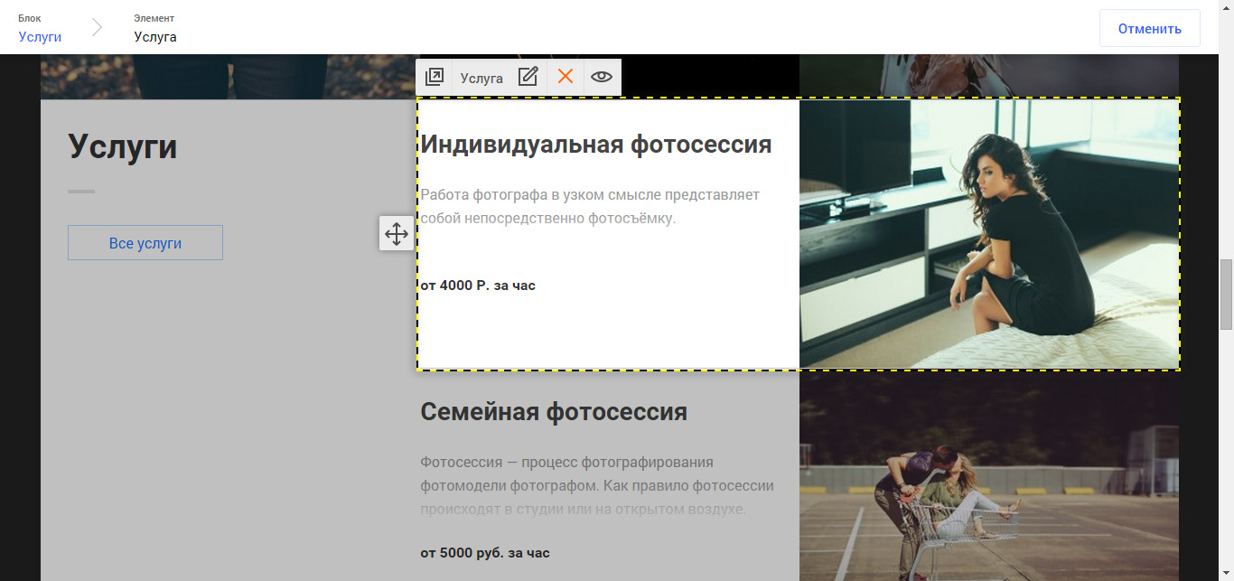
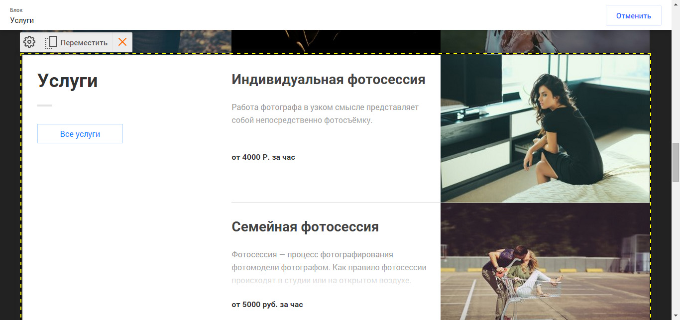
We in Phloxime when designing a site / page management interface use multi-layeredness to visualize the page architecture:
Different elements belong to different entities (website, page layout, content block, record) and to a different set of pages (only this page, the branch of the structure, the whole site), but the management of them for the user is maximally universalized. Each visible element can be selected, and an edging will appear in it, as well as contextual icons of actions: editing, setting, deleting, switching on / off, transfer, etc.
And wherever possible, apply edit-in-place with a maximum pixel-perfect (sorry for anglicism).
WYSIWYG as a predictability tool
One of the main signs of a good interface is predictability. The user must clearly understand the consequences of his actions. Let us examine a few examples.
First example
How long should a new menu item be to fit into the line? What will the block look like if it doesn't fit in anyway?
In Floxime, before the addition process is completed, you will see how the block where you are adding content will look:
Second example
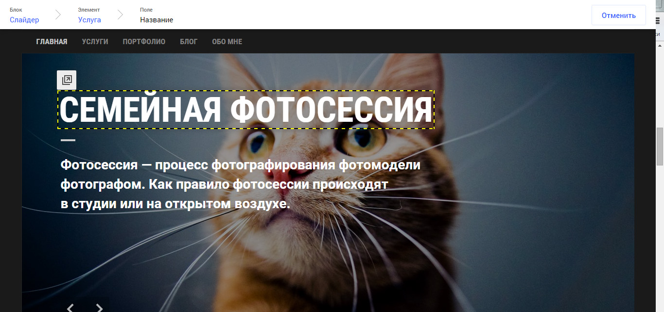
If I insert a long title here, will the tile increase vertically or will part of the text not appear? And what part, suddenly important?
Here you can see the result of editing and you can make a decision before saving:
Third example
If I add the “News” block here, will it definitely look good? Or do I need the Articles block?
Here you will see a preview of the block and you can play around with its settings before saving it.
For those entities that cannot be changed in WYSIWYG (title, block properties, non-displayable parts of the content), we use traditional modal windows.
Changes on the site should be reflected in real time.
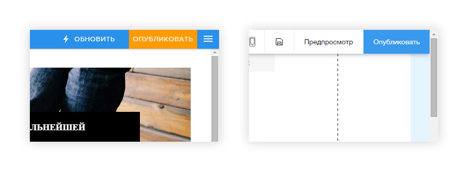
Many website designers upload user-modified pages only by pressing the “Publish” button:
To understand the anachronism of this approach, try to justify it to the user with the help of an analogy from the real world. For example, we are making up a wall newspaper: we pretend the arrangement of individual frames and headings, after which we glue and hang on the wall. Or we are a video studio; we post the video only after selecting a material from the captured fragments, editing, color correction. But in these cases it is not clear why it would be necessary to re-glue an already finished newspaper or re-compile an already released video, if it is not an emergency.
The same with the site. Routine operations on a working site: add news, replace the title, edit the price of the goods. Global changes are extremely rare, usually only at the very beginning. But in this case we can not be afraid that visitors will see a mess on the site - we do not have them yet.
As for random errors, the best protection against them is the button to undo recent actions. (We, however, do not have such a button yet, but it will definitely appear, and then we will get rid of the terrible dialogs “Do you really want to delete it?”)
By creating an extra buffer between user actions and the result, we create extra friction in the interface. If the previous principle (WYSIWYG) works well, changes on the site should occur in real time.
The user manages the data, not its design.
On the topic of user access to the design of pages, there are two polar opinions:
- Do not even give the text underline button, not to mention the color or indents;
- Giving everything technically possible: this is his website.
Both approaches have obvious drawbacks, the “right” approach, apparently, lies somewhere in the middle. But it was very difficult to find this golden mean. At the moment, we give the user two types of design controls:
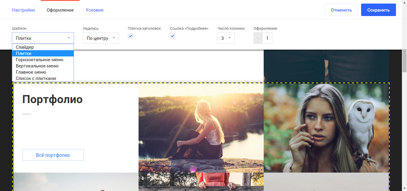
- Content templates. The user can select a template from the design template author. For example, for a list of articles, this could be a slider, a tile, just links.
- The template can have its own settings: the title on the right / left, the "more" button is / not, whether to show the announcement of the material.
However, we already see some situations where the user really wants to give a choice of indentation size or color. The key reason for this is that the designer / developer cannot foresee all the needs of the user. Therefore, we assume that we will have to deviate from the rule of “not giving the user fine tuning”.
***
As far as we are able to comply with these rules - you can make an opinion yourself. We invite readers to try Floxim, without access to the source code. And about the opening of a full-fledged site, we will inform all registered on our site, as well as in the blog on Habré and on our pages on Facebook , VK and Twitter .
Source: https://habr.com/ru/post/268467/
All Articles