Food Design Digest, September 2015
For five years now I have been publishing regular reviews of fresh articles on the topic of interfaces, new tools and collections of patterns, interesting cases and historical stories. From the tapes of several hundred thematic subscriptions, approximately 5% of the worthwhile publications are selected that are interesting to share. Previous materials: April 2010-August 2015 .

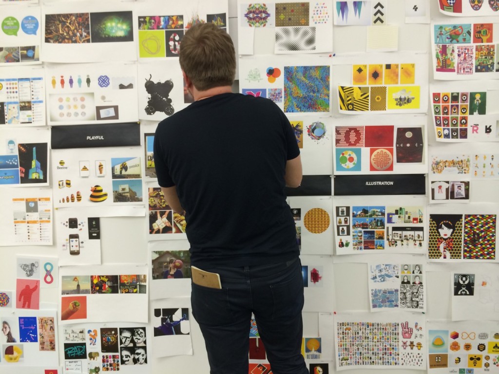
vc.ru: We announce the hunt for interface cases from Russia
In early September, Zuckerberg Ring up, now called vc.ru , was restarted . I became one of the curators of the “Interfaces” column - together with Philip Kontsarenko and Anton Frolov. Since last year my digest is published on the site, and even earlier I gave comments to some of the translations. Now cooperation will become more systematic.

')
We have made an interesting content plan, which will help to make the already demanded source of Russian-language content through interfaces one of the best. Within six months it should materialize. Among the tasks:
Recently, Vladislav Golovach launched a strong initiative to motivate Russian-speaking authors of design articles . The topic is really painful - we have a lot of interesting things going on in the market, but they don’t write much about it. So the profession looks exceptionally poor in this regard, when compared with English-language publications. How so?
In general, if you have good cases, a desire to write a memo on working with one of the new tools for designers, or a good column with your own thoughts on a non-broken topic - write to us . Template for cases and reviews of tools .
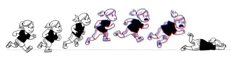
Motion and interface design - Continuity and expectation
Issara Willenskomer’s good message is that the animation in the product should be consistent, to which he brings a theoretical basis to his theses.
How to fix a bad user interface
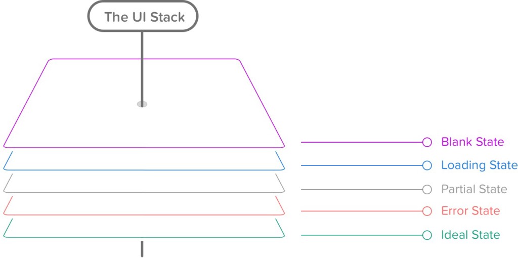
One of the best articles on the empty interface state from Scott Hurff. He divides them into five stages - no data, download, little information, error, ideal state.
Type Sizes for Every Device
Steven Hoober describes the optimal font sizes for different devices depending on the screen size and the position of the user. At the end of the article is a useful summary table.

How to display threaded discussions on the web
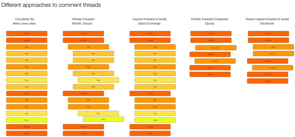
The Rian van der Merwe blog compares different approaches to displaying comments in branching discussions. Pros, cons, pitfalls.
Product List Usability - Avoid 'Quick View' Overlays
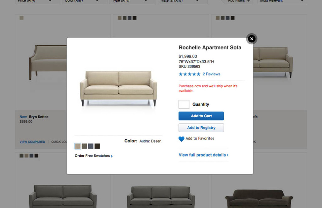
A new study by Baymard Institute about intermediate pop-ups with product information in online stores. This is a bad practice, since users perceive them as the main product card, although there is very little information there.
Form Usability - 5 Requirements for Slider Interfaces
Christian Holst from Baymard Institute describes the problem areas of the sliders. They have a lot of problems and are not always useful. The article gives recommendations for the competent implementation of this control. Continuing the theme:
Presentation of content in the form of cards
Work with notifications
Spatial interfaces
Translation into Russian of very interesting reflections of Pasquale D'Silva on how to present a map of interaction with the product in the form of multidimensional space. This space can be both simple, two-dimensional, and more complex. If there is a clear model, it will be much easier for the user to work with the application. He gives successful examples and a complete mess, which for some reason famous for music services.
The Visual Storyteller's Guide to Web UI Design
A new book from UXPin on how to convey a visual message with pictures, video, interaction, styles, examples from Tesla, FitBit, Microsoft and Squarespace.
Smart tv
Apple iOS 9
September 9 shows the final version of iOS 9. Starting with iOS 7, I go with beta versions of the operating system on the phone. This time, the changes were small and in many ways strange - two searches (stretching down and to the left of the first screen), multitasking mode with the worst comfort for a wheelbarrow, clumsy solution with a return to the previous application in the status panel. Is that the stability of the work, sort of like, began to improve.
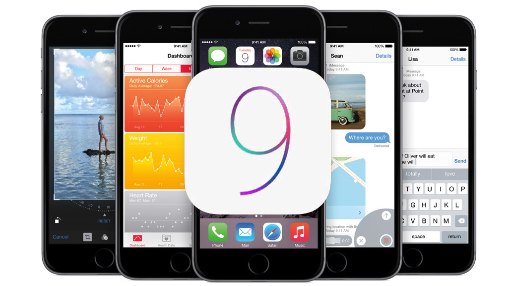
It turned out that the most interesting thing was waiting for the announcement of force touch and the taptic engine - all the main interface changes concern them. An entire solution package has been added to the OS, greatly reducing and simplifying application scenarios: quick actions from the home screen and pop-ups for displaying key information without switching to the application. This is very, very cool, makes the phone even more powerful tool and gives designers a lot of opportunities. Tomorrow in the morning we will discuss how to use it in our applications.
Another thing is that most of what has been shown for many years was called “long tap” and does not require additional technologies. Is that the context menu in the icon on the main screen (now long-tap calls the settings mode) and the challenge of multitasking with a swipe with effort from the left edge of the screen - but the affordance of this gesture is no better than the classic solution with a double tap on the "Home" button. Yes, and the long tap (aka 3D touch - Samsung didn’t manage without Samsung marketers) suffers from a lack of Affordants (iOS apologists blamed it, seeing the solution in Android and WinPhone). Well, the shown quick photo view on Instagram and completely meaningless is an additional way in the interface that does not give any value regarding switching to a separate screen. In addition, all these operations with 3D touch often require the use of both hands. Although in any case, the gesture is still unaccustomed and we must watch it live. Surely he will give a bunch of interesting features to the games.
Separately, they laughed about the operation mode of mail a la Tinder - the topic constantly surfaced in working discussions, but only in the format of banter (true, they had super- likes on the same day , so there is much to strive for ). In fact, now any application can implement this interface solution to itself. Already gone concepts on Dribbble .
Useful materials:
Apple TV Human Interface Guidelines
A new version of Apple TV is shown, the operating system of which is called tvOS. Already available guidelines for her. The interface has become modern, in the spirit of iOS and MacOS, a control panel with gestures in the spirit of Nintendo Wii and a touch-surface has been added to the control capabilities. It works without a cursor, an element on the screen is enlarged at the point of guidance with an interesting parallax effect .

Another interesting thing described two actions at the console - "touch" and "click . " It also gives a recommendation to skip the intro to games and videos on the user's action. Other materials:
Apple Watch
The US Digital Services Playbook
Soon the entire American state Internet will acquire a single face, as the government officially published an alpha version of the design standards. Announcement of guidelines with eyeliner on the issue .

Material design
Android Wear
iPad
Designing Safer Web Animation For Motion Sensitivity
Val Head raises a fairly new problem - accessibility for interface animation. A certain percentage of people suffer from motion sickness and for them modern products, crammed with sophisticated transitions, are not very comfortable. She talks about specific problems and suggests even thinking about a single button to turn off the animation on the site.
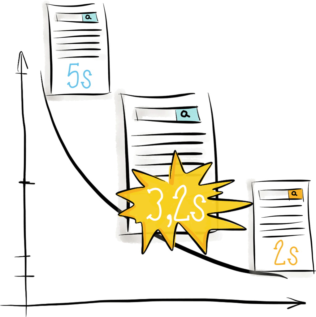
Why Performance Matters - The Perception Of Time
Denis Mishunov talks about the budget performance optimization for web services. It is very interesting how he calculates the optimal load time for the service, taking into account the characteristics of perception and the state of competitors.
The study of the physical limitations of users when working with the tablet
My colleague Ksenia Sternina shares the results of the latest usability study. She studied the physical limitations when working with the tablet. According to the research, it was possible to create a map of comfortable areas for the iPad Air 2.
Accessibility
Microsoft Inclusive Design Toolkit
Microsoft's barrier-free design guide, including for people with disabilities. A 20-minute film about him.
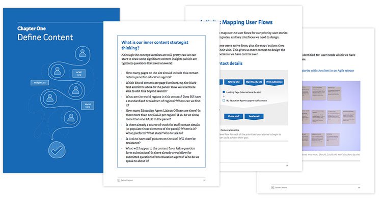
Content Strategy A Guide for UX Designers
Another book (fourth) from GatherContent about working with content, this time with a focus on designers. This is rather a set of good practices, but due to the rarity of explanatory materials on working with content, it should be interesting to many.
Chaos Method of Requirements Prioritization
Gennady Dragun describes the reverse chaos method - a simple and effective way to prioritize requirements.
http://www.slideshare.net/Hienadz.Drahun/chaos-method-of-requirements-prioritisation
Customer Journey Map
Audience-Based Navigation - 5 Reasons to Avoid It
Katie Sherwin writes about the problems of navigation, which is divided into groups of the target audience. Most implementations force users to get lost in trying to figure out which group they belong to, and also have problems with wrong expectations.
Axure RP 8 Beta is Now Available
In August, it was possible to post a beta version of Axure RP 8. The link provides a complete list of innovations, and the product blog itself tells in detail about each of them .

Frontify - Collaboration for Web Designers and Front-End Developers
The product has recently been reborn, now it is a powerful tool for creating guidelines. Very very cool!
Invision
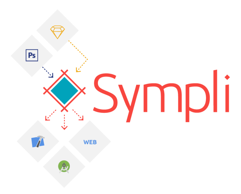
Sympli
A tool for transferring design from designers to developers. Its main difference from the existing solutions is that several graphic editors (Photoshop and Sketch) are supported. And for developers, in addition to the web application, extensions are provided for the IDE (Android Studio and Xcode), which allow you to save time on dragging on the design of the application. At the moment, the project is in beta and free, after the release it will continue to remain free for a limited number of projects.
Atomic - Interface design software for professionals
The beta is complete, the project is officially launched. From Invision / Marvel favorably with the presence of vector layers, for which you can manually prescribe CSS (hello rounded corners, aha) and more fine-tuning animation. Of the minuses - there is not even vertical scrolling, which limits the work with many mobile application layouts, plus resources need to be added independently, there is no auto parsing or plugins.
Create interactive application layouts using Mockup.io
Mockup.io is an online platform for creating and presenting prototypes of mobile applications with the ability to test on real devices (iOS and Android). Allows working with prototypes for iOS and Android devices, Apple Watch, as well as for devices with custom (customizable) screen sizes.
Vectr
To heaps of design tools: Vectr, browser vector editor. Sites, printing, etc.
Principle
Sketch
Comparison of prototyping tools
Zeplin
Readymag
10 Best Practices For Competitive UX Benchmarking
Jeff Sauro's pack of comparative research tips.
Polls
New Mr Tappy - A filming rig for mobile and tablet usability testing
The new version of Mr.Tappy - mounts for testing mobile devices.
Presumptive Design - Design Provocations for Innovation
An excerpt from the book Leo Frishberg and Charles Lambdin " Presumptive Design: Design Provocations for Innovation ". Part 1, definition of the term.
Live guidelines and component systems
Xcode and Swift for designers
Framer
New scripts
Work with SVG
Flexbox
Web typography
UX strategy
Design Culture
Metrics and ROI
A list of creative exercises for creative teams
Foursquare's Jon Steinback describes a weekly practice among designers and other company employees when they solve a nonstandard problem every Friday or try another creative experiment. He gives a pack of examples of exercises.
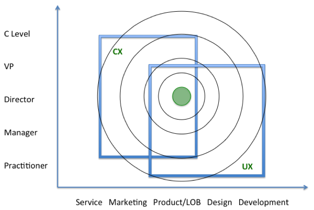
UX and CX - Maximize your User Experience Experience
Tandem Seven's blog describes approaches for bundling UX and CX initiatives. Including the intersection between these different faces of the same task.
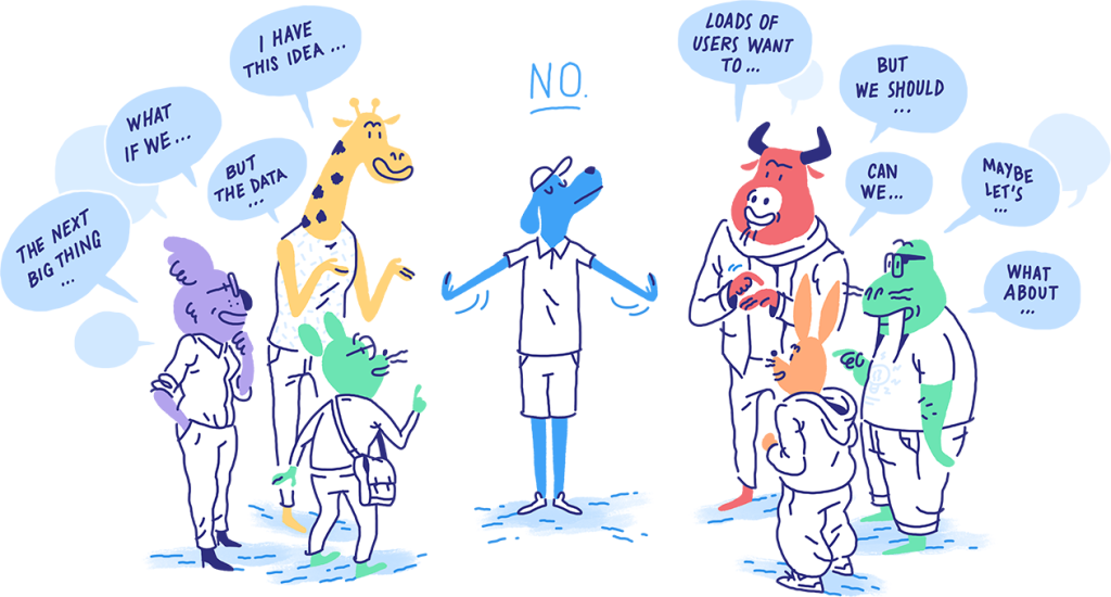
Prevent Feature Creep and Bad Product Requests
A simple one-page from Intercom for product managers and designers who learns to answer "no" to requests that break a product.
UX-Wednesday AMA: Russian Post Redesign
In September, we launched the first AMA (ask me anything) from UX-Environment and vc.ru — Ruslan Lobachev (project manager, Tsentsiper) and Sergey Surganov (art director, Medusa, answered earlier, Tsentziper "), Who worked on the new site of the Russian Post.
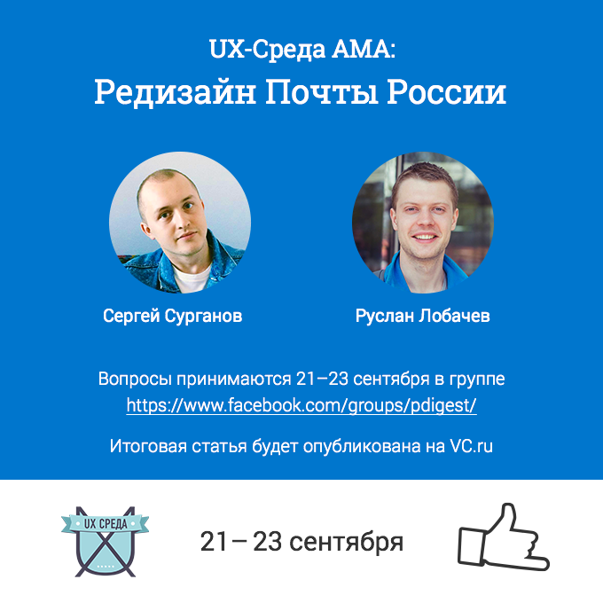
Large-scale changes are taking place in the company and the site is only the tip of the restructuring of internal processes, without which it is impossible to provide good service. You need to think about the whole ecosystem. Therefore, the experience of the guys is especially interesting.
We wanted to launch the AMA format at the end of last year, but there was not enough time, and then it appeared at Creative Russia and Roem.ru, so in simple terms it did not make sense. But the thematic format is not yet worn out, so let's try it in practice. We thank Sergey and Ruslan for the detailed answers, and our Facebook readers for interesting questions. Authors of questions: Nadezhda Shpiyakina, Sergey Aleshin, Yana Moskvin, Anatoly Batareykin, Ivan Prishvin, Denis Shumov, Olga Oreshkova, Natalia Kharzu, Vladislav Kovalev from Wonderfull.
World Map Design
Andrei Karmatsky opened his Urbica Design studio after leaving Yandex.Maps. Their first project was a redesign of maps of the Maps.me application. The article contains many interesting details of the process.

Games Mechanics in Apps - An Interview with Courtney Christopher of Swarm
Chatting with Courtney Christopher, Swarm lead designer, about working on a new game mechanics app. After the division of Foursquare into two products, most of the iconic chips disappeared, but recently the team completely rethought the service and turned it into a real game.

The Making Of FiftyThree's Beloved Paper App For The iPhone
Explanatory case of work on the new Paper application for the iPhone. Why FiftyThree did not begin to port the well-known iPad-version, and rethought from scratch.

Other cases
Telephone Keypad Design
Another article about this landmark usability testing 60 years ago. As in Bell Labs, the optimum location of the buttons on the phone was chosen. Translation into Russian .

Subtraction.com Design Tools Survey
Khoi Vinh recently conducted a survey among designers about used tools. According to his results, he published a report with conclusions in different categories. 4000 people from 196 countries participated. He recently moved to Adobe, so all of this will be taken into account in the development of the company's products.
Design machines
UX Fox translated into Russian one of the best materials of the month from Travis Gertz. He says that modern design on the web has turned into a dull monotony and examines the reasons for this dominance of the clones. And after offering a way out - where to look and where to move, to break the deadlock. Very inspiring, and decorated cool. Continuing the theme:
Trends 2015
UX-Marathon 2015: Yuri Vetrov - Product design digest
For the online conference " UX-Marathon " I tried to make a digest in the format of the presentation. Gathered the most interesting news over the past couple of months. , , « » :) , .
« - » (-)
1 - « - », .

, , , , . , , -.
UXSPb , .
PS — « » :)
Online Courses
400
UX Hero
UX Hero Tal Florentin, Jonathan Sketch.

UX Fox —
UX Fox . , , .
Death to Bullshit
Brad Frost Death to Bullshit . , .

Detox For Facebook
, . Detox Designer News, Dribbble, Behance, Awwwards, Smashing Magazine . Panda.
Andrei Herasimchuk — Twenty Years in the Valley
Andrei Herasimchuk, UX- Adobe, 20 . , .

:
Cooper and Cooper U, Part 1
Large-scale series of articles on Cooper U, a large initiative on design education by Cooper Consulting. Interview with Tereza Brazen, head of training programs, as well as the analysis of courses.

Shopping design studios by large companies
John Maeda Interview
A small but meaningful interview with John Maeda after the workshop on the hackathon HackMIT. By the way, he combined his mini-sites under one umbrella .
Sessions AMA
OFFF RUSSIA 2015
On October 10 and 11, IKR for the second time leads the international OFFF festival to Russia. It is held annually in Barcelona and in countries around the world. OFFF is known in the domestic professional community - entire delegations from Russian-speaking countries regularly go to the main event in Barcelona. Designers are working on a variety of tasks in different environments, and this conference manages to make a good cut of all this diversity - how to make unusual and fresh solutions in interfaces, promotional and marketing things, the real world.

Last year it was held in St. Petersburg, this time in the Mail.Ru Group office. There will be IDEO, AKQA, Joshua Davis, StinkDigital, MUCHO. On the second day, there will be master classes from Burton Rast from IDEO and Joshua Davis. By the way, Burton was interviewed for Look at Me. and participated in the AMA .
UX STRAT 2015
Presentations from the UXSTRAT 2015 conference, which took place on September 8-10 in Athens, Georgia (USA). It is dedicated to the design strategy and gathers a powerful composition of thematic speakers.
Fresh links can also be tracked in the Facebook group of the same name. Thanks to everyone who also publishes links in it, especially Gennady Dragun, Pavel Skripkin, Dmitry Podluzhny, Anton Artyomov, Denis Efremov, Alexey Kopylov, Taras Brizitsky and Yevgeny Sokolov. More and more materials in reviews appear thanks to them.
A letter arrives once a month.
Heading " Interfaces " on vc.ru
vc.ru: We announce the hunt for interface cases from Russia
In early September, Zuckerberg Ring up, now called vc.ru , was restarted . I became one of the curators of the “Interfaces” column - together with Philip Kontsarenko and Anton Frolov. Since last year my digest is published on the site, and even earlier I gave comments to some of the translations. Now cooperation will become more systematic.
')
We have made an interesting content plan, which will help to make the already demanded source of Russian-language content through interfaces one of the best. Within six months it should materialize. Among the tasks:
- Publish interesting domestic cases. We have created a template for them , allowing you to make an intelligent story. It’s just that studio step-by-step descriptions of layouts are not suitable, you need a description of business problems and how the redesign solved them.
- Write reviews of domestic and Western tools for designers ( structure ). Released the first material on its basis about the Ukrainian service Mockup.io . On the way is still a pack.
- Adjust the translation of all 20 articles that fall into the squeeze of the digest for vc.ru. Of course, you need to know English in order to have access to all modern journalism. But translations will make life easier for many.
- Question and Answer Sessions (AMA) with domestic designers. The first experience with the team of the company Tsentsiper, which made the redesign of the Russian Post, has recently ended ( article-interview based on it ). We will continue.
Recently, Vladislav Golovach launched a strong initiative to motivate Russian-speaking authors of design articles . The topic is really painful - we have a lot of interesting things going on in the market, but they don’t write much about it. So the profession looks exceptionally poor in this regard, when compared with English-language publications. How so?
In general, if you have good cases, a desire to write a memo on working with one of the new tools for designers, or a good column with your own thoughts on a non-broken topic - write to us . Template for cases and reviews of tools .
Patterns and Best Practices
Motion and interface design - Continuity and expectation
Issara Willenskomer’s good message is that the animation in the product should be consistent, to which he brings a theoretical basis to his theses.
How to fix a bad user interface
One of the best articles on the empty interface state from Scott Hurff. He divides them into five stages - no data, download, little information, error, ideal state.
Type Sizes for Every Device
Steven Hoober describes the optimal font sizes for different devices depending on the screen size and the position of the user. At the end of the article is a useful summary table.
How to display threaded discussions on the web
The Rian van der Merwe blog compares different approaches to displaying comments in branching discussions. Pros, cons, pitfalls.
Product List Usability - Avoid 'Quick View' Overlays
A new study by Baymard Institute about intermediate pop-ups with product information in online stores. This is a bad practice, since users perceive them as the main product card, although there is very little information there.
Form Usability - 5 Requirements for Slider Interfaces
Christian Holst from Baymard Institute describes the problem areas of the sliders. They have a lot of problems and are not always useful. The article gives recommendations for the competent implementation of this control. Continuing the theme:
Presentation of content in the form of cards
- Samantha Zhang about working on the Graphiq product . They structured the format of issuing information in the cards, at the end of the article useful developments on the topic.
Work with notifications
- The new Basecamp introduces the “work wait” mode (do not disturb) . And in general, he is thinking about how to divide work and personal life.
Spatial interfaces
Translation into Russian of very interesting reflections of Pasquale D'Silva on how to present a map of interaction with the product in the form of multidimensional space. This space can be both simple, two-dimensional, and more complex. If there is a clear model, it will be much easier for the user to work with the application. He gives successful examples and a complete mess, which for some reason famous for music services.
The Visual Storyteller's Guide to Web UI Design
A new book from UXPin on how to convey a visual message with pictures, video, interaction, styles, examples from Tesla, FitBit, Microsoft and Squarespace.
Smart tv
Guidelines for platforms and companies
Apple iOS 9
September 9 shows the final version of iOS 9. Starting with iOS 7, I go with beta versions of the operating system on the phone. This time, the changes were small and in many ways strange - two searches (stretching down and to the left of the first screen), multitasking mode with the worst comfort for a wheelbarrow, clumsy solution with a return to the previous application in the status panel. Is that the stability of the work, sort of like, began to improve.
It turned out that the most interesting thing was waiting for the announcement of force touch and the taptic engine - all the main interface changes concern them. An entire solution package has been added to the OS, greatly reducing and simplifying application scenarios: quick actions from the home screen and pop-ups for displaying key information without switching to the application. This is very, very cool, makes the phone even more powerful tool and gives designers a lot of opportunities. Tomorrow in the morning we will discuss how to use it in our applications.
Another thing is that most of what has been shown for many years was called “long tap” and does not require additional technologies. Is that the context menu in the icon on the main screen (now long-tap calls the settings mode) and the challenge of multitasking with a swipe with effort from the left edge of the screen - but the affordance of this gesture is no better than the classic solution with a double tap on the "Home" button. Yes, and the long tap (aka 3D touch - Samsung didn’t manage without Samsung marketers) suffers from a lack of Affordants (iOS apologists blamed it, seeing the solution in Android and WinPhone). Well, the shown quick photo view on Instagram and completely meaningless is an additional way in the interface that does not give any value regarding switching to a separate screen. In addition, all these operations with 3D touch often require the use of both hands. Although in any case, the gesture is still unaccustomed and we must watch it live. Surely he will give a bunch of interesting features to the games.
Separately, they laughed about the operation mode of mail a la Tinder - the topic constantly surfaced in working discussions, but only in the format of banter (true, they had super- likes on the same day , so there is much to strive for ). In fact, now any application can implement this interface solution to itself. Already gone concepts on Dribbble .
Useful materials:
- UI Kit for Sketch by Meng To 3D touch .
- Inserted five cents for vc.ru.
- Luke Wroblewski has compiled the coolest comparative table of input methods for the entire line of Apple devices . The smartphone is the most advanced.
- Analysis of the implementation of the bottom panel in the well-known applications for the iPhone . As far as they correspond to the guidelines and are generally well implemented.
- Analysis of the nuances of the San Francisco font on different devices and resolutions .
- Uz Kit for Photoshop from Oz Pinhas, fitted to 3 types of screens (iPhone 5, 6, 6+) .
Apple TV Human Interface Guidelines
A new version of Apple TV is shown, the operating system of which is called tvOS. Already available guidelines for her. The interface has become modern, in the spirit of iOS and MacOS, a control panel with gestures in the spirit of Nintendo Wii and a touch-surface has been added to the control capabilities. It works without a cursor, an element on the screen is enlarged at the point of guidance with an interesting parallax effect .
Another interesting thing described two actions at the console - "touch" and "click . " It also gives a recommendation to skip the intro to games and videos on the user's action. Other materials:
- The first UI kit for Sketch . And one more
- Ben Markowitz experimentally put together a parallax effect on an icon on the web .
- The effect of parallax hooked on many designers, the scripts fell from all sides . Designmodo version.
- Detailed analysis of transformations in the effect with the formulas from Nash Vail .
Apple Watch
- Updated watchOS guidelines . Including animation.
- Translation of an article by Luke Wroblewski with his interface logic concept .
The US Digital Services Playbook
Soon the entire American state Internet will acquire a single face, as the government officially published an alpha version of the design standards. Announcement of guidelines with eyeliner on the issue .
Material design
- August update of material design guidelines . In particular, about how to ask permission to use the functions of the phone in a new form.
- Google launched a contest for the design of the best domestic application in the spirit of material . They promise features and material prizes.
Android Wear
iPad
Understanding the user
Designing Safer Web Animation For Motion Sensitivity
Val Head raises a fairly new problem - accessibility for interface animation. A certain percentage of people suffer from motion sickness and for them modern products, crammed with sophisticated transitions, are not very comfortable. She talks about specific problems and suggests even thinking about a single button to turn off the animation on the site.
Why Performance Matters - The Perception Of Time
Denis Mishunov talks about the budget performance optimization for web services. It is very interesting how he calculates the optimal load time for the service, taking into account the characteristics of perception and the state of competitors.
The study of the physical limitations of users when working with the tablet
My colleague Ksenia Sternina shares the results of the latest usability study. She studied the physical limitations when working with the tablet. According to the research, it was possible to create a map of comfortable areas for the iPad Air 2.
Accessibility
- Katie Sherwin of NN / g on the use of mobile touch devices by users with limited vision .
- Yahoo, Facebook, Dropbox and LinkedIn will give preference to candidates who are able to optimize their work for accessibility .
- Tips from the Medium team on CSS issues that affect accessibility .
- Recommendations from an expert on accessibility for the blind .
- Anthony T advises modifying form elements for people with color perception .
Microsoft Inclusive Design Toolkit
Microsoft's barrier-free design guide, including for people with disabilities. A 20-minute film about him.
Information architecture, conceptual design, content strategy
Content Strategy A Guide for UX Designers
Another book (fourth) from GatherContent about working with content, this time with a focus on designers. This is rather a set of good practices, but due to the rarity of explanatory materials on working with content, it should be interesting to many.
Chaos Method of Requirements Prioritization
Gennady Dragun describes the reverse chaos method - a simple and effective way to prioritize requirements.
Customer Journey Map
- Very intelligent material studio Livework on how to analyze customer experience . Many interesting customer journey map diagrams for different sections.
- Jim Kalbach Experience Mapping workshop materials at the UXSTRAT 2015 conference .
Audience-Based Navigation - 5 Reasons to Avoid It
Katie Sherwin writes about the problems of navigation, which is divided into groups of the target audience. Most implementations force users to get lost in trying to figure out which group they belong to, and also have problems with wrong expectations.
Design and design of interface screens
Axure RP 8 Beta is Now Available
In August, it was possible to post a beta version of Axure RP 8. The link provides a complete list of innovations, and the product blog itself tells in detail about each of them .
Frontify - Collaboration for Web Designers and Front-End Developers
The product has recently been reborn, now it is a powerful tool for creating guidelines. Very very cool!
Invision
- InVision has launched a beta version of the new Insight feature . It simplifies the interaction between designers and developers.
- Soon, a unified tool will be launched for working with correspondence around projects .
- It seems that soon it will be possible to add InVision to the number of intelligent tools for animation - the Motion function will greatly improve these product features .
Sympli
A tool for transferring design from designers to developers. Its main difference from the existing solutions is that several graphic editors (Photoshop and Sketch) are supported. And for developers, in addition to the web application, extensions are provided for the IDE (Android Studio and Xcode), which allow you to save time on dragging on the design of the application. At the moment, the project is in beta and free, after the release it will continue to remain free for a limited number of projects.
Atomic - Interface design software for professionals
The beta is complete, the project is officially launched. From Invision / Marvel favorably with the presence of vector layers, for which you can manually prescribe CSS (hello rounded corners, aha) and more fine-tuning animation. Of the minuses - there is not even vertical scrolling, which limits the work with many mobile application layouts, plus resources need to be added independently, there is no auto parsing or plugins.
Create interactive application layouts using Mockup.io
Mockup.io is an online platform for creating and presenting prototypes of mobile applications with the ability to test on real devices (iOS and Android). Allows working with prototypes for iOS and Android devices, Apple Watch, as well as for devices with custom (customizable) screen sizes.
Vectr
To heaps of design tools: Vectr, browser vector editor. Sites, printing, etc.
Principle
- The Mirror app for viewing prototypes on iOS has been verified by Apple . Because of this, it is available later than the announcement of the tool itself.
Sketch
- Plugin for use of iconic fonts .
- Simplify the work with the choice of colors .
- Plugin for searching and replacing text in layers .
- The plugin creates an HTML page with layout specifications .
Comparison of prototyping tools
Zeplin
- Now you can publish a design guide on the Internet . In addition, Zeplin now connects to Slack.
Readymag
User research and testing, analytics
10 Best Practices For Competitive UX Benchmarking
Jeff Sauro's pack of comparative research tips.
Polls
- Erica Hall on the design of questionnaires .
- Jeff Sauro's response article to Erika Hall material . He describes the tasks that the surveys handle perfectly.
New Mr Tappy - A filming rig for mobile and tablet usability testing
The new version of Mr.Tappy - mounts for testing mobile devices.
Presumptive Design - Design Provocations for Innovation
An excerpt from the book Leo Frishberg and Charles Lambdin " Presumptive Design: Design Provocations for Innovation ". Part 1, definition of the term.
Visual programming and browser design
Live guidelines and component systems
- Stef. Sullivan Rewis talks about the background to the creation of Salesforce Lightning . The company already had a live guideline, but there was not enough systematization of all the processes of work within and interaction with partners. Interestingly, they view Lightning in many ways as an “interface” of working with external designers.
- My colleagues from the back-end team described a piece of their part of the “burger design” solution . The guys from the front-end started talking about their half .
Xcode and Swift for designers
- Designer Linda Dong is learning to work with Swift. She launched a website with experiments and source code on GitHub .
Framer
- Sketch plugin that makes it relatively easy to create animated prototypes in Framer based on layouts .
- Frames application for viewing prototypes on the iPhone .
New scripts
- There are several ways to hide the long menu under "more . "
- A simple script to check the availability of certain features HTML, CSS, JS, SVG, etc. in the current browser, using data from the famous Can I Use website .
- The script processes requests in natural language, which contain dates, links, phone numbers, email addresses, physical addresses . Able to tear them out of a piece of plain text.
- According to the authors, another JavaScript gallery solution is easy and adaptive .
- Experimental navigation in the spirit of a zoom interface .
- How to make the effect of diverging circles a la Material design using SVG .
- Website Stylesheets.io collects new CSS scripts and tutorials .
- Not a script, but insanely cool demonstration of their capabilities . Different types of physical particles with a reaction to user actions.
- Elastic progress indicator on SVG + JS .
Work with SVG
- Chris Youderian's small instruction on working with maps in SVG .
- Heydon Pickering describes an approach to animation in SVG, similar to translucent films that use multipliers . Several layered parts of the image are created that can move independently to create a holistic animation.
Flexbox
- Patrick Brosset review article on CSS Grid Layout, an alternative to flexbox that is being worked on by the W3C . In the next article Rachel Andrews gives a couple of intricate examples of the layout using it (from materials from the Grid by Example ).
Web typography
UX strategy and management
UX strategy
- Very sensible article by Jon Innes with a history of growing interest in the phenomenon .
- Sensible advice on the restructuring of design in software for the corporate market from Anton Baturan .
Design Culture
- How is the design team of the service Optimizely .
- Jim Ross about when a company needs a generalist, and when - a specialist .
- How does the design team TED .
- The explanatory column of Aaron Walter from Mailchimp is about why he tries to hire people, not skills .
- The gaming company Halfbrick, which produces the well-known game Fruit Ninja, has abandoned the role of designer in the team . They believe that each team member should have design skills, this is crucial to the success of the game. Opinions igrodelov .
- A simple and very robust Cap Watkins column on how to build a culture of interaction between a product manager, designer, and developer .
Metrics and ROI
- Jeff Sauro lists 10 metrics for calculating the design ROI along with how to calculate them .
- Jeff Sauro on how to estimate LTV / CLV for a product, even if there is no real data .
A list of creative exercises for creative teams
Foursquare's Jon Steinback describes a weekly practice among designers and other company employees when they solve a nonstandard problem every Friday or try another creative experiment. He gives a pack of examples of exercises.
UX and CX - Maximize your User Experience Experience
Tandem Seven's blog describes approaches for bundling UX and CX initiatives. Including the intersection between these different faces of the same task.
Prevent Feature Creep and Bad Product Requests
A simple one-page from Intercom for product managers and designers who learns to answer "no" to requests that break a product.
Cases
UX-Wednesday AMA: Russian Post Redesign
In September, we launched the first AMA (ask me anything) from UX-Environment and vc.ru — Ruslan Lobachev (project manager, Tsentsiper) and Sergey Surganov (art director, Medusa, answered earlier, Tsentziper "), Who worked on the new site of the Russian Post.
Large-scale changes are taking place in the company and the site is only the tip of the restructuring of internal processes, without which it is impossible to provide good service. You need to think about the whole ecosystem. Therefore, the experience of the guys is especially interesting.
We wanted to launch the AMA format at the end of last year, but there was not enough time, and then it appeared at Creative Russia and Roem.ru, so in simple terms it did not make sense. But the thematic format is not yet worn out, so let's try it in practice. We thank Sergey and Ruslan for the detailed answers, and our Facebook readers for interesting questions. Authors of questions: Nadezhda Shpiyakina, Sergey Aleshin, Yana Moskvin, Anatoly Batareykin, Ivan Prishvin, Denis Shumov, Olga Oreshkova, Natalia Kharzu, Vladislav Kovalev from Wonderfull.
World Map Design
Andrei Karmatsky opened his Urbica Design studio after leaving Yandex.Maps. Their first project was a redesign of maps of the Maps.me application. The article contains many interesting details of the process.
Games Mechanics in Apps - An Interview with Courtney Christopher of Swarm
Chatting with Courtney Christopher, Swarm lead designer, about working on a new game mechanics app. After the division of Foursquare into two products, most of the iconic chips disappeared, but recently the team completely rethought the service and turned it into a real game.
The Making Of FiftyThree's Beloved Paper App For The iPhone
Explanatory case of work on the new Paper application for the iPhone. Why FiftyThree did not begin to port the well-known iPad-version, and rethought from scratch.
Other cases
- Frankie Gaw on the Facebook Mentions app design case .
- A small case about remaking the section of the mobile application for Android with a more explicit access to the photo gallery . There are useful numbers on what worked and how.
- Translation into Russian of the smartest case of Denis Nevojaya about working on the interface of Alcatel One Touch Watch smart watches .
Story
Telephone Keypad Design
Another article about this landmark usability testing 60 years ago. As in Bell Labs, the optimum location of the buttons on the phone was chosen. Translation into Russian .
Trends
Subtraction.com Design Tools Survey
Khoi Vinh recently conducted a survey among designers about used tools. According to his results, he published a report with conclusions in different categories. 4000 people from 196 countries participated. He recently moved to Adobe, so all of this will be taken into account in the development of the company's products.
Design machines
UX Fox translated into Russian one of the best materials of the month from Travis Gertz. He says that modern design on the web has turned into a dull monotony and examines the reasons for this dominance of the clones. And after offering a way out - where to look and where to move, to break the deadlock. Very inspiring, and decorated cool. Continuing the theme:
- Material on The Next Web . Not so systematic, of course, but there are a couple of practical thoughts.
Trends 2015
For general and professional development
UX-Marathon 2015: Yuri Vetrov - Product design digest
For the online conference " UX-Marathon " I tried to make a digest in the format of the presentation. Gathered the most interesting news over the past couple of months. , , « » :) , .
« - » (-)
1 - « - », .
, , , , . , , -.
UXSPb , .
PS — « » :)
Online Courses
- , InVision - . Scott Hurff Tinder.
- Designlab, - . .
400
- , , , .
- Andrew Hwang . , .
UX Hero
UX Hero Tal Florentin, Jonathan Sketch.
UX Fox —
UX Fox . , , .
Death to Bullshit
Brad Frost Death to Bullshit . , .
Detox For Facebook
, . Detox Designer News, Dribbble, Behance, Awwwards, Smashing Magazine . Panda.
People and companies in the industry
Andrei Herasimchuk — Twenty Years in the Valley
Andrei Herasimchuk, UX- Adobe, 20 . , .
:
- Adobe (Adobe, 1994).
- 20 (Adobe, 1995).
- . , , , (Adobe, 1997).
- About meeting with Steve Jobs (Adobe, 1997).
- On the conflict with the developer, which resulted in a successful working session and the still-living transformation tool in Photoshop (Adobe, 1995).
Cooper and Cooper U, Part 1
Large-scale series of articles on Cooper U, a large initiative on design education by Cooper Consulting. Interview with Tereza Brazen, head of training programs, as well as the analysis of courses.
Shopping design studios by large companies
- Cooper went against the trend of collapsing an independent design business and bought the Catalyst Group studio themselves . Now they have an office in New York and extensive expertise.
- Airbnb bought a domestic industrial design studio Lapka . Not exactly on the topic of interfaces, but the first such case from Russia.
- Tenny Pinheiro sensibly describes the problems of design studios in the current moment . The special irony of the situation is that agencies have long explained to the client the importance of design. But as soon as the client understands it and thinks about consistency, he often opens the internal design department.
John Maeda Interview
A small but meaningful interview with John Maeda after the workshop on the hackathon HackMIT. By the way, he combined his mini-sites under one umbrella .
Sessions AMA
Conference proceedings
OFFF RUSSIA 2015
On October 10 and 11, IKR for the second time leads the international OFFF festival to Russia. It is held annually in Barcelona and in countries around the world. OFFF is known in the domestic professional community - entire delegations from Russian-speaking countries regularly go to the main event in Barcelona. Designers are working on a variety of tasks in different environments, and this conference manages to make a good cut of all this diversity - how to make unusual and fresh solutions in interfaces, promotional and marketing things, the real world.
Last year it was held in St. Petersburg, this time in the Mail.Ru Group office. There will be IDEO, AKQA, Joshua Davis, StinkDigital, MUCHO. On the second day, there will be master classes from Burton Rast from IDEO and Joshua Davis. By the way, Burton was interviewed for Look at Me. and participated in the AMA .
UX STRAT 2015
Presentations from the UXSTRAT 2015 conference, which took place on September 8-10 in Athens, Georgia (USA). It is dedicated to the design strategy and gathers a powerful composition of thematic speakers.
Fresh links can also be tracked in the Facebook group of the same name. Thanks to everyone who also publishes links in it, especially Gennady Dragun, Pavel Skripkin, Dmitry Podluzhny, Anton Artyomov, Denis Efremov, Alexey Kopylov, Taras Brizitsky and Yevgeny Sokolov. More and more materials in reviews appear thanks to them.
Subscribe to the newsletter
A letter arrives once a month.
Source: https://habr.com/ru/post/268429/
All Articles