Adaptation of complex applications for Material Design: an approach from Aviary
We continue our cycle of translations about Material Design, the previous articles of which can be found here and here . Today's post will tell you about one of the most complex design translations from one “rail” to another.

When your application is rich in various functions, it assumes work not only with text and standard elements, but its original design was developed even when the interface with iOS applications and skeuomorphism met, to switch to a new visual language - truly titanic work and extremely difficult task. It is about this application today and talk.
Note: Like last time, most of the post is written in a living language and from the first person, so the translation will be provided with notes and comments where they may be required.
')
How I reworked Aviary's Photo Editor in the new Google style - Amy Hints , Aviary Chief Designer.
For three years I have been working as Aviary’s chief designer for the Android platform. I was lucky to develop a design for the application, with which many people express their desire for creativity in a mobile photo. Recently, I completely reworked the design of the application in accordance with the material design of Google. But I want to talk not only about the redesign process, but also about my own professional progress, caused by changes in the visual language of the platform. Now the rules set by the platform inspire me, not limit me. To understand where the platform is moving, it is important to understand what was in the beginning. Changing Aviary’s original style to material design was not easy. But thanks to this, I learned a lot about mobile design, and also loved the unique features of the Android platform.
When I started working at Aviary, I had the task to adapt the design of the iOS application for Android. Then I used the iPhone and only learned the subtleties of mobile design. I had a phone on Android for some time at the university, but I really didn’t figure it out.
At first, I studied our test devices on Android and tried to come up with a formula with which to adapt the design of iOS to Android. The Aviary iOS app was made in a skeuomorphic style, with dense shadows and textures. Then in Android, the visual language Holo was used, and I took it as a basis for adapting a more heavyweight design. I replaced the textures with neat gradients and added sharp corners on all screens. So there was the first version of Aviary design for Android.

Note: At the same time, as you can see, the Holo Guidelines are still far away, and the interface shows where his “legs grow”.
Since at that time Aviary mainly worked with iOS, the Android platform became a field for me to experiment with. Most of the functions first appeared in an application on iOS, so I had complete freedom with regard to design.
They didn’t expect much from an application on Android, because we had relatively few users. However, we quickly realized the importance of this platform. The number of users and downloads on Android began to grow, and then the company decided to work harder on the application for the platform.
At that time, I collaborated with a developer who was a long-time Android user and his evangelist. He considered it offensive that I myself use the iPhone while doing design for Android - and was right. So in 2013, I bought myself the HTC One. I began to download apps and found that among them there is no that stylistic unity that we see on iOS. I was amazed at how many options for setting up the phone, how flexible the applications themselves and the interaction between them are. After reviewing many applications, I finally saw the characteristics of Android and some design models. So I gradually refined the application, made it more convenient and natural for the platform.
In June 2014, Google developed Material Design. By that time, I had been using Android for 2 years already, but it turned out that the design of our application was disastrously outdated. The minor changes we made could not seriously affect the application and did not allow us to fully appreciate the advantages of the Android platform. Therefore, we took advantage of the emergence of material design to develop a new style of application specifically for Android.
We began the process of developing a new design with the study of documentation - the Google team at the time began to publish it, and also provide various useful resources on this topic.
Google Material Design Rules
In the summer of 2014, I began to study all this, trying to learn as much as possible. Fortunately, the information about the design was much more than last time. The documentation, which was released on Google, fully explained the purpose and essence of material design. The motive of the company was clearly the desire to lay the foundation for creating a visual language that would make the platform unified.
I began to study the fundamental concept of material design: the metaphor of paper and ink, the influence of clear graphic layers, the use of motion, which gave the necessary integrity to the platform. However, it seemed that manuals were more designed for applications with a large number of lists, such as mail programs or reading applications.
Note. Just about this we told in the introduction. It's one thing when your application consists of “cards”, input fields, a couple of buttons, and the main content is text, and completely different when you are trying to create something very complex: for example, a photo editor, as you did in Aviary.
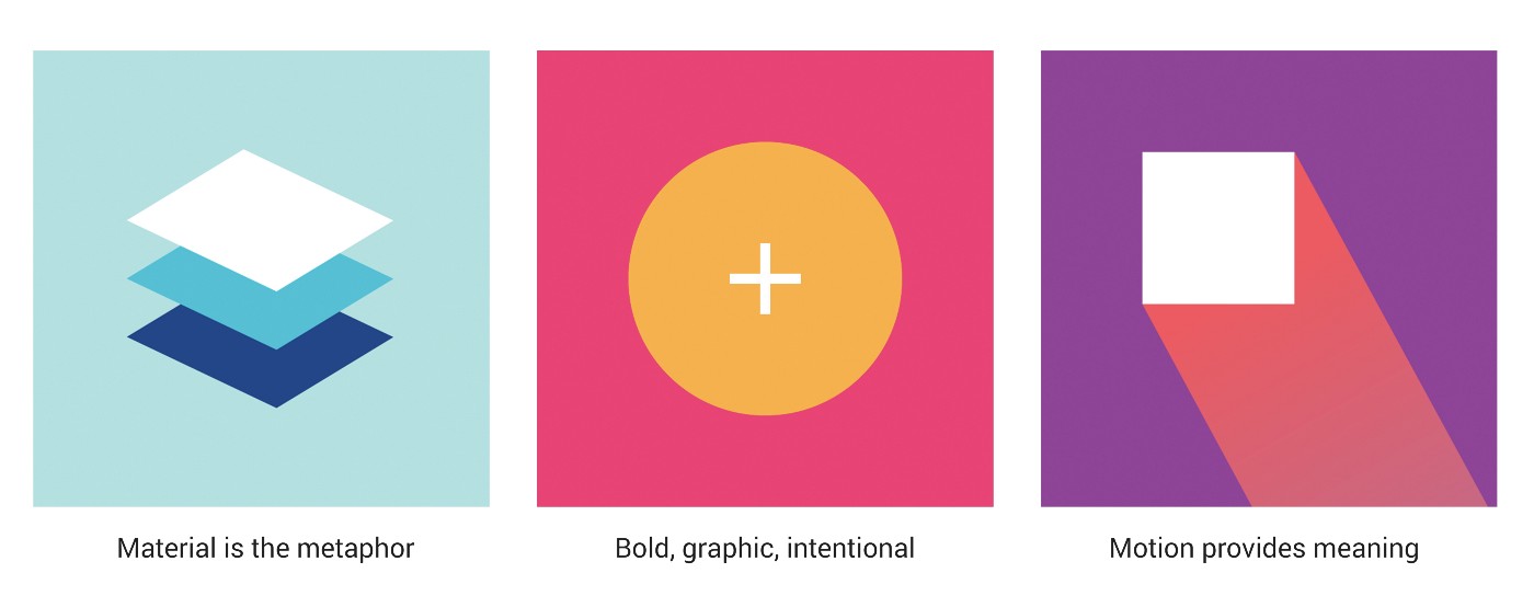
Material is a metaphor | Clarity, graphic, natural | Motion attaches importance. Three principles of material design Google
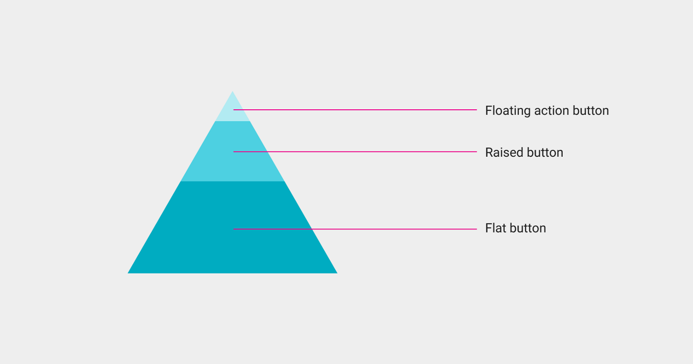
While continuing to study the materials, I wondered: how will our application fit into this framework? How do we show content? What buttons to make voluminous, which flat and which - floating? How to use one action button when we have so many instant actions? Where in the linear photo editing process to embed the transition animation? How to add color elements to the application and leave focus on the photo? But instead of concentrating on these issues, I first simply removed all unnecessary from the application.
Google button style guidelines
I decided that I could start with a few global visual changes. First, I basically designed each screen. I decided to come up with stylistic features and design of transitions later. Then I took up the color scheme. Guided by the palette of material design, I chose the primary, secondary and accent colors that matched the brand colors. The main color I made the base gray-blue. It is neutral, not as contrasting as black, but the picture on its background stands out. For icons and text, I used white, and I used blue as the accent. Removing shadows, gradients, and strokes from an application was in itself a big change.
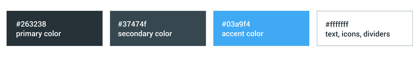
Aviary color palette
The next step was to recycle the badges. Our old badges were too massive, heavy, and looked outdated. To find ideas, I looked at the guidelines for drawing icons and studied existing Google icons. This helped me to maintain the style of Android and at the same time maintain my own style that reflects the mood and spirit of Aviary. I used shape repeats to draw symmetrical, clear icons that are schematic and simplified for each tool. After loading into layouts, something has already begun to take shape.

Badges from Aviary using Google guide
Having simplified the application to the limit, I began to reflect on the user's workflow. It is simple and linear, and begins with the fact that the user selects a photo from the standard gallery. We decided to leave this part without global change. Is that the top panel was replaced with a new one and added a side, leading to the account settings. In addition, we created a floating button to enter the gallery - the main action on this screen.
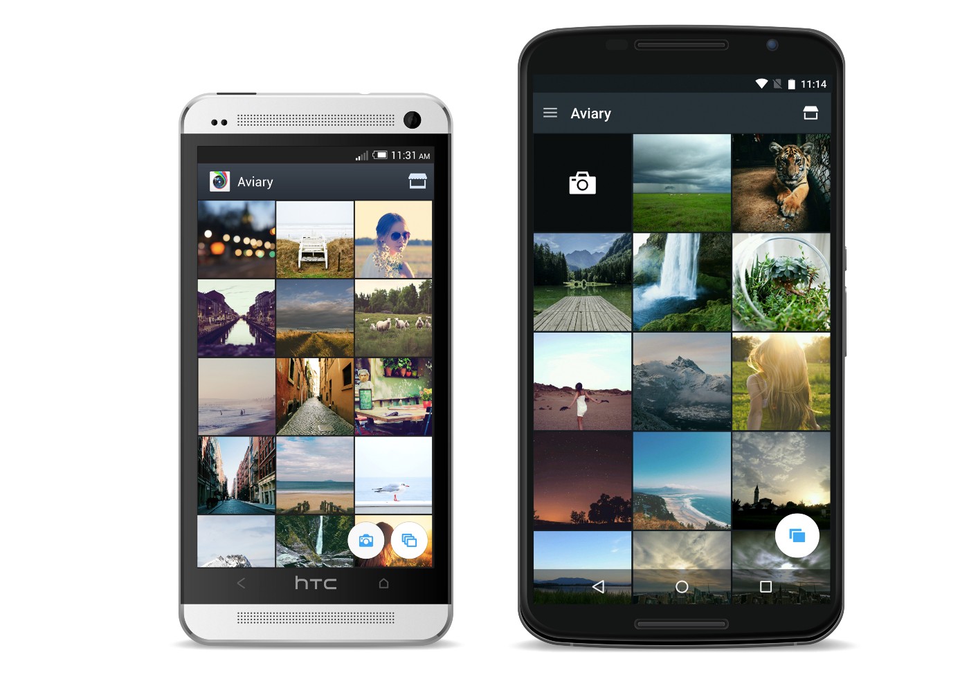
Left: the original version of the gallery. Right: the gallery in material design.
The user first selects a photo, and then - a tool on the horizontal bar. There are 20 such elements in total. Having opened a specific tool, he sees options for action with a photograph. For example, in the Improve tool there are three such options. We wanted the second level to look different than the first. To do this, we replaced the background color with a lighter color and added round borders to the icons. This helps the user to understand that he is already at another level. And to make the transition from the primary color to the secondary, we added a circular drop-down "ink" animation.
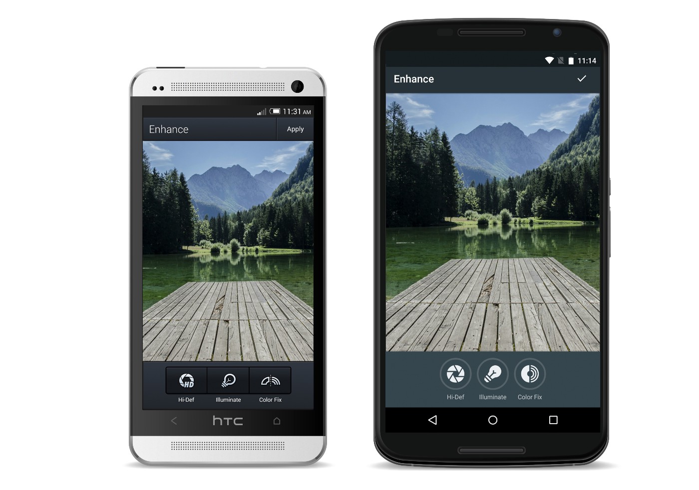
Left: the original version of the "Improve" function, right: the same function after redesign
Another example of additional tools (and the main focus in the application) is our content tools, in particular effects, stickers, frames and filters. In the menu of each of them are free and paid items. In addition, there is the entrance to the "tool shop", where you can also view additional content. We decided to start by making changes to the “tool store”. We focused on the presentation of applications in Google Play - used cards and tabs menu with the advertised images. We decided that this design will help introduce users to the purchase process. Thus, the addition of material design elements has led to the fact that the buying process has become more harmoniously integrated into the application. We updated the style of the cards and added a slider under the tabs in the application menu to make it easier to move from one type of content to another.

On the left: the original version of the “tool magazine”, on the right: the version of the “tool magazine” in Material Design
Also in the “tool shop” we had the opportunity to work with colors and images. This technique is recommended in the material design guide. For each set of tools we add a carefully selected photo. On it we show the capabilities of the tool. And here we have worked with the manual on color . We decided to take the brightest color from the photo, make it even more alive and use it in the screen interface. In addition, we zoomed in to remove borders. So the user's attention is fully focused on the photo. We also used color to shade compilation headings. This gives individuality to each compilation and allows you to color the working screen with a color in harmony with the photo.

Left: content screen - old version, right: content screen with colors Material Design
After experimenting with the color guide, we realized that we could use it in other sections of the application. We took the brightest color of the edited photo and used it in the interface. We used the same technique in the case of the slider and loading icons - this is how the application changes with each new photo. To achieve maximum effect, we added colors from the photo itself to the standard brush colors. Thus, in addition to several standard palettes, we added colors from the photo, harmonizing the photo and interface by color.

A drawing tool that uses colors from the photo itself.
Finally, we reworked the application icon itself. Using the Google guide, I improved its old version. We removed the heavy gradients and extra details. As a result, the new version turned out simple and bright. To show the depth and layering, while not making the picture heavier, we took the colors from the Google material design palette and added a shadow to the icon.
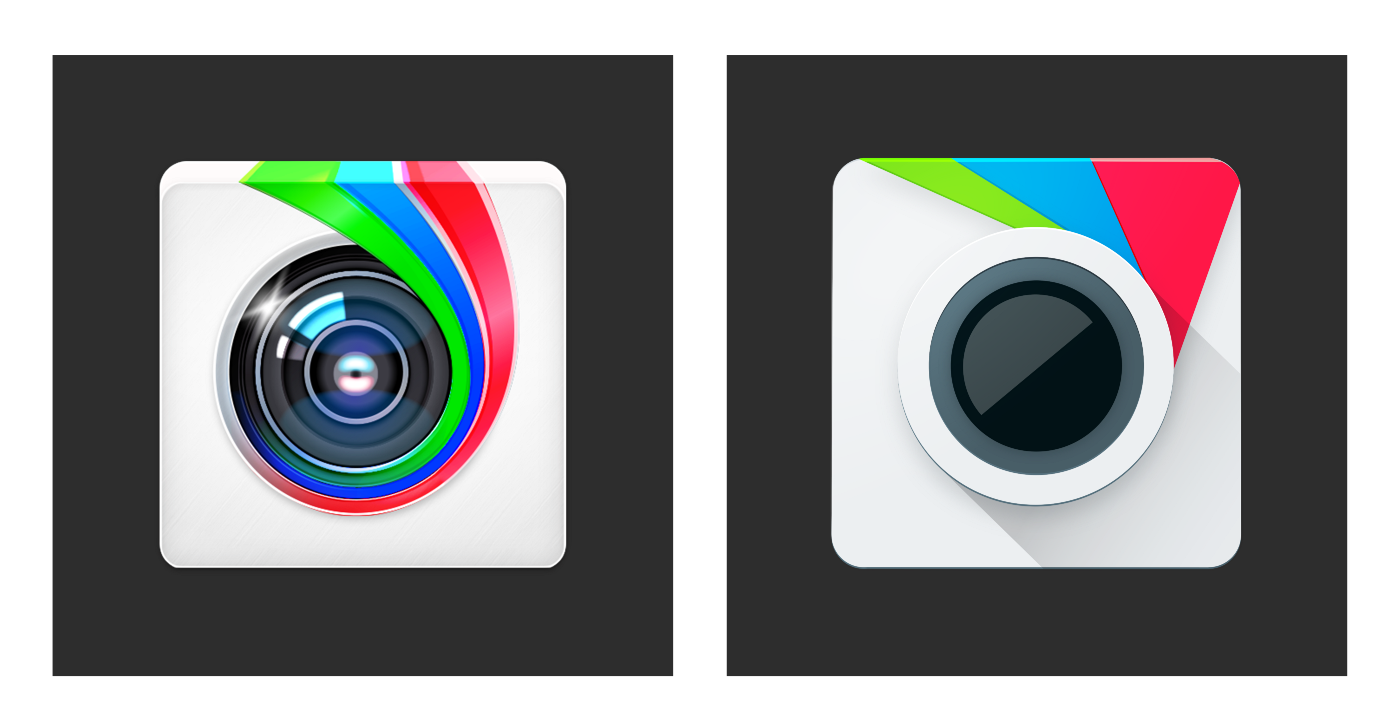
Left: the original version of the icon, right: the same in Material Design
After several months of hard work, on April 9, 2015, we finally launched a new version of the application. And Android users appreciated our efforts. It was very nice to see that many of them liked the result.
After the completion of the project, I realized that I initially tried too hard to follow the guidelines in order to make the application perfect for it. But then I realized that Google does not want everyone to repeat their experience. Leadership is just an indication and source of inspiration. For Google, it is important that the applications are beautiful and built on a single basis, but at the same time, each developer can make them in his own style. As soon as I tried to think more liberatedly, it clicked in my head: the visual language of the platform does not exist to limit, it gives us a point of reference for creativity and allows us to express our individuality.
Thanks for reading! If you like it, click the "Recommend" button. Well, you can download Aviary’s Photo Editor on Google Play .
The Aviary application is a good example of how the most complex applications, with due attention and understanding of the manual, turn into excellent examples of modern Material Design applications, clean and neat interfaces.
We hope that these three succes story, our guidelines and recommendations will help you to translate your application into a new visual language. Take part in the Developer Contest , get valuable prizes and do not forget that the main thing is user convenience and ease of use, and everything else is just tools to achieve user-friendly interfaces.
When your application is rich in various functions, it assumes work not only with text and standard elements, but its original design was developed even when the interface with iOS applications and skeuomorphism met, to switch to a new visual language - truly titanic work and extremely difficult task. It is about this application today and talk.
Note: Like last time, most of the post is written in a living language and from the first person, so the translation will be provided with notes and comments where they may be required.
')
How I reworked Aviary's Photo Editor in the new Google style - Amy Hints , Aviary Chief Designer.
For three years I have been working as Aviary’s chief designer for the Android platform. I was lucky to develop a design for the application, with which many people express their desire for creativity in a mobile photo. Recently, I completely reworked the design of the application in accordance with the material design of Google. But I want to talk not only about the redesign process, but also about my own professional progress, caused by changes in the visual language of the platform. Now the rules set by the platform inspire me, not limit me. To understand where the platform is moving, it is important to understand what was in the beginning. Changing Aviary’s original style to material design was not easy. But thanks to this, I learned a lot about mobile design, and also loved the unique features of the Android platform.
How did Aviary start for Android?
When I started working at Aviary, I had the task to adapt the design of the iOS application for Android. Then I used the iPhone and only learned the subtleties of mobile design. I had a phone on Android for some time at the university, but I really didn’t figure it out.
At first, I studied our test devices on Android and tried to come up with a formula with which to adapt the design of iOS to Android. The Aviary iOS app was made in a skeuomorphic style, with dense shadows and textures. Then in Android, the visual language Holo was used, and I took it as a basis for adapting a more heavyweight design. I replaced the textures with neat gradients and added sharp corners on all screens. So there was the first version of Aviary design for Android.
Note: At the same time, as you can see, the Holo Guidelines are still far away, and the interface shows where his “legs grow”.
Since at that time Aviary mainly worked with iOS, the Android platform became a field for me to experiment with. Most of the functions first appeared in an application on iOS, so I had complete freedom with regard to design.
They didn’t expect much from an application on Android, because we had relatively few users. However, we quickly realized the importance of this platform. The number of users and downloads on Android began to grow, and then the company decided to work harder on the application for the platform.
At that time, I collaborated with a developer who was a long-time Android user and his evangelist. He considered it offensive that I myself use the iPhone while doing design for Android - and was right. So in 2013, I bought myself the HTC One. I began to download apps and found that among them there is no that stylistic unity that we see on iOS. I was amazed at how many options for setting up the phone, how flexible the applications themselves and the interaction between them are. After reviewing many applications, I finally saw the characteristics of Android and some design models. So I gradually refined the application, made it more convenient and natural for the platform.
Submitted material design
In June 2014, Google developed Material Design. By that time, I had been using Android for 2 years already, but it turned out that the design of our application was disastrously outdated. The minor changes we made could not seriously affect the application and did not allow us to fully appreciate the advantages of the Android platform. Therefore, we took advantage of the emergence of material design to develop a new style of application specifically for Android.
We began the process of developing a new design with the study of documentation - the Google team at the time began to publish it, and also provide various useful resources on this topic.
Google Material Design Rules
In the summer of 2014, I began to study all this, trying to learn as much as possible. Fortunately, the information about the design was much more than last time. The documentation, which was released on Google, fully explained the purpose and essence of material design. The motive of the company was clearly the desire to lay the foundation for creating a visual language that would make the platform unified.
I began to study the fundamental concept of material design: the metaphor of paper and ink, the influence of clear graphic layers, the use of motion, which gave the necessary integrity to the platform. However, it seemed that manuals were more designed for applications with a large number of lists, such as mail programs or reading applications.
Note. Just about this we told in the introduction. It's one thing when your application consists of “cards”, input fields, a couple of buttons, and the main content is text, and completely different when you are trying to create something very complex: for example, a photo editor, as you did in Aviary.
Material is a metaphor | Clarity, graphic, natural | Motion attaches importance. Three principles of material design Google
While continuing to study the materials, I wondered: how will our application fit into this framework? How do we show content? What buttons to make voluminous, which flat and which - floating? How to use one action button when we have so many instant actions? Where in the linear photo editing process to embed the transition animation? How to add color elements to the application and leave focus on the photo? But instead of concentrating on these issues, I first simply removed all unnecessary from the application.
Google button style guidelines
Color palette
I decided that I could start with a few global visual changes. First, I basically designed each screen. I decided to come up with stylistic features and design of transitions later. Then I took up the color scheme. Guided by the palette of material design, I chose the primary, secondary and accent colors that matched the brand colors. The main color I made the base gray-blue. It is neutral, not as contrasting as black, but the picture on its background stands out. For icons and text, I used white, and I used blue as the accent. Removing shadows, gradients, and strokes from an application was in itself a big change.
Aviary color palette
Badges
The next step was to recycle the badges. Our old badges were too massive, heavy, and looked outdated. To find ideas, I looked at the guidelines for drawing icons and studied existing Google icons. This helped me to maintain the style of Android and at the same time maintain my own style that reflects the mood and spirit of Aviary. I used shape repeats to draw symmetrical, clear icons that are schematic and simplified for each tool. After loading into layouts, something has already begun to take shape.
Badges from Aviary using Google guide
Photo selection
Having simplified the application to the limit, I began to reflect on the user's workflow. It is simple and linear, and begins with the fact that the user selects a photo from the standard gallery. We decided to leave this part without global change. Is that the top panel was replaced with a new one and added a side, leading to the account settings. In addition, we created a floating button to enter the gallery - the main action on this screen.
Left: the original version of the gallery. Right: the gallery in material design.
Work in the application
The user first selects a photo, and then - a tool on the horizontal bar. There are 20 such elements in total. Having opened a specific tool, he sees options for action with a photograph. For example, in the Improve tool there are three such options. We wanted the second level to look different than the first. To do this, we replaced the background color with a lighter color and added round borders to the icons. This helps the user to understand that he is already at another level. And to make the transition from the primary color to the secondary, we added a circular drop-down "ink" animation.
Left: the original version of the "Improve" function, right: the same function after redesign
Store tools and content in the app
Another example of additional tools (and the main focus in the application) is our content tools, in particular effects, stickers, frames and filters. In the menu of each of them are free and paid items. In addition, there is the entrance to the "tool shop", where you can also view additional content. We decided to start by making changes to the “tool store”. We focused on the presentation of applications in Google Play - used cards and tabs menu with the advertised images. We decided that this design will help introduce users to the purchase process. Thus, the addition of material design elements has led to the fact that the buying process has become more harmoniously integrated into the application. We updated the style of the cards and added a slider under the tabs in the application menu to make it easier to move from one type of content to another.
On the left: the original version of the “tool magazine”, on the right: the version of the “tool magazine” in Material Design
Color and images
Also in the “tool shop” we had the opportunity to work with colors and images. This technique is recommended in the material design guide. For each set of tools we add a carefully selected photo. On it we show the capabilities of the tool. And here we have worked with the manual on color . We decided to take the brightest color from the photo, make it even more alive and use it in the screen interface. In addition, we zoomed in to remove borders. So the user's attention is fully focused on the photo. We also used color to shade compilation headings. This gives individuality to each compilation and allows you to color the working screen with a color in harmony with the photo.
Left: content screen - old version, right: content screen with colors Material Design
Dynamic color
After experimenting with the color guide, we realized that we could use it in other sections of the application. We took the brightest color of the edited photo and used it in the interface. We used the same technique in the case of the slider and loading icons - this is how the application changes with each new photo. To achieve maximum effect, we added colors from the photo itself to the standard brush colors. Thus, in addition to several standard palettes, we added colors from the photo, harmonizing the photo and interface by color.
A drawing tool that uses colors from the photo itself.
Application icon
Finally, we reworked the application icon itself. Using the Google guide, I improved its old version. We removed the heavy gradients and extra details. As a result, the new version turned out simple and bright. To show the depth and layering, while not making the picture heavier, we took the colors from the Google material design palette and added a shadow to the icon.
Left: the original version of the icon, right: the same in Material Design
Launch
After several months of hard work, on April 9, 2015, we finally launched a new version of the application. And Android users appreciated our efforts. It was very nice to see that many of them liked the result.
After the completion of the project, I realized that I initially tried too hard to follow the guidelines in order to make the application perfect for it. But then I realized that Google does not want everyone to repeat their experience. Leadership is just an indication and source of inspiration. For Google, it is important that the applications are beautiful and built on a single basis, but at the same time, each developer can make them in his own style. As soon as I tried to think more liberatedly, it clicked in my head: the visual language of the platform does not exist to limit, it gives us a point of reference for creativity and allows us to express our individuality.
Thanks for reading! If you like it, click the "Recommend" button. Well, you can download Aviary’s Photo Editor on Google Play .
Conclusion
The Aviary application is a good example of how the most complex applications, with due attention and understanding of the manual, turn into excellent examples of modern Material Design applications, clean and neat interfaces.
We hope that these three succes story, our guidelines and recommendations will help you to translate your application into a new visual language. Take part in the Developer Contest , get valuable prizes and do not forget that the main thing is user convenience and ease of use, and everything else is just tools to achieve user-friendly interfaces.
Source: https://habr.com/ru/post/268307/
All Articles