Usability Authorization Forms
Remember how usually form to enter the site of a store or service? Here is a typical example:
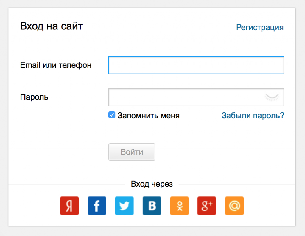
Have you always managed to enter the site using this form from the first time? There were no problems? For me personally, these forms are pain and suffering. I use a huge number of different services, so I don’t always remember on which ones I registered and how. And I have 5 email addresses and at least 6 social. networks. You know, sometimes I even wonder when I get to log in the first time. Familiar? Under the cat an alternative approach to the interface of the entrance to the site, partially facilitates life.
But first, I’ll explain what the classical approach is so bad at. There are two main file scripts.
')
For some reason, among the leaders of Internet projects there is a perception that the more social icons. networks will be in authorization, the more successful and popular will be the product. I have never noticed such a correlation in my practice, but this is another question. Let's return to the failure scenario.
I will try to formulate a partial solution, a somewhat more friendly approach, which seems to be promising.
First of all, it is worth forgetting the horrible words “authorization” and “registration”, because these words belong to the world of the developer, not the user. If you want usability, then first you need to at least speak the language of your visitor. There is a "Login" to the site. And yet, no technical terms. The rest is the problem of the system, not the person.
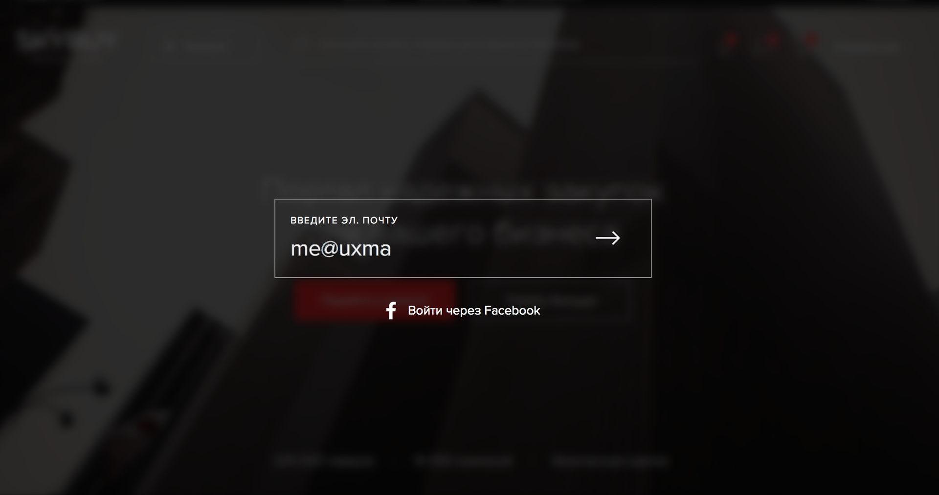
Next is the most interesting. Please enter email. mail This is exactly one field, not more:

Click "Enter" or the continuation icon. If the database is a user with such email. by mail, please enter your password:
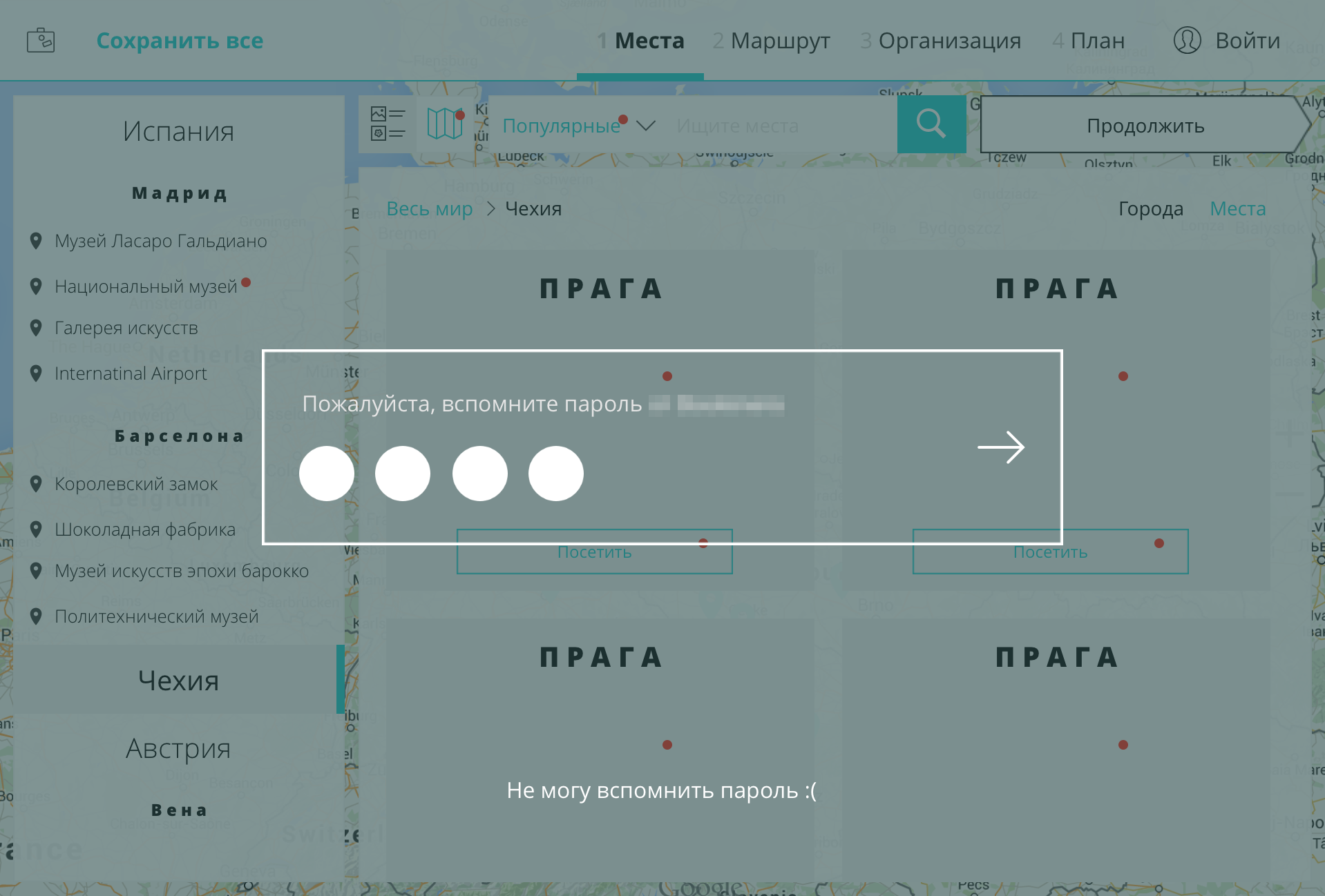
If email The mail is not located, it means that the user is most likely new and instead of this screen we show the field “Please create a password”:

Yes, the user could be sealed in the mail. But the probability is admissible small: there is a visual control of input plus most likely this person often enters his email. mail everywhere and learned how to do it without error. In case of a typo in the password, it can be restored through the same mail. There are links to reset your password and enter another address.
The pain associated with re-entry is not through that social. The network (file script number 2) is partially treated rather clumsily: you need to choose one, the most popular social network. the network in which the target audience of the service sits, and leave the entrance only through this social. network. I said “partially” because there are still two ways to log in (e-mail and social network): the user may still be mistaken. But you must admit, remembering the method of initial entry when choosing from two options is much easier than choosing from 8 options (email and 7 social networks).
Needless to say, the best option is an interface with one way of logging in (only email. Or only one social network). Unfortunately, marketers are usually not ready to go for it. Therefore, the proposed friendly version of the interface is supplemented with an enter button via social. network:
I admit that the proposed approach may have some significant drawbacks, due to which it has not yet become popular. In the comments I will be glad to hear your criticism and discuss these very disadvantages. If someone has the opportunity to quickly test this pattern on a large audience in the A / B-test mode, I will take part with interest and help with the design: I would like to get a quantitative justification for the suitability of the approach for different audiences.

Have you always managed to enter the site using this form from the first time? There were no problems? For me personally, these forms are pain and suffering. I use a huge number of different services, so I don’t always remember on which ones I registered and how. And I have 5 email addresses and at least 6 social. networks. You know, sometimes I even wonder when I get to log in the first time. Familiar? Under the cat an alternative approach to the interface of the entrance to the site, partially facilitates life.
But first, I’ll explain what the classical approach is so bad at. There are two main file scripts.
')
Fail-scenario №1. Random re-registration
- I enter the site in full confidence that I have not registered here yet
- I am looking for the “Register” button, I get upset about the time that I have to spend on filling in the fields, and I get upset about the captcha separately:

- However, courageously fill in all fields. After that, the service happily informs me that I have already registered here and that I entered the captcha incorrectly. In general, the memory to hell, and even inattentive:
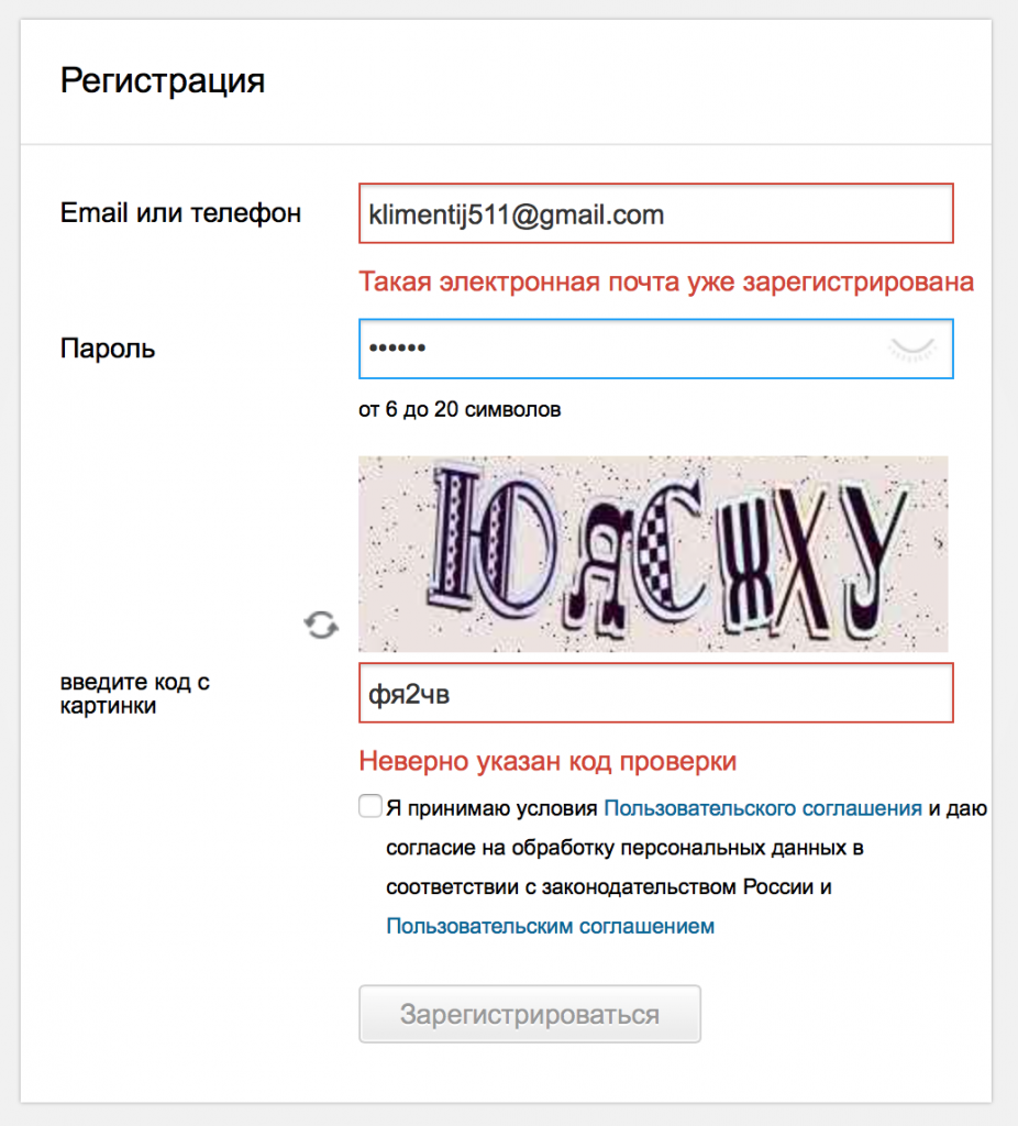
- In the end - a complete failure, 3 minutes of life irretrievably lost, returning to the login form, re-enter (!) Email. mail and trying to remember the password.
Fail scenario number 2. Re-entry through another social. network
For some reason, among the leaders of Internet projects there is a perception that the more social icons. networks will be in authorization, the more successful and popular will be the product. I have never noticed such a correlation in my practice, but this is another question. Let's return to the failure scenario.
- I have already used this service once, and now I want to log into my account again. It seems that I entered then through social. network. But through what? I have 6 or more, and there is such a rich choice:

- Like Vkontakte. I'll try.
- Logged in Damn, my account is empty, although I remember exactly how I filled it:

I understand that I just did not go through that social service. network: you will have to try another 3-4 options, spend another five minutes, but in the end I will find my account. But the average user decides that the service simply deleted his data and is likely to leave this villainous site forever.
I will try to formulate a partial solution, a somewhat more friendly approach, which seems to be promising.
More friendly approach
First of all, it is worth forgetting the horrible words “authorization” and “registration”, because these words belong to the world of the developer, not the user. If you want usability, then first you need to at least speak the language of your visitor. There is a "Login" to the site. And yet, no technical terms. The rest is the problem of the system, not the person.
Next is the most interesting. Please enter email. mail This is exactly one field, not more:

Click "Enter" or the continuation icon. If the database is a user with such email. by mail, please enter your password:

If email The mail is not located, it means that the user is most likely new and instead of this screen we show the field “Please create a password”:

Yes, the user could be sealed in the mail. But the probability is admissible small: there is a visual control of input plus most likely this person often enters his email. mail everywhere and learned how to do it without error. In case of a typo in the password, it can be restored through the same mail. There are links to reset your password and enter another address.
The pain associated with re-entry is not through that social. The network (file script number 2) is partially treated rather clumsily: you need to choose one, the most popular social network. the network in which the target audience of the service sits, and leave the entrance only through this social. network. I said “partially” because there are still two ways to log in (e-mail and social network): the user may still be mistaken. But you must admit, remembering the method of initial entry when choosing from two options is much easier than choosing from 8 options (email and 7 social networks).
Needless to say, the best option is an interface with one way of logging in (only email. Or only one social network). Unfortunately, marketers are usually not ready to go for it. Therefore, the proposed friendly version of the interface is supplemented with an enter button via social. network:

Conclusion
I admit that the proposed approach may have some significant drawbacks, due to which it has not yet become popular. In the comments I will be glad to hear your criticism and discuss these very disadvantages. If someone has the opportunity to quickly test this pattern on a large audience in the A / B-test mode, I will take part with interest and help with the design: I would like to get a quantitative justification for the suitability of the approach for different audiences.
Source: https://habr.com/ru/post/268253/
All Articles