Why minimalist design still rules the web

Design, like fashion, is subject to regular changes. But still there are directions that never lose their popularity. One of them is minimalism. In recent years, HTML 5, CSS 3, and a number of other technologies have been booming, allowing us to create very complex web pages today. Nevertheless, minimalism in design is still very much in demand.
As one scientist in the “Jurassic Park” said: “ ... your scientists were so concerned about whether they could do it or not, that they didn’t even think about whether they should .” This phrase is also perfect for web design - the fact that technology allows us to add all sorts of visual effects to sites does not mean that we need to do it.
This is what happens when a developer uses all available modern technologies (clickable):
')

As you can see, here are slides, animation, and parallax. It is very difficult to single out some main topic, if there is one at all. Take a moment to study this example. Perhaps you will find on this site and their favorite technology.
But let's leave bad design alone and consider the reasons why a minimalist website can be useful for business.
Business and marketing
You have to perfect your message.
What is the purpose of your site? What do you want to convey to your users? On this and need to focus, not allowing his message to get lost in all kinds of lost among all kinds of beauty and special effects.

With a minimalist design, you do not have room for experimentation, because in this case it is necessary to carefully consider all the details. Each element must perform some practical function. It is impossible to give your message to users indistinctly with the help of lengthy texts or standard stock photographs. It is necessary to choose carefully only what is absolutely necessary for the transmission of your marketing message.
Your offer
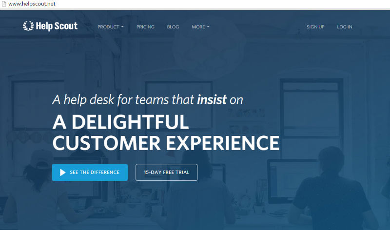
Visual order on the page is an ideal opportunity to present users with the uniqueness of their sales offer. For example, the Help Scout website has a very clean, clear and elegant design. In addition to the menu, they only have about 10 words in the cap, but the background does not distract attention, but at the same time participates in the transfer of the message: the photo is presented by the support service staff.
The less clutter, the better the conversion.
It would seem an obvious fact. But, as practice shows, not for everyone. Rate the screenshot below for one site and try to find the registration button right away.
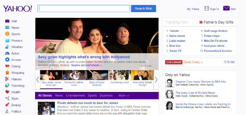
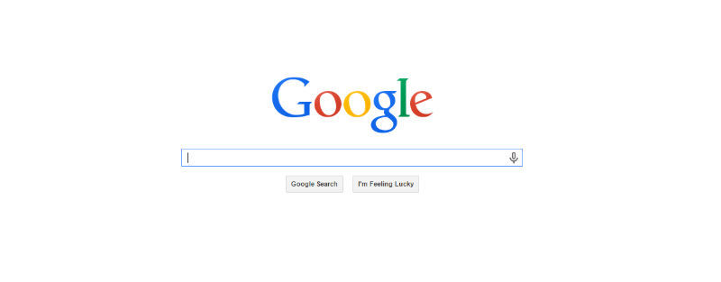
Or compare Yahoo! sites. and google. Which of them is faster and easier to find the search string?
Of course, the minimalist design helps to clearly and clearly convey a call to action.
Adaptability
Sites adapted for mobile devices embody the idea of the superiority of minimalist design. Those developers who created mobile versions of sites understand how small screens make them give up everything that is superfluous. After all, 3-5 inches are not particularly clearer.
But there is another reason why minimalism prevails in the mobile segment: such sites are much easier to make adaptive. Well, or at least port them to versions for smartphones and tablets. After all, the layers are much simpler, there are less elements, there is little content, and it is presented in a concentrated form.
Interaction experience
Free space for sharing content
When content is not crowded, but divided into fragments with the help of blank lines and separators, it creates a sense of calm. The site seems to say: "Everything is fine, no need to hurry." And users subconsciously feel this calm message. They understand what it means to pay attention to what is really important. You do not flood them with an abundance of information, but create peculiar comfort zones, keep a distance. Here is one example of the implementation of this approach:
Easy navigation
Minimalism is useful for organizing not only content, but also all sorts of menus. As in all other cases, the menu should contain only those items, without which it is impossible to do. In this context, you can again recall the design of the HelpScout project. Its menu reflects the most important thing to inform users: product information, prices, a link to a blog. Everything else — information about the project, documents, etc. — is hidden in the More item. No multi-level menu, users can quickly and easily find all the important information.
Elegance and sophistication
Minimalism often goes hand in hand with elegance and sophistication. This can be argued with a certain degree of confidence. Look at the same ZenHabits or TruthLabs .
Side effects
Save resources and download speeds
Sites with minimalist design require less resources. You will not overload your server with an abundance of graphics, video and Flash, the load on the processors will also be much lower. On the client side, you will not need to use all sorts of plugins that reduce performance and download speed. By the way, according to Kissmetrics, 47% of users expect sites to load in less than 2 seconds. Yes, and simply in terms of ranking in Google, it makes sense to attend to the speed of loading sites.
Simple support
Minimalism in design saves resources not only servers and storage, but also support services. Updating multiple plugins, libraries, and frameworks alone can turn into a nightmare. But you still need to check that all updates have risen correctly, there were no failures and incompatibilities. And with a minimalist design, you are unlikely to use excessive visual effects that require a variety of plug-ins.
Conclusion
Of course, in every rule there are exceptions. And some of the above statements may be untenable, provided competently thought-out complex design, or lack of time and money to develop concise design. Minimalism requires the developer to work thoughtfully, weighing each decision. This means that you need to clearly justify the need to place each element on the page. And if something can be abandoned, then it must be abandoned.
It is worth noting that minimalism is not always appropriate. And you must first evaluate, without what information on the page you can not do what tasks the site faces, before choosing one or another approach to design.
At the same time, we must not forget that we should not complicate the design just because you can afford it. The main thing is the interests of users and the message that you want to convey.
Competent laconic design can be very profitable for your business.
Source: https://habr.com/ru/post/268227/
All Articles