Todoist transition to Material Design
As part of our competition for application developers, we promised to translate for you some interesting materials about how popular applications were translated into a new visual design language: Material Design. Last week we talked about Feedly, today we’ll talk about Todoist, one of the most popular task managers for Android and iOS.
Note: Like last time, most of the post is written in a living language and from the first person, so the translation will be provided with notes and comments where they may be required.
We were sitting not far from the front row when Matthias Duarte came on the scene. “Design plays a big role in the modern world; it reflects your experience and your emotions, ”he said, announcing material design. A new concept won us over from the first slides that appeared on the screen. We learned that Google, contrary to the trend for a flat and minimalist design, made a choice in favor of a more integrated design on all platforms and devices. And now, in a year, the success of this idea is obvious. That day a new era began for Google, Android and for the Todoist app.
')
Since its inception, Material Design has come a long way: The Android OS Lollipop was released - the largest platform for translating design ideas. There were also detailed guidelines in which not only ideas were clearly described, but also real examples of the use of certain elements were considered. There are new concepts of design and animation - not only from Google, but also from other companies. And all this time we spent at the blackboard, working out principles, discussing ideas and creating.
“Material” is a figurative expression. Clarity, graphic, natural. Motion attaches importance.
Note: In the original, a hard-to-play wordplay is used, associated with the interpretation of the word Material. The closest in Russian language will be the concept of "real" design: i.e. based on real, existing objects.
These are the key principles of material design, and that is what we used in Todoist. Global redesign was not easy for us, but it was worth it. We love interesting tasks, especially when their main goal is to create a single, perfectly developed product. And although the path is not finished yet, a certain stage has come when we want to share what we have learned in the process. Together with Ana Fereyra , the leading designer of Todoist, we are happy to tell you about how we made the new Todoist design in Material style and what lessons we have learned.
Material design is still a very young visual language. Only one year has passed since its announcement - and eight months since it was presented to the general public on Android Lollipop. During this time, Google managed to update the recommendations on the use of Material Design several times; An incalculable number of examples of using the language in a variety of conditions have appeared. At the same time, Material Design did not stand still. The use of real-world applications has improved individual elements that did not fit into the system or the quality of which did not suit the community. Therefore, it is important for developers to constantly study materials and create new versions.
Ana Ferreira: “Material design is an absolutely new language, while there are few examples of its use. Therefore, it was simply invaluable to study manuals, read as much as possible on the topic, experiment with Android Lollipop, test other people's applications, especially those released by Google itself. However, theory alone is not enough to achieve a good result. We decided to put everything we learned into practice and use different approaches to solve a specific Todoist task.
For example, first we updated the task manager, making the background color bright yellow. But they saw that there was not enough contrast and clarity, so they made the color darker. In the past two months, we have reworked the process of adding dates. We put the option to add the date directly to the task screen, and this made the manager more convenient. Iteration is the key to improvement. ”
Google has put a lot of effort into explaining the essence of material design. Google developers have published a guide to working with him. Thanks to this, other companies were able to create stylistically uniform products for different platforms and devices. The documentation is very detailed, many topics are covered in it. But we must remember that leadership is just a guide. It indicates the direction, but it does not limit. It is an inspiration, not a rule.
Ana: “At first, we scrupulously followed the guidelines - in fonts, colors, icons, grid of coordinates. But they quickly realized that such an approach would not be able to completely solve our problems. And then we started to treat manuals as instructions, rather than strict rules.
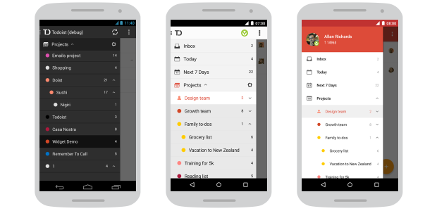
Todoist is a cross-platform application with a strong brand spirit. Therefore, we chose which rules to follow, based on our needs. For example, we retained our own colors, although they do not match the 100% material design palette. We also used our own background in the navigation menu. Google has very specific recommendations for this type of menu, but they were not combined with our background. The guides work fine when there are no minor elements, but our navigation has several structural levels (for example, subprojects). This feature could not be tied to the material design, so it was decided to reduce the left border and the distance to the text. Thus, more space for each entry appeared, and the menu became more readable and visually appealing.
Each of the deviations from the manual gave us the assurance that our users will have impeccable experience with the application. ”
Material design creates a foundation on which to build applications is easy and convenient: you have a lot of opportunities to move forward. To achieve the best results, you need to use a uniform, comprehensive approach. There are no easy ways, and the smallest details are of utmost importance. Any - from changing state icons and the desire to avoid too abrupt changes to the need to ensure that the application’s behavior in response to user actions remains consistent. Architectural improvements should be accompanied by the addition of necessary features, if necessary. Only then can people use the application to the maximum.
Ana: “Updating the material-style application was a great reason to rework the previous ways of interaction and, in general, improve usability.
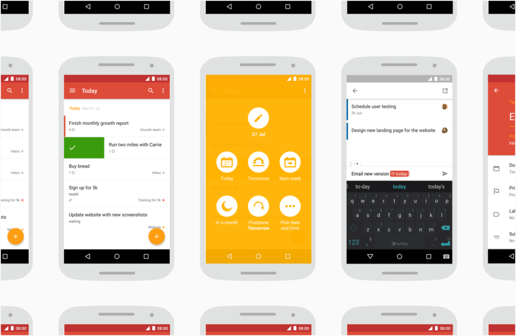
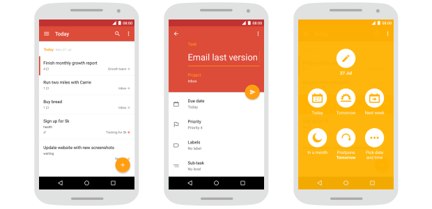
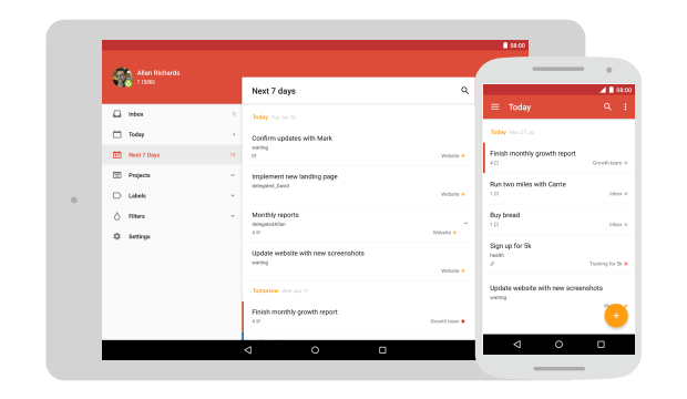
Adding tasks is one of the key functions in the scheduler application. In the process of redesign, we set a goal to make it even easier and more convenient. Now users do not need to open a special screen - you can add a task on any screen using the quick add button. In addition, it allows you to add multiple tasks in a row.
But we knew that users create not only simple tasks, so we went further and expanded the possibilities of quick adding. We connected the recognition of natural language - with the help of this function, the system understands what the user is typing, selects dates, labels and priorities. This allows you to solve many problems at once in one place. In addition, we added the ability to quickly change the level of tasks to create structured lists.
The most frequently used functions on a mobile device are the completion of tasks and the scheduling of their execution time. Therefore, our goal was a quick and intuitive interface. So there was a decision to add gestures that simplify these processes - a shift to the right to complete, and a shift to the left to set the time. We also added the ability to apply gestures to already completed tasks, to make them active again, as well as to transfer them to history or delete them.
All these changes were needed to show that this is not just a superficial redesign. ”
Movement is one of those areas where Material Design makes the most of itself. In addition to being simply beautiful, a continuous stream is created in which elements react to the user's touch, and this completely changes the interface. At the same time, the execution of commands is one of the most important aspects of animation: only one non-working element prevents the user from smoothly and harmoniously interacting with the application. Animation needs to be applied wisely.
Ana: “Our number one goal has always been to create intuitive applications. It is important for users to spend as little time as possible on drawing up lists, and as much as possible on implementing plans. That is why we liked the recommendations of the material design about the movement - that the application should respond to user actions. We comprehensively studied this and introduced animation and transitions into the application to make the process of interaction with it as smooth as possible. One example is the animation at the moment of a left shift when scheduling a task. The background fills the entire screen, spreading from the point of initial touch, and this helps the user to understand what exactly is changing in the interface and why. The user can work on tasks with his colleagues. Therefore, another example is animation when a newly added person takes his place. We worked with the whole team so that these smooth transitions served as signposts, guiding users and helping to understand what was happening on the screen of their gadgets. ”
Android is the most popular mobile operating system, its users in the world more than 1 billion. However, only 12% of users have a version of Android Lollipop - the one on which the material design first appeared. Creating a great app brings satisfaction to the developer, only if it is available to most people. Therefore, it is extremely important to consider all relevant versions of Android.
Ana: “Material design is a big step forward in the visual language of Android. Applications look better, they have become more understandable and convenient - but you can not forget about 88% of users!
Therefore, we have created our own tools to make innovations accessible to all. We added the height of elements in Android versions that did not support it, to be able to use real-world metaphors and give users a hint on structure.
Note: Here we are talking about what we tried to explain in an untranslatable play on words. Material Design is based on the transfer of interaction with "real" surfaces in the virtual world. This metaphor best reflects this picture:
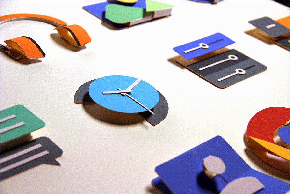
More information about the multi-layered concept and the tangibility of what is happening can be read in our last post , in the sections “Principle One: Tangible Interfaces” and “Principle Three: Meaningful Animation”.
The ability to dim icons - fill icons with any color, covering them with masks with an alpha channel - was added only to Lollipop. However, with the advent of our new themes within the application, it has become very useful to us. If the icons did not change color, it would worsen the impression of the application, and the presence of icons of all colors would make it heavier. We had no choice, so we implemented a blackout in all versions of Android that we support. ”
The goal of material design is to achieve unity on various platforms and devices of different sizes. “It is important to consider the rules for working with mobile devices, but it is equally important to remember that, like touch and voice, the mouse and keyboard are also basic input methods,” the material design guide says. It is important to be attentive to users of different devices.
Ana: “Many Android apps look good on standard-sized smartphones, but they lack attractiveness on tablets and smartphones with a large screen size. As for Todoist, one of the most favorite features of users of the application is accessibility on many platforms. There are a huge number of smartphones and tablets, different in size and configuration. For us, it is fundamentally important that people be comfortable using the application, regardless of the diagonal of the display of their favorite gadget. Therefore, we spent a lot of time creating an interface that automatically adapts to your device. With the transition to material design, users received an application with which it is equally comfortable to work both on tablets and on smartphones. ”
Note: In addition, responsive design allows you to build one application for smartphones and tablets, thereby saving developers from unnecessary work on assembling, publishing, fixing errors and updating two applications instead of one.
Getting feedback is important at all stages of design. And when it comes to such large-scale changes, the importance of feedback is increasing a thousandfold. It is necessary from time to time to "move away from the canvas" and evaluate the promotion of a fresh look. Thanks to this approach, you will be able to identify and improve unprocessed elements thanks to comments from both team members and other people.
Ana: “When creating an application design, anyone who is actively involved in it can lose the ability to critically evaluate. That is why third-party opinions are crucial in order to make a great product. In the process of translating the application to Material Design, we regularly held internal meetings and discussions, trying to find the best solutions to emerging UI / UX problems. In addition, from time to time we released special test assemblies so that each employee of the company could test the latest changes and share impressions with the development department. At the same time, we were not limited to the responses of our colleagues. In the first few months, we contacted Google designers directly for comments, and their help in the process of rethinking the design was simply invaluable.
They developed guidelines and Material Design itself, so their understanding of the principles of constructing Material design was much deeper than ours. At the Google IO 2015 conference in San Francisco, the team had the opportunity to get the opinion of third-party experts. This happened a month before the release of the updated application and helped us to polish the last details. ”
Our update in Material Design gives an impetus to further improve the Todoist ecosystem and, in particular, the Android application. It was amazing, and we can’t wait to share with you what we have learned.
PS: In accordance with the first lesson, we are already working on another version in which we will again improve the UI, so stay with us!
That's all for today! Stay in touch, you are waiting for another post about the transition from the old design to the new visual language Material Design. Have a nice day and productive week! ;)
UPD.: We were in a hurry to share with you stories about Material Design, so they forgot to include a link to the original post - What we learned from crafting Todoist's Material Design . Correct. :) Many thanks to the authors of the article for the material and interaction during the translation.
Note: Like last time, most of the post is written in a living language and from the first person, so the translation will be provided with notes and comments where they may be required.
We were sitting not far from the front row when Matthias Duarte came on the scene. “Design plays a big role in the modern world; it reflects your experience and your emotions, ”he said, announcing material design. A new concept won us over from the first slides that appeared on the screen. We learned that Google, contrary to the trend for a flat and minimalist design, made a choice in favor of a more integrated design on all platforms and devices. And now, in a year, the success of this idea is obvious. That day a new era began for Google, Android and for the Todoist app.
')
Since its inception, Material Design has come a long way: The Android OS Lollipop was released - the largest platform for translating design ideas. There were also detailed guidelines in which not only ideas were clearly described, but also real examples of the use of certain elements were considered. There are new concepts of design and animation - not only from Google, but also from other companies. And all this time we spent at the blackboard, working out principles, discussing ideas and creating.
What does “material” design mean?
“Material” is a figurative expression. Clarity, graphic, natural. Motion attaches importance.
Note: In the original, a hard-to-play wordplay is used, associated with the interpretation of the word Material. The closest in Russian language will be the concept of "real" design: i.e. based on real, existing objects.
These are the key principles of material design, and that is what we used in Todoist. Global redesign was not easy for us, but it was worth it. We love interesting tasks, especially when their main goal is to create a single, perfectly developed product. And although the path is not finished yet, a certain stage has come when we want to share what we have learned in the process. Together with Ana Fereyra , the leading designer of Todoist, we are happy to tell you about how we made the new Todoist design in Material style and what lessons we have learned.
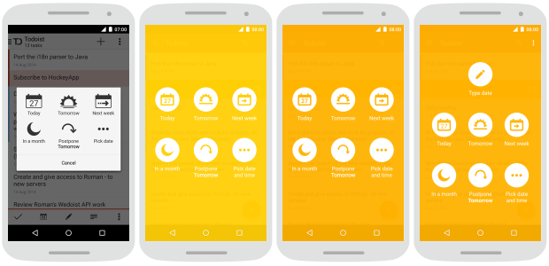
Lesson №1: Research and new versions
Material design is still a very young visual language. Only one year has passed since its announcement - and eight months since it was presented to the general public on Android Lollipop. During this time, Google managed to update the recommendations on the use of Material Design several times; An incalculable number of examples of using the language in a variety of conditions have appeared. At the same time, Material Design did not stand still. The use of real-world applications has improved individual elements that did not fit into the system or the quality of which did not suit the community. Therefore, it is important for developers to constantly study materials and create new versions.
Ana Ferreira: “Material design is an absolutely new language, while there are few examples of its use. Therefore, it was simply invaluable to study manuals, read as much as possible on the topic, experiment with Android Lollipop, test other people's applications, especially those released by Google itself. However, theory alone is not enough to achieve a good result. We decided to put everything we learned into practice and use different approaches to solve a specific Todoist task.
For example, first we updated the task manager, making the background color bright yellow. But they saw that there was not enough contrast and clarity, so they made the color darker. In the past two months, we have reworked the process of adding dates. We put the option to add the date directly to the task screen, and this made the manager more convenient. Iteration is the key to improvement. ”
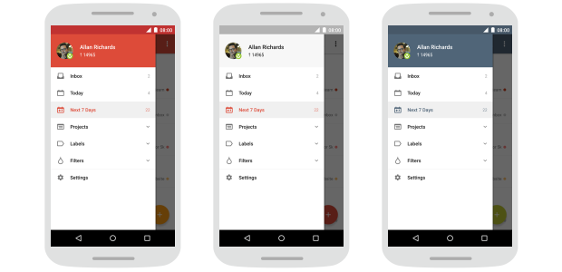
Lesson # 2: Inspiration, not a rule
Google has put a lot of effort into explaining the essence of material design. Google developers have published a guide to working with him. Thanks to this, other companies were able to create stylistically uniform products for different platforms and devices. The documentation is very detailed, many topics are covered in it. But we must remember that leadership is just a guide. It indicates the direction, but it does not limit. It is an inspiration, not a rule.
Ana: “At first, we scrupulously followed the guidelines - in fonts, colors, icons, grid of coordinates. But they quickly realized that such an approach would not be able to completely solve our problems. And then we started to treat manuals as instructions, rather than strict rules.
Todoist is a cross-platform application with a strong brand spirit. Therefore, we chose which rules to follow, based on our needs. For example, we retained our own colors, although they do not match the 100% material design palette. We also used our own background in the navigation menu. Google has very specific recommendations for this type of menu, but they were not combined with our background. The guides work fine when there are no minor elements, but our navigation has several structural levels (for example, subprojects). This feature could not be tied to the material design, so it was decided to reduce the left border and the distance to the text. Thus, more space for each entry appeared, and the menu became more readable and visually appealing.
Each of the deviations from the manual gave us the assurance that our users will have impeccable experience with the application. ”
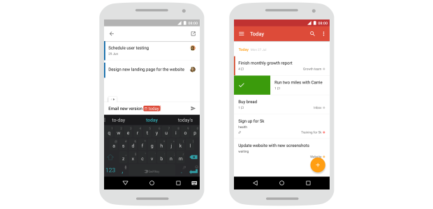
Lesson # 3: Not just external changes.
Material design creates a foundation on which to build applications is easy and convenient: you have a lot of opportunities to move forward. To achieve the best results, you need to use a uniform, comprehensive approach. There are no easy ways, and the smallest details are of utmost importance. Any - from changing state icons and the desire to avoid too abrupt changes to the need to ensure that the application’s behavior in response to user actions remains consistent. Architectural improvements should be accompanied by the addition of necessary features, if necessary. Only then can people use the application to the maximum.
Ana: “Updating the material-style application was a great reason to rework the previous ways of interaction and, in general, improve usability.
Adding tasks is one of the key functions in the scheduler application. In the process of redesign, we set a goal to make it even easier and more convenient. Now users do not need to open a special screen - you can add a task on any screen using the quick add button. In addition, it allows you to add multiple tasks in a row.
But we knew that users create not only simple tasks, so we went further and expanded the possibilities of quick adding. We connected the recognition of natural language - with the help of this function, the system understands what the user is typing, selects dates, labels and priorities. This allows you to solve many problems at once in one place. In addition, we added the ability to quickly change the level of tasks to create structured lists.
The most frequently used functions on a mobile device are the completion of tasks and the scheduling of their execution time. Therefore, our goal was a quick and intuitive interface. So there was a decision to add gestures that simplify these processes - a shift to the right to complete, and a shift to the left to set the time. We also added the ability to apply gestures to already completed tasks, to make them active again, as well as to transfer them to history or delete them.
All these changes were needed to show that this is not just a superficial redesign. ”
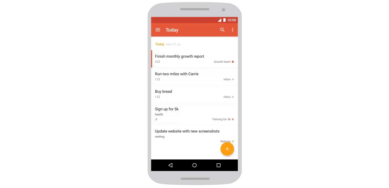
Lesson 4: Movement is the key to the perfect interface.
Movement is one of those areas where Material Design makes the most of itself. In addition to being simply beautiful, a continuous stream is created in which elements react to the user's touch, and this completely changes the interface. At the same time, the execution of commands is one of the most important aspects of animation: only one non-working element prevents the user from smoothly and harmoniously interacting with the application. Animation needs to be applied wisely.
Ana: “Our number one goal has always been to create intuitive applications. It is important for users to spend as little time as possible on drawing up lists, and as much as possible on implementing plans. That is why we liked the recommendations of the material design about the movement - that the application should respond to user actions. We comprehensively studied this and introduced animation and transitions into the application to make the process of interaction with it as smooth as possible. One example is the animation at the moment of a left shift when scheduling a task. The background fills the entire screen, spreading from the point of initial touch, and this helps the user to understand what exactly is changing in the interface and why. The user can work on tasks with his colleagues. Therefore, another example is animation when a newly added person takes his place. We worked with the whole team so that these smooth transitions served as signposts, guiding users and helping to understand what was happening on the screen of their gadgets. ”
Lesson # 5: Applications for all
Android is the most popular mobile operating system, its users in the world more than 1 billion. However, only 12% of users have a version of Android Lollipop - the one on which the material design first appeared. Creating a great app brings satisfaction to the developer, only if it is available to most people. Therefore, it is extremely important to consider all relevant versions of Android.
Ana: “Material design is a big step forward in the visual language of Android. Applications look better, they have become more understandable and convenient - but you can not forget about 88% of users!
Therefore, we have created our own tools to make innovations accessible to all. We added the height of elements in Android versions that did not support it, to be able to use real-world metaphors and give users a hint on structure.
Note: Here we are talking about what we tried to explain in an untranslatable play on words. Material Design is based on the transfer of interaction with "real" surfaces in the virtual world. This metaphor best reflects this picture:
More information about the multi-layered concept and the tangibility of what is happening can be read in our last post , in the sections “Principle One: Tangible Interfaces” and “Principle Three: Meaningful Animation”.
The ability to dim icons - fill icons with any color, covering them with masks with an alpha channel - was added only to Lollipop. However, with the advent of our new themes within the application, it has become very useful to us. If the icons did not change color, it would worsen the impression of the application, and the presence of icons of all colors would make it heavier. We had no choice, so we implemented a blackout in all versions of Android that we support. ”
Lesson number 6: Not only smartphones
The goal of material design is to achieve unity on various platforms and devices of different sizes. “It is important to consider the rules for working with mobile devices, but it is equally important to remember that, like touch and voice, the mouse and keyboard are also basic input methods,” the material design guide says. It is important to be attentive to users of different devices.
Ana: “Many Android apps look good on standard-sized smartphones, but they lack attractiveness on tablets and smartphones with a large screen size. As for Todoist, one of the most favorite features of users of the application is accessibility on many platforms. There are a huge number of smartphones and tablets, different in size and configuration. For us, it is fundamentally important that people be comfortable using the application, regardless of the diagonal of the display of their favorite gadget. Therefore, we spent a lot of time creating an interface that automatically adapts to your device. With the transition to material design, users received an application with which it is equally comfortable to work both on tablets and on smartphones. ”
Note: In addition, responsive design allows you to build one application for smartphones and tablets, thereby saving developers from unnecessary work on assembling, publishing, fixing errors and updating two applications instead of one.
Lesson 7: Feedback
Getting feedback is important at all stages of design. And when it comes to such large-scale changes, the importance of feedback is increasing a thousandfold. It is necessary from time to time to "move away from the canvas" and evaluate the promotion of a fresh look. Thanks to this approach, you will be able to identify and improve unprocessed elements thanks to comments from both team members and other people.
Ana: “When creating an application design, anyone who is actively involved in it can lose the ability to critically evaluate. That is why third-party opinions are crucial in order to make a great product. In the process of translating the application to Material Design, we regularly held internal meetings and discussions, trying to find the best solutions to emerging UI / UX problems. In addition, from time to time we released special test assemblies so that each employee of the company could test the latest changes and share impressions with the development department. At the same time, we were not limited to the responses of our colleagues. In the first few months, we contacted Google designers directly for comments, and their help in the process of rethinking the design was simply invaluable.
They developed guidelines and Material Design itself, so their understanding of the principles of constructing Material design was much deeper than ours. At the Google IO 2015 conference in San Francisco, the team had the opportunity to get the opinion of third-party experts. This happened a month before the release of the updated application and helped us to polish the last details. ”
Our update in Material Design gives an impetus to further improve the Todoist ecosystem and, in particular, the Android application. It was amazing, and we can’t wait to share with you what we have learned.
PS: In accordance with the first lesson, we are already working on another version in which we will again improve the UI, so stay with us!
That's all for today! Stay in touch, you are waiting for another post about the transition from the old design to the new visual language Material Design. Have a nice day and productive week! ;)
UPD.: We were in a hurry to share with you stories about Material Design, so they forgot to include a link to the original post - What we learned from crafting Todoist's Material Design . Correct. :) Many thanks to the authors of the article for the material and interaction during the translation.
Source: https://habr.com/ru/post/267837/
All Articles