Card Design: How and Why
In the network you can find enough materials on creating styles of maps (including on the habr), but mostly they show the technical side of creating a style in tilemill / mapbox studio. But with the theory things are much worse, they mostly write about some particular aspects of design, and they do not always explain why they should do this and not otherwise. In this article I will try to correct this situation and share my experience with novice mappers.

I ask all interested under the cat.
To begin, as always, you need to ask the right questions. Why do you need your own style? Who is the target audience of the card? How should style affect card functionality? After answering these questions, you can proceed directly to the design style. The following reflections are valid for the cartotilla of the base substrate of the world map (as the most time consuming) and do not claim to be the ultimate truth.
')
So, first of all the map is the data that we want to show to the user. There is a lot of these data and there are various connections between them and not only spatial ones. So the first thing you need to build a semantic hierarchy of data: we divide all our data into layers and arrange according to logic.
Initially, we have a blank canvas, sometimes it is taken for the world ocean, because adding data about the oceans is not always advisable. Then there are continents, then land use data, then reservoirs, and so on. A good guide would be the description of the data layers in Mapbox Streets . Especially pay attention to the layers with signatures, their sequence often does not coincide with the sequence of the objects themselves. Just think in advance how your layers can intersect: tunnels, bridges, racks, etc. For the road network, a good guideline is the organization of the levels in osm-bright . Pay attention to the railway network, trams and other types of transport, whether they should be separated into separate layers and how to deal with intersections in this case.
Once the data is built into a coherent hierarchy - you can proceed directly to building a visual hierarchy. Our visual hierarchy will be fully based on the meaning. We have a lot of data and, ideally, we need to strive to ensure that the user receives only the information that he needs to solve the current problem. And do it in a convenient form. Therefore, for each data layer, you must first determine the range of visibility in the zoom levels, otherwise we will have a spaghetti monster, not a map. However, sometimes a layer must be divided into several layers, or an additional attribute may be created that contains a subcategory of layer data. Thus, we will be able to progressively increase the density of data on the map while increasing the zoom.
Example
The hierarchy is ready (at least the first version of it), the data are divided into layers, and, finally, you can proceed to the choice of colors, fonts and everything else that most people think of as design. Here we have at our disposal two basic tools, color and patterns. With the use of patterns, you need to be moderate in order not to overload the card with visual noise. Yes, do not forget in what format the tiles of your style will end up, and take into account the related limitations (number of colors, transparency) at the very beginning of development.
The topic of human perception of color is very extensive and ambiguous, I advise you to study it yourself, there are enough materials on this topic in the network. I will continue to rely on a number of established opinions. First, you need to use the “right” color model, I usually use HSB / HSL. Secondly, from the point of view of visual weight, brightness is our main instrument, then tone and saturation come.
UPD:
In accordance with the above, objects of different levels of hierarchy on the map should be at least different brightness. This means that when casting our map to shades of gray, we should easily distinguish, for example, the main road from the secondary. Here are some examples.
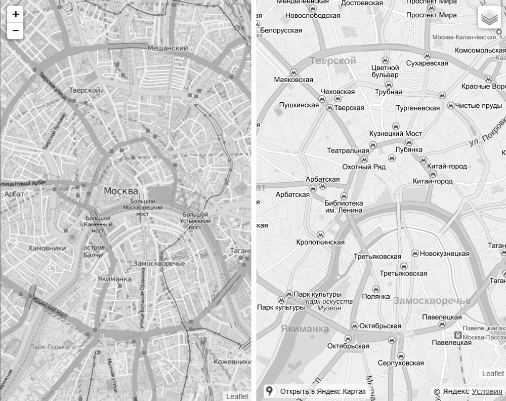
As you can see on Yandex maps, things are better than in the default OSM style.
But when superimposing information about traffic jams, Yandex breaks the hierarchy, people with color perception have long complained, but alas ...
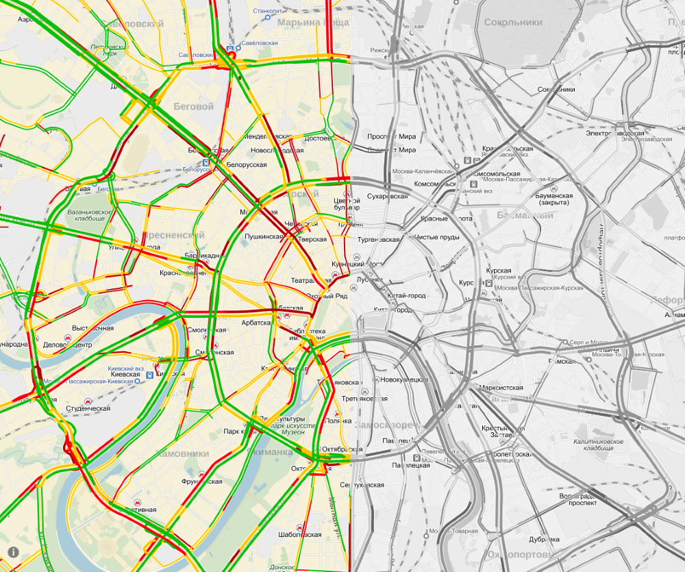
In fact, the brightness is not a panacea, and the whole thing in contrast, and how you will achieve it, your business, the main thing is that it works.
Text editors have light and dark themes, such a division is also applicable to maps (normal and night display mode). So, for a light theme, dominated by light colors, more important objects are better marked with darker colors to increase visual weight. In the case of a dark theme, everything is usually exactly the opposite.

At the same time, one should always look at the context and take into account the known features of human vision.
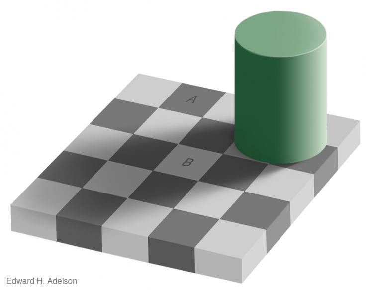
We have a lot of different types of objects on the map and colors, respectively. How to decide what color to choose for a particular type of object? Here I can give the following advice. Try to break the types of objects into groups and use similar colors within the group.
Example
Try to use natural (logical) colors, do not make ponds pink. Use established associations.
So, you tried to take into account all the features of working with color, but there are so many objects that the head is spinning, the rules start to conflict with each other. Panic. Here the principles of gestalt come to our aid, having mastered them, it is possible to more precisely designate the visual weight of objects and place the necessary accents.

I advise you to read all the articles of Steven Bradley from the cycle of Design principles, and especially these: Design Principles: Connecting And Separating Elements: Contrast And Similarity , Design Principles: Visual Weight And Direction .
Armed with new knowledge, start experimenting, try different options, and see what works best.
As it is not surprising, it is important that they are contrasting, so the font color usually depends on the color of the object being signed. And still use halos for greater contrast. About the fonts themselves I will not say anything, thensee what others have for your taste / experience.
Capital letters sign large areal objects. Yeah, like the top level headers, and yes, the letter spacing can also be increased. Sometimes the streets are signed in capital letters, this is done to emphasize the shape and boundaries of the street, but in my opinion it is better to use a small capital for these purposes. The priorities for placing the signature of a point object are as follows: right above, below right, above left, below left. For countries where they read from right to left, priorities will change accordingly. Make the difference between signature levels noticeable, a couple of pins difference should suffice.
Yeah, you know what. Do not forget about the hierarchy, put a signature in accordance with the priorities. This also applies to pin and outline. Do not be afraid if there is no room for some signatures, and do not try to squeeze them at all costs.
Icons are added to one of the last layers, along with captions. At this point, the density of information on the map is already quite large. But icons have an advantage - we can set their shape. There are several options for icons: only the image of the icon and the image of the icon on the nameplate (in the frame of a form). So, different groups of objects on the map can be associated with icons of different types. Recall how certain categories of road signs are defined by shape and color. Here you can do the same. If the task is not to create a unique set of icons from scratch, then you can use one of the ready ones, for example, the maki set, by the way, there is a separate tool for modifying it: makizushi .
After you are done with the visual side of the question, you can proceed to optimize the style. The essence of optimization is to reduce the amount of requested data needed to draw metatails. Therefore, the first step is to remove all the data that for some reason have not been useful to us. We remove test data, unnecessary attributes, etc. Then we need to add additional restrictions on the coverage, zoom and density of labels on the cell of the conventional pixel grid. This will significantly reduce the rendering time for meta files. You can read about it in the manual for PostGIS from Mapbox: postgis manual .
If you work with OSM data, and most likely it is so, then do not forget about two things. First, there are errors in the data, so consider this, do the appropriate checks. Secondly, you can easily modify the data: add your own attributes, change and add geometries, combine your own data with OSM data.
That's all, I hope the article will be useful for novice cartographers-designers. Create your own styles and share the results with the world offriends and enjoy the beauty created together =)
Much of the above is also true for cartograms and various thematic maps. After all, there, in fact, simply adds another information layer on top of the main substrate. Of course there are enough of its own nuances, but this is the topic of another article.
That's all. Learn the rules to know how to break them. As in this picture about the context =).
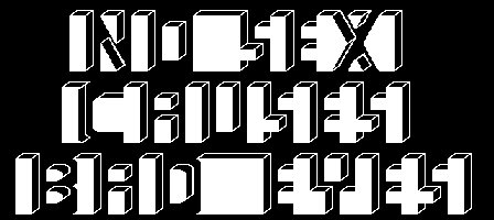
Good luck to all.

I ask all interested under the cat.
To begin, as always, you need to ask the right questions. Why do you need your own style? Who is the target audience of the card? How should style affect card functionality? After answering these questions, you can proceed directly to the design style. The following reflections are valid for the cartotilla of the base substrate of the world map (as the most time consuming) and do not claim to be the ultimate truth.
')
Our hierarchy is everything
So, first of all the map is the data that we want to show to the user. There is a lot of these data and there are various connections between them and not only spatial ones. So the first thing you need to build a semantic hierarchy of data: we divide all our data into layers and arrange according to logic.
Initially, we have a blank canvas, sometimes it is taken for the world ocean, because adding data about the oceans is not always advisable. Then there are continents, then land use data, then reservoirs, and so on. A good guide would be the description of the data layers in Mapbox Streets . Especially pay attention to the layers with signatures, their sequence often does not coincide with the sequence of the objects themselves. Just think in advance how your layers can intersect: tunnels, bridges, racks, etc. For the road network, a good guideline is the organization of the levels in osm-bright . Pay attention to the railway network, trams and other types of transport, whether they should be separated into separate layers and how to deal with intersections in this case.
Once the data is built into a coherent hierarchy - you can proceed directly to building a visual hierarchy. Our visual hierarchy will be fully based on the meaning. We have a lot of data and, ideally, we need to strive to ensure that the user receives only the information that he needs to solve the current problem. And do it in a convenient form. Therefore, for each data layer, you must first determine the range of visibility in the zoom levels, otherwise we will have a spaghetti monster, not a map. However, sometimes a layer must be divided into several layers, or an additional attribute may be created that contains a subcategory of layer data. Thus, we will be able to progressively increase the density of data on the map while increasing the zoom.
Example
There is a data layer with all buildings of the city, if you start to show it on medium zoom, then the amount of processed data increases, and most buildings will be too small, that is, they will be more like information noise than useful information. On the other hand, data on shopping centers, warehouses and other very large buildings, which will be good reference points in medium zoom, are stored in the same layer. Therefore, it is possible to break down buildings into categories by space and show them in parts, depending on the zoom. The main thing is to make sure that this does not mislead your users.
Visual presentation
The hierarchy is ready (at least the first version of it), the data are divided into layers, and, finally, you can proceed to the choice of colors, fonts and everything else that most people think of as design. Here we have at our disposal two basic tools, color and patterns. With the use of patterns, you need to be moderate in order not to overload the card with visual noise. Yes, do not forget in what format the tiles of your style will end up, and take into account the related limitations (number of colors, transparency) at the very beginning of development.
Colour
The topic of human perception of color is very extensive and ambiguous, I advise you to study it yourself, there are enough materials on this topic in the network. I will continue to rely on a number of established opinions. First, you need to use the “right” color model, I usually use HSB / HSL. Secondly, from the point of view of visual weight, brightness is our main instrument, then tone and saturation come.
UPD:
The comments rightly noted that HSL does not take into account the peculiarities of color perception by people. Consequently, this model is not “good”, unlike Lab , HCL , cubehelix and others. But we do not need to build gradients, but we can take into account the visually perceived brightness (luminance) separately. Actually, I did, so it's a matter of the convenience of the tool used. I once revised a lot of different color pickers and chose the option from WorkWithColor . The main thing is to understand what you are doing and what the consequences are.
In accordance with the above, objects of different levels of hierarchy on the map should be at least different brightness. This means that when casting our map to shades of gray, we should easily distinguish, for example, the main road from the secondary. Here are some examples.

As you can see on Yandex maps, things are better than in the default OSM style.
But when superimposing information about traffic jams, Yandex breaks the hierarchy, people with color perception have long complained, but alas ...

In fact, the brightness is not a panacea, and the whole thing in contrast, and how you will achieve it, your business, the main thing is that it works.
Text editors have light and dark themes, such a division is also applicable to maps (normal and night display mode). So, for a light theme, dominated by light colors, more important objects are better marked with darker colors to increase visual weight. In the case of a dark theme, everything is usually exactly the opposite.

At the same time, one should always look at the context and take into account the known features of human vision.

Color variety
We have a lot of different types of objects on the map and colors, respectively. How to decide what color to choose for a particular type of object? Here I can give the following advice. Try to break the types of objects into groups and use similar colors within the group.
Example
Fields, forests, parks, reserves can be easily attributed to one group and assign them similar colors of green shades.
Try to use natural (logical) colors, do not make ponds pink. Use established associations.
Principles of gestalt
So, you tried to take into account all the features of working with color, but there are so many objects that the head is spinning, the rules start to conflict with each other. Panic. Here the principles of gestalt come to our aid, having mastered them, it is possible to more precisely designate the visual weight of objects and place the necessary accents.

I advise you to read all the articles of Steven Bradley from the cycle of Design principles, and especially these: Design Principles: Connecting And Separating Elements: Contrast And Similarity , Design Principles: Visual Weight And Direction .
Armed with new knowledge, start experimenting, try different options, and see what works best.
Signatures
As it is not surprising, it is important that they are contrasting, so the font color usually depends on the color of the object being signed. And still use halos for greater contrast. About the fonts themselves I will not say anything, then
Capital letters sign large areal objects. Yeah, like the top level headers, and yes, the letter spacing can also be increased. Sometimes the streets are signed in capital letters, this is done to emphasize the shape and boundaries of the street, but in my opinion it is better to use a small capital for these purposes. The priorities for placing the signature of a point object are as follows: right above, below right, above left, below left. For countries where they read from right to left, priorities will change accordingly. Make the difference between signature levels noticeable, a couple of pins difference should suffice.
Yeah, you know what. Do not forget about the hierarchy, put a signature in accordance with the priorities. This also applies to pin and outline. Do not be afraid if there is no room for some signatures, and do not try to squeeze them at all costs.
Icons
Icons are added to one of the last layers, along with captions. At this point, the density of information on the map is already quite large. But icons have an advantage - we can set their shape. There are several options for icons: only the image of the icon and the image of the icon on the nameplate (in the frame of a form). So, different groups of objects on the map can be associated with icons of different types. Recall how certain categories of road signs are defined by shape and color. Here you can do the same. If the task is not to create a unique set of icons from scratch, then you can use one of the ready ones, for example, the maki set, by the way, there is a separate tool for modifying it: makizushi .
Optimization
After you are done with the visual side of the question, you can proceed to optimize the style. The essence of optimization is to reduce the amount of requested data needed to draw metatails. Therefore, the first step is to remove all the data that for some reason have not been useful to us. We remove test data, unnecessary attributes, etc. Then we need to add additional restrictions on the coverage, zoom and density of labels on the cell of the conventional pixel grid. This will significantly reduce the rendering time for meta files. You can read about it in the manual for PostGIS from Mapbox: postgis manual .
OSM data
If you work with OSM data, and most likely it is so, then do not forget about two things. First, there are errors in the data, so consider this, do the appropriate checks. Secondly, you can easily modify the data: add your own attributes, change and add geometries, combine your own data with OSM data.
Instead of conclusion
That's all, I hope the article will be useful for novice cartographers-designers. Create your own styles and share the results with the world of
Much of the above is also true for cartograms and various thematic maps. After all, there, in fact, simply adds another information layer on top of the main substrate. Of course there are enough of its own nuances, but this is the topic of another article.
That's all. Learn the rules to know how to break them. As in this picture about the context =).

Good luck to all.
Source: https://habr.com/ru/post/267725/
All Articles