Messy about developing letters

Picture to attract attention belongs studio4
Hey. For a long time, many interesting things have accumulated on the development of letters, but I do not imagine it possible to systematize it into a full story. Instead, I’ll just talk about it as described in the topic header.
')
Haters letters believe that I am evil. This is not true. I make it so that all the guano that you do not like in your mailbox, at least looks like a human being. In addition to marketing campaigns, there are trigger, system, transactional. And even the simplest letters need layout. In the end, to limit the width of the letter and a little work on typewriting will never be superfluous. At the same time maintaining the adequacy of display letters on mobile phones.
Marketers believe that I overestimate the importance of the layout of letters. Moreover, I cannot read 50% of the letters I receive from my mobile. They look like stuffing. Another 25% of the rest of them are overlaid with bugs, or are not adapted at all. Marketers are fiddling with CTR, and they don’t care about the quality of the letter. Why is the magazine layout maker putting on a curved layout, and in letters you can mess up?
My framework collected 143 stars on a githaba. This is a good motivator to continue working on it. By the way, now it is not just a letter template. We screwed the gulp collector and inliner styles. This feature is not yet brought to mind, but will be soon. Thanks to csscoderRU for participating in the development of the framework.
“The point is that this letter should not just be bulletproof, it should withstand a direct nuclear strike”
Artem Kiselev. TimePad.
All airlines and ticketing sites have a vomiting list. However, OneTwoTrip makes a pleasant attempt to correct this moment.
Example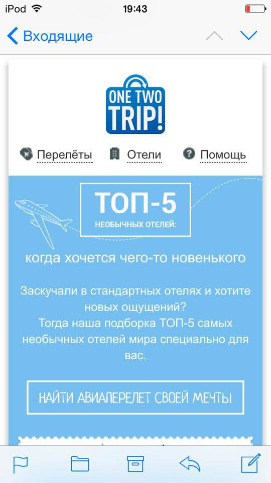
Among the classic fonts are not really really bold. But if subpixel antialliasing is applied to Helvetica, it turns out
very cool.
It is a pity that anti-aliasing will not work in all email clients.Delighted allows you to realize
cute questionnaires in letters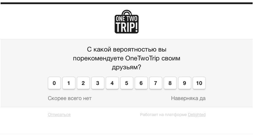
Here are just a mobile adaptation of these letters is lame.Be careful with template engines.
body { background:url('{{PictureServer}}/image.jpg'); } At Gog.com
overwhelming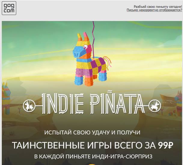
mailing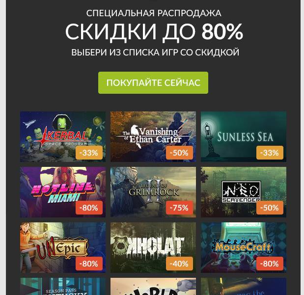
They took over the excellent sales practices from Steam. But as a killerphic Gog for each game specially draws a cool cover. Looking at them is a pleasure.Saw avatars for your mailing lists.
Instead of arguments
Emoji in letter themes are gaining popularity. While the units used it, it was cool. Soon it will be a disaster.
Test your letters on different platforms. For example, a letter from liters on the vinfone in general
not displayed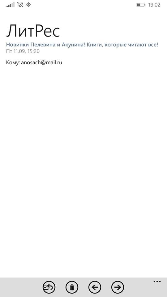
A vivid example of why you should not use justify
text formatting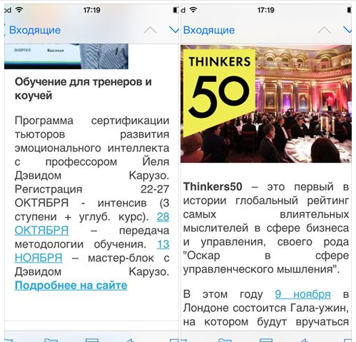
I do not like what is happening in the examples of this topic .
Even letters from Litmus can get into spam.
Socicon is a great generator of social icons.
Do not open rambler mail
on smartphone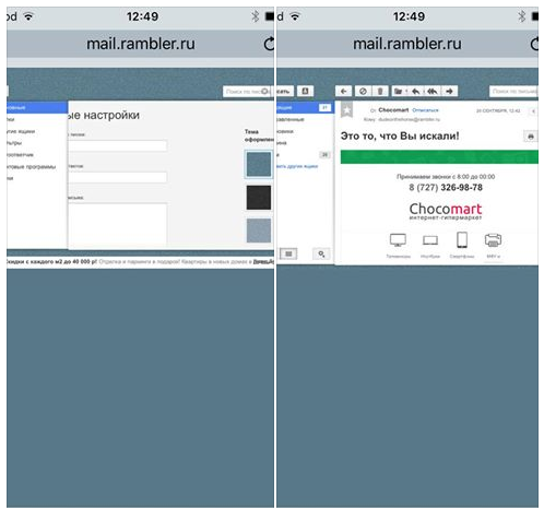
And by the way body {margin: 0; } works only for mobile android email clients. You should not use this property if your letters are aligned to the left and executed on a white canvas without the use of indents. Simply put, minimalistic. Otherwise, the text will stick to the left edge of the smartphone screen.
What do you know about fakes on Twitter? I only know that they are too lazy to start their own soaps. I am watching the following picture for fun. My Yandex box was hacked a couple of years ago, but the password was not changed. With an enviable regularity, a lot of fakes are sent to my box, for which I can even log in on Twitter. They are there something their spam and delete acc. Then again fake fake on my box. Fail is that they do not disable email notifications and I constantly receive suggestions for following Diego Rodriguez.
Memo to the designer letters:
- Ssy in the ears maker, how cool you are and make changes to the layout every day (bad advice)
- Use a 10px modular grid for all letter layouts
- Use the mail template to draw letters. I'm * censored * how can I continue your background picture when you cut it at the edges of a letter?
- Try to draw a letter layout, so that it can be composed without the use of graphics. Crap, right?
- Use only classic fonts: arial, helvetica, tahoma, verdana, times, courier. In the extreme case of roboto, calibri and myriad pro. Crap, right?
- Never make letters wider than 600px. Just do as I ask.
- Do not draw the mobile version of the letter. I still do not make it the way you thought.
- Never make the elements sticking out from the main canvas, if you value your life.
- You love to draw promotional codes. Draw them so that they can be composed without the use of graphics.
- I understand that you conceived these rounds at the button as a design decision, but believe me, if a person uses BAT or Outluk, then he doesn’t care about them, he is much more interested in child porn. Why am I doing this? We will lay out on CSS, no pictures. Forget about gradients too. But if you really want, then sometimes you can.
- Use smart objects in Photoshop. Better yet, make the cutting of all the pictures yourself and put it in the daddy next to the layout. Yes, so that with double resolution. We support retina.
Memo to the coder of letters for exorcism with Outluk:
- Background pictures only work for Body
- Draw backgrounds for cells through VML is akin to coprophilia. You can try, but people better not know about it
- Background-color for DIV does not work. Set it for table cell
- Do not use conditional comments in styles. Only in the DOM structure. Why? Because Autluk 2007+ wants it that way. Or gobble the horse in the bathroom with cucumbers.
- Do not believe Litmus when testing outline 2003.
- Do not set the line-height in EM'ah or percentage. Only pixels.
- Wish the designer a quick death
On the question of why letters are best made 600px wide;
It's just a magic and verified number over the years.
See:
- The display area of the letter on desktops and tablets is never less than 600px
- For example, in an apple mailbox, this area is clearly equal to 620px; just to fit a 600px letter and leave room for the substrate
- The number 600 is ideally divided by 2/3/4/5/6 = 300/200/150/120/100, which allows us to perfectly position the multi-column elements during layout.
- The size of the visible area of the letter on mobile phones is most often equal to 300px, which leads us to the simplest adaptation of typesetting by dividing by 2 in width. Collisions are fixed by media queries and max-width
No other number is perfect for letter size.
All ingenious is simple.
You will not believe it, but in terms of the quality of letter rendering, Outlook on iOS is the coolest mobile email client along with Spark (which is no less surprising). To them there is no single criticism. It seems that they are made on the same engine. To show the difference, go through the rest:
- Outlook (android) - wrong percent calculation for the width of multi-column elements. The error is about 0.2%. Trifle, but nasty.
- Yahoo! (iOS) - no CSS3 support (not enough border-radius)
- Google Inbox (iOS, android) - even more unpredictable behavior of the width property than in gmail. For the rest, the rendering principle is similar. No support for media queries.
- Gmail (iOS, android) - the width property for block elements and images is not supported in principle. In asymmetrical letters on the columns, stuffing begins. If you send a non-adaptive letter, then the client tries to adapt it using its own algorithms. On Android, it also turns into stuffing. On iOS, you can view the unadapted original. No support for media queries.
- Mail.ru (android, iOS) - generally approx. Reversal of text wrapping. When transforming a phone number into a link (and, in general, any transformation of text into a link), the link itself does not pick up the design color from css. No support for media queries.
- My.com mail - the engine is identical to the mail.ru application
- Yandex mail (web, android) - no support for media queries. Errors in calculating the width of multicolumn elements were noticed on the android client.
- Sparrow - was an ideal email client, except that its interface has not changed since the time of the 4th iPhone. Now sawed from eppstor.
- Apple Mail (iOS) - body has a reinforced concrete margin: 15px; He can not win.
- Mailbox (iOS, android) - is generally beautiful. But the basic body values are zero, as with all apple email clients except Outlka and Apple mail. Thus, still inferior to Autluk.
- Android Mail - No complaints, except for the rendering of those pictures, the original size of which exceeds the specified in the layout. A dozen phones on the android passed through my hands and everywhere, in all email clients on the android there are artifacts on such pictures.
That's all for now.
Source: https://habr.com/ru/post/267499/
All Articles