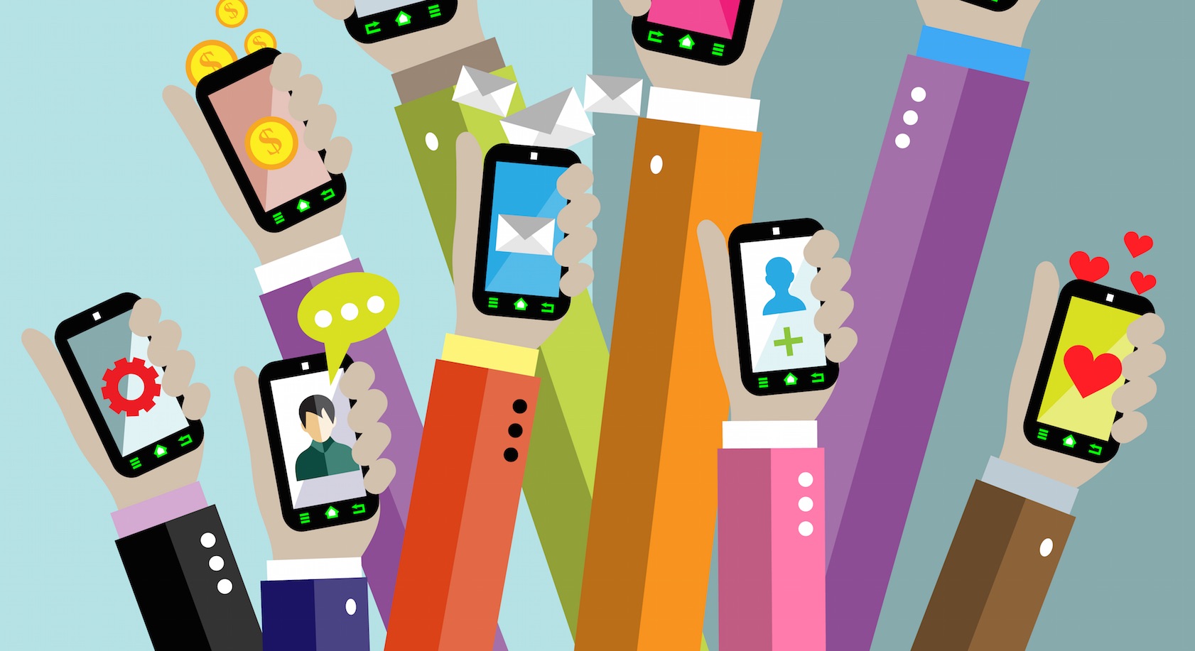
The evolution of design and usability of mobile applications known services. How to improve your application?
In July 2008, Apple announced the Apple App Store, a catalog of iOS applications. Google Play appeared a bit later. Initially, the catalogs had a minimum of programs, but after a while the number of applications increased to hundreds of thousands. Now in the App Store about a half million programs, and on Google Play, and even more - about a million six hundred thousand (1.6 million).
Over time, the design of applications changed, and these changes were (and are) quite significant. Naturally, they did not just happen - the developers wanted to attract more users, retain existing ones, improving usability and the appearance of the program. Let's take a look at how the applications of known services have changed over time and what can be the result of such changes.
The social network Facebook has almost the fastest created a separate application for its users. The original version was the usual tracing paper of the site. The buttons were inconvenient, the navigation bar and worse. Everywhere - gradient and shadow.
')
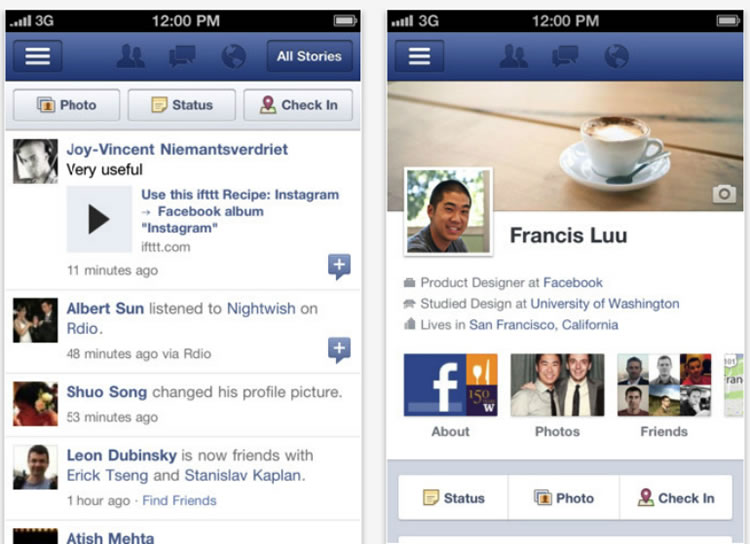
Company application in 2012
A significant evolutionary step was the use of a flat design . Simplified icons and simple colors looked much better on small displays, plus the entire load time for elements and the entire application decreased. To improve usability, the company's developers began to use drop-down menus.
The result of such changes was the emergence of a much more rational, convenient and minimalistic application. Working with him was not an example easier, especially with regard to navigation. Of course, even now App for Facebook cannot be called ideal, but the application is already close to the golden mean.
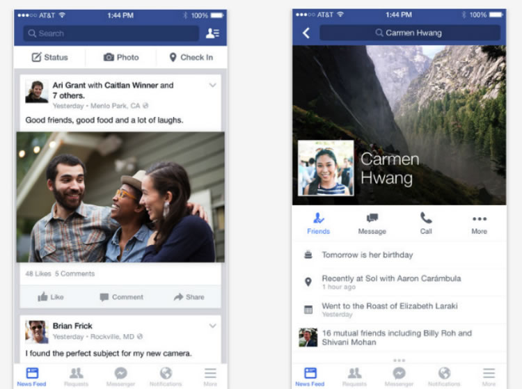
Facebook application in 2015
Since the release of the first version of the application, Facebook has changed a lot of things, and now the social network is experimenting with Material Design for its Android program. During the year, changes will be presented to the general public.
Launched in July 2010, the app was created exclusively for the iPad. An interesting point: the developers have created a significant part of the application even before the design of the iPad was presented and the features of iOS work became known.
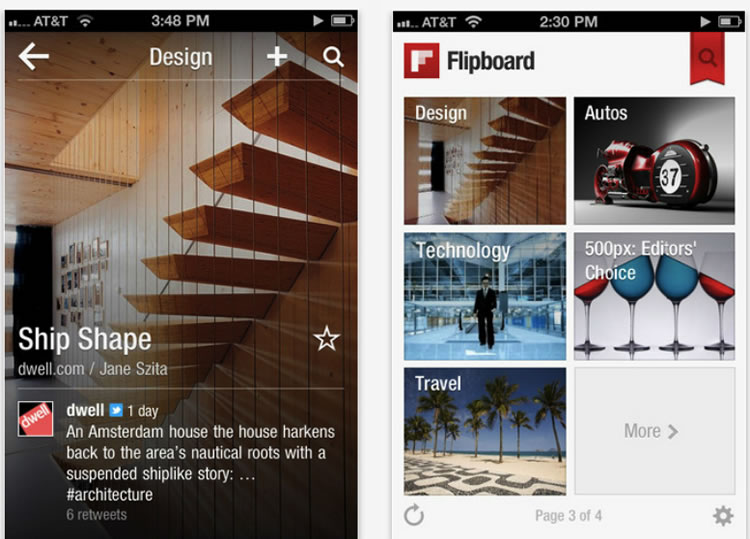
Flipboard in 2012
Initially, the application had a minimal interface. The fonts were fairly simple, and the user's attention was focused on the images. But, despite all this minimalism, the application had problems. For example, the images were drawn not too well, plus the download time left much to be desired.
Over time, the developers have improved a lot. For example, the background was changed - it was made lighter. The text has become more prominent and easier to read. The developers also optimized the free space and increased the recommended size of the images. The modified program looks much better on modern smartphones than the first versions of the application.
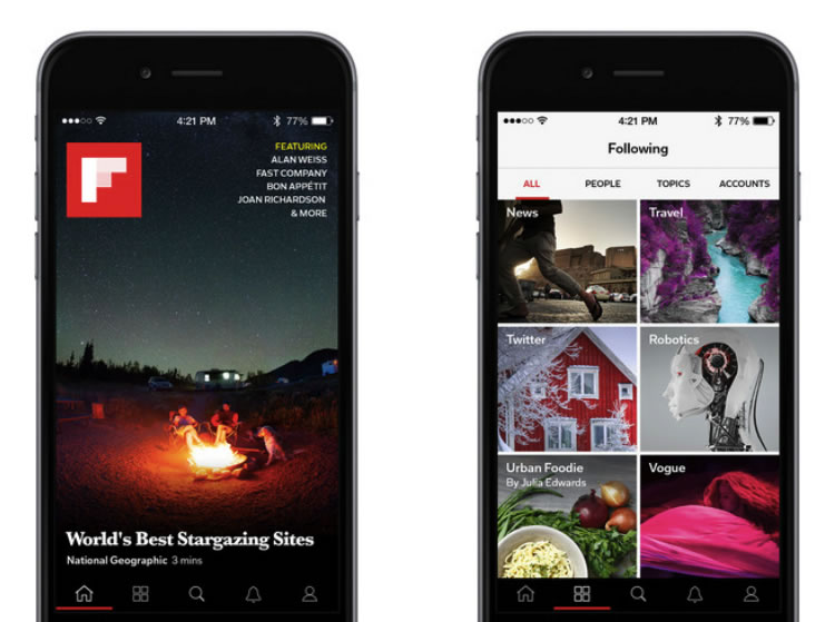
Flipboard in 2015
By the way, the website of the service was launched only three years after the release of the application.
The service released its first iOS app in May 2011. The initial version contained three columns of content. The interface was quite attractive, but the functionality was limited. Nevertheless, it was not difficult for the user who first installed the program to figure out what was happening, what and how it worked here.
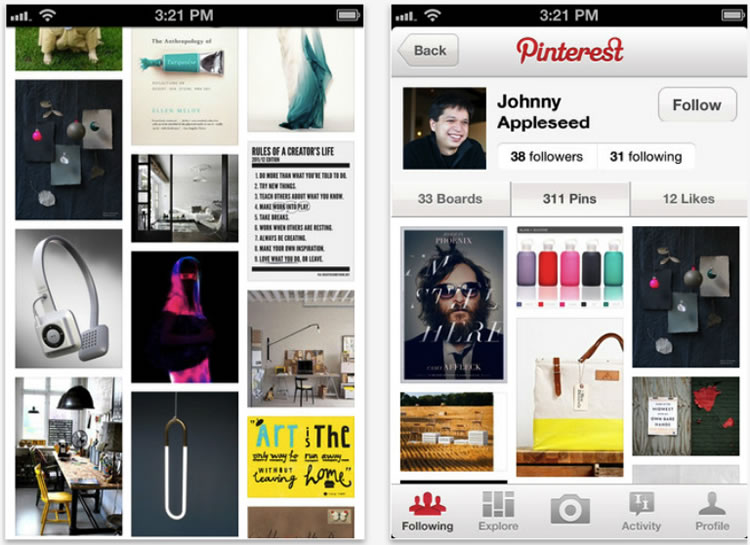
Pinterest app in 2012
A year later, the company decided to change its program. It was optimized for the iPad, new features and capabilities, like a two-column interface. Plus, a strip of text was added along with a profile photo.
Despite the fact that everything seemed to be looking good, many users left negative reviews. The level of criticism just went off scale, so other developers began to change their programs little by little, tracking user reactions, rather than implementing all critical changes right away.
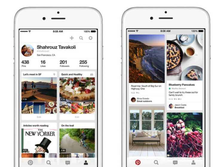
Pinterest app in 2015
Since 2012, there have been few changes; from innovations, it is possible to note round pictures for profiles and several other purely cosmetic edits.
Tinder
Another application that was launched in 2012 and quickly became popular. By 2014, Tinder already had 50 million active users per month. In fact, the application was very attractive, and about 80% of users opened the program at least once a week, and 65% did it every day.
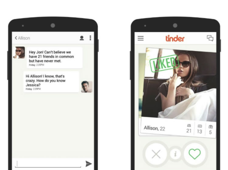
Tinder application in 2012
The first version was very simple, with limited functionality - exactly Pinterest. To make the program intuitive for the user, the developers brought elements of other applications to its various components. For example, the chat here is very similar to iMessenger.
Of course, it was not without problems, but Tinder did not lose its popularity over time, receiving an increasingly extensive user base.
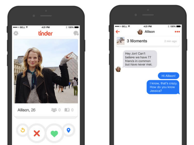
Tinder app in 2015
The program interface has not changed. Even the addition of new features was not critical for updating the interface.
Conclusion
Looking at the change of some applications, it is surprising how strange and illogical they were. However, to avoid mistakes when developing your application and its interface is not an easy task.
Therefore, before you change anything, you need to test several times the operability of the modified program and make sure that the changes really go to good. Here it is necessary to take into account trends in the development of applications that have become relevant recently:
- modular design and flashcards (Google Now and Pinterest);
- flat interface (or in any case something close to Flat UI);
- the use of svaypov as a means of reducing the number of actions required from the user;
- Finger interface;
- minimalism;
- simple palette, clear and light fonts, clear icons;
- multi-layered interface;
- the blur effect of inactive elements to let the user know which elements are currently active;
- content update lower svaypom;
- hidden menus and other rarely used items, access to which the user gets swipe.
Also important is:
Platform Nothing frustrates the user of the application as binding the latter to a specific model / phone model. The more universal and cross-platform the program, the better.
Simple navigation . Another problem is too complicated, difficult navigation. This does not like the user. Especially true for commercial applications where it is proposed to buy something. If the purchase process is too complicated, then not all will reach the end. Many will throw halfway, deciding that it is not worth it.
Relevant content . There is nothing to say here - the user of the application should receive content that is interesting to him. This is the key to success. Content should interest the client and persuade him to purchase a product or order a service if the application is commercial.
Auto input . A user who regularly uses an application often wants to see their data already entered when they reuse the program. Yes, this may be a security issue, but here you need to find a middle ground. A program that requires input of a heap of data each time to use it can be deleted by the user if it finds a more flexible alternative.
Monetization . Do not forget to provide advertising space so that it does not annoy the user, but could bring the necessary income. You can look at the standard formats on the Appodeal website, as well as consider the possibility of using native advertising.
Source: https://habr.com/ru/post/267365/
All Articles