Histogram and box with a mustache on the fingers
In this post I want to describe two types of graphs for one-dimensional data, namely
Consider an arbitrary sample of real numbers.) , we denote ordinal statistics
, we denote ordinal statistics ![x _ {[k]}](http://tex.s2cms.ru/svg/x_%7B%5Bk%5D%7D) such that
such that ![x _ {[1]} \ leq \ ldots \ leq x _ {[k]} \ leq \ ldots \ leq x _ {[N]}](http://tex.s2cms.ru/svg/x_%7B%5B1%5D%7D%5Cleq%5Cldots%5Cleq%20x_%7B%5Bk%5D%7D%5Cleq%5Cldots%5Cleq%20x_%7B%5BN%5D%7D) .
.
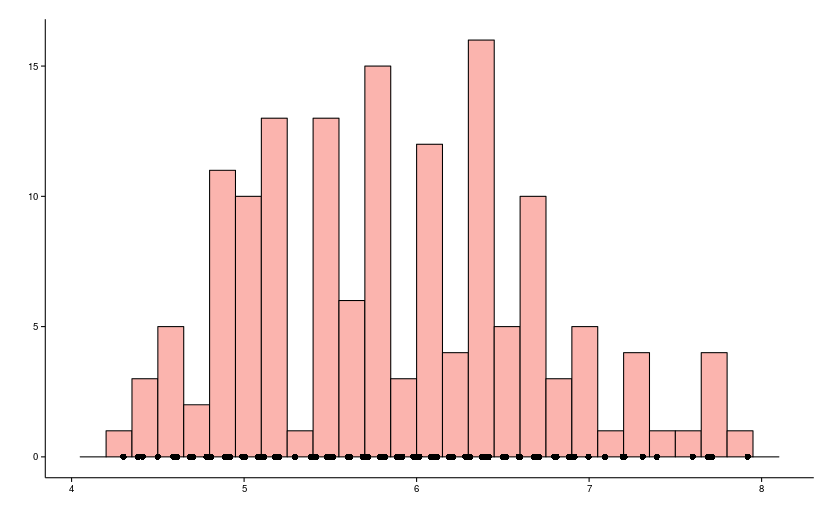
Most likely to change this type of schedule from the school or university program, which looks approximately like in the picture.
')
First of all, it must be remembered that the values of the input sample are located along the x axis, and along the y axis there is the number of times that this value is encountered (let's call them samples). The histogram allows you to harden and make the data set more compact, while not diminishing its specificity.
Important characteristics of the histogram are the following:
In most cases, the histogram is defined on the segment![I = [min (X) - \ varepsilon_1; max (x) + \ varepsilon_2]](http://tex.s2cms.ru/svg/I%3D%5Bmin(X)-%5Cvarepsilon_1%3B%20max(X)%2B%5Cvarepsilon_2%5D) where
where  - initial sample,
  auxiliary constants, rounding to the nearest “readable” numbers, which in each case depend on the scale and, as a rule, dozens of dividers in the scale of the initial data. If suddenly it became interesting how to set the cutoffs in the data, then you can see the link: R (pretty)
Also, histograms usually divide segment I into subsegments of equal length and, here, the choice of the number of segments is an art, although several formulas can be given:
Where - the number of columns
  - the size of the original sample,
  - assessment of standard deviation,
 ![IQR = X _ {[3 / 4N]} - X _ {[1/4 N]}](http://tex.s2cms.ru/svg/IQR%3DX_%7B%5B3%2F4N%5D%7D-X_%7B%5B1%2F4%20N%5D%7D) - interquartile distance, which is still below.
- interquartile distance, which is still below.
You can also note a few rules of common sense:
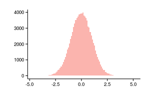
Otherwise, if the number of columns is excessive and the initial data is small, the histogram will resemble a bar code, as for example in the figure below.

Histograms are in absolute values when the number of elements of the original sample in each of the intervals is plotted along the y axis, and relative when the sum of the columns is normalized to one, in this case the histogram is an estimate of the density of the distribution and only the scale changes from the point of view of the graph.
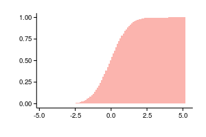
Since a regular histogram is a density estimate, we can summarize the columns and get an estimate of the probability function as follows: . The following two graphs are plotted using the same data, the left is not a normalized histogram, on the right is the accumulated values of the normalized histogram.
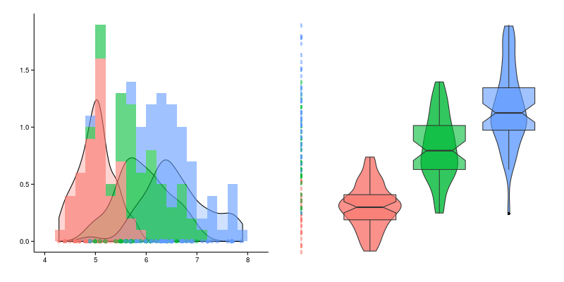
So far, we have considered the case when we have a characteristic that we just want to look at, it is usually much more interesting to compare the behavior of the same characteristic for different subgroups. In this case, the histogram will be as follows.
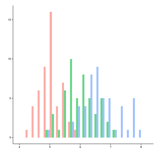
In this case, the width of each column for each group decreases in proportion to the number of groups and slightly shifts relative to each other, as an alternative, you can consider a translucent overlap, which will look like this for the same data.

To draw a histogram you need to define
To draw a histogram for each group, the following values must be stored:
The “mustache box” does not have an officially established name, but to call it a “mustache box” my language does not turn, especially when there are several boxes, and the span diagram is not a very frequent, but more harmonious name. Let us give an example of the three boxes on the left; the corresponding values of the initial data are displayed (they are not part of the swing diagram). First of all, it should be noted that in the case of span diagrams, the initial characteristic is plotted along the Y axis, and the X axis is arbitrary and is a grouping variable.

To draw a box for one group about the source data you need to know all three characteristics:
Sometimes the following additional ones are added to the “mandatory” set:
Thus, the box with a mustache in the section will look like this.
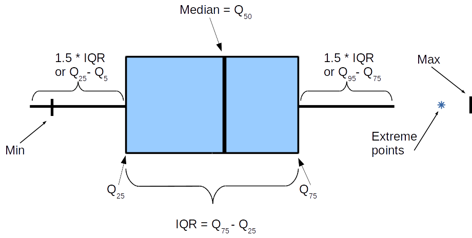
Some points require clarification. The box, that is, the object between and
and  , almost everywhere is limited by these values, but the “whiskers” can differ and if you are really interested in numbers, you need to clarify what is meant in each individual case. The most important is the length of the whiskers: we presume that it
 ) .
.
The minimum and maximum marks are often omitted, extreme points, that is, those outside the whiskers, are also omitted or drawn with dots or asterisks. Depending on the data structure, the desire to draw extreme values can significantly increase the amount of data for drawing a span chart.
Magic number appeared in the work of Tukey Exploratory Data Analysis (1977) and the reason for its appearance is not very clear, but since that time nothing has changed, many tools offer it as the default value, but allow you to set arbitrary, down to zero, in this case, “ whiskers ”will cover the entire segment from the minimum to maximum values of the original data.
There is an assumption that arose as follows. Mustache width is  , it is known that
  for symmetric distributions, it coincides with the absolute deviation from the median (MAD), which in turn is an estimate of the variance with a coefficient
  . Which means
  , we get not unknown 3 sigmas to the left, 3 sigmas to the right.
Sometimes a spacing is suggested as a mustache end.![[Q_ {5}, Q_ {95}]](http://tex.s2cms.ru/svg/%5BQ_%7B5%7D%2C%20Q_%7B95%7D%5D) In this case, it is obvious that always (if the source data is greater than 20) points should be obtained that do not fall inside the interval and therefore they are usually ignored with this approach.
In this case, it is obvious that always (if the source data is greater than 20) points should be obtained that do not fall inside the interval and therefore they are usually ignored with this approach.
To draw a “span chart” you need to define:
To draw a “box with mustache” for one group, only 3 numbers are required.
- bar chart
- mustache box
Consider an arbitrary sample of real numbers.
bar chart
Most likely to change this type of schedule from the school or university program, which looks approximately like in the picture.
')
First of all, it must be remembered that the values of the input sample are located along the x axis, and along the y axis there is the number of times that this value is encountered (let's call them samples). The histogram allows you to harden and make the data set more compact, while not diminishing its specificity.
Important characteristics of the histogram are the following:
- number of columns (called bins or bars)
- absolute or density y-axis readings
- how data is grouped
Columns
In most cases, the histogram is defined on the segment
Also, histograms usually divide segment I into subsegments of equal length and, here, the choice of the number of segments is an art, although several formulas can be given:
- Sturges Rule (Not a Photographer).
- Scott's rule.
- Friedman-Dyakonis Rule.
Where
You can also note a few rules of common sense:
- it’s good that most columns have more than one source value
- each column of the histogram requires at least one pixel in width, and in general the restriction of “no more than 200” columns is quite common
Otherwise, if the number of columns is excessive and the initial data is small, the histogram will resemble a bar code, as for example in the figure below.
Y axis
Histograms are in absolute values when the number of elements of the original sample in each of the intervals is plotted along the y axis, and relative when the sum of the columns is normalized to one, in this case the histogram is an estimate of the density of the distribution and only the scale changes from the point of view of the graph.
Since a regular histogram is a density estimate, we can summarize the columns and get an estimate of the probability function as follows:
Grouping data
So far, we have considered the case when we have a characteristic that we just want to look at, it is usually much more interesting to compare the behavior of the same characteristic for different subgroups. In this case, the histogram will be as follows.
In this case, the width of each column for each group decreases in proportion to the number of groups and slightly shifts relative to each other, as an alternative, you can consider a translucent overlap, which will look like this for the same data.
In the dry residue
To draw a histogram you need to define
- Number of columns
- Do I need to normalize and accumulate data
- The way to display different groups
To draw a histogram for each group, the following values must be stored:
column bound value where the very first value
-coordinate of the left border of the leftmost column, and the last -
Span Chart
The “mustache box” does not have an officially established name, but to call it a “mustache box” my language does not turn, especially when there are several boxes, and the span diagram is not a very frequent, but more harmonious name. Let us give an example of the three boxes on the left; the corresponding values of the initial data are displayed (they are not part of the swing diagram). First of all, it should be noted that in the case of span diagrams, the initial characteristic is plotted along the Y axis, and the X axis is arbitrary and is a grouping variable.
To draw a box for one group about the source data you need to know all three characteristics:
- First quartile
- Median
- Third quartile
Sometimes the following additional ones are added to the “mandatory” set:
- Minimum
- Maximum
- 5% percentile
- Ninety five percent percentile
- Set of extremes
,
Thus, the box with a mustache in the section will look like this.
Some points require clarification. The box, that is, the object between
The minimum and maximum marks are often omitted, extreme points, that is, those outside the whiskers, are also omitted or drawn with dots or asterisks. Depending on the data structure, the desire to draw extreme values can significantly increase the amount of data for drawing a span chart.
Magic number
There is an assumption that
Sometimes a spacing is suggested as a mustache end.
In the dry residue
To draw a “span chart” you need to define:
- data grouping method
- whisker length
- whether to mark extreme values
To draw a “box with mustache” for one group, only 3 numbers are required.
Source: https://habr.com/ru/post/267123/
All Articles