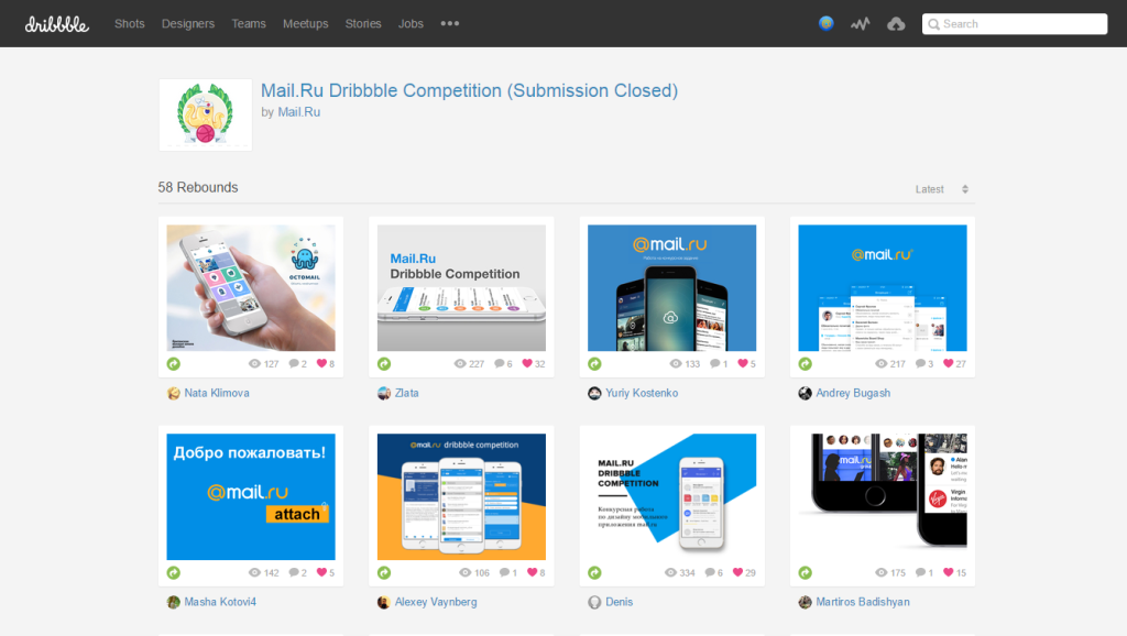
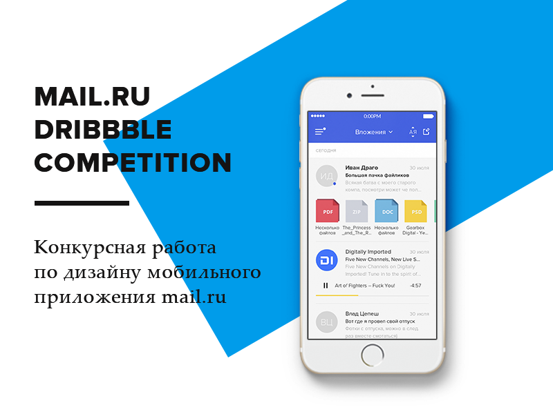
The results of the contest for the design of Mail.Ru mailing app on Dribbble
In mid-August, we completed the submission of works for the Mail.Ru Mailing application for Dribbble for the concept contest . Although at the start the dynamics were rather sluggish, at the end the flow exceeded all our expectations - 54 designers ! We got a lot of fresh insights on how to develop the functions of working with attachments in the product. And yet - a good experience in conducting competitions.

We announced the contest on May 23 at the Moscow Dribbble Meetup 2015 , which we have been holding for the fourth year already. The task was as follows:
')
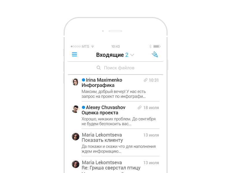
The letters receive a lot of useful information - photos and documents, information about events, contact information, information about booking tickets and hotels, checks about purchases in online stores. In the standard form of the list of letters it is not very convenient to find them, and the search here rarely helps.
Imagine that there is an application in which all mail attachments from your mail are conveniently represented. In it you can look at information by type, title, linking to time and place, specific correspondence, life stories, projects, and maybe other contexts. Design and draw the main screens of this application for Android or iOS, to choose from. It’s not necessary to rely on the current Mail.Ru design - fresh visual solutions will get more points.

For us, this is a great opportunity to look at the services of the company through the eyes of people from outside. We have a fairly strong team, which is immersed in all the nuances of the products. But this has a downside - the pressure of technological and business constraints. We use a lot of internal techniques and practices to get around them. Contests - one of them. So, Odnoklassniki have been conducting the Russian Design Cup since 2012, where participants solve problems close to reality. And we have been interacting with the British for a long time, where, as part of the intensives and core courses, students also work on real Mail.Ru Group products.

We do not expect that we will get a ready-made breakthrough solution on a saucer for relatively little money - this is impossible without deep immersion in the product. Therefore, for us, competitive works are a kind of “bridge” that allows you to look at parts of a product from a different angle and, by adding up individual solutions from there with your own workings, you can get a good solution for a particular functionality. In fact - Brainstorm with the design community.
Before the start of the competition, we had an idea of what a good decision could be. And after a close communication with students of the summer intensity of the British on the UX / UI, it became even clearer. As a product, Mail.Ru Mail will benefit from the fact that users will be able to get more benefit from working with an archive of attachments that come with letters. This can be achieved in three ways:
Therefore, we evaluated all solutions primarily by how well the authors worked on these components. Naturally, the quality of visual design and reasonableness of the interface logic were taken into account. Separate ideas, effective presentation and thoughtfulness of the concept description were also taken into account.


The work was evaluated by designers and managers of Mobile Mail - Slava Yashkov (iOS designer), Kostya Zubanov (Android designer), Ivan Myzdrikov (product manager), Boris Nikiforov (head of mobile direction), as well as Alexey Sergeev (deputy vice president) and I (the head of the portal design team). We could evaluate ideas from three sides - the quality of design and interface, business value and technological feasibility.
But in order to get an outside view, and here, having made the assessments more objective, we asked Artem Triple to join the jury. He is the best suited for this role - a young but very promising designer who has become widely known for his redesign concept for the New York Times .

We received work from 54 designers. Someone downloaded several versions of his decision, but we took the latter into account in the assessment. In general, there was something to see. True, almost no one got into our idea of the ideal interface for this task (see 3 methods above), so we began to sort out the concepts into separate interesting ideas.
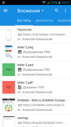
One of the key screens of the application is the list of attachments in different variations. The type of tile, of course, is the most colorful - there is a place to roam, there is enough space for a spectacular presentation of information about the file. The best design looks like Sergey Mekryukov - an irregular grid, in which an attachment can have three types (large, medium, small) - like tiles in Windows 8. Addressees are displayed next to the files.
The first idea to display the addressee on the file tile was suggested by Kirill Kovalsky - this is a small badge in the form of an avatar, something like Facebook messenger. Later she met in many papers. Simple, but very nice tiles came from Andrei Novozhilov , more colorful - from Arsen Kolyba . Several designers at once drew a letter in the form of a tile with an attachment - Ilyas Aliyev (beautiful!), Ksenia Butyrina and Zhenya & Artem .
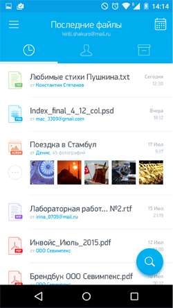
The vertical list of attachments turned out well in Artem Magomaev . A lot of useful information is derived from Alexey Kamensky , Alex RSR and Denis Matveyev . But the most pleasant, probably, in the work of Shakuro .
The combined version of the list can be noted in Ivan Ledkov - grouping by type and date; and Andrei Novozhilova - tricky grouping by contact, date and file type.
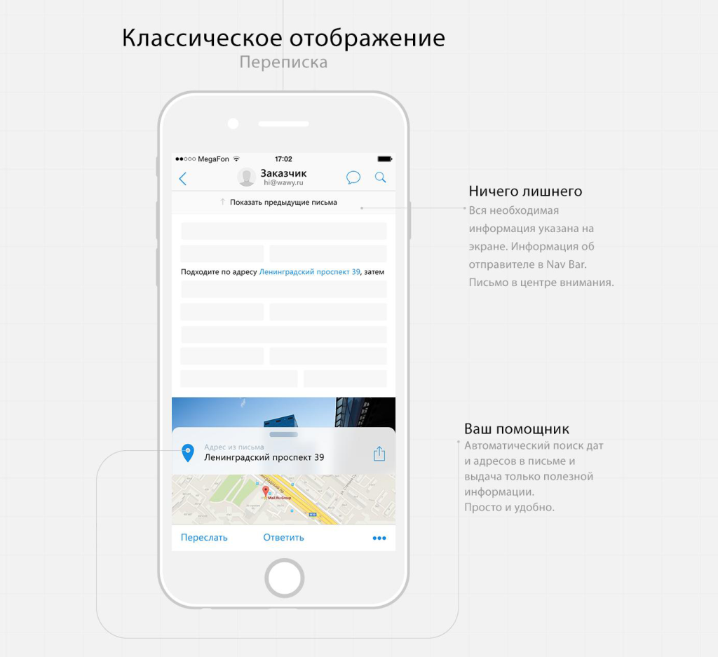
According to the presentation of the attachments inside the letter, the works of Denis Mihutin and Zhenya & Artem look good.
He was shown many works, but in a completely basic form - Kirill Kovalsky , Andrey Novozhilov , Ivan Ledkov , Nazar Moravsky , Denis Matveyev , RedLab , Ivan Mosievsky , Mikhail Voropaev , Alex RSR , Arsen Kolyba , Maria Gordeychik , Alexander Starodubtsev , Darina Turkovsky , Alexander Pesenko , Ksenia Butyrina , Alexander Hive , Zhenya & Artyom , Alexey Kamensky , Alexey Weinberg , Andrey Bugash . Interesting was the property panel in the Shakuro concept and navigation through the investments of Roman Gordienko .
To handle all types of events - meetings, flights, movie tickets, etc., a number of participants suggested something like a calendar in the form of a chronological tape. Someone, like Martiros Badishyan , showed a variant similar to the first version of the Facebook timeline. Someone, like Artem Triple , brought up QR codes for tickets for faster access - if you refine the idea, you’ll have something like a passbook from iOS.
The third way to implement the task is the most interesting. In addition to recreating a simple file browser, you can analyze their source and content, the context of correspondence and the relatedness of recipients. The simplest thing is to combine armor tickets, hotels and cars on a journey, as suggested by Inbox shortly after the announcement of the competition. More difficult - the correspondence on the project. For example, the worker, when the service itself brings together contracts, layouts, documentation, etc. Or personal - a trip to a concert, a birthday. In this case, we go from the opposite - not the user is looking for files, but the service offers him a selection of suitable content on potentially interesting topics.
Travel processing was offered by Artem Triple , Eduard Baksheyev and a group of British students of summer intensives on UX / UI . And some of them provided for the possibility of manual twisting - you can manually attach the letters to the journey, if the system did not handle the situation.
And the students also suggested traveling actions - to share, make them available offline.

The idea of presenting mail in the form of a chat has been flying in the air for a long time, applications are launched regularly - for example, Hop or domestic Mailburn. The interest is clear - messengers gather an unthinkable audience, intersect in many usage scenarios with the mail, and are generally perceived more easily and casually. Danial Siddiqi , Yegor Kuznetsov , students of the British and Lunart went among the participants in this direction. Although this direction has a number of problems: not all of the letters manage to cut quotes, formatting is lost, and how to present the incoming list correctly? Therefore, large services and not particularly strive in this direction.

Farid Rafikov used the chat interface in a different format - he offered rather a helper, which allows you to find useful information among attachments. The function is called "secretary" and suggests how to build a search query in natural language - it turned out quite interesting. Farid told about the principles of work in the article on Medium .
Almost all the participants thought about how the navigation through the attachment archive will work. The possibilities of searching, filtering, sorting, and different list views are a necessary part of the task. We consider them as a complex function, so let's go through the individual ideas:
A very interesting idea is shown in the concept of Daniel Bakalin - contextual search using a floating button that can be dragged to any element on the screen and get results on it. In the shown form, the function is not particularly obvious, but the idea itself is excellent, it can be refined and turned into an excellent working tool. It is a pity that the author did not work on the visual component.
Ilya Sidorenko suggests grouping search results.
The many states of Nikita Filippov are well described. And also - Alexei Kamensky , Ivan Ledkov . In general, Nikita's work perfectly showed the organic integration of the new functionality into the existing Mail application (he is one of those who prepared the accompanying article ), in this she is one of the best.

Artem Magomaev transferred the search form to the sidebar - there is enough space to show many possibilities.
Compact filter on the results in the form of tabs offered Shakuro .
One of the best implementations of the search screen is Bauyrzhan Orynbassar . Compact, with the ability to search for different cuts.
Evgeny Ryabtsev has a full screen, although using mobile sliders is a bad idea. They are found in many other concepts, but it is extremely difficult to set a more or less accurate value for them. Kirill Kovalsky , Alex RSR , Alexey Weinberg , Timur Minvaleev showed a couple of expanded forms. By the way, Timur also has a voice search.
Nazar Moravsky suggests using tags in the search box. They are used in the query history. Ksenia Butyrina has managed to put this and other ideas from those described above into a pretty holistic solution. An even more unusual approach with tags was sent by Maxim Mezentsev .
Prince Yakublu presented the incoming in a similar to the Inbox form, but showed the number of letters in different categories during the day - they also work as filters.
The query history is also shown in the concept of Yuri Kostenko .
Filtering by category is the majority of participants. Vasily Potetyurin went further and made the set and order of categories customizable. Radmir Arslanov made a filter in the popup. Roman Gordienko has a clear screen with large buttons. Ilyas Aliyev shows them in the sidebar with the transformation list. Alexander Starodubtsev showed the possibility of creating their own filters.
Somewhat heavy, but unusual approach with toggle switches showed Zlata Smolyaninova .
Well, the sorting was thought by Denis Matveyev , Alexander Starodubtsev , Alexey Kamensky and Timur Minvaleev .
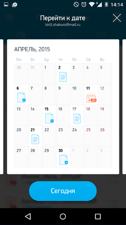 A very cool idea was suggested by Shakuro - navigating through the archive on the monthly calendar, which shows the attachments for the day. And in the form of a stack, if there are several. In a simpler form, this is shown by Maria Gordeychik , Vasily Poteturin and Artem Magomayev . The most unusual are Illyas Aliyev (a stack of files by date) and Nazar Moravsky (a zummed interface). Nazar generally dig deep into different informational sections — there are plenty of good ideas on the subject.
Another approach is to view attachments by contact. Many people thought in this direction - Artem Magomayev , Alex RSR , Timur Minvaleev , Arsen Kolyba , Alexander Pesenko , Shakuro . Denis Matveyev for this task uses a floating button at the bottom of the screen - it gives a quick exit to all attachments on the contact. Sergey Mekryukov binds directly to the group of recipients and location. Ksenia Butyrina shows also letters.
By file type filter Artem Magomaev , Arsen Kolyba , Denis Matveyev . Moreover, Alexander Hive offers among the possible types of filtering offers contact information, and Alexander Starodubtsev - the file extension.

Several designers offered a switch to the type of incoming - the usual list of letters and detailed, with attachments - Artem Magomaev , Alex RSR , Mikhail Voropaev . And for Ksenia Butyrina this mode shows actions - add to calendar, call, open on map, etc.

There are a couple of lessons on the actions with a letter from Alexander Pesenko and Andrey Bugash .
 In terms of mass operations, Mikhail Voropayev's idea was pleasant - you can select attachments directly from the inbox.
Alexander Starodubtsev and Alexey Kamensky showed quick actions with an attachment (he also has interesting thoughts on operations within the letter). We did not fully understand the principle of the svayp's work on the element in Darina Turkovskaya , but it looks interesting. Bauyrzhan Orynbassar showed a calendar event with a quick response, and British students - moving to a category.
Daniyal Siddiqi offers to shake the phone on the incoming screen to mark all the letters read.
Denis Mihutin and Yuri Kostenko thought about how to improve the work with music and video in attachments. Denis suggested putting the player right in the inbox, and Yuri - separate sections for them. And in the second case there is also a separate player.
Accounting for the location skips in different works - for example, Anna Manjuna and Sergey Mekryukov . Alex RSR went further and showed the attachments on the map, and Maria Kotovich drew a section with a map of the places. But the most interesting thing turned out to be Danial Siddiqi - if there is an address in the letter, you can see the map in a separate card.
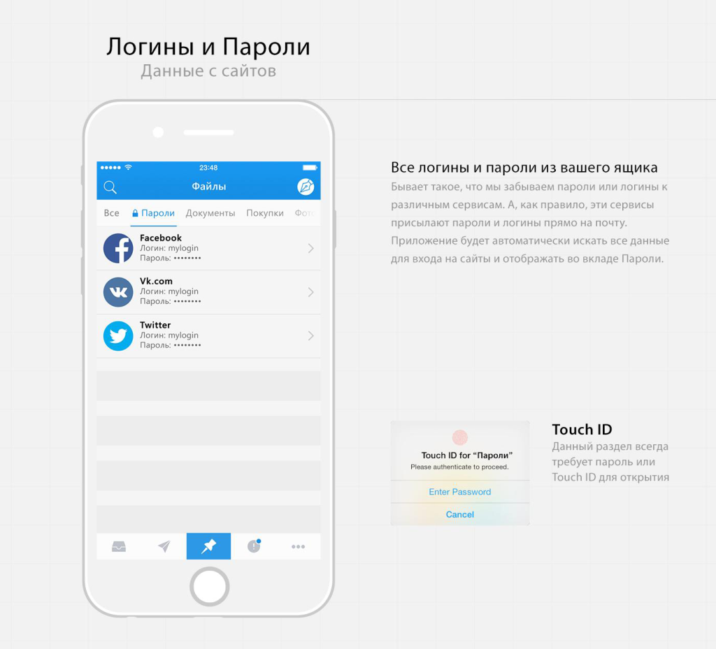
A couple of participants took into account that the registration data of Internet services often arrive in the mail. Sections for managing passwords and accounts are shown in the works of Daniel Siddiqi and Anton Smirnov . And Daniel thought about additional protection - to enter the section you need to attach a fingerprint.
Although there was no such requirement in the task, some participants thought about how to tell the user about how the application works. Tutorials are in the decisions of Andrei Novozhilov , Alex RSR and students of the British .
In early September, the final version of iOS9 and the phones on it were shown. Interestingly, some of the participants suggested ideas similar to the announcement.
Vasily Potetyurin took into account force touch in the iPhone 6s and suggested several gestures with its use.
The most excellent idea is shown by Yuri Kostenko - if you make a swipe on an attachment from the left edge, the associated letter will be shown. Almost 3D touch with a card in a pop-up. Even closer to this solution is Danial Siddiqi’s above-mentioned approach with a map in a letter.

The concept of Yuri as a whole is unusual. In it, you can make pinch to zoom for quick viewing of a letter from the list, and swipe left and right a bit like Tinder - this also resembles solutions with 3D touch.
Well, the very presentation of the letters in the tab style of mobile Safari only adds to the memorability of the idea.
Not everyone, unfortunately, showed an information map of the application, and without this it can be difficult to understand the idea. It's great that there were interactive prototypes in InVision and Marvel - this allowed us to touch the interface visually. Some work frankly failing in terms of the visual. But in general, the level is quite good, and some concepts are especially pleasant in terms of submission:
Ilyas Aliyev : Powerful video and the presentation itself.
Ksenia Butyrina : Excellent presentation. It is a pity that I didn’t quite get into the task - in terms of the quality of performance, this is a clear candidate for victory.
Shakuro : Good design, well-described presentation.
Valery Sirotkin : Although this neural network looks discouraging, in fact it turned out a good grouping of information. The screen of the letter is well read in this style, the search screen is also well structured.
Marrying & Artem :
Ivan Mosievsky : I received the audience award in the jury for the perpendicular approach.
Yevgeny Zagumenny : We did not fully understand whether it is subtle trolling, but the style is respected to the smallest detail.
Octomail : This work from British students did not participate in the contest, but the character juggling with attachments pleased us pleasantly.
Some designers too literally read the assignment, so, in essence, they did a redesign of the main Mail application. Although from here, too, you can learn some ideas, in general, they passed the competition. Perhaps the reason for this is the competition announcements on third-party resources, some of which also literally read the task. It is a pity, because the concept of Amala Alili turned out to be pleasant and neat.
Many participants did not go far and reproduced the list of letters from the Google Inbox application. Someone is quite meticulous, someone with their own variations. This is really one of the three parts of the integrated solution (highlighting attachments right in the list of letters), but it is unlikely that a competition was needed. Enumerate them, probably will not.
We carefully walked through the list of ideas described above. Having driven them through the set of criteria described above, we received three of the most suitable works:
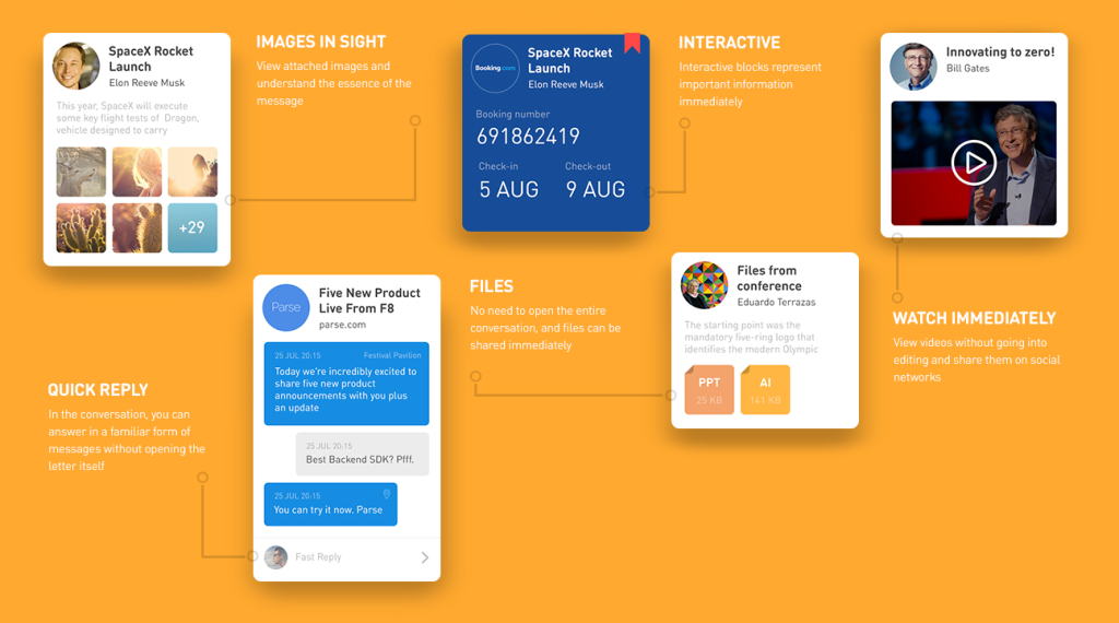
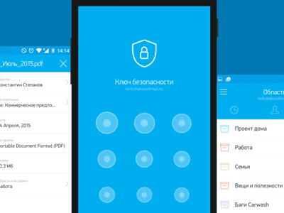
The guys best hit the task. This is a separate application, well thought out in terms of interface and great filed in terms of visual design. The decision is accompanied by an intelligent description and animation of the product. In addition to all this, in the concept is a bundle of individual ideas that do not overlap with other works - for example, archive of files by date on the calendar grid, sharinga panel, access PIN code.
, . Magic Operator, . , , , .
. , , , -. , ( ), , — . , .
! , , .
Kickstarter. 10 . , — .
1 (Shakuro):
2 ( ):
3 ( ):
Kickstarter? — - Apple. , — . .
, , :
Dribbble Meetup 2016, Mail.Ru Group . . , :)
Dribbble Meetup . , . , , Dribbble — , . Google, Dropbox, Twitter, Facebook, Salesforce, Instagram, InVision, Evernote, Squarespace, Mailchimp, Spotify, Pinterest, Medium, Stripe . - Mail.Ru Group .
Dribbble. 2013 , My.com, . 58 , . , , — . , Dribbble , .
. — , . - . -, . , . — 20-30 !
, — . South Park, :)
In the meantime, follow the progress of another competition of our Russian Design Cup and do not forget to come to the fifth Moscow Dribbble Meetup 2016 . Thanks again to all participants! And I finally exhale :)
Task
We announced the contest on May 23 at the Moscow Dribbble Meetup 2015 , which we have been holding for the fourth year already. The task was as follows:
')
The letters receive a lot of useful information - photos and documents, information about events, contact information, information about booking tickets and hotels, checks about purchases in online stores. In the standard form of the list of letters it is not very convenient to find them, and the search here rarely helps.
Imagine that there is an application in which all mail attachments from your mail are conveniently represented. In it you can look at information by type, title, linking to time and place, specific correspondence, life stories, projects, and maybe other contexts. Design and draw the main screens of this application for Android or iOS, to choose from. It’s not necessary to rely on the current Mail.Ru design - fresh visual solutions will get more points.
Why do we need it?
For us, this is a great opportunity to look at the services of the company through the eyes of people from outside. We have a fairly strong team, which is immersed in all the nuances of the products. But this has a downside - the pressure of technological and business constraints. We use a lot of internal techniques and practices to get around them. Contests - one of them. So, Odnoklassniki have been conducting the Russian Design Cup since 2012, where participants solve problems close to reality. And we have been interacting with the British for a long time, where, as part of the intensives and core courses, students also work on real Mail.Ru Group products.
We do not expect that we will get a ready-made breakthrough solution on a saucer for relatively little money - this is impossible without deep immersion in the product. Therefore, for us, competitive works are a kind of “bridge” that allows you to look at parts of a product from a different angle and, by adding up individual solutions from there with your own workings, you can get a good solution for a particular functionality. In fact - Brainstorm with the design community.
Solutions
Before the start of the competition, we had an idea of what a good decision could be. And after a close communication with students of the summer intensity of the British on the UX / UI, it became even clearer. As a product, Mail.Ru Mail will benefit from the fact that users will be able to get more benefit from working with an archive of attachments that come with letters. This can be achieved in three ways:
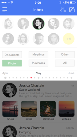
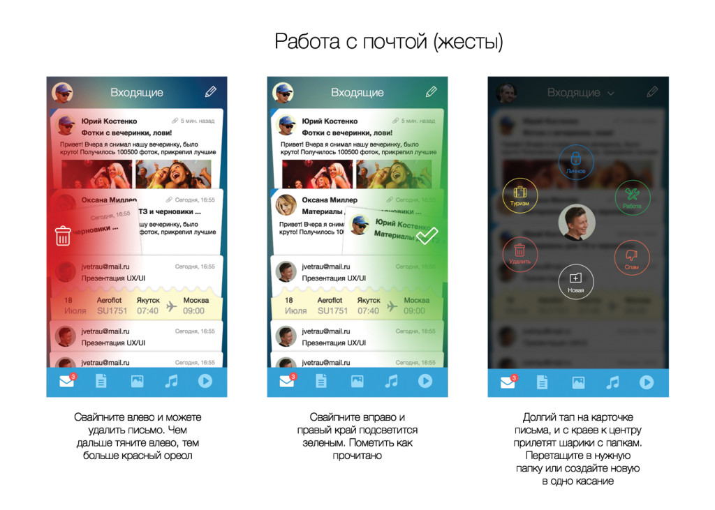
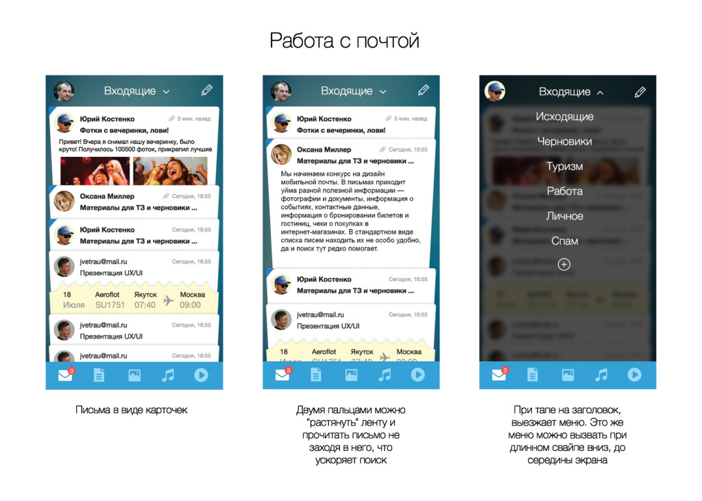
- Highlight attachments right in the list of letters. This is perfectly solved in the mailbox Inbox, and with some of them actions can be performed right there without leaving the inbox.
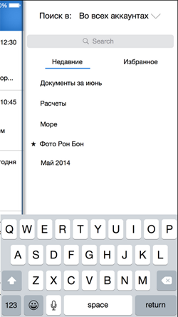
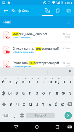
- A separate section with navigation and search for attachments from letters. Such a function for several years already exists in the web version of Mail.Ru Mail. Interestingly, Yandex came from the other side - it made it an automatic folder in Disk.
- Automatic collection of investments in "threads" and "threads threads": for example, a trip or all the files on the project. We removed this hint from the task shortly after the announcement - we wanted the participants to come to her themselves. Although literally a week later, work with travel was shown in the Inbox.
Therefore, we evaluated all solutions primarily by how well the authors worked on these components. Naturally, the quality of visual design and reasonableness of the interface logic were taken into account. Separate ideas, effective presentation and thoughtfulness of the concept description were also taken into account.
Jury
The work was evaluated by designers and managers of Mobile Mail - Slava Yashkov (iOS designer), Kostya Zubanov (Android designer), Ivan Myzdrikov (product manager), Boris Nikiforov (head of mobile direction), as well as Alexey Sergeev (deputy vice president) and I (the head of the portal design team). We could evaluate ideas from three sides - the quality of design and interface, business value and technological feasibility.
But in order to get an outside view, and here, having made the assessments more objective, we asked Artem Triple to join the jury. He is the best suited for this role - a young but very promising designer who has become widely known for his redesign concept for the New York Times .
Artem Triple : I really like design competitions. There are no restrictions. On them, the designer grows independently and moves the design industry forward. You can think of a spaceship. It often happens that the wing from such a ship will be used in a real project. In this competition, I liked that there were quite a lot of good ideas.
Works
We received work from 54 designers. Someone downloaded several versions of his decision, but we took the latter into account in the assessment. In general, there was something to see. True, almost no one got into our idea of the ideal interface for this task (see 3 methods above), so we began to sort out the concepts into separate interesting ideas.
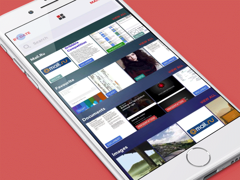
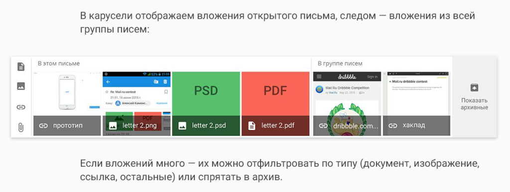
Attachment List
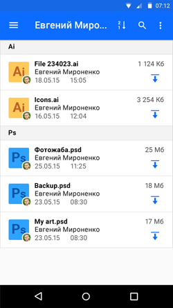
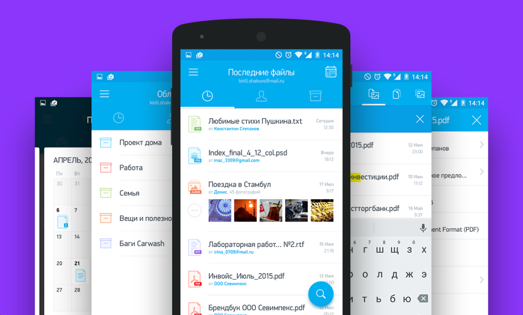
One of the key screens of the application is the list of attachments in different variations. The type of tile, of course, is the most colorful - there is a place to roam, there is enough space for a spectacular presentation of information about the file. The best design looks like Sergey Mekryukov - an irregular grid, in which an attachment can have three types (large, medium, small) - like tiles in Windows 8. Addressees are displayed next to the files.
The first idea to display the addressee on the file tile was suggested by Kirill Kovalsky - this is a small badge in the form of an avatar, something like Facebook messenger. Later she met in many papers. Simple, but very nice tiles came from Andrei Novozhilov , more colorful - from Arsen Kolyba . Several designers at once drew a letter in the form of a tile with an attachment - Ilyas Aliyev (beautiful!), Ksenia Butyrina and Zhenya & Artem .
The vertical list of attachments turned out well in Artem Magomaev . A lot of useful information is derived from Alexey Kamensky , Alex RSR and Denis Matveyev . But the most pleasant, probably, in the work of Shakuro .
The combined version of the list can be noted in Ivan Ledkov - grouping by type and date; and Andrei Novozhilova - tricky grouping by contact, date and file type.
According to the presentation of the attachments inside the letter, the works of Denis Mihutin and Zhenya & Artem look good.
Screen attachment
He was shown many works, but in a completely basic form - Kirill Kovalsky , Andrey Novozhilov , Ivan Ledkov , Nazar Moravsky , Denis Matveyev , RedLab , Ivan Mosievsky , Mikhail Voropaev , Alex RSR , Arsen Kolyba , Maria Gordeychik , Alexander Starodubtsev , Darina Turkovsky , Alexander Pesenko , Ksenia Butyrina , Alexander Hive , Zhenya & Artyom , Alexey Kamensky , Alexey Weinberg , Andrey Bugash . Interesting was the property panel in the Shakuro concept and navigation through the investments of Roman Gordienko .
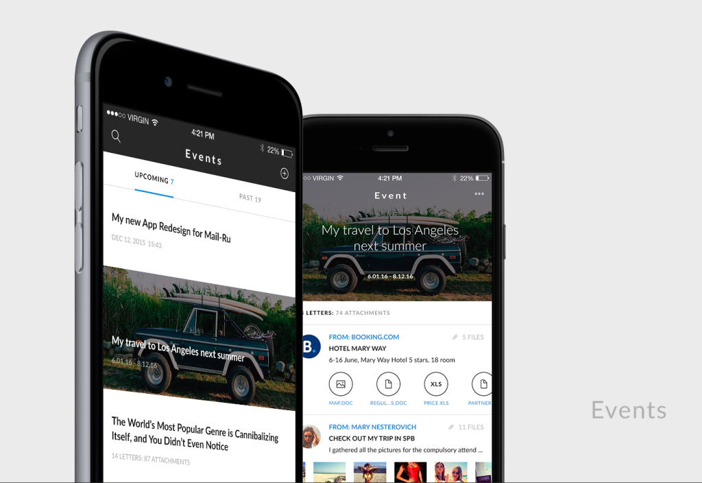
event Ribbon
To handle all types of events - meetings, flights, movie tickets, etc., a number of participants suggested something like a calendar in the form of a chronological tape. Someone, like Martiros Badishyan , showed a variant similar to the first version of the Facebook timeline. Someone, like Artem Triple , brought up QR codes for tickets for faster access - if you refine the idea, you’ll have something like a passbook from iOS.
Kostya Zubanov : A neat visual work that did not quite fall under the theme of the competition (no attention was paid to working with attachments).
Slava Yashkov : One of the many works that the designer worked on was looking in the direction of Inbox. The only interesting thing is to move the action buttons with letters to the top, away from the thumb.
"Projects"
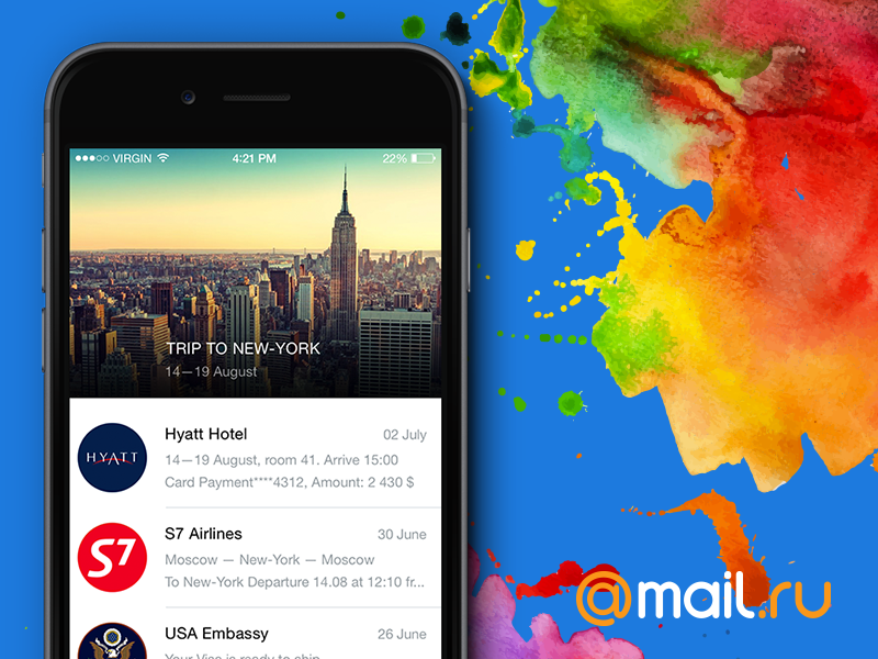
The third way to implement the task is the most interesting. In addition to recreating a simple file browser, you can analyze their source and content, the context of correspondence and the relatedness of recipients. The simplest thing is to combine armor tickets, hotels and cars on a journey, as suggested by Inbox shortly after the announcement of the competition. More difficult - the correspondence on the project. For example, the worker, when the service itself brings together contracts, layouts, documentation, etc. Or personal - a trip to a concert, a birthday. In this case, we go from the opposite - not the user is looking for files, but the service offers him a selection of suitable content on potentially interesting topics.
Travel processing was offered by Artem Triple , Eduard Baksheyev and a group of British students of summer intensives on UX / UI . And some of them provided for the possibility of manual twisting - you can manually attach the letters to the journey, if the system did not handle the situation.
And the students also suggested traveling actions - to share, make them available offline.
Chats and personal assistants
The idea of presenting mail in the form of a chat has been flying in the air for a long time, applications are launched regularly - for example, Hop or domestic Mailburn. The interest is clear - messengers gather an unthinkable audience, intersect in many usage scenarios with the mail, and are generally perceived more easily and casually. Danial Siddiqi , Yegor Kuznetsov , students of the British and Lunart went among the participants in this direction. Although this direction has a number of problems: not all of the letters manage to cut quotes, formatting is lost, and how to present the incoming list correctly? Therefore, large services and not particularly strive in this direction.
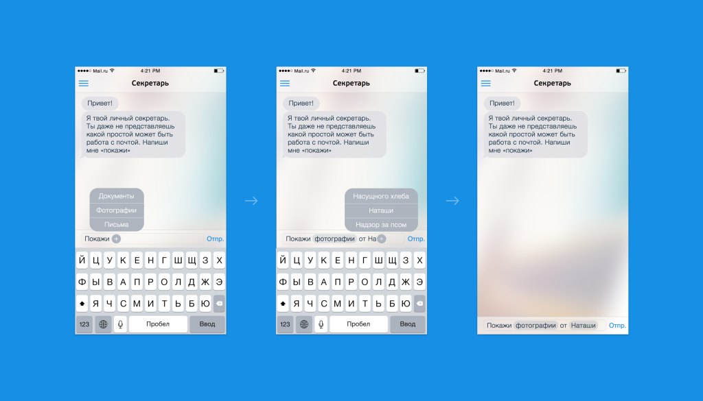
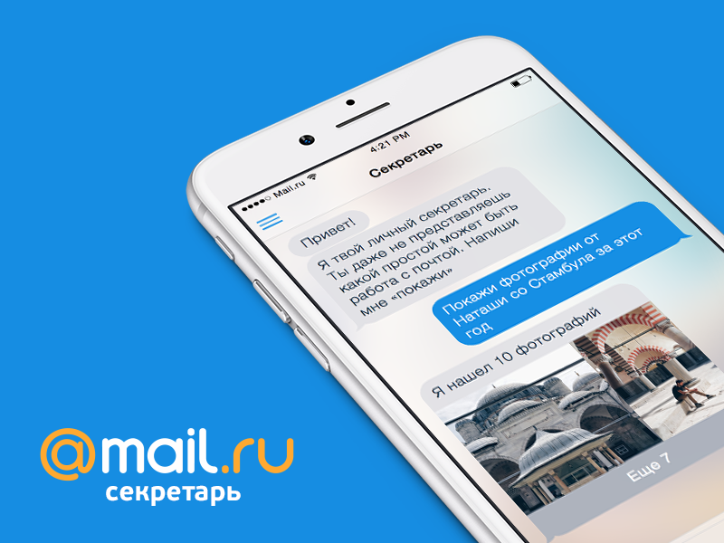
Farid Rafikov used the chat interface in a different format - he offered rather a helper, which allows you to find useful information among attachments. The function is called "secretary" and suggests how to build a search query in natural language - it turned out quite interesting. Farid told about the principles of work in the article on Medium .
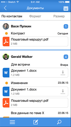
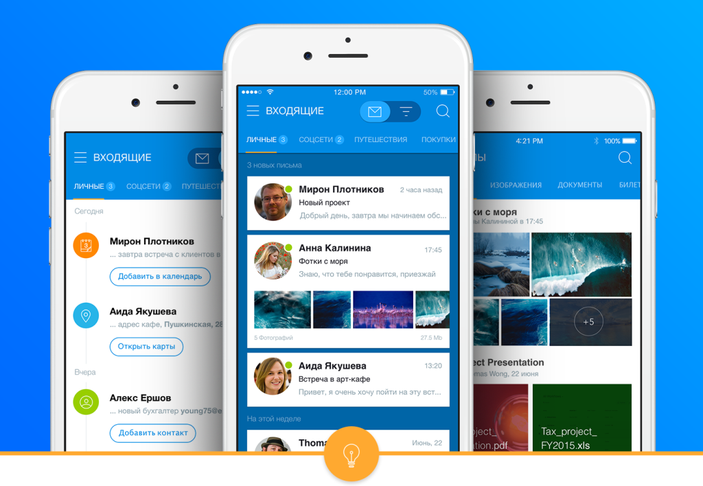
Search and filtering
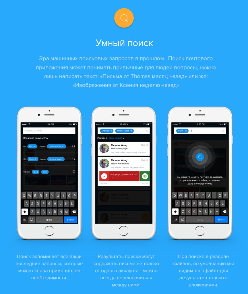
Almost all the participants thought about how the navigation through the attachment archive will work. The possibilities of searching, filtering, sorting, and different list views are a necessary part of the task. We consider them as a complex function, so let's go through the individual ideas:
A very interesting idea is shown in the concept of Daniel Bakalin - contextual search using a floating button that can be dragged to any element on the screen and get results on it. In the shown form, the function is not particularly obvious, but the idea itself is excellent, it can be refined and turned into an excellent working tool. It is a pity that the author did not work on the visual component.
Ilya Sidorenko suggests grouping search results.
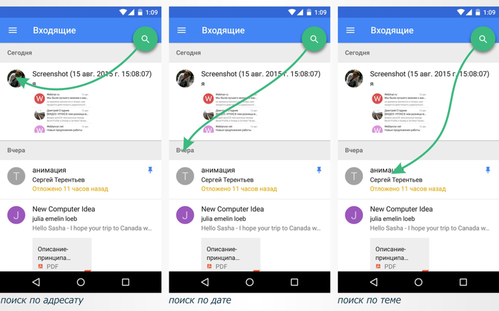
The many states of Nikita Filippov are well described. And also - Alexei Kamensky , Ivan Ledkov . In general, Nikita's work perfectly showed the organic integration of the new functionality into the existing Mail application (he is one of those who prepared the accompanying article ), in this she is one of the best.
Artem Magomaev transferred the search form to the sidebar - there is enough space to show many possibilities.
Compact filter on the results in the form of tabs offered Shakuro .
One of the best implementations of the search screen is Bauyrzhan Orynbassar . Compact, with the ability to search for different cuts.
Evgeny Ryabtsev has a full screen, although using mobile sliders is a bad idea. They are found in many other concepts, but it is extremely difficult to set a more or less accurate value for them. Kirill Kovalsky , Alex RSR , Alexey Weinberg , Timur Minvaleev showed a couple of expanded forms. By the way, Timur also has a voice search.
Nazar Moravsky suggests using tags in the search box. They are used in the query history. Ksenia Butyrina has managed to put this and other ideas from those described above into a pretty holistic solution. An even more unusual approach with tags was sent by Maxim Mezentsev .
Prince Yakublu presented the incoming in a similar to the Inbox form, but showed the number of letters in different categories during the day - they also work as filters.
The query history is also shown in the concept of Yuri Kostenko .
Filtering by category is the majority of participants. Vasily Potetyurin went further and made the set and order of categories customizable. Radmir Arslanov made a filter in the popup. Roman Gordienko has a clear screen with large buttons. Ilyas Aliyev shows them in the sidebar with the transformation list. Alexander Starodubtsev showed the possibility of creating their own filters.
Somewhat heavy, but unusual approach with toggle switches showed Zlata Smolyaninova .
Well, the sorting was thought by Denis Matveyev , Alexander Starodubtsev , Alexey Kamensky and Timur Minvaleev .
Archive Navigation
A very cool idea was suggested by Shakuro - navigating through the archive on the monthly calendar, which shows the attachments for the day. And in the form of a stack, if there are several. In a simpler form, this is shown by Maria Gordeychik , Vasily Poteturin and Artem Magomayev . The most unusual are Illyas Aliyev (a stack of files by date) and Nazar Moravsky (a zummed interface). Nazar generally dig deep into different informational sections — there are plenty of good ideas on the subject.Another approach is to view attachments by contact. Many people thought in this direction - Artem Magomayev , Alex RSR , Timur Minvaleev , Arsen Kolyba , Alexander Pesenko , Shakuro . Denis Matveyev for this task uses a floating button at the bottom of the screen - it gives a quick exit to all attachments on the contact. Sergey Mekryukov binds directly to the group of recipients and location. Ksenia Butyrina shows also letters.
By file type filter Artem Magomaev , Arsen Kolyba , Denis Matveyev . Moreover, Alexander Hive offers among the possible types of filtering offers contact information, and Alexander Starodubtsev - the file extension.
Concise and detailed view
Several designers offered a switch to the type of incoming - the usual list of letters and detailed, with attachments - Artem Magomaev , Alex RSR , Mikhail Voropaev . And for Ksenia Butyrina this mode shows actions - add to calendar, call, open on map, etc.
Actions with the letter and gestures
There are a couple of lessons on the actions with a letter from Alexander Pesenko and Andrey Bugash .
In terms of mass operations, Mikhail Voropayev's idea was pleasant - you can select attachments directly from the inbox.Alexander Starodubtsev and Alexey Kamensky showed quick actions with an attachment (he also has interesting thoughts on operations within the letter). We did not fully understand the principle of the svayp's work on the element in Darina Turkovskaya , but it looks interesting. Bauyrzhan Orynbassar showed a calendar event with a quick response, and British students - moving to a category.
Daniyal Siddiqi offers to shake the phone on the incoming screen to mark all the letters read.
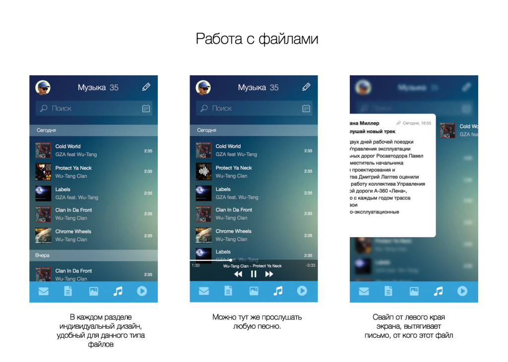
Music and video
Denis Mihutin and Yuri Kostenko thought about how to improve the work with music and video in attachments. Denis suggested putting the player right in the inbox, and Yuri - separate sections for them. And in the second case there is also a separate player.
Maps and addresses
Accounting for the location skips in different works - for example, Anna Manjuna and Sergey Mekryukov . Alex RSR went further and showed the attachments on the map, and Maria Kotovich drew a section with a map of the places. But the most interesting thing turned out to be Danial Siddiqi - if there is an address in the letter, you can see the map in a separate card.
Passwords and accounts
A couple of participants took into account that the registration data of Internet services often arrive in the mail. Sections for managing passwords and accounts are shown in the works of Daniel Siddiqi and Anton Smirnov . And Daniel thought about additional protection - to enter the section you need to attach a fingerprint.
Tutorial
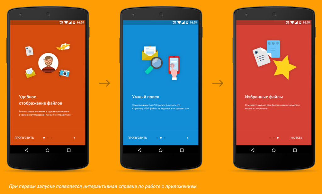
Although there was no such requirement in the task, some participants thought about how to tell the user about how the application works. Tutorials are in the decisions of Andrei Novozhilov , Alex RSR and students of the British .
Kostya Zubanov : The designer was moving in the right direction, but he didn’t work out his concept. I liked the display of the count of each type of files from a particular sender per day / week. There is no possibility to view files in the context of letters.
Slava Yashkov : The designer chose the right direction, but unfortunately he stopped halfway, or did not show all his ideas. Looking for an attachment by sender is the first thing that comes to mind, but if you don’t remember it, then you have no chance in this concept.
iOS9 and iPhone 6s
In early September, the final version of iOS9 and the phones on it were shown. Interestingly, some of the participants suggested ideas similar to the announcement.
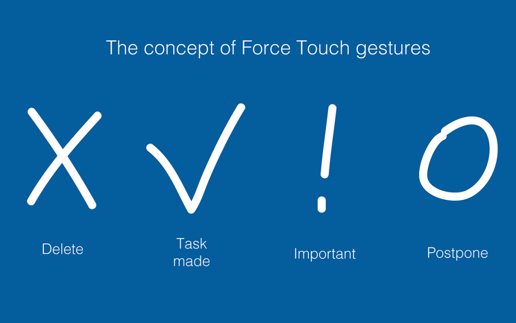
Vasily Potetyurin took into account force touch in the iPhone 6s and suggested several gestures with its use.
The most excellent idea is shown by Yuri Kostenko - if you make a swipe on an attachment from the left edge, the associated letter will be shown. Almost 3D touch with a card in a pop-up. Even closer to this solution is Danial Siddiqi’s above-mentioned approach with a map in a letter.
The concept of Yuri as a whole is unusual. In it, you can make pinch to zoom for quick viewing of a letter from the list, and swipe left and right a bit like Tinder - this also resembles solutions with 3D touch.
Well, the very presentation of the letters in the tab style of mobile Safari only adds to the memorability of the idea.
Spectacular feed
Not everyone, unfortunately, showed an information map of the application, and without this it can be difficult to understand the idea. It's great that there were interactive prototypes in InVision and Marvel - this allowed us to touch the interface visually. Some work frankly failing in terms of the visual. But in general, the level is quite good, and some concepts are especially pleasant in terms of submission:
Ilyas Aliyev : Powerful video and the presentation itself.
Ksenia Butyrina : Excellent presentation. It is a pity that I didn’t quite get into the task - in terms of the quality of performance, this is a clear candidate for victory.
Shakuro : Good design, well-described presentation.
Valery Sirotkin : Although this neural network looks discouraging, in fact it turned out a good grouping of information. The screen of the letter is well read in this style, the search screen is also well structured.
Marrying & Artem :
Kostya Zubanov : An interesting choice of visual style, very cool. But the grid would be nice to modify, not enough "geometrical"
Slava Yashkov : This work shows what the mail would look like if the guys from VSCOcam did the design. Simple shapes of icons, minimal set of styles and colors for the font - I love that. Less is more. True, in this style accuracy is required, here it is not observed, for example, there is clearly no grid of indents.
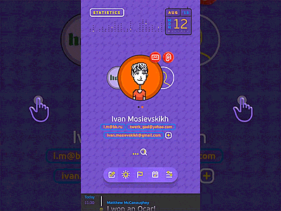
Ivan Mosievsky : I received the audience award in the jury for the perpendicular approach.
Yevgeny Zagumenny : We did not fully understand whether it is subtle trolling, but the style is respected to the smallest detail.
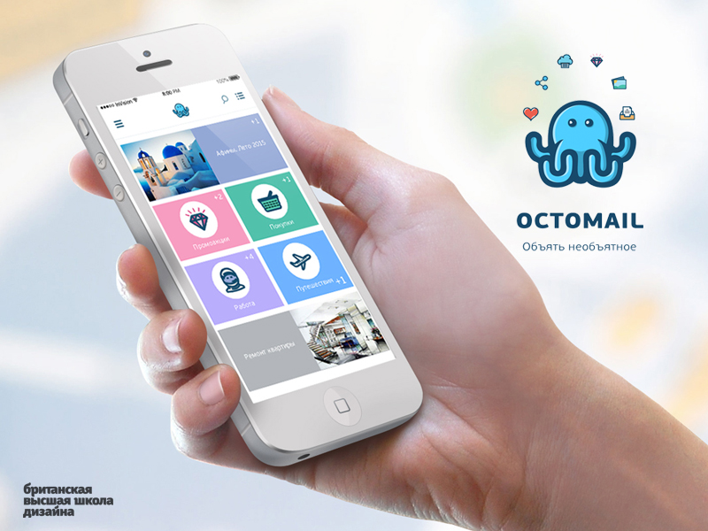
Octomail : This work from British students did not participate in the contest, but the character juggling with attachments pleased us pleasantly.
Not everyone got into the task
Some designers too literally read the assignment, so, in essence, they did a redesign of the main Mail application. Although from here, too, you can learn some ideas, in general, they passed the competition. Perhaps the reason for this is the competition announcements on third-party resources, some of which also literally read the task. It is a pity, because the concept of Amala Alili turned out to be pleasant and neat.
Many participants did not go far and reproduced the list of letters from the Google Inbox application. Someone is quite meticulous, someone with their own variations. This is really one of the three parts of the integrated solution (highlighting attachments right in the list of letters), but it is unlikely that a competition was needed. Enumerate them, probably will not.
Artem Triple : It is a pity that some designers did not try to come up with something completely new, but only added categories for sorting. This is not a test job when applying for a job. In such competitions there is an opportunity to come up with something completely unique, and not something that will be implemented after the competition.
Winners
We carefully walked through the list of ideas described above. Having driven them through the set of criteria described above, we received three of the most suitable works:
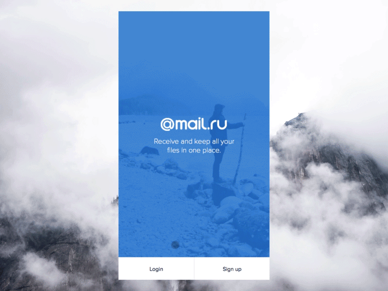
1st place: Shakuro
The guys best hit the task. This is a separate application, well thought out in terms of interface and great filed in terms of visual design. The decision is accompanied by an intelligent description and animation of the product. In addition to all this, in the concept is a bundle of individual ideas that do not overlap with other works - for example, archive of files by date on the calendar grid, sharinga panel, access PIN code.
Kostya Zubanov : This work is a good example of solving the set task. Recent files in the context of correspondence, an interesting idea with a calendar and a good feed. I didn’t like the emphasis on text search by attachments and the principle of distribution of documents among smart folders is incomprehensible.
Slava Yashkov : It is evident that the guys were confused and looked on behalf of the people who will use it. Basic cases for finding attachments are present. . .
2 :
, . Magic Operator, . , , , .
: — . , . . . , — .
: . , . , , .
: . , Medium.
3 :
. , , , -. , ( ), , — . , .
! , , .
Kickstarter. 10 . , — .
1 (Shakuro):
2 ( ):
3 ( ):
Kickstarter? — - Apple. , — . .
, , :
Dribbble Meetup 2016, Mail.Ru Group . . , :)
Dribbble Meetup . , . , , Dribbble — , . Google, Dropbox, Twitter, Facebook, Salesforce, Instagram, InVision, Evernote, Squarespace, Mailchimp, Spotify, Pinterest, Medium, Stripe . - Mail.Ru Group .
Dribbble. 2013 , My.com, . 58 , . , , — . , Dribbble , .
. — , . - . -, . , . — 20-30 !
findings
, — . South Park, :)
- . .
- Conducting the competition. To receive work you need to give more time. On the analysis and evaluation - too.
In the meantime, follow the progress of another competition of our Russian Design Cup and do not forget to come to the fifth Moscow Dribbble Meetup 2016 . Thanks again to all participants! And I finally exhale :)
Source: https://habr.com/ru/post/267081/
All Articles