Visualization of the job market with R
The labor market is a classic formation of supply and demand for labor. And if, on the demand side for labor, many employment agencies and job search portals are some analytics on the available proposals (though not always in the required form). Then, from the supply side (job seekers), analysts are much smaller, and the one that is is not universal for everyone, and most often represents just a slice of desired income in some common areas, or simply by the name of a resume.
I was also interested in a tool that, by a random sample of a resume (by name, key words, etc.), would show the main characteristics of such a sample, the distribution of salaries, ages, and much more, both graphically and in the form of random percentiles. The result of my desire, below under a cat.
So, to visualize the data, you need the actual data, the largest source of such data is the site HeadHunter . Knowing that he has an API , I thought that now, with him, I’ll get everything quickly, and I don’t have to parse anything, but after reading his description, I saw that access to it to the database exactly a resume can be obtained only for employers, and moreover, only for the purpose of a job offer. But nothing, and in the public domain hh.ru there is a section with summaries of people who opened them all over the Internet, and we see them, and there are quite a few of them, about a third of the total. Of these people, we are interested in those who indicated the desired income, and the vast majority of them - 80%.
As a result, the data collection was implemented in two ways - data collection using the import.io API (initially, as quicker for implementation), and directly collecting and parsing is done using R, this method ended up 20% faster. So the maximum number of resumes - 5,000 (restriction hh.ru ) is collected in 3 minutes, but usually they are much less in the request of interest, so the immediate temporary difference between the two methods of collection is a few seconds.
Most likely, this sample is biased, I assume that most people who open summaries for the entire Internet are more interested in finding a job, and as a result, their income expectations are probably only slightly underestimated. But without access to the full database, it is impossible to test this hypothesis, therefore, that is, that is.
Analyzing the results, you can always remember about this bias, and, for example, throw a few percent on the results. I also decided to further divide the sample into two parts: an executive summary, updated to six months and older, to assess the trend, whether there is a notorious effect of the crisis on the expectations and age of applicants or not.
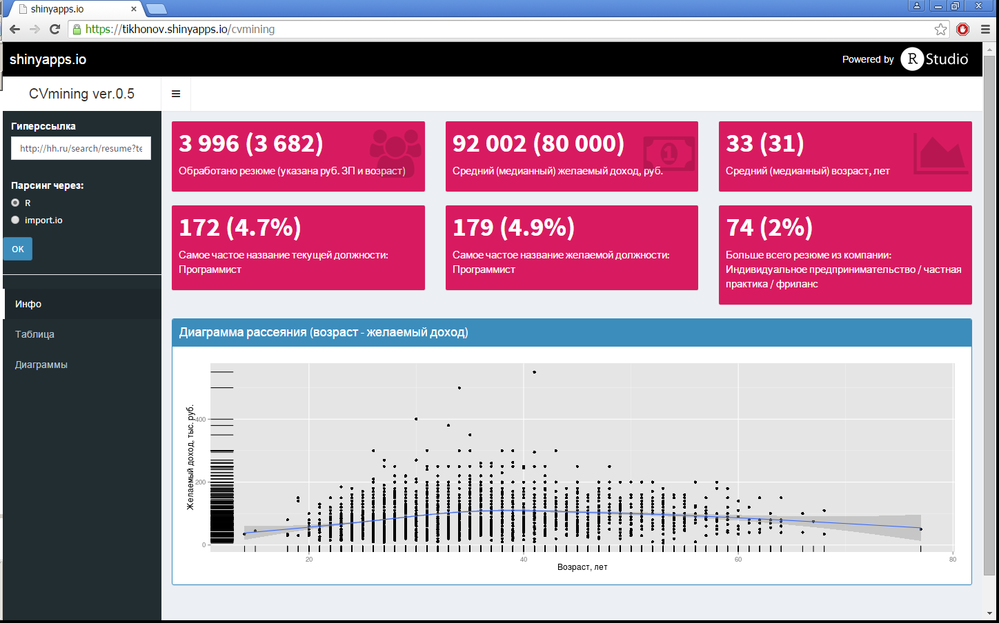
Since the formation of the initial request on the hh site is powerful enough, it is not advisable to duplicate it separately in the R-Shiny application, so the initial random query is formed on the hh site itself, and in the application you just need to specify this hyperlink (in this example the following query was used not interested in such a request): Moscow, IT / Telecom, Programming / development, experience from 3 years ). This hyperlink is automatically converted to the output of one hundred ads per page (to speed up data collection), and data is collected (without entering the summary), since the main characteristics of the sample are already indicated on this home page. After the necessary transformations (excluding resumes without a ruble salary and age, if this was not done on the hh site itself, processing the dates of the resume), in addition to the summary image from the post title, different diagrams are drawn for this sample, they are shown in Fig. 1, 3. This is all done using the Shiny Dashboard package. The diagrams in Fig. 1 show the density of distributions, both wages and ages, with the deciles indicating these values (by the way, it is visually clear that the expectations of applicants more than six months ago and now are no different).
')
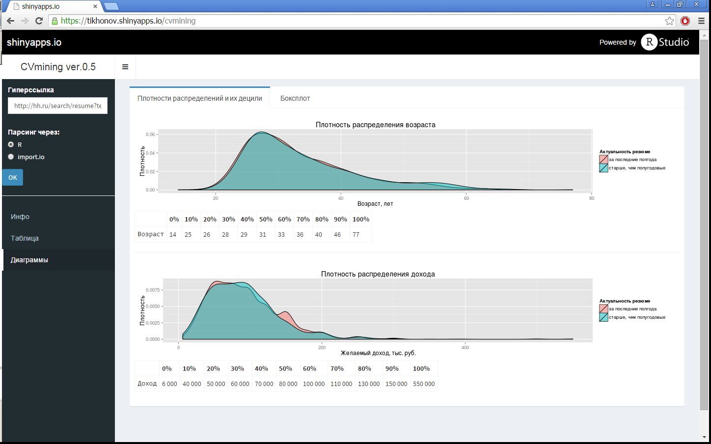
Fig. 1. Density of age and salary distributions with deciles indicated
Also in a separate item in the side menu (Fig. 2), all the resumes are displayed in a convenient tabular form, in which, additionally by sorting or search filters, you can find something specific.
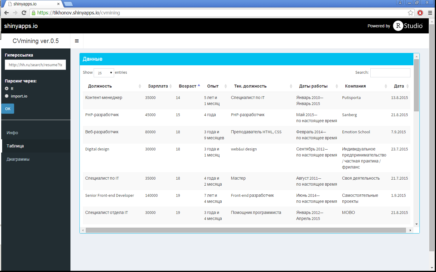
Fig.2 Data Table
In the last diagram (Fig. 3), you can see both the main characteristics of income (minimum, three quartiles, maximum and emissions) for a specific age, and the general income trend (in addition to the scatter diagram from the post title, which shows a smoothing curve).
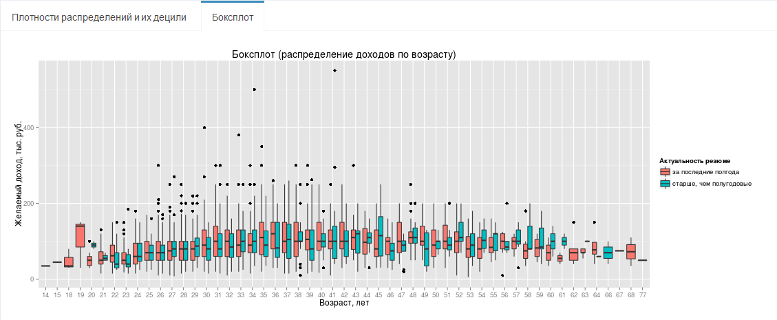
Fig.3 Boxsplot (income distribution by age)
In the next post about R, I wanted to show that many arbitrary “data around us” can be quickly and easily processed and presented in a visual and more readable form. In this case, it is possible, for example, to evaluate as a “broad” view of the industry, the world of work, or vice versa, a “narrow” one - by maximally detailing your request in many parameters (key words, direction), to see the main trends.
I was also interested in a tool that, by a random sample of a resume (by name, key words, etc.), would show the main characteristics of such a sample, the distribution of salaries, ages, and much more, both graphically and in the form of random percentiles. The result of my desire, below under a cat.
Data collection
So, to visualize the data, you need the actual data, the largest source of such data is the site HeadHunter . Knowing that he has an API , I thought that now, with him, I’ll get everything quickly, and I don’t have to parse anything, but after reading his description, I saw that access to it to the database exactly a resume can be obtained only for employers, and moreover, only for the purpose of a job offer. But nothing, and in the public domain hh.ru there is a section with summaries of people who opened them all over the Internet, and we see them, and there are quite a few of them, about a third of the total. Of these people, we are interested in those who indicated the desired income, and the vast majority of them - 80%.
As a result, the data collection was implemented in two ways - data collection using the import.io API (initially, as quicker for implementation), and directly collecting and parsing is done using R, this method ended up 20% faster. So the maximum number of resumes - 5,000 (restriction hh.ru ) is collected in 3 minutes, but usually they are much less in the request of interest, so the immediate temporary difference between the two methods of collection is a few seconds.
Data overview
Most likely, this sample is biased, I assume that most people who open summaries for the entire Internet are more interested in finding a job, and as a result, their income expectations are probably only slightly underestimated. But without access to the full database, it is impossible to test this hypothesis, therefore, that is, that is.
Analyzing the results, you can always remember about this bias, and, for example, throw a few percent on the results. I also decided to further divide the sample into two parts: an executive summary, updated to six months and older, to assess the trend, whether there is a notorious effect of the crisis on the expectations and age of applicants or not.
Web GUI
Since the formation of the initial request on the hh site is powerful enough, it is not advisable to duplicate it separately in the R-Shiny application, so the initial random query is formed on the hh site itself, and in the application you just need to specify this hyperlink (in this example the following query was used not interested in such a request): Moscow, IT / Telecom, Programming / development, experience from 3 years ). This hyperlink is automatically converted to the output of one hundred ads per page (to speed up data collection), and data is collected (without entering the summary), since the main characteristics of the sample are already indicated on this home page. After the necessary transformations (excluding resumes without a ruble salary and age, if this was not done on the hh site itself, processing the dates of the resume), in addition to the summary image from the post title, different diagrams are drawn for this sample, they are shown in Fig. 1, 3. This is all done using the Shiny Dashboard package. The diagrams in Fig. 1 show the density of distributions, both wages and ages, with the deciles indicating these values (by the way, it is visually clear that the expectations of applicants more than six months ago and now are no different).
')
Fig. 1. Density of age and salary distributions with deciles indicated
Also in a separate item in the side menu (Fig. 2), all the resumes are displayed in a convenient tabular form, in which, additionally by sorting or search filters, you can find something specific.
Fig.2 Data Table
In the last diagram (Fig. 3), you can see both the main characteristics of income (minimum, three quartiles, maximum and emissions) for a specific age, and the general income trend (in addition to the scatter diagram from the post title, which shows a smoothing curve).
Fig.3 Boxsplot (income distribution by age)
Conclusion
In the next post about R, I wanted to show that many arbitrary “data around us” can be quickly and easily processed and presented in a visual and more readable form. In this case, it is possible, for example, to evaluate as a “broad” view of the industry, the world of work, or vice versa, a “narrow” one - by maximally detailing your request in many parameters (key words, direction), to see the main trends.
Source: https://habr.com/ru/post/266319/
All Articles