Digest of grocery design, August 2015
For five years now I have been publishing regular reviews of fresh articles on the topic of interfaces, new tools and collections of patterns, interesting cases and historical stories. From the tapes of several hundred thematic subscriptions, approximately 5% of the worthwhile publications are selected that are interesting to share. Previous materials: April 2010-July 2015 .
How to Use Photography in Branding
Very sensible article by Loren Baxter on the use of photos in the interface to enhance the brand. He gives vivid examples and gives instructions on how to find his own style.
')

Adaptation for large screens

Large touch screens
Mailing List
Perceived interface speed
Interface Animation Collections
Work with notifications
MailChimp Content Style Guide
MailChimp has put together a good comprehensive stylistic guide for company employees. Previously, these were scattered guidelines, but now they are merged into one.

Hp grommet
Grommet, UX-framework for enterprise applications from HP.

Designing Web Interfaces For Kids
A very sensible review of the design features for children of different ages from Trine Falbe. In each of the periods of development of their cognitive and physical abilities, which greatly affects the optimal interface.
Micro-moments
Google has released a new site about micromoments - small spontaneous scenarios that users initiate on mobile devices.

Content Wireframing for Responsive Design
New book UXPin about prototyping for responsive design at the content level.
Russian Prototyping Club
Anton Kartashov created a group about Origami, Framer.js, Pixate and other modern design tools. Practical questions on specific tasks, problem solving, beginner's guides.

Where the prototyping tools are moving
Principle
The tool came out: the cost is slightly higher than expected, but a trial version is available. The video clip looks pretty nice - there are a lot of little things that Pixate lacks and are poorly implemented in Proto.io. More details:
Flinto
Five app prototyping tools compared - Proto.io, Pixate, Origami, Framer & Form
A very cool approach to comparing modern prototyping tools. Tes Mat tries to bring the same interface into them and describes the pros and cons of Proto.io, Pixate, Origami, Framer and Form.
Invision
Sketch
Keynote Prototyping
32 Ways To Measure The Customer Experience
Excellent classification of user research methods from Jeff Sauro in relation to specific tasks.

Comparing Between- and Within-Subjects Studies
Jeff Sauro is about user research where different tasks are given to the same or very different respondents. In the end, he compares the pros and cons of these options. The first is cheaper, the second gives less noise.
WebKit Visual Styles Sidebar
WebKit implements a visual visual editor of page styles. In addition to the standard panel with the code, a tab was added in the spirit of graphic editors, where you can explicitly set the basic design parameters - almost like in Sketch or Photoshop. Very cool, waiting for the same thing in Chrome.
SalesForce Lightning Design System
Lightning design system by Salesforce. A little about how it was done .

Work with Bootstrap and Foundation

Easee
And another new tool for designers Easee. It allows you to animate in the browser. A short story by its creator Steven Fabre about how and why he made it.

Framer
Webflow CMS
Webflow launches its CMS: not everything is clear yet, but it looks intriguing. Almost visual creation of a dynamic responsive website with a bunch of technically complex elements.
Work with Flexbox
Web typography
New scripts
Layer blending modes in the browser
Applied UX Strategy, Part 3: Platform Thinking
My article on platform thinking based on a recent presentation. How to stop producing documentation and start living. All this burns a lot of time for paperwork - the forces go to polishing side documents, not the product. It is necessary to perceive the work on the product as the creation and development of a platform, and not a specific release. Russian version .

I talked about this on Smashing Magazine ( mobile web and content projects ). But there was an emphasis on specific cases, and in this publication - step by step instructions for creating such a platform.
At the end there is a long list of all those thanks to whom this picture lined up and began to be introduced into practice. The original idea was simple, the first prototype of the platform appeared in mid-2012. But as more and more services were transferred to it, the vision was corrected and expanded. We have a huge number of products and questions on each of them, so that we are still on the way. Therefore, the series will continue :)
UX strategy
Design Culture

Hiring designers
Design Sprints
Getting Started With UX Design Process & Documentation
Another book UXPin, on the construction of the design process and work with the documentation.
The Designer's Guide to Collaborating With Developers
And one more - about the interaction of designers and developers.
Presumptive Design - Design Research Through the Looking Glass
Leo Frishberg and Charles Lambdin offer their own variation on lean UX. Not very meaningful budding with the main motive of creating “we are not understood,” but it is useful in terms of money.
Pickup Technique - How to create a product and conquer users
The summer program of the Strelka & Rambler & Co institute was delivered by Rahul Sen from Spotify, dealing with the growth of user base and profits. He has quite an interesting concept of building user experience as a personal relationship. In this article, however, quite a general overview, a little more detail was in the English version . Although the most interesting thing remains in the presentation itself and, apparently, the training. Including about their models of metrics AACR (Acquisition, Activation, Conversion, Retention) and its binding in the interface.

Design x Data
IDEO launched a blog on Medium on data usage and analytics in design. So far, however, just a couple of publications.
From Russia With Love - Behind The Responsive Redesign Of Kremlin.ru
Artem Geller answers Smashing Magazine questions about working on the new Kremlin.ru website. A rich article in which many interesting technical details. This is the first Russian state project "on the pages of" such a publication.
Version in Russian .

Alcatel Watch UX
Denis's chic case Nevozaya about working on the Alcatel One Touch Watch smart watch interface. In detail, the iterations of the design are shown, the initial ideas and the final implementation are described. This is Alcatel's own platform, so finding solutions is especially interesting.

Hossein Rahman: How hardware products are designed in Jawbone
A very powerful case from the Jawbone team, covering all the nuances of grocery work. The second part .

Thinking of Thinking About Designing Wildcard 2.0
Khoi Vinh talks about the work on the Wildcard news application, for which he was doing a fairly in-depth study of card interfaces. True, they initially planned to launch a mobile browser, but it didn’t take off and gave it up for a simpler week. The application came out recently and this is one of the most spectacular pieces on iOS this year.
Redesign Cases
Samsung Design
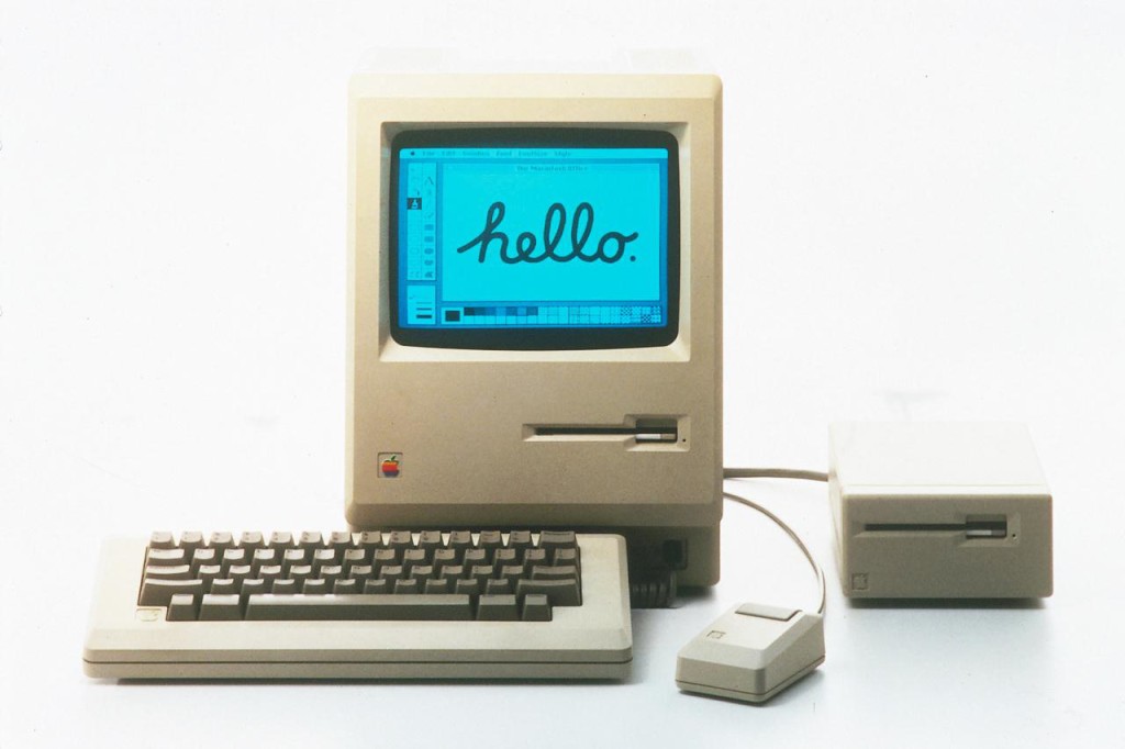
50 years ago today the word "hypertext" was introduced
Interview with Ted Nelson, the author of the idea of hypertext. He tells in detail about how he came to this idea, how her legendary presentation took place 50 years ago and what came of it all.

Web '90 x

The Post-Mac Interface
A very long but very interesting text about the history of the GUI development from Adam Baker. He recalls the 1996 Anti-Mac interface concept from Jakob Nielsen and D. Gentner, in which they tried to rethink the classic Mac interface with the advent of the Internet. Some of their predictions came true, something did not, and Adam offers his own vision of the Post-Mac.
Trends in Newsrooms - Gaming the news
Recently, the media are increasingly preparing spets.proekty and alternative presentation of materials presented in the game style. The site of the association WAN IFRA examines the most vivid examples.
Web Design Book of Trends 2015-2016
Book UXPin about trends in the web 2015-2016.
Wearable device
Car Interfaces
How to design award-winning websites
Lasse Kristensen is a member of the FWA jury. He talks about the criteria for judging work.

Grocery designer
Selection of books
I Have No Idea
Translation of an article based on Brad Frost’s recent talk on the features and design philosophy of the modern web. Many key ideas come together.
Designer bios
An amusing collection of mini-biographies of designers from their personal sites and studio sites. Who submits and how.
Interesting designer appointments
Shopping design studios by large companies
LayerVault close
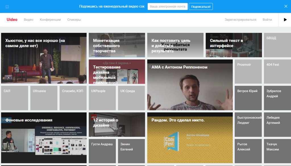
Uideo - 374 near-design video
Andrey Yakushev launched a video aggregator from domestic design conferences. The database is already under four hundred speeches.
UX Strategies Summit 2015 Review, Part 1 - Overview and Workshops
Pabini Gabriel-Petit's report on the UX Strategies Summit 2015 conference, held June 10-11 in San Francisco, USA. Very detailed summary of keynote speeches. Day 2
Fresh links can also be tracked in the Facebook group of the same name. Thanks to everyone who also publishes links in it, especially Gennady Dragun, Pavel Skripkin, Dmitry Podluzhny, Anton Artyomov, Denis Efremov, Alexey Kopylov, Taras Brizitsky and Yevgeny Sokolov. More and more materials in reviews appear thanks to them.
A letter arrives once a month.
Patterns and Best Practices
How to Use Photography in Branding
Very sensible article by Loren Baxter on the use of photos in the interface to enhance the brand. He gives vivid examples and gives instructions on how to find his own style.
')
Adaptation for large screens
- Recommendations Baymard Institute to adapt the design of online stores to large monitors . Their percentage is growing and it’s time to pay attention to these users.
Large touch screens
- Kara Pernice from NN / g continues the theme of working with large touch screens. She interviewed Dorothy Shamonsky from ViewPoint, which specializes in such interfaces . Part of the captain's advice, but a selection of useful.
Mailing List
- Kevin Mandeville from Litmus with another amazing story about the possibilities of mailing letters . They played 5 tickets to their conference and this is what came of it.
- Team Medusa talks about how they work with mailing lists .
Perceived interface speed
- Experimenting with various downloaders from a Viget intern . Ian Tate compares several animation options and looks at how users are willing to wait for the interface to load.
- A well-structured set of tips on Adrian Zumbrunnen .
Interface Animation Collections
- UI Movement , another collection.
Work with notifications
Platform guidelines and design templates for them
MailChimp Content Style Guide
MailChimp has put together a good comprehensive stylistic guide for company employees. Previously, these were scattered guidelines, but now they are merged into one.
Hp grommet
Grommet, UX-framework for enterprise applications from HP.
Understanding the user
Designing Web Interfaces For Kids
A very sensible review of the design features for children of different ages from Trine Falbe. In each of the periods of development of their cognitive and physical abilities, which greatly affects the optimal interface.
Micro-moments
Google has released a new site about micromoments - small spontaneous scenarios that users initiate on mobile devices.
Information architecture, conceptual design, content strategy
Content Wireframing for Responsive Design
New book UXPin about prototyping for responsive design at the content level.
Design and design of interface screens
Russian Prototyping Club
Anton Kartashov created a group about Origami, Framer.js, Pixate and other modern design tools. Practical questions on specific tasks, problem solving, beginner's guides.
Where the prototyping tools are moving
- Julius Huijnk asked the creators and managers of key prototyping tools (Axure, InVision, Marvel, Proto.io, UXPin) about their future and the possibility of creating a universal product . He imagined some kind of universal service for absolutely all tasks in the process of working on product design, but in fact the idea is not very robust - the design processes vary greatly from company to company, from project to project. Useful material for those who want to create such a monster.
- Khoi Vinh reflects on where the prototyping tools market is going .
Principle
The tool came out: the cost is slightly higher than expected, but a trial version is available. The video clip looks pretty nice - there are a lot of little things that Pixate lacks and are poorly implemented in Proto.io. More details:
- The first reaction of the Russian community practitioner to Principle . Conquers from the first minute, the tool is really very cool. Especially since this is the very first version.
- The creators say that you can recreate the key interactions of Facebook Paper in 60 seconds . The video, however, shows the result, not the process, but colleagues began to actively experiment with the tool and the speed of work in it is really great.
- Overview of Principle features from Benjamin Berger . He received an early version a month ago and managed to work a lot with her. In his blog, I saw an indirect mention of the product at the end of July.
Flinto
- Flinto was reborn and released a tool for working with prototypes and animations for Mac, similar to the recent Principle . The race of tools does not subside!
Five app prototyping tools compared - Proto.io, Pixate, Origami, Framer & Form
A very cool approach to comparing modern prototyping tools. Tes Mat tries to bring the same interface into them and describes the pros and cons of Proto.io, Pixate, Origami, Framer and Form.
Invision
- In the wake of Marvel, InVision followed the usability testing of prototypes . They made a bunch with Lookback.
- Now, another InVision UI Kit . There are versions for Sketch and Photoshop.
- Now it is possible to create “boards” for mindboards, guidelines and presentations .
Sketch
Keynote Prototyping
- A good overview of how to animate interfaces in Keynote .
- And one more thing about how to animate layouts from Sketch .
User research and testing, analytics
32 Ways To Measure The Customer Experience
Excellent classification of user research methods from Jeff Sauro in relation to specific tasks.
Comparing Between- and Within-Subjects Studies
Jeff Sauro is about user research where different tasks are given to the same or very different respondents. In the end, he compares the pros and cons of these options. The first is cheaper, the second gives less noise.
Visual programming and browser design
WebKit Visual Styles Sidebar
WebKit implements a visual visual editor of page styles. In addition to the standard panel with the code, a tab was added in the spirit of graphic editors, where you can explicitly set the basic design parameters - almost like in Sketch or Photoshop. Very cool, waiting for the same thing in Chrome.
CSS is complicated. Web Inspector's Newest Styles sidebar can help you now. pic.twitter.com/ucS5BUkO6Q - WebKit (@webkit) August 20, 2015
SalesForce Lightning Design System
Lightning design system by Salesforce. A little about how it was done .
Work with Bootstrap and Foundation
- The first alpha version of Bootstrap 4 has been released . The project blog has an impressive list of changes. In addition, the official catalog of themes has been launched.
Easee
And another new tool for designers Easee. It allows you to animate in the browser. A short story by its creator Steven Fabre about how and why he made it.
Framer
Webflow CMS
Webflow launches its CMS: not everything is clear yet, but it looks intriguing. Almost visual creation of a dynamic responsive website with a bunch of technically complex elements.
Work with Flexbox
- 20-minute video course on flexbox .
- A very simple and straightforward explanation of the flexbox guidelines from Ben Gremillion from ZURB . By the way, the next version of the Foundation framework will use it.
Web typography
- Typekit Bram Stein talks about his vision for the future of web fonts . Very cool about the technological development of web typography first hand.
- Another search engine for Google Web Fonts .
- JavaScript library typographer .
New scripts
- A collection of all sorts of visualizations and interactive concepts .
- Polygonal cat in dogonku to polygonal dinosaur .
- WebGL Studio for working with 3D scenes on the web .
- An interesting product is emerging that implements two-way interaction between the code and the result (while the emphasis is on graphics) .
- Cycloid drawing tool, several options, customizable parameters, result export .
Layer blending modes in the browser
Management of interface projects, processes and teams
Applied UX Strategy, Part 3: Platform Thinking
My article on platform thinking based on a recent presentation. How to stop producing documentation and start living. All this burns a lot of time for paperwork - the forces go to polishing side documents, not the product. It is necessary to perceive the work on the product as the creation and development of a platform, and not a specific release. Russian version .
I talked about this on Smashing Magazine ( mobile web and content projects ). But there was an emphasis on specific cases, and in this publication - step by step instructions for creating such a platform.
At the end there is a long list of all those thanks to whom this picture lined up and began to be introduced into practice. The original idea was simple, the first prototype of the platform appeared in mid-2012. But as more and more services were transferred to it, the vision was corrected and expanded. We have a huge number of products and questions on each of them, so that we are still on the way. Therefore, the series will continue :)
UX strategy
- Paul Bryan describes his vision of the UX strategy well . It has 7 key components: a bundle with a business strategy, a client model, a map experience, comparative studies and reports, a general plan for implementing a strategy and a roadmap.
Design Culture
- Jon Kolko writes in the Harvard Business Review about how large corporations to inculcate design culture .
- Very cool idea Nick Daze on the selection of designers to the team with the necessary skills . The petal diagram is used, which shows the strengths and weaknesses of both the individual employee and the entire team.
Hiring designers
Design Sprints
Getting Started With UX Design Process & Documentation
Another book UXPin, on the construction of the design process and work with the documentation.
The Designer's Guide to Collaborating With Developers
And one more - about the interaction of designers and developers.
Presumptive Design - Design Research Through the Looking Glass
Leo Frishberg and Charles Lambdin offer their own variation on lean UX. Not very meaningful budding with the main motive of creating “we are not understood,” but it is useful in terms of money.
Product management and analytics
Pickup Technique - How to create a product and conquer users
The summer program of the Strelka & Rambler & Co institute was delivered by Rahul Sen from Spotify, dealing with the growth of user base and profits. He has quite an interesting concept of building user experience as a personal relationship. In this article, however, quite a general overview, a little more detail was in the English version . Although the most interesting thing remains in the presentation itself and, apparently, the training. Including about their models of metrics AACR (Acquisition, Activation, Conversion, Retention) and its binding in the interface.
Design x Data
IDEO launched a blog on Medium on data usage and analytics in design. So far, however, just a couple of publications.
Cases
From Russia With Love - Behind The Responsive Redesign Of Kremlin.ru
Artem Geller answers Smashing Magazine questions about working on the new Kremlin.ru website. A rich article in which many interesting technical details. This is the first Russian state project "on the pages of" such a publication.
Version in Russian .
Alcatel Watch UX
Denis's chic case Nevozaya about working on the Alcatel One Touch Watch smart watch interface. In detail, the iterations of the design are shown, the initial ideas and the final implementation are described. This is Alcatel's own platform, so finding solutions is especially interesting.
Hossein Rahman: How hardware products are designed in Jawbone
A very powerful case from the Jawbone team, covering all the nuances of grocery work. The second part .
Thinking of Thinking About Designing Wildcard 2.0
Khoi Vinh talks about the work on the Wildcard news application, for which he was doing a fairly in-depth study of card interfaces. True, they initially planned to launch a mobile browser, but it didn’t take off and gave it up for a simpler week. The application came out recently and this is one of the most spectacular pieces on iOS this year.
Redesign Cases
- Excellent and effectively presented history of redesign of thematic news site The Hechinger Report . Interestingly, the designers were aware of objective reality and separately thought about how beautiful it is to serve content for a publication, where there are often no photos.
- A short story about how Vox Media works on its long-reads .
- Alexander Komarov talks about how his team worked on the application for coordinating time zones .
Samsung Design
- The company is often kicked in the design community, but in the meantime they have done a lot of really cool things. Very sensible article about how the company changed its attitude to design and the role of vice president of design An Yong-Il in this .
Story
50 years ago today the word "hypertext" was introduced
Interview with Ted Nelson, the author of the idea of hypertext. He tells in detail about how he came to this idea, how her legendary presentation took place 50 years ago and what came of it all.
Web '90 x
Trends
The Post-Mac Interface
A very long but very interesting text about the history of the GUI development from Adam Baker. He recalls the 1996 Anti-Mac interface concept from Jakob Nielsen and D. Gentner, in which they tried to rethink the classic Mac interface with the advent of the Internet. Some of their predictions came true, something did not, and Adam offers his own vision of the Post-Mac.
Trends in Newsrooms - Gaming the news
Recently, the media are increasingly preparing spets.proekty and alternative presentation of materials presented in the game style. The site of the association WAN IFRA examines the most vivid examples.
Web Design Book of Trends 2015-2016
Book UXPin about trends in the web 2015-2016.
Wearable device
Car Interfaces
- Jake Zukowski, ex-Frog about the combination of usability and safety in the design of automotive interfaces .
The presentation at http://www.slideshare.net/JakeZukowski/ux-in-automobiles-balancing-effective-ui-design-driver-safety-41477573 is not available.
For general and professional development
How to design award-winning websites
Lasse Kristensen is a member of the FWA jury. He talks about the criteria for judging work.
Grocery designer
- Mike Atherton quite interestingly talks about this topic, including the fuzzy border between the designer and product manager .
- Kyle Fiedler about how it works in the design studio ThoughtBot .
Selection of books
- David Travis advises books for specific tasks . The list is not that big, but the approach is interesting.
I Have No Idea
Translation of an article based on Brad Frost’s recent talk on the features and design philosophy of the modern web. Many key ideas come together.
People and companies in the industry
Designer bios
An amusing collection of mini-biographies of designers from their personal sites and studio sites. Who submits and how.
Interesting designer appointments
- Khoi Vinh knowingly collaborated with Adobe on the Comp CC prototyping tool . The company hired him to deal with tools for designers. One of the most interesting appointments of recent times.
- Susan Kare became the head of Pinterest product design . Interview about exactly what she does.
Shopping design studios by large companies
LayerVault close
Conference proceedings
Uideo - 374 near-design video
Andrey Yakushev launched a video aggregator from domestic design conferences. The database is already under four hundred speeches.
UX Strategies Summit 2015 Review, Part 1 - Overview and Workshops
Pabini Gabriel-Petit's report on the UX Strategies Summit 2015 conference, held June 10-11 in San Francisco, USA. Very detailed summary of keynote speeches. Day 2
Fresh links can also be tracked in the Facebook group of the same name. Thanks to everyone who also publishes links in it, especially Gennady Dragun, Pavel Skripkin, Dmitry Podluzhny, Anton Artyomov, Denis Efremov, Alexey Kopylov, Taras Brizitsky and Yevgeny Sokolov. More and more materials in reviews appear thanks to them.
Subscribe to the newsletter
A letter arrives once a month.
Source: https://habr.com/ru/post/266013/
All Articles