Igrodel on subtitles: theory and practice
Whether it is beautiful, conveniently made subtitles - this can affect the player's impressions. But for some reason, the developers constantly stumble on the same rake from a small - and easily correctable - list. This article recalls the three most important principles and ten good tips, tested in games and related industries. And at the same time - some thoughts on how to collect and process information about users.
Players often use subtitles of speech and important sounds; more often than consumers of other types of media. There are many reasons for this - not only hearing loss, but also poor mobile speakers, ambient noise, a sleeping child. And yet - the risk that an important remark will be lost in the game noise. Finally, some subtitles are often localized in games.
')
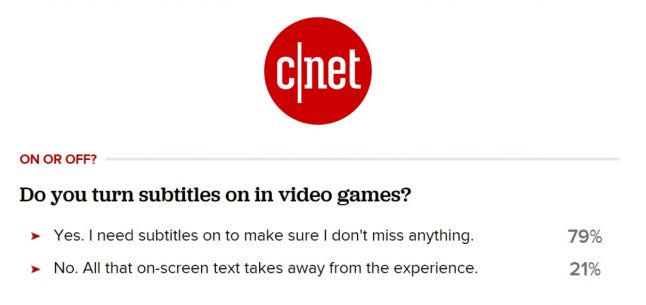
So it’s not surprising that 79% of the players in the CNet survey on subtitles said that they play with subtitles. The figure is rather unscientific, but it already says that they play with subtitles very often.
And despite all this, subtitles often do not pay proper attention. Subtitles are often attached just before the exit, and do not work as an integral part of the interface. A good titration system is better to do in advance, then to fill in the text when it appears.
The very basics are easy to do right, and if you don’t, there will be a lot of disgruntled players. This convincingly showed a recent discussion on Neograf . Here are a few comments:
From Neograf it is clear that there are not so many flaws, and for the most part they are visual. This is partly due to misconceptions about how to make subtitles unobtrusive.
Usually, if the subtitles seem intrusive, reduce the font size. But this leads to the opposite effect — if the text is unreadable, it takes longer to read, the eyes spend more on subtitles and less on the game, and the subtitles become more intrusive.
No need to reinvent the wheel: all this has long been decided in other media. These three points are constantly complaining not only about Neograf, but also on the forums and in social networks, and they need to be done in all games without exception.
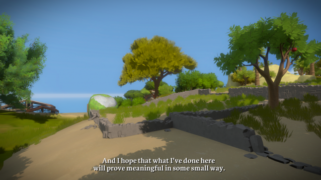
Assassin's Creed: Black Flag. White subtitles with a light shadow on a complex light background.
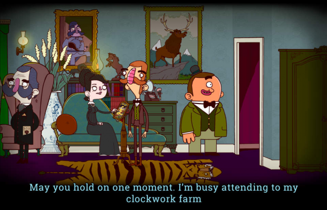
Portal 2. The plate adds contrast to any background.
At a minimum, a noticeable black stroke is needed. A simple shadow is not recommended, because the half-letter will not be separated from the background. You can also try the black plate. So that it was not so conspicuous, by default it can be made translucent (50%). Ideally, this figure should be adjusted (see below in the “Good Tips”).
X-Com. There is a lot of text, and you have to read it.
The Witness. Subtitles are broken into short lines. This can be read even the corner of the eye.
Large blocks of text can become spoilers, giving events ahead. For example:
This phrase should be broken down into three separate ones, one after another:
Large blocks also interfere with readability. The smaller the text, the easier it is to grab it with one glance and return to the game again.
So it is much better to give the text in small pieces, breaking it into logical pauses and punctuation marks if possible.
Standards are set on television between countries and channels. In different countries, they are slightly different; for HD video, a maximum of 37 (Australia) to 40 (Finland) characters per line is recommended, a maximum of two lines (in exceptional cases, three). If one phrase occupies several lines, the first one should be the longest, but try to make them approximately equal in length.
Good:
Poorly:
And do not replace one text abruptly with another, leave a quarter-second pause between them to emphasize the shift.

Sleeping Dogs: Definitive Edition. Small text, so the subtitles are hard to read. Even if someone is able to read them, it takes time and effort.
Bertram Fiddle. Large clear text, easy and fluently read.
As you can see from the discussion on Neogaf, small text is a common problem. Do not do what looks adequate on the big screen under the nose - not everyone sees it so well, not everyone has a big screen, and someone is sitting far away. Even if you are testing "from the couch", do not forget that not everyone can move a perfect distance.
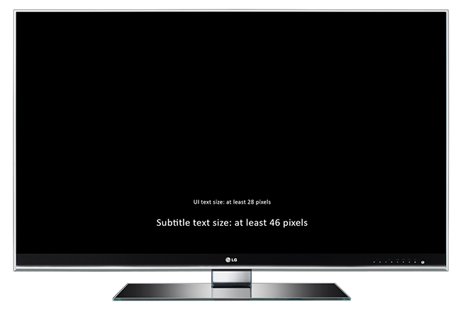
Other industries have established recommendations: for example, Amazon’s recommendations for an “interface from three meters” say: the minimum possible text size is 14 scale independent pixels (sp), or 28 pixels per 1080p. Since the subtitles are visible for a limited time, the text should be larger for them: for example, Channel 4 (UK) requires all HD subtitles to be 46 pixels (or 26 on SD).
These dimensions coincide with the unpublished study conducted by one of the manufacturers of consoles.
In games, of course, there is another limitation that is not found in other media - subtitles compete for space on the screen with the game interface. But if you limit the length of the string to 38 characters, this should not be a problem.
These recommendations are compiled from the standards of other industries set by the BBC and the United States Office of Communications. Most we see from time to time in games, but not all the time, and games that do everything together are still rare.
If you do this, your subtitles will be in step with the industry, and set an example of how to do it. Whenever possible, these subtitles should be considered, especially if there is a lot of chatter in the game.
Even minor inconsistencies in time and text are striking. In order to meet the time, the replicas are shortened (see clause 7 below). Sometimes the actor says gag. So if the texts and localization are done before the dubbing is over, you need to go through the texts again, as soon as the final sound comes, and check for errors.
A frequent complaint is that in some parts of the game there are no subtitles. Therefore, you need to check out the video sequences, in-game scripted and dynamic audio, and introductory video.
But you need to somehow turn on the subtitles before the intro starts. Infamous: First Light came up with a simple solution: press a button to turn it on.
And you can also keep subtitles enabled by default. If you are developing for XboxOne / Android / iOS, there is a system setting that can be pulled out and read as the default.
By default, the subtitles are below in the middle, with a small indent from the bottom edge of the screen.
If a temporary interface element appears in this place (for example, a QTE message), the subtitles are shifted higher so that nothing overlaps. If the element is large and the subtitles go to the top of the screen, put them at the top. This example applies to tape buttons, but the same applies to other things, like QTE messages and in-game menus.
However, do not expect that the Xbox One notification system will put your messages from the bottom and in the center. They should not be there, and I hope that this will be fixed in the future.
Subtitles are usually shown one by one: one has disappeared, the second has appeared. But they can be shown at the same time - say, if they appear frequently. In this case, new ones should appear from below, moving up older ones.
Some games reach character portraits. But this is rarely done, usually costing different colors. Even if it is not so clear who speaks - from the crowd, through the loudspeaker, by phone, from behind the frame - display his name:
If the speakers differ in colors, make them light so that there is a good contrast with the dark outline or die. Pay particular attention to red; it appears dark brown to most color blind people.
If the sound is from behind the screen, show with an arrow which side:
If there are 38 characters on a line, make sure that even the shortest, one word, replica will be on the screen for 1 second, and long - 2–2.5 seconds per line.
True, to achieve this, sometimes you need to cut off the words. But the discrepancy interferes with understanding, especially for fast readers. It is possible to cut off only in extreme cases, the meaning should be preserved, and the words should remain extremely close to the original. So, replica "No, no, no! Not now! ”, You can trim to“ No! Not now! ”, But not until“ No, later! ”The BBC has a whole guide on how to deal in delicate situations.
Children need more time. The BBC recommends 3–3.5 seconds per line for children under 13, and 4–4.5 for children under 7.
The case of letters is normal: “Hello, everyone,” but not “HELLO TO ALL”, “Hello, Everyone” or “Hello, Everyone”, in legible letters without serifs. CAPTS can be rendered to background noise.
Although the subtitles and should be combined with the style of graphics, but not at the expense of readability. If readability suffers, the subtitles are fundamentally wrong. Customization (the next item) will help to elegantly resolve all conflicts of interest.
There are several subtitle usage scenarios. Someone occasionally glances at them, and wants them to be unobtrusive. Someone relies entirely on subtitles. So make some or all of the parameters customizable; ideally with live results.
Again, if you are developing for XboxOne / iOS / Android, there are system settings for all of this, you can pull them out through the API, and these will be the default values.
Such a degree of adjustment can be discouraging, but it is easily solved by ready-made sets: “unobtrusive”, “clear” and “custom”, with fine-tuning of all this.
Even a couple of these settings will be valuable. The most important ones are large / small print and on-off dies. Already these two will make many contented.
The word "subtitles" usually refers to speech, but it is worth titrating other important sounds. Noise subtitles are common in other media, but rare in games. Although several famous games use them: Portal , Left for Dead , Tomb Raider and Dragon Age .
In some games they are added trivially. In others there is an additional complexity, which is not found in other media - due to the unpredictable nature of the gaming sound, several noises can play simultaneously. In Dead to Rights for this, they arranged a whole line of priorities. Each sound has a priority, and it turns out about this.
Such a system will show only the most important subtitles at the exact time: only critical replicas and vital clues are displayed in the sound porridge, but if everything is calm, smaller noises are titrated.
Repeat everything at last.
All this related to the implementation. But now let's talk about one more aspect - metrics.
Usually there is not enough data on the use of subtitles. The 79% poll on CNet says that it is worth investing in subtitles, but not at all scientific: only a small fraction answered, who read the article and felt that it was necessary to answer, and not all who played this or that game.
But with online and mobile games, which already track a lot of parameters, it’s easy to add a couple of functions that check what percentage of players included subtitles.
These data are very important to developers, especially if you need to make a decision: to invest in a function or not. But they are even more important if you share them with the public. The same applies to other data related to disability, ranging from the regime for color blind and ending with an independent volume setting.
Of course, there is no certainty who and why includes this or that setting, even the regime for color-blind people often include those who see normally. But you can do, and then say: apparently, it paid off, because even information about whether or not they often include tuning is very important.
Some independent studios publish data on disability settings that they find interesting and valuable to others. 13% of those who played at The Last Door included the font for dyslexics, 13% of MUDrammer users are blind, in Solara the blind buy more than others. So any data that can be shared on subtitles, and on availability in general, will be invaluable.
And even without the collection of information, and even without ten "good tips", it is worth taking care of the size, contrast and amount of text in the subtitles. It will just make the game even more enjoyable for many.
gameaccessibilityguidelines.com
bbc.co.uk/futuremedia/accessibility
channel4.com/media
fcc.gov/document/closed-captioning-internet-protocol-delivered-video-programming (specification of the United States Communication and Video Accessibility Act)
developer.amazon.com
1. If someone sings, you can make karaoke. But karaoke should be turned off in some simple (for localizer) way, because it is unlikely that there will be a poetic translation of the song, rather a subscript.
2. If you translate subtitles without touching the voice acting (for example, amateur), be careful with artistic renames (Gadget → Gadget). This does not mean that the mouse should be called Gadget, and only this way, you need to feel the language and understand whether it is worth it, and if the viewer identifies the Gadget with Gadget.
3 (thanks creker ). Choose a subtitle language regardless of the audio language. Either our actors outplay, or underplay, or they don’t take computer games at all seriously ... This is what: Spanish-speaking people hide their dubbing, what the light is worth.
Players often use subtitles of speech and important sounds; more often than consumers of other types of media. There are many reasons for this - not only hearing loss, but also poor mobile speakers, ambient noise, a sleeping child. And yet - the risk that an important remark will be lost in the game noise. Finally, some subtitles are often localized in games.
')
So it’s not surprising that 79% of the players in the CNet survey on subtitles said that they play with subtitles. The figure is rather unscientific, but it already says that they play with subtitles very often.
And despite all this, subtitles often do not pay proper attention. Subtitles are often attached just before the exit, and do not work as an integral part of the interface. A good titration system is better to do in advance, then to fill in the text when it appears.
The very basics are easy to do right, and if you don’t, there will be a lot of disgruntled players. This convincingly showed a recent discussion on Neograf . Here are a few comments:
- Almost no one subtitles the right size!
- Subtitles in games are cheesy. Just cheesy.
- Most subtitles in games are crap.
- Good subtitles are a must.
- A suitable font size would solve half the problems.
- Subtitles - rubbish!
- I would like to set the font and size.
- Need standardization.
- Would not hurt the setting.
- Well, if you could control the size of the subtitles.
- I hate subtitles at the top of the screen.
- In many games, subtitles can be improved.
- Awful too small.
The basics
From Neograf it is clear that there are not so many flaws, and for the most part they are visual. This is partly due to misconceptions about how to make subtitles unobtrusive.
Usually, if the subtitles seem intrusive, reduce the font size. But this leads to the opposite effect — if the text is unreadable, it takes longer to read, the eyes spend more on subtitles and less on the game, and the subtitles become more intrusive.
No need to reinvent the wheel: all this has long been decided in other media. These three points are constantly complaining not only about Neograf, but also on the forums and in social networks, and they need to be done in all games without exception.
1. Enough contrast between text and background.
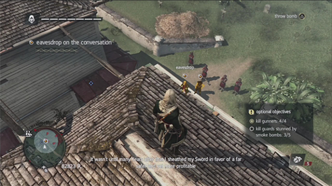
Assassin's Creed: Black Flag. White subtitles with a light shadow on a complex light background.
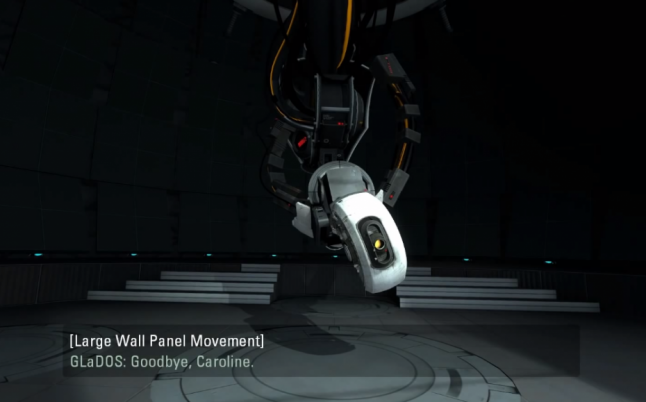
Portal 2. The plate adds contrast to any background.
At a minimum, a noticeable black stroke is needed. A simple shadow is not recommended, because the half-letter will not be separated from the background. You can also try the black plate. So that it was not so conspicuous, by default it can be made translucent (50%). Ideally, this figure should be adjusted (see below in the “Good Tips”).
2. Do not throw out the "sheet" of the text
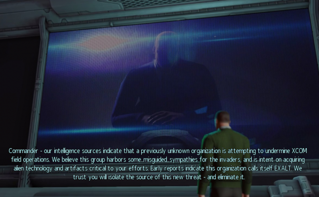
X-Com. There is a lot of text, and you have to read it.
The Witness. Subtitles are broken into short lines. This can be read even the corner of the eye.
Large blocks of text can become spoilers, giving events ahead. For example:
Hi John, old man! * SHOT * Why, John?
This phrase should be broken down into three separate ones, one after another:
Hi John, old man!
*SHOT*
Why, John?
Large blocks also interfere with readability. The smaller the text, the easier it is to grab it with one glance and return to the game again.
So it is much better to give the text in small pieces, breaking it into logical pauses and punctuation marks if possible.
Standards are set on television between countries and channels. In different countries, they are slightly different; for HD video, a maximum of 37 (Australia) to 40 (Finland) characters per line is recommended, a maximum of two lines (in exceptional cases, three). If one phrase occupies several lines, the first one should be the longest, but try to make them approximately equal in length.
Good:
It’s not easy to take
and write subtitles
Poorly:
It is not so easy to take and write
subtitles
From the translator ...
And the author is in the original, and I translated a very convenient phrase, where logical pauses coincide with convenient line breaks. If they do not coincide, it is necessary to attach this way and that and see what is more readable.
And do not replace one text abruptly with another, leave a quarter-second pause between them to emphasize the shift.
3. Make a big enough font.
Sleeping Dogs: Definitive Edition. Small text, so the subtitles are hard to read. Even if someone is able to read them, it takes time and effort.
Bertram Fiddle. Large clear text, easy and fluently read.
As you can see from the discussion on Neogaf, small text is a common problem. Do not do what looks adequate on the big screen under the nose - not everyone sees it so well, not everyone has a big screen, and someone is sitting far away. Even if you are testing "from the couch", do not forget that not everyone can move a perfect distance.
Other industries have established recommendations: for example, Amazon’s recommendations for an “interface from three meters” say: the minimum possible text size is 14 scale independent pixels (sp), or 28 pixels per 1080p. Since the subtitles are visible for a limited time, the text should be larger for them: for example, Channel 4 (UK) requires all HD subtitles to be 46 pixels (or 26 on SD).
These dimensions coincide with the unpublished study conducted by one of the manufacturers of consoles.
In games, of course, there is another limitation that is not found in other media - subtitles compete for space on the screen with the game interface. But if you limit the length of the string to 38 characters, this should not be a problem.
Good advice
These recommendations are compiled from the standards of other industries set by the BBC and the United States Office of Communications. Most we see from time to time in games, but not all the time, and games that do everything together are still rare.
If you do this, your subtitles will be in step with the industry, and set an example of how to do it. Whenever possible, these subtitles should be considered, especially if there is a lot of chatter in the game.
1. After the replicas say, you need to double-check the subtitles
Even minor inconsistencies in time and text are striking. In order to meet the time, the replicas are shortened (see clause 7 below). Sometimes the actor says gag. So if the texts and localization are done before the dubbing is over, you need to go through the texts again, as soon as the final sound comes, and check for errors.
2. Make sure that all important dialogs are read, and the subtitles can be turned on before they are needed.
A frequent complaint is that in some parts of the game there are no subtitles. Therefore, you need to check out the video sequences, in-game scripted and dynamic audio, and introductory video.
But you need to somehow turn on the subtitles before the intro starts. Infamous: First Light came up with a simple solution: press a button to turn it on.
And you can also keep subtitles enabled by default. If you are developing for XboxOne / Android / iOS, there is a system setting that can be pulled out and read as the default.
3. Position the bottom in the middle, but do not impose on the interface elements
By default, the subtitles are below in the middle, with a small indent from the bottom edge of the screen.
If a temporary interface element appears in this place (for example, a QTE message), the subtitles are shifted higher so that nothing overlaps. If the element is large and the subtitles go to the top of the screen, put them at the top. This example applies to tape buttons, but the same applies to other things, like QTE messages and in-game menus.
However, do not expect that the Xbox One notification system will put your messages from the bottom and in the center. They should not be there, and I hope that this will be fixed in the future.
4. If you need to pile up several subtitles, add new ones from the bottom.
Subtitles are usually shown one by one: one has disappeared, the second has appeared. But they can be shown at the same time - say, if they appear frequently. In this case, new ones should appear from below, moving up older ones.
5. Let's know who is talking.
Some games reach character portraits. But this is rarely done, usually costing different colors. Even if it is not so clear who speaks - from the crowd, through the loudspeaker, by phone, from behind the frame - display his name:
John: Hi!
If the speakers differ in colors, make them light so that there is a good contrast with the dark outline or die. Pay particular attention to red; it appears dark brown to most color blind people.
6. Specify where the sound comes from
If the sound is from behind the screen, show with an arrow which side:
← John: Hi!
7. Give time to read the subtitles
If there are 38 characters on a line, make sure that even the shortest, one word, replica will be on the screen for 1 second, and long - 2–2.5 seconds per line.
True, to achieve this, sometimes you need to cut off the words. But the discrepancy interferes with understanding, especially for fast readers. It is possible to cut off only in extreme cases, the meaning should be preserved, and the words should remain extremely close to the original. So, replica "No, no, no! Not now! ”, You can trim to“ No! Not now! ”, But not until“ No, later! ”The BBC has a whole guide on how to deal in delicate situations.
Children need more time. The BBC recommends 3–3.5 seconds per line for children under 13, and 4–4.5 for children under 7.
8. Use a clear, legible font.
The case of letters is normal: “Hello, everyone,” but not “HELLO TO ALL”, “Hello, Everyone” or “Hello, Everyone”, in legible letters without serifs. CAPTS can be rendered to background noise.
Although the subtitles and should be combined with the style of graphics, but not at the expense of readability. If readability suffers, the subtitles are fundamentally wrong. Customization (the next item) will help to elegantly resolve all conflicts of interest.
9. Have your subtitles customizable.
There are several subtitle usage scenarios. Someone occasionally glances at them, and wants them to be unobtrusive. Someone relies entirely on subtitles. So make some or all of the parameters customizable; ideally with live results.
- Font: artist's choice / sans serif / special for dyslexics.
- Font size: small / medium / large.
- Who says: do not show / names / colors.
- Edge effect: none / stroke / shadow / both.
- Plate: on / off
- Transparency dies.
Again, if you are developing for XboxOne / iOS / Android, there are system settings for all of this, you can pull them out through the API, and these will be the default values.
Such a degree of adjustment can be discouraging, but it is easily solved by ready-made sets: “unobtrusive”, “clear” and “custom”, with fine-tuning of all this.
Even a couple of these settings will be valuable. The most important ones are large / small print and on-off dies. Already these two will make many contented.
10. Make a separate option for subtitle noise
From the translator ...
I did not find a suitable translation for the term “closed captions”, I translate it by meaning.
The word "subtitles" usually refers to speech, but it is worth titrating other important sounds. Noise subtitles are common in other media, but rare in games. Although several famous games use them: Portal , Left for Dead , Tomb Raider and Dragon Age .
In some games they are added trivially. In others there is an additional complexity, which is not found in other media - due to the unpredictable nature of the gaming sound, several noises can play simultaneously. In Dead to Rights for this, they arranged a whole line of priorities. Each sound has a priority, and it turns out about this.
- The character (priority 1) says the subtitles are shown for 2 seconds.
- The dog barks (priority 2), there is no space on the screen, ignored.
- 2 seconds per character (priority 1) passed, we remove the caption
- A gust of wind (priority 2), showing the titer.
Such a system will show only the most important subtitles at the exact time: only critical replicas and vital clues are displayed in the sound porridge, but if everything is calm, smaller noises are titrated.
Repeat everything at last.
The basics
- Enough contrast between text and background.
- Do not throw out the "sheet" of the text.
- Make a big enough font.
Good advice
- After replicas say, you need to double-check the subtitles.
- Make sure that all important dialogs are read through, and you can turn on subtitles before they are needed.
- Place the bottom center, but do not impose on the interface elements.
- If you need to pile up several subtitles, add new ones from below.
- Let's know who is talking.
- Point out where the sound comes from.
- Give time to read the subtitles.
- Use a clear, legible font.
- Have your subtitles customizable.
- Make a separate option for subtitle noise.
Collection and publication of data
All this related to the implementation. But now let's talk about one more aspect - metrics.
Usually there is not enough data on the use of subtitles. The 79% poll on CNet says that it is worth investing in subtitles, but not at all scientific: only a small fraction answered, who read the article and felt that it was necessary to answer, and not all who played this or that game.
But with online and mobile games, which already track a lot of parameters, it’s easy to add a couple of functions that check what percentage of players included subtitles.
These data are very important to developers, especially if you need to make a decision: to invest in a function or not. But they are even more important if you share them with the public. The same applies to other data related to disability, ranging from the regime for color blind and ending with an independent volume setting.
Of course, there is no certainty who and why includes this or that setting, even the regime for color-blind people often include those who see normally. But you can do, and then say: apparently, it paid off, because even information about whether or not they often include tuning is very important.
Some independent studios publish data on disability settings that they find interesting and valuable to others. 13% of those who played at The Last Door included the font for dyslexics, 13% of MUDrammer users are blind, in Solara the blind buy more than others. So any data that can be shared on subtitles, and on availability in general, will be invaluable.
From the translator ...
MUDs are in principle friendly to the blind, and if a specialized client like MUDrammer gives a couple of functions especially for them, this is a miracle in general. A healthy majority can play on a regular terminal. The Last Door is a big-pixel game, and the font for dyslexics, departing from this styling, is corny better read.
And even without the collection of information, and even without ten "good tips", it is worth taking care of the size, contrast and amount of text in the subtitles. It will just make the game even more enjoyable for many.
Links
gameaccessibilityguidelines.com
bbc.co.uk/futuremedia/accessibility
channel4.com/media
fcc.gov/document/closed-captioning-internet-protocol-delivered-video-programming (specification of the United States Communication and Video Accessibility Act)
developer.amazon.com
A little ad-libbing from the translator
1. If someone sings, you can make karaoke. But karaoke should be turned off in some simple (for localizer) way, because it is unlikely that there will be a poetic translation of the song, rather a subscript.
2. If you translate subtitles without touching the voice acting (for example, amateur), be careful with artistic renames (Gadget → Gadget). This does not mean that the mouse should be called Gadget, and only this way, you need to feel the language and understand whether it is worth it, and if the viewer identifies the Gadget with Gadget.
3 (thanks creker ). Choose a subtitle language regardless of the audio language. Either our actors outplay, or underplay, or they don’t take computer games at all seriously ... This is what: Spanish-speaking people hide their dubbing, what the light is worth.
Source: https://habr.com/ru/post/265131/
All Articles