Introduction to the new CoordinatorLayout
This year, at the Google IO conference, Google introduced the new Android Design Support Library, which is designed to help developers embed material design into their applications. The library contains many components needed for this new style, and works with all API levels starting from the seventh. If for some reason you missed its announcement, you can read the post Ian Lake, posted on the Android Developers Blog.
Of all the components included in the Android Design Support Library, the most interesting is the new “pumped FrameLayout”, which is also the hero of our article - CoordinatorLayout . By name, you can guess that CoordinatorLayout allows you to coordinate certain dependencies between the widgets included in it.
All we need to do is wrap the widgets we need in CoordinatorLayout. Let's see how it will look like in code. Our demo code is very simple - Floating Action Button, by clicking on which Snackbar appears on the screen.
First, add the Support Design Library to the gradle:
')
Now we create the markup for our Activity:
And at the same time, the MainActivity itself:
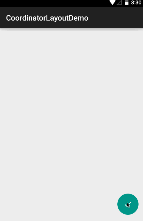
Look at the demo:
Cool, right?
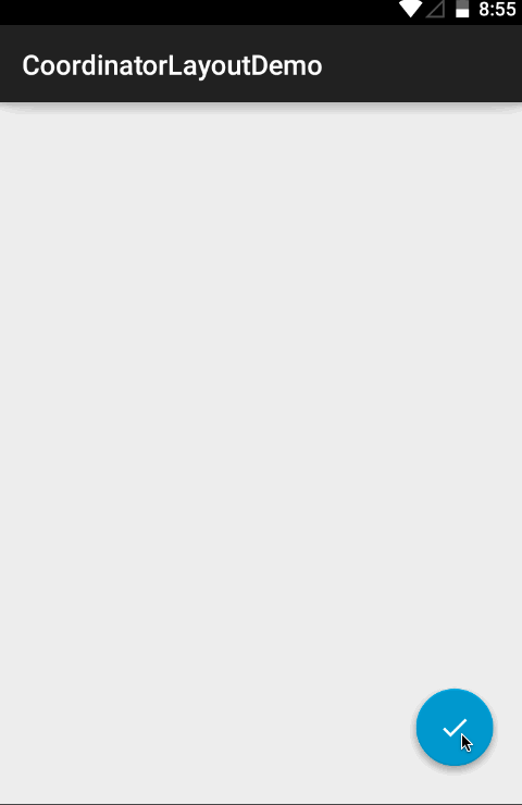
But what if we want to use another implementation of FAB? The FAB from the Support Library is not able to unfold by clicking on it in the list of available options (note of the translator: as shown in the design specifications from Google itself), so let's try another FAB implementation :
In this case, CoordinatorLayout does not work out of the box, and this is due to the fact that our new FAB has no implementation of the CoordinatorLayout.Behavior class attached to it (note of the translator: the word "behavior" will be used hereinafter). What can be done? You can wait until someone adds it ...
... or write your own implementation of CoordinatorLayout.Behavior, specific to FAB in our project.
What CoordinatorLayout really does is that we don’t need to have access to the source code of the widget for which we want to implement its behavior. You can also change the default behavior for any widget.
First we will inherit from the CoordinatorLayout.Behavior class:
Add a constructor with the Context and AttributeSet parameters so that our implementation can get the attributes it needs from the xml file:
The next step is to override the layoutDependsOn () method and return true only when we want to respond to changes in the markup. In our case, we only want to react to changes in the Snackbar widget:
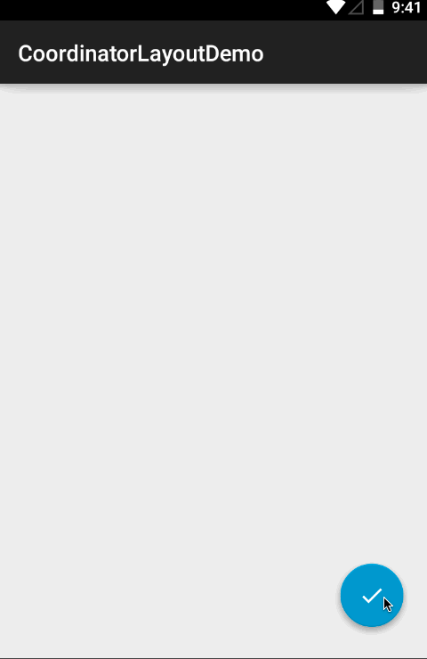
We now turn to the implementation of behavior. The onDependentViewChanged method is called whenever a widget that is in the CoordinatorLayout and which changes we are tracking, something happens (note of the translator: these are changes that lead to the need to recalculate the position on the screen of the widget for which we are implementing behavior, that is, it is clear that changing, say, the color of Snackbar does not interest us). In this method we can find out the current Snackbar state, and, accordingly, move the FAB up when the Snackbar appears on the screen. To do this, change the value of the translationY of the FAB by an amount equal to the height of the Snackbar. At the beginning of the Snackbar animation, the translationY SnackBar property is set to a value equal to the height of the Snackbar itself, which means that in order to get the correct translationY value for the FAB, we need to subtract the height of the Snackbar from its translationY. According to the documentation, we need to return true when the object changes its position on the screen.
The last thing to do is specify that the CoordinatorLayout should use FloatingActionButtonBehavior. This can be done in the markup:
And here is the result:
If you want to specify the default behavior for your widget, mark it with the DefaultBehavior annotation, specifying the path to the implementation of the Behavior class in the annotation parameters.
Want to take a look at the full implementation? You on github .
Enjoy your coding!
Meet the Android CoordinatorLayout
Of all the components included in the Android Design Support Library, the most interesting is the new “pumped FrameLayout”, which is also the hero of our article - CoordinatorLayout . By name, you can guess that CoordinatorLayout allows you to coordinate certain dependencies between the widgets included in it.
All we need to do is wrap the widgets we need in CoordinatorLayout. Let's see how it will look like in code. Our demo code is very simple - Floating Action Button, by clicking on which Snackbar appears on the screen.
First, add the Support Design Library to the gradle:
')
compile 'com.android.support:design:22.2.0' Now we create the markup for our Activity:
<?xml version="1.0" encoding="utf-8"?> <android.support.design.widget.CoordinatorLayout xmlns:android="http://schemas.android.com/apk/res/android" android:layout_width="match_parent" android:layout_height="match_parent"> <android.support.design.widget.FloatingActionButton android:id="@+id/fab" android:layout_width="wrap_content" android:layout_height="wrap_content" android:layout_gravity="end|bottom" android:layout_margin="16dp" android:src="@drawable/ic_done" /> </android.support.design.widget.CoordinatorLayout> And at the same time, the MainActivity itself:
public class MainActivity extends AppCompatActivity { @Override protected void onCreate(Bundle savedInstanceState) { super.onCreate(savedInstanceState); setContentView(R.layout.activity_main); findViewById(R.id.fab).setOnClickListener(new View.OnClickListener() { @Override public void onClick(View view) { Snackbar.make(view, "Hello Snackbar", Snackbar.LENGTH_LONG).show(); } }); } } Look at the demo:
Cool, right?
But what if we want to use another implementation of FAB? The FAB from the Support Library is not able to unfold by clicking on it in the list of available options (note of the translator: as shown in the design specifications from Google itself), so let's try another FAB implementation :
compile 'com.getbase:floatingactionbutton:1.9.1' <?xml version="1.0" encoding="utf-8"?> <android.support.design.widget.CoordinatorLayout xmlns:android="http://schemas.android.com/apk/res/android" xmlns:app="http://schemas.android.com/apk/res-auto" android:layout_width="match_parent" android:layout_height="match_parent"> <com.getbase.floatingactionbutton.FloatingActionButton android:id="@+id/fab" android:layout_width="wrap_content" android:layout_height="wrap_content" android:layout_gravity="end|bottom" android:layout_margin="16dp" app:fab_icon="@drawable/ic_done" /> </android.support.design.widget.CoordinatorLayout> In this case, CoordinatorLayout does not work out of the box, and this is due to the fact that our new FAB has no implementation of the CoordinatorLayout.Behavior class attached to it (note of the translator: the word "behavior" will be used hereinafter). What can be done? You can wait until someone adds it ...
... or write your own implementation of CoordinatorLayout.Behavior, specific to FAB in our project.
Widgets learn to behave correctly
What CoordinatorLayout really does is that we don’t need to have access to the source code of the widget for which we want to implement its behavior. You can also change the default behavior for any widget.
First we will inherit from the CoordinatorLayout.Behavior class:
public class FloatingActionButtonBehavior extends CoordinatorLayout.Behavior<FloatingActionButton> Add a constructor with the Context and AttributeSet parameters so that our implementation can get the attributes it needs from the xml file:
public FloatingActionButtonBehavior(Context context, AttributeSet attrs) {} The next step is to override the layoutDependsOn () method and return true only when we want to respond to changes in the markup. In our case, we only want to react to changes in the Snackbar widget:
@Override public boolean layoutDependsOn(CoordinatorLayout parent, FloatingActionButton child, View dependency) { return dependency instanceof SnackbarLayout; } We now turn to the implementation of behavior. The onDependentViewChanged method is called whenever a widget that is in the CoordinatorLayout and which changes we are tracking, something happens (note of the translator: these are changes that lead to the need to recalculate the position on the screen of the widget for which we are implementing behavior, that is, it is clear that changing, say, the color of Snackbar does not interest us). In this method we can find out the current Snackbar state, and, accordingly, move the FAB up when the Snackbar appears on the screen. To do this, change the value of the translationY of the FAB by an amount equal to the height of the Snackbar. At the beginning of the Snackbar animation, the translationY SnackBar property is set to a value equal to the height of the Snackbar itself, which means that in order to get the correct translationY value for the FAB, we need to subtract the height of the Snackbar from its translationY. According to the documentation, we need to return true when the object changes its position on the screen.
@Override public boolean onDependentViewChanged(CoordinatorLayout parent, FloatingActionButton child, View dependency) { float translationY = Math.min(0, dependency.getTranslationY() - dependency.getHeight()); child.setTranslationY(translationY); return true; } The last thing to do is specify that the CoordinatorLayout should use FloatingActionButtonBehavior. This can be done in the markup:
<?xml version="1.0" encoding="utf-8"?> <android.support.design.widget.CoordinatorLayout xmlns:android="http://schemas.android.com/apk/res/android" xmlns:app="http://schemas.android.com/apk/res-auto" android:layout_width="match_parent" android:layout_height="match_parent"> <com.getbase.floatingactionbutton.FloatingActionButton android:id="@+id/fab" android:layout_width="wrap_content" android:layout_height="wrap_content" android:layout_gravity="end|bottom" android:layout_margin="16dp" app:layout_behavior="com.getbase.coordinatorlayoutdemo.FloatingActionButtonBehavior" app:fab_icon="@drawable/ic_done" /> </android.support.design.widget.CoordinatorLayout> And here is the result:
If you want to specify the default behavior for your widget, mark it with the DefaultBehavior annotation, specifying the path to the implementation of the Behavior class in the annotation parameters.
Want to take a look at the full implementation? You on github .
Enjoy your coding!
Source: https://habr.com/ru/post/265119/
All Articles