Clustering graphs and searching for communities. Part 1: introduction, overview of tools and Hair Spheres
Hi, Habr! In our work, there is often a need to identify communities (clusters) of different objects: users, websites, grocery pages of online stores. The benefits of such information are quite multifaceted - these are just a few areas for the practical application of high-quality clusters:
 From a machine learning point of view, getting such related groups looks like a typical clustering task. However, not always we are easily accessible features of observations, in the space of which one could look for clusters. Content or semantic features are rather time-consuming in obtaining, as well as the integration of various data sources, from where these features could be obtained. But we have a DMP called Facetz.DCA , where the facts of user visits to the pages are on the surface. From them it is easy to get the number of visits to sites, both individually and jointly for each pair of sites. This information is already enough to build graphs of web domains or product pages. Now the task of clustering can be formulated as the task of isolating communities in the resulting graphs.
Looking ahead, I’ll say that we have already managed to use the web domain communities with great benefit in advertising RTB campaigns. The classic problem that traders face is the need to maneuver between targeting accuracy and segment volume. On the one hand, coarse targeting on socio-demographic features is too wide and ineffective. On the other hand, tricky thematic segments are often too narrow, and changes in probability thresholds in classifiers are not capable of expanding the segment to the required volume (say, several tens of millions of cookies). At the same time, people who frequently visit domains from the same cluster form good segments for such wide-ranging campaigns.
In this series of posts, I will try to dwell more on the algorithmic side of the problem than on the business side, and do the following. First, describe our experiments and show the pictures that we have turned out. Secondly, to elaborate on the methods: what we applied / wanted to apply, but changed our minds / still want to apply in perspective.
')
Many of you probably had to cluster the data, but most probably, like us, never clustered the graph. The main feature of graph clustering is the absence of observational features. We have no distance between two arbitrary points in space, because there is no space itself, there is no norm, and it is impossible to determine the distance. Instead, we have edge metadata (ideally, for each pair of vertices). If there is an edge “weight”, then it can be interpreted as a distance (or, on the contrary, as a similarity), and then we have distances for each pair of vertices.
Many of the clustering algorithms in Euclidean space are also suitable for graphs, since for these algorithms it is only necessary to know the distance between observations, and not between arbitrary “points in space”. Some require exactly feature space and are not suitable for graphs (for example, k-means). On the other hand, graphs have many unique properties that can also be used: connectivity components, local edge clusters, places of looping of information flows, etc.
To date, people have invented a huge number of cluster clustering methods - each with its own advantages and jambs. In one of the following posts we will examine in more detail some algorithms and their properties. In the meantime, we consider it useful to share links to open graph analysis tools where something has already been implemented for clustering and finding communities.
If the goal is to conduct a reproducible experiment on small data and not roll out the finished product into production, then among all the above, the best options are, in our opinion, the graph-tool (item 3), Gephi (item 4) or Infomap (item 9).
And now we will tell you how we formed the graphs of domains of the Runet and its environs, and show the pictures with the results of their clustering. The next part of our series of articles will describe the algorithm by which the following images were obtained. These are modified k-medoids, which we wrote on the root python in the best traditions of cycling, and with the help of which we managed to solve some problems surprisingly well. Some of the information from this and the next post, as well as a description of some other algorithms, is in the presentation, which I told on newprolab in digital october this spring:
The first task is clustering web domains. From DMP, we take data on visits by users of different domains, and based on them we build a graph, where domains act as nodes, and affinity between domains as nodes. Affinity (also known as elevator) between domains and
and  - this is a selective assessment of how “a user visits
  domain name "And" user visit domain name »Close to independence. If a
  - the total number of users under consideration, and
  - the number of users who visited , then:

To get rid of noise, you need to filter domains with too few visits, as well as edges with low affinity. Practice shows that a threshold of 15–20 for visits and 20–25 for affinity is sufficient. With a higher affinity threshold, the result is too many isolated vertices.
This method of graph construction allows you to see in the data a fairly clear structure of the “communities” of domains. One of its interesting features is that the largest domains (search engines, social networks, some large stores and news sites), as a rule, do not have very “thick” edges from any other top. This leads to the fact that these domains are located on the outskirts and often remain isolated vertices, not falling into any of the clusters. We consider this a plus, since a joint visit to vk.com and a highly specialized website really says little about their connection with each other.
It must be said that getting and filtering data, building a graph and calculating various matrices using it is a much more resource-intensive task than obtaining the clusters themselves. Some stages (in particular, the calculation of pairwise similarity) managed to be parallelized using the pathos package ( pathos.multiprocessing ). Unlike the standard Python package multiprocessing, it has no problems with serialization, because it uses dill instead of pickle. Its syntax is absolutely identical to the standard multiprocessing. Here you can read about dill.
It's time to show some pictures with graphs (how they came out, we will tell in the next part). It is known that networkX is not intended for visualization of graphs, and that for this purpose it is better to refer to d3.js, gephi or graph-tool. We found out too late about it, and contrary to common sense, we still courageously continued to draw pictures on networkX. It turned out not that pure honey (in particular, it was not possible to adjust the mutual pushing away of the nodes and non-overlapping inscriptions), but we tried our best and squeezed everything that is possible from the networkX capabilities. In all pictures, the diameter of the circle (domain) corresponds to its attendance, the thickness of the edge corresponds to affinity, the color of the circle means that the domain belongs to the cluster. The color of the edge means that both vertices belong to this cluster, the gray color corresponds to the edges connecting the vertices from different clusters.
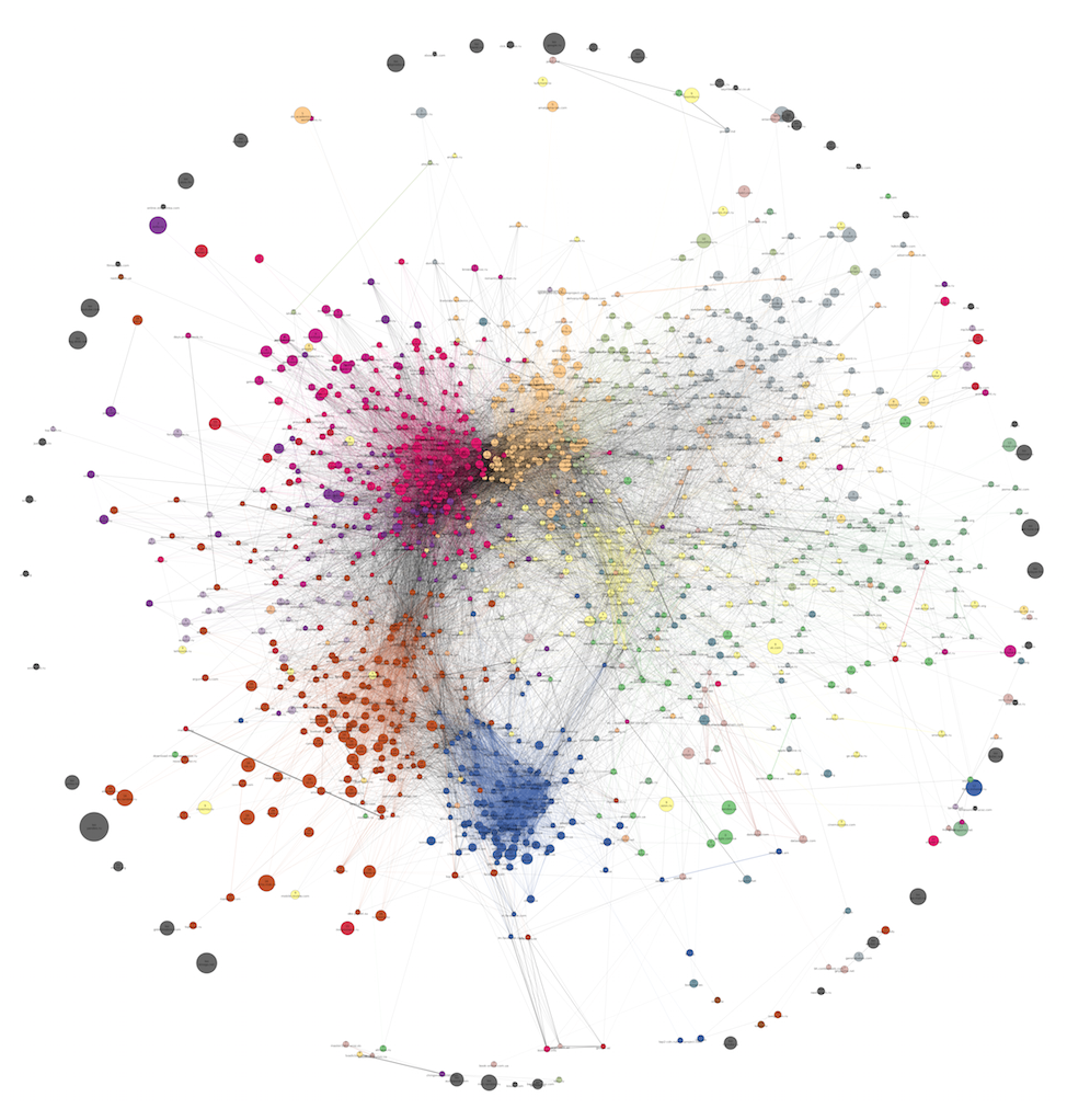
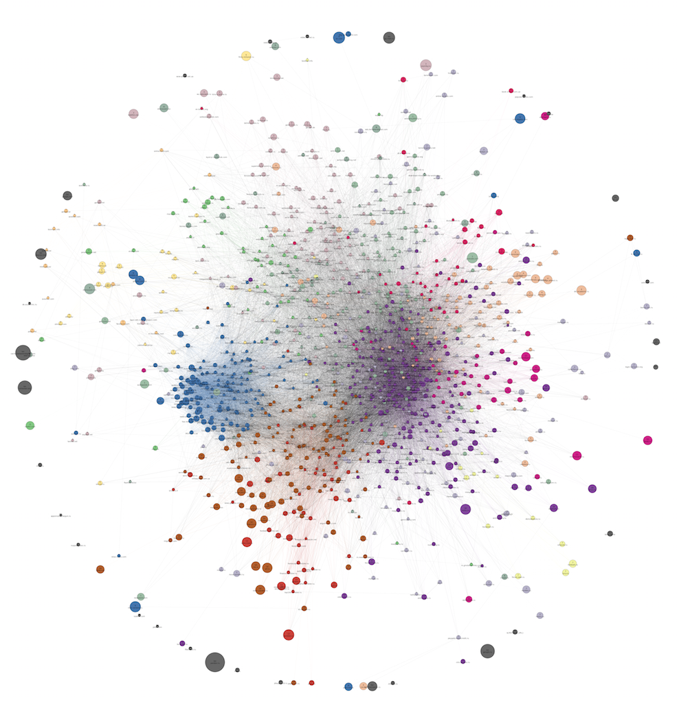
Not very big graph from 1285 domains:

The picture shows a sparse version of it: most of the ribs are removed according to the local sparsification method (it will be described in the next section), because of which the grouping into communities looks more distinct, and the effect of the “Big Hair Ball” is softened. There are only 18 clusters. Full size of the picture (in png).
Each vertex contains the domain name and cluster number to which it belongs. Pay attention to the isolated vertices around the outer circumference - these are usually large domains without strong ties to anyone. The lower part of the graph can be described as more "feminine" (or rather, "family"). It is rather disorderly, probably because from one browser (with one cookie) pages were viewed by several family members at different times. Allocation of communities in this part of the graph did not work very well.
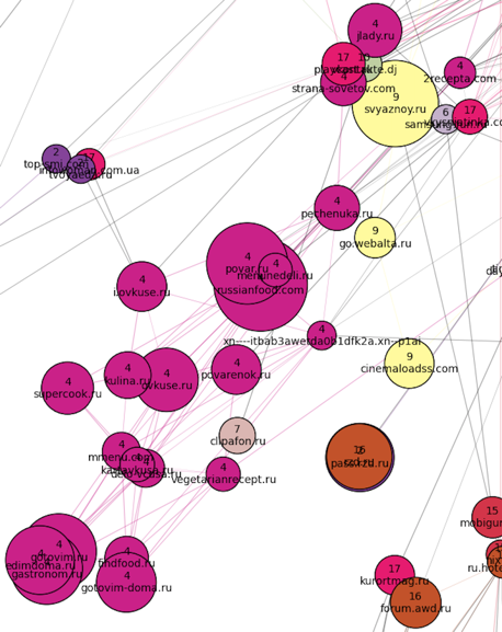
A lot of things got into one huge cluster at number 17 (pink) - from the websites for managing pregnancy below and medical sites in the center, to a jumble of weather forecasts, women's forums and magazines in the upper part of the cluster. To the "south-west" there is a culinary cluster (number 4):
To the "south-east" of the family cluster - real estate + job search (united in one cluster number 2):

To the "south" of cluster 17 is located very poorly marked area. Thus, the algorithm failed to isolate the community of tourist domains (they are scattered across different communities), and the site about the weapon got into the culinary cluster.
In a small cluster of 15 (red) were mainly legal sites:

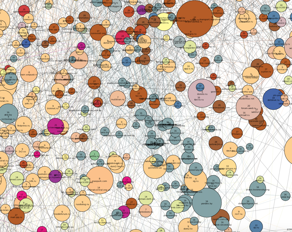
To the "north-west" of the "family" part are the most distinct clusters. Apparently, no one uses the browsers of visitors of these sites anymore (and this is logical, based on the topics of clusters). First, two dense clusters are striking: Russian (number 16, brick) and Ukrainian (number 12, blue) news sites, and the latter is much denser, though smaller in size. You may also notice that the engagement of sites along the Russian cluster is changing:
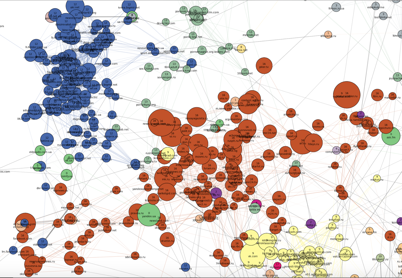
Movies, series and online cinemas (gray and yellow clusters numbered 3 and 8) are located to the "northeast" of the news sites. A film cluster is located between the film clusters and the Ukrainian news cluster as a transitional zone.

Cluster number 1 is located to the east - the entire Kazakh Internet. Next to it are automotive sites (cluster 6, lilac) and Russian sports sites (they joined the rest of the news in cluster 16).

Further to the south is a cluster of cartoons and children's games (number 10, swamp), as well as closely related school clusters of dictionaries, online textbooks and essays: large Russian (number 5, peach) and very small Ukrainian (number 0, green) . In the cluster number 0 also hit the Ukrainian sites of all topics, except for news (they turned out quite a bit). School clusters in the “south” smoothly pass into the main female cluster number 17.
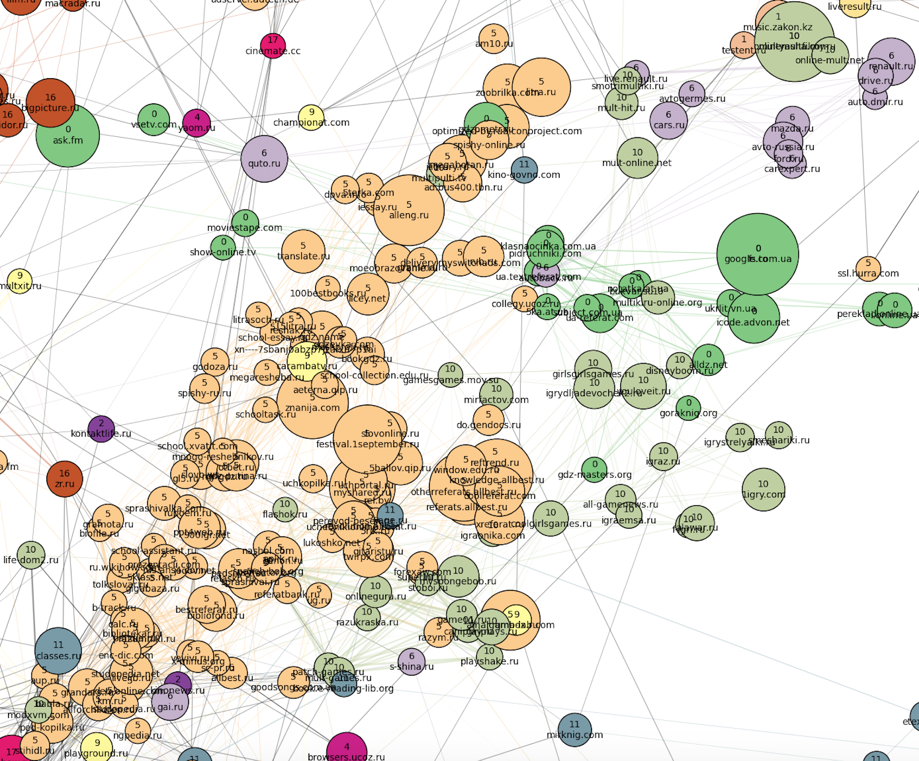
The last thing to note here is a cluster of books located on the outskirts of the “eastern” part of the picture:

Here is the same graph, just drawn without thinning:
Full size.
And here is what a similar graph looks like, built almost a year before the previous one. It has 12 clusters:
Full size.
As you can see, during this time the structure as a whole has remained the same (news sites, a large female cluster, a large rarefied area of entertainment sites of different directions). Of the differences can be noted the final disappearance of the cluster with the music during this time. Probably, during this time, people almost stopped using specialized websites to find music, often turning to social networks and picking up services like Spotify. The division of the entire graph into communities as a whole has increased, and the number of meaningful clusters has been brought from 12 to 18. The reasons for this most likely lie not in changing user behavior, but simply in changing our data sources and data collection mechanism.
If we increase the sample of users and leave the filters at the same level for the minimum number of visits to the domain and a pair of domains, as well as the minimum affinity for the formation of the edge, we get a larger graph. Below is a graph of 10,121 vertices and 30 clusters. As you can see, the power algorithm for drawing from networkx is not very good at it and gives a rather confusing picture. However, some patterns can be traced in this form. The number of edges has been reduced from one and a half million to 40,000 using the same dilution method (local sparsification). PNG-file is 80 MB, so please look at the full size here.
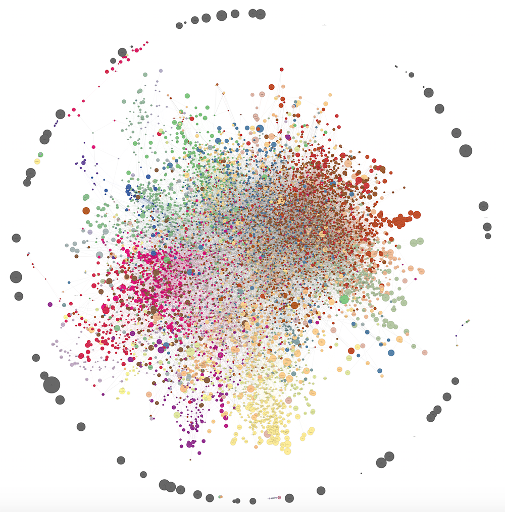
On visualization, we failed to properly identify the structure of the communities (mash in the center), but in reality the clusters turned out to be no less meaningful than in the case of 1,285 domains.
With the increase in the amount of data, interesting patterns are observed. On the one hand, small peripheral clusters that were indistinguishable on small data begin to stand out. On the other hand, that which is poorly clustered on small data is also poorly clustered on large ones (for example, sites about real estate and job search are mixed, esoterics and astrology often adjoin them).
Here are some examples of new communities. On the outskirts, the Spanish cluster stood out, as we see something from there:

Not far from it, closer to the main cluster of points, is the Azerbaijani cluster (number 2) and the Georgian (number 4):
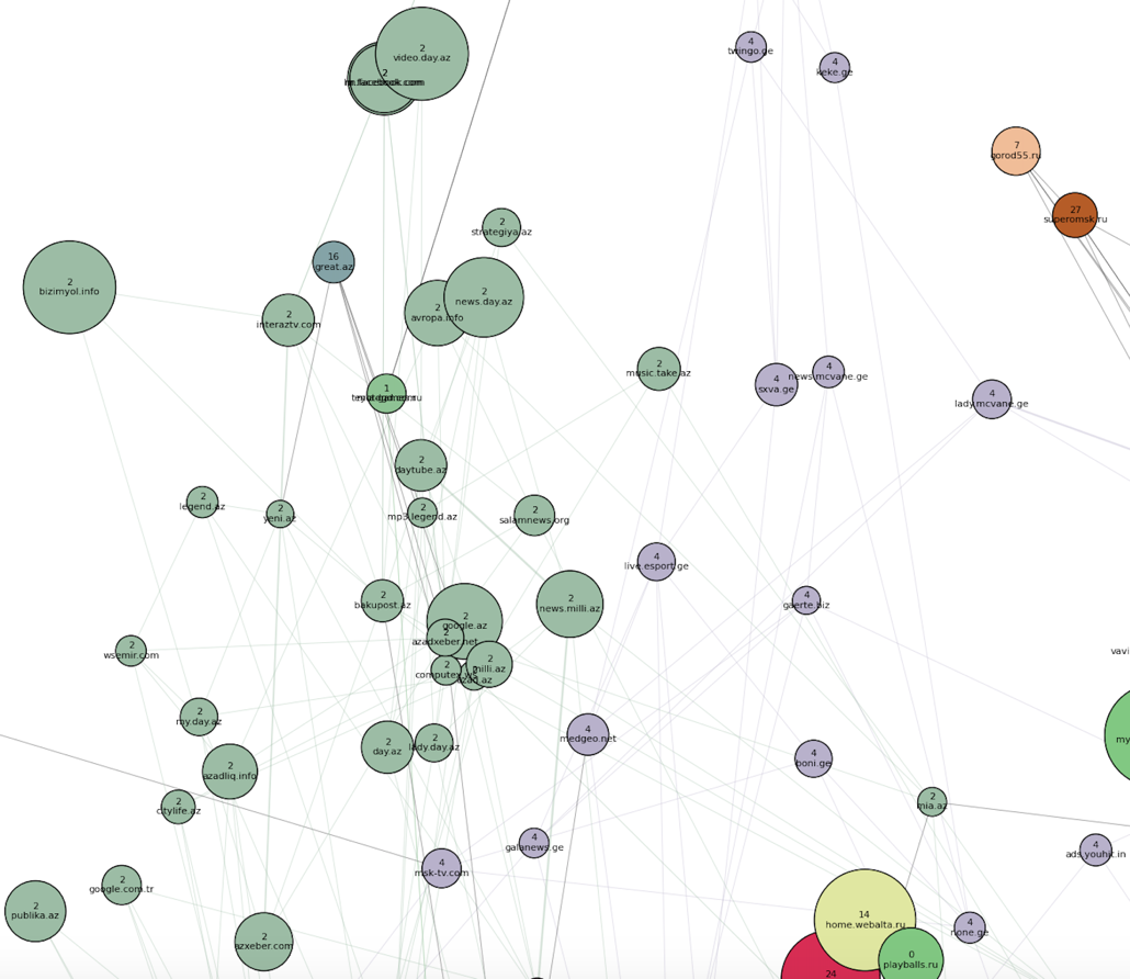
An Uzbek-Tajik cluster appeared, as well as the Belarusian (number 16) - within the bulk of the domains, next to the “Russian news” and “Ukrainian non-news” communities:
In the next post will be a description of the algorithm:
- how the clusters themselves were obtained so that the graph could be colored like that;
- how to remove the excess edges.
Ready to answer your questions in the comments. Stay tuned!
- Selection of user segments for targeted advertising campaigns.
- Using clusters as predictors (“features”) in personal recommendations (in content-based methods or as additional information in collaborative filtering).
- Reduction of dimensionality in any machine learning task, where the pages or domains visited by the user act as features.
- Comparison of product URLs between different online stores in order to identify among them the groups corresponding to the same product.
- Compact visualization - it will be easier for a person to perceive the data structure.
From a machine learning point of view, getting such related groups looks like a typical clustering task. However, not always we are easily accessible features of observations, in the space of which one could look for clusters. Content or semantic features are rather time-consuming in obtaining, as well as the integration of various data sources, from where these features could be obtained. But we have a DMP called Facetz.DCA , where the facts of user visits to the pages are on the surface. From them it is easy to get the number of visits to sites, both individually and jointly for each pair of sites. This information is already enough to build graphs of web domains or product pages. Now the task of clustering can be formulated as the task of isolating communities in the resulting graphs.Looking ahead, I’ll say that we have already managed to use the web domain communities with great benefit in advertising RTB campaigns. The classic problem that traders face is the need to maneuver between targeting accuracy and segment volume. On the one hand, coarse targeting on socio-demographic features is too wide and ineffective. On the other hand, tricky thematic segments are often too narrow, and changes in probability thresholds in classifiers are not capable of expanding the segment to the required volume (say, several tens of millions of cookies). At the same time, people who frequently visit domains from the same cluster form good segments for such wide-ranging campaigns.
In this series of posts, I will try to dwell more on the algorithmic side of the problem than on the business side, and do the following. First, describe our experiments and show the pictures that we have turned out. Secondly, to elaborate on the methods: what we applied / wanted to apply, but changed our minds / still want to apply in perspective.
')
Many of you probably had to cluster the data, but most probably, like us, never clustered the graph. The main feature of graph clustering is the absence of observational features. We have no distance between two arbitrary points in space, because there is no space itself, there is no norm, and it is impossible to determine the distance. Instead, we have edge metadata (ideally, for each pair of vertices). If there is an edge “weight”, then it can be interpreted as a distance (or, on the contrary, as a similarity), and then we have distances for each pair of vertices.
Many of the clustering algorithms in Euclidean space are also suitable for graphs, since for these algorithms it is only necessary to know the distance between observations, and not between arbitrary “points in space”. Some require exactly feature space and are not suitable for graphs (for example, k-means). On the other hand, graphs have many unique properties that can also be used: connectivity components, local edge clusters, places of looping of information flows, etc.
Tool overview
To date, people have invented a huge number of cluster clustering methods - each with its own advantages and jambs. In one of the following posts we will examine in more detail some algorithms and their properties. In the meantime, we consider it useful to share links to open graph analysis tools where something has already been implemented for clustering and finding communities.
- GraphX is very fashionable and developing now. It had to be written the first element in the list, but there are no ready-made clustering algorithms as such (version 1.4.1). There is a calculation of triangles and connected components, which, together with standard Spark RDD operations, can be used to write your own algorithms. So far, GraphX has apa only for scala, which can also complicate its use.
- A library for the Apache Giraph called Okapi uses several algorithms, including a fairly new proprietary algorithm called Spinner , based on label propagation. Giraph is an add-on to Hadoop, designed to handle graphs. It has almost no machine learning, and Okapi was created to compensate for this at Telefonica. Probably now Giraph does not look so promising against GraphX, but the Spinner algorithm itself fits well with the Spark paradigm. About Spinner can be read here .
- The graph-tool library for python contains several new clustering algorithms and works very quickly. We used it to compare URLs corresponding to the same product. All that is possible is parallelized across the processor cores, and for local computing (graphs up to a couple of hundred thousand nodes in size) this is the fastest option.
- Gephi is a famous tool that we have bypassed, perhaps unfairly. For a long time, Gephi practically did not develop, but good plug-ins appeared, including those for selecting communities . Recently, the project has revived and version 0.9 is expected.
- GraphLab Create . This is a Python wrapper over C ++ that allows you to run machine learning both locally and distributed (Yarn). Clustering of graphs is still not there, just finding k-cores .
- The vaunted networkX, despite the abundance of algorithms , does not know how to cluster graphs, but only to analyze connected components and clicks. In addition, it is much slower than the graph-tool, and in terms of rendering it is inferior to the same graph-tool and gephi.
- The implementation of the Markov clustering algorithm (MCL) from its inventor. The author has reduced the complexity of the usual MCL in the worst case with
before
where
- the number of nodes, and
- the maximum degree of the node, and offended when the MCL algorithm is called unscalable. He also added chips to adjust the number of clusters. However, the MCL had several other serious problems, and it is unclear whether they are solved. For example, the problem of cluster size instability (our small experiment produced one giant connected component and many small clusters of 2-3 knots, but perhaps we did not find the right handle). The latest news on the site dates back to 2012, which is not very good.
- Different implementations of one of the most popular algorithms Louvain: for C , for Python , even for Python . Classic article about this algorithm: link .
- The site dedicated to the Infomap algorithm and its modifications from the authors of the method. As elsewhere, there is open source. In addition to good support and documentation, there are amazing demos that illustrate the work of the algorithm: here and here . You can find out how the algorithm works here .
- A package for R called igraph . It implements quite a lot of clustering algorithms, but we cannot say anything concrete about them, since we have not studied the package.
If the goal is to conduct a reproducible experiment on small data and not roll out the finished product into production, then among all the above, the best options are, in our opinion, the graph-tool (item 3), Gephi (item 4) or Infomap (item 9).
Our experiments
And now we will tell you how we formed the graphs of domains of the Runet and its environs, and show the pictures with the results of their clustering. The next part of our series of articles will describe the algorithm by which the following images were obtained. These are modified k-medoids, which we wrote on the root python in the best traditions of cycling, and with the help of which we managed to solve some problems surprisingly well. Some of the information from this and the next post, as well as a description of some other algorithms, is in the presentation, which I told on newprolab in digital october this spring:
Data
The first task is clustering web domains. From DMP, we take data on visits by users of different domains, and based on them we build a graph, where domains act as nodes, and affinity between domains as nodes. Affinity (also known as elevator) between domains
To get rid of noise, you need to filter domains with too few visits, as well as edges with low affinity. Practice shows that a threshold of 15–20 for visits and 20–25 for affinity is sufficient. With a higher affinity threshold, the result is too many isolated vertices.
This method of graph construction allows you to see in the data a fairly clear structure of the “communities” of domains. One of its interesting features is that the largest domains (search engines, social networks, some large stores and news sites), as a rule, do not have very “thick” edges from any other top. This leads to the fact that these domains are located on the outskirts and often remain isolated vertices, not falling into any of the clusters. We consider this a plus, since a joint visit to vk.com and a highly specialized website really says little about their connection with each other.
It must be said that getting and filtering data, building a graph and calculating various matrices using it is a much more resource-intensive task than obtaining the clusters themselves. Some stages (in particular, the calculation of pairwise similarity) managed to be parallelized using the pathos package ( pathos.multiprocessing ). Unlike the standard Python package multiprocessing, it has no problems with serialization, because it uses dill instead of pickle. Its syntax is absolutely identical to the standard multiprocessing. Here you can read about dill.
Visualization
It's time to show some pictures with graphs (how they came out, we will tell in the next part). It is known that networkX is not intended for visualization of graphs, and that for this purpose it is better to refer to d3.js, gephi or graph-tool. We found out too late about it, and contrary to common sense, we still courageously continued to draw pictures on networkX. It turned out not that pure honey (in particular, it was not possible to adjust the mutual pushing away of the nodes and non-overlapping inscriptions), but we tried our best and squeezed everything that is possible from the networkX capabilities. In all pictures, the diameter of the circle (domain) corresponds to its attendance, the thickness of the edge corresponds to affinity, the color of the circle means that the domain belongs to the cluster. The color of the edge means that both vertices belong to this cluster, the gray color corresponds to the edges connecting the vertices from different clusters.
Comments to clusters on the example of one of the graphs
Not very big graph from 1285 domains:
The picture shows a sparse version of it: most of the ribs are removed according to the local sparsification method (it will be described in the next section), because of which the grouping into communities looks more distinct, and the effect of the “Big Hair Ball” is softened. There are only 18 clusters. Full size of the picture (in png).
Each vertex contains the domain name and cluster number to which it belongs. Pay attention to the isolated vertices around the outer circumference - these are usually large domains without strong ties to anyone. The lower part of the graph can be described as more "feminine" (or rather, "family"). It is rather disorderly, probably because from one browser (with one cookie) pages were viewed by several family members at different times. Allocation of communities in this part of the graph did not work very well.
A lot of things got into one huge cluster at number 17 (pink) - from the websites for managing pregnancy below and medical sites in the center, to a jumble of weather forecasts, women's forums and magazines in the upper part of the cluster. To the "south-west" there is a culinary cluster (number 4):
To the "south-east" of the family cluster - real estate + job search (united in one cluster number 2):
To the "south" of cluster 17 is located very poorly marked area. Thus, the algorithm failed to isolate the community of tourist domains (they are scattered across different communities), and the site about the weapon got into the culinary cluster.
In a small cluster of 15 (red) were mainly legal sites:
To the "north-west" of the "family" part are the most distinct clusters. Apparently, no one uses the browsers of visitors of these sites anymore (and this is logical, based on the topics of clusters). First, two dense clusters are striking: Russian (number 16, brick) and Ukrainian (number 12, blue) news sites, and the latter is much denser, though smaller in size. You may also notice that the engagement of sites along the Russian cluster is changing:
Movies, series and online cinemas (gray and yellow clusters numbered 3 and 8) are located to the "northeast" of the news sites. A film cluster is located between the film clusters and the Ukrainian news cluster as a transitional zone.
Cluster number 1 is located to the east - the entire Kazakh Internet. Next to it are automotive sites (cluster 6, lilac) and Russian sports sites (they joined the rest of the news in cluster 16).
Further to the south is a cluster of cartoons and children's games (number 10, swamp), as well as closely related school clusters of dictionaries, online textbooks and essays: large Russian (number 5, peach) and very small Ukrainian (number 0, green) . In the cluster number 0 also hit the Ukrainian sites of all topics, except for news (they turned out quite a bit). School clusters in the “south” smoothly pass into the main female cluster number 17.
The last thing to note here is a cluster of books located on the outskirts of the “eastern” part of the picture:
Changes for the year
Here is the same graph, just drawn without thinning:
Full size.
And here is what a similar graph looks like, built almost a year before the previous one. It has 12 clusters:
Full size.
As you can see, during this time the structure as a whole has remained the same (news sites, a large female cluster, a large rarefied area of entertainment sites of different directions). Of the differences can be noted the final disappearance of the cluster with the music during this time. Probably, during this time, people almost stopped using specialized websites to find music, often turning to social networks and picking up services like Spotify. The division of the entire graph into communities as a whole has increased, and the number of meaningful clusters has been brought from 12 to 18. The reasons for this most likely lie not in changing user behavior, but simply in changing our data sources and data collection mechanism.
If we increase the sample of users and leave the filters at the same level for the minimum number of visits to the domain and a pair of domains, as well as the minimum affinity for the formation of the edge, we get a larger graph. Below is a graph of 10,121 vertices and 30 clusters. As you can see, the power algorithm for drawing from networkx is not very good at it and gives a rather confusing picture. However, some patterns can be traced in this form. The number of edges has been reduced from one and a half million to 40,000 using the same dilution method (local sparsification). PNG-file is 80 MB, so please look at the full size here.
On visualization, we failed to properly identify the structure of the communities (mash in the center), but in reality the clusters turned out to be no less meaningful than in the case of 1,285 domains.
With the increase in the amount of data, interesting patterns are observed. On the one hand, small peripheral clusters that were indistinguishable on small data begin to stand out. On the other hand, that which is poorly clustered on small data is also poorly clustered on large ones (for example, sites about real estate and job search are mixed, esoterics and astrology often adjoin them).
Here are some examples of new communities. On the outskirts, the Spanish cluster stood out, as we see something from there:
Not far from it, closer to the main cluster of points, is the Azerbaijani cluster (number 2) and the Georgian (number 4):
An Uzbek-Tajik cluster appeared, as well as the Belarusian (number 16) - within the bulk of the domains, next to the “Russian news” and “Ukrainian non-news” communities:
In the next post will be a description of the algorithm:
- how the clusters themselves were obtained so that the graph could be colored like that;
- how to remove the excess edges.
Ready to answer your questions in the comments. Stay tuned!
Source: https://habr.com/ru/post/265077/
All Articles