Total Mobilization with MobilizeToday
Since April 2015, Google has introduced a new algorithm for ranking search results on mobile devices, which in the United States has already been dubbed “mobilemailddon”. Now resources that do not have a mobile version of the site will have lower positions. At the same time, the search engine described the requirements for mobile sites and even offered tools for assessing the quality and identifying errors. Such a policy of the IT giant is not accidental: mobile devices have conquered the world and do not give up.
According to a study published by Yandex in the spring of 2015, at the end of 2014, 68% of Internet users in Russian cities went online at least once a month using mobile devices (56% in the previous year). Mobile users have become a significant part of the audience sites. In 2014, the share of visits to sites from smartphones and tablets increased by one and a half times. Moreover, from the smartphones at the end of 2014, Russians made almost two times more visits than from tablets, and the growth in activity also increased. If we look at global trends, the share of smartphone owners among Internet users is 80% and growth continues.
')
From mobile devices are looking for both ordinary users and business. So, it's time to create mobile versions of sites. Long, expensive, difficult.
We conducted a desk study and found that the lack of a mobile site is a strong blow to the conversion, and therefore to the company's profitability. As of the IV quarter of 2014, the share of mobile users in Moscow was 31%, by region this share is relatively metropolitan with an error of ± 2-3%. As we found out, a part of users with a certain probability can leave the site, not adapted for mobile devices. MobilizeToday.ru collected the following statistics: 46% of visitors rarely visit a site that is inconvenient for navigation, 31% will remain loyal, 23% will immediately leave the site. By simple analysis, estimate the number of potential customers lost! A mobile site is necessary for almost any business for a number of marketing and technical reasons:
The MobilizeToday team drew attention to the situation and found a way out - we created our solution so that users can easily adapt existing websites to smartphones and tablets. At the core of the solution, we use the cloud-based IDE with the Ace editor from Cloud9. Inside, Git is used as a version control system with a visual interlayer to view the change history, create branches and resolve conflicts. We intercept the loading of the HTML page in the browser in order to gain complete control over the change of the interface for a particular mobile device. The resulting files, which make the site adaptive, can be stored on the client’s server or on the CDN for faster download. The main features of our solution are the following:
We worked a lot with other applications and we didn’t always like them - other designers and builders always have limitations. The MobilizeToday team managed to get rid of the restrictions - the mobile page can be created completely from scratch and edited at the lowest level using HTML, CSS and JavaScript.
A unique feature of IDE MobilizeToday is the combination of two entities: a cloud-based IDE for solving front-end tasks and optimizing existing sites for mobile devices. We made sure that integration was done as efficiently as possible:
MobilizeToday.ru is not just an online editor with the possibility of joint work of several developers, it is a self-contained system for solving a business problem. The MobilizeToday project has its own user interface (UI) built in which branches are created for working on a project, there is an interface for quickly resolving conflicts, as well as for viewing changes made to a project. When working with branches, there is no need to know the Git commands; the system makes it easy to handle version control using a friendly interface. This allows you to involve in the project people with a lower level and experience in web development and even customers who can easily replace the text or the name of the button without the participation of the developer. Users don’t have to worry about saving files or manually creating revisions; all this is done automatically, like Google Docs or the Gmail online editor does. Regular files, unlike other Cloud IDEs, are allocated a rather modest place, and editing objects, such as templates and snippets (ready-made code snippets), is brought to the forefront. Editing these entities opens automatically when you change the page of the mobile site or when searching for a specific element on the page. Such logic was made for the optimal solution of the main business problem - optimization of the site interface for mobile devices with the involvement of participants of different skill levels.
To work with the application, the user does not need to install and download programs - only a browser is needed. To get started, the site owner adds the MobilizeToday.ru initialization script to the code of the desktop version, which “makes friends” of the site and the IDE and makes it adaptive, without affecting the performance and performance of the main site. When the adaptation work is completed using the Constructor and Control Panel, all the resulting files, including static HTML, CSS, JS files, images, and dynamic template files are placed on the client’s server or on the CDN content distribution network.
Since the tool is focused on front-end development, the main focus is on a bunch of HTML / CSS / JS. In addition to these technologies, XPath 1.0 or CSS selectors are used to fetch data from the original desktop page. When creating mobile page templates, a simple template engine is used with its own syntax for displaying values, conditional jumps and loops. The system's API functions for working with the source DOM document are available, as well as support functions for determining the type of user device (smartphone, tablet). In the mobile version templates, you can use the jQuery syntax to manipulate the original HTML document. The syntax of the templates, as well as examples of the use of the API are described in detail and are available in the documentation that is published on the website.
It does not matter which server-side technology is used - CMS, pure HTML or PHP. MobilizeToday.ru intercepts the loading of the HTML document in the browser and already works with the material (HTML) that is given by the server. All changes occurring on the desktop site in real time are displayed on the mobile. This is especially valuable for the field of e-commerce, since numerous changes to the product range and price do not need to be duplicated on two separated backend databases.
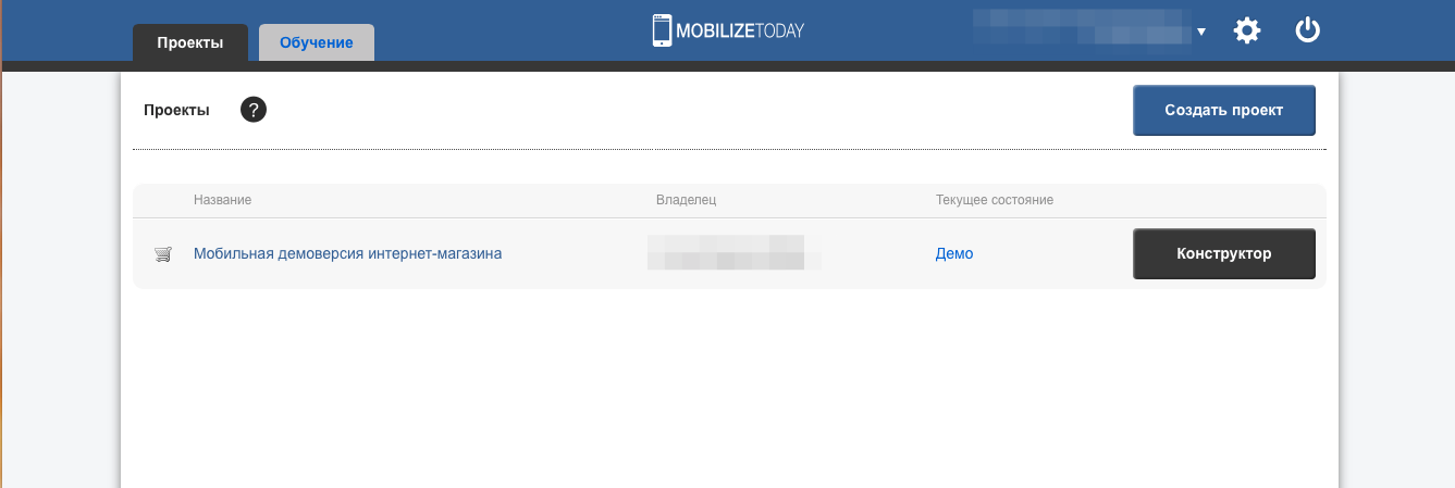
Consider a test example of how everything works and what interface users will have to deal with. Immediately in the list of projects available to the user one free demo project. If a company has more than one site, it can create a project for each of them and, at the entrance, choose a site over which it is going to work.
In the IDE interface, you can use desktop, tablet and mobile emulators with different screen widths. For the last two devices landscape and portrait orientation is available. Thus, the user can immediately assess how the mobile site will look and what you need to pay attention to.
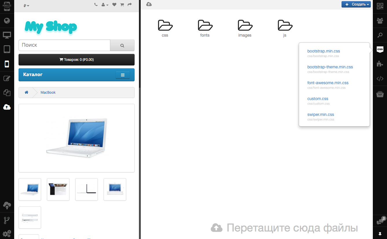
After the device has been selected, you can turn on the edit mode. The code of the page that is open on the emulator will be displayed in the right block. The code has a backlight, can be displayed on a dark or light background. The developer can make changes to the code and immediately get a visual result. The MobilizeToday.ru interface includes left and right toolbars with icons and tooltips (tooltips) to them. Icons allow one-click access to any tool: template manager, file manager, editing, device type, displaying CSS styles.

Testing of the site on a real mobile device can be done using a QR code.
Built-in chat allows you to communicate to project participants working in co-editing mode. There is no need to switch to the windows of third-party messengers to discuss development details with colleagues.

User settings are available that allow you to make work more convenient:
In general, an integrated mobile site creation system is a convenient solution and has several advantages.
Working on the MobilizeToday.ru project, we initially decided that we would release new releases every two months - the world of mobile development is developing at a frantic pace and we want our customers to always have the most relevant tool. In just a few days, another release will be released, in which there will be several important changes. We know how difficult it is to take the first step, so we are constantly improving the user experience: updating the documentation, adding training materials and simplifying the connection of frameworks such as jQuery Mobile and Bootstrap. Also in release 2.2, registered users will have access to a pre-installed demo project for training on cats and statistics with the number of pages viewed. In future releases, we plan to add a couple of necessary options.
It is also important for us to know the opinion of users what new features they would like to see in our product, so we will be happy to see any feedback.
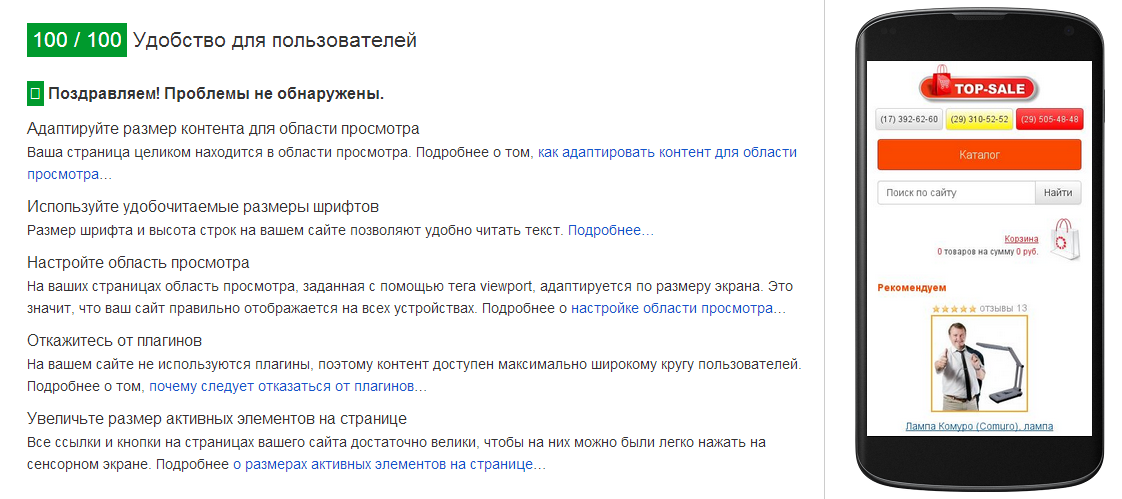
At the beginning of the post, we mentioned one of the main prerequisites for a mass transition to the site versions adapted for mobile devices - Google positions. Each site we check with the tools that the search engine offers webmasters. Sites optimized using MobilizeToday.ru successfully pass the Google test on Mobile-Friendly .
Since the main site remains the same, when it is adapted using MobilizeToday, it does not lose its position in the Google and Yandex search results, and thanks to the mobile-friendly interface, it bypasses its non-optimized competitors and occupies a higher position in search results. Optimizing sites for mobile phones and tablets, we do not forget about the download speed for the convenience of users, speed-test applications are successful.
We can confidently assert that with our system, mobile sites turn out really high-quality: the MobilizeToday.ru team has implemented successful e-commerce projects for the Japanese market, including such giants as Canon, Sanrio and Tokyo Gas. These were complex challenges that we handled. The experience gained during the implementation of these projects was used to improve the IDE. Our project, together with the i3DESIGN company, was presented at the exhibitions of Japan IT Week 2014 in Tokyo and Mobile World Congress 2015 in Barcelona, where experts from many countries of the world were convinced of the effectiveness of the application.
PS: If you are dazzled by the code, checklists, or have no desire, time and energy to port the site to mobile devices, we can do it for you.
Ready to answer your questions in the comments!
According to a study published by Yandex in the spring of 2015, at the end of 2014, 68% of Internet users in Russian cities went online at least once a month using mobile devices (56% in the previous year). Mobile users have become a significant part of the audience sites. In 2014, the share of visits to sites from smartphones and tablets increased by one and a half times. Moreover, from the smartphones at the end of 2014, Russians made almost two times more visits than from tablets, and the growth in activity also increased. If we look at global trends, the share of smartphone owners among Internet users is 80% and growth continues.
')
From mobile devices are looking for both ordinary users and business. So, it's time to create mobile versions of sites. Long, expensive, difficult.
Who needs a mobile version of the site?
We conducted a desk study and found that the lack of a mobile site is a strong blow to the conversion, and therefore to the company's profitability. As of the IV quarter of 2014, the share of mobile users in Moscow was 31%, by region this share is relatively metropolitan with an error of ± 2-3%. As we found out, a part of users with a certain probability can leave the site, not adapted for mobile devices. MobilizeToday.ru collected the following statistics: 46% of visitors rarely visit a site that is inconvenient for navigation, 31% will remain loyal, 23% will immediately leave the site. By simple analysis, estimate the number of potential customers lost! A mobile site is necessary for almost any business for a number of marketing and technical reasons:
- Convenience of navigation and implementation of actions on the site (registration, call order, choice of goods). The user does not have to miss by clicking on the buttons or increasing the input field to at least somehow get into it with the cursor.
- Great opportunities for e-commerce - optimization of product cards for mobile users, ease of viewing, working with a basket and placing an order.
- No need to pay for the development of a mobile application for each of the platforms - the mobile site will open in the browser on any device, regardless of the mobile OS.
- The ability to avoid Google sanctions and not to lose the position in the search for mobile results. Google is harsh, but it is Google and it’s better to be considered. The April statements turned out to be true - unadapted sites are losing their positions in mobile issuance.
- The ability to create additional design solutions for mobile devices (shopping cart, buttons, tips). The purchase page for a mobile device must be convenient and intelligible, otherwise the user will abandon the idea of “catching” every field and every checkbox.
- Participation of business in spontaneous purchases that users make. The availability of a convenient mobile version of the site allows the user to work with your application anytime and anywhere - you are always next to a client who may suddenly want to order a pizza on the way home or begin to choose a suitcase for the holidays, standing in traffic.
The MobilizeToday team drew attention to the situation and found a way out - we created our solution so that users can easily adapt existing websites to smartphones and tablets. At the core of the solution, we use the cloud-based IDE with the Ace editor from Cloud9. Inside, Git is used as a version control system with a visual interlayer to view the change history, create branches and resolve conflicts. We intercept the loading of the HTML page in the browser in order to gain complete control over the change of the interface for a particular mobile device. The resulting files, which make the site adaptive, can be stored on the client’s server or on the CDN for faster download. The main features of our solution are the following:
- Website address remains unchanged and is used for all browsers and devices.
- Mobile site editing is possible using HTML / CSS / JS standards.
- the ability to use any UI framework to create a mobile version of the site, such as jQueryMobile or Bootstrap
- possibility of partial or full replacement of the original desktop page with a new, optimized for mobile device
- built-in caching using localStorage minimizes the number of requests and improves the performance of the mobile site
- convenient editing and testing in the cloud IDE
- You can invite an unlimited number of participants to the project for free - designers, developers, testers and even customers.
- automatic saving of editing results with the ability to view the change history
- publish mobile site in CDN with a single click
- 100% passing Google test on Mobile-Friendly with proper mobile site development
We worked a lot with other applications and we didn’t always like them - other designers and builders always have limitations. The MobilizeToday team managed to get rid of the restrictions - the mobile page can be created completely from scratch and edited at the lowest level using HTML, CSS and JavaScript.
Two in one: cloud IDE + optimization of sites for mobile devices
A unique feature of IDE MobilizeToday is the combination of two entities: a cloud-based IDE for solving front-end tasks and optimizing existing sites for mobile devices. We made sure that integration was done as efficiently as possible:
- displaying the result of code editing in real time for all participants;
- the ability to work on a “live” domain, without the need to alter the addresses used by JavaScript, while captcha and social networking plugins work;
- instant switching between project branches;
- possibility of using one template for several pages linked by a URL or by a unique page identifier;
- quick search of the line of code by the selected visual element on the page, and vice versa - search for the element by the selected line of code;
- the ability to preview the result with the desired screen resolution, as well as simultaneously on several real devices using a QR code;
- There is no need to configure external systems for compiling source code, automatic testing and deployment - all this has already been done.
MobilizeToday.ru is not just an online editor with the possibility of joint work of several developers, it is a self-contained system for solving a business problem. The MobilizeToday project has its own user interface (UI) built in which branches are created for working on a project, there is an interface for quickly resolving conflicts, as well as for viewing changes made to a project. When working with branches, there is no need to know the Git commands; the system makes it easy to handle version control using a friendly interface. This allows you to involve in the project people with a lower level and experience in web development and even customers who can easily replace the text or the name of the button without the participation of the developer. Users don’t have to worry about saving files or manually creating revisions; all this is done automatically, like Google Docs or the Gmail online editor does. Regular files, unlike other Cloud IDEs, are allocated a rather modest place, and editing objects, such as templates and snippets (ready-made code snippets), is brought to the forefront. Editing these entities opens automatically when you change the page of the mobile site or when searching for a specific element on the page. Such logic was made for the optimal solution of the main business problem - optimization of the site interface for mobile devices with the involvement of participants of different skill levels.
To work with the application, the user does not need to install and download programs - only a browser is needed. To get started, the site owner adds the MobilizeToday.ru initialization script to the code of the desktop version, which “makes friends” of the site and the IDE and makes it adaptive, without affecting the performance and performance of the main site. When the adaptation work is completed using the Constructor and Control Panel, all the resulting files, including static HTML, CSS, JS files, images, and dynamic template files are placed on the client’s server or on the CDN content distribution network.
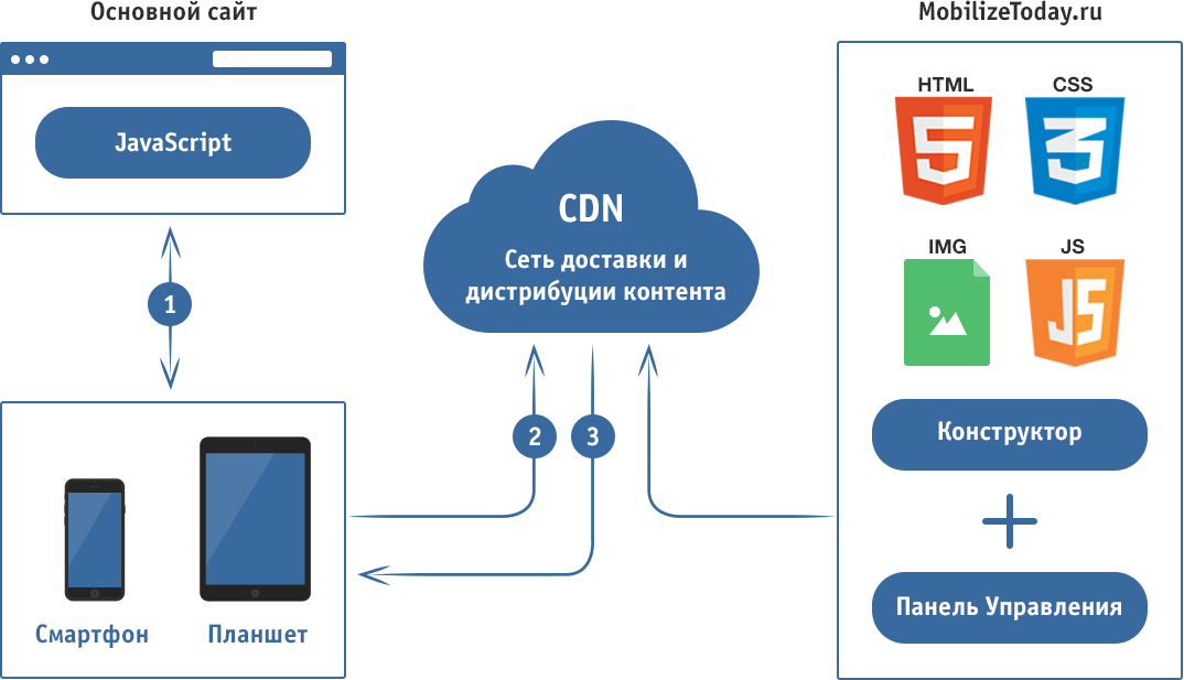
The scheme of the finished mobile site
- The user from a mobile device opens the site, the initialization script is triggered.
- The script identifies the device and requests from the CDN (or client server) the desired mobile page or template. At the same time, the resources of the desktop site that are heavy and unnecessary in the mobile version are not loaded.
- A mobile page is loaded from the CDN or from the localStorage browser (if the page is re-opened). The on-the-go conversion of the already downloaded desktop page to its mobile version is being carried out, after which it is displayed in the browser.
Since the tool is focused on front-end development, the main focus is on a bunch of HTML / CSS / JS. In addition to these technologies, XPath 1.0 or CSS selectors are used to fetch data from the original desktop page. When creating mobile page templates, a simple template engine is used with its own syntax for displaying values, conditional jumps and loops. The system's API functions for working with the source DOM document are available, as well as support functions for determining the type of user device (smartphone, tablet). In the mobile version templates, you can use the jQuery syntax to manipulate the original HTML document. The syntax of the templates, as well as examples of the use of the API are described in detail and are available in the documentation that is published on the website.
It does not matter which server-side technology is used - CMS, pure HTML or PHP. MobilizeToday.ru intercepts the loading of the HTML document in the browser and already works with the material (HTML) that is given by the server. All changes occurring on the desktop site in real time are displayed on the mobile. This is especially valuable for the field of e-commerce, since numerous changes to the product range and price do not need to be duplicated on two separated backend databases.
Consider a test example of how everything works and what interface users will have to deal with. Immediately in the list of projects available to the user one free demo project. If a company has more than one site, it can create a project for each of them and, at the entrance, choose a site over which it is going to work.
In the IDE interface, you can use desktop, tablet and mobile emulators with different screen widths. For the last two devices landscape and portrait orientation is available. Thus, the user can immediately assess how the mobile site will look and what you need to pay attention to.
After the device has been selected, you can turn on the edit mode. The code of the page that is open on the emulator will be displayed in the right block. The code has a backlight, can be displayed on a dark or light background. The developer can make changes to the code and immediately get a visual result. The MobilizeToday.ru interface includes left and right toolbars with icons and tooltips (tooltips) to them. Icons allow one-click access to any tool: template manager, file manager, editing, device type, displaying CSS styles.
Testing of the site on a real mobile device can be done using a QR code.
Built-in chat allows you to communicate to project participants working in co-editing mode. There is no need to switch to the windows of third-party messengers to discuss development details with colleagues.
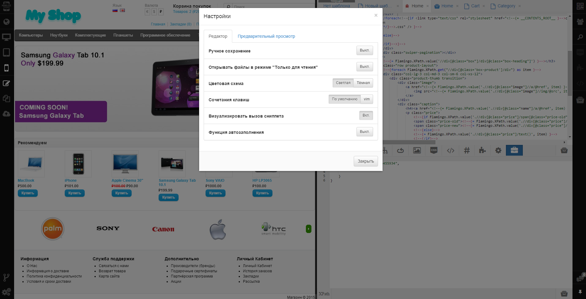
User settings are available that allow you to make work more convenient:
- manual save enabled
- setting the color scheme of the display and code highlighting
- setting the default shortcut keys and settings editor vim
- enable snippet insert visualization
- autocompletion function when writing code.
In general, an integrated mobile site creation system is a convenient solution and has several advantages.
- Cloud development and testing environment (Cloud IDE) makes it quite easy to make changes to the mobile version of the site. After the site is created, even people with minimal HTML knowledge can support it.
- You can use the familiar content management system (CMS) - there is no need to retrain employees to work in a new CMS or duplicate content in two CMS at the same time.
- The mobile version of the site is updated automatically, without additional efforts and is available at the same address as the main site.
- There is no need to work on the backend of a mobile application or revise the logic of the backend operation of the main desktop site.
- The mobile site can be created very quickly, and this is very important in the context of reducing unadapted sites in the issue.
Working on the MobilizeToday.ru project, we initially decided that we would release new releases every two months - the world of mobile development is developing at a frantic pace and we want our customers to always have the most relevant tool. In just a few days, another release will be released, in which there will be several important changes. We know how difficult it is to take the first step, so we are constantly improving the user experience: updating the documentation, adding training materials and simplifying the connection of frameworks such as jQuery Mobile and Bootstrap. Also in release 2.2, registered users will have access to a pre-installed demo project for training on cats and statistics with the number of pages viewed. In future releases, we plan to add a couple of necessary options.
- Ability to easily configure and run A / B tests for mobile pages.
- Built-in support for popular UI frameworks and the provision of ready-made elements of pages based on them, such as menus, lists, buttons, headers, etc. for faster development.
It is also important for us to know the opinion of users what new features they would like to see in our product, so we will be happy to see any feedback.
Do I need to win friendship with Google?
At the beginning of the post, we mentioned one of the main prerequisites for a mass transition to the site versions adapted for mobile devices - Google positions. Each site we check with the tools that the search engine offers webmasters. Sites optimized using MobilizeToday.ru successfully pass the Google test on Mobile-Friendly .
Since the main site remains the same, when it is adapted using MobilizeToday, it does not lose its position in the Google and Yandex search results, and thanks to the mobile-friendly interface, it bypasses its non-optimized competitors and occupies a higher position in search results. Optimizing sites for mobile phones and tablets, we do not forget about the download speed for the convenience of users, speed-test applications are successful.
We can confidently assert that with our system, mobile sites turn out really high-quality: the MobilizeToday.ru team has implemented successful e-commerce projects for the Japanese market, including such giants as Canon, Sanrio and Tokyo Gas. These were complex challenges that we handled. The experience gained during the implementation of these projects was used to improve the IDE. Our project, together with the i3DESIGN company, was presented at the exhibitions of Japan IT Week 2014 in Tokyo and Mobile World Congress 2015 in Barcelona, where experts from many countries of the world were convinced of the effectiveness of the application.
PS: If you are dazzled by the code, checklists, or have no desire, time and energy to port the site to mobile devices, we can do it for you.
Ready to answer your questions in the comments!
Source: https://habr.com/ru/post/264991/
All Articles