How-to: Techniques for creating interactive emails using CSS
In our blog, we have already talked about how to implement pagination in a letter, but this is not the only option for interactive email distribution . In some cases, attractive letters can be created using the hover-effect, when the content changes when you hover over it.
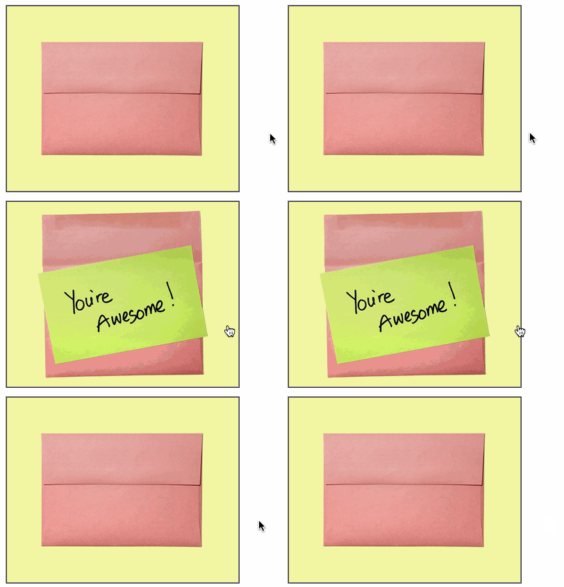
Today we bring to your attention a squeeze from FreshInbox blog articles on how to create an interactive email letter.
')
The first method involves three simple steps.
First you need to create a table that will contain one cell with the image as a background:
For the hover effect, you need two images - one is shown initially, and the other appears when you hover. In the second step, you need to set the main image to be "wrapped" by the link. The “img-swap” class is also added to the link, and the
The final step is to add styles to the link and set up a pseudo-class for it
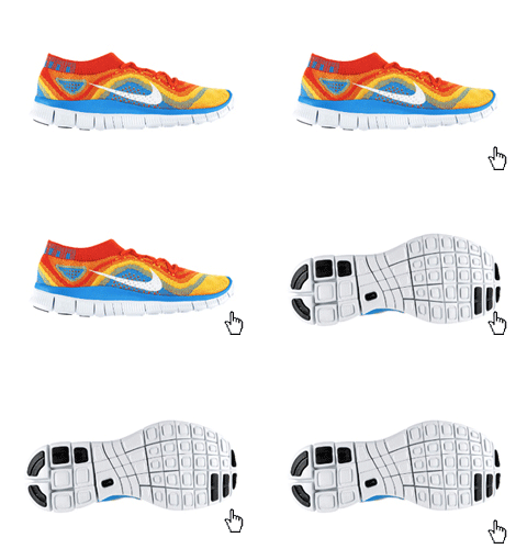
This method is supported by Yahoo! Mail, Outlook.com (and Outlook 2003). There is also a modification for Gmail, which we discussed in detail in one of the previous articles .
Another technique allows you to create interactive letters using hover-effect, and for mobile users to show the "surprise" after clicking on the picture.
This method is similar to the one described above, but it differs in that initially, for unsupported clients, it is not the original image that is shown, but the picture that appears. This will allow users with unsupported mail programs not to miss the very meaning of the letter (although all interactivity will not be available to them).
Supported clients : iOS Mail, Android 4.x Mail, Yahoo! Mail, Outlook.com and Gmail.com (with the hack with attribute selectors described above).
Unsupported clients : Desktop Outlook, Gmail and Gmail for business mobile apps
To make it possible to display the opened image, you need to make small changes compared to the previous version of the technique. Instead of using the cover image as an overlay and opening the image as a background, you need to do the opposite:
The opened image will be the main one, and the original “cover” will become the background. Then on supported email clients, we initially hide the overlay, showing only the cover (that is, the background). When the user hovers over the image, the hidden image will already be shown.

Therefore, instead of:
The code will look like this:
Thus, if the mail program does not support interactivity, the user will see the image that eventually opens on the hover. In this case, the wow-effect is lost, but the meaning of the message remains.
In addition, the image is wrapped in a “dead link” - this is necessary in order for the effect to work on tapu on iOS and Android. The link may be active, but then in Android users will be redirected to it. In principle, interactivity on mobile devices can be turned off altogether using a special media query:
The full code of the example is presented under the spoiler (you can also work with it on Codepen ):

Today we bring to your attention a squeeze from FreshInbox blog articles on how to create an interactive email letter.
')
The first method involves three simple steps.
Step 1: table and background image
First you need to create a table that will contain one cell with the image as a background:
<table cellpadding=0 cellspacing=0 border=0><tr> <td width=240 background="http://.../alternate-image.jpg"> </td></tr></table> Step 2: link and image
For the hover effect, you need two images - one is shown initially, and the other appears when you hover. In the second step, you need to set the main image to be "wrapped" by the link. The “img-swap” class is also added to the link, and the
display:block property is applied to the image. <table cellpadding=0 cellspacing=0 border=0><tr> <td width=240 background="http://../alternate-image.jpg"> <a class="img-swap" href="http://../link"><img src="http://../primary-image.jpg" width="240" height="170" border="0" style="display:block;" alt="the product"></a> </td></tr></table> 3 step: style and hover
The final step is to add styles to the link and set up a pseudo-class for it
:hover , “aimed” at the image. By setting the height of the image to 0px in the case when the cursor is over the link, you can hide the image, which is the “background” image from the cell. The display style is set to :block so that the link retains the width and height even if the image it contains is hidden. <style> .img-swap { display: block; width: 240px; height: 170px; } .img-swap:hover img { height: 0px; } </style> 
This method is supported by Yahoo! Mail, Outlook.com (and Outlook 2003). There is also a modification for Gmail, which we discussed in detail in one of the previous articles .
Click and see a surprise
Another technique allows you to create interactive letters using hover-effect, and for mobile users to show the "surprise" after clicking on the picture.
This method is similar to the one described above, but it differs in that initially, for unsupported clients, it is not the original image that is shown, but the picture that appears. This will allow users with unsupported mail programs not to miss the very meaning of the letter (although all interactivity will not be available to them).
Supported clients : iOS Mail, Android 4.x Mail, Yahoo! Mail, Outlook.com and Gmail.com (with the hack with attribute selectors described above).
Unsupported clients : Desktop Outlook, Gmail and Gmail for business mobile apps
What is the difference from the previous method
To make it possible to display the opened image, you need to make small changes compared to the previous version of the technique. Instead of using the cover image as an overlay and opening the image as a background, you need to do the opposite:
<table border=1 cellpadding=0 cellspacing=0 background="http://freshinbox.com/examples/rollover-reveal-simple/images/reveal-close-l.jpg"> <tr><td> <a class="reveal" lang="x-reveal" style="display:block;width:500px;height:400px;" href="#"> <img src="1450830627199316115658" style="display:block;" height=400 width=500 alt="A surprise!" border=0> </a> </td></tr></table> The opened image will be the main one, and the original “cover” will become the background. Then on supported email clients, we initially hide the overlay, showing only the cover (that is, the background). When the user hovers over the image, the hidden image will already be shown.

Therefore, instead of:
rollover:hover img{ max-height: 0px; height:0px; } The code will look like this:
.reveal img{ max-height: 0px; height:0px; } .reveal:hover img{ max-height: none; height: auto; } Thus, if the mail program does not support interactivity, the user will see the image that eventually opens on the hover. In this case, the wow-effect is lost, but the meaning of the message remains.
In addition, the image is wrapped in a “dead link” - this is necessary in order for the effect to work on tapu on iOS and Android. The link may be active, but then in Android users will be redirected to it. In principle, interactivity on mobile devices can be turned off altogether using a special media query:
@media screen and (max-device-width: 1024px){ .reveal img{ max-height: none !important; height: auto !important; } } The full code of the example is presented under the spoiler (you can also work with it on Codepen ):
Sample code
<!DOCTYPE html PUBLIC "-//W3C//DTD XHTML 1.0 Transitional//EN" "http://www.w3.org/TR/xhtml1/DTD/xhtml1-transitional.dtd"> <html xmlns="http://www.w3.org/1999/xhtml"> <head> <meta http-equiv="Content-Type" content="text/html; charset=UTF-8" /> <meta http-equiv="X-UA-Compatible" content="IE=EDGE" /> <meta name="viewport" content="width=device-width, initial-scale=1.0"/> <title>Rollover to Reveal</title> <!-- This version supports mobile --> <style> /* wrapping in media query prevents styles from activating in OWA */ .yfix{} @media screen and (max-width:9999px) { .reveal img{ max-height: 0px; height:0px; } .reveal:hover img{ max-height: none; height: auto; } * [lang=x-reveal] img{ max-height: 0px; height:0px; } * [lang=x-reveal]:hover img{ max-height: none; height: auto; } } </style> </head> <body style="margin:0px; padding:0px;"> <table border=1 cellpadding=0 cellspacing=0 background="http://freshinbox.com/examples/rollover-reveal-simple/images/reveal-close-l.jpg"><tr> <td><a class="reveal" lang="x-reveal" style="display:block;width:500px;height:400px;" href="#"><img src="1450830627199316115658" style="display:block;" height=400 width=500 alt="A surprise!" border=0></a></td> </tr></table> </body> Other materials about the layout of letters in the Pechkin blog:
Source: https://habr.com/ru/post/264967/
All Articles