UX-strategy in practice. Part 3 - Platform Thinking

In the first part of a series of articles on the UX-strategy, I described its general vision and designer , which we need for the system development of UX. What should be the result of his work?
Many are accustomed to thinking about artifacts and the process of their creation and coordination. We research users and the market, we think over scenarios and infoarchitecture, we do sketches and prototypes, we prepare design layouts and guidelines, we give them to development. And after all this, we look at what happened in practice and make improvements until we achieve product compliance with the market and the required level of quality. The approach is generally correct, but in classical schemes with the near-pipelining process it burns a lot of time for artifacts. All this blurs the focus and responsibility - it takes a lot of effort to polish side documents, and not the product itself. And since most of these talmudas are needed only for the transfer of knowledge between members of the product team and quickly become obsolete, we also get high transaction costs. This is no good.
In this article, I will talk about how to stop thinking with documentation and go to platform thinking. Designers need to perceive their work not as a temporary project to launch a new design or specific functionality, but as a market launch and development of a holistic platform. Then the product will grow systemically, and the company's UX-strategy will work at all levels - operational, tactical and strategic.

')
System approach to the UX product
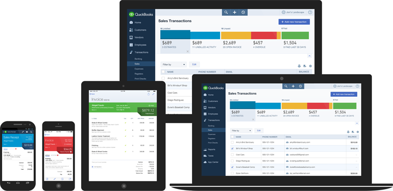
The classic solution for the systemic development of products is guidelines and libraries of patterns. They describe typical interface solutions that are encountered when working on the product line. As well as the rules for their use and other useful details that help designers, managers, developers and testers to achieve consistency between screens, products and teams. And, of course, reduce the cost and speed up development by using ready-made solutions. They are critical for large companies, but equally useful for medium and small organizations with well-established products. Yes, and users consistency and familiarity increases comfort.
But the guidelines in the usual sense - another static artifact that requires the passage of the decision on an additional step. The chain “ guideline → layout → layout → implementation ” is born, at each stage of which details are lost and bugs are generated. This gives a number of problems:
- Designers often say that developers do not read the documentation. But they themselves, to be honest, are also filony, if several people need to synchronize.
- Design according to the specification is difficult to implement at 100%, if it is done for several products at once. Firstly, the specification itself requires regular updating - new patterns appear or better solutions are available for existing ones. Secondly, in the course of the redesign, something may not have time to realize and the service is launched “almost polished”. And the entire product line is “almost similar.” And then what is considered a reference design? Of course, you can refactor, but it turns out to be expensive - it must be carried out constantly for each product.
- All this requires tremendous effort and a lot of time from the designer to control the quality of implementation. What is expensive and tiring. Not to mention the routine with the regular drawing of the same things.
- Design updates reinforce the problem. It is necessary to go again on the whole line - to redo and control, redo and to control ...
- Experiments with the design is also not cheap. They also force the generation of side artifacts and, as a result, increase the entropy.
Adok! And we are not talking about important "nuances" like adaptive design ... Many in this case hire more designers. But those who think systematically try to find a solution at the intersection of design and technology. Only by transferring the reference design from static documentation to the implementation level, can the chain be reduced to “ guideline = design = layout → implementation ”. And that means to get rid of the hemorrhoids heap on the introduction, improvement and support of products.
Design and technological unification
Many large companies are already moving in this direction, which greatly simplifies their lives and unleashes their business development. Good design can and should be obtained cheaply and quickly, which is impossible to achieve when working with your hands. What could be this technical solution? There are two options: simpler when you make your little Bootstrap and more complicated, creating a complete system of components.
The first option is cheaper and faster to create - you already get a profit from easier support, inexpensive design experiments and easy prototyping. Although, in fact, you simply use a set of HTML / CSS styles that can break when used in a real product. Over the past few years, many visionary articles have appeared on this topic - for example, from Mark Otto and Dave Rupert , and a huge number of companies are already working on this principle .
speakerdeck.com/mdo/build-your-own-bootstrap
The second option is more expensive to create, but at the exit you have guaranteed the quality of the implementation of the design and all the benefits from the simplicity of updating the products. We in Mail.Ru Group went in this direction. This approach has 5 levels of maturity:
- General design principles are defined and embedded in CSS.
- All products work on the basis of uniform components.
- There are live guidelines describing the principles of design and uniform components. They show implementation, not screenshots.
- You can prototype pages based on live guidelines.
- Experiments with the design of components to compare different approaches.
There are not so many companies on the way of the finished components, but there are very powerful examples from Intuit with their Harmony ecosystem , the Lonely Planet solution based on the Rizzo framework , Yandex.Lego and, of course, Google's Polymer Project implementing Material Design.
Intuit Harmony Ecosystem
What good is this approach?
- Unified visual style and principles of the interface, as well as its information architecture. It is convenient for the user - a group of similar products works in the same clear and familiar way. And also good for the brand - the entire line of services looks complete.
- Design unification is 90% guaranteed by the approach to development - all ready blocks and elements are taken from a single code base and only from it. Another 10% - attentiveness and thoughtfulness when using ready-made solutions. Even from the perfect designer you can assemble a monster.
- Simplify the launch of new products and redesign existing ones. In the framework there are most of the necessary blocks and components for all occasions, which allows you to quickly build a new interface.
- Controlling a large pool of projects becomes easier when they are the same. Instead of hundreds of individual projects, you follow a pair of guidelines.
- Need to draw less layouts. The page can be assembled from ready-made blocks, and in the future - completely without the launch of Photoshop. The same applies to various special projects.
- The cumulative effect of good product decisions. For example, having raised the viewing depth on one of the services, it is easy to apply these improvements to the others.
- The transition from large redesigns every few years to the constant maintenance of the relevance of the interface. The restarts take a lot of energy and lose thousands of small developments bolted to the design for a long time of its development.
And the next trend after flat design will be quick and easy to pick up :) Of course, the pursuit of trends is not the most commendable idea. However, in our industry, periodically quite sharp breaks in the visual paradigm occur, as was the case last year with the release of iOS7, and companies must respond promptly to them.
In general, this is a key part of our UX strategy. But the most important thing is that the framework has also become a technical unification. We made many approaches to the “shell” - we wrote specifications, collected a single source, made libraries of elements, etc. But all this quickly faded out, because it was in a cozy design world and was little demanded by developers. And we all know how often the design is “twisted” on the way from layouts to implementation. But if one time to make the code correct and distributed - there will be confidence in the quality of the design that works in the real product. Therefore, one of the main criteria for the success of any unification projects is their transfer to the level of concrete implementation.
Bill Scott talked about his experiences moving from Netflix to PayPal in a similar vein. In PayPal, due to technological limitations, it took a month and a half to change a simple text block on the main page. This hinders the development of the design and makes frequent experiments impossible. Being in Netflix, one of his first tasks was to facilitate the development process. The result is a strong HTML5 framework running on the full range of supported devices.
We want to use not the hands, but the head of the designer. By reducing the routine, it is possible to translate the focus on product challenges and business solutions, as well as less visible, but also important design issues.
The company is also in the black. Minus the entry price for the transfer of products to the platform, it gets a systematic approach to improving the efficiency of products, accelerating the launch of new functions on the market, guaranteed design unification. The ability to speak a common language helped us to convince the management to invest in the framework.
How to build your platform
It is necessary to stop thinking with screens and to perceive the product as a platform. The experience of Apple, Google and Microsoft will come in handy, even if your company is not so ambitious and ambitious - they have done well in building platforms and ecosystems. If you disassemble them into the main components - the general principles of visual style and interaction, a set of your own applications and a huge number of applications from third-party developers (consider, created by partners and outsourcers) - then you can find a lot in common with the work of any grocery company.
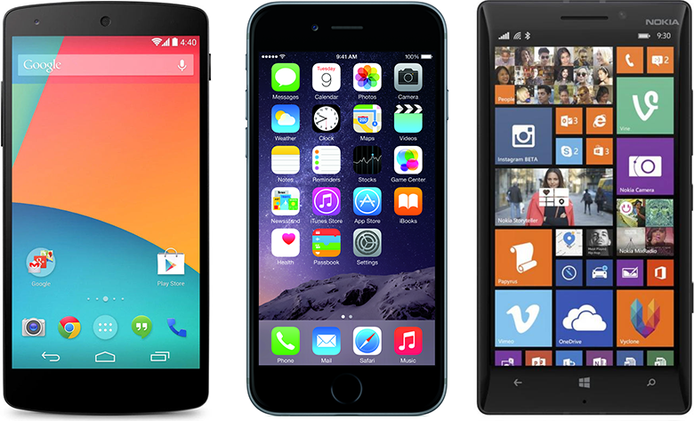
Android, iOS, Windows Phone
Unification can be started from two sides. First create a guideline and then apply it to existing products. Or, successfully update the design of one of them and choose as a reference, then creating a guideline based on its motives. Pros and cons have both approaches.
We in the company went the second way . An already proven design, optimized through analytics and user research, is scaled. After all, on the eve and immediately after the release, a lot of experiments and tests are carried out, after which the design is adjusted many times. Although the path turns out to be somewhat winding, so now we are refactoring the resulting and building the system from top to bottom.
Matt McManus says continuous design has two main principles . First, to abandon the concept of "final" design. Designers should be involved in the entire development process, not just its beginning. Secondly, designers should create reusable front-end code or interactive prototypes instead of static documentation like PSD.
You can, of course, do both products and guideline at the same time, but in practice it takes an enormous amount of time due to constant iterations “they offered a typical solution → tried on products → found a couple of inconsistencies → discussed and solved problems with the whole team → again tried on products. .. " And considering that there are hundreds of such decisions on projects, the release will never take place.
Based on the accumulated experience, I see several stages in the development of the platform:
1. General principles
At the start of the unification work, it is necessary to determine the basics on which the entire platform will be built. They facilitate the adoption of design decisions at all levels and make its development systemic. A great example is the IBM design language .
Manifest or general design principles
This is a set of a dozen rules or so that help to knit the image of the brand with specific solutions. So to speak, high-level checklist for checking interface patterns. For example, one of the principles of our international brand My.com is a combination of a minimalistic white background for all interface working surfaces with dotted accents of the firm red color, which allows us to better identify the identity. At the same time, another brand quality is emotionality and personality. In order to maintain it and not violate the first rule, juicy background substrates are used, and the main working area lies on a white translucent substrate.
Principles can relate to a variety of things that you find important for a brand. For example, Mailchimp places particular emphasis on the tone of voice - the texts in the interface. Microsoft in metro design insists on focusing on content instead of chrome, and also highlights the special role of animation. And this translates into a consistent consistent experience.
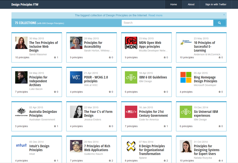
It is important that the manifesto does not exist by itself, but is tied to the overall strategy of the company. In the case of design principles - mainly through branding. Only then will they work in full force, and will not become the next newfangled method of toy designers. They will be shared by managers and other employees of the company, they will really help in making decisions. The number of principles must be reasonable so that they can be remembered and there is no duplication between them. As a guide, you can walk through the Design Principles FTW collection .
Design Principles FTW
Visual language
The specific principles underlying the visual presentation, interaction logic, and information architecture. If the manifesto speaks at the level of values, then the basics of design are about concrete solutions. To simplify the future life of the platform, you need to strive for a high level of abstraction in all definitions.
Information architecture . Based on the specifics of the product and its target audience, we need to describe the principles of separation of functions and use scenarios on the screens, build their hierarchy and provide navigation between them. If we are talking about the product line, they can vary considerably and require different approaches. Therefore, it is useful to describe everything at once - one-page, hierarchical structure, linear, network, hub or a combination of several. Each of the approaches should have a kind of mini-manifesto - for what tasks it is used, how to shift the functionality and product usage scenarios to it. And even better, if with all the nuances - the names of categories and links, description of meta-data, organizational charts (alphabet, geography, chronology, subject, task, audience, popularity).
Principles of interaction . Specific navigation solutions that implement the principles of information architecture - constant (including basement) and context menus (visible, right-click or long finger-click), search, breadcrumbs, tools for working with lists (sorting, filtering, grouping, page-by-page navigation or loading), contextual content, content notification systems and alerts. It is desirable with their illustrated transposition on the model of a typical screen, as well as recommendations for solving specific product problems - for example, content wrap helps to increase the viewing depth.
All this should be based on supported device types - a large and mobile web, applications for different platforms (mobile, tablets, wearable). Each of them may have its own characteristics - the specifics of control methods (mouse, touch, voice), quick actions (hot keys, gestures), and accessibility.
Interface Grid . This is the step along which all interface elements line up - their sizes and indents between them. Now the most popular 8-pixel, it uses including Android and Google in general. iOS is based on 11-pixel, Windows 8 - 5-pixel. The 8-pixel pitch is especially convenient because it divides well into 2 - for example, you can get a 2-pixel round of blocks. The basic step determines the possible distances. We base our solution on 4dp instead of 8, so in our case it’s 4, 8, 16, 24, 32, 48, 96, 128. It’s impossible to convey the full degree of ease of work - the number of disputes and errors on trifles drops by an order of magnitude. The designer chooses the size not by eye, but according to the same rules. True, it is useful to conduct measurements in pixels independent of screen density (dp) instead of px.
Structural grid It sets a set of columns in which the main layout of the interface fits. The 12-column grid is very popular, it is used by most popular frameworks. Although we use rather the “rhythm” mechanism - this is a set of 40-pixel columns with 20-pixel indents. This approach allowed unifying different generations of design (16 columns for 1024, 20 for 1280, 24 for 1440, 26 for 1600). The structural grid also determines the logic of adaptability - how the layout changes at different resolutions.
Layouts and containers . Concrete on the basis of the structural grid - how the interface workspaces will be placed. 1 column, popular on promotional sites? 2 columns, classic approach for almost any task? 3 columns, increasingly used due to congestion? An endless stream of cards or tiles popularized by Pinterest? The layout can also set vertical ratios, although this is not often the case.
Each column of the layout is a stack in which containers of specific blocks with content are placed one after another. It is useful to set the appearance logic (border, background, shadow, title, etc.) and the behavior of the content at the level of the container itself. So it will be easier to develop the platform by adding new blocks or correcting general principles. For example, if there are more elements in the block than can be displayed on the screen, we can add a link to the full list on a separate page, expand them immediately by clicking on “show more”, split by page navigation or scroll inside (vertical or horizontal). If we chose horizontal scrolling and in the future we want to remake the arrows or add a swipe for touch screens, we will not have to go over all copies of the container.
This also includes the pop-ups.

4 grid levels
Font grid . There are many approaches to the choice of font sizes, based on the idea of scaling from the base text. Service Gridlover collected, it seems, all possible. If you focus on the interface grid, they should be a multiple of 4. For headings, this is easy, although in practice there are problems with typesetting. First, the beautiful number 16 for the main text is too large for a specific interface solution. Secondly, the features of rendering web fonts in Windows make you make a lot of crutches and workarounds. But if the line spacing falls into the interface grid, everything is not so bad anymore - both the interface text and the typeset text will not break it.
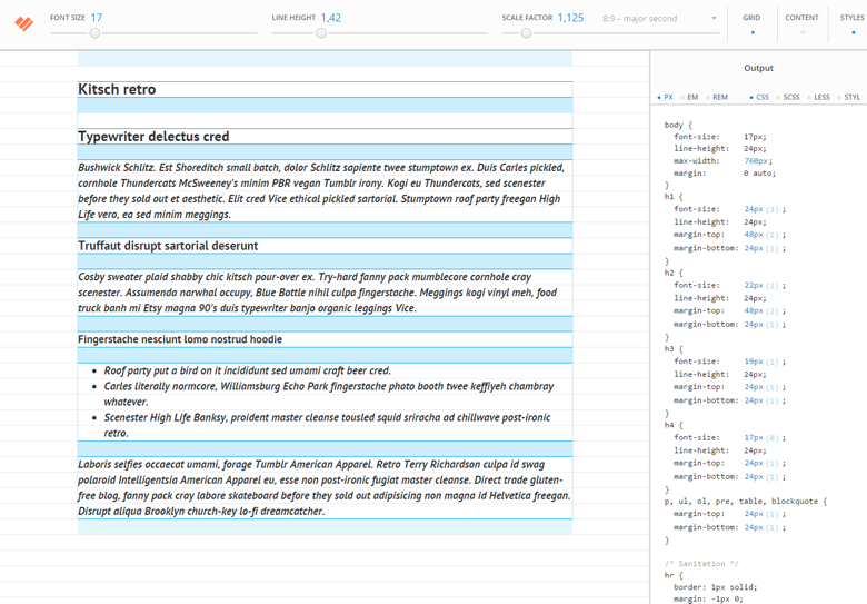
Gridset
Color palette . To the basis, which specify the basic colors of the brand, auxiliary values should be spelled out. First, these are interface colors — white and black (or their shades, if the net values do not match), error colors and other system messages (red, green, yellow), links, and also a ruler of gray colors (substrates, borders, auxiliary text). Secondly, accent - for example, to designate categories of content. Moreover, they can be given the logic of change, if variations are necessary (for example, inaccessible categories are highlighted). All colors in the palette must be complementary to the main, specified by the brand.
In addition to colors, it is useful to describe formulas for creating shadows, set several standard parameters for transparency and background blur.
A set of controls . Having an interface and font grid, as well as a color palette, you can systematically approach the work on basic building elements. Buttons (main, normal, with additional options; text, icon, version for toolbars), links, general and specialized input fields and drop-down lists (combo box, calendar, country with phone code, etc.), switches (checkbox, radio button, toggle switch), custom content loaders (photos, videos, files). For them, the following states must be set: focus, active, pointing, inaccessible.
In addition to form elements, you need to describe their layouts. The location of the field names, explanatory texts to them, the rules of validation of values and the display of errors.
Graphics and illustrations . Required standards for photos and other content graphics. Proportions, typical sizes and their variations for different resolutions. Ideally, they should fit into the column grid. The same goes for avatars.
The interface icons must be connected to the general branding in a good way - you can gradually develop their universal set. Illustrations should also fit into the general outline, but it suffices to describe the general approaches to style. The thickness of the lines, the color palette, the principles of volume transfer, the rules of placement in the interface and promotional materials. Large illustrations icons can be based on the metaphors of the interface icons, developing them in greater detail, and for a medium size, set a standardized grid.
Infographics and visualization . Tables, common charts (pie, bar, histogram, line graph, scatter plot) and more rare (areal, donut, radar, scatter, Venn, Sankey), cartography, heat charts, tag cloud, graphs and trees, flat tree , mental maps, flowcharts and process diagrams, timelines, communication diagrams. This entire list is needed only for highly specialized services, but the most requested ones need to be described.
Animation model . Ideally, the transitions between states and interface screens should obey a particular model. Then the animation in the product will be consistent, and it will be easier for the user to work with it. For example, popups can arrive at the top of the screen and go back after closing, and if this is a step-by-step assistant - after the appearance of the main window, new states can come to the right. For example, you can explore the approaches of three large platforms - Android (fine orchestration), iOS (before iOS7 and after), Windows Phone (the founder of the modern approach).
Advertising . The advertising grid often defines the look, setting the limits of the designer grid. It is important to work with the commercial department as tightly as with the developers - this will allow you to find formats that do not destroy the design or cash flow of the project. It is necessary to determine the advertising inventory - the types and sizes of media and contextual blocks, the principles of branding blocks and pages, set standards for the layout of fullscreen and other aggressive approaches. It is also useful to work out typical solutions for internal promo. The second step is, in fact, the grid on which advertising is placed on standard layouts.

IBM Visual Language
Principles in code
After determining the basic principles of platform design, you need to lay them in the basis of CSS. It is extremely important for designers to understand it in order to build a future-friendly system together with developers. This is exactly what I wrote in the second part of this series - the final design in one form or another is determined at all stages of product development and it is important not to forget about it if you want to work systematically. Modern CSS preprocessors like SASS and Less allow you to set global variables and this is a great way to define basic principles in code. And the icon fonts and SVG-sprites will help you conveniently work with auxiliary graphics.
Due to the high level of abstraction of general principles, we get a powerful interface math, which removes the possibility of discrepancies. For example, to get a button, we write “Save” with a basic font size, measure typical indents at the top, bottom and sides, fill this space with a standard color for the button substrates, also outline a stroke with a standard color, and enclose a standard shadow from the bottom. And until the constants change, this mathematics will lead the whole team to the same solutions, even if the designers have little communication with each other. And if all this is also wired into the code - you can easily update the constants, changing the entire product line. Nirvana and Valhalla at the same time!
It is useful to give an example of the structure of sample pages based on layouts. These include header, basement, content area, auxiliary columns. This helps to better understand the basics of using guidelines.
2. Library of patterns and ready-made solutions
The next step in building a platform is to create ready-made components and transfer the entire design to them. Based on our goal of simplifying the production chain to “guideline = design = layout → implementation”, a component is a ready-made code with a certain visual style, logic of work and user interaction with it. It should be independent of the environment - we can use it on any page without fear that it will break.
In essence, this is the classic design pattern, which designers usually assembled as libraries to design and design tools, and then described in guidelines. Only we do not need to check the quality of its implementation every time and maintain it throughout the chain of artifacts. And if we decide to change the pattern, we need to replace the original in a single code base, after which it will be updated on all projects using the framework.
To describe the components, it is extremely important to adhere to semantics As in the plan of reference to the basic principles, the pattern uses not a specific value “font size 24” or “substrate color # F0F0F0”, but the meaning is “level 2 header” or “substrate for cards”. So in the sense of general purpose - the main content, information on the topic, additional strapping. Then the whole idea with an easy update across the entire product line really works.
Examples of components:
- Navigation - tabs, alphabetical index, calendar, search and filters, sorting, browsing history;
- Lists - list, matrix, scrollable tape, asynchronous tile layout;
- Media - video, infographics, photo gallery, post from the social network;
- Informers - weather, stock prices and commodities, sports statistics, schedules, horoscopes, world time;
- Social interaction - comments, polls, consultations, ratings, feedback, sharing in social networks.
In addition to individual solutions, it is useful to describe typical pages consisting of standardized components. News list, specific publication, search results, settings, user profile, authorization and registration, “zero” states, server errors, etc. This also includes mailing list templates. , , . , — .
- , , — . . , — , . , , .
3.
, , . , CSS. — , . — . Bootstrap, .
100%. — . «». CSS . — .
4.
, — wireframes . HTML-, HTML- . « ».
, . - , HTML CSS . — . .
, - . , , Axure — . — Polymer Project Google, material. Bootstrap .
Polymer Project
, . «lorem ipsum», . . Sketch .
. , , . .
5.
-, , — . , . , , , . , , - A/B-.
-, — , , ( ). -, , — . , ( ) . , , .
6. ?
. — , , , . .
. , . . ( , , ..) . , . , . Flipboard .
— CMS The Grid , , , . A/B- . — Robofont , . — , . -.

The Grid
, . Bootstrap Foundation — , , . , .
Anna Debenham Brad Frost , . , .
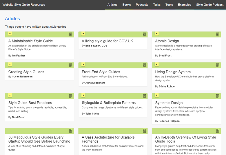
Styleguides.io
Brad Frost , Atomic Design , . , .
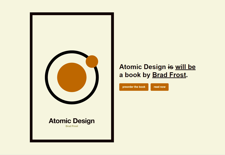
Brad Frost «Atomic Design»
Mobile applications
. — , .. . -.
— - . :
- . , .
- . , - .
- - . , .
- . , . .
. — . , . , .
, . — . - — , . . , .
— , . , — . , - . .
Total
, UX- , . , — , .
:
- .
- .
- -.
- .
- — .
, , — . , . .
PS , ! — , , , , , , , , , , , , , . — , , , , , , , , , , , , , , , , . .
PPS Just do not rush to extremes! Any new approach to work does not cancel, but complements and modifies the old ones. It is foolish to shout that advanced designers work only in the browser, and all who remained in Photoshop are old grandfathers. But also to remain clamped within the framework of the classical tools - to bury your career.
Article written for the magazine UXMatters .
Source: https://habr.com/ru/post/264933/
All Articles