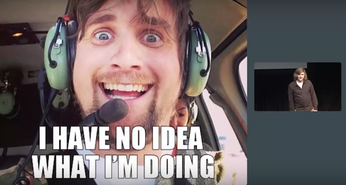
I have no idea what the hell I'm doing
Recently I had the opportunity to open a conference for web designers Generate Conf in New York. I had a chance to talk about the uncertainty of the future.
Here you can watch the video from the show:
')
And here is the transcript:
Thank. How are you, New York? I am glad to be here again. As Oliver said, my name is Brad Frost, and I have no idea what the hell I'm doing. Thanks to Dave Rupert ( Dave Rupert ) for involuntarily throwing me an idea about this beautiful title slide.

I think we all look like this baby. Today we are faced with such a huge stream of new inventions like never before. We have to create projects that should work properly on all types of devices, be compatible with different browsers, work in a variety of conditions and with any user settings.
We have more technologies, more software, more tools, libraries, frameworks. And just to be aware of all this, we are forced to read more blogs, tweets, newsletters, posts on Medium, Pastry Box and Net Magazine, study more training materials, listen to more podcasts, conferences, watch more videos, pay attention to more opinions.
And the funny thing about this scene - of course, it’s funny at all - is that he just sits and suffers, although it’s not at all necessary to do it. He just asks: “Who are you? Why are you doing this? ”
But he has a choice, right? I repeat: we behave like this guy. We have the opportunity to decide whether we will continue to swim in the flow of all this, drowning in technology and solutions. Or we will manage to get out of this stream.
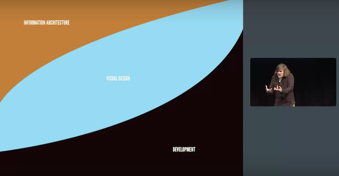
Adaptive design
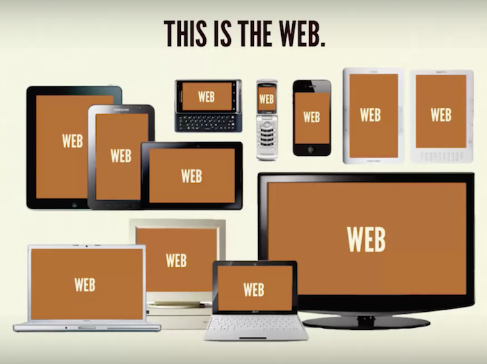
That is our reality now. That's what we, as web designers, have to face. There are different tools, different values of viewports, different types of devices. And this is the prospect of responsive web design. And now we suddenly had the opportunity to set the location of elements in such a way, to create such “flexible” websites that they magically adjust to the value of the viewport. And this is amazing. Lord, how much we have to consider when developing websites now.
Adaptive design recently turned five, but for some reason I still come across this one . Reading some adaptive design guide, I see a mention of 320-pixel resolution, which is used on the iPhone 4 in portrait mode. 480 pixels on iPhone 4 in landscape mode. 768 pixels on the iPad in portrait mode. 1024 pixels on iPad in landscape mode. "Fold". Lord, fold ! Constantly. And so always.
But now all these boundaries are blurred. Every 30 seconds, Samsung launches another device in a new size. And now Apple is also there. Take for example the iPhone 6 and 6 Plus, I like this animation:

She very accurately conveys the process. Now on the iPhone 6 uses values of 375 and 414 pixels. And we also have such a powerful tool as Sass: “So, we need our sites to work on phones, on tablets, and on computers.” And we introduce these concepts into the language and our workflow.

Any selection of a certain class of devices is as short-lived as traces are not sand. - Jason Grigsby
This is a bad influence on the Network - it is not good to try to “push” everything and pay attention only to phones, tablets and personal computers. Our job as responsive web designers is not only to serve a multitude of existing devices - we must also take into account those that are not yet known .
Neither I, nor the people who write on The Verge, know what devices will appear next year, and what values of the viewport will be on them. That is why we have to create a page markup that will work for any viewport.
Therefore, I created a small tool called “ish”, with which you can change the value of the viewport. If you choose a “small” size, the viewing area becomes smaller; if you select “average” size, you get an average value of the viewport; if you click “large”, the viewport value increases accordingly.
If you click on the button again, the value of the viewport will change again. Although this idea is not very practical in terms of development and design, but it can serve as an information base for our clients and colleagues — that is our task.
We create not only what will look good on the iPhone. Our job is to create a website that does not lose its attractiveness and functionality on any device, regardless of the value of the viewport when viewed.
And, of course, customers have their favorite - I placed it here - Disco mode, in which the viewport “jumps” across the screen. Seeing it, customers say, “Hahahaha, look at this! Look how it is changing! ”And this is cool, because, again, this is a way (perhaps an overly bold way) to show them that we are trying to create a universal layout. Whatever the values of the viewport are ahead of us, we are ready for this.
Progressive improvement
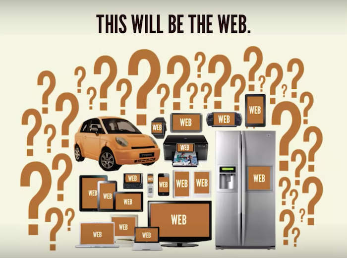
We all know that computers are no longer the only way to access the Web, although we are still working on them. Now we have all these smartphones, push-button telephones, e-books, tablets, netbooks, laptops, computers, TVs, game consoles that can be connected to the web. All these devices have different technical capabilities.
But what we have to deal with in the near future: watches, smart refrigerators, which, if desired, you can buy today. But much more important than those devices that already exist, those that have not yet been created. Neither the journalists of The Verge or Engadget, nor anyone else - no one knows what devices may appear next year.
Yes, our browsers are becoming more powerful, more efficient, as is our technique, Moore's law is still valid. But at the same time, this law operates in two directions. First, its effect is manifested in the improvement of technology: faster processors, more powerful chips and so on.
However, there is also a tendency to reduce the cost of technology. We see this stream of cheap, but at the same time sufficiently high-quality, low-power devices with access to the Network, which Scott Jenson calls Zombie Apocalypse .
The network is not a platform. This is a continuum. Jeremy Keith ( Jeremy Keith )
As Jeremy Keith eloquently put it, if we look at the Web from the point of view of the platform, then we put it on par with iOS, or Android, or even something like Flash. Either you have it or not. But, according to Jeremy, it is very important to understand that the Network is a continuum.
Despite the presence of various devices with access to the Network, all these technologies, browsers, user settings, etc., there is a range of [technologies] that must be supported. And the Network is doing quite well with this task. That is why, at present, progressive improvement plays such an important role.
We constantly build all these hypotheses: yes, of course, users have the latest version of Chrome installed. Of course, they have enabled javascript. Of course, they have a wired connection. Of course, we have their full attention. Of course, they have a big screen and they use an effective input format - a mouse or keyboard. We build all these assumptions, create sites on their basis, and then we puzzle about how to fit this huge object into a small screen.
Instead, we should do what Luke Wroblewski has been talking about for several years. His idea is to turn everything upside down and recognize the fact that the limitations of mobile devices are only in our hands.
Thus, instead of building such hypotheses, it may be better to go by contradiction: yes, of course, the user has a small screen. Of course, they have a disgusting connection. Of course, they have an inconvenient input technology, like a D-pad or something similar for other antediluvian touch screen devices. Of course, they are in a hurry and distracted.

Thus, being in conditions of maximum limitation, we achieve all our business goals, user goals, solve the problem of placing content, and then as the screen increases, while improving the properties of the browser, we can take advantage of these advantages and gradually improve the site. This is why the principle of progressive improvement is so important.
Recently, really powerful JavaScript libraries have appeared. However, the fact that, ostensibly, no one else disables JavaScript (in principle, this is true, few people do it) does not mean that we can just rely on it everywhere by default.
Progressive improvement refers to working with technology imperfections and to a lesser extent due to the fact that users may not support the technology. Andy Hume
So you need to ask this question: what will happen if something goes wrong?
And something will definitely go wrong. And you must answer it. Will you send your users to hell? Or you will provide them with the best possible content and functionality. Start with a basic HTML level, then CSS, and then add JavaScript functionality.
[Note: a video was cut out of the video about how I am sitting on my insurance company’s terribly slow website. Sorry, I thought it was funny]
Ultimately, the idea of progressive improvement, this idea of web standards , taking HTML as a basis, putting CSS on it and then adding other functionality is your fundamental work. I understand that HTML is unattractive. But he performs the role of concrete. Concrete is unsightly. It is dim and gray. But at the same time, it is on it that we can build something beautiful.
Future orientation
It is impossible to create a website for absolutely all devices of the future. But this does not mean that we are unable to prepare for what lies ahead. And this is strange, if you think about it - the projects that you create today will work on devices that do not even exist yet. And it happens more and more often - every new day - take a look at this new watch. It's really cool:
This guy reads his Twitter from the clock, and he goes to the site that I created a couple of years ago. Isn't that cool? That is, this dude has access to what appeared long before the invention of his watch. While designing this website, I did not think: “Yes, I can bet that one day this site will be viewed from such hours”. That's what it is about: to be future-oriented means to imply its unpredictability.
Atomic web design
We do not create pages, we create systems of components. Stephen Hay
Are any of those present using Bootstrap or the Zurb Foundation? True? No one? Do not worry, I do not blame you. Although, perhaps, I condemn. But this is very handy stuff. Responsive design and web design for different devices is not easy.
And these frameworks, these UI toolkits, which can be combined in any way you like, are very helpful. It's awesome, and from a conceptual level, I fully support this approach. Yes, let's create this component system, as Stephen Hay put it.
But the problem, in my opinion, is that these frameworks are just tools. And Bootstrap as well. When I watched science fiction movies as a kid, I couldn't get the idea out of my head. Hmm, I suppose, after a sufficient amount of time, the only problem we solved is fashion. Some guy decided that from now on it would be cool to wear overalls and all such: “Yes, of course.” Just look at these happy people, they are delighted.

Of course, all people are very different. We all have different needs, different requests, different goals and desires. And therefore, when we use these tools, which give us ready-made answers: this is what your drop-down list looks like, this is how your buttons look like - all our sites become the same.
Small bootstraps for every client. Dave Rupert (Dave Rupert)
In this regard, Dave Rupert proposed a wonderful solution, which is to create small bootstraps for each client. He explains in detail that these adaptive toolkits that we offer to our organizations and customers should be very similar to full-featured systems like Twitter Bootstrap.
They need to be customized in accordance with the requirements of customers. And such customer orientation is key in this case. We can create our own design systems.
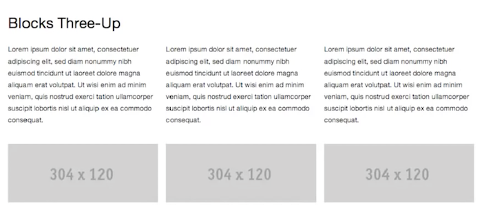
This was the impetus for the publication of many guides on the style and libraries of patterns. Hyde Code for America just awesome. And then there are Salesforce , Mailchimp , Yelp , Starbucks . And when you enter them, you see patterns like “ blocks 3-up ”.
In this case, this is the main pattern that Starbucks uses in its interface: you can resize the window to see how it will look in an adaptive environment. At the same time, they create their own glossary of terms that can be used in the future. In the case of the Starbucks example, the main block before you consists of an image, a title and a text passage.
The page shows how such blocks are grouped - this markup format is great for small screen sizes. The configuration can be complicated - and see how the new version will “work” in an adaptive environment.
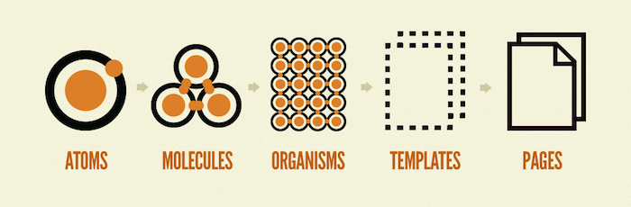
I spent a lot of time thinking about these interface design systems, about the importance of a deliberate approach to building such systems. I call this atomic design, which provides a clear methodology for creating your own design system.
Such is the sequence of work within the framework of the atomic design concept: from atoms to molecules, from molecules to organisms, from organisms to templates, from templates to pages. But this is a separate conversation, so if you want to know more about this, you can purchase my book for $ 10.
Just last week, Google released updates to its Material Design Language system, and I am extremely happy about this, because we should be engaged in creating such projects. I repeat, we don’t know exactly whether what we are working on today will be relevant in the future.
And if you think about it, it is very presumptuous to finish your work, to declare "that's all, the project will not need anything more." Systems like Material Design language allow us to use them, learn, test and, returning from practice to theory, modify the language itself.
We can use these systems, implement them, use them as an example, This is exactly how it works with its design language and Google, and all other people using it.
Again, I do not know what will happen with this system further; I do not know how people will use it. In any case, these pattern libraries and design systems are becoming increasingly important.
Instruments
Great minds discuss ideas. Average minds discuss events. Small minds discuss people. Henry Thomas Buckle
I like this quote. Therefore, I will push off from her. So great minds discuss principles. Average minds discuss technology. Small minds discuss tools.
Do me a favor: raise your hands to those who have a designer using Sketch in the company? Where are my Photoshop lovers? What about front-end developers? Who uses Sublime Text? And who, say, something else? So, we will play a little game called Gangs of New York. Look under the seats, there you have axes and butcher knives. We will fight to the death for our tools.
We are accustomed to paying increased attention to tools. What kind of “grid” do I use? Which editor? What tool is better to use for work? What is a front-end framework? Use jQuery or not? Angular or Ember? Native vs. Web. We constantly get involved in these battles.
And what we really need to do is retreat. But I continue to receive emails from design students and developers with requests like: “Please help me. What languages should I learn? Which frameworks are better to use? What tools to use?
They can be understood. Has anyone recently viewed sites with job advertisements? Have you seen the list of requirements? You can go crazy.
So, I will take this opportunity - since the last time things have been going quite well at Brad Frost Web LLC - I'm thinking about increasing the staff. In general, I open a job for you. Since you are smart enough to attend such a conference, maybe I’m feeling lucky and I’ll find the perfect employee among you.
Here is a list of required knowledge and skills:
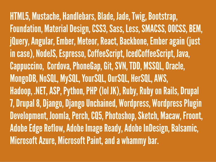
If you meet these requirements, Brad Frost Web LLC is impatient to see what you can offer our advanced team. The initial salary on a competitive basis is 15 thousand dollars a year, from pleasant bonuses - a dress code in casual style and a ping-pong table. Hiring agents do not apply.
Aside from jokes, I received such letters last week: “Do you know any experts on React.js you can hire?” I went to the React.js page on Wikipedia, its first stable version was created just four months ago . Again, this is a blind passion for individual tools and individual technologies.
And again I was asked to answer the question : “As a front-end engineer, should I know all the problem-solving algorithms in order to pass an interview in a large company?” Like bubble sort and similar garbage. It's complicated. It is very, very difficult.
Recently, Jen Simmons, on her excellent podcast The Web Ahead, talked about this:
When I need to understand some kind of new technology, it’s easy for me to log into Google, find a manual and study a certain code. It’s much harder to figure out why I should use this technology. Very often, this moment is not set out and is not illuminated properly. Jen Simmons. (Jen Simmons)
Of course, this idea of understanding and justifying the reasons why we determine the benefits of specific technologies is extremely important. But instead, we focus only on the stream of Github frameworks and archives, which breed like lustful rabbits.
It's about principles.
I call them principles of responsive design . Here's what should be focused on: do my projects take advantage of the availability of the Web? Are they universal? Are they effective? Do they use the unique capabilities of those browsers and devices through which they are viewed? How long are they created? Do I think about the future?

Knowledge and skills
So what do we do? What are we focusing our efforts on? Each of us has a set of specific skills and knowledge, but we can always learn more.
Do you know the idea of a T-shaped specialist ? T-shaped competence? The breadth of your competence is determined by a set of knowledge in different areas. But you have deeper knowledge in a certain area. I think this is a good, sensible way to express the idea that it is impossible to know absolutely everything.
For me, as a front-end developer, the base of my “T” is HTML and CSS, but for someone else they will be a horizontal line in the letter “T”. Although that's what came to my mind: if this "T" were a table, he would have fallen. Here's what we really need to do:

Team a few T-specialists to work together on a project. Having people who complement each other thanks to the diversity of their skills will help your team become stronger and more stable as a whole.
Process
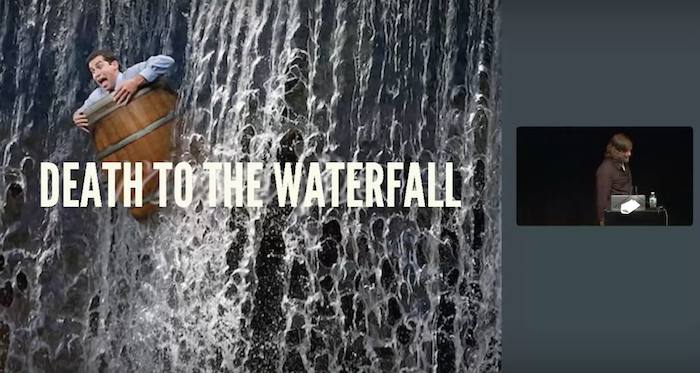
And to deal with this, we need to once and for all put an end to the “waterfall” model. You understand what I'm talking about, right? Are there UX designers in the room?
You create frames, three hundred page reports in PDF and show them to the client. And he says: "Yes, I think it looks good." He gives his consent, you give everything to the designer, who works on colors, typography, textures, and when you show the customer the final version, he declares: “Well, I don’t know. Can we change something? ”We say“ of course ”and get down to work on version 2.
And again we show it to the client, to which he says: “I like this option, but is it possible to return some of the original version”. And we answer: "Ok, we will make version 3." Customer: "Ok, ...".
And when the homepage_final_v2_forreview_finalfinal_fordevreview_finalthistime_FINAL.psd version is finally approved, graphic designers quietly podkardyvayutsya to the cave of developers, enclose projects under the door, and, running away, shout: “It needs to be finished in two weeks! We no longer fit into the budget and deadlines! ”The developers are selected from their caves with the words:“ Damn, but then all is wrong! ”
Being a front-end developer, I am experiencing a serious personality crisis. In all the companies where I worked, I was asked: “So what are you doing? “Well, I write code in HTML and CSS.” “Oh, so you're a coder! Go and sit next to those Ruby developers. ” I: “Eeee ...” “How long will it take you to write us this software?” “Um ... my mother teaches art. I never went to computer science classes in my life. I do not understand what you are talking about. ”
I think that in the design process it is very important to focus on the future, develop multiplatform websites and consider front-end development as the most important and key element of web design.
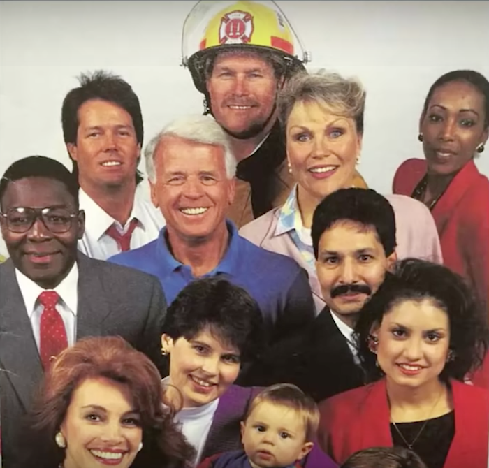
Raise your hand if in your organization designers and developers are sitting next to each other. It's good. I'm happy for you.
Raise your hand if the designers and developers are sitting on the same floor? On different floors? In different cities? In different countries? This is a serious problem. We cannot do our job qualitatively in the presence of such organizational barriers. It is understood that each of us must know the answers to all questions. But we do not know. We just can not know everything.
We don't know what the hell we do. We need to work together, to interact with each other. Sit nearby. This is not very comfortable and unnatural, but only this way you can achieve a good result. This applies to everyone (after seeing this photo in my uncle's manual therapy room, I said: “Oh God. I will include it in my presentation”).
This concerns not only the specialists of our sphere, it concerns all. I love working on the web, and I hope all of you too. Because it is we, the people who create the Network, understand all its power. We understand the true nature of cooperation, which is the sharing of knowledge and publicity.
Therefore, I strongly recommend that you keep your blogs, write on Medium, share your own design process experience, photographs of your work, case studies, data, give advice and recommendations, ask questions at Stack Overflow, answer questions at Stack Overflow, add documentation, send bug reports in browsers, share your projects on Github.
The beauty of the web is that it is huge and messy:

You immediately understand that no one knows everything about the Web. There are no such experts. There are no superstars, no ninjas. There are only people who have puzzle pieces. And only by interacting and helping each other, we can put them together.
I really like this schedule:
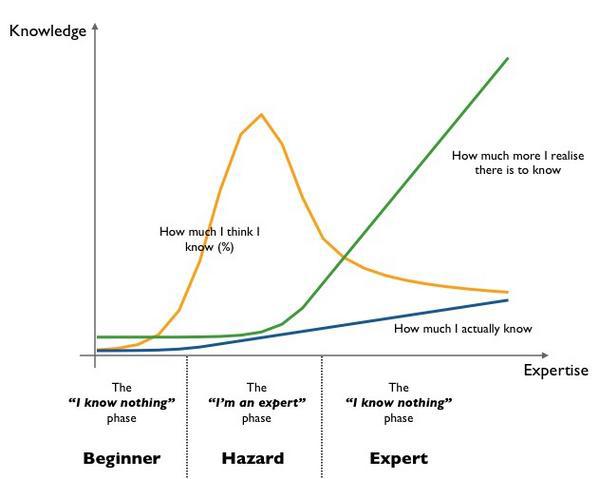
Simon Wardley recently completed work on it. At first, you go through the phase: “I don’t know anything,” and this is true, because you’ve just begun. And then you rush upward with a false sense of “omniscience” and confidence.
But over time, you realize that there is still a hell of a lot unknown to you. And so I also do not know anything. And I have no idea what the hell I'm doing. It concerns you too. And that's fine.
Network - this is one huge puzzle, from which we lost the box. And it will never be fully assembled. We spend hours collecting the sky from blue pieces, and then the child crawls and eats a couple. After that, some idiot comes and dumps a thousand new pieces on a puzzle with the words: “Here, get! Now it's part of the puzzle. ”
But does this mean that we should stop everything? Not. We have to assemble this puzzle. Indeed, despite the fact that it will never be completed, we are seeing some progress. And you can see what a beautiful picture comes out of it.
And also to collect puzzles is devilishly fascinating. Thank.
Source: https://habr.com/ru/post/264575/
All Articles