Grinding CSS Animation
Creating CSS animations may look like a simple study of syntax, but to create a beautiful and intuitive animation requires certain subtleties. Since the animation attracts a lot of attention, it is extremely important to put the code in order for the timing to work correctly and to debug everything that does not work correctly. After I dealt with this problem myself, I decided to collect several tools that can help in this process.
Let's say you have several animations that run at the same time, and you need to build them in a checkerboard pattern. You can use the animation delay, but you don’t want the user to wait while visiting the page until some immovable parts start.
You can set a negative animation delay value, and this will move the playback cursor back in time, with the result that all animations will move when the user enters the page. This option is suitable, in particular, when animations have the same keyframe values, and the difference in movement is only in the delay.
This concept can also be used for debugging. Set animation-play-state: paused ;, then set various negative delay values. As you go, you will see animation frames in various pause states.
')
In this funny demo, we see two robots hovering with a different period of time to make it look more natural. When describing the hang animation, let the purple robot get a negative delay so that when the user first sees the page, it will already move.
For greater efficiency, some elements should also be moved and modified using the transform function, which will help you avoid the cost of redrawing with a field or shifting left / right, etc. Paul Lewis has an excellent resource called CSS Triggers , in which such costs are presented in the form of a convenient table. The pitfalls here are that if you try to move elements through multiple transformations, you will encounter a number of problems.
The main problem is order. Transformations will not be applied at the same time, as one would expect, and instead they will appear in the order of operations. The first operation will be on the far right, and then in order. For example, in the code below, the scaling will start first, then the transformation, and then the rotation.
In most situations, this is not ideal. Most likely, you need all this to happen in parallel. Moreover, it becomes even more difficult if you begin to divide the transformations into several keyframes, in which some values are used simultaneously and some not. For example, in this way:
This will lead to some surprising and not quite perfect results . The solution, unfortunately, is the use of several nested elements, with an application for each individual transformation, so that there are no conflicts.
There are other alternatives, for example, using matrix transformations (which are not intuitive for manual code) or using the JavaScript animation API, for example, GreenSock, in which you cannot customize the order of multiple interpolations of transformations.
Using multiple div elements can also help troubleshoot SVGs. In Safari, you cannot set the transparency and transformation of the animation at the same time - one of the values will not work. The workaround is shown in this article in the first demo.
In early August 2015, the definitions of individual transformations entered Chrome Canary. This means that we no longer need to worry about order. The functions rotate, translate and scale can now be set separately.
Both Chrome and Firefox today provide several tools designed specifically for working with animation. They offer a slider for speed control, a pause button, a user interface for working with smoothing values. Reducing the speed of movement of elements and the consideration of animation at certain stopping points helps a lot in debugging CSS animations.
Both tools use Lee Verow's cubicbebezier.com and GUI visualization. This is pretty good, since you no longer have to jump back and forth from cubic-bezier.com to a text editor for verification.
These tools allow us to customize the animation more intuitively. Here’s what the user interface looks like:
Both Chrome and Firefox allow you to control timekeeping (speed up or slow down), as well as manually clean up animations. More advanced time management tools will soon be introduced to Chrome and will be able to view multiple items at once. This would be nice, since working with only one animation element at a time is a strong limiting factor.
One of the problems I encountered is a quick capture of the element, if the animation is short and fast. In such cases, I usually set animation-iteration-count: infinite; to be able to continuously play the animation without having to fight over time.
I also consider it a great way to slow down the animation, and then re-play it and adjust the timing in the browser using these tools. This allows you to break every movement at the initial level and see how everything interacts and how the movement itself looks. If you configure everything at this speed, then you can set a high speed, and it will look more professional.
If you want to determine exactly where and when each animation begins, you can use a bit of JavaScript to define and mark when each event occurs by connecting animationstart, animationiteration and animationend.
Demo
I often see how people define the same property and value in a keyframe at 0% and in a keyframe at 100%. It is not necessary to do this, and this may lead to more bloated code. The browser will take the value of the properties as the original, and the final - by default.
This is too much:
It should look like this:
Creating a beautiful and capacious animation usually means writing a certain function of smoothness cubic-bezier (). A well-tuned smoothness function works like a company palette. You have a certain branding and “voice” in motion. If you use them throughout the site (and you have to maintain everything in the same style), the easiest way to do this is to keep one or two smoothness functions in a variable, just like we do in palettes. SASS and other pre / post processors make it pretty simple:
When creating animations using CSS keyframes, we want as much help from the GPU as possible. This means that if you are animating multiple objects, you need a way to easily prepare the DOM for the incoming movement and layered the element. You can hardware speed up a native DOM element (not SVG) using CSS by using the standard description component. Since we reuse it on all the elements that we animate, it makes sense to make a little description and additionally use impurities or inheritance:
Be careful. Unloading too many items at a time can have the opposite effect and slow performance. Most animations should be detailed, but be careful if you use something like haml to generate a huge amount of DOM elements.
On Smashing Magazine recently published a good article , which was presented work on a fantastic project - Species in Pieces. In one of the sections, the author describes in some detail how the animation of all the details at once led to performance problems. He's writing:
You can use for loops in Sass or other pre / post processors to create such functionality. Here is a pretty simple version that I wrote to loop the nth-child child:
In addition, they can be used to place in a staggered manner such visual effects as color, etc.
When creating longer animations, you can build a sequence of several animations or events by linking them in a chain with progressive delays. For example:
But suppose you make certain changes and find that the second account of the first animation needs to be changed. This will affect the delays of everything that goes after it, so you need to adjust the timing of each subsequent animation. It is not difficult.
And now let's add another animation and change the timing of the second one again (this configuration option almost always happens when creating really high-quality animation). It gets a bit ineffective. If you do this more than three times, it will be really ineffective.
Now imagine that in the middle of the path two animation movements must start at the same time, so you need to adhere to uniform timing with two different properties and ... well, you understand. Therefore, every time I line up three or four linked animations, I switch to JavaScript. Personally, I like the GreenSock animation API, as it has very convenient time setting functionality, and most of the JS animations make it easy to build animation without recalculation, which definitely has a good effect on the workflow.
Debugging animation work is more important than just building an animation. As a rule, editing, improving and debugging turn a project into a well-organized and efficient thing. I hope these tips will bring some new tools to your piggy bank and smooth out your workflow.
Use negative delay values
Let's say you have several animations that run at the same time, and you need to build them in a checkerboard pattern. You can use the animation delay, but you don’t want the user to wait while visiting the page until some immovable parts start.
You can set a negative animation delay value, and this will move the playback cursor back in time, with the result that all animations will move when the user enters the page. This option is suitable, in particular, when animations have the same keyframe values, and the difference in movement is only in the delay.
This concept can also be used for debugging. Set animation-play-state: paused ;, then set various negative delay values. As you go, you will see animation frames in various pause states.
')
.thing { animation: move 2s linear infinite alternate; animation-play-state: paused; animation-delay: -1s; } In this funny demo, we see two robots hovering with a different period of time to make it look more natural. When describing the hang animation, let the purple robot get a negative delay so that when the user first sees the page, it will already move.
.teal { animation: hover 2s ease-in-out infinite both; } .purple { animation: hover 2s -0.5s ease-in-out infinite both; } @keyframes hover { 50% { transform: translateY(-4px); } } Multiple Transformation Value Problems
For greater efficiency, some elements should also be moved and modified using the transform function, which will help you avoid the cost of redrawing with a field or shifting left / right, etc. Paul Lewis has an excellent resource called CSS Triggers , in which such costs are presented in the form of a convenient table. The pitfalls here are that if you try to move elements through multiple transformations, you will encounter a number of problems.
The main problem is order. Transformations will not be applied at the same time, as one would expect, and instead they will appear in the order of operations. The first operation will be on the far right, and then in order. For example, in the code below, the scaling will start first, then the transformation, and then the rotation.
@keyframes foo { to { /* 3rd 2nd 1st */ transform: rotate(90deg) translateX(30px) scale(1.5); } } In most situations, this is not ideal. Most likely, you need all this to happen in parallel. Moreover, it becomes even more difficult if you begin to divide the transformations into several keyframes, in which some values are used simultaneously and some not. For example, in this way:
@keyframes foo { 30% { transform: rotateY(360deg); } 65% { transform: translateY(-30px) rotateY(-360deg) scale(1.5); } 90% { transform: translateY(10px) scale(0.75); } } This will lead to some surprising and not quite perfect results . The solution, unfortunately, is the use of several nested elements, with an application for each individual transformation, so that there are no conflicts.
There are other alternatives, for example, using matrix transformations (which are not intuitive for manual code) or using the JavaScript animation API, for example, GreenSock, in which you cannot customize the order of multiple interpolations of transformations.
Using multiple div elements can also help troubleshoot SVGs. In Safari, you cannot set the transparency and transformation of the animation at the same time - one of the values will not work. The workaround is shown in this article in the first demo.
In early August 2015, the definitions of individual transformations entered Chrome Canary. This means that we no longer need to worry about order. The functions rotate, translate and scale can now be set separately.
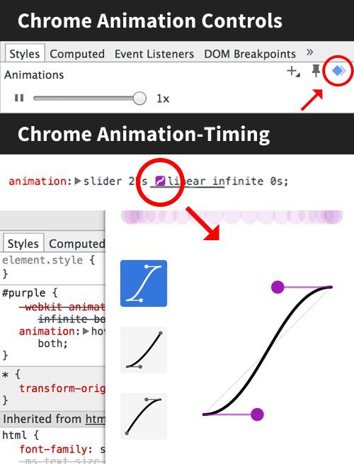
Timekeeping Tools
Both Chrome and Firefox today provide several tools designed specifically for working with animation. They offer a slider for speed control, a pause button, a user interface for working with smoothing values. Reducing the speed of movement of elements and the consideration of animation at certain stopping points helps a lot in debugging CSS animations.
Both tools use Lee Verow's cubicbebezier.com and GUI visualization. This is pretty good, since you no longer have to jump back and forth from cubic-bezier.com to a text editor for verification.
These tools allow us to customize the animation more intuitively. Here’s what the user interface looks like:
Both Chrome and Firefox allow you to control timekeeping (speed up or slow down), as well as manually clean up animations. More advanced time management tools will soon be introduced to Chrome and will be able to view multiple items at once. This would be nice, since working with only one animation element at a time is a strong limiting factor.
One of the problems I encountered is a quick capture of the element, if the animation is short and fast. In such cases, I usually set animation-iteration-count: infinite; to be able to continuously play the animation without having to fight over time.
I also consider it a great way to slow down the animation, and then re-play it and adjust the timing in the browser using these tools. This allows you to break every movement at the initial level and see how everything interacts and how the movement itself looks. If you configure everything at this speed, then you can set a high speed, and it will look more professional.
Debugging CSS Animation Events with JavaScript
If you want to determine exactly where and when each animation begins, you can use a bit of JavaScript to define and mark when each event occurs by connecting animationstart, animationiteration and animationend.
Demo
Keyframes must remain compact
I often see how people define the same property and value in a keyframe at 0% and in a keyframe at 100%. It is not necessary to do this, and this may lead to more bloated code. The browser will take the value of the properties as the original, and the final - by default.
This is too much:
.element { animation: animation-name 2s linear infinite; } @keyframes animation-name { 0% { transform: translateX(200px); } 50% { transform: translateX(350px); } 100% { transform: translateX(200px); } } It should look like this:
.element { transform: translateX(200px); animation: animation-name 2s linear infinite; } @keyframes animation-name { 50% { transform: translateX(350px); } } "Dry" animation
Creating a beautiful and capacious animation usually means writing a certain function of smoothness cubic-bezier (). A well-tuned smoothness function works like a company palette. You have a certain branding and “voice” in motion. If you use them throughout the site (and you have to maintain everything in the same style), the easiest way to do this is to keep one or two smoothness functions in a variable, just like we do in palettes. SASS and other pre / post processors make it pretty simple:
$smooth: cubic-bezier(0.17, 0.67, 0.48, 1.28); .foo { animation: animation-name 3s $smooth; } .bar { animation: animation-name 1s $smooth; } When creating animations using CSS keyframes, we want as much help from the GPU as possible. This means that if you are animating multiple objects, you need a way to easily prepare the DOM for the incoming movement and layered the element. You can hardware speed up a native DOM element (not SVG) using CSS by using the standard description component. Since we reuse it on all the elements that we animate, it makes sense to make a little description and additionally use impurities or inheritance:
@mixin accelerate($name) { will-change: $name; transform: translateZ(0); backface-visibility: hidden; perspective: 1000px; } .foo { @include accelerate(transform); } Be careful. Unloading too many items at a time can have the opposite effect and slow performance. Most animations should be detailed, but be careful if you use something like haml to generate a huge amount of DOM elements.
Cycles for better performance
On Smashing Magazine recently published a good article , which was presented work on a fantastic project - Species in Pieces. In one of the sections, the author describes in some detail how the animation of all the details at once led to performance problems. He's writing:
Imagine that you are moving 30 objects at the same time; you require too much from the browser, and it is logical that this can lead to problems. If the speed of each object is 0.199 seconds and the delay is 0.2 seconds, the displacement of only one object at a time can solve the problem. The fact that the same number of movements actually occurs does not matter: if the animation is performed along a chain, the performance immediately increases 30 times.
You can use for loops in Sass or other pre / post processors to create such functionality. Here is a pretty simple version that I wrote to loop the nth-child child:
@for $i from 1 through $n { &:nth-child(#{$i}) { animation: loadIn 2s #{$i*0.11}s $easeOutSine forwards; } } In addition, they can be used to place in a staggered manner such visual effects as color, etc.
Setting up multiple animations in a sequence
When creating longer animations, you can build a sequence of several animations or events by linking them in a chain with progressive delays. For example:
animation: foo 3s ease-in-out, bar 4s 3s ease-in-out, brainz 6s 7s ease-in-out; But suppose you make certain changes and find that the second account of the first animation needs to be changed. This will affect the delays of everything that goes after it, so you need to adjust the timing of each subsequent animation. It is not difficult.
animation: foo 2.5s ease-in-out, bar 4s 2.5s ease-in-out, brainz 6s 6.5s ease-in-out; And now let's add another animation and change the timing of the second one again (this configuration option almost always happens when creating really high-quality animation). It gets a bit ineffective. If you do this more than three times, it will be really ineffective.
Now imagine that in the middle of the path two animation movements must start at the same time, so you need to adhere to uniform timing with two different properties and ... well, you understand. Therefore, every time I line up three or four linked animations, I switch to JavaScript. Personally, I like the GreenSock animation API, as it has very convenient time setting functionality, and most of the JS animations make it easy to build animation without recalculation, which definitely has a good effect on the workflow.
Debugging animation work is more important than just building an animation. As a rule, editing, improving and debugging turn a project into a well-organized and efficient thing. I hope these tips will bring some new tools to your piggy bank and smooth out your workflow.
Paysto payment solutions for Habr readers:
→ Get paid by credit card right now. Without a site, PI and LLC.
→ Accept payments from companies via the Internet. Without a site, PI and LLC.
→ Acceptance of payments from companies for your site. With document circulation and exchange of originals.
→ Automation of sales and service transactions with legal entities. Without intermediary in the calculations.
→ Accept payments from companies via the Internet. Without a site, PI and LLC.
→ Acceptance of payments from companies for your site. With document circulation and exchange of originals.
→ Automation of sales and service transactions with legal entities. Without intermediary in the calculations.
Source: https://habr.com/ru/post/264421/
All Articles