Simple plan-fact analysis in Power BI Desktop. Part Two - Visualization
Hello!
Here is a continuation of the story about the plan-actual analysis in Power BI Desktop. The first part can be read here . If you want to read in general about the Power BI platform, then welcome here .
Today I will talk about building interactive reports and quite a bit about creating calculated fields in Power BI Desktop. Under the cat there will be a lot of gifs, so be careful with the traffic.
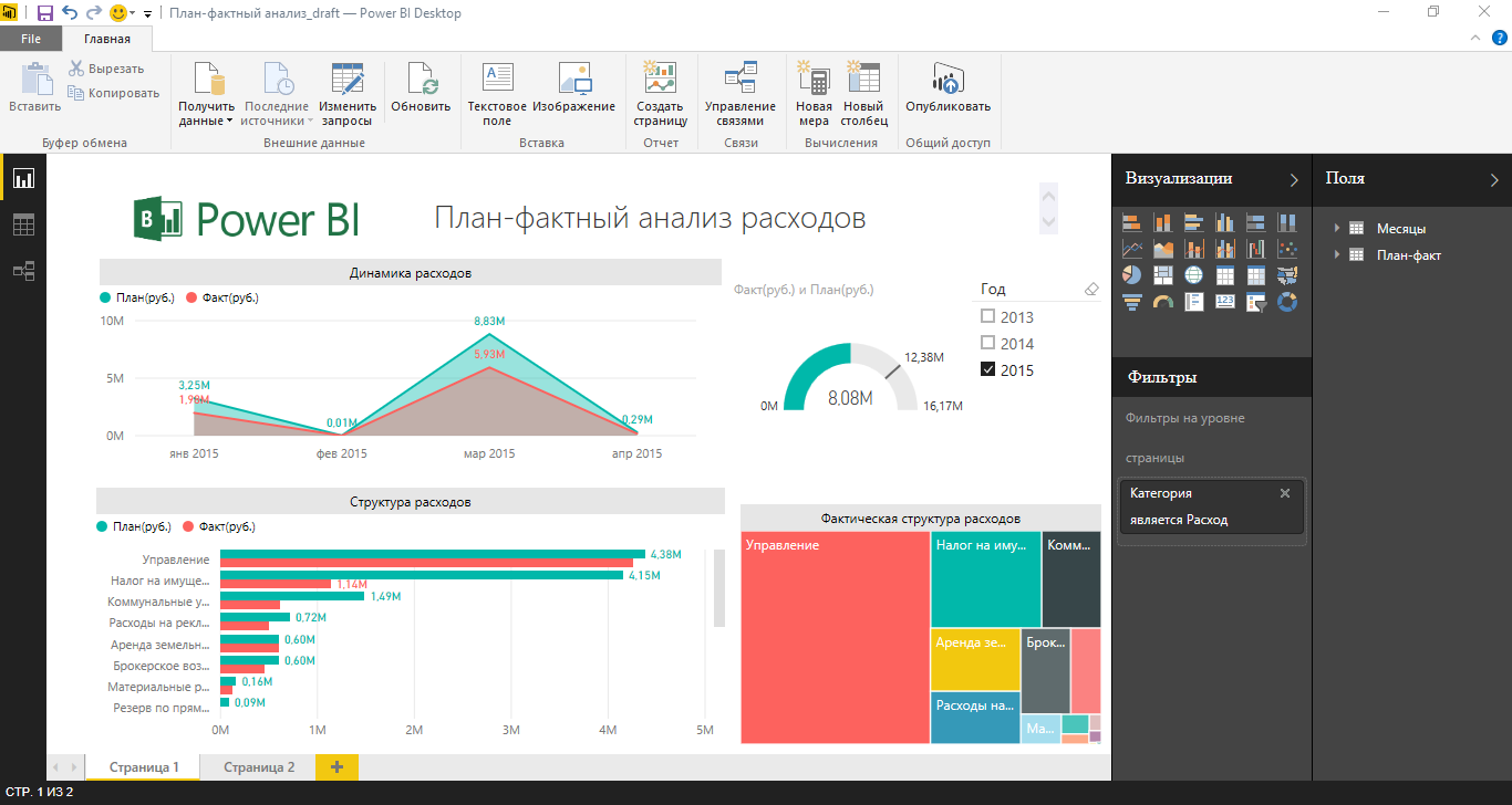
Figure 1. Power BI Desktop appearance
The appearance of Power BI Desktop in the report preparation mode is shown in the figure above. In the "Visualization" panel, you can select the desired type of data display and further formatting. The Fields panel displays all the tables, columns, and measures that are in the data model.
Let's look at the process of preparing the report shown in the figure.
To create any visualization, simply drag the fields containing the desired data into the report area. Depending on the type of data, various aggregate functions as well as various visualization methods can be automatically applied to them. In our case, we are interested in the fields "Date", "Plan (rub.)" And "Fact (rub)".
')
After dragging the fields into the report area, a table was formed that contains several columns. The appearance of the data in the report area is configured using the "Visualization" panel. The list of available ways to display data is not very large, but it is sufficient for many tasks. In addition, Power BI Desktop has a monthly update cycle, which allows us to hope that the functionality will be expanded in the future.
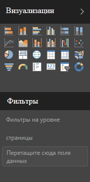
Figure 3 The Visualization panel in Power BI Desktop
Select the “Area with Chart” visualization type and slightly increase the size of the chart. Please note that the Visualization panel is context-sensitive and offers a different set of settings for each type of visualization.
In addition, two levels of filters are available for visualizations - at the level of the visual element and at the page level. As the name suggests, the page level filter will be applied to all visual elements located on the report page. You can filter by any fields in the data model. In this case, apply a page level filter on the "Category" field, since Only expense data is required in the report.
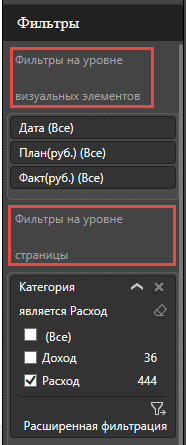
Figure 5 Visual Filters
After applying the filter, you can slightly adjust the appearance of the diagram, for example, change colors. This operation can be performed using the "Format" tab in the "Visualization" panel. The formatting options are different for each type of visualization, and formatting is not available for text elements in principle. For example, for an element of the type "Card" you can not change either the color or the font size. For charts, you can customize the colors of elements, enable or disable data labels, etc. It is extremely interesting to have such an inscription when choosing a color as “Theme Colors”. Unfortunately, I could not find ways to create my own themes for Power BI Desktop, maybe this functionality will be available in the future.
In our case, we will change the colors of the data, add a display of data labels, and also change the type of the X axis to categorical.
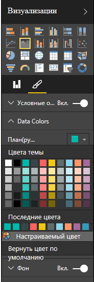
Figure 7 Formatting a Chart
In addition to the overall dynamics of expenditures, it is interesting for me to see in which categories the expenditures were within the framework of the plan, and for which of which there are deviations to the larger, smaller side. To do this, add a bar chart with grouping.
Notice that by default the data in the diagram is sorted alphabetically. This is inconvenient, but you can always change the field and sort order. The main limitation when setting up sorting for a visual element is that you can only sort by the fields whose data is present in the graph (see figure).
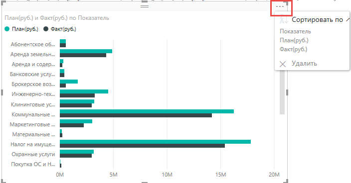
Figure 10 Sorting a Chart
If you need to sort by a field that is not involved in the visual element, use the “Sort by column” functionality, which is available in data modeling mode.

Figure 11 Sort by column
After adjusting the sorting and small formatting of the headings, the chart will look more pleasing to the eye:
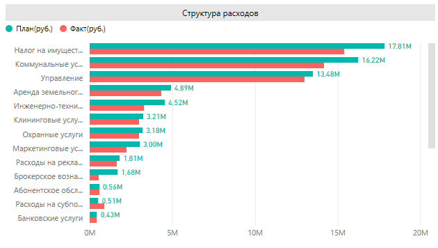
Figure 12 Formatted Chart
After adding visual elements like “Tree” and a sensor, the result is an interactive report that shows the dynamics of expenses, the distribution of expenses by categories and the ratio of planned indicators to actual ones.
So, the preparation of the report is almost complete, but for convenience, you need to add the ability to filter data by year. Yes, you can use advanced page filters, but this is not very convenient. Therefore, we use the slice visualization element. If you simply drag the Date field and select the desired type of visualization, you will see a complete list of all dates, which is completely inconvenient.

Figure 14 Incorrect slice display by date
In order for us to add a slice by year, we need to create a calculated column that will contain the value of the year. This can be done both in the report mode and in the data modeling mode. DAX formulas are used to create calculated columns and measures. In our case, to create a column containing year values, we need a simple formula: Year = Year ([Date]). The process of creating a calculated column and adding a slice to the report is shown in Figure 15.
The report is almost ready, it remains only to add the name and logo of the company.
This concludes the second part of the article on plan-actual analysis in Power BI Desktop. A big request to answer the survey about the usefulness and clarity of my articles. Thank you for reading.
Here is a continuation of the story about the plan-actual analysis in Power BI Desktop. The first part can be read here . If you want to read in general about the Power BI platform, then welcome here .
Today I will talk about building interactive reports and quite a bit about creating calculated fields in Power BI Desktop. Under the cat there will be a lot of gifs, so be careful with the traffic.
Figure 1. Power BI Desktop appearance
The appearance of Power BI Desktop in the report preparation mode is shown in the figure above. In the "Visualization" panel, you can select the desired type of data display and further formatting. The Fields panel displays all the tables, columns, and measures that are in the data model.
Let's look at the process of preparing the report shown in the figure.
To create any visualization, simply drag the fields containing the desired data into the report area. Depending on the type of data, various aggregate functions as well as various visualization methods can be automatically applied to them. In our case, we are interested in the fields "Date", "Plan (rub.)" And "Fact (rub)".
')
Figure 2 Dragging fields to report area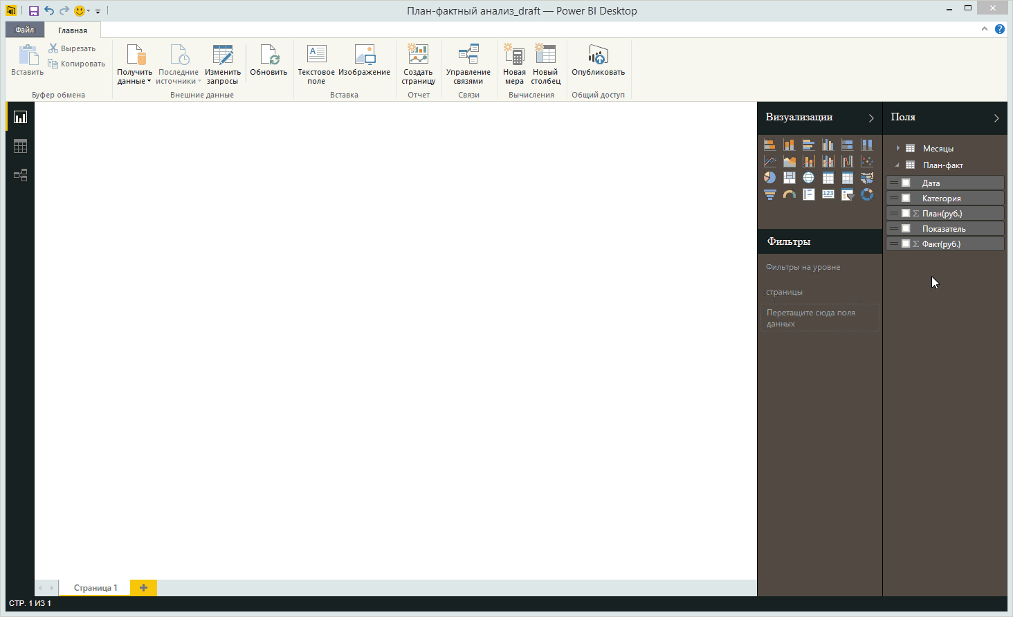
After dragging the fields into the report area, a table was formed that contains several columns. The appearance of the data in the report area is configured using the "Visualization" panel. The list of available ways to display data is not very large, but it is sufficient for many tasks. In addition, Power BI Desktop has a monthly update cycle, which allows us to hope that the functionality will be expanded in the future.
Figure 3 The Visualization panel in Power BI Desktop
Select the “Area with Chart” visualization type and slightly increase the size of the chart. Please note that the Visualization panel is context-sensitive and offers a different set of settings for each type of visualization.
Figure 4 Changing the type of visualization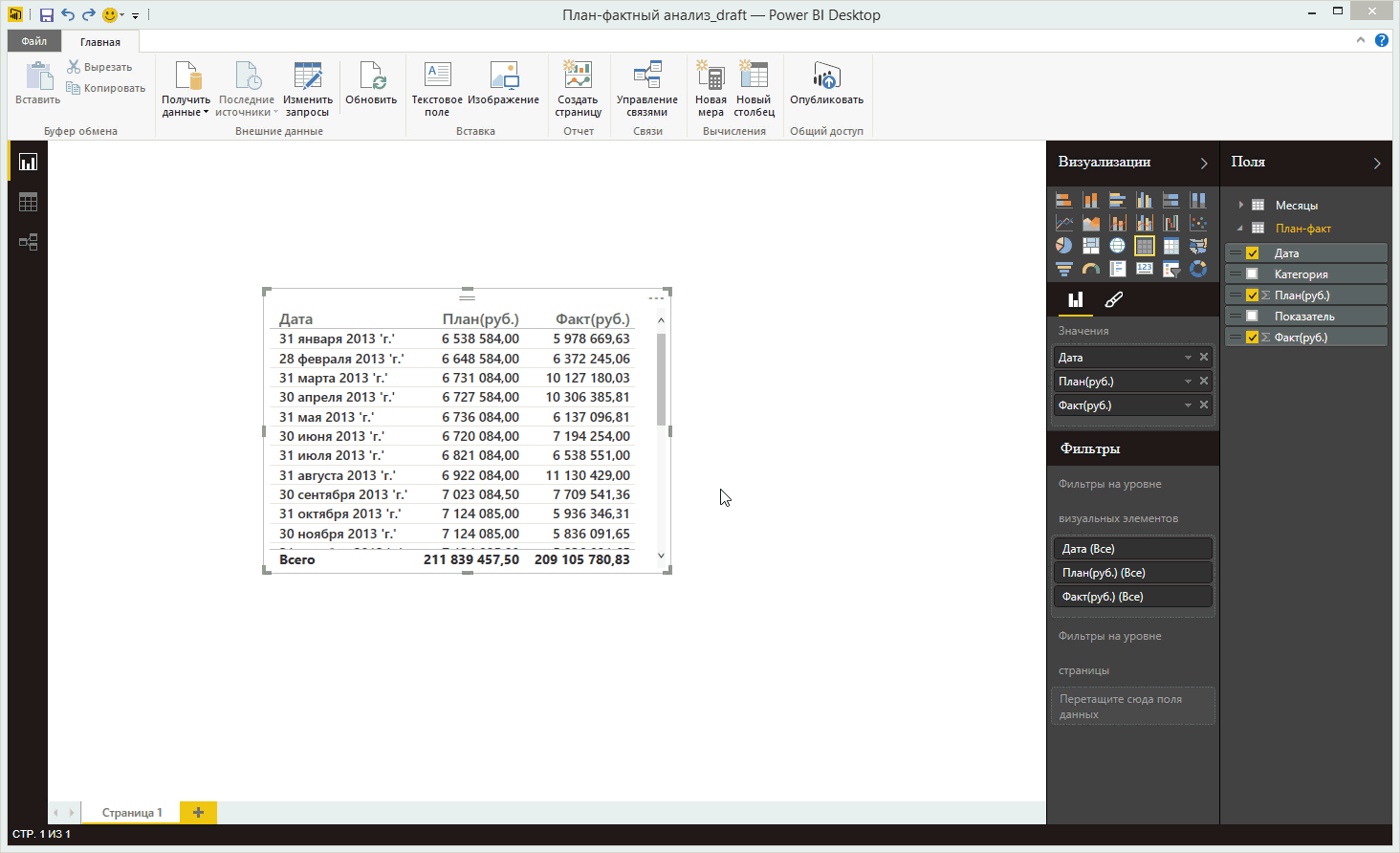
In addition, two levels of filters are available for visualizations - at the level of the visual element and at the page level. As the name suggests, the page level filter will be applied to all visual elements located on the report page. You can filter by any fields in the data model. In this case, apply a page level filter on the "Category" field, since Only expense data is required in the report.
Figure 5 Visual Filters
Figure 6 Applying a page filter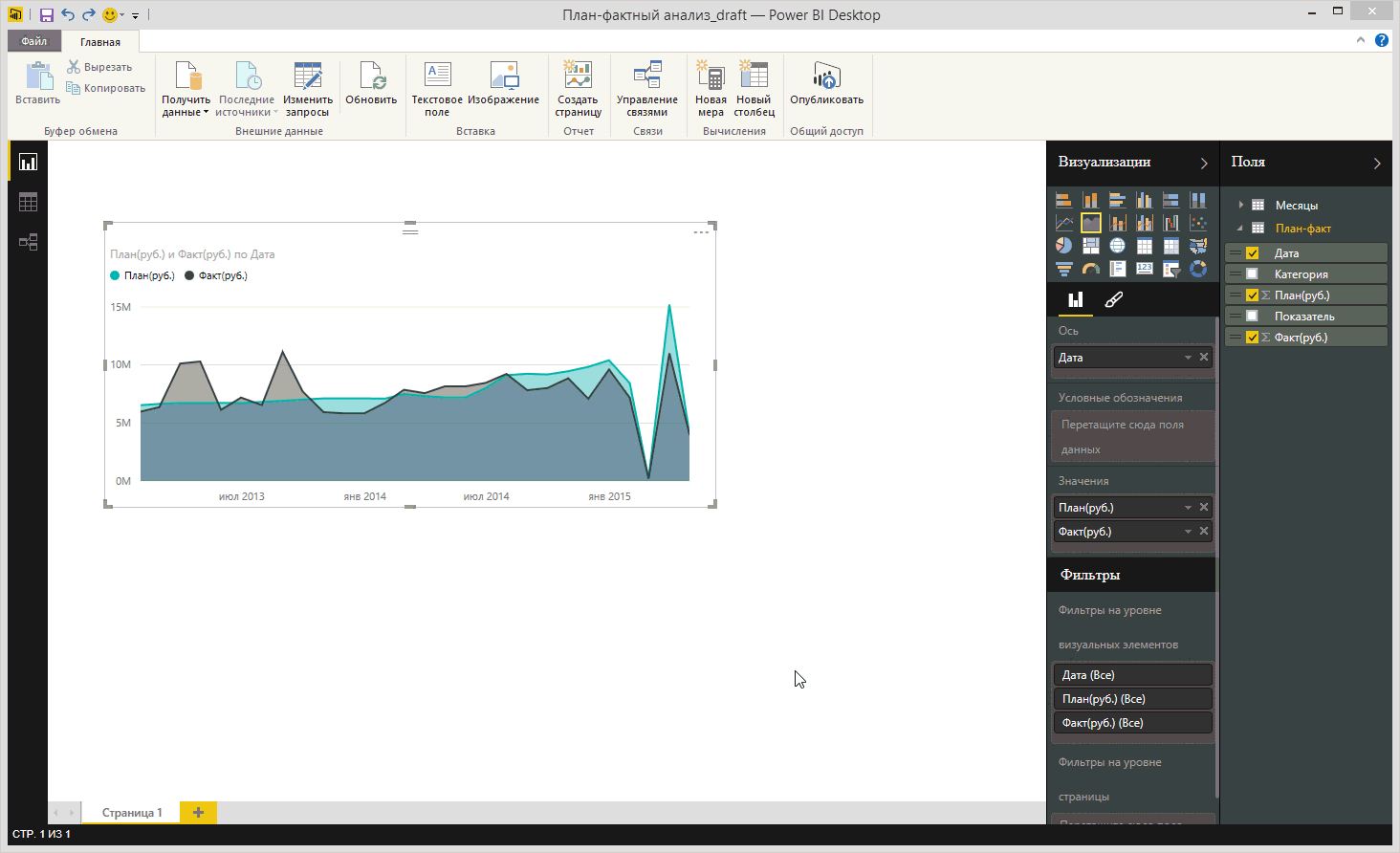
After applying the filter, you can slightly adjust the appearance of the diagram, for example, change colors. This operation can be performed using the "Format" tab in the "Visualization" panel. The formatting options are different for each type of visualization, and formatting is not available for text elements in principle. For example, for an element of the type "Card" you can not change either the color or the font size. For charts, you can customize the colors of elements, enable or disable data labels, etc. It is extremely interesting to have such an inscription when choosing a color as “Theme Colors”. Unfortunately, I could not find ways to create my own themes for Power BI Desktop, maybe this functionality will be available in the future.
In our case, we will change the colors of the data, add a display of data labels, and also change the type of the X axis to categorical.
Figure 7 Formatting a Chart
Figure 8 Changing the chart format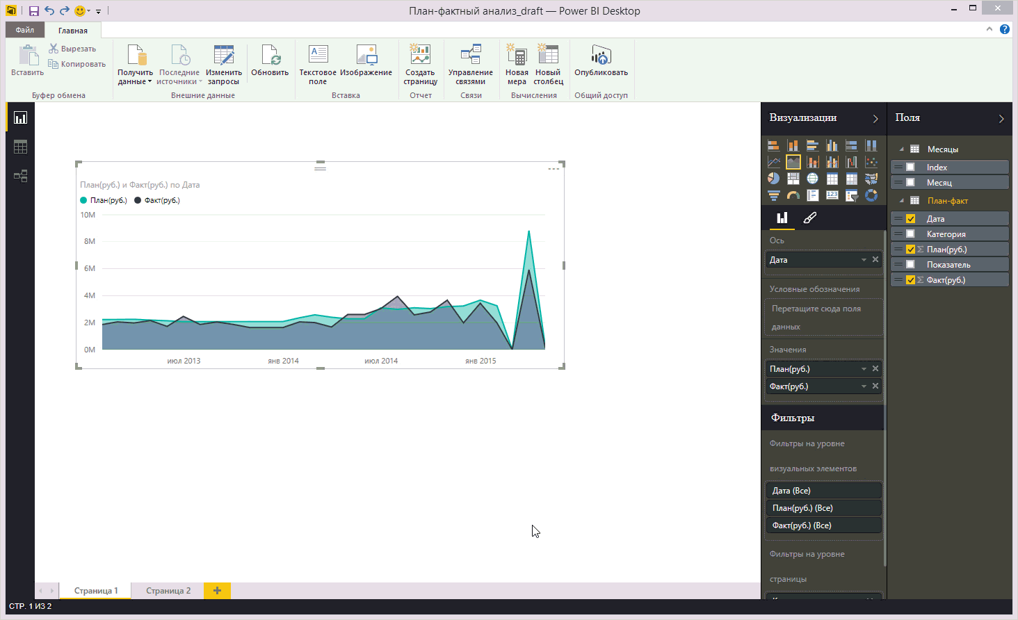
In addition to the overall dynamics of expenditures, it is interesting for me to see in which categories the expenditures were within the framework of the plan, and for which of which there are deviations to the larger, smaller side. To do this, add a bar chart with grouping.
Figure 9 Adding Bar Chart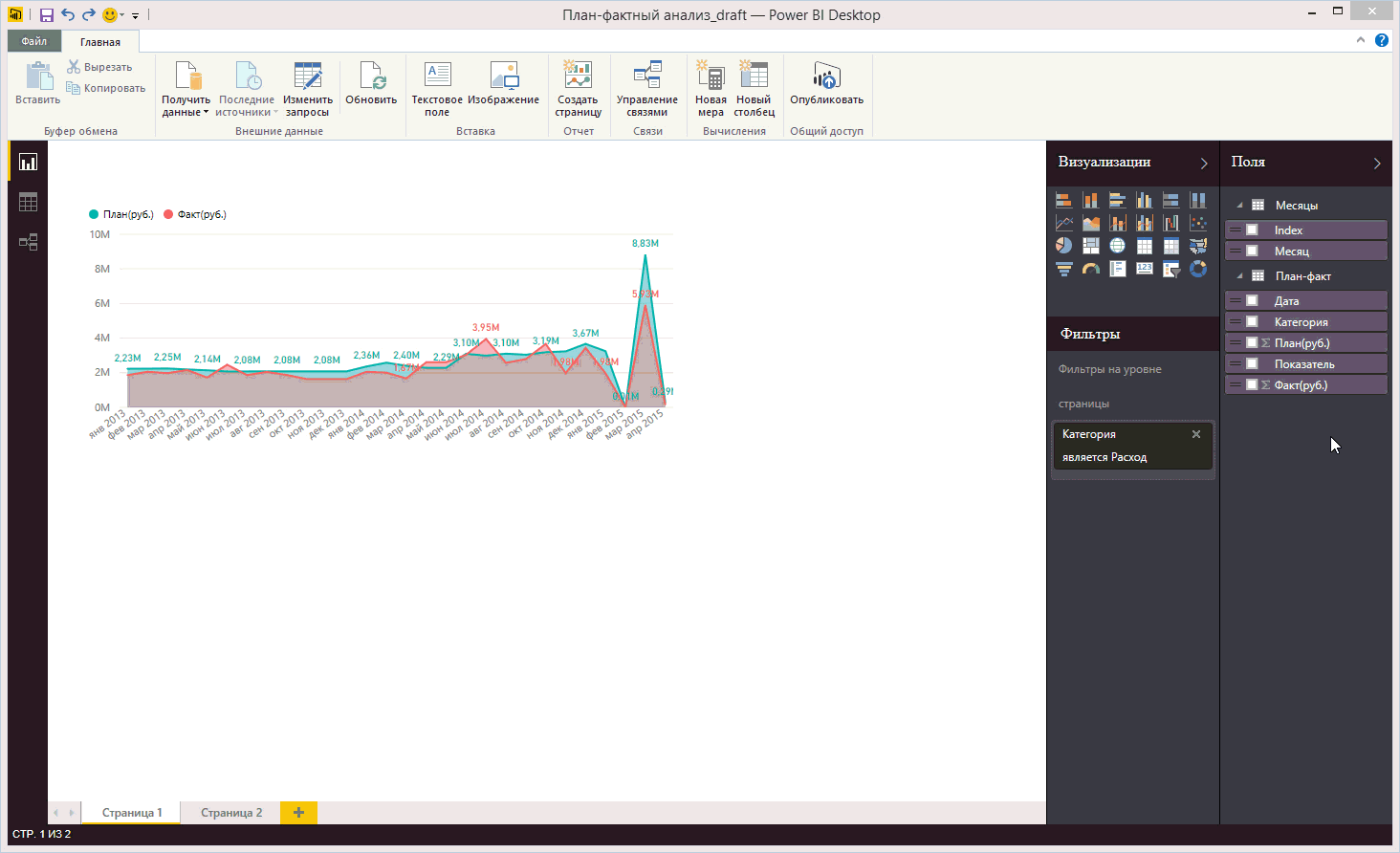
Notice that by default the data in the diagram is sorted alphabetically. This is inconvenient, but you can always change the field and sort order. The main limitation when setting up sorting for a visual element is that you can only sort by the fields whose data is present in the graph (see figure).
Figure 10 Sorting a Chart
If you need to sort by a field that is not involved in the visual element, use the “Sort by column” functionality, which is available in data modeling mode.
Figure 11 Sort by column
After adjusting the sorting and small formatting of the headings, the chart will look more pleasing to the eye:
Figure 12 Formatted Chart
After adding visual elements like “Tree” and a sensor, the result is an interactive report that shows the dynamics of expenses, the distribution of expenses by categories and the ratio of planned indicators to actual ones.
Figure 13 Almost finished online report
So, the preparation of the report is almost complete, but for convenience, you need to add the ability to filter data by year. Yes, you can use advanced page filters, but this is not very convenient. Therefore, we use the slice visualization element. If you simply drag the Date field and select the desired type of visualization, you will see a complete list of all dates, which is completely inconvenient.
Figure 14 Incorrect slice display by date
In order for us to add a slice by year, we need to create a calculated column that will contain the value of the year. This can be done both in the report mode and in the data modeling mode. DAX formulas are used to create calculated columns and measures. In our case, to create a column containing year values, we need a simple formula: Year = Year ([Date]). The process of creating a calculated column and adding a slice to the report is shown in Figure 15.
Figure 15 Creating a calculated column and adding a slice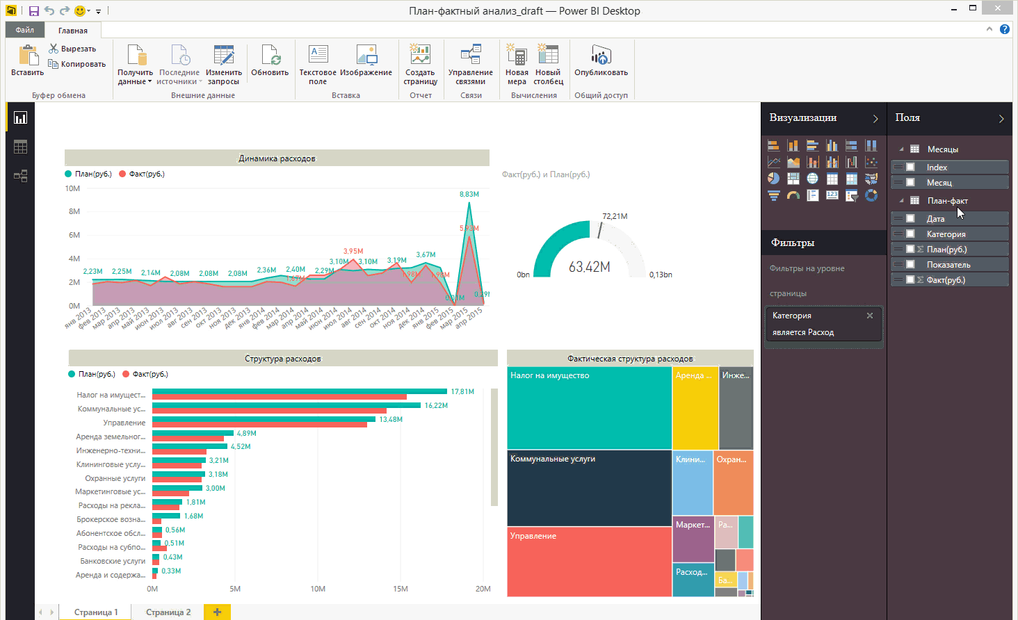
The report is almost ready, it remains only to add the name and logo of the company.
Figure 16. Adding a name and logo
This concludes the second part of the article on plan-actual analysis in Power BI Desktop. A big request to answer the survey about the usefulness and clarity of my articles. Thank you for reading.
Source: https://habr.com/ru/post/264223/
All Articles