Open Data Analysis in R, Part 1
Introduction
At the time of this writing, most applications based on open data (on official data.mos.ru/apps and data.gov.ru ) are interactive guides on the infrastructure of a city or settlement with visual visualization and often with the option of choosing the best route. The purpose of this and subsequent publications is to draw the attention of the community to the discussion of strategies for analyzing open data, including aimed at forecasting, building statistical models and extracting information not presented explicitly. The toolkit uses the R language and the RStudio development environment.
As an illustration of the ease of use of R, we consider a small example and visualize on a map the register of the attraction of the Criminal Code, Homeowners Association for 2013 in Ulyanovsk . This data set contains information about the fines of various management companies. For visualization, the number of oral remarks, the number of fines and fines in rubles for all time presented in dataset were selected. This data (as well as all others from open sources that I came across) tends to have a lot of omissions, typos, etc. therefore, pre-processed data is loaded into R:
ulyanovsk.data <- read.csv('./data/formated_tsj.csv')
For visualization, an interface to google maps and the ggplot2 library are used; for organizing graphs on an output device, use gridExtra:
')
Code
library (ggmap)
library (ggplot2)
library (gridExtra)
library (ggplot2)
library (gridExtra)
In dataset there are lat and lon columns, which contain information about latitude and longitude. We need a map not of the whole Ulyanovsk but only its parts, the coordinates of which are in the sample:
Code
box <- make_bbox (lon, lat, data = ulyanovsk.data)
ulyanovsk.map <- get_map (location = 'ulyanovsk', zoom = calc_zoom (box))
p0 <- ggmap (ulyanovsk.map)
p0 <- p0 + ggtitle (“Part of the map of Ulyanovsk”) + theme (legend.position = “none”)
ulyanovsk.map <- get_map (location = 'ulyanovsk', zoom = calc_zoom (box))
p0 <- ggmap (ulyanovsk.map)
p0 <- p0 + ggtitle (“Part of the map of Ulyanovsk”) + theme (legend.position = “none”)
Apply to the map penalties in rubles (column penalties_rub_total):
Code
p1 <- ggmap (ulyanovsk.map)
p1 <- p1 + geom_point (data = ulyanovsk.data, aes (x = lon, y = lat, color = penalties_rub_total, size = penalties_rub_total))
p1 <- p1 + scale_color_gradient (low = 'yellow', high = 'red')
p1 <- p1 + ggtitle (“Fines in rubles”) + theme (legend.position = “none”)
p1 <- p1 + geom_point (data = ulyanovsk.data, aes (x = lon, y = lat, color = penalties_rub_total, size = penalties_rub_total))
p1 <- p1 + scale_color_gradient (low = 'yellow', high = 'red')
p1 <- p1 + ggtitle (“Fines in rubles”) + theme (legend.position = “none”)
The number of fines in units:
Code
p2 <- ggmap (ulyanovsk.map)
p2 <- p2 + geom_point (data = ulyanovsk.data, aes (x = lon, y = lat, color = penalties_total, size = penalties_total))
p2 <- p2 + scale_color_gradient (low = 'yellow', high = 'red')
p2 <- p2 + ggtitle (“Number of fines”) + theme (legend.position = “none”)
p2 <- p2 + geom_point (data = ulyanovsk.data, aes (x = lon, y = lat, color = penalties_total, size = penalties_total))
p2 <- p2 + scale_color_gradient (low = 'yellow', high = 'red')
p2 <- p2 + ggtitle (“Number of fines”) + theme (legend.position = “none”)
Number of oral remarks in pieces:
Code
p3 <- ggmap (ulyanovsk.map)
p3 <- p3 + geom_point (data = ulyanovsk.data, aes (x = lon, y = lat, color = oral_comments_total, size = oral_comments_total))
p3 <- p3 + scale_color_gradient (low = 'yellow', high = 'red')
p3 <- p3 + ggtitle (“Number of oral remarks”) + theme (legend.position = “none”)
p3 <- p3 + geom_point (data = ulyanovsk.data, aes (x = lon, y = lat, color = oral_comments_total, size = oral_comments_total))
p3 <- p3 + scale_color_gradient (low = 'yellow', high = 'red')
p3 <- p3 + ggtitle (“Number of oral remarks”) + theme (legend.position = “none”)
Building it all together:
grid.arrange(p0, p1, p2, p3, ncol=2)

The size of the point and the value of red monotonously increase with the parameter (for example, the more penalties, the more and red the point). The graphs show that in the surveyed dataset, management companies from the right bank of Ulyanovsk have more fines and comments than from the left bank.
Research statistics crash
This section uses data from a single interdepartmental information and statistical system . Dataset contains the death rate from traffic accidents per 100 thousand people by regions of the Russian Federation for 2011-2014:
Code
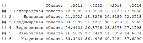
accidents <- read.csv ('./ data / accidents.csv')
head (accidents)
head (accidents)
Average for each year by regions:
apply(accidents[,2:5],2,FUN = mean)
## y2011 y2012 y2013 y2014
## 21.36942 21.55694 20.18582 20.34727
Histograms:
Code
library (reshape2)
accidents.melt <- melt (accidents [, 2: 5])
ggplot (accidents.melt, aes (x = value, fill = variable)) + geom_histogram (alpha = 0.3)
accidents.melt <- melt (accidents [, 2: 5])
ggplot (accidents.melt, aes (x = value, fill = variable)) + geom_histogram (alpha = 0.3)
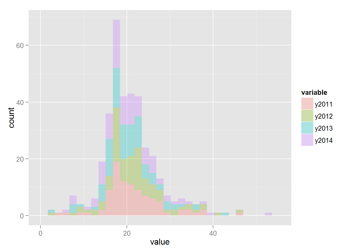
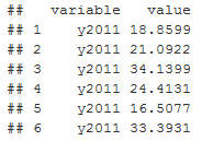
The melt function reorganizes datasets in such a way that the value column stores the value of the indicator, in the variable column the year for which the indicator was obtained:
head(accidents.melt)
It is interesting to compare whether the difference in indicators for different years is statistically significant. The following model assumptions are accepted:
1) The value of the indicator is a random variable obeying the student's distribution
2) Each year has its own distribution parameters, nu is the normality parameter, sigma is the variance, mu is the average
3) The parameters nu, sigma, mu are also random variables with their own year-independent distributions.
Formal statement of the problem: using data to establish whether the distribution parameter mu is different for different years. If we write out the Bayes formula for our case (which I will not give here, in order not to overload the article), then we get a hierarchical model:
1) death rate (field value in accidents.melt) ~ t (mu, sigma, nu)
2) mu | group_id ~ N (mu_hyp, sigma_hyp)
3) sigma | group_id ~ Unif (a_hyp, b_hyp | group_id)
4) nu | group_id ~ Exp (lambda_hyp)
Where mu | group_id ~ N (mu_hyp, sigma_hyp) indicates that the mu parameter for the group_id group has a normal distribution with hyper parameters mu_hyp, sigma_hyp.
The variable group_id takes a value depending on the year, 1 for 2011, 2 for 2012, etc .:
accidents.melt$group_id <- as.numeric(accidents.melt$variable)
For modeling, R uses an interface to the Jags language and the auxiliary function plotPost from the file DBDA2E-utilities.R, which can be found here (by John Kruschke):
Code
library (rjags)
source ('DBDA2E-utilities.R')
source ('DBDA2E-utilities.R')
The description of the model takes place in the jags language, therefore, first a file or a string variable is created inside R with the model:
Code
modelString <- '
model {
for (i in 1: N)
{
y [i] ~ dt (mu [group_id [i]], 1 / sigma [group_id [i]] ^ 2, nu [group_id [i]])
}
for (j in 1: NumberOfGroups)
{
mu [j] ~ dnorm (PriorMean, 0.01)
sigma [j] ~ dunif (1E-1, 1E + 1)
nuTemp [j] ~ dexp (1/19)
nu [j] <- nuTemp [j] + 1
}
}
'
model {
for (i in 1: N)
{
y [i] ~ dt (mu [group_id [i]], 1 / sigma [group_id [i]] ^ 2, nu [group_id [i]])
}
for (j in 1: NumberOfGroups)
{
mu [j] ~ dnorm (PriorMean, 0.01)
sigma [j] ~ dunif (1E-1, 1E + 1)
nuTemp [j] ~ dexp (1/19)
nu [j] <- nuTemp [j] + 1
}
}
'
After the model is specified, it is passed to the jags along with the data:
Code
modelJags <- jags.model (file = textConnection (modelString),
data = list (y = accidents.melt $ value, group_id = accidents.melt $ group_id, N = length (accidents.melt), NumberOfGroups = 4, PriorMean = (20)),
n.chains = 8, n.adapt = 1000)
data = list (y = accidents.melt $ value, group_id = accidents.melt $ group_id, N = length (accidents.melt), NumberOfGroups = 4, PriorMean = (20)),
n.chains = 8, n.adapt = 1000)
Jags uses MCMC and implements a random walk model in our parameter space mu, sigma, nu. Moreover, the probability that the parameters will take a specific value is proportional to their joint probability, although the joint probability is not considered explicitly. Thus, jags returns a list of mu, sigma, nu values, so you can estimate their probabilities using histograms. The following lines launch our model and return the result:
Code
update (modelJags, 2000)
summary (samplesCoda <- coda.samples (model = modelJags, variable.names = c ('nu', 'mu', 'sigma'), n.iter = 50000, thin = 500))
summary (samplesCoda <- coda.samples (model = modelJags, variable.names = c ('nu', 'mu', 'sigma'), n.iter = 50000, thin = 500))
To answer our question about the value of the mu parameter for different years, we consider histograms of the difference between the values of the parameters:
Code
samplesCodaMatrix <- as.matrix (samplesCoda)
samplesCodaDataFrame <- as.data.frame (samplesCodaMatrix)
samplesCodaDataFrame <- samplesCodaDataFrame [, 1: 4]
plotPost (samplesCodaMatrix [, 1] - samplesCodaMatrix [, 2], cenTend = 'mean', main = '2011 vs. 2012')
plotPost (samplesCodaMatrix [, 1] - samplesCodaMatrix [, 3], cenTend = 'mean', main = '2011 vs. 2013')
plotPost (samplesCodaMatrix [, 1] - samplesCodaMatrix [, 4], cenTend = 'mean', main = '2011 vs. 2014')
plotPost (samplesCodaMatrix [, 2] - samplesCodaMatrix [, 3], cenTend = 'mean', main = '2012 vs. 2013')
plotPost (samplesCodaMatrix [, 2] - samplesCodaMatrix [, 4], cenTend = 'mean', main = '2012 vs. 2014')
plotPost (samplesCodaMatrix [, 3] - samplesCodaMatrix [, 4], cenTend = 'mean', main = '2013 vs. 2014')
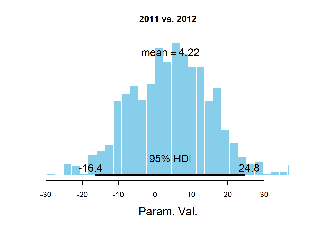

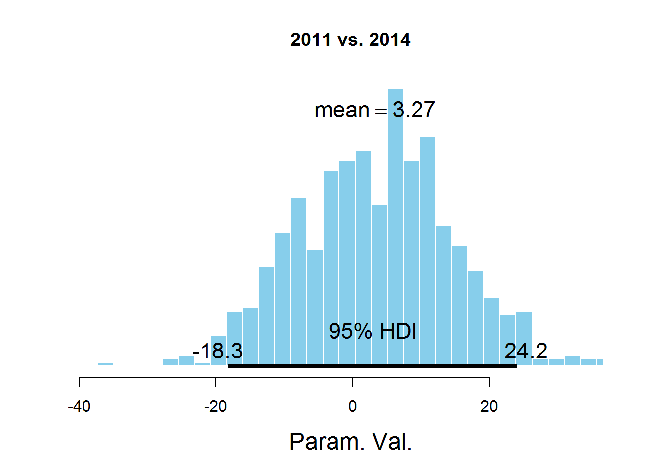
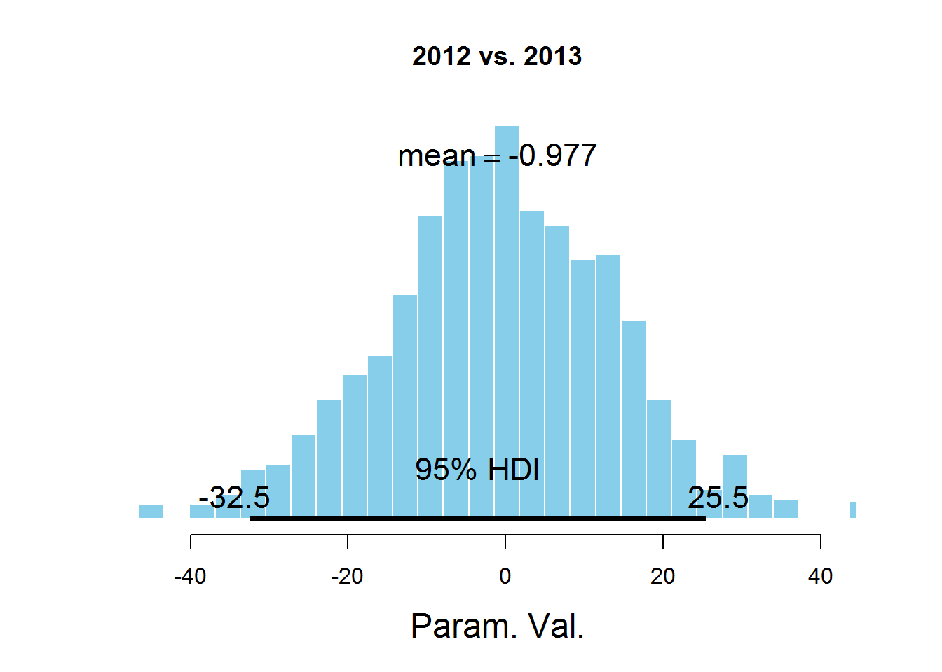
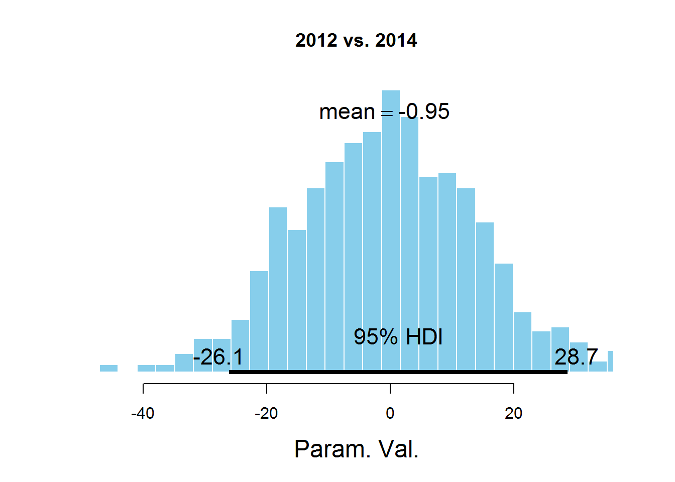
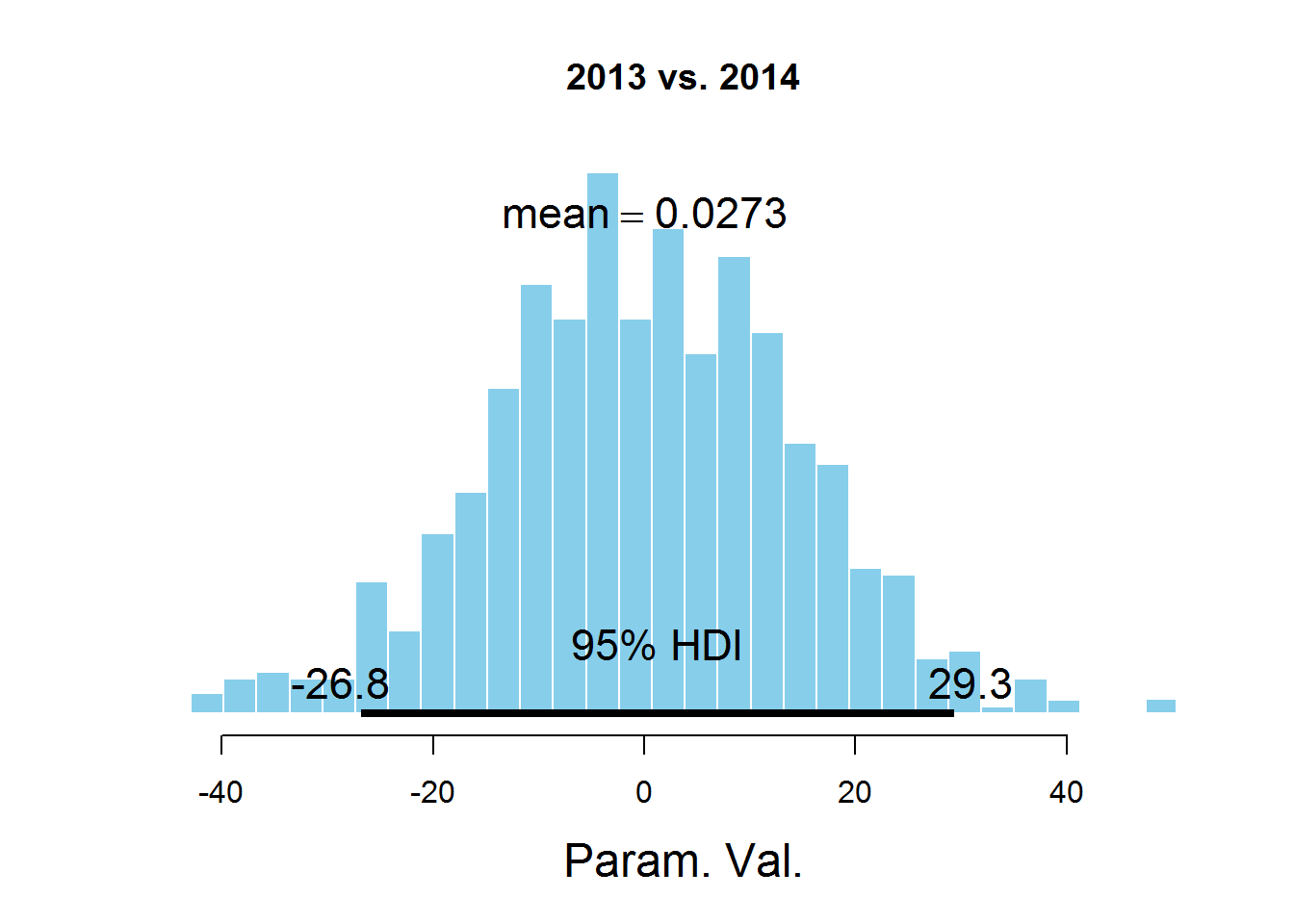
The graphs indicate the HDI interval, the values in which have a greater probability than the values outside the interval, and the sum of the probabilities of these values is 0.95. It can be seen that the value 0 falls in HDI, which suggests that the mu parameter is the same for all the years represented in the dataset. There is a controversial point here - the HDI value is selected according to the knowledge of the subject area, i.e. perhaps for this task a value of 95% is not the most suitable.
Source: https://habr.com/ru/post/264153/
All Articles