Reader mode: Pagination in mobile emails
The blog FreshInbox has published a post about an interesting experimental technique for implementing pagination in letters of mobile mailings . Its use allows you to create letters, whose recipients can navigate through the content without the need for scrolling.
The development of responsive design has made reading letters on mobile devices easier. On the other hand, a side effect was the fact that in order to read "massive" letters, you now need to scroll a lot. As a result, only the most persistent readers get to the end of the message. If you give people the ability to quickly navigate the letter, it would greatly improve the situation.
')
The described technique only works in Mail for iPhone (Android version is in development).
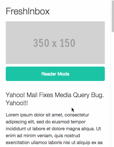
The described technique allows the user to independently control the content of the letter - with the help of a special button, the letter is transformed into a version for reading, divided into several pages that can be accessed with a click.
The button to enable the "reader mode" is wrapped in a shortcut that switches the checkbox using the navigation cell id. To display the elements in this mode, the pseudo-class is
Articles wrapped in two containers. When the selector is activated, the outer container displays the content to the full width and height of the visible area of the screen. The outer container is also set at a fixed value at the top of the email message minus the space occupied by the menu.
The inner container occupies the width of the visible area multiplied by the number of articles. Articles also occupy width in the viewport and are shifted to the left. This allows you to arrange them in a horizontal position, displaying one article at a time.
Then a radio element is created for each article. When the selector
The value of vw does not work on Android, so you will have to place the articles one above the other and show what you need, hiding or changing its z-index.
To navigate through the articles, we will create arrows shortcuts that, when clicked, will activate the desired radio element. These labels are hidden by default and only the pair associated with the currently visible article is displayed.
The index menu contains a list of shortcuts related to articles in a hidden and absolutely positioned div (div) and is displayed when the user clicks on the menu using the
An interesting point, often if the menu is hidden immediately after selecting an item, the mail client simply ignores the choice made. You can cope with this problem by adding a transition and a delay.
You can work with the example code in the builder of one of the mail services. In text form, it is presented under the spoiler:
Other materials about the layout of letters in the Pechkin blog:
The development of responsive design has made reading letters on mobile devices easier. On the other hand, a side effect was the fact that in order to read "massive" letters, you now need to scroll a lot. As a result, only the most persistent readers get to the end of the message. If you give people the ability to quickly navigate the letter, it would greatly improve the situation.
')
The described technique only works in Mail for iPhone (Android version is in development).
Reader mode
The described technique allows the user to independently control the content of the letter - with the help of a special button, the letter is transformed into a version for reading, divided into several pages that can be accessed with a click.
Activation
The button to enable the "reader mode" is wrapped in a shortcut that switches the checkbox using the navigation cell id. To display the elements in this mode, the pseudo-class is
:checked , the menu at the top of the panel is set to position:fixed : <style> .toolbar-container{ position:fixed; top:0px; left:0px; display:none; ... } #navbox:checked ~ .toolbar-container{ display:block!important; } #navbox:checked ~ .articles-container{ height:100%; overflow:hidden; position:fixed; top:50px; left:0px; } </style> <input id="navbox" type="checkbox"> <label for="navbox" >Activate Reader Mode</label> <div class="toolbar-container">...hidden toolbar content ... <div> <div class="articles-container"> article1, article2, article3... </div> Pagination of articles
Articles wrapped in two containers. When the selector is activated, the outer container displays the content to the full width and height of the visible area of the screen. The outer container is also set at a fixed value at the top of the email message minus the space occupied by the menu.
The inner container occupies the width of the visible area multiplied by the number of articles. Articles also occupy width in the viewport and are shifted to the left. This allows you to arrange them in a horizontal position, displaying one article at a time.
Then a radio element is created for each article. When the selector
:checked set to a specific radio element, the internal container is shifted left or right by the number of tap widths (vw) of each article. Adding a transition allows you to achieve a "slip effect" when flipping articles: #navbox:checked ~ #a1radio:checked ~ .articles-cont .articles{ left:0px; } #navbox:checked ~ #a2radio:checked ~ .articles-cont .articles{ left:-100vw; } #navbox:checked ~ #a3radio:checked ~ .articles-cont .articles{ left:-200vw; } The value of vw does not work on Android, so you will have to place the articles one above the other and show what you need, hiding or changing its z-index.
Moving through the articles
To navigate through the articles, we will create arrows shortcuts that, when clicked, will activate the desired radio element. These labels are hidden by default and only the pair associated with the currently visible article is displayed.
<style> #navbox:checked ~ #a1radio:checked ~ .toolbar-cont .a1nav, #navbox:checked ~ #a2radio:checked ~ .toolbar-cont .a2nav, #navbox:checked ~ #a3radio:checked ~ .toolbar-cont .a3nav{ display:block; } </style> <div class="nav-arrows a1nav"> <label> </label><label for="a2radio">»</label> </div> <div class="nav-arrows a2nav"> <label for="a1radio">«</label><label for="a3radio">»</label> </div> <div class="nav-arrows a3nav"> <label for="a2radio">«</label><label> </label> </div> Index menu of articles
The index menu contains a list of shortcuts related to articles in a hidden and absolutely positioned div (div) and is displayed when the user clicks on the menu using the
:hover selector.An interesting point, often if the menu is hidden immediately after selecting an item, the mail client simply ignores the choice made. You can cope with this problem by adding a transition and a delay.
Code
You can work with the example code in the builder of one of the mail services. In text form, it is presented under the spoiler:
Sample code
<!DOCTYPE html PUBLIC "-//W3C//DTD XHTML 1.0 Transitional//EN" "http://www.w3.org/TR/xhtml1/DTD/xhtml1-transitional.dtd"> <html xmlns="http://www.w3.org/1999/xhtml"> <head> <meta name="viewport" content="width=device-width" /> <meta http-equiv="Content-Type" content="text/html; charset=UTF-8" /> <style> * { margin:0; padding:0; font-family: "Helvetica Neue", "Helvetica", Helvetica, Arial, sans-serif; font-size: 100%; line-height: 1.5; color:#333333; } img{ max-width:100%; } body { -webkit-text-size-adjust:none; width: 100%!important; height: 100%; } h1,h2{ margin-bottom:15px; line-height: 1.3; font-weight:300; } h1 { font-size: 32px; } h2 { font-size: 22px; } .toolbar-cont{ max-height:none!important; overflow:visible!important; z-index:10; width:100%; position:fixed; top:0px; left:0px; display:none; height:50px; background-color:#eeeeee; border-bottom:1px solid #222222; } .toolbar{ height:50px; line-height:50px; display:block; text-decoration:none; } .toolbar-menu{ z-index:10; text-align:center; position:absolute; top:51px; overflow:hidden; transition: all 0.3s; -webkit-transition: all 0.3s; transform: rotateX(90deg); -webkit-transform: rotateX(90deg); transform-origin: top; -webkit-transform-origin: top; -webkit-transition-delay: 0.5s; transition-delay: 0.5s; } .toolbar-menu label{ display:block; padding:5px 20px 5px 20px; } .toolbar:hover + .toolbar-menu{ display:block; transform: rotateX(0deg); -webkit-transform: rotateX(0deg); } .articles-cont{ background-color:#ffffff; } #navbox:checked ~ .articles-cont{ width:100%; height:100%; overflow:hidden; position:fixed; top:50px; left:0px; } #navbox:checked ~ .articles-cont .articles{ position:absolute; left:0px; width:303vw; transition: all 0.3s; -webkit-transition: all 0.3s; height:100%; } #navbox:checked ~ .articles-cont .articles .art{ width:100vw; float:left; height:1000px; overflow:hidden; } #navbox:checked ~ .articles-cont .articles .art div{ width:90vw; padding:20px 5vw 10px 5vw; } input{ max-height:0; display:none; } .nav-arrows{ float:right; display:none; } .nav-arrows label{ cursor:pointer; display:inline-block; vertical-align:middle; text-align:center; height:50px; width:50px; font-size:30px; font-weight:bold; } #navbox:checked ~ #a1radio:checked ~ .articles-cont .articles{ left:0px; } #navbox:checked ~ #a2radio:checked ~ .articles-cont .articles{ left:-100vw; } #navbox:checked ~ #a3radio:checked ~ .articles-cont .articles{ left:-200vw; } #navbox:checked ~ #a1radio:checked ~ .articles-cont .a1, #navbox:checked ~ #a2radio:checked ~ .articles-cont .a2, #navbox:checked ~ #a3radio:checked ~ .articles-cont .a3{ height:100%; overflow-y:scroll; } #navbox:checked ~ #a1radio:checked ~ .toolbar-cont .a1nav, #navbox:checked ~ #a2radio:checked ~ .toolbar-cont .a2nav, #navbox:checked ~ #a3radio:checked ~ .toolbar-cont .a3nav{ display:block; } .closer{ display:inline-block; vertical-align:middle; text-align:center; height:50px; width:50px; font-size:30px; font-weight:bold; float:left; } #navbox:checked ~ .opener{ display:none; } #navbox:checked ~ .toolbar-cont{ display:block!important; } @media screen and (max-width: 480px) { #cbox-capable:checked ~ .opener div{ margin:10px auto; background-color:#1abc9c; color:#ffffff; border-radius:5px; display: block !important; max-height:50px !important; line-height:50px; text-align:center; vertical-align:middle; } } </style> </head> <body> <div id="main-cont" style="padding:20px;"> <h1>FreshInbox</h1> <div style="dislay:block;width:350px;margin:0px auto;max-width:100%"> <img src="http://placehold.it/350x150"> </div> <!--[if !mso 9]><!--> <input id="cbox-capable" type="checkbox" style="display:none!important;max-height:0;visibility:hidden;" checked> <input id="navbox" type="checkbox" style="display:none!important;max-height:0;visibility:hidden;"> <label for="navbox" class="opener"> <div style="display:none;max-height:0px;overflow:hidden;cursor:pointer">Reader Mode</div></label> <input id="a1radio" name="qradio" type="radio" checked style="display:none!important;max-height:0;visibility:hidden;"> <input id="a2radio" name="qradio" type="radio" style="display:none!important;max-height:0;visibility:hidden;"> <input id="a3radio" name="qradio" type="radio" style="display:none!important;max-height:0;visibility:hidden;"> <div class="toolbar-cont" style="display:none;max-height:0px;overflow:hidden;"> <label for="navbox" class="closer">x</label> <div class="nav-arrows a1nav"> <label> </label><label for="a2radio">»</label> </div> <div class="nav-arrows a2nav"> <label for="a1radio">«</label><label for="a3radio">»</label> </div> <div class="nav-arrows a3nav"> <label for="a2radio">«</label><label> </label> </div> <a href="#" class="toolbar">Article Index...</a> <div class="toolbar-menu" style="text-align:left;background-color:#C8DEFA;border:1px solid #888888;font-size:15px;"> <label for="a1radio">Yahoo! Mail Fixes Media Query Bug. Yahoo!!!</label> <label for="a2radio">Outlook.com and Background Images</label> <label for="a3radio">Gmail iOS Increases Email Font Sizes – Again</label> </div> </div> <!--<![endif]--> <div class="articles-cont"> <div class="articles"> <div class="art a1"><div> <h2>Yahoo! Mail Fixes Media Query Bug. Yahoo!!!</h2> Lorem ipsum dolor sit amet, consectetur adipiscing elit, sed do eiusmod tempor incididunt ut labore et dolore magna aliqua. Ut enim ad minim veniam, quis nostrud exercitation ullamco laboris nisi ut aliquip ex ea commodo consequat. Duis aute irure dolor in reprehenderit in voluptate velit esse cillum dolore eu fugiat nulla pariatur. Excepteur sint occaecat cupidatat non proident, sunt in culpa qui officia deserunt mollit anim id est laborum. Lorem ipsum dolor sit amet, consectetur adipiscing elit, sed do eiusmod tempor incididunt ut labore et dolore magna aliqua. Ut enim ad minim veniam, quis nostrud exercitation ullamco laboris nisi ut aliquip ex ea commodo consequat. Duis aute irure dolor in reprehenderit in voluptate velit esse cillum dolore eu fugiat nulla pariatur. Excepteur sint occaecat cupidatat non proident, sunt in culpa qui officia deserunt mollit anim id est laborum. <HR> </div></div> <div class="art a2"><div> <h2>Outlook.com and Background Images</h2> Lorem ipsum dolor sit amet, consectetur adipiscing elit, sed do eiusmod tempor incididunt ut labore et dolore magna aliqua. Ut enim ad minim veniam, quis nostrud exercitation ullamco laboris nisi ut aliquip ex ea commodo consequat. Duis aute irure dolor in reprehenderit in voluptate velit esse cillum dolore eu fugiat nulla pariatur. Excepteur sint occaecat cupidatat non proident, sunt in culpa qui officia deserunt mollit anim id est laborum. Lorem ipsum dolor sit amet, consectetur adipiscing elit, sed do eiusmod tempor incididunt ut labore et dolore magna aliqua. Ut enim ad minim veniam, quis nostrud exercitation ullamco laboris nisi ut aliquip ex ea commodo consequat. Duis aute irure dolor in reprehenderit in voluptate velit esse cillum dolore eu fugiat nulla pariatur. Excepteur sint occaecat cupidatat non proident, sunt in culpa qui officia deserunt mollit anim id est laborum. <HR> </div></div> <div class="art a3"><div> <h2>Gmail iOS Increases Email Font Sizes – Again</h2> Lorem ipsum dolor sit amet, consectetur adipiscing elit, sed do eiusmod tempor incididunt ut labore et dolore magna aliqua. Ut enim ad minim veniam, quis nostrud exercitation ullamco laboris nisi ut aliquip ex ea commodo consequat. Duis aute irure dolor in reprehenderit in voluptate velit esse cillum dolore eu fugiat nulla pariatur. Excepteur sint occaecat cupidatat non proident, sunt in culpa qui officia deserunt mollit anim id est laborum. Lorem ipsum dolor sit amet, consectetur adipiscing elit, sed do eiusmod tempor incididunt ut labore et dolore magna aliqua. Ut enim ad minim veniam, quis nostrud exercitation ullamco laboris nisi ut aliquip ex ea commodo consequat. Duis aute irure dolor in reprehenderit in voluptate velit esse cillum dolore eu fugiat nulla pariatur. Excepteur sint occaecat cupidatat non proident, sunt in culpa qui officia deserunt mollit anim id est laborum. <HR> </div></div> </div> </div> </div> </body> </html> <b> Other materials about the layout of letters in the Pechkin blog:
Source: https://habr.com/ru/post/264129/
All Articles