Digest of grocery design, July 2015
For five years now I have been publishing regular reviews of fresh articles on the topic of interfaces, new tools and collections of patterns, interesting cases and historical stories. From the tapes of several hundred thematic subscriptions, approximately 5% of the worthwhile publications are selected that are interesting to share. Previous materials: April 2010-June 2015 . You can receive fresh reviews by mail .

Spatial interfaces
Pasquale D'Silva’s very interesting thoughts on how to present a product interaction map in the form of multidimensional space. This space can be both simple, two-dimensional, and more complex. If there is a clear model, then it will be much easier for the user to work with the application. He gives successful examples and a complete mess, which for some reason famous for music services.

')
Dropdowns Should be the UI of Last Resort
Luke Wroblewski recommends, if possible, to abandon drop-down lists in mobile forms. They require more clicks, and in the case of modern iOS, the system control (“drum”) is also extremely inconvenient.

Ad Placement for Mobile
Aurora Bedford of NN / g describes the nuances of using ads on mobile. Under the conditions of an already limited space, you need to be triple neat and not to annoy users, not to shift the beginning of the content completely down and not create the sensations of the end of the page.
To convert landing pages
Excellent crib on Landing from WebDesignerDepot.
Mailing letters
Excerpts from the Baymard Institute report
Web UI Design Techniques: Colors & Flat Design
New book from UXPin: flat design, colors, palettes and techniques. By the way, Krzysztof Stryjewski, the author of the covers for this series, began to publish them on Behance .
Healthcare Design
Material design

Apple Watch

The Psychology of Pricing: A Gigantic List of Strategies
A Russian translation of powerful material about working with prices has appeared, their display is an important part of the design for conversion. Nick Kolenda prepared a very, very cool review of the psychological strategies and design methods of product pricing methods.
Character Method Problems
Does your red look like my red?
Alternative color schemes or color anomaly. Color blindness for dummies. Detailed explanation of the mechanism of color perception in Russian. The concept of Qualia and the Theory of Mind to boot. Continuing the theme:
Multichannel interaction
Pixate + Form = Google

Prototyping with iAd Producer
Linda Dong, who worked at Apple on tools for the iAd advertising system, shows how to use iAd Producer to prototype interfaces. It turns out that he has unexpectedly strong capabilities for interface designers.
Principle - Visual Prototyping
This year, with the new tools for the designer, the lull, but here’s a relatively fresh one - Principle. There are no details yet, but they promise everything that InVision-like tools do. One of the creators is a former Apple engineer.
Future design tools
Pagecloud
The PageCloud service has become one of the hits of the recent TechCrunch Disrupt. It allows you to edit the page of the site in the browser on the fly and save the changes to the server. In addition, it is easy to import a layout from the same Photoshop directly into the browser. All this is well shown in the video .
Sketch
Marvel
Uxpin
Invision
Lucidchart
Publishing Tools
Photoshop Plugins
Prototyping Tool Reviews
Analysis Isn't Cool
Most publications and speeches on the topic of user research say a lot about how to work with users, but not very actively talking about one of the key stages - the analysis of the knowledge gained. Jim Ross complains about this and describes his approach.
5 Things to Know about Likert Scales
A small cheat sheet on the Likert scale from Jeff Sauro.
How To Moderate Effectively In Usability Research
Colleen Roller gives advice to moderators of user research in order to minimally influence their results.
Measuring & Modeling Customer Expectations
Jeff Sauro offers a method for tracking and predicting user expectations from a product. To do this, users are shown a standard questionnaire on a 7-point scale before and after working with the interface, while it is better to divide them into two groups so that the first assessment does not affect the second.
How to statistically test preference data
Jeff Sauro makes recommendations on surveys about several design options. How to understand that the most popular option in absolute values is to statistically correctly choose the winner.
Live guidelines and component systems

QuartzCode
The QuartzCode application helps designers create native code in Objective C or Swift for animation in iOS and Mac applications. It imports graphics into SVG, although you can create vector images right in the tool.

Weld - From idea to website in minutes
Weld tool allows you to create responsive websites in the browser. There is a ready-made set of elements, you can do animation, hosting is easier.
Framer
Pure ui
Interesting reflections Guillermo Rauch that if the interface was designed as a function, and not a specific visual solution. This will allow the designer and developer to work more closely.

Protein
New scripts
Work with SVG
Work with Flexbox
Work with color
Web typography
Smarter Grids With Sass And Susy
Michelle Barker wrote a small step-by-step guide to creating adaptive grids using the Susy framework based on Sass. In this thread will be collected solutions for working with grids in CSS.

Bootstrap and Foundation
JavaScript for designers
The W3C Mobile Checker
The alpha version of the W3C mobile and tablet testing tool. So far, the test has been going on for a long time, if it works at all, but gives advice on improving the design and layout.
New media and online journalism
Branding and #DesignInTech
An interesting discussion on the topic of brand identity in the interface and other aspects of the product, led by John Maeda, Robert Padbury and Tim McCoy.
Zeplin
Tactical Design Critique
Marcin Wichary talks about the formalized design criticism process used in the Medium team. This is a small workshop, somewhat similar to the well-known peer reviews, allowing you to find and describe many problems in the interface.
Building a design culture
Product Design Unification Case Study, Part 2: "Burger-Driven" Framework
My second article on the unification of the design in Mail.Ru Group was published on Smashing Magazine - how we bring to a single mind a line of content projects using a design-technological solution and a burger approach. This is a continuation of the story of the mobile web , which came out in the spring.
 I have already talked about this in the fall in the form of a presentation . Now all this is in the form of an article, with a bunch of full-length illustrations and additional details. Version of the article in Russian .
Last year we restarted five services in burger design (Poster, Auto, Health, Weather, Horoscopes), there are already four of them (Real Estate, TV, Lady, Hi-Tech). This is the wildest interesting and difficult task, although we have so far gone through only the first stage - we have to develop the platform product, systematically systematized and cleaned visually.
My Two Years as an Anthropologist on the Photoshop Team
Charles Pearson works as a user researcher on the Photoshop team and talks about his work.

Facebook Design

Facebook's design team took Medium even more tightly and launched two blogs at once: general and dedicated to specialized tools . The flow of articles at the start of a powerful, there are many interesting things:
Redesign Cases
Uninvited Redesigns
BBC redesign
Mishap history Healthcare.gov
History of Icons - A visual brief on icon history by FUTURAMO
Chic material on the history of icons from the 80s to the present. Futuramo analyzes the evolution of approaches and gives examples of all more or less significant platforms. Review version in Russian .

Design machines
One of the best materials of the month from Travis Gertz. He says that modern design on the web has turned into a dull monotony and examines the reasons for this dominance of the clones. And after offering a way out - where to look and where to move, to break the deadlock. Very inspiring, and decorated cool. All the same in the presentation format . Continuing the theme:

Ideology No UI
Car Interfaces
The virtual reality
Smart watches and bracelets
Tilda education
Somewhere in the beginning of the month, the Tilda Publishing team launched its design school. Nikita Obukhov has recently devoted a lot of time to educating the market and these materials are part of a common initiative. And in October, two online courses are launched in addition to articles on web design and web publishing.

Readymag Design School
The creators of Readymag have launched their online design school. In fact, this is rather a set of good-quality educational articles on the basics of design - fonts, mesh, color, composition.

So you want to be an IA?
Abby Covert's excellent motivating article for those who want to become an information architect, and generally grow professionally in the UX. Including false and correct development goals.

How to become an awesome designer in 365 days
Marko Stupić talks about his personal project, where he made icon-illustrations every day for a year. This allowed him to pump professionally, get a bunch of useful contacts, and even sell many of these works. The format of “100 works within 100 days” has been popular in recent years, thanks in large part to Michael Beirut of Pentagram, this is a great way to pump your prof. Skills.

The Guide to Interactive Wireframing
New book from UXPin about creating interactive wireframes.
All issues Glavred mailing. Experiment
Maxim Ilyakhov laid out all the Glavred newsletters on his website.

Announcements of trainings and seminars
Jokes about designers for 400
Grocery designer
Sketchnotes
Excerpts from the book Mike Monteiro "You're My Favorite Client"
Design partners of venture companies
Purchase of design studios by large companies
Susan kare
Fresh links can also be tracked in the Facebook group of the same name. Thanks to everyone who also publishes links in it, especially Gennady Dragun, Pavel Skripkin, Dmitry Podluzhny, Anton Artyomov, Denis Efremov, Alexey Kopylov, Taras Brizitsky and Yevgeny Sokolov. More and more materials in reviews appear thanks to them.
A letter arrives once a month.
Patterns and Best Practices
Spatial interfaces
Pasquale D'Silva’s very interesting thoughts on how to present a product interaction map in the form of multidimensional space. This space can be both simple, two-dimensional, and more complex. If there is a clear model, then it will be much easier for the user to work with the application. He gives successful examples and a complete mess, which for some reason famous for music services.
')
Dropdowns Should be the UI of Last Resort
Luke Wroblewski recommends, if possible, to abandon drop-down lists in mobile forms. They require more clicks, and in the case of modern iOS, the system control (“drum”) is also extremely inconvenient.
Ad Placement for Mobile
Aurora Bedford of NN / g describes the nuances of using ads on mobile. Under the conditions of an already limited space, you need to be triple neat and not to annoy users, not to shift the beginning of the content completely down and not create the sensations of the end of the page.
To convert landing pages
Excellent crib on Landing from WebDesignerDepot.
Mailing letters
- An amusing collection of anti-patterns, when it’s almost impossible to find a link to unsubscribe from a newsletter .
- Cheat sheet to create mailing lists from the service Send with Us . Stages of the process, tools, tips.
Excerpts from the Baymard Institute report
- The final review of the main findings of the study with an attempt to apply them to the site Macy's .
Web UI Design Techniques: Colors & Flat Design
New book from UXPin: flat design, colors, palettes and techniques. By the way, Krzysztof Stryjewski, the author of the covers for this series, began to publish them on Behance .
Healthcare Design
Platform guidelines and design templates for them
Material design
- Google Material Design Lite is a framework that allows you to quickly and easily build your site on mobile platforms in a “material” style. According to Google, it is built on HTML5, CSS3 and JavaScript, does not use other frameworks, is cross-browser and is implemented using the gracefully degradation method, which allows it to work well even in older browsers. Included are basic components (buttons, cards, menus, switches, etc), 5 typical templates, a simple tool for customizing color themes, and quite intelligible documentation. A nice bonus - one of the templates is based on the Android site. Repository on github .
- An overview of resources for designers working on material design .
- Taylor Ling compared the implementation of the main button in Google applications with what is written in the guidelines . Almost all do not correspond to what is written in the official recommendations :)
- The continuation of a powerful case about Chrome Android Redesign by Sebastien Gabriel .
- Over the past year, many designers and publications have confessed in love to the material design with great aspiration . Meng To writes that it is neither better nor worse than iOS, just another. The article provides an interesting comparison of the strengths and weaknesses of both platforms.
- Nexus 5 and 9 templates in PSD by Sebastien Gabriel .
Apple Watch
- How physically arranged the clock screen .
- Peter Lewis is trying to take a sober look at the realms of truly beneficial use of smart watches . They should be, in fact, an augmented reality device that does not pull a person out of life, and not alternatively, like smartphones.
- Luke Wroblewski went with the Apple Watch for two months and proposed a simplified model of how their interface works . The watch does have redundancy for such a small device and its approach is closer to Android Wear, a simpler platform in this regard.
Understanding the user
The Psychology of Pricing: A Gigantic List of Strategies
A Russian translation of powerful material about working with prices has appeared, their display is an important part of the design for conversion. Nick Kolenda prepared a very, very cool review of the psychological strategies and design methods of product pricing methods.
Character Method Problems
Does your red look like my red?
Alternative color schemes or color anomaly. Color blindness for dummies. Detailed explanation of the mechanism of color perception in Russian. The concept of Qualia and the Theory of Mind to boot. Continuing the theme:
Information architecture, conceptual design, content strategy
Multichannel interaction
- Kevin Nichols writes on the subject of content preparation for a company interacting with the user through several channels at once .
- Jantine Geldof says that effective cross-channel interaction requires changing the culture in the company , because you need to establish effective interaction between many previously unrelated units.
Design and design of interface screens
Pixate + Form = Google
- Google bought Pixate and made Pixate Studio free.
- After a long lull , Form 1.3 has been released . There is a possibility of native launch of prototypes, added components of material design .
- Interesting interview Matias Duarte with the creators of Pixate and Form . Sheds light on why tools are bought.
Prototyping with iAd Producer
Linda Dong, who worked at Apple on tools for the iAd advertising system, shows how to use iAd Producer to prototype interfaces. It turns out that he has unexpectedly strong capabilities for interface designers.
Principle - Visual Prototyping
This year, with the new tools for the designer, the lull, but here’s a relatively fresh one - Principle. There are no details yet, but they promise everything that InVision-like tools do. One of the creators is a former Apple engineer.
Future design tools
- Plugin Matej Hrescak for Sketch, which implements some of the ideas described in the article Josh Puckett .
- Benjamin Berger also raises this issue . He divides the workflow of the designer into two stages - the search for a suitable direction and the production of a product based on it. And it refers to the Matej Hrescak plugin and Atomic Design ideology as an exit.
Pagecloud
The PageCloud service has become one of the hits of the recent TechCrunch Disrupt. It allows you to edit the page of the site in the browser on the fly and save the changes to the server. In addition, it is easy to import a layout from the same Photoshop directly into the browser. All this is well shown in the video .
Sketch
- Sagi Shrieber describes the real problems of transition to Sketch, which his Team in SimilarWeb had to deal with . The refusal of Photoshop was not so clear and the number of bugs is still significant.
- Video materials on working with Sketch .
- A few words about how relatively easy it is to build prototypes in Keynote based on the layouts in Sketch .
Marvel
Uxpin
- UXPin received a $ 5 million investment from True Ventures, where Jeffrey Veen recently left . They will develop faster and, for sure, produce more books!
Invision
Lucidchart
Publishing Tools
- Tilda can now export pages to Wordpress . In this case, the common elements of the site like the menu remain yours, Tilda changes only the content.
- Tilda has improved the ability to work with the mobile version .
Photoshop Plugins
Prototyping Tool Reviews
User research and testing, analytics
Analysis Isn't Cool
Most publications and speeches on the topic of user research say a lot about how to work with users, but not very actively talking about one of the key stages - the analysis of the knowledge gained. Jim Ross complains about this and describes his approach.
5 Things to Know about Likert Scales
A small cheat sheet on the Likert scale from Jeff Sauro.
How To Moderate Effectively In Usability Research
Colleen Roller gives advice to moderators of user research in order to minimally influence their results.
Measuring & Modeling Customer Expectations
Jeff Sauro offers a method for tracking and predicting user expectations from a product. To do this, users are shown a standard questionnaire on a 7-point scale before and after working with the interface, while it is better to divide them into two groups so that the first assessment does not affect the second.
How to statistically test preference data
Jeff Sauro makes recommendations on surveys about several design options. How to understand that the most popular option in absolute values is to statistically correctly choose the winner.
Visual programming and browser design
Live guidelines and component systems
- The open source Styleguide tool for creating well-designed website guidelines .
- Jina Bolton talks about how the SalesForce team has unified the product line design and has moved from live guidelines to a live design system . They store variables like color palettes separately and distribute them across all platforms - web, mobile applications. Older publication and Theo , a piece of technology solution.
- The script checks the actual CSS in the product from what is described in the guidelines .
QuartzCode
The QuartzCode application helps designers create native code in Objective C or Swift for animation in iOS and Mac applications. It imports graphics into SVG, although you can create vector images right in the tool.
Weld - From idea to website in minutes
Weld tool allows you to create responsive websites in the browser. There is a ready-made set of elements, you can do animation, hosting is easier.
Framer
- Improved work with layers for prototypes imported from Sketch .
- Framer based Prototyp online tool .
- Anton Kartashov wrote a review post about working with Coffee Script in Framer .
Pure ui
Interesting reflections Guillermo Rauch that if the interface was designed as a function, and not a specific visual solution. This will allow the designer and developer to work more closely.
Protein
New scripts
- Fireworks on CSS and JS .
- The polygonal lion that keeps track of the cursor .
- Interesting behavior when drag & drop .
- Polygonal dinosaur that responds to mouse movement .
- Animated transitions between pages .
- JS-library Dragula for drag & drop .
- Automatically increase the width and height of input fields in javascript .
Work with SVG
- A drawing tool that helps you understand how paths work in SVG .
- Detailed Sara Saraeidan tutorial on nontrivial SVG coloring with CSS .
- Lea Verou about creating pie charts in SVG .
Work with Flexbox
Work with color
- Random gradient generator, helps in our difficult time longridoparallax
- A collection of CSS variables with a large palette of colors, called simple words.
Web typography
- An interesting study on the use of shritfov in mailing letters from the company Style Campaign . The popularity of specific fonts, styles, ways of loading custom fonts, sizes and ratios, colors, etc.
- Company 1910 proposes to align the text not at the very baseline, but in the gap between them . This makes it easier to create a vertical rhythm in the interfaces.
Smarter Grids With Sass And Susy
Michelle Barker wrote a small step-by-step guide to creating adaptive grids using the Susy framework based on Sass. In this thread will be collected solutions for working with grids in CSS.
Bootstrap and Foundation
JavaScript for designers
The W3C Mobile Checker
The alpha version of the W3C mobile and tablet testing tool. So far, the test has been going on for a long time, if it works at all, but gives advice on improving the design and layout.
Metrics and ROI
New media and online journalism
Management of interface projects, processes and teams
Branding and #DesignInTech
An interesting discussion on the topic of brand identity in the interface and other aspects of the product, led by John Maeda, Robert Padbury and Tim McCoy.
Zeplin
- Product out of beta . The blog describes the major changes.
Tactical Design Critique
Marcin Wichary talks about the formalized design criticism process used in the Medium team. This is a small workshop, somewhat similar to the well-known peer reviews, allowing you to find and describe many problems in the interface.
Building a design culture
- How the GoPro design team works . Interestingly, every week, all employees need to walk a couple of hours with the company's camera in order to better understand how consumers use it.
Cases
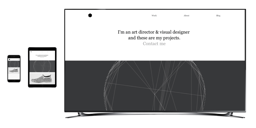
Product Design Unification Case Study, Part 2: "Burger-Driven" Framework
My second article on the unification of the design in Mail.Ru Group was published on Smashing Magazine - how we bring to a single mind a line of content projects using a design-technological solution and a burger approach. This is a continuation of the story of the mobile web , which came out in the spring.
I have already talked about this in the fall in the form of a presentation . Now all this is in the form of an article, with a bunch of full-length illustrations and additional details. Version of the article in Russian .Last year we restarted five services in burger design (Poster, Auto, Health, Weather, Horoscopes), there are already four of them (Real Estate, TV, Lady, Hi-Tech). This is the wildest interesting and difficult task, although we have so far gone through only the first stage - we have to develop the platform product, systematically systematized and cleaned visually.
My Two Years as an Anthropologist on the Photoshop Team
Charles Pearson works as a user researcher on the Photoshop team and talks about his work.
Facebook Design
Facebook's design team took Medium even more tightly and launched two blogs at once: general and dedicated to specialized tools . The flow of articles at the start of a powerful, there are many interesting things:
- Darren Geraghty about working on a tool for advertisers, which clearly shows the complex mechanism of targeting and calculating the cost, and also teaches customers to work more efficiently . Very interesting.
- 4 principles of Facebook when working on B2B interfaces .
Redesign Cases
- A simple, but well-described, case study for the development of a mobile Thanx application . There are no special discoveries, but the process for such tasks is shown well.
- Daria Kalinina from the Yandex.Money team tells about the redesign of the service during the week .
- A story about the redesign of a business-oriented calendar application for Android .
- A story about how to make a tool for working with charts in the Paper application .
Uninvited Redesigns
BBC redesign
- Powerful material on the BBC team on the experience of localization of a group of products, taking into account adaptability . Many subtle nuances that only surface in such large projects.
Mishap history Healthcare.gov
- About the Nava studio, which participated in the redesign of US state services in the Obama team and rethought the work on them . As a rule, these are monstrous systems, which are started entirely, and then otgrebyayut to the full. They made them modular, so independent contractors can work on individual chunks, which adds dynamics and quality. As a result, they opened a separate company that specializes in rethinking the work on state services.
Story
History of Icons - A visual brief on icon history by FUTURAMO
Chic material on the history of icons from the 80s to the present. Futuramo analyzes the evolution of approaches and gives examples of all more or less significant platforms. Review version in Russian .
Trends
Design machines
One of the best materials of the month from Travis Gertz. He says that modern design on the web has turned into a dull monotony and examines the reasons for this dominance of the clones. And after offering a way out - where to look and where to move, to break the deadlock. Very inspiring, and decorated cool. All the same in the presentation format . Continuing the theme:
Ideology No UI
- Similar in spirit to the concept of Zero UI, although more mundane . Unlike No UI, which proposes not to make the interface at all, Zero UI speaks about abandoning the GUI.
- About fake interface solutions and whether this is sinful . If we refuse to make decisions by the user in favor of the system, then it is not necessary to imitate messages about its status. After all, it makes the gap between the user's mental model and the real model of the system even more.
Car Interfaces
- A study at the University of Toronto suggests that the projection of the interface on the windshield impairs driving safety .
- Brian Lamb talks about the concept interface for Kia, which they did in their free time while working on the web version of the MyUVO system .
The virtual reality
- Julius Tarng recently came to Facebook and took up virtual reality . He describes his first steps and gives advice to beginners, and also shows how to use Quartz Composer to do this.
Smart watches and bracelets
For general and professional development
Tilda education
Somewhere in the beginning of the month, the Tilda Publishing team launched its design school. Nikita Obukhov has recently devoted a lot of time to educating the market and these materials are part of a common initiative. And in October, two online courses are launched in addition to articles on web design and web publishing.
Readymag Design School
The creators of Readymag have launched their online design school. In fact, this is rather a set of good-quality educational articles on the basics of design - fonts, mesh, color, composition.
So you want to be an IA?
Abby Covert's excellent motivating article for those who want to become an information architect, and generally grow professionally in the UX. Including false and correct development goals.
How to become an awesome designer in 365 days
Marko Stupić talks about his personal project, where he made icon-illustrations every day for a year. This allowed him to pump professionally, get a bunch of useful contacts, and even sell many of these works. The format of “100 works within 100 days” has been popular in recent years, thanks in large part to Michael Beirut of Pentagram, this is a great way to pump your prof. Skills.
The Guide to Interactive Wireframing
New book from UXPin about creating interactive wireframes.
All issues Glavred mailing. Experiment
Maxim Ilyakhov laid out all the Glavred newsletters on his website.
Announcements of trainings and seminars
Jokes about designers for 400
- Jokes on a topic from one of the Simpsons artists .
- How designers lie to customers . Translation into Russian .
- Reverse a series of posters about how customers lie to designers .
Grocery designer
Sketchnotes
Excerpts from the book Mike Monteiro "You're My Favorite Client"
People and companies in the industry
Design partners of venture companies
Purchase of design studios by large companies
Susan kare
Fresh links can also be tracked in the Facebook group of the same name. Thanks to everyone who also publishes links in it, especially Gennady Dragun, Pavel Skripkin, Dmitry Podluzhny, Anton Artyomov, Denis Efremov, Alexey Kopylov, Taras Brizitsky and Yevgeny Sokolov. More and more materials in reviews appear thanks to them.
Subscribe to the newsletter
A letter arrives once a month.
Source: https://habr.com/ru/post/264097/
All Articles