Office as Platform issue 2: Power BI - a new approach to creating business intelligence

Today, one of the important tasks that we face in the process of work is the task of the correct and beautiful data presentation. We strive to turn faceless figures into interesting and informative materials, to revive our reports and presentations. Moreover, the amount of data received in the human brain increases every year, so along with getting any results, we need to correctly process and structure them.
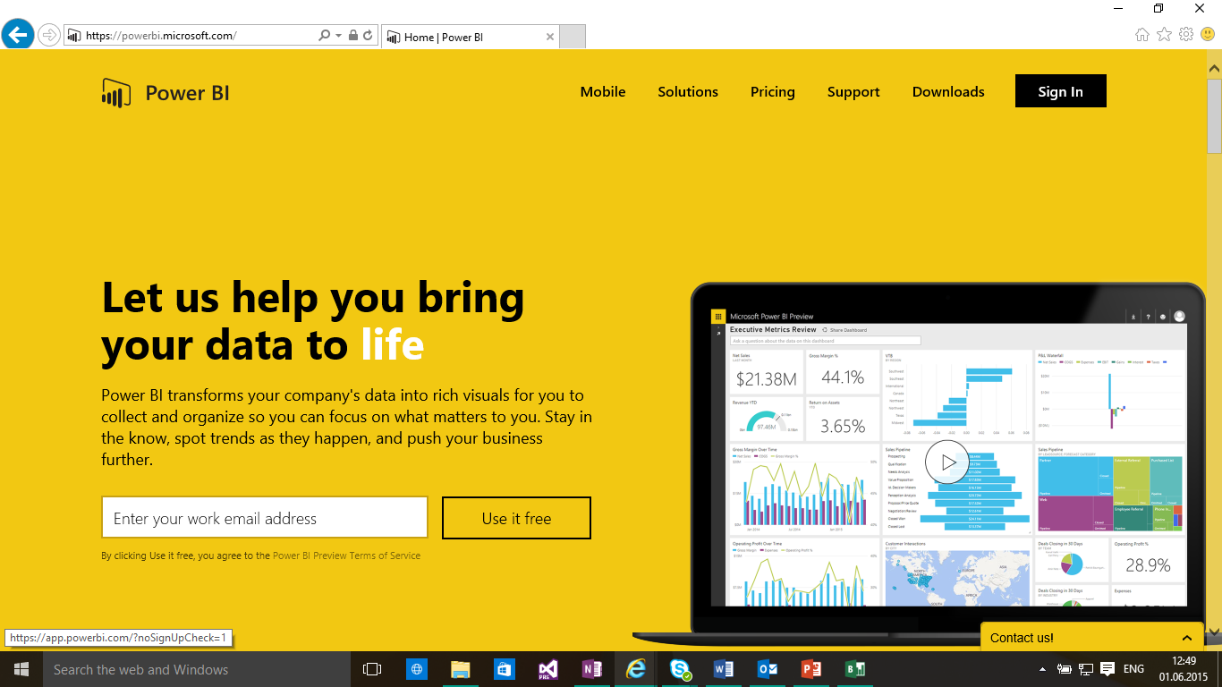
Today, using the example of a number of tasks, we will consider a powerful cloud-based tool that allows you to create various bright and colorful reports based on a huge number of data sources. Namely, I hasten to share with you a new tool that will help you visualize your data - Power BI .
Where do we start?
')
First, we need to install Power BI . The Power BI tool is available as a standalone Power BI Desktop application) or on the powerbi.com portal. Our acquaintance with Power BI will begin with Power BI Desktop - in it we will first process the data, create a report on them, and then upload it to the portal.
It is very easy to install Power BI Desktop - just follow the link, click the Download button. The installation file of the program will be downloaded, which you will need to run and walk through the standard installation steps.
As I noted above, Power BI Desktop allows you to download and edit data, create beautiful visual reports.
Each time Power BI Desktop is loaded, a welcome page opens where you are invited to download new data or open a ready-made report.

A single word about the data formats and services with which you can work. They are a huge set! These are the familiar formats of csv, xlsx, the ability to download data from the web, SQL server, SharePoint, Dynamics CRM, GitHub, Oracle, Google Analytics and many others.

The Power BI Desktop program has two modes - data editing mode and report creation mode. In edit mode, you can work with your data - add new columns, merge existing ones, sort data, change their format, etc.
I decided to try to create a report based on open data from the open data portal of the city of Moscow . I downloaded a table with a list of city bicycle parking in csv format, uploaded it to Power BI Desktop , and started looking at what data I managed to download from the portal. The table has several columns with information about the name of the parking lot, its address, telephone number of the person in charge, etc. - The usual "faceless" information. In principle, working with the table is quite comfortable - you need the necessary information, you can copy the address and see the location on the map on the Internet. But I wanted to “revive” this data, which I tried to do with Power BI . I almost did not have to work with the table - it was enough to change the headings (for my own convenience) and change the type of some columns (everything has the text format by default, but we understand that the coordinates of the location are decimal).

In the second mode, the report creation mode, you can visualize the data, create beautiful charts and graphs for their best presentation. For example, in case we load data with geographic coordinates of objects, we can plot it on the map and add it to our report.
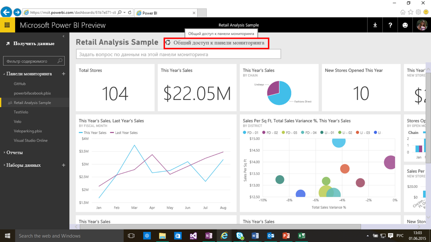
Great, this is what I need! For practice, I created 3 charts - the distribution of parking by districts (indicating the number in each district), information on the name and address of parking for each selected district and, most interestingly, marked the parking on the map. Now you can click on the parking lot of interest on the map, view information about it, as well as about other parking lots located in that area. Quick and convenient. My report is ready!

After you have finished working with the report, you can upload it to the portal - powerbi.com . Just go to the site and log in with your account for which an Office 365 subscription is active.
For the most part, the Power BI portal performs all the same functions as Power BI Desktop , except for the lack of data editing capabilities. The main feature of the portal is the dashboard.

You can pin on the dashboard data from various reports and track changes in real time. Also, the portal has the opportunity to share a report with everyone who works with this data.
In general, with the fact that such Power BI we met, now let's look at another example of working with data. At this time, let's see what is meant by connecting data from Facebook and analyze the information available to us.
Note: For those who want to watch a video with an example of bicycle parking - this example was considered at the opening of DevCon2015 .
Power BI + Facebook. What is interesting stored in the group?
As a group whose data we will analyze, I chose the Software Development Community , the social networking site Facebook. We will connect to the page with a login and password from Facebook, no additional accounts need to be created.
- Open Power BI Desktop, click Get Data , select Facebook as your data source, click Connect . A warning about connecting to an external resource (Facebook) will be displayed, agree and press Connect again.

- Fill in the necessary information. In the first field, enter the name of the group, the data we want to receive, and in the second, the data type (posts, links, comments, etc.).
In this case, consider the msdnru group and analyze the posts that were made in this group.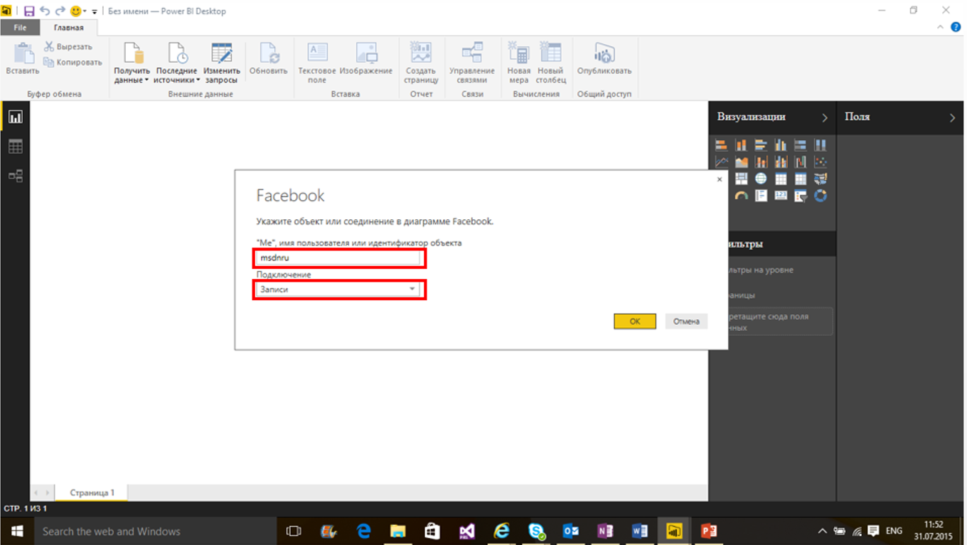
- Next, enter your Facebook account details.
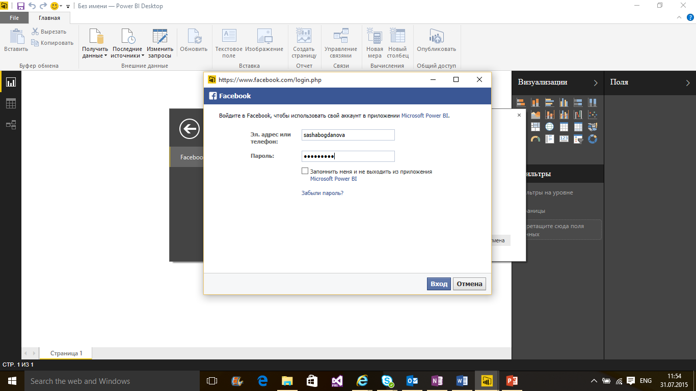
You will be offered the opportunity to select the data to which you give access.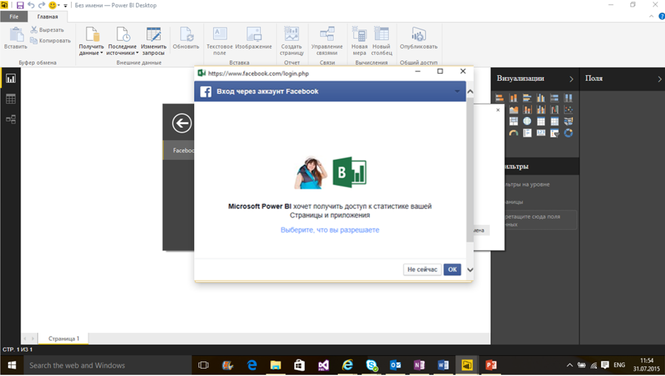
- After loading, a window will open with a list of data columns loaded from the page. In order to see what these columns are filled with, switch to the data view mode by clicking on the button with the table icon.
For the time being we will remain in the report creation mode and start creating the report - For example, we will construct a chart of the relationship between the types of posts (photos, links, videos, just statuses).
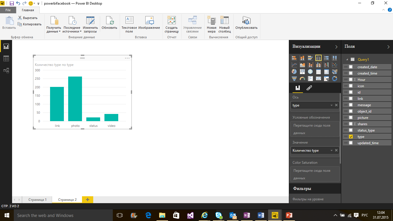
- Immediately there was a nice chart with the distribution of records. Let's change its type to the Tree Diagram . Notice that the buttons for changing the type of diagram are both on the toolbar and on the panel that appears when you click on the diagram.
You can hover on each block and see the number of entries in it: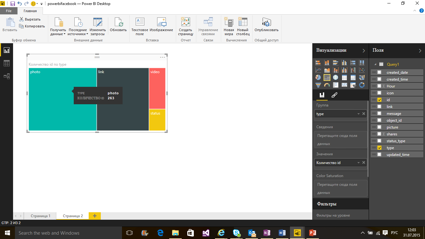
Next, we construct a diagram of the dependence of the number of reposts on the post publication time. For this we need to work with columns. Let's switch to the data editing mode and see what needs to be formatted and how.
Under the spoiler, a detailed description of what I did with the data:Actions with data- Work with created_time column. Divided it into two parts. The column contains information about the date and time of the post. We divide this column into two: created_time and created_date . In order to split the columns, we will use the Split Column command, we will divide by the symbol T. Renamed the columns created after splitting the created_time column (I called them created_time and created_date ). Now we transform the column with time. We only need the distribution of records by the hour (minutes and seconds are not so important), so select the created_time column, go to the Transform tab, select Time, then Hour .
- Work with the Shares column. This one contains additional “embedded” information. In order to see what is inside it, click on the “two arrows” icon, then, OK . Renamed the shares.count column to shares . It is necessary to change the type of the shares column. Select it, right-click, Change Type , Whole Number.
Let's go into report creation mode - let's start creating our visual report. First, drag the shares column, and then the created_date column to the workspace. You should have a graph of the number of reposts on the date of posting .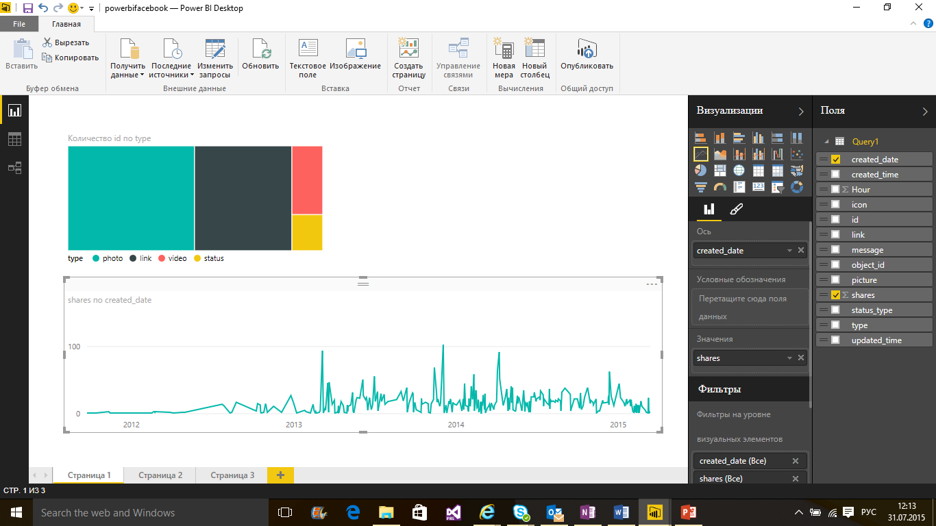
Next, we add a graph of the distribution of reposts depending on the time of publication (by the hour). Move the shares column and the created_time column to the workspace . Move the created_time column to the Axis area and change the chart view to Bar Chart .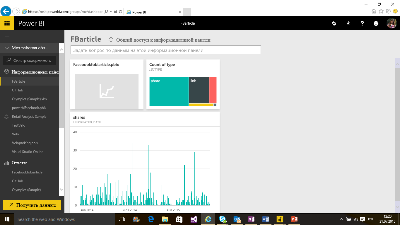
- Work with created_time column. Divided it into two parts. The column contains information about the date and time of the post. We divide this column into two: created_time and created_date . In order to split the columns, we will use the Split Column command, we will divide by the symbol T. Renamed the columns created after splitting the created_time column (I called them created_time and created_date ). Now we transform the column with time. We only need the distribution of records by the hour (minutes and seconds are not so important), so select the created_time column, go to the Transform tab, select Time, then Hour .
Application for Windows, iOS, Android
We saw that the generated reports can be easily viewed in the browser. But you see, it would be more convenient if they were all collected in one application. And for Power BI there is such an application. It is available for both Windows and iOS and Android .
API for development
If you want to use Power BI diagrams in your application, then you can use the Power BI API, which is available by reference . I will tell you more about the development possibilities with the Power BI API in the following articles.
Conclusion
So let's summarize. Power BI is a cloud-based tool for visualizing data from various sources from various sources. With Power BI, you can create beautiful reports, share them with your colleagues. Power BI consists of several parts - Power BI Desktop is an application in which you can edit your data and create reports, the powerbi.com portal to which you can upload generated reports, configure automatic data updates, and just share the generated reports.
Oh yes! I almost forgot the application for Windows , iOS and Android - actual data will always be in your smartphone.
useful links
I suggest you try to create your first report now. To make it easier, here is a list of the main links:
- Main portal Power BI
- Download Power BI Desktop
- Download mobile apps for Windows , iOS and Android
- Database of open data that can be taken for analysis
Source: https://habr.com/ru/post/264051/
All Articles