Free grid control for Xamarin from DevExpress
In the previous article ( Development Features for Xamarin.Forms ) I talked about our development experience for the Xamarin.Forms framework, which allows you to create native user interfaces for three mobile platforms (iOS, Android, Windows Phone) using common C # code and XAML markup .
Today we will look at the result of the work we have done, our first component for Xamarin.Forms - Data Grid. This component can be used for free by downloading here . Together with him you will receive an application that demonstrates the main functionality of the GridControl.

')
So, under the cut you will find an overview of all that the Grid can at the moment, as well as a little Getting Started.
As it should be, our grid is a component for displaying and editing tabular data that can be obtained from sources of various types. Let's see what opportunities it provides for quick and efficient data analysis.

Most of the above functionality is available to end-users by default. For example, through the built-in context menus (each of which, by the way, can be easily customized if necessary - for example, add new items or delete existing ones) or intuitive gestures. Any of the available functions can also be easily made inaccessible to users, if necessary.
And at the disposal of developers - API, giving them complete freedom of action.
Well, now let's see how to add a Grid component to the application and start working with it.
So, first we will create a new Xamarin.Forms Portable application in Xamarin Studio (in general, Xamarin.Forms applications can be developed in Visual Studio, but in this example we will use Xamarin Studio on OS X).
Next, download the DevExpress Grid component from the Xamarin Components store and add it to Android and iOS projects. This is done very simply - right in Xamarin Studio.
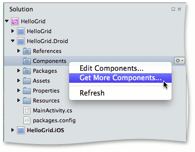
Please note that when adding a component, links to all the necessary “platform” assemblies are automatically added to Android and iOS projects.

But links to the general assemblies DevExpress.Mobile.Grid.v15.1.dll and DevExpress.Mobile.Core.v15.1.dll need to be added to the PCL project manually. You can find them in the Components / devexpress-grid-15.1.5.0 / lib / pcl / directory, which is automatically created in the current application directory.
If you are working in Visual Studio, and your application includes a Windows Phone project, you must also manually add links to the DevExpress.Mobile.Grid.WinPhone.v15.1.dll and DevExpress.Mobile.Core.WinPhone.v15 assemblies . 1.dll .
To initialize the grid, add the following line to the files MainActivity.cs and AppDelegate.cs (Android and iOS projects, respectively):
Now you can create an instance of the grid, while not forgetting to connect the namespace DevExpress.Mobile.DataGrid .
The data source for the grid is set via the ItemsSource property.
By default, the grid will create columns for all fields from the data source. The set or order of columns in the grid can be changed by setting them manually using the GridControl.Columns property.
Here, for example, how this can be done using XAML markup.
In the above code, in addition to the definition of grid columns, we also:
Now when you start the application, we get such a grid filled with data from the specified source.
A small promo video about our GridControl can be viewed here:
Like this. Now in our product line there is also a grid component for the Xamarin platform. If you are looking in the direction of developing mobile applications using Xamarin.Forms technology, then be sure to try our grid - this is easy, it is free and conveniently integrated into your project. We will be happy to answer your questions and hear your wishes in the comments to this article.
Today we will look at the result of the work we have done, our first component for Xamarin.Forms - Data Grid. This component can be used for free by downloading here . Together with him you will receive an application that demonstrates the main functionality of the GridControl.
')
So, under the cut you will find an overview of all that the Grid can at the moment, as well as a little Getting Started.
About component
As it should be, our grid is a component for displaying and editing tabular data that can be obtained from sources of various types. Let's see what opportunities it provides for quick and efficient data analysis.
Data management
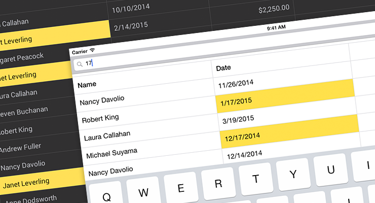
- First, these are all the standard functions required for working with tabular data — filtering, sorting (including sorting by several columns at the same time) and grouping data.
- Calculation of summary information ( summary ) for groups and for the whole grid. The five most frequently used functions ( Sum, Average, Max, Min and Count ) are already available by default, but you can also use your own algorithm for the calculation.
- All set grid settings can be saved (for example, in an xml file) and then quickly restored again in the grid.
- Add, edit and delete rows.
- The ability to export data from the grid, taking into account all applied settings (sorting, grouping, filters, counted totals, etc.) in XLS, XLSX or CSV formats.
Columns
- Several standard column types have been implemented for data of various types: text, numbers, dates, images and values from the list ( TextColumn, NumberColumn, DateColumn, ImageColumn, PickerColumn ). For example, when a user starts editing a cell, an on-screen keyboard for entering text or a calendar is automatically displayed on his tablet or smartphone, depending on whether he edits string data or dates.
By the way, for each column you can set the format for displaying values. For example, fractional, monetary, percentage and other formats are available for numeric data, and special formats for dates and times. - If none of the standard column types is suitable - it doesn't matter, you can add a column specified by a template ( TemplateColumn ) to the grid.
- It is not necessary that all the columns in the grid correspond to any field from the data source — the grid may contain so-called unbound columns — columns in which values are calculated from a given expression based on data from other columns.
- You can hide and show columns again, change their width with an appropriate gesture.
Formatting
- Conditional formatting is the ability to format cells based on their values, selectively or automatically. For example, this functionality allows you to highlight important information or exception values, visualize trends, and more. Our grid supports many options for conditional formatting - from a simple change in the font color or cell background to the use of color scales, sets of icons and histograms.
- Light and dark themes are available for the grid.
"Mobile chips"
- Well, of course, we could not but implement such familiar to users of mobile devices “chips” as pull-to-refresh (synchronization with the data source and updating the contents of the grid with a flick from top to bottom) and load-more (the ability to load more records from the data source, when the user has scrolled to the last row of the grid).
- Another feature familiar to iPhone and iPad users is Swipe Buttons . You can easily extend the standard functionality of our grid by adding additional buttons available to the user when you slide your finger along the lines of the grid from left to right and vice versa - from right to left.
Most of the above functionality is available to end-users by default. For example, through the built-in context menus (each of which, by the way, can be easily customized if necessary - for example, add new items or delete existing ones) or intuitive gestures. Any of the available functions can also be easily made inaccessible to users, if necessary.
And at the disposal of developers - API, giving them complete freedom of action.
Create application
Well, now let's see how to add a Grid component to the application and start working with it.
So, first we will create a new Xamarin.Forms Portable application in Xamarin Studio (in general, Xamarin.Forms applications can be developed in Visual Studio, but in this example we will use Xamarin Studio on OS X).
Next, download the DevExpress Grid component from the Xamarin Components store and add it to Android and iOS projects. This is done very simply - right in Xamarin Studio.
Please note that when adding a component, links to all the necessary “platform” assemblies are automatically added to Android and iOS projects.
But links to the general assemblies DevExpress.Mobile.Grid.v15.1.dll and DevExpress.Mobile.Core.v15.1.dll need to be added to the PCL project manually. You can find them in the Components / devexpress-grid-15.1.5.0 / lib / pcl / directory, which is automatically created in the current application directory.
If you are working in Visual Studio, and your application includes a Windows Phone project, you must also manually add links to the DevExpress.Mobile.Grid.WinPhone.v15.1.dll and DevExpress.Mobile.Core.WinPhone.v15 assemblies . 1.dll .
To initialize the grid, add the following line to the files MainActivity.cs and AppDelegate.cs (Android and iOS projects, respectively):
DevExpress.Mobile.Forms.Init(); Now you can create an instance of the grid, while not forgetting to connect the namespace DevExpress.Mobile.DataGrid .
The data source for the grid is set via the ItemsSource property.
By default, the grid will create columns for all fields from the data source. The set or order of columns in the grid can be changed by setting them manually using the GridControl.Columns property.
Here, for example, how this can be done using XAML markup.
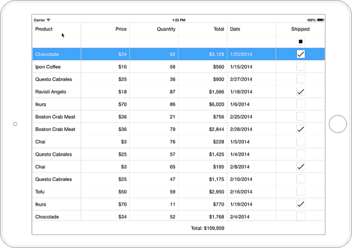
<ContentPage xmlns="http://xamarin.com/schemas/2014/forms" xmlns:x="http://schemas.microsoft.com/winfx/2009/xaml" x:Class="HelloGrid.MainPage" xmlns:dxg="clr-namespace:DevExpress.Mobile.DataGrid;assembly=DevExpress.Mobile.Grid.v15.1"> <dxg:GridControl x:Name="grid" ItemsSource="{Binding Orders}" SortMode="Multiple" AutoFilterPanelVisibility="true"> <dxg:GridControl.Columns> <dxg:TextColumn FieldName="Product.Name" Caption="Product" Width="170" /> <dxg:NumberColumn FieldName="Product.UnitPrice" Caption="Price" DisplayFormat="C0"/> <dxg:NumberColumn FieldName="Quantity"/> <dxg:NumberColumn FieldName="Total" UnboundType="Integer" UnboundExpression="[Quantity] * [Product.UnitPrice]" IsReadOnly="True" DisplayFormat="C0"/> <dxg:DateColumn FieldName="Date" DisplayFormat="d"/> <dxg:SwitchColumn FieldName="Shipped" /> </dxg:GridControl.Columns> <dxg:GridControl.TotalSummaries> <dxg:GridColumnSummary FieldName="Total" Type="Sum" DisplayFormat= "Total: {0:C0}"/> </dxg:GridControl.TotalSummaries> </dxg:GridControl> </ContentPage> In the above code, in addition to the definition of grid columns, we also:
- included the ability to simultaneously sort by multiple columns
- added a panel to filter data by columns
- and set the total summary to calculate the total for the Total column.
Now when you start the application, we get such a grid filled with data from the specified source.
A small promo video about our GridControl can be viewed here:
Conclusion
Like this. Now in our product line there is also a grid component for the Xamarin platform. If you are looking in the direction of developing mobile applications using Xamarin.Forms technology, then be sure to try our grid - this is easy, it is free and conveniently integrated into your project. We will be happy to answer your questions and hear your wishes in the comments to this article.
Source: https://habr.com/ru/post/264039/
All Articles