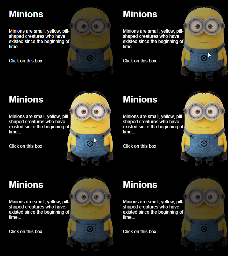
Advanced CSS filters
The translation of the article advanced css filters , by Vincent De Oliveira, which I found in the last digest .
I could not translate briefly into Russian backdrop and background, retaining the semantic difference between them, so I will explain now:
the backdrop is what is behind the element, and can be seen through it, cropped around its frame;
background is also a background, but is part of the element, and the background property refers to it.
Back in 2011, browsers began to introduce CSS filters from the specifications . At that time, mainly SVG filters were supported, and Firefox was the only browser that could apply them to HTML content (basically, nothing has changed).
')
CSS filters such as blur (), contrast () or grayscale () are a great addition to CSS, although SVG can do amazing things. You can learn more about them on a variety of resources.
Today I want to go a little further, showing the new features of CSS.
First of all, this is the backdrop-filter property defined in Filter Effect Level 2. It allows you to apply filters to the background of the element, not to its background.
I was skeptical, but I started playing at WebKit nightlies in February, and changed my mind - this is very cool. Everyone agrees with me, as evidenced by my Vine (post service similar to oub - comment. Translator) post, which collected more than 20 thousand views in 48 hours.
In June, Apple announced at WWDC that these properties will be available in Safari 9. This is good news. It's time to check (the author uses the beta of iOS 9 and Safari 9).
With this property you can get effects that were hard to achieve. The most banal - blur like in iOS:
Each element behind the header is blurred by 5px. It is so simple.

A live example on JSBin (Safari 9 only).
In the demo, I used
backdrop-filter can increase the readability of text superimposed over an image:

A live example on JSBin (Safari 9 only).
By combining several filters, you can make simple graphic effects close to those offered by CSS blend-modes:

A live example on JSBin (Safari 9 only).
A few things you need to know:
Sometimes, it is necessary to impose a filter neither on the element, nor on the backdrop. You just want to apply it to the background (background), but there are no background-filter properties. Here the filter () function can be useful, not to be confused with the filter property. The function takes two parameters: an image and a filter, returns a new image. This image can be used with any CSS property that supports images. Something like this:
As a result, you can now apply filters for images, before using as a background. You might think that it is a background-filter variation (or background-opacity, background-blur), but it is much more powerful.

A live example on JSBin (Safari 9 only).
The good news is that even without mentioning Apple, it is available in Safari 9.
A few things you need to know:
It is worth noting that backdrop-filter and filter () can be easily animated with CSS transitions or animation, or using JavaScript.

I look forward to introducing these features in browsers. SVG can do this too, but the same cool effects can easily be done with CSS. Since last year, a lot of controversy surrounding CSS has been focused on architecture, methodology, tools. It's good to remember that CSS is also about graphic design (along with SVG).
OK, support is minimal now, but it will be possible on millions of iPhones and iPads by the end of the year.
I could not translate briefly into Russian backdrop and background, retaining the semantic difference between them, so I will explain now:
the backdrop is what is behind the element, and can be seen through it, cropped around its frame;
background is also a background, but is part of the element, and the background property refers to it.
Back in 2011, browsers began to introduce CSS filters from the specifications . At that time, mainly SVG filters were supported, and Firefox was the only browser that could apply them to HTML content (basically, nothing has changed).
')
CSS filters such as blur (), contrast () or grayscale () are a great addition to CSS, although SVG can do amazing things. You can learn more about them on a variety of resources.
Today I want to go a little further, showing the new features of CSS.
backdrop-filter
First of all, this is the backdrop-filter property defined in Filter Effect Level 2. It allows you to apply filters to the background of the element, not to its background.
I was skeptical, but I started playing at WebKit nightlies in February, and changed my mind - this is very cool. Everyone agrees with me, as evidenced by my Vine (post service similar to oub - comment. Translator) post, which collected more than 20 thousand views in 48 hours.
In June, Apple announced at WWDC that these properties will be available in Safari 9. This is good news. It's time to check (the author uses the beta of iOS 9 and Safari 9).
With this property you can get effects that were hard to achieve. The most banal - blur like in iOS:
.header { background-color: rgba(255,255,255,.6); backdrop-filter: blur(5px) } Each element behind the header is blurred by 5px. It is so simple.

A live example on JSBin (Safari 9 only).
In the demo, I used
@supportsin order to apply backdrop-filter along with minor adjustments (background-color and positioning) to keep the header `readable in unsupported browsers.
backdrop-filter can increase the readability of text superimposed over an image:
.text { backdrop-filter: blur(1px) } 
A live example on JSBin (Safari 9 only).
By combining several filters, you can make simple graphic effects close to those offered by CSS blend-modes:
.text { background: rgba(0,0,0,.6); backdrop-filter: grayscale(1) contrast(3) blur(1px); } 
A live example on JSBin (Safari 9 only).
A few things you need to know:
- the background of the element applied to the backdrop-filter should be semi-transparent. If not, you will never see the effect.
- there is a bug when combining backdrop-filter with any property that cuts an element (border-radius, mask, clip-path, etc). This means that advanced effects are not yet possible.
- backdrop-filter creates a new blend context like opacity
- backdrop-filter can be animated
- This property requires the prefix: -webkit-backdrop-filter
- Caniuse
filter ()
Sometimes, it is necessary to impose a filter neither on the element, nor on the backdrop. You just want to apply it to the background (background), but there are no background-filter properties. Here the filter () function can be useful, not to be confused with the filter property. The function takes two parameters: an image and a filter, returns a new image. This image can be used with any CSS property that supports images. Something like this:
.element { background: filter(url(path/to/img.jpg), blur(5px)); } As a result, you can now apply filters for images, before using as a background. You might think that it is a background-filter variation (or background-opacity, background-blur), but it is much more powerful.

A live example on JSBin (Safari 9 only).
The good news is that even without mentioning Apple, it is available in Safari 9.
A few things you need to know:
- there is a bug with background-size
- function can be animated
- the function requires the prefix: -webkit-filter ()
It is worth noting that backdrop-filter and filter () can be easily animated with CSS transitions or animation, or using JavaScript.

I look forward to introducing these features in browsers. SVG can do this too, but the same cool effects can easily be done with CSS. Since last year, a lot of controversy surrounding CSS has been focused on architecture, methodology, tools. It's good to remember that CSS is also about graphic design (along with SVG).
OK, support is minimal now, but it will be possible on millions of iPhones and iPads by the end of the year.
Source: https://habr.com/ru/post/264037/
All Articles