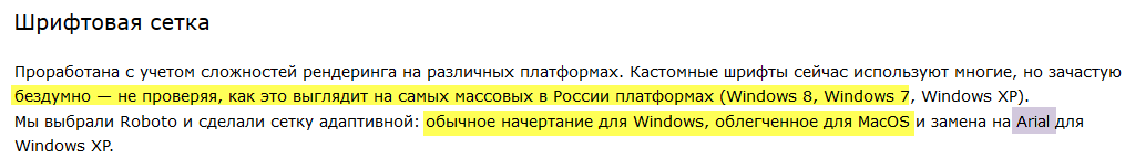
"Mindless" use of fonts
The other day I read a local article about “burger design” and everything would be fine, but I came across the use of fonts.
Here is a quote.
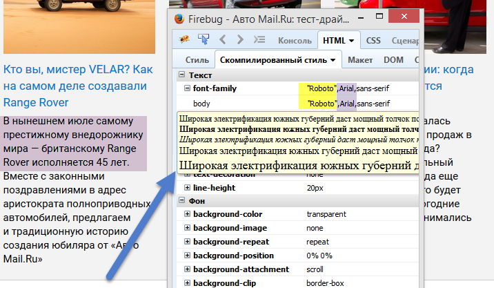
My browser shows the site represented by the Author in Arial. In the code there is Roboto, but "dropped" to the default with serifs.
')
Undoubtedly, this is a consequence of the lack of font Roboto in my system. I checked in Windows 8 and 7 - there are no fonts, I called my makovod-mate - he has a similar situation.
Assuming that I’m wrong and the Author’s experts applied the “magic” @ font-face, and also considering that the Arial and Roboto fonts are somewhat similar, I made an easy comparison.
Almost to the naked eye, the differences are most noticeable in the writing of the letters “d” and “s”. In Arial, the "d" is wide, while the "s" has both parts of the mark closely. In Roboto, the “d” width obviously loses, and the “stick” of the “s” is further to the right.

PS I strongly do not pretend to publish everything I said above, I just ask the moderators to somehow inform the Author about all this, because in the English “burger” version, my doubts, written in Russian, were deleted ten minutes later, and the question “Why ...?”, translated with the help of a google-translator, still hangs unanswered.
PPS The strength of a system is determined by the strength of its weakest element.
Here is a quote.
My browser shows the site represented by the Author in Arial. In the code there is Roboto, but "dropped" to the default with serifs.
')
Undoubtedly, this is a consequence of the lack of font Roboto in my system. I checked in Windows 8 and 7 - there are no fonts, I called my makovod-mate - he has a similar situation.
Assuming that I’m wrong and the Author’s experts applied the “magic” @ font-face, and also considering that the Arial and Roboto fonts are somewhat similar, I made an easy comparison.
Almost to the naked eye, the differences are most noticeable in the writing of the letters “d” and “s”. In Arial, the "d" is wide, while the "s" has both parts of the mark closely. In Roboto, the “d” width obviously loses, and the “stick” of the “s” is further to the right.
PS I strongly do not pretend to publish everything I said above, I just ask the moderators to somehow inform the Author about all this, because in the English “burger” version, my doubts, written in Russian, were deleted ten minutes later, and the question “Why ...?”, translated with the help of a google-translator, still hangs unanswered.
PPS The strength of a system is determined by the strength of its weakest element.
Source: https://habr.com/ru/post/263925/
All Articles