Evolution of the Top Story application interface
Many corporations pay special attention to mobile users - indeed, the proportion of those who practically do not let smartphones go is constantly growing. The owners of smart mobile devices during the use of devices form certain habits related to the features of the organization of news feeds in social networks. They transfer their expectations to other informational applications, in particular, news feeds: users need up-to-date content, relevant to their interests, a comfortable viewing mode, and minimal time for reading news.
The Top Story team has released a mobile application for reading news and creating subscriptions, which takes into account the interests of the owner of the smartphone. Top Story knows how important it is that the application is comfortable, pleasant and responsive, so the weekly releases always have interface improvements. We pay considerable attention to each element and their work in the aggregate. The TopStory team is ready to tell you how, step by step, we walked the way to a convenient and intuitive interface.
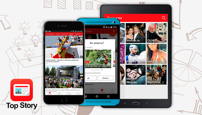
Top Story is continuously working on the interface of the application, is engaged in this constant group of three designers. Most of the changes are based on reviews, suggestions and ideas of users, which they express in comments on social networks, on Google Play and in the App Store, and also inform us by e-mail. Changes are global, for example, changing the style of the ribbon, and there are also not very large, for example, changing the color of the interface, style and font size, etc. ... In the series of screenshots you can see how the sharing button and the upper right menu evolved: the button gradually became floating below screen - so the user can share the content he liked immediately after reading. And in the upper right menu there were two functions that are important during the reading: the ability to change the font size on the screen and the “asterisk” to bookmark the material you like (bookmark “My collection”). The location of this button is familiar to users - this is how it looks in most browsers.
')

As an experiment, we introduced the lower navigation bar - while the results are encouraging and users of Top Story, and us - it is always convenient to switch to the desired tab and get quick access to news or favorite subscriptions. Developers didn’t immediately come to such a navigation bar - the standard application type of navigation , recommended by Google for mobile developers, was originally used. It was the side menu that everyone got used to using social networks or, for example, the Google Play application. The bottom menu turned out to be more functional and better in terms of content availability. It cannot be argued that the side menu is a bad interface solution, it looks great for applications with a rigid structure (think Facebook, Vkontakte), but the specificity of the news feed makes the bottom menu a more attractive option.

Just a few days ago, we changed the name “Digest” to “Recommended”, it happened just on the day of our first review . The logic of the formation of the section itself prompted us to these changes: Top Story is a machine being taught and recommends the user to the news based on his interests. The “Popular” section was changed to the name “From Social Networks”, since it is in social networks that the content that is popular among readers is concentrated.
The fact that the application runs on smartphones brings another important touch to the development - we have to work with the touch interface on various screen sizes. By the way, in many respects precisely because of the more comfortable work with different screen sizes, the lower navigation bar was chosen - there is no need to reach up behind the side menu - just switch the sections with one finger. We also try to use touch navigation to control the application with hand gestures. For example, to return to a section from a readable article, just drag the screen to the right. This, by the way, is not a very standard solution - usually, to go back, make a slide to the left. But according to the logic of the application and the interface, we decided to experiment with the slide to the right and animation. The user liked this solution.
Color plays a significant role in design - and we also managed to experiment with it. As you can see in the screenshots, before the application was decorated in blue colors - a reference to the business style. However, the current version has a red skin - it seems to us that this reflects the essence of Top Story more, it is associated with speed (the “Main” section receives news within 2-3 minutes after they are released on the main news feeds), with hot news and more informally.
In order to get to know the user better and offer only the news that he wants to see, Top Story of the current version provided a kind of vote for the news - the smartphone owner can click the button with a cross in the lower right corner of any news in the feed and mark in the dialog that opens the reason he doesn't like the content. The system will take into account his wishes when forming the tape in the future.

Users can not only receive news that they are interested in, but also edit the sections available in the top menu. For convenience, we have made a list in which it is enough to put or remove hints on the relevant sections. At the request of the owner of the smartphone, you may receive notifications about interesting and latest news - they are displayed by an icon in the upper toolbar of the screen.

Since the news feed is a 100% application for the user, to which he often refers, we tried to draw attention to possible needs. For example, it is known that often elderly people are interested in news, who have become more and more fashionable smartphones. For them and for the visually impaired, we have provided for the switching of the font. And you can change the size of the letters in the account settings, and in the upper right corner during the direct reading of the page. In order to care about the readers in the dark and the people who are close to them, Top Story has a night mode (white letters on a black background), which the user can turn on in the account settings on his own.

Another interface block that we have been carefully working on is sharing, including social networks. Using the sharing button, you can share your favorite article via mail, WhatsApp, social networks.

In addition, under the read article there is an opportunity to put a like or dizlick and immediately share it on the social network by clicking on its icon. If there is a subscription to the source, then right under the article read, the user can subscribe to the resource he liked by clicking the plus.

The section that interests you most can be brought to the desktop of the smartphone and create a whole news space based on Top Story. In the newest release, one more feature was added: when creating a subscription to some sources (Life News, Big Picture, Hi-Tech, Nacked Science, etc.) and making a source on the smartphone’s desktop, the familiar source logo appears, not a color label, as it were before and how it is saved for user-selected keywords.

Sometimes users note that the Top Story interfaces on Android smartphones and on the iPhone are slightly different. Indeed, sometimes you can see the differences - this is due to the long cycle of reviewing the new release of the application in the App Store (7-10 working days, which ultimately boils down to two weeks). However, in general, applications have almost the same interface.
The interface of Top Story changes weekly, noticeably and imperceptibly. To date, the application looks and is managed in a balanced manner, the flow of users' wishes for external improvements has decreased. Continuous work is being done not only on programming the backend of the system, which is responsible for the relevance of news to the interests of users, but also on the interface, which must meet the requirements of usability changing with fantastic speed. At the beginning of the post, we said that we have three designers - in fact, they have tens of thousands of them - all those users who daily (and some hourly) use our application and give feedback.
We invite you to join our users on Android and iPhone smartphones !
The Top Story team has released a mobile application for reading news and creating subscriptions, which takes into account the interests of the owner of the smartphone. Top Story knows how important it is that the application is comfortable, pleasant and responsive, so the weekly releases always have interface improvements. We pay considerable attention to each element and their work in the aggregate. The TopStory team is ready to tell you how, step by step, we walked the way to a convenient and intuitive interface.
Top Story is continuously working on the interface of the application, is engaged in this constant group of three designers. Most of the changes are based on reviews, suggestions and ideas of users, which they express in comments on social networks, on Google Play and in the App Store, and also inform us by e-mail. Changes are global, for example, changing the style of the ribbon, and there are also not very large, for example, changing the color of the interface, style and font size, etc. ... In the series of screenshots you can see how the sharing button and the upper right menu evolved: the button gradually became floating below screen - so the user can share the content he liked immediately after reading. And in the upper right menu there were two functions that are important during the reading: the ability to change the font size on the screen and the “asterisk” to bookmark the material you like (bookmark “My collection”). The location of this button is familiar to users - this is how it looks in most browsers.
')
As an experiment, we introduced the lower navigation bar - while the results are encouraging and users of Top Story, and us - it is always convenient to switch to the desired tab and get quick access to news or favorite subscriptions. Developers didn’t immediately come to such a navigation bar - the standard application type of navigation , recommended by Google for mobile developers, was originally used. It was the side menu that everyone got used to using social networks or, for example, the Google Play application. The bottom menu turned out to be more functional and better in terms of content availability. It cannot be argued that the side menu is a bad interface solution, it looks great for applications with a rigid structure (think Facebook, Vkontakte), but the specificity of the news feed makes the bottom menu a more attractive option.
Just a few days ago, we changed the name “Digest” to “Recommended”, it happened just on the day of our first review . The logic of the formation of the section itself prompted us to these changes: Top Story is a machine being taught and recommends the user to the news based on his interests. The “Popular” section was changed to the name “From Social Networks”, since it is in social networks that the content that is popular among readers is concentrated.
The fact that the application runs on smartphones brings another important touch to the development - we have to work with the touch interface on various screen sizes. By the way, in many respects precisely because of the more comfortable work with different screen sizes, the lower navigation bar was chosen - there is no need to reach up behind the side menu - just switch the sections with one finger. We also try to use touch navigation to control the application with hand gestures. For example, to return to a section from a readable article, just drag the screen to the right. This, by the way, is not a very standard solution - usually, to go back, make a slide to the left. But according to the logic of the application and the interface, we decided to experiment with the slide to the right and animation. The user liked this solution.
Color plays a significant role in design - and we also managed to experiment with it. As you can see in the screenshots, before the application was decorated in blue colors - a reference to the business style. However, the current version has a red skin - it seems to us that this reflects the essence of Top Story more, it is associated with speed (the “Main” section receives news within 2-3 minutes after they are released on the main news feeds), with hot news and more informally.
In order to get to know the user better and offer only the news that he wants to see, Top Story of the current version provided a kind of vote for the news - the smartphone owner can click the button with a cross in the lower right corner of any news in the feed and mark in the dialog that opens the reason he doesn't like the content. The system will take into account his wishes when forming the tape in the future.
Users can not only receive news that they are interested in, but also edit the sections available in the top menu. For convenience, we have made a list in which it is enough to put or remove hints on the relevant sections. At the request of the owner of the smartphone, you may receive notifications about interesting and latest news - they are displayed by an icon in the upper toolbar of the screen.
Since the news feed is a 100% application for the user, to which he often refers, we tried to draw attention to possible needs. For example, it is known that often elderly people are interested in news, who have become more and more fashionable smartphones. For them and for the visually impaired, we have provided for the switching of the font. And you can change the size of the letters in the account settings, and in the upper right corner during the direct reading of the page. In order to care about the readers in the dark and the people who are close to them, Top Story has a night mode (white letters on a black background), which the user can turn on in the account settings on his own.
Another interface block that we have been carefully working on is sharing, including social networks. Using the sharing button, you can share your favorite article via mail, WhatsApp, social networks.
In addition, under the read article there is an opportunity to put a like or dizlick and immediately share it on the social network by clicking on its icon. If there is a subscription to the source, then right under the article read, the user can subscribe to the resource he liked by clicking the plus.
The section that interests you most can be brought to the desktop of the smartphone and create a whole news space based on Top Story. In the newest release, one more feature was added: when creating a subscription to some sources (Life News, Big Picture, Hi-Tech, Nacked Science, etc.) and making a source on the smartphone’s desktop, the familiar source logo appears, not a color label, as it were before and how it is saved for user-selected keywords.
Sometimes users note that the Top Story interfaces on Android smartphones and on the iPhone are slightly different. Indeed, sometimes you can see the differences - this is due to the long cycle of reviewing the new release of the application in the App Store (7-10 working days, which ultimately boils down to two weeks). However, in general, applications have almost the same interface.
The interface of Top Story changes weekly, noticeably and imperceptibly. To date, the application looks and is managed in a balanced manner, the flow of users' wishes for external improvements has decreased. Continuous work is being done not only on programming the backend of the system, which is responsible for the relevance of news to the interests of users, but also on the interface, which must meet the requirements of usability changing with fantastic speed. At the beginning of the post, we said that we have three designers - in fact, they have tens of thousands of them - all those users who daily (and some hourly) use our application and give feedback.
We invite you to join our users on Android and iPhone smartphones !
Source: https://habr.com/ru/post/263713/
All Articles