How-to: responsive emails in Gmail
In our blog, we often write about creating responsive mailing lists ( one , two , three ) and in general we pay great attention to email layout . Today we will talk about how to create responsive emails for the Gmail mail client, known for its rather meager support for various layout options. This technique was described in 2014 by Justin Koo (Justin Khoo), later the method was supplemented with an article by Mark Robbins in the Email Code Geek blog. We present to your attention an adapted translation of the main points of the two publications.
Gmail Interactive Emails
Gmail allows you to simulate CSS class selectors, for this you need to use attributes that the mail service does not cut (for example,
title ). Below is the code for creating a hover effect button in a letter. Also, the code added contains two class selectors ( .divbox ) and attributes ( class=”divbox” ), so that the effect works in mail clients that cut attribute selectors (for example, in Yahoo! Mail).')
<html> <head> <style> .divbox, * [lang~="x-divbox"]:hover{ background-color: green !important; color: white; } </style> </head> <body> <div class="divbox" lang="x-divbox" style="padding:10px;width:100px;height:40px; background-color:#eeeeee;">Divbox Content</div> </body> The
lang attribute used in this code is one of the few attributes that Gmail does not cut ( title , lang , width , alt , href in this list). One could use the title , but it has one “side effect” - when you hover the cursor, this title would be visible. Lang , in turn, is universal (suitable for all elements) and does not appear on hover.In HTML specifications, this attribute is supposed to be used differently. Therefore, the
“x-” prefix is used here, which tells the mail client not to process the lang attribute.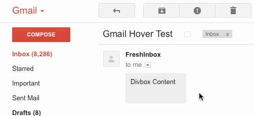
And here are all the styles whose performance in Gmail has been confirmed by Justin Koo’s experiments:
* E[foo] * E[foo="bar"] * E[foo~="bar"] * E[foo^="bar"] * E[foo*="bar"] * E[foo$="bar"] * E:hover * E:link * E:visited * E:active EF E > F E + F E ~ F Below is a description of how Gmail handles CSS in the message header:
.divbox {..} //, - Gmail #divbox {..} //, - Gmail id- [class~="divbox"] {...} // Gmail * [class~="divbox"] {...} //, — div {...} //, div:hover {...} // Gmail. ? ! * div:hover {...} //! … * [lang~="x-divbox"] {...} //, * [lang~="x-divbox"]:hover {...} //! , ! Add adaptability
This is what we are striving for (the “breakpoints” for different screen sizes are marked in color):
If, when creating a letter, the specified maximum width of 600 pixels is used, then the first “breakpoint” (breakpoint) could be set at this point, but Gmail considers the width of the browser window, not the email message container, as some other email programs do .
In this case, the first media request can be used at around 1160 pixels - while the width of the email container will be just 600 pixels.
@media screen and (max-width:1160px){ * [lang=x-outer]{ width:100% !important; } } When the browser window is narrowed to 700px, the width of the letter area will be only 450px. If the width is even smaller, a horizontal scroll will appear, which is not the most convenient element of navigation.
To avoid this, you need to set the width at around 100% of the screen width minus 250 pixels for the column fixed on the left side of the screen.
@media screen and (max-width:700px){ * [lang=x-outer]{ width:calc(100vw - 250px) !important; float:left; } } Here, the units of measurement are
vw - 1 vw = 1% viewport width (in this case, the browser window). The percentage describes the size of the element contained in the container (in our case, fixed at 450px). Then, to perform calculations, the Calc function is used (it can work with the values of px , % , em , rem , vw , vh , etc.)In this case, our email will not be 300 pixels. Therefore, these 300px are added to the 250px left column, in addition, a media query is used, fixing a width of 300px:
@media screen and (max-width:550px){ * [lang=x-outer]{ width:300px !important; } } The technique described above is well suited for use when creating mobile-friendly letters (if you don’t take smartphones and tablets, you rarely see mail on a screen that is less than 1160px wide).
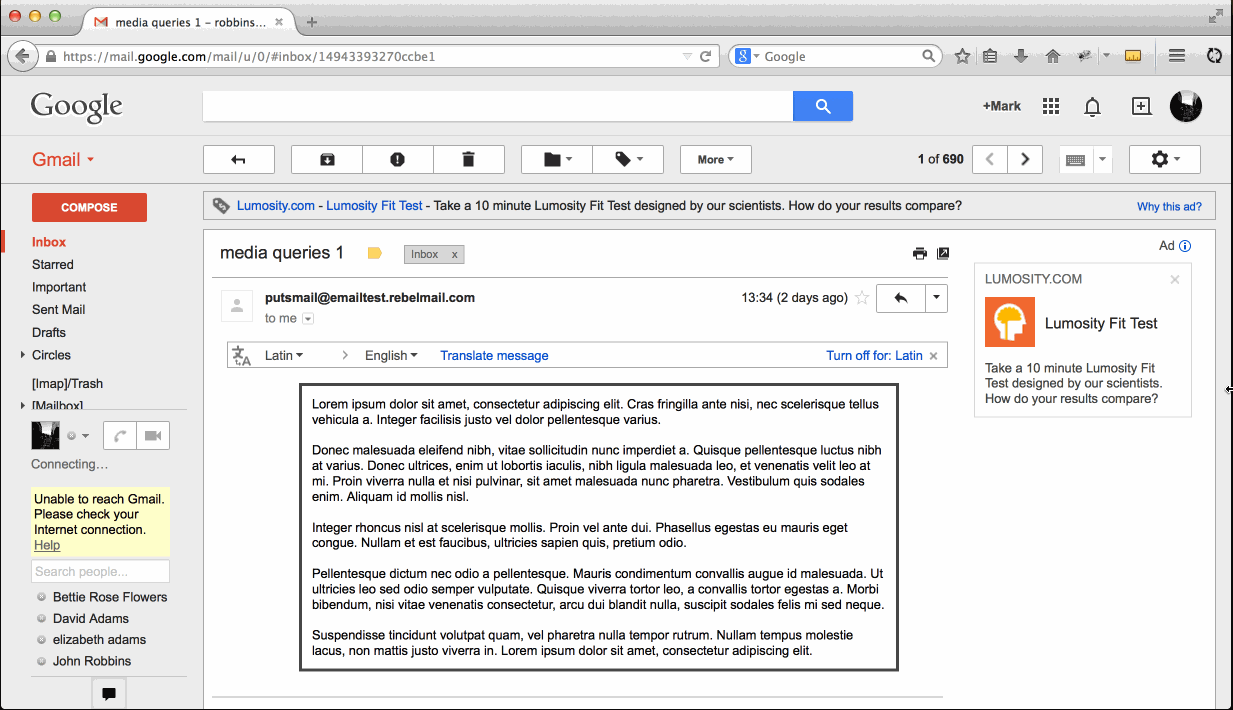
Under the spoiler is the full code of the example (you can also work with it on Codepen ):
Sample code
<!DOCTYPE html> <html lang="en" xmlns:v="urn:schemas-microsoft-com:vml" xmlns:o="urn:schemas-microsoft-com:office:office"> <!--xmlns fix Outlook Scaling--> <head> <meta http-equiv="Content-Type" content="text/html; charset=utf-8" /> <meta name="viewport" content="width=device-width, initial-scale=1" /> <meta name="format-detection" content="telephone=no"> <meta http-equiv="X-UA-Compatible" content="IE=edge"> <!--Fix Outlook Scaling--> <!--[if gte mso 9]><xml> <o:OfficeDocumentSettings> <o:AllowPNG/> <o:PixelsPerInch>96</o:PixelsPerInch> </o:OfficeDocumentSettings> </xml><![endif]--> <title>Media queries</title> <style> body { text-size-adjust: none !important; -ms-text-size-adjust: none !important; -webkit-text-size-adjust: none !important; } .ExternalClass * { line-height: 100%; } table { border-collapse: collapse; table-layout: fixed; margin: 0 auto; } table table table { table-layout: auto; } @media screen and (max-width:1160px){ * [lang=x-outer]{ background: olive; width:100% !important; } .outer.outer{ width:600px !important; } } @media screen and (max-width:700px){ * [lang=x-outer]{ background: teal; width:calc(100vw - 250px) !important; float:left; } .outer.outer{ width:600px !important; float:none; } } @media screen and (max-width:550px){ * [lang=x-outer]{ background: steelblue; width:300px !important; } .outer.outer{ width:100% !important; } } </style> </head> <body> <table width="100%" border="0" cellspacing="0" cellpadding="0" bgcolor="#ffffff" > <tr> <td> <table align="center" width="600" lang="x-outer" border="0" cellspacing="0" cellpadding="0" class="outer"> <tr> <td> <div style="padding:10px; border:1px solid #444444;"> Lorem ipsum dolor sit amet, consectetur adipiscing elit. Cras fringilla ante nisi, nec scelerisque tellus vehicula a. Integer facilisis justo vel dolor pellentesque varius. <br><br> Donec malesuada eleifend nibh, vitae sollicitudin nunc imperdiet a. Quisque pellentesque luctus nibh at varius. Donec ultrices, enim ut lobortis iaculis, nibh ligula malesuada leo, et venenatis velit leo at mi. Proin viverra nulla et nisi pulvinar, sit amet malesuada nunc pharetra. Vestibulum quis sodales enim. Aliquam id mollis nisl. <br><br> Integer rhoncus nisl at scelerisque mollis. Proin vel ante dui. Phasellus egestas eu mauris eget congue. Nullam et est faucibus, ultricies sapien quis, pretium odio. <br><br> Pellentesque dictum nec odio a pellentesque. Mauris condimentum convallis augue id malesuada. Ut ultricies leo sed odio semper vulputate. Quisque viverra tortor leo, a convallis tortor egestas a. Morbi bibendum, nisi vitae venenatis consectetur, arcu dui blandit nulla, suscipit sodales felis mi sed neque. <br><br> Suspendisse tincidunt volutpat quam, vel pharetra nulla tempor rutrum. Nullam tempus molestie lacus, non mattis justo viverra in. Lorem ipsum dolor sit amet, consectetur adipiscing elit. </div> </td> </tr> </table> </td> </tr> </table> </body> </html> By using attributes that Gmail doesn’t cut out and applying to the styles of universal selectors, you can create interactive and responsive emails even for this mail service. However, this does not mean that you can stop using inline CSS code - the Gmail and Gmail For Businesses mobile apps do not support the tag
.Source: https://habr.com/ru/post/263699/
All Articles