Full guide to creating landing pages that sell
We continue to introduce you to the best articles on web design. Today we have translated a fresh article on Medium about creating effective landing pages. Translation is made by " I love FE ".
Landing pages are landing pages that are designed specifically to achieve certain conversion goals. Sometimes the landing page is the main page (although many believe that it cannot be a real landing page). But most often, special landing pages are created for certain marketing campaigns.
')
Conversion goals can include anything from a checkout to a free order. Once you have a specific goal and you understand your market, you can create, test and optimize landing pages that will help you best achieve your goals.
Why do I need a landing page?
The biggest mistake of the marketer will be to send traffic from any advertising or PR campaign to the main page of the site. Most likely, your homepage has nothing to do with this campaign. And it will only confuse your visitors.
Landing page, on the contrary, is directly related to the advertising campaign. She can repeat her language and use the same images. And when a visitor gets to this page, you can direct him exactly the way you want. This experience is for the user more holistic, comfortable and understandable.
Landing pages exist in order to capture and hold the attention of visitors in a way that an ordinary home page cannot do. They attract attention precisely to the information to which you want, instead of leaving the visitor alone with a bunch of information on the main page.
Get to know your target audience
The first thing you need to know to create a landing page is your target audience. Of course, it is necessary to create any web page. But there are some peculiarities. You must know:
- Where do your users come from? Do they click on an ad? What is this advertising? Context, banner or some other?
- Or do they come from a PR campaign? From social networks? News? Blogging? Forums?
- What kind of information are they looking for? Do they want to buy something? To register? Get more information? Or something completely different?
When you know the answers to all these questions, you can better adapt the design to your goals.
Understand how landing text works
There are two main approaches to how landing should work.
Representatives of the "old school" believe that long landing pages work best. They are a kind of equivalent to long, multipage emails from the time of direct mail. We all have seen such landing pages: you simply scroll endlessly through information and calls to action on a page without any special design. (These are the classic landing pages with a white background, highlights of a light yellow color, red headings, and calls to action, with which we have all been familiar for a long time.)
PickEvent is a great example of a long landing.

Others believe that short landing pages, possibly divided into several pages and forming a sales funnel, work much better than long ones. Each approach has its pros and cons, and each of them is better suited for different purposes.
It is better to use short landings if the call to action does not require large expenses or obligations on the part of the user and does not carry obvious risks (for example, a subscription to a newsletter or a trial version). Also, short landings are better suited for impulse-based purposes. Or when your company or product is already well known and does not require long explanations.
Long landings work better for purposes based on need and at higher risks (the user needs more confidence to perform the action). They are also better suited for new or complex products. In other words:
The more time, energy, nerves or money a person needs to spend, the longer the landing should be .
A long landing page answers more potential questions, thereby reducing anxiety. He can also convince more potential customers to make a purchase without having to contact you for more information, speeding up the process and reducing costs. In many situations, a long landing page can lead to more conversions than a short one. Here is just one example, the company Crazy Egg managed to increase the conversion rate by 363%, making the main page 20 times longer.
If your potential client already knows what he is looking for, then a short landing page, on the contrary, can increase the conversion. Here is another example , when reducing a page by about a third led to an increase in conversion of 11%.
If you, as a designer, do not write the text directly, you can send someone who will do this, write either a long or a short text depending on your target audience (especially if this someone is not a professional copywriter).
Break the text apart
No matter how long your text is, it is important to break it apart so that it is easier to read (or scan).
Usually a landing page consists of four parts:
- Headline
- Subtitle.
- Mandatory information ( you need to know ).
- Additional information ( which is useful to know ).
For a short landing these parts are enough. Long landing is better to break into additional parts. For this you can use lists or additional subheadings.
To break the text, you can also use design elements. Images, lines, areas with other formatting, etc. will help to break the content and make it more beautiful and readable at the same time.
Another point about the breakdown of the text: add a few calls to action at certain intervals across the page. When your user is ready to perform an action, he will not have to scroll up or down to find the button. Ideally, the call to action should be in every section of the page.
You can have only one goal.
Each landing should have only one goal. This goal may be to request information, make a purchase, sign up for a trial version or something else.
If there are more goals, attention will be divided between them, blurring the effect. Therefore, decide which goal is the most important, and focus only on it. You can add an additional goal (for example, subscribe to a newsletter) on the confirmation page after the main one is reached.
Attention factor
The attention factor of your landing page is equal to how many links you have on the page to the number of conversion goals (which should always be 1). Therefore, the more links on the page that do not lead directly to the goal, the higher the attention factor. Ideally, it should be 1: 1.
That is why we need landings, instead of sending people just to the main page. On the main page, the attention factor can be 10: 1, 25: 1 or even 100: 1. This means that, in addition to your main goal, too many things will fight for the user's attention.
Remember : your landing page should have only one goal . If you have several goals, you should have several landing pages and several advertising campaigns.
Explore competitors
Before you start creating a landing page, study your competitors. What landings do they use, long with a bunch of text or short, on several pages, in the form of a sales funnel? Do they have any landing pages?
After that you can decide how much you want to differ from the norm in the industry. Or slightly, or you can do something completely different.
Where does the traffic come from?
Traffic to the landing page usually comes from one of two sources. This is a paid advertising or PR / marketing campaign.
Advertising may include:
- video ads,
- advertising in social networks,
- contextual advertising
- banners, etc.
Sources of traffic from a PR / marketing campaign are:
- press releases,
- free posts on social networks,
- blog posts (in your or someone else's),
- news, etc.
If this is an ad, then you can fully control the ad message that sends traffic to your site. If this is one of the sources of a PR campaign, then it is more difficult to do. In this case, the landing should be more straightforward and understandable, since you do not know what information your visitors already possess.
The text must match
If your users come with an advertising campaign, make sure that the text of the landing page matches the text of the advertisement. For example, if an advertisement offers a free trial, then the landing page should also offer a free trial, and not a subscription to the newsletter.
If you use banners or video ads, make sure that the landing page matches their style. Use the same color scheme, photos and other elements for the entire campaign.
If this is just a text ad, make sure that its title is exactly the same as your landing page title.
You have the same control if you send users to your site from your social networks or from a corporate blog (or from paid posts in other blogs). Make sure your message matches in all of these sources.
If users come from other sources that you cannot control, then in this case it is necessary for the landing page title to make it clear why they are here and what they will find here. You can try to repeat the message from the press release, but keep in mind that it may change depending on the source.
The first impression is most important.
The first impression that your landing page makes is important. If it is bad, the visitor will leave the site before he has time to do something on it. If - good, then everything will be exactly the opposite.
Secrets of a good impression for any landing are quite simple:
- Clear title.
- Good, thoughtful design.
- Relevant visual elements.
- Strong call to action.
These four elements immediately give the visitor to understand what this site is and what you can expect on it. Of course, content also plays an important role, but attention is paid to it after the first impression.
For example, the main page Ghost . This is a great example of a good first impression, which has all the elements mentioned.

Call to action
The whole purpose of the landing is to encourage users to a specific action. Therefore, the call to action is the most important element on the page. Most often it is a button, sometimes a link or form. By optimizing just this one item, you can significantly increase your conversion. Several factors influence the call to action. This design (buttons, forms or links), the location on the page, the text of the call and the surrounding content.
A simple way to increase conversion is to replace possessive pronouns. Instead of “your” or “your” use “mine.” Many studies show that this simple change can almost double the conversion. It personalizes the call to action and very subtly expresses established relationships.
The color of your call-to-action button can also drastically affect people's behavior. There is no one color that works best for each landing page. But it is certainly true that the call to action must be contrasting and different from everything else on the page.
Your color palette consists mainly of blue or green shades? Make the button red or orange. Do you use neutral colors? Any bright color will suit you more than another gray.
Ballpark is a good example of how a call to action stands out and contrasts with the rest of the elements on the page.

Red is considered to mean “danger” and causes the user to stop. But studies have shown that in some situations, red can surpass green. The Performable website managed to increase conversion by 21% by changing the color of the call-to-action button from green to red. One of the possible explanations lies in the fact that green is being actively used on the entire page, so the green button was not as contrast as red.
You do not want a lot of other content around your call to action. Separate it with enough white space to make it stand out and attract attention.
Where you place the call to action also plays an important role. Ideally, the call to action should appear at certain intervals depending on the length of your page. If the landing is short, then one call to action will be enough. If it is long, then it is worth making several calls to action and arrange them evenly on the page ( or one and fix it ) so that the visitor can immediately proceed to action.
Take time to test and optimize your call to action. This will help you maximize your conversion. Having spent just a week (or a month) on a test of a landing page, you can get completely different results for the entire campaign.
Another call to action is a form on the page. Here the same principles apply: color, text and call-to-action contrast. But one more thing is important for success - the form should contain as little information as possible in order to reduce the obligations on the part of the user.
If you only need an email address to fulfill their goals, ask them to specify only one. If you need more information (for example, to make a payment), try to split the form into two parts or even transfer it to the next page, leaving only the button on the main page.
In spite of the fact that copywriters, not designers, are writing texts for a landing page, it will be useful for you to learn what the title should be. A good landing page should take into account the target audience and what they are looking for. You should highlight in the title the main benefits your product will bring to them.
Your title should also be actionable and dynamic. It should be clear and positive. Do not concentrate in the title on the negative. The title may be as long as you need it, but not too much. Reduce it until it is most effective.
A good example is the Dropmark site. The title “All your things in one simple, visual, personal place” (“ All your stuff in one simple, visual, private place ”) conveys the main advantages of the service and at the same time remains clear and understandable.

The images you use on the page should confirm your main message. They must match the text of perception.
Remember that a human face (even if it’s just a cartoon character) is more likely to attract attention than any other element on the page. This means that sometimes a human face can distract from the title. It is not necessary that it is bad. But in such cases, you need to additionally make sure that the image of the person you are using supports your message.
Photos of people - this is one of the options, but there are others. If you are landing for an application or online service, use the screenshots. With their help, you can show what your users will receive. The same applies to the regular product: show his photos.
The main idea is that the images should confirm your message, reduce possible risks and motivate users to take action .
Stock photos vs. ordinary
If you use photos of your product (or screenshots), then you will have original pictures. If you use more general photos, then you need to decide whether to use stock images or not. They have pros and cons.
- Stock photos are usually cheaper than the original. And they can give you access to those photos that could not be taken with your budget.
- Of course, you will not have exclusive rights to these photos. This means that your competitors can use the same or similar images.
- Original photos are usually more expensive than stock photos, but they are completely under your control. If you can afford it, it is better to opt for the original photos.
Video usage
Depending on your product and conversion goal, using high quality video in a landing page is a great way to increase conversion. The video increases the time users spend on the site, and can better convey the message for those who are not ready to read a lot of text. A video can also better convey information about more complex products or services than text.
Groove makes good use of the video in order to convey its proposal.

A video that shows you or your employees can also increase trust among your visitors. People trust other people, not websites.
The only thing I do not recommend doing with the video is to turn it on automatically when someone enters the site. For each conversion that you get in this way, there will be at least three who don’t like it and leave your site.
If you are recording a screencast, add a voice after the video is ready. This will make the recording more professional, since you don’t have to concentrate on two things at once.
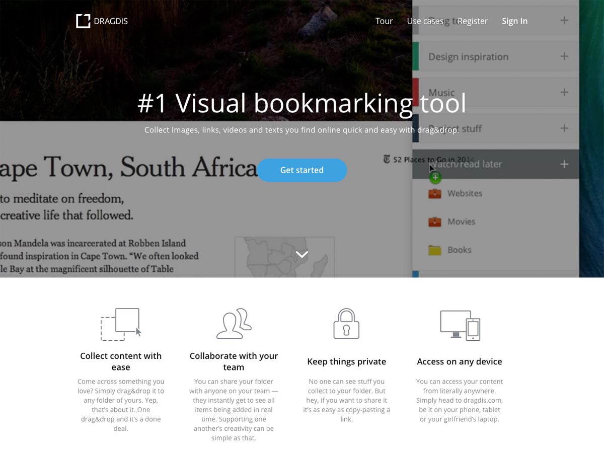
Another way to use a video is to place it as a background for a call to action. If this is done well, then you can draw attention to the call to action, while talking about your product. A great example of this use can be found on the Dragdis website:
Although the video can be a nice addition to your landing page, it is not necessary to use it. You can create a professional, effective landing without video. But in some cases the video can be very useful.
Social evidence
Social approval is a big motivator. Knowing that others are using your product or service can help convince the most indecisive.
That is why it is better to include reviews of your users on the page But make sure that they are separated from the main content. Reviews near the call to action can be even more compelling.
If you do not have reviews, think about how else you can demonstrate social approval. These can be your page likes or reposts (from several hundred to several thousand, depending on the scope of your activity).
A / B testing
A / B testing helps significantly increase page efficiency. There are a lot of factors that affect conversion, and without testing you won’t be able to figure out what really works and what doesn't.
Ideally, only one item should be checked at a time. For example, you can test two different headers, or two different colors for a button, or two layouts. But do not test all three things at once.
Here are the cases in which A / B testing is useful:
- Where is the form
- Text length
- Headline
- Subtitle
- Call-to-action button color
- Call to Action Button Text
- The text of the call to action
- Images on page
- Color page
Test how each of these elements affects the conversion separately, before deciding on the final option.
Install the most important information analytics
At this stage, you also need to install analytics of the most important information in order to track not only the test results, but also the page’s overall effectiveness in the long term.
Metrics to track:
- Time on site
- Total Conversions
- Bounce rate
If you use a landing page as a sales funnel, then watch how many people eventually passed it and where the rest came out.
Tools for creating more effective landing pages
There are many tools that you can use to quickly and easily create, test and optimize landing pages, so as not to start from scratch.
Unbounce
Unbounce provides tools for creating, publishing and A / B testing landing pages without the need to write code. The cost of tariff plans starts from $ 49 per month and includes a free trial version for 30 days.

Convert
Convert is an A / B test application. Tests can be created using a visual editor, as well as access to HTML and CSS. To use the tests on the site you need to insert a small piece of code. The application seamlessly integrates with Google Analytics. Prices start at $ 125 per month, there is a 15-day trial version.

Optimizely
Optimizely offers optimization tools with easy installation. With it, the landing page can be optimized for each specific user, which in turn can lead to an increase in conversion. They also have a free version.

Visual Website Optimizer
Visual Website Optimizer is another application that helps optimize and personalize landing pages. It includes features such as A / B testing, separate URL testing, multivariate tests, feedback, a landing analyzer, heatmaps, and more. Rates start at $ 49 per month, there is a free trial.

Inspage
Instapage helps you create responsive landings in just a few minutes, without any design skills. Pages are integrated with a large number of popular marketing tools. You can even post them on WordPress or GoDaddy. They have a free plan for sites with hundreds of visitors per month, paid rates start at $ 29 per month.

Lander
Lander helps to create landing pages specifically for small businesses. The application has a simple editor, A / B testing function and integration with Facebook Pages. Prices start at $ 22 per month, the service can be tried for free for 30 days.

HubSpot Landing Pages
HubSpot Landing Pages allows you to create landing pages in seconds and test them often and early. The application has a drag & drop editor, smart forms, responsive pages, smart content and more. This is part of the HubSpot Marketing app, which starts at $ 200 per month.

Google Analytics Experiments
Google Analytics experiments allow you to test different page variations depending on your users. They are part of a Google Analytics account.
Usability hub
Usability Hub is a website where you can test your design or layout on real people. Download your design, select the type of test (5-second test, click test, preference test or navigation), they will show it to their users, and you will receive a detailed report on the results. ( , ) 99$ .

10
Basecamp
Basecamp . , . .

Benchmark
Benchmark — . , , . (« ») .

Manpacks
Manpacks , . .

WebDAM
WebDAM , , — . , , . , , .

Shopify
Shopify — . . , , .

Invision
Invision , .

Stripe
Stripe , , . , , .

Evernote
Evernote Work Chat : « Work Chat» , . .

SuperTasker
SuperTasker , , . , .

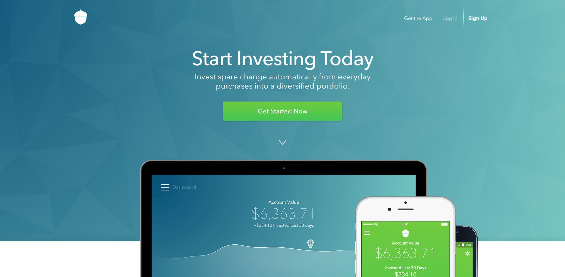
Acorns
Acorns , . , .

, , . , .
, , , .
— Flow . , . (Pricing, Features, Blog Log In) 1:1.

, . .
- .
- , .
- . .
- . , 1:1.
- . , .
- , .
- , , .
- A/B !
- , .
A good landing page can increase your conversion exponentially. Skills to create such landing pages will be useful to you as a designer, especially if it will have a good influence on the business of your customers.
Making the design of the landing is not more difficult than any other page, but for this you need to have additional information and know the best practices.
Source: https://habr.com/ru/post/263605/
All Articles