Add a hamburger to the Windows 10 application menu
Only a few days before the release of tens, and Visual Studio 2015 is already available for developers. One of the new XAML controls is SplitView. This control, like a Grid container, remains invisible as long as nothing is placed in it.
Let's analyze an example of creating a menu with a hamburger button based on SplitView. The main purpose of SplitView is to simplify navigation. In fact, this control replaces the Charm Panel, which still works in Windows 10 applications, but will not be used later. It combines well with the Navigation Framework, which is still available in Silverlight applications and is now available in Windows UWP.
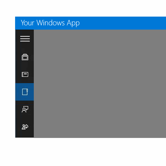
The appearance of the application window with a menu and a hamburger button is something like this:
')
Button hamburger called three horizontal stripes. You can call this button to your taste: a cheeseburger, a leggiburger, an adidas, an erroneous pregnancy test or something else.
Now seriously. SplitView contains 2 child property tags - Pane and Content. In a simplified form, together with the child elements, the control looks like this:
<SplitView> <SplitView.Pane></SplitView.Pane> <SplitView.Content></SplitView.Content> </SplitView> The content of the Pane will be the navigation bar, but Content is the rest of the contents of your application. Pane has 2 states. In the IsPaneOpen = ”false” state, the panel width is rather small, just enough to display buttons. In addition, the panel may be absent altogether. In CompactOverlay mode, let's set the closed panel width to 50 pixels. In this case, all elements inside the Pane beyond 50 pixels will simply not be displayed. Tag with attributes can be like this:
<SplitView x:Name="MySplitView" DisplayMode="CompactOverlay" IsPaneOpen="False" CompactPaneLength="50" OpenPaneLength="150"> The display mode in this case is CompactOverlay. The following picture describes other possible modes of SplitView operation:
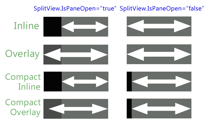
To make the picture clearer I will describe the modes with the words:
Inline - when Pane is open it pushes the content. When closed, the content returns to its original position. If the user clicks outside the panel, then it does not close.
Overlay - when Pane is open, it lies on top of the content. When closed, it is invisible. To close the panel, the user can click the screen outside the pane.
Compact Inline - when Pane is open it pushes the content. When closed, the content returns to its original position, but the Pane remains visible in a compact mode.
Compact Overlay - when Pane is open, it lies on top of the content. When closed, it remains visible in compact mode.
To display a button 50 pixels wide (for a closed panel), and then with an open panel to show some other elements, it will be convenient for us to use a horizontal layout StackPanel.
So, we use the StackPanel with a vertical layout, inside which there are panels with a horizontal layout:
<StackPanel Orientation="Vertical"> <StackPanel Orientation="Horizontal"> <Button x:Name="MenuButton1" FontFamily="Segoe MDL2 Assets" Content="&# xE825;" Width="50" Height="50" Background="Transparent" Click="HamburgerButton_Click" /> <TextBlock Text="Button 1" FontSize="18" VerticalAlignment="Center" /> </StackPanel> <StackPanel Orientation="Horizontal"> <Button x:Name="MenuButton2" FontFamily="Segoe MDL2 Assets" Content="&# xE10F;" Width="50" Height="50" Background="Transparent"/> <TextBlock Text="Button 2" FontSize="18" VerticalAlignment="Center" /> </StackPanel> <StackPanel Orientation="Horizontal"> <Button x:Name="MenuButton3" FontFamily="Segoe MDL2 Assets" Content="&# xE1D6;" Width="50" Height="50" Background="Transparent"/> <TextBlock Text="Button 3" FontSize="18" VerticalAlignment="Center" /> </StackPanel> </StackPanel> As you can see, the content of the horizontal StackPanel is the 50 px wide button and the text that becomes visible only when the panel is open.
Pay attention to the font that is used to display pictures on the buttons - glyphs.
In Windows 8.x, we searched for glyphs in the Segoe Symbol font that was present in the system. In the 10-ke also present a new font Segoe MDL2 Assets. In the meantime, MDL2 stands for Microsoft Design Language 2.0. This font contains the hamburger icon we need.
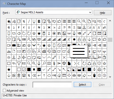
You were not going to use pictures for jpg / png / gif icons? Vector characters from the font are much better than bitmaps.
The event of pressing the button HamburgerButton is such a simple code that opens the panel:
private void HamburgerButton_Click(object sender, RoutedEventArgs e) { if (!this.MySplitView.IsPaneOpen) { this.MySplitView.IsPaneOpen = true; } } Pane can contain not only buttons and text, but also any other controls that seem appropriate to you. One of the controls recommended for it is RadioButton.
If we want to set a glyph directly to the RadioButton value, we cannot do this. But to get around this is quite simple by specifying the content binding to the tag like this: Content = {TemplateBinding Tag}
To get full control over the tag, you can carry it by attributes:
<RadioButton Content={TemplateBinding Tag}> <RadioButton.Tag> <TextBlock Text=” ” /> </RadioButton.Tag> </RadioButton> Thus, it is possible to use not only text as a tag, but also, for example, an image (replacing TextBlock with Image).
SplitView.Content inside can contain a Grid or some other layout element:
<SplitView.Content> <Grid> </Grid> </SplitView.Content> as well as the Frame element, which allows us to navigate through the application's content: <SplitView.Content> <Frame /> </SplitView.Content> In this case, usually above the button, a hamburger is usually added with the “Back” button in order to make navigation easier.Based on
Windows 10 SplitView - Build Your First Hamburger Menu
Implementing Awesome Hamburger Button with XAML's New SplitView control in Windows 10
Video on Channel9 Developer's Guide to Windows 10 Preview: (05) SplitView Control
Source: https://habr.com/ru/post/263363/
All Articles