How to designer to prepare the transfer of Android applications to the developer
When cutting graphics for applications, there are often a lot of difficulties: from resolving devices and problems with grids and Google recommendations to directly transferring the application to the developer. For 2 years I have been working on the design of more than 10 applications, I learned how to find solutions to a variety of problems and make it so that in the end the application looks the same as in design.
This will be discussed under the cut.

')
xxxhdpi - maximum resolution
Specification
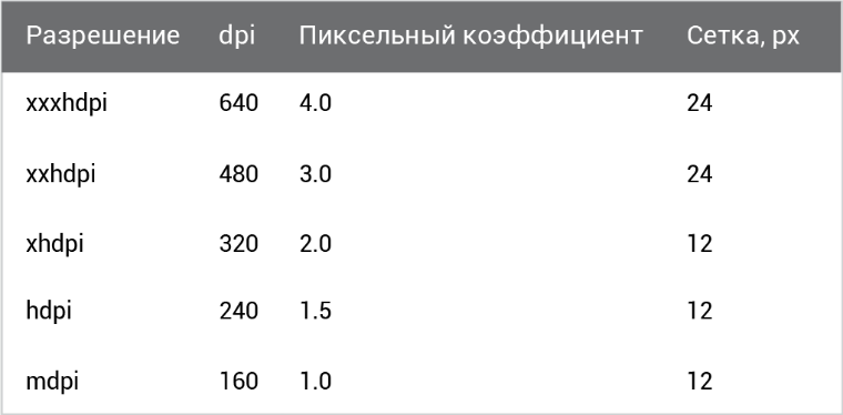
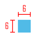
When creating a specification, you must ensure that the interface elements are on the grid. The grid size for XXH is 24 px, for other resolutions 12 px. (see table above)
We can not edit all the menu items, we can only set the color (data for the menu is in the material design )
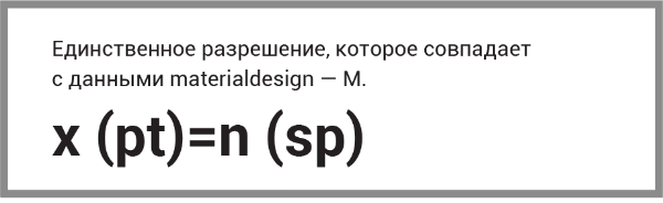
Each element must be entered in the grid. Google recommends pinsetting in SP (12, 14, 16, 20, and 34). SP is a universal font size that is calculated:
x (pt) * 3 = n (sp)
What is it for
In Material Design, the sizes in sp and dp, because in Android, the resolutions, as well as the height, and the width of the screen, are different from different manufacturers, while sp and dpi are universal. But we draw all the same in the maximum resolution, because the application will drag on in different ways, depending on the device.
Cutting
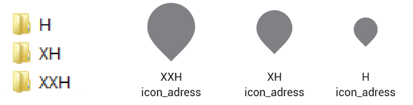
A “cut” folder is created (later it is transferred to the developer), in which, in turn, folders are created with the necessary permissions, for example, XXH, XH, H. After creation, the item is placed in a folder with the appropriate resolution and name.
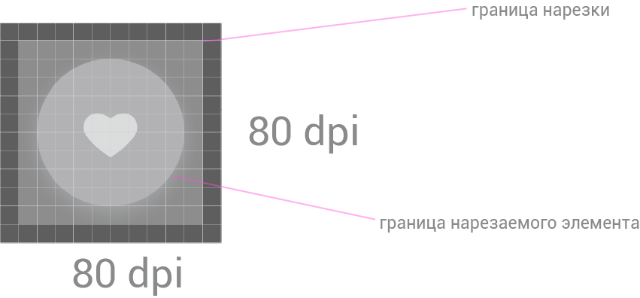
The size of the sliced elements must be a multiple of 3 and recorded in dp. That is, if the size of the icon is 240 px, then we write down the size of 80 dp.
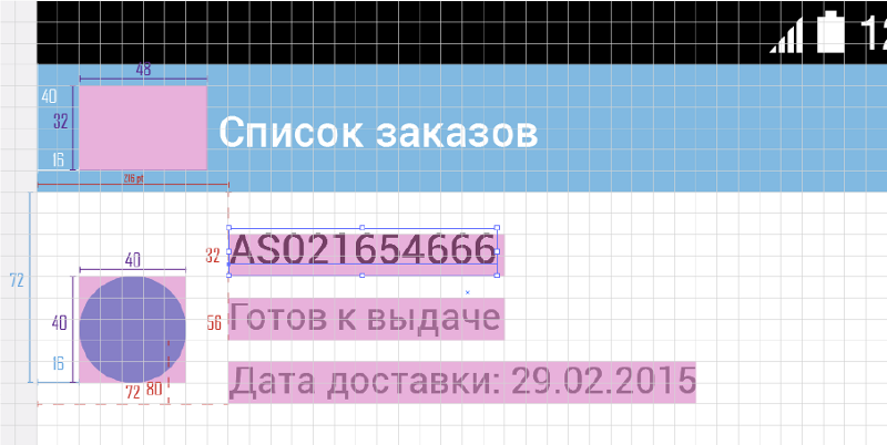
In annotations we sign indents, sizes of graphic elements, font sizes.
By the way, there is a handy program for annotations specctr pro
These numbers are the coordinates of the element in the X and Y axes. They are necessary for the developer to enter the coordinates of the element and the element to fall into place. I understand that there are a lot of sizes and lines and you can get confused. I propose to introduce logic: the size of graphic elements should be signed in one color or in outline.
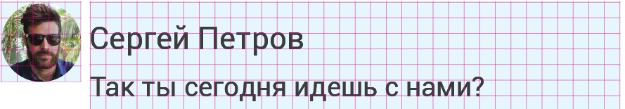
Standard elements (bar, alert, delimiters) do not need to be signed, the maximum is to be highlighted in color, but it is always better to check with the developer.
An example of font annotation, color and size of delimiters:

Graphic elements (buttons)
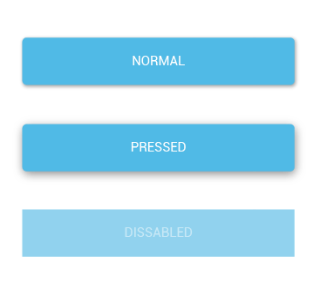
Always keep in mind that the buttons have three states. Do not forget to draw them, otherwise the developer will have to do it for you.
In Android, a graphic element has a property to stretch in all directions, if it consists of one color:
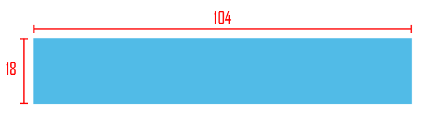
So the button looks short:
We cut, check layouts, graphic elements, make annotations and transfer to developers.
And do not forget to make a review!
If you have any questions / suggestions / comments, please write in the comments.
PS: There are very few materials on this topic; if you have them, please share;)
This will be discussed under the cut.
Permissions
')
xxxhdpi - maximum resolution
Specification
When creating a specification, you must ensure that the interface elements are on the grid. The grid size for XXH is 24 px, for other resolutions 12 px. (see table above)
We can not edit all the menu items, we can only set the color (data for the menu is in the material design )
Each element must be entered in the grid. Google recommends pinsetting in SP (12, 14, 16, 20, and 34). SP is a universal font size that is calculated:
x (pt) * 3 = n (sp)
What is it for
In Material Design, the sizes in sp and dp, because in Android, the resolutions, as well as the height, and the width of the screen, are different from different manufacturers, while sp and dpi are universal. But we draw all the same in the maximum resolution, because the application will drag on in different ways, depending on the device.
Cutting
A “cut” folder is created (later it is transferred to the developer), in which, in turn, folders are created with the necessary permissions, for example, XXH, XH, H. After creation, the item is placed in a folder with the appropriate resolution and name.
The size of the sliced elements must be a multiple of 3 and recorded in dp. That is, if the size of the icon is 240 px, then we write down the size of 80 dp.
Annotations
In annotations we sign indents, sizes of graphic elements, font sizes.
By the way, there is a handy program for annotations specctr pro
These numbers are the coordinates of the element in the X and Y axes. They are necessary for the developer to enter the coordinates of the element and the element to fall into place. I understand that there are a lot of sizes and lines and you can get confused. I propose to introduce logic: the size of graphic elements should be signed in one color or in outline.
Standard elements (bar, alert, delimiters) do not need to be signed, the maximum is to be highlighted in color, but it is always better to check with the developer.
An example of font annotation, color and size of delimiters:
Graphic elements (buttons)
Always keep in mind that the buttons have three states. Do not forget to draw them, otherwise the developer will have to do it for you.
In Android, a graphic element has a property to stretch in all directions, if it consists of one color:
So the button looks short:
We cut, check layouts, graphic elements, make annotations and transfer to developers.
And do not forget to make a review!
If you have any questions / suggestions / comments, please write in the comments.
PS: There are very few materials on this topic; if you have them, please share;)
Source: https://habr.com/ru/post/263303/
All Articles