New tab engine for cloud IDE
')
Content
- Introduction;
- Part 1. Tab mechanisms in existing IDE;
- Part 2. Results of the study;
- Part 3. Our tabs mechanism;
Introduction
About mr. Gefest
Mr. Gefest is a cloud-based IDE — all in one (combines the functions of several programs) for web developers. Its goal is to reduce the daily work time when creating websites by 2-4 hours. To do this, we rethink each mechanism, technology and element of the IDE, carrying out their in-depth analysis, not dwelling on established beliefs, to make mr. Gefest'a most convenient and efficient. With each release we are getting closer and closer to achieving the project’s goal (to reduce the daily working time when creating websites by 2-4 hours).
In today's world, we have to deal daily with interfaces that either evolve in the direction of “beautiful” without functionality, or with functionality without convenience.
At the initial stage of development mr. Gefest I laid a few rules in it. One of them says: "To create only functional, convenient and aesthetic interface elements."
Following this rule is not easy. Sometimes you have to completely change some interface element for which you spent several weeks, because at the testing stage (when creating websites in mr. Gefest), it didn’t simplify the work of web developers enough.
The tab mechanism is one of the frequently used UI elements in development environments. Despite the fact that all the implementations of this technology have many drawbacks, no one has ever fundamentally changed them. For this reason, we decided to rethink his concept and create the most effective tab mechanism.
In this article, we will look at the existing tab9 mechanisms in Cloud9, PHPstorm, Sublime Text3 and Bracket, their disadvantages and advantages, and also tell you about the implemented solution in mr. Gefest'e.
Part 1. Tab mechanisms for existing IDEs.
Cloud9
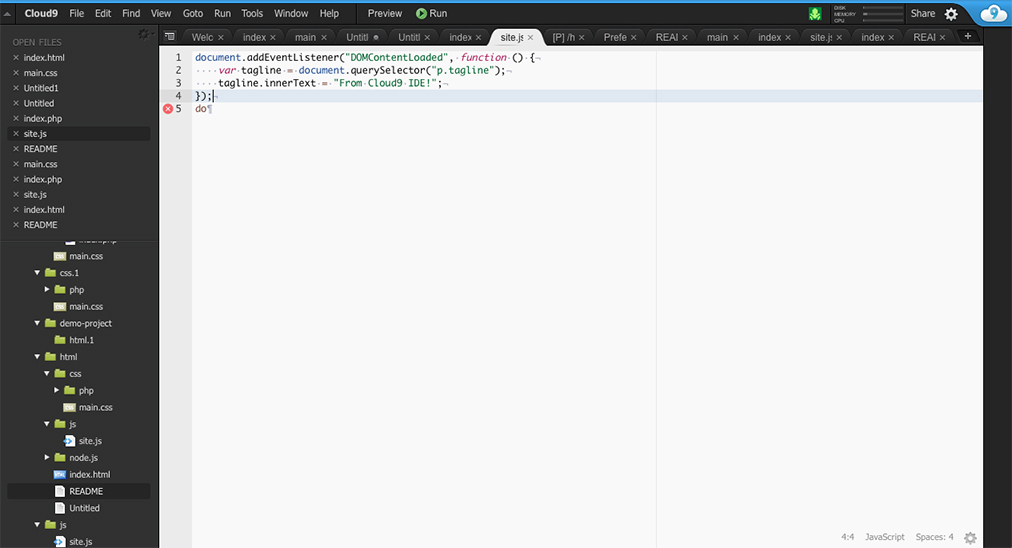
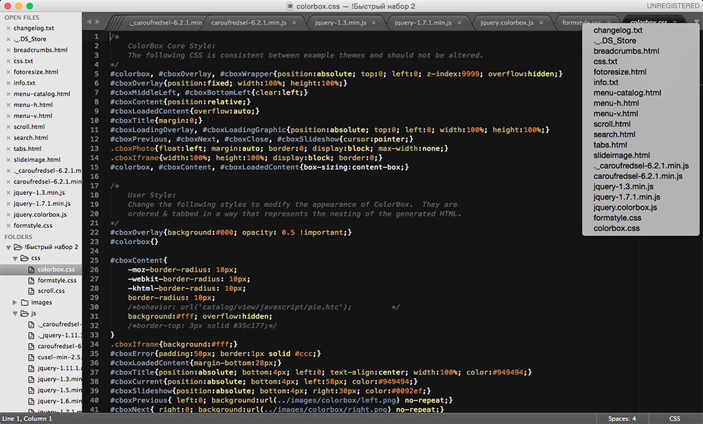
In Cloud9, the tabs are in two places: above the text editor and above the file manager. When opening a large number of files, it is impossible to read their names and you cannot find out their full path. On the panel above the text editor there is a button to open the list of files. All tabs except the current one (the text in the lower right corner) cannot find out the syntax used.
Its tab mechanism is located in three panels, which means that the interface is cluttered up unnecessarily.
Benefits:
- has a familiar implementation;
- There are two ways to work with tabs;
- there is a button "Close" for each tab;
- there is a button "Create file" on the panel above the text editor;
Disadvantages:
- not informative;
- takes a lot of space;
- inconvenient to work with tabs and file manager at the same time;
- when opening a large number of tabs and when working through a panel above a text editor, it is impossible to read their full names;
- tabs reduce the size of the file manager;
- no file preview;
- the “Create file” button takes up additional space in the “Tabs” panel;
- It is impossible to find out the shortcut to the file in all tabs at once;
- It is difficult to select a specific tab from several when they have the same file names, because their location is unknown;
Bracket
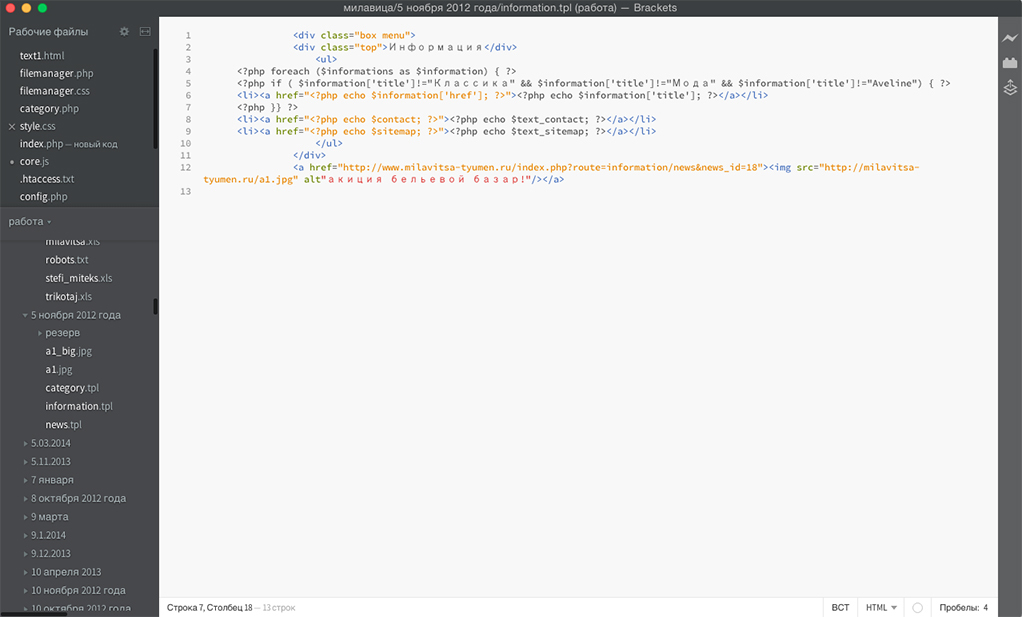
In Bracket, the mechanism in question is in the left pane as a list of files and occupies a specific height, so it’s more convenient to work simultaneously with the file manager and tabs than in other IDEs with a vertical implementation. If you look at the way tabs are displayed, you can see that their names and extensions have a different color. All tabs, except the current one, cannot determine the full path and syntax used.
Benefits:
- tab names are fully displayed;
- there is ease of movement in the vertical list;
- name and extension have a different color (for open files);
- the “Close” button appears when you hover over a tab;
Disadvantages:
- the implementation of this mechanism is not informative;
- it is not convenient to work with tabs and file manager at the same time;
- sometimes full filenames do not fit;
- unusual implementation;
- tabs reduce the size of the file manager;
- there is no file preview;
- not used syntax for all tabs;
- It is impossible to find out the shortcut to the file in all tabs at once;
- It is difficult to select a specific tab from several when they have the same file names, because their location is unknown;
Phpstorm
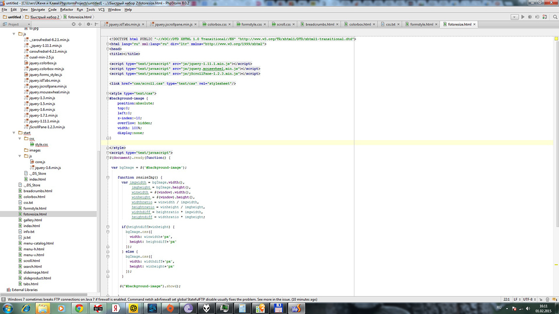
This IDE has an open file mechanism implemented in the form of a horizontal panel above a text editor. And he has his zest. When the panel is completely filled with tabs and you open a new file, the oldest one of them closes. On the one hand - it is convenient, on the other - not. And if you need to open a tab that has been deleted from this panel?
For the current file, the full path is displayed in a separate interface space. This means that the tab mechanism takes up two UI panels.
All tabs are not informative enough and have only complex icons indicating their extensions.
Benefits:
- has a familiar implementation;
- each tab has an image showing its extension;
- uses an unusual way of working with tabs with a large number of them;
- all open files have a "Close" button;
Disadvantages:
- not informative enough;
- occupies two panels;
- Old tabs have to be reopened via the file manager (because they are automatically deleted from the tab bar);
- It is difficult to select a specific tab from several when they have the same file names, because their location is unknown;
- the number of tabs depends on the screen resolution;
- no file preview;
- It is impossible to find out the shortcut to the file in all tabs at once;
Sublime Text 3
ST3 developers are trying to improve their tabs mechanism. This is evidenced by their innovations in ST3, which were not in ST2.
In the interface, it occupies two panels: the left, where you have to jump from the tabs to the file manager, and the right above the text editor.
Tabs on both panels are not very informative. The syntax of the current file is displayed as text without an icon on a small panel (under a text editor) that you rarely pay attention to. The remaining tabs cannot identify the syntax used. If you hold the mouse pointer over the elements of the mechanism in question for a long time, you can sometimes find out the full path to them.
On the top panel there are three buttons: two switches that allow you to navigate through hidden tabs, and a button to view the full list of open files.
Benefits:
- there are different options for the location of tabs;
- displays the full names of open files;
- there is a button "Close" for each tab;
- switches for switching between hidden tabs;
Disadvantages:
- has not enough informative tabs;
- the open file mechanism takes up a lot of space in the interface;
- no file preview;
- inconvenient to work with FM and tabs on one panel;
- the path to the file is not always displayed;
- It is difficult to select a specific tab from several when they have the same file names, because their location is unknown;
- It is impossible to find out the shortcut to the file in all tabs at once;
Part 2. The results of the study.
Display the results of the study in the comparative table:
IDE  | ADVANTAGES | LIMITATIONS |
|---|---|---|
| Cloud9 |
|
|
| Bracket |
|
|
| Phpstorm |
|
|
| Sublime Text 3 |
|
|
After analyzing the table, we derived two types of tabs:
- horizontal list of tabs above the text editor;
- vertical list of open files in the left panel;
They have the following advantages and disadvantages:
| Tab mechanisms | ADVANTAGES | LIMITATIONS |
|---|---|---|
| horizontal tab list above text editor |
|
|
| vertical list of open files in the left pane |
|
|
Part 3. New tab mechanism.
We decided to stop putting up with this situation and try to create a new solution.
The new mechanism is not only unusual, but also comfortable, beautiful and effective. This is one of those interface elements that has evolved over several months. It has never been removed, because all this time it has improved the performance in developing websites.
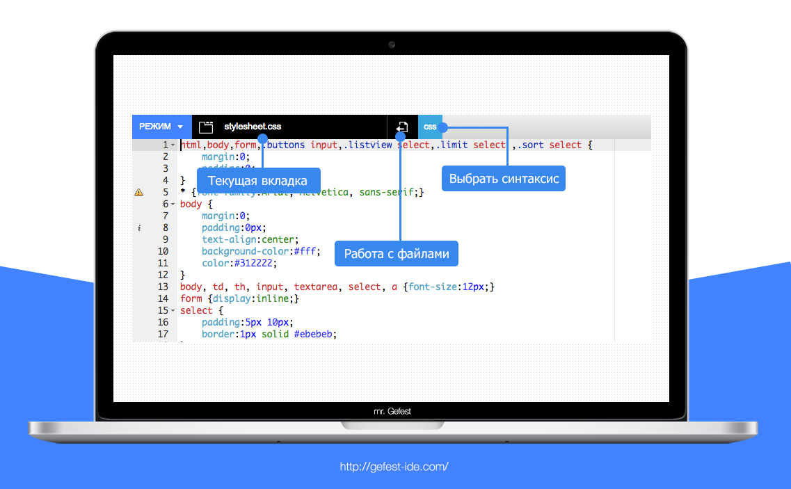
This tab mechanism fits nicely into the area where the main menu should be (we don’t have it, but that’s another story), and doesn’t take up extra space. This allows you to increase the space for a text editor, which is very beneficial in the case of additional browser panels. This way of display does not clutter up the interface, but it allows you to see everything you need: the current open file and its syntax.
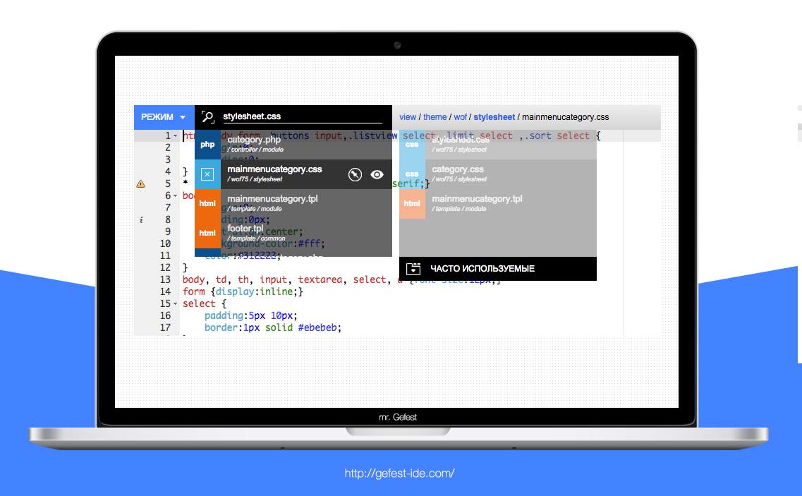
In the interface mr. Gefest we combined three functional parts (tabs, work with a file and the choice of syntax) into one logical block, since their functions often intersect with each other when developing websites.
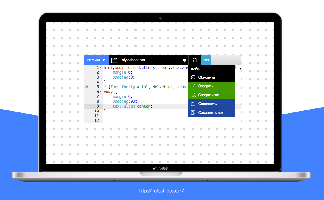
When you hover the mouse over the icon “Document with an arrow,” the menu “Working with a file” appears. Through which you can create a new file, save it or update (downloading from the server again). As you can see, the functions are separated by colors, which clearly distinguish between the purpose and the tone of the semantic load coincide with the tones of the context menu of the file manager (this is also a separate story).
We try to achieve a single information field for each interface element, intersecting their colors (color, text, and others) so that the work with the interface is at an incomprehensible intuitive level.
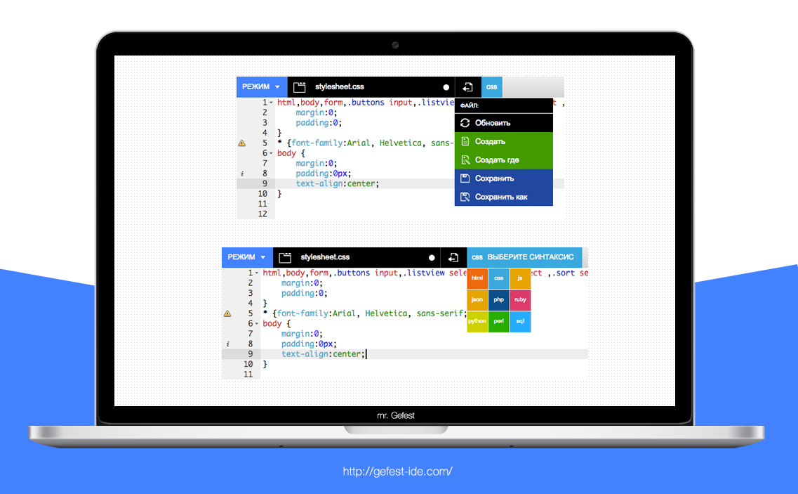
Choosing the necessary syntax for an open file has now become very simple. You do not have to look for it in a long list of confusing main menus or through a text editor panel.
In it there is an association of syntax with color, which will allow you, without reading the name, to intuitively change the programming language. In this format, nothing needs to be found, everything is quick and clear.
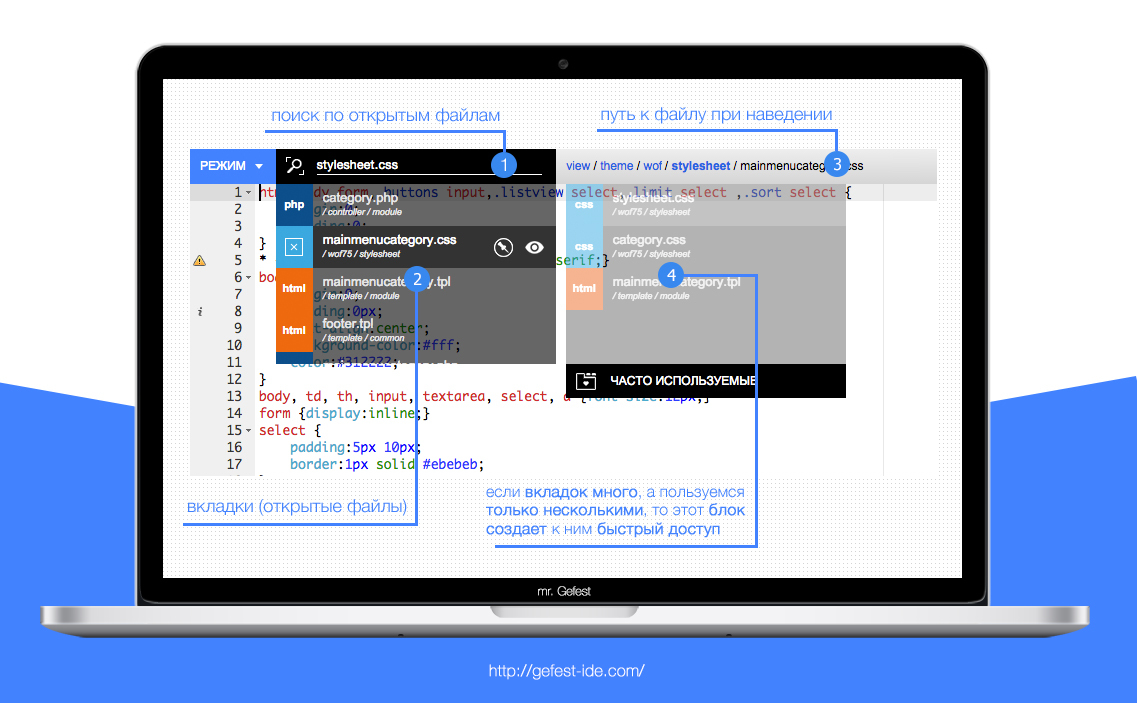
When you hover on a new mechanism opens a list of tabs, search for them and a block of frequently used open files.
Looks stylish, minimalist and futuristic. Displays all the necessary information.
When you open this list, the current tab is displayed in the search field, but as soon as you click on it, the text disappears and you can enter the name of any open file. This will allow you to instantly find the desired tab, when you have a lot of them! If you have not entered anything in the specified field, the name of the current tab is returned.
Sometimes when developing websites, the number of open files can reach a large number, although you only work with a few of them. For such a case, a special unit was invented. The tabs that you most often use in a specific period of time fall into it using a special algorithm. It is very convenient!
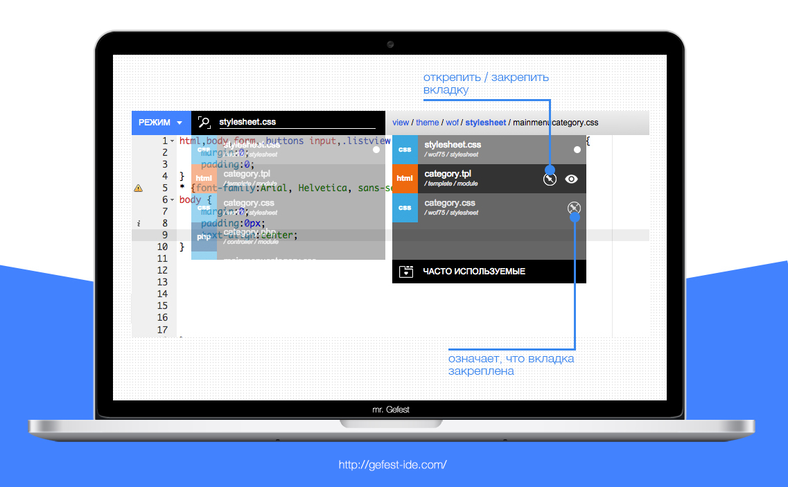
In addition, each open file has a special “Fasten / Unpin” button. It allows you to attach a specific tab in the "Frequently used" block. So, popular files are always at hand!
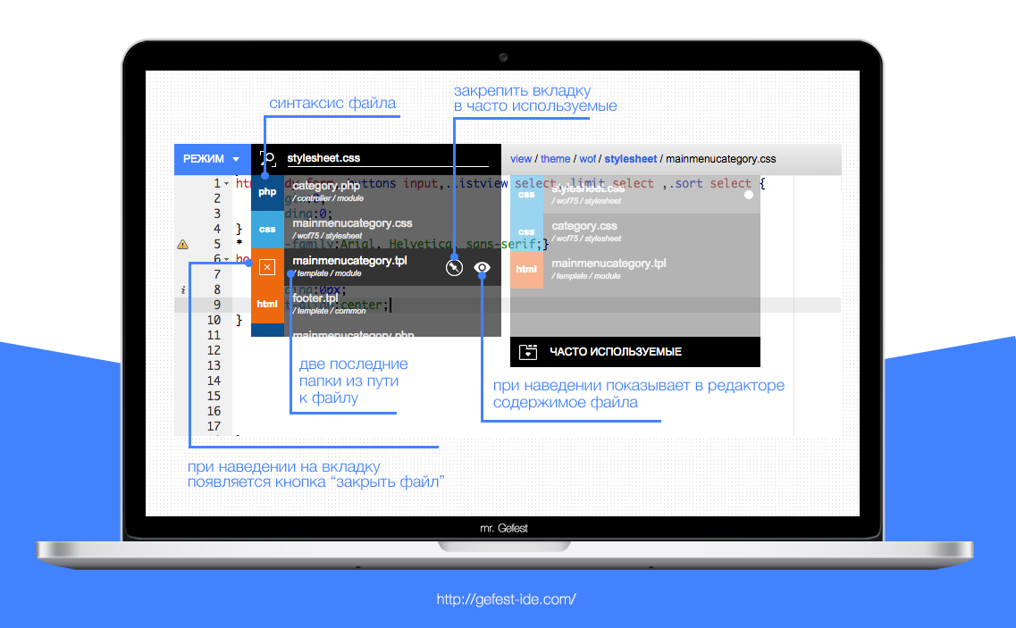
Each tab has all the important information:
- file name;
- the last two folders before the file;
- syntax;
- full path to the file;
The syntax icon is not made in the form of a complex image, but in color and text. This tricky trick after 1-3 hours of work in the development environment allows you to associate color with a specific syntax. This approach gives you the opportunity to select a tab not only by name, but also by syntax. The color tones of the programming languages used in the tabs are completely identical to the tones in the syntax selection block.
Specifying the last two folders in each tab allows you to see the differences in open files with the same name.
When you hover the mouse over a specific contribution, instead of the name of the syntax, the Close button, the full path to the file and the Eye icon begin to appear.
The last folder of the full path is highlighted in bold, and the file name in it is displayed in black.
If you hover the mouse over the tab “Eye” icon, you can see its contents in a text editor without opening it. So you can quickly view each file.
This tab mechanism has one noticeable flaw - the unusual, which disappears in an hour of work in mr. Gefest'e .
But the benefits are much greater:
- You can see the full path to the file in any tab;
- Does not take up much space in the interface;
- Each tab displays its full name, syntax and the last two folders before it;
- You can view the contents of the file without directly opening it (via a special button);
- All important information about the file can be easily seen even with open 50+ tabs;
- It has a tab search by name;
- The easiest and most intuitive way to choose syntax
- The block of frequently used tabs allows when opening a large number of files and using only some of them, to switch between them without a long search;
- An association occurs between the color and syntax of the file;
- There is a button "Close" for each tab;
- The choice of syntax, work with the file and tabs are combined into one logical block;
- The last two folders allow you to distinguish between tabs with the same name;
And now we will look at the comparative table of the three tab mechanisms:
| Tab mechanisms | ADVANTAGES | LIMITATIONS |
|---|---|---|
| horizontal tab list above text editor |
|
|
| vertical list of open files in the left pane |
|
|
| tabs in mr. Gefest |
|
|
As can be seen from the table, the mechanism of tabs from mr. Gefest is ahead of its peers.
We understand that at first glance you can aggressively treat this innovation, but we hope that before you do this, wait for access, where you can use all this in practice and after that you will formulate the final conclusion, because its effectiveness has been tested. with real site development by us and users of the cloud IDE mr. Gefest.
In every element of mr. Gefest, we put our soul and energy, trying to make new and effective technologies, analyzing a large number of programs (both modern and obsolete) and conducting a lot of different kinds of simulations. We hope that you have felt our energy and charged it.
We wish everyone a productive and interesting work!
Important information! Now we are looking for reliable partners for our product, especially Russian hosting providers. Please write to email: support@gefest-ide.com

Source: https://habr.com/ru/post/263257/
All Articles