Unification through the "burger design": Mail.Ru Group framework for content projects
In the first part of the story about the unification of the Mail.Ru Group product line, I described our first approach to the projectile — a solution for the mobile web . In addition to creating a single style and principles of the interface for a dozen services, we were able to restructure the design process from the classic “prototype → layout → layout → code” for each screen to a more efficient and modern framework-based. In the second part I will talk about the transfer of more complex and large-scale versions of sites to the same technology - as our “Bootstrap on steroids” has become even more powerful.
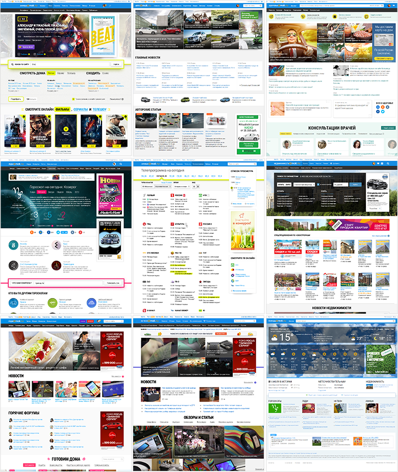
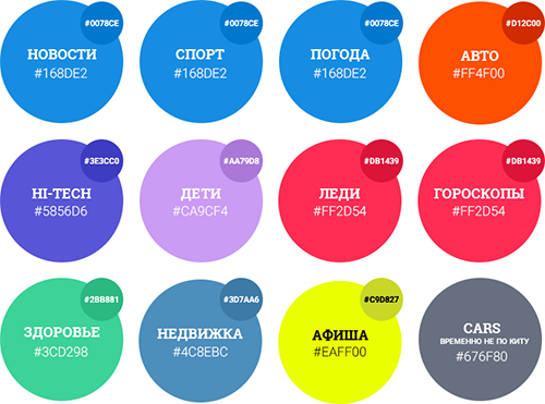
Poster , Auto , Health , Horoscopes , TV , Real Estate , Lady , Hi-Tech , Weather
In the spring of 2012, 11 content projects were transferred to our Mail and Portal division - Auto, Playbill, Horoscopes, Children, Health, Lady, Moto, News, Weather, Sport, TV. Many of them are leaders in their niche in Runet. But the history of creation and development each had its own, so that the design was made in its own way, often on an outsource, without systematization and development of common approaches and solutions.
')
For our team, bringing their appearance and work logic into order became one of the main tasks. And later - and the need to unify the approach to design. A simple and clear solution - interface-visual guidelines for the entire product line. They should make the user's work understandable and predictable - it is easy for him to move from one site to another and not understand new patterns of interaction. It also strengthens the brand. And as a nice bonus, it makes it easier for the product team to develop and support services.
But as our experience has shown, static interface specification is not enough :
Without technical solutions can not do . Only by transferring the reference design from static documentation to the implementation level, can the chain be reduced to “specification = design = layout → implementation”. And that means to get rid of the hemorrhoids heap on the introduction, improvement and support of products.
Many large companies are already moving in this direction, which greatly simplifies their lives and unleashes their business development. Good design can and should be obtained cheaply and quickly, which is impossible to achieve when working with your hands. What could be this technical solution? There are two options: simpler when you make your “ little Bootstrap ” and more complicated, creating a full-fledged system of components .
The first option is cheaper and faster to create - you already get a profit from easier support, inexpensive design experiments and easy prototyping. Although in fact you just take a set of HTML / CSS styles that can break when used in a real product. Over the past few years, many visionary articles have appeared on this topic - for example, from Mark Otto and Dave Rupert , and a huge number of companies are already working on this principle .
https://speakerdeck.com/mdo/build-your-own-bootstrap
The second option is more expensive to create, but at the exit you have guaranteed the quality of the implementation of the design and all the benefits from the simplicity of updating the products. We in Mail.Ru Group went in this direction. This approach has 5 levels of maturity:
There are not so many companies on the way of the finished components, but there are very powerful examples from Intuit with their Harmony ecosystem, Lonely Planet solution based on the Rizzo framework and, of course, Google's Polymer Project , which implements Material Design.
Historically, many Mail.Ru Group services as a portal were largely aggregators of content from third-party projects. We have a large audience by provoking popular products (Mail, home page, instant messengers). And she is interested in more niche things - for example, news about cars, family, city events. At the same time, the main entry point for some of them is the Mail.Ru main page - there is a list of especially popular materials on it, updated several times a day, so that users read the news from here.
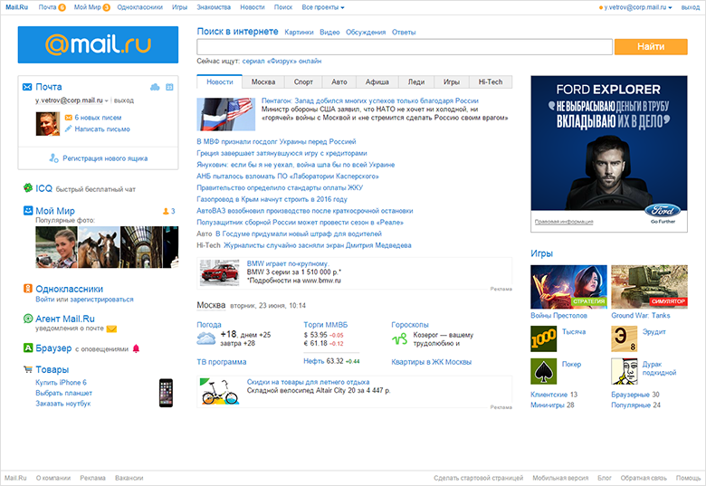
Mail.Ru home page
As a result, the user gets immediately to the news, bypassing the product main page. And often closes it, returning to the main Mail.Ru. At the same time, in many cases, not realizing the difference between services - for him all this is news.
Therefore, one of the key product challenges after the transition of content projects to our division was the reduction of dependence on the main page for each of them. To get their audience products forced to create their own content, work with positioning and identity, SEO and SMM. And it gave a noticeable effect.
It was also necessary to extend the user's path through the site from the news page . And for traffic from the main Mail.Ru, and for SEO, and for SMM - this is the first place where it goes. The output was numerous strapping of relevant content - for example, films and actors for Posters, diseases and consultations for Health, announcements of used cars in Auto. Of course, you also need to solve the problem of increasing the depth of viewing and other indicators.
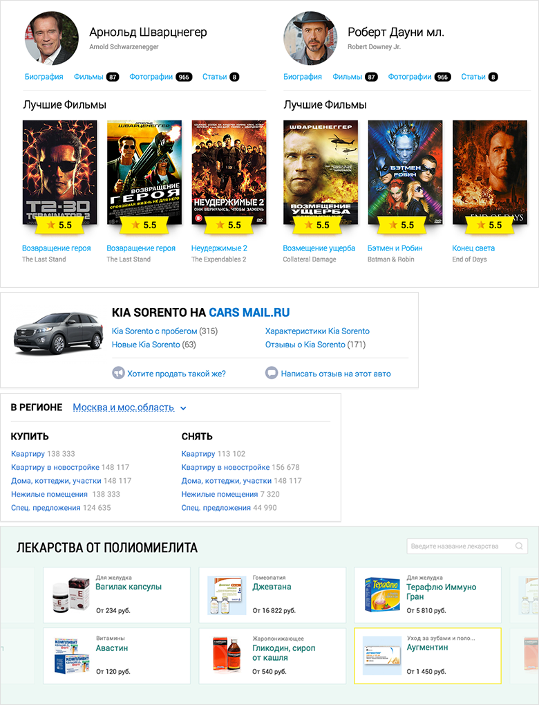
Binding content on the topic
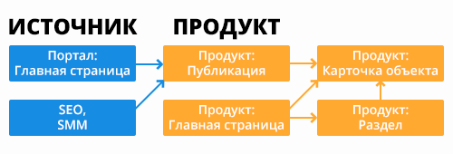
Navigation Path Chart
Starting work on a new playbill at the end of 2012, we took the "burger" approach as a basis. This is a series of "belts", "lines", "inserts" or "containers", which is actively used in modern promotional sites, and mobile are built around the same principle. At that time, the approach was not as massive as it is now, so it should have turned out still fresh.
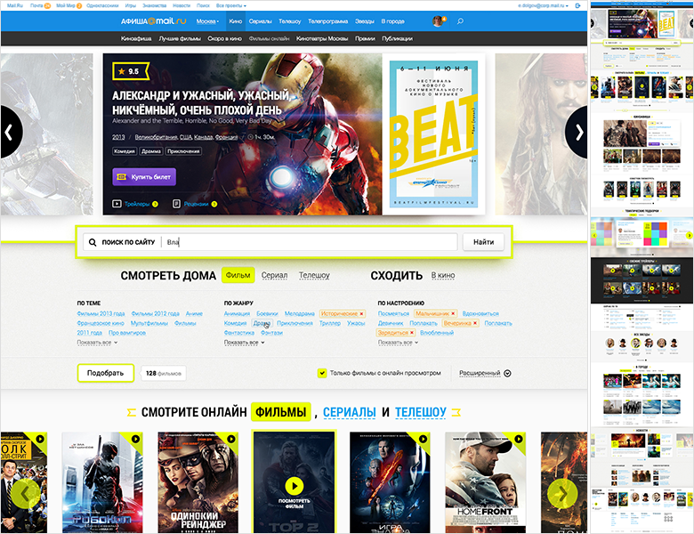
Poster Mail.Ru, spring 2013
Unlike the usual column structure, in which the content is squeezed into a “glass”, the “burger” allows you to get a more effective magazine design with lots of free space, large fonts and illustrations. Each "belt" can have its own layout, which allows a great variety of content presentation.
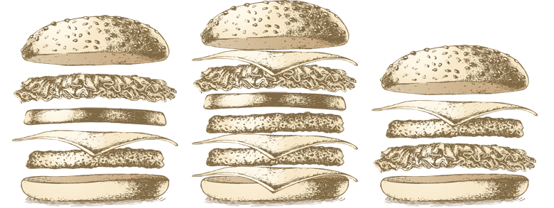
How to make a burger
But the most pleasant thing is the convenience of such a structure in work . Belts can be easily added and removed from the page, swapped. Or reused on several pages without the need to take into account adjacent columns (albeit with some reservations - on some pages we have not yet managed to solve this problem). It is easy to assemble special projects and new pages - just like in a burger, you just need to put the components between the buns, i.e. caps and footer. A nice bonus - managers can no longer engage in cheating like “let's add this block to the column”, trying to avoid prioritization. What is higher is more important.
Konstantin Weiss from Information Architects describes the advantages of burger design in the concept of " containerist ". In its terms, a layer or belt is a container:
Ideology "Containerist"
Adaptability is no less simple - no need to think about the complex logic of the flow of columns. The order of the “belts” in the big web and on the mobile is the same, only the number of elements in the inset changes, and blocks with horizontal scrolling often turn into a classic list. On the tablets, the changes are simple.
True, there are problems:
We carefully recorded all this for further research and began to wait for the first working versions for verification.
One of the strategic objectives for the company is to bring all products to a single form. At the same time, it is important for products themselves to have their own face, increasing their brand awareness and value, in order to further reduce dependence on traffic from the Mail.Ru main page. How to satisfy both requirements so that the interfaces are always familiar and understandable for the user, but the services do not turn into just an appendage of the portal? We found the right solution, but not immediately.
"Burgerny" format - our second approach to the unification of content projects. It all started with the redesign of News in spring 2012. This is a key product in the lineup with 4.5 million unique visitors per day. The interface had a lot of thematic, partner and advertising dodgers, as well as duplicating each other menu. The work went on two fronts.
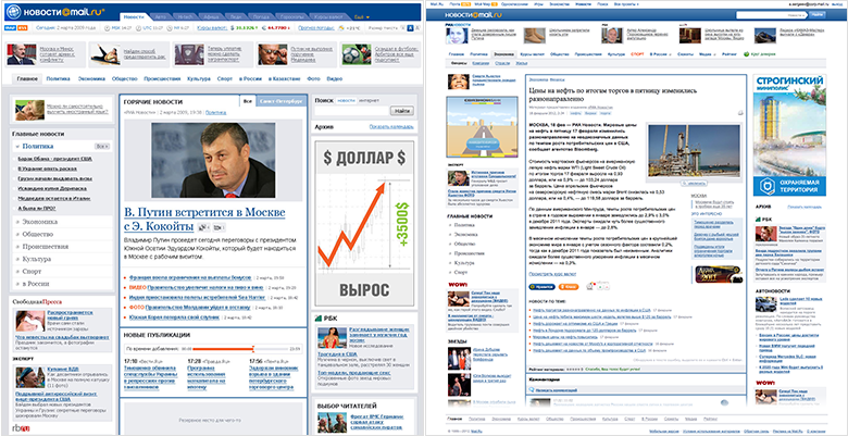
Mail.Ru news, the beginning of 2011: main , news
First, the news page as the main landing page and the most visited of all. It was important to get rid of the left column so that the eye first saw the content of the material, and not the minor body kits. I really wanted to clearly distinguish between the main content, materials on the topic, advertising and affiliate links - this is a big problem for news sites at that time, and now too.
News Mail.Ru: News page
The solution was the layout of "1 + 2" - the most visible and large area is given under the content, and on the right is a dual column of advertising and partner blocks. This focuses the user on basic information, and everything that accompanies it is neatly collected side by side. Due to the increase in the cost of advertising space managed to get rid of the dodger. And sticking the column when scrolling helped to clean the holes arising from the different heights of the news. At the end of the page is placed a standardized footer with the themes of the day and another “exchange”.
Zoning Information
Secondly, the main and pages of headings - here we have more freedom. Home is visited by an order of magnitude less than the rest of the screens, so you can donate part of the dodger and make the project face was spectacular. We declared war on the columns - as a rule, this is a warehouse of something that restricts and damages the layout of the page. Thanks to this, the main one became “lower case”. She looks more collected and more comfortable working with her. Probably from there came our future "burger" approach. The rubrics are more complicated - there is more traffic and it was necessary to leave the “1 + 2” approach.
Mail.Ru news: home page
The launch of the News was not without problems, it was necessary to twist the key indicators - many blocks did not work as expected. But when Sport was launched on the basis of the same guidelines, the problem arose with only one of the navigation elements. The rules worked!
We immediately thought about styling content projects - we wanted to have a single interface solution that would be adapted to the theme and audience with the help of color schemes, fonts and decorative elements. And they have already begun to translate other products into it - Sport, Children. True, they turned out, though similar in structure and visually successive, but different in their approaches to creating and supporting projects. In addition, problems later appeared when working with tablets - the “1 + 2” layout required a separate version for them, since in portrait mode there was no space for the three columns and a horizontal scroll appeared. There was also a technical solution that would severely limit unnecessary discrepancies.
Sport and Kids Mail.Ru
So with this understanding of the pros and cons of our unified design, we took up the poster ...
We have already passed this way for the mobile web - together with the developers came up with and created a design and technology framework . By the end of 2013, it launched a dozen content projects, so the approach was run-in.
However, doing sites for mobile and large web on the same technology is not exactly the same thing . There are a lot of differences and nuances - at least the fact that in mobile there are only two types of list views (a list and a slider with hard-coded illustrations), and in a large web there is much more variety. But again, praise our development team - the guys appreciated the challenge and the possible profit from the implementation, fitting into this challenging, but extremely important and interesting project.
Initially, the framework was organized as follows:
If we find a new solution for an old block or component (for example, a new type of photo galleries), it changes in a single code base. After that, each project updates it from the common repository (with strong changes, the incoming content is also updated). In this case, the designer needs to check only one implementation in a single code base, instead of tracking each of the services. And you can be confident in the quality of implemented design. More about the framework, my colleagues and I will tell in the third part of the article.
In the mobile version, the same page template is used for the server and the client, and then the final HTML is generated from it in the user's browser using V8. This model works despite the fact that historically projects have been written in different programming languages. But in the big web the story is more difficult - it is important to give the final HTML to the browser , i.e. generate it on the server side. Therefore, the development team had to find a way to communicate with the “stand-alone” demon v8 for each programming language. My colleagues will describe in detail the technical part in a separate article.
This is not an easy project. But the approach with the transfer of design to the level of technical implementation is crucial for both designers and companies:
We want to use not the hands, but the head of the designer . Due to the reduction of the routine, it is possible to transfer the focus to product challenges and solving less visible, but also important design problems. Increasing the main metrics, nice animation, subtle nuances of adaptability, bringing advertising into a human form - in an endless stream they did not always have enough time.
The company is also in the black. Minus the input price of transferring products to the platform, it gets a systematic approach to improving the efficiency of products, accelerating the launch of new functions on the market, guaranteed design unification. The ability to speak a common language helped us to convince the management to invest in the framework - the initiative to create it came from below. How to find this language, I wrote in my article about UX-strategy .
By the fall of 2014, we came up with 4 running services and another pack in work. Auto, Poster, Health and Weather hit the first wave, and later Horoscopes, Real Estate, TV and Lady appeared. Did we do a good job?
We conducted a series of usability tests and thoroughly dug analytics data. Problems after launch always exist and I want to solve the most critical problems as soon as possible. It was even more interesting to understand if the “burger” approach worked, and what about its risks - first of all, scrolling through long pages? In general, yes, but with nuances and reservations.
The scroll funnels for the main pages and key sections have shown that users willingly twist down and fall off moderately.
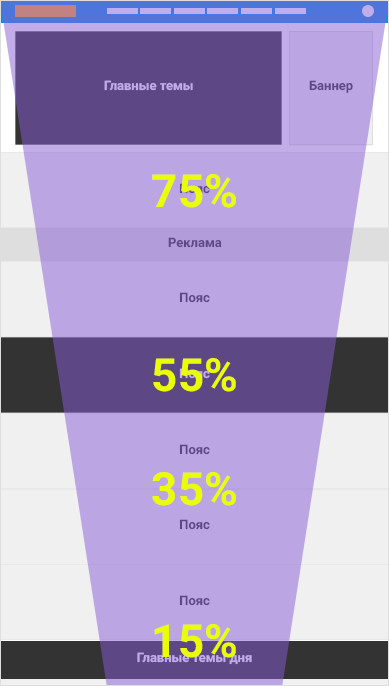
Page Scroll Funnel (indicative figures)
If the page contains more or less homogeneous content (for example, a list of films), then the cuts are catastrophic - the user thinks that the page is over and leaves. For the same reason, the sharing strip on the disease page was perceived as the end of useful content, although there were a lot of really valuable additions below.
Different effects of contrasting belts
At the same time, purely aggregation pages work normally - for example, information about a film, which consists almost entirely of pieces. It seems that there is no expectation of what is the main content. Anchor links are also a good help - users are even more actively using the entire content of the page.
Poster Mail.Ru: Movie as an example of an aggregation page
We worked on the height and contrast of the sections on the problem pages - it is important that they do not break the uniform flow. This helps to solve the problem of a twist, which is especially critical for one of the key product tasks - to lead the user further into the login page due to the thematic links.
In the near future we will solve the problems found and polish the framework itself . Somewhere, as with Afisha, we had the opportunity to launch an early version on a part of the audience and test design solutions in a semi-combat mode. Somewhere, as with Auto, we were tied up with advertising contracts and had to be launched as soon as possible. But thanks to the systematic solution, this accumulated knowledge benefits the entire product line , and does not remain just the results of the “note” reports. So new services on the engine will start without these problems.
And again, some facts and figures about how our workflow has changed thanks to the framework:
- .
, .
, .
, , . .
.
. , — , (Windows 8, Windows 7, Windows XP). Roboto : Windows, MacOS Arial Windows XP.
( )
, . , - , . 2013 , . , — .
Windows
. .. — « », .. . , , InDesign — .
, , «» . , .
, , . , , . , . , , .
-
, , .
. . . , . , Behance Dribbble. , .
Mail.Ru:
«» , - «1+2». — , .
40/20
, , 4- ( 8-). — . , . , — . , , .

. — 4:3, 16:9 1:1, . — ( -), - ( ).
, . . -, . , « » .
. , — . — . , - .
, . , . ; , ; .
. - , , , . - , - , - .
— , : , - -. , , — , , . «» -; , . , «/» , «/». - ; - . - , . - - . .
. , . - CSS . , .
, - CMS — . - — — . , - .
: , ,
, - Vox Media Look at Media . CMS - , . , . .
Vox Media Look at Media
Mail.Ru Group , , , . -, -, e-commerce, , . . -, . «» — productivity, -, e-commerce. , 10 40 .
But we, of course, would like to continue unification further, at least within the framework of my Post office and portal. Translation of an increasing number of services to a single framework brings us closer to this from the product and technical side. A parallel work on the approximation of the visual representation of clusters - with the designer. Perhaps soon there will be an occasion to continue the series of articles about the unification of design with a story about the next stage of implementation.
There are lots of advantages to the platform:
But the main thing - we are moving away from heroic redesigns to a constantly up-to-date interface . So we can spend more time on grocery work, and not endless maintenance of design. And the specialist himself becomes a product designer who ceases to think in mock-ups and goes beyond Photoshop.
PS Many thanks to the whole team of designers and developers, thanks to whom it all turned out! From the side of design - Gevorg Glechyan, Evgeny Dolgov, Mitya Osadchuk, Artem Gladkov, Pavel Skripkin, Alexey Kandaurov, Evgeny Ferulev, Sveta Solovyova, Alexey Sergeev and me. From the side of development - Stas Mikhalsky, Konstantin Vorozheikin, Alexander Bekbulatov, Sergey Nozhkin, Andrey Kusimov, Dmitry Belyaev, Evgeny Ivanov, Anton Poleschuk, Vitaly Vasin, Maxim Trusov, Boris Rebrov. All managers and editors, as well as Anatoly Rozhkov, who believed in us.
The English version of the article, see Smashing Magazine.
Poster , Auto , Health , Horoscopes , TV , Real Estate , Lady , Hi-Tech , Weather
In the spring of 2012, 11 content projects were transferred to our Mail and Portal division - Auto, Playbill, Horoscopes, Children, Health, Lady, Moto, News, Weather, Sport, TV. Many of them are leaders in their niche in Runet. But the history of creation and development each had its own, so that the design was made in its own way, often on an outsource, without systematization and development of common approaches and solutions.
')
For our team, bringing their appearance and work logic into order became one of the main tasks. And later - and the need to unify the approach to design. A simple and clear solution - interface-visual guidelines for the entire product line. They should make the user's work understandable and predictable - it is easy for him to move from one site to another and not understand new patterns of interaction. It also strengthens the brand. And as a nice bonus, it makes it easier for the product team to develop and support services.
Design + Technology
But as our experience has shown, static interface specification is not enough :
- It creates a chain of “specification → design → layout → implementation”, where at each transition details are lost and shoals emerge .
- Designers say that developers do not read the documentation. But designers themselves, frankly, are filonyat if several people need to synchronize.
- Design according to the specification is difficult to implement at 100%, if it is done for several products at once. Firstly, the specification itself requires regular updating - new patterns appear, more successful solutions are found for existing ones. Secondly, in the course of the redesign, something may not have time to realize and the service is launched “almost polished”. And the entire product line is “almost similar.” And then what is considered a reference design? Of course, you can refactor, but it turns out to be expensive - it needs to be done constantly for each of the products, with each more or less noticeable update.
- All this requires tremendous effort and a lot of time from the designer to control the quality of implementation. What is expensive and tiring.
- Design updates reinforce the problem. It is necessary to go again on the whole line - to redo and control, redo and to control ...
Without technical solutions can not do . Only by transferring the reference design from static documentation to the implementation level, can the chain be reduced to “specification = design = layout → implementation”. And that means to get rid of the hemorrhoids heap on the introduction, improvement and support of products.
Small Bootstrap or component system
Many large companies are already moving in this direction, which greatly simplifies their lives and unleashes their business development. Good design can and should be obtained cheaply and quickly, which is impossible to achieve when working with your hands. What could be this technical solution? There are two options: simpler when you make your “ little Bootstrap ” and more complicated, creating a full-fledged system of components .
The first option is cheaper and faster to create - you already get a profit from easier support, inexpensive design experiments and easy prototyping. Although in fact you just take a set of HTML / CSS styles that can break when used in a real product. Over the past few years, many visionary articles have appeared on this topic - for example, from Mark Otto and Dave Rupert , and a huge number of companies are already working on this principle .
The second option is more expensive to create, but at the exit you have guaranteed the quality of the implementation of the design and all the benefits from the simplicity of updating the products. We in Mail.Ru Group went in this direction. This approach has 5 levels of maturity:
- General design principles are defined and embedded in CSS.
- All products work on the basis of uniform components.
- There are live guidelines describing these components and general design principles. They show the final implementation, not screenshots.
- You can prototype pages based on live guidelines.
- It is possible to experiment with the design of components to compare different approaches.
There are not so many companies on the way of the finished components, but there are very powerful examples from Intuit with their Harmony ecosystem, Lonely Planet solution based on the Rizzo framework and, of course, Google's Polymer Project , which implements Material Design.
Product challenge
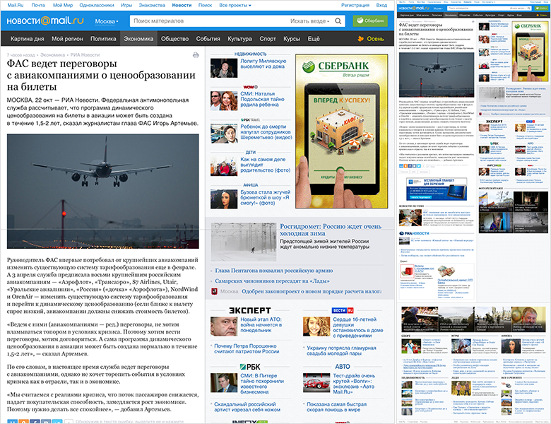
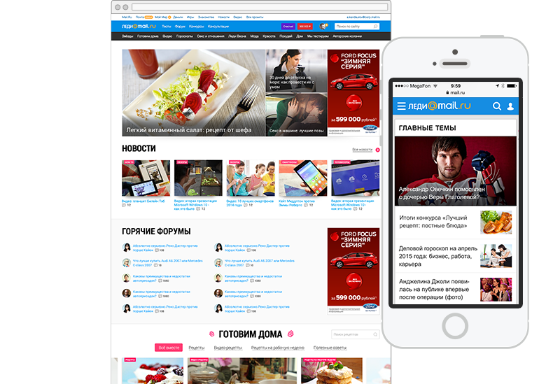
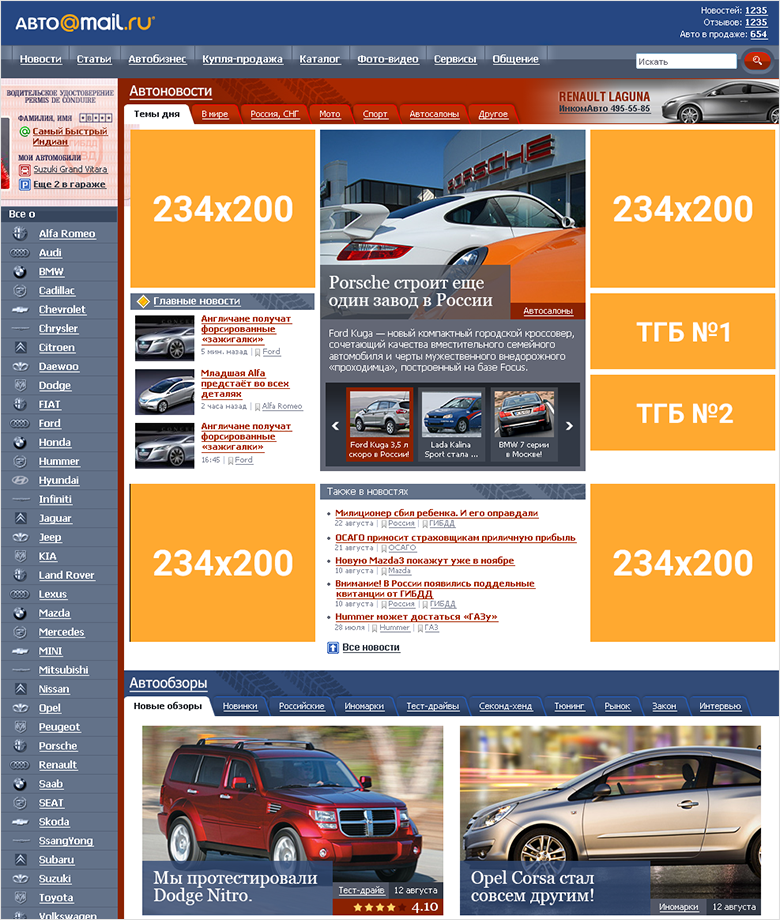
Historically, many Mail.Ru Group services as a portal were largely aggregators of content from third-party projects. We have a large audience by provoking popular products (Mail, home page, instant messengers). And she is interested in more niche things - for example, news about cars, family, city events. At the same time, the main entry point for some of them is the Mail.Ru main page - there is a list of especially popular materials on it, updated several times a day, so that users read the news from here.
Mail.Ru home page
As a result, the user gets immediately to the news, bypassing the product main page. And often closes it, returning to the main Mail.Ru. At the same time, in many cases, not realizing the difference between services - for him all this is news.
Therefore, one of the key product challenges after the transition of content projects to our division was the reduction of dependence on the main page for each of them. To get their audience products forced to create their own content, work with positioning and identity, SEO and SMM. And it gave a noticeable effect.
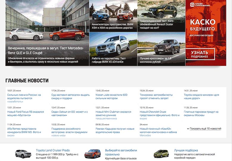
It was also necessary to extend the user's path through the site from the news page . And for traffic from the main Mail.Ru, and for SEO, and for SMM - this is the first place where it goes. The output was numerous strapping of relevant content - for example, films and actors for Posters, diseases and consultations for Health, announcements of used cars in Auto. Of course, you also need to solve the problem of increasing the depth of viewing and other indicators.
Binding content on the topic
Navigation Path Chart
Process: Design
Starting work on a new playbill at the end of 2012, we took the "burger" approach as a basis. This is a series of "belts", "lines", "inserts" or "containers", which is actively used in modern promotional sites, and mobile are built around the same principle. At that time, the approach was not as massive as it is now, so it should have turned out still fresh.
Poster Mail.Ru, spring 2013
Unlike the usual column structure, in which the content is squeezed into a “glass”, the “burger” allows you to get a more effective magazine design with lots of free space, large fonts and illustrations. Each "belt" can have its own layout, which allows a great variety of content presentation.
How to make a burger
But the most pleasant thing is the convenience of such a structure in work . Belts can be easily added and removed from the page, swapped. Or reused on several pages without the need to take into account adjacent columns (albeit with some reservations - on some pages we have not yet managed to solve this problem). It is easy to assemble special projects and new pages - just like in a burger, you just need to put the components between the buns, i.e. caps and footer. A nice bonus - managers can no longer engage in cheating like “let's add this block to the column”, trying to avoid prioritization. What is higher is more important.
Konstantin Weiss from Information Architects describes the advantages of burger design in the concept of " containerist ". In its terms, a layer or belt is a container:
- Endless stack of "belts" . They can be added and removed without the risk of breaking the grid.
- Easy prioritization . They can be moved inside the stack, if necessary, without the risk of breaking the grid.
- Containers can be duplicated and reused on the page . These are patterns tied to a grid.
- As development - use on several pages at once .
- A container used on several pages may have nuances of display on each of them.
- It can be used on multiple sites at once . For this purpose, a language for describing such patterns is used.
Ideology "Containerist"
Adaptability is no less simple - no need to think about the complex logic of the flow of columns. The order of the “belts” in the big web and on the mobile is the same, only the number of elements in the inset changes, and blocks with horizontal scrolling often turn into a classic list. On the tablets, the changes are simple.
True, there are problems:
- Pages become very long and users may not add them all the way.
- Absolutely free use of space reduces the amount of useful information on small monitors .
- The abundance of colorful, color spots can reduce the effectiveness of advertising .
We carefully recorded all this for further research and began to wait for the first working versions for verification.
One of the strategic objectives for the company is to bring all products to a single form. At the same time, it is important for products themselves to have their own face, increasing their brand awareness and value, in order to further reduce dependence on traffic from the Mail.Ru main page. How to satisfy both requirements so that the interfaces are always familiar and understandable for the user, but the services do not turn into just an appendage of the portal? We found the right solution, but not immediately.
Prehistory
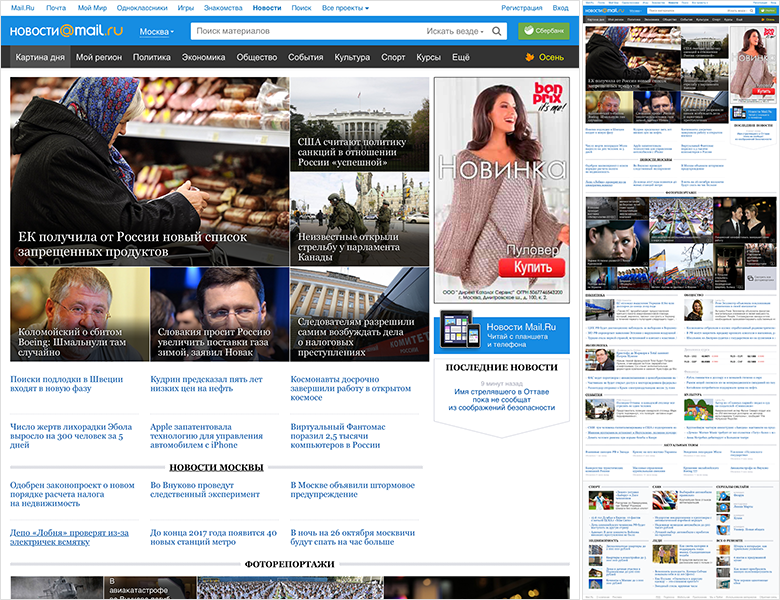
"Burgerny" format - our second approach to the unification of content projects. It all started with the redesign of News in spring 2012. This is a key product in the lineup with 4.5 million unique visitors per day. The interface had a lot of thematic, partner and advertising dodgers, as well as duplicating each other menu. The work went on two fronts.
Mail.Ru news, the beginning of 2011: main , news
First, the news page as the main landing page and the most visited of all. It was important to get rid of the left column so that the eye first saw the content of the material, and not the minor body kits. I really wanted to clearly distinguish between the main content, materials on the topic, advertising and affiliate links - this is a big problem for news sites at that time, and now too.
News Mail.Ru: News page
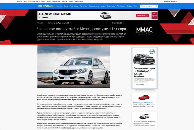
The solution was the layout of "1 + 2" - the most visible and large area is given under the content, and on the right is a dual column of advertising and partner blocks. This focuses the user on basic information, and everything that accompanies it is neatly collected side by side. Due to the increase in the cost of advertising space managed to get rid of the dodger. And sticking the column when scrolling helped to clean the holes arising from the different heights of the news. At the end of the page is placed a standardized footer with the themes of the day and another “exchange”.
Zoning Information
Secondly, the main and pages of headings - here we have more freedom. Home is visited by an order of magnitude less than the rest of the screens, so you can donate part of the dodger and make the project face was spectacular. We declared war on the columns - as a rule, this is a warehouse of something that restricts and damages the layout of the page. Thanks to this, the main one became “lower case”. She looks more collected and more comfortable working with her. Probably from there came our future "burger" approach. The rubrics are more complicated - there is more traffic and it was necessary to leave the “1 + 2” approach.
Mail.Ru news: home page
The launch of the News was not without problems, it was necessary to twist the key indicators - many blocks did not work as expected. But when Sport was launched on the basis of the same guidelines, the problem arose with only one of the navigation elements. The rules worked!
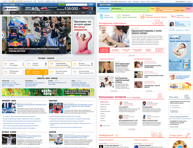
We immediately thought about styling content projects - we wanted to have a single interface solution that would be adapted to the theme and audience with the help of color schemes, fonts and decorative elements. And they have already begun to translate other products into it - Sport, Children. True, they turned out, though similar in structure and visually successive, but different in their approaches to creating and supporting projects. In addition, problems later appeared when working with tablets - the “1 + 2” layout required a separate version for them, since in portrait mode there was no space for the three columns and a horizontal scroll appeared. There was also a technical solution that would severely limit unnecessary discrepancies.
Sport and Kids Mail.Ru
So with this understanding of the pros and cons of our unified design, we took up the poster ...
Process: Technical Solution
We have already passed this way for the mobile web - together with the developers came up with and created a design and technology framework . By the end of 2013, it launched a dozen content projects, so the approach was run-in.
However, doing sites for mobile and large web on the same technology is not exactly the same thing . There are a lot of differences and nuances - at least the fact that in mobile there are only two types of list views (a list and a slider with hard-coded illustrations), and in a large web there is much more variety. But again, praise our development team - the guys appreciated the challenge and the possible profit from the implementation, fitting into this challenging, but extremely important and interesting project.
Initially, the framework was organized as follows:
- A library of patterns in Photoshop and InDesign, which includes all the solutions used on projects. As well as a guideline describing the basic principles of design. Plans to move away from static documentation for a live guide using ready-made code instead of layouts. This will shorten the chain and save us from unnecessary artifacts.
- Single code base that implements interface patterns. Page elements consist of absolutely independent typesetting blocks, the code uses the style naming principle, taken from the BEM methodology (block element-modifier). The same interface blocks are used on different pages - their design does not depend on what is happening around. It is not necessary to double-check each time whether the block on each of the pages seemed correct.
- Template for displaying the site page in the user's browser. He collects the final layout on the fly from separately laid out blocks, graphics, styles and scripts. For all types of pages, rules for their assembly are defined - i.e. a set of blocks, their sequence and content. Own technologies are used instead of those attached to BEM.
If we find a new solution for an old block or component (for example, a new type of photo galleries), it changes in a single code base. After that, each project updates it from the common repository (with strong changes, the incoming content is also updated). In this case, the designer needs to check only one implementation in a single code base, instead of tracking each of the services. And you can be confident in the quality of implemented design. More about the framework, my colleagues and I will tell in the third part of the article.
In the mobile version, the same page template is used for the server and the client, and then the final HTML is generated from it in the user's browser using V8. This model works despite the fact that historically projects have been written in different programming languages. But in the big web the story is more difficult - it is important to give the final HTML to the browser , i.e. generate it on the server side. Therefore, the development team had to find a way to communicate with the “stand-alone” demon v8 for each programming language. My colleagues will describe in detail the technical part in a separate article.
This is not an easy project. But the approach with the transfer of design to the level of technical implementation is crucial for both designers and companies:
- Design unification is 90% guaranteed by the approach to development - all ready blocks and elements are taken from a single code base and only from it. Another 10% - attentiveness and thoughtfulness when using ready-made solutions.
- Avoiding heroic products once every few years to keep the interface up to date . The restarts take a lot of energy and lose thousands of small developments bolted to the design for a long time of its development.
- The others gain from improvement in one particular product. For example, if a block of news on a topic has increased the depth of views on Auto, this solution will very quickly get into other services.
- Need to draw less layouts. The page can be assembled from ready-made blocks, and in the future - completely without the launch of Photoshop. The same applies to various special projects.
We want to use not the hands, but the head of the designer . Due to the reduction of the routine, it is possible to transfer the focus to product challenges and solving less visible, but also important design problems. Increasing the main metrics, nice animation, subtle nuances of adaptability, bringing advertising into a human form - in an endless stream they did not always have enough time.
The company is also in the black. Minus the input price of transferring products to the platform, it gets a systematic approach to improving the efficiency of products, accelerating the launch of new functions on the market, guaranteed design unification. The ability to speak a common language helped us to convince the management to invest in the framework - the initiative to create it came from below. How to find this language, I wrote in my article about UX-strategy .
Launch
By the fall of 2014, we came up with 4 running services and another pack in work. Auto, Poster, Health and Weather hit the first wave, and later Horoscopes, Real Estate, TV and Lady appeared. Did we do a good job?
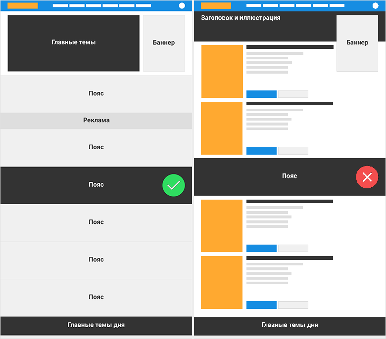
We conducted a series of usability tests and thoroughly dug analytics data. Problems after launch always exist and I want to solve the most critical problems as soon as possible. It was even more interesting to understand if the “burger” approach worked, and what about its risks - first of all, scrolling through long pages? In general, yes, but with nuances and reservations.
The scroll funnels for the main pages and key sections have shown that users willingly twist down and fall off moderately.
Page Scroll Funnel (indicative figures)
If the page contains more or less homogeneous content (for example, a list of films), then the cuts are catastrophic - the user thinks that the page is over and leaves. For the same reason, the sharing strip on the disease page was perceived as the end of useful content, although there were a lot of really valuable additions below.
Different effects of contrasting belts
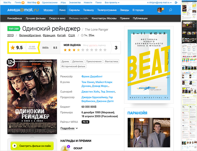
At the same time, purely aggregation pages work normally - for example, information about a film, which consists almost entirely of pieces. It seems that there is no expectation of what is the main content. Anchor links are also a good help - users are even more actively using the entire content of the page.
Poster Mail.Ru: Movie as an example of an aggregation page
We worked on the height and contrast of the sections on the problem pages - it is important that they do not break the uniform flow. This helps to solve the problem of a twist, which is especially critical for one of the key product tasks - to lead the user further into the login page due to the thematic links.
In the near future we will solve the problems found and polish the framework itself . Somewhere, as with Afisha, we had the opportunity to launch an early version on a part of the audience and test design solutions in a semi-combat mode. Somewhere, as with Auto, we were tied up with advertising contracts and had to be launched as soon as possible. But thanks to the systematic solution, this accumulated knowledge benefits the entire product line , and does not remain just the results of the “note” reports. So new services on the engine will start without these problems.
And again, some facts and figures about how our workflow has changed thanks to the framework:
- The speed from the beginning of the design to the transfer to the development has increased significantly . For example, with one of the latest services, we began work on the design in late January, and I went into development in mid-March. For large projects, this is our internal record - it used to take at least six months. What have we saved on? Coordination of stylistics, creation of patterns and components in a single code base, rejection of many layouts - we take already implemented solutions, often whole pages.
- Much easier to harmonize design . He has already been approved once with managers, editors and developers. Next, we think about how it solves the product tasks of the service, rather than fighting for style and general direction. This, of course, limits the designer a little, but there are still many points of application where you can turn around to creative - animation, advertising formats, more subtle work with usage scenarios, work with analytics and experiments.
- The first product releases on the new design ideology have a drawdown on some metrics . But after their correction, subsequent launches have the best performance. This shows that the idea of scaling works - problems are fixed once and for all.
- Mobile and large web work on the same engine , prepare data in the same way, use a number of common libraries. In the first part I said that pure adaptability is impossible, until the main versions are redone. Now it has become more real, although there is no practical need yet. Versions are almost identical for the user - uniform URLs, coincidence in content and services. In addition, when adding any new page or function, it is simultaneously worked out and implemented in a large and mobile web.
- The work itself with the template engine is the same in the large and mobile web . But in the telephone version there are fewer standard blocks and the logic of information output is simpler, so there are no special reasons for the discrepancy. At the same time, in a large web, the variability is much greater. In addition, a wider set of page layouts, there is support for multiple permissions. This makes coordination between different specialists especially important.
- Easy rotation of the team between projects , because their insides are very similar to each other. For the period of redesign or launch of a new large-scale functionality, it became much easier to parallelize the task within one project between different executors. The cost of connecting another developer to it has greatly decreased, so now two people can actually complete one task almost twice as fast.
- Standard solutions greatly help out . It used to be just chaos - every project has its own. Transferring the photo gallery to the new project took the same amount of time as creating it for the first time. Managers reasonably complained - why can't we just take a ready-made solution from another project and implement it ?! Now it works, although the workflow still requires debugging.
- No more need to cut crutches to standard solutions ordered by each manager. This problem was solved by the very approach to the standardization of design - a more expensive departure from it.
- On the side of the back-end, the approach helped bring order to the projects and lead to the correct MVC model.
- The component-based update works - we have already managed to rework the photo galleries, sharing stripes, article page, list of publications, and a number of other components. And they also dealt with the general visual style - tuning font grid, color palette, block styles. For this, code semantics and a healthy level of abstraction of design are extremely important. Modern CSS preprocessors (we use Stylus historically) allow us to transfer many things into variables, and this makes it easy to update throughout the product line.
Nuances of work
- .
, .
, .
, , . .
.
. , — , (Windows 8, Windows 7, Windows XP). Roboto : Windows, MacOS Arial Windows XP.
( )
, . , - , . 2013 , . , — .
Windows
. .. — « », .. . , , InDesign — .
, , «» . , .
, , . , , . , . , , .
-
, , .
. . . , . , Behance Dribbble. , .
Mail.Ru:
40/20
«» , - «1+2». — , .
40/20
, , 4- ( 8-). — . , . , — . , , .
. — 4:3, 16:9 1:1, . — ( -), - ( ).
, . . -, . , « » .
. , — . — . , - .
Plans
, . , . ; , ; .
. - , , , . - , - , - .
— , : , - -. , , — , , . «» -; , . , «/» , «/». - ; - . - , . - - . .
- , . , , . , , . - .
. , . - CSS . , .
, - CMS — . - — — . , - .
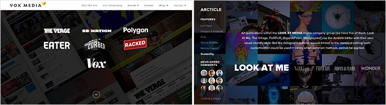
: , ,
, - Vox Media Look at Media . CMS - , . , . .
Vox Media Look at Media
Mail.Ru Group , , , . -, -, e-commerce, , . . -, . «» — productivity, -, e-commerce. , 10 40 .
But we, of course, would like to continue unification further, at least within the framework of my Post office and portal. Translation of an increasing number of services to a single framework brings us closer to this from the product and technical side. A parallel work on the approximation of the visual representation of clusters - with the designer. Perhaps soon there will be an occasion to continue the series of articles about the unification of design with a story about the next stage of implementation.
findings
There are lots of advantages to the platform:
- Accelerating the launch of new product features.
- A guaranteed way to get a unified design.
- The others gain from improvement in one particular product.
- The designer works less with his hands and more with his head.
But the main thing - we are moving away from heroic redesigns to a constantly up-to-date interface . So we can spend more time on grocery work, and not endless maintenance of design. And the specialist himself becomes a product designer who ceases to think in mock-ups and goes beyond Photoshop.
PS Many thanks to the whole team of designers and developers, thanks to whom it all turned out! From the side of design - Gevorg Glechyan, Evgeny Dolgov, Mitya Osadchuk, Artem Gladkov, Pavel Skripkin, Alexey Kandaurov, Evgeny Ferulev, Sveta Solovyova, Alexey Sergeev and me. From the side of development - Stas Mikhalsky, Konstantin Vorozheikin, Alexander Bekbulatov, Sergey Nozhkin, Andrey Kusimov, Dmitry Belyaev, Evgeny Ivanov, Anton Poleschuk, Vitaly Vasin, Maxim Trusov, Boris Rebrov. All managers and editors, as well as Anatoly Rozhkov, who believed in us.
The English version of the article, see Smashing Magazine.
Source: https://habr.com/ru/post/263221/
All Articles