12 little-known facts about CSS
I offer the readers of Habrakhabr a translation of the article “12 Little-Known CSS Facts (The Sequel)” . She was recently mentioned in a digest of interesting materials from the world of web development and IT .
Update: a bit of "shredded" translation. I express my gratitude to all readers who are not indifferent.
Attention! Under the cut almost 1.5 MB of images and many interesting links.
So let's start with ...
')
1. You can use the slash syntax in the
This was already written 4 years ago, but many newbies and even some experienced developers are not aware of the existence of this “trick”.
Believe it or not, the following code is valid:
This approach is a little discouraging the first time. Here is the explanation from the specification:
The specification also provides the following chart:
Using slash while specifying values will allow you to create asymmetrical rounded corners. If you want to study this topic in more detail, read the article mentioned above or, even better, try the interactive demo from MDN .
Most border-radius generators do not allow setting additional values. Of all such generators found, only MDN-ovsky can do this.
2. The
Most often, the
But two possible meanings are often forgotten -
According to the specification, these keywords set the font to be fatter or thinner than inherited. This ability to work with the display of text is important if the font used has several options for "weight", and not just "bold" and "normal."
In weight values that are multiples of a hundred, “bold” is 700, and “normal” is 400. Thus, if you want to set the weight to 300, then the
The example uses the Exo 2 font, which has 18 different styles, but only non-cursive font variants are needed - this is sufficient for all numerical weights.
The demo uses 12 nested box elements with different
In this example, the
This is due to the fact that you tell the browser to choose the next font option that is “fatter” or “lighter”. And the browser chooses not just the “next bold” or “next thinner” option, but the “bold” and “easy” version in relation to the current inherited version. But if the lightest version of the font has a weight of 300, for example, like Open Sans , and the inherited value was 400, then using “lighter” you will get 300.
This behavior can be confusing, but if you "play around" with a demo example, then everything will fall into place.
3. There is an
The outline property is quite widely known due to its use during debugging (because of it, the page does not “creep away”) . In the specification, however, the property
In the demo, when you change the position of the slider, the amount of the border shift also changes. In the example, values are from 0px to 30px, but you can change the limits as you like. Note that the
The main disadvantage of the
4. There is a
Do not confuse this property with
Since
Perhaps this is the first time in the history of the W3C specification when something is so difficult to understand.
But seriously, using the demo will help.
In the example above, the advantage of using the
Chris Coyier wrote a great article about using long rows in tables last year, in which this topic is very well revealed.
5. The
If you are developing websites from the mid-2000s or earlier, or you know quite a lot about HTML and email, then you probably assume that the
But the
So, what is the difference when using this property in ordinary elements and table cells?
If
Demo .
The
Bear in mind that this demo is just a superficial glance at vertical-align. A deeper consideration can be found here .
When
Demo .
As shown in the example, for
6. The pseudo-element
The pseudo-element
Browsers support the standard relatively well with respect to this “first letter”. For the first time I saw this pseudo-element in a tweet of Matt Andrews , although he obviously means that this is still a bad “trick”. Demo .

It's great that 4 large browsers display this pseudo-element in the same way, because, in my opinion, this is the correct display option. It would look strange if any symbol, such as a single parenthesis, was perceived as the “first letter” — rather, it could be considered the “first character” that is worthy of its own new pseudo-class.
This approach was discussed by Ben Edvard in 2013 , and I think it’s worth a closer look at this issue.
Ben wrote about using slash ("/") as a separator of HTML classes into groups in order to make the code more readable and easier to scan. The author points out that despite the fact that an unshielded slash is an “invalid” symbol, browsers simply ignore it and will not give an error.
Suppose you have this HTML code:
When using slash-it turns out the following:
You can use any character (valid or not) to get the same effect:
All of these options work fine, which can be seen by looking at the demo
Of course, these delimiters cannot be used in css-styles as classes. The following code is incorrect and will not apply to the element:
If you are forced to use similar symbols in the names of your css-classes, then you can use this tool . Thus, the above code will work if you convert it to this:
If we continue this topic, Unicode characters should not be escaped at all, and you can create various crazy things:
In addition, you can “escape” these characters too, instead of using them directly. The following css lines are similar to the previous ones:
When describing an animation, you can use the
The above code says that the animation will play 3 times. But perhaps you did not know that fractional values can be specified:
In this case, the animation will be lost only half of the first iteration. In the CodePen demo, the upper circle shows the number of iterations 1, and the lower one - .5

The duration of the iteration is not determined by the change in the values of the properties during the animation, but by the time and taking into account the smoothing. In the above example, a linear function of time is used -
But in this example , anti-aliasing is already applied:

Notice that the second circle went more than half the way to a stop due to a different time function.
If you understand the various smoothing functions, you will notice that when using
Some developers have noticed this by chance, although there is a corresponding warning in the specification. Let's look at the following animation:
Notice, I use the animation name
Animation does not work, because
The
I don’t know who first started using it, but first I saw this demo from Gunnar Bittersmann . Suppose you have a list of 20 items and you need to select items 7 through 14 inclusive. This can be done like this:
Demo .

In Safari, because of a bug, this technique will not work. However, the solution is still there - Matt Pomaski fixed it. You just need to list the elements of the sample in a different order:
This code uses a chain of related pseudo-classes. Although the expression is a bit confusing, the key numbers 7 and 14 are used without change.
I will try to explain how it works. The first part of the expression says: “choose the seventh element, and then everything AFTER it”. And the second part - "choose the fourteenth element, and then everything is BEFORE it." Since the parts are connected, then at the intersection of the queries the required range is obtained.
For a more detailed discussion of this topic, it is recommended to read an earlier article .
Surely you tried to use pseudo-elements with images or input. But this does not work with "replaceable" elements (the translator's note - in the comments to this translation, SelenIT2 tried to explain what kind of a beast it is ). I think many developers assume that empty elements (those that do not have a closing tag) also fall into this category. But it is not.
You can use pseudo-elements along with some empty elements that are not “replaceable”. For example, <hr> in this demo .

The colored area is the <hr> tag and its two pseudo-elements
You can also use pseudo-elements with meta tags or <link>, if, of course, you are ready to apply the display: block property to them as in this demo .
Finally, something incomprehensible. Suppose there is this HTML:
You can stylize both of these elements as follows:
It works great. And what about this?
The values of both attributes are written in upper case. In this case, the
Update: a bit of "shredded" translation. I express my gratitude to all readers who are not indifferent.
Attention! Under the cut almost 1.5 MB of images and many interesting links.
So let's start with ...
')
1. You can use the slash syntax in the border-radius property.
This was already written 4 years ago, but many newbies and even some experienced developers are not aware of the existence of this “trick”.
Believe it or not, the following code is valid:
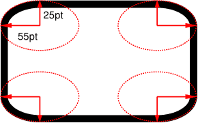
.box { border-radius: 35px 25px 30px 20px / 35px 25px 15px 30px; } This approach is a little discouraging the first time. Here is the explanation from the specification:
If the values are specified both before and after the slash, the values of before are set to horizontal radius, and the values of after are set to vertical.
If slash is absent, the values of both radii are considered the same.
The specification also provides the following chart:
Using slash while specifying values will allow you to create asymmetrical rounded corners. If you want to study this topic in more detail, read the article mentioned above or, even better, try the interactive demo from MDN .
Most border-radius generators do not allow setting additional values. Of all such generators found, only MDN-ovsky can do this.
2. The font-weight property can take "relative" values.
Most often, the
font-weight property takes the value normal or bold. Sometimes there are integer values that are multiples of a hundred, such as 100, 200, etc. up to 900.But two possible meanings are often forgotten -
bolder and lighter .According to the specification, these keywords set the font to be fatter or thinner than inherited. This ability to work with the display of text is important if the font used has several options for "weight", and not just "bold" and "normal."
In weight values that are multiples of a hundred, “bold” is 700, and “normal” is 400. Thus, if you want to set the weight to 300, then the
lighter value applied to the text that inherited the normal weight 400 will set the right weight . If there is no lighter version of the font (ie, 400 is the thinnest font version), then the same 400 will remain and there will be no effect from using the lighter .The example uses the Exo 2 font, which has 18 different styles, but only non-cursive font variants are needed - this is sufficient for all numerical weights.
The demo uses 12 nested box elements with different
font-weight values, including bolder and lighter , so the effect of using these keywords is obvious. Below are the styles used. Pay attention to the comments in the code and note that each next element is inside the previous one.A lot of css-code from the demo
.box { font-weight: 100; } .box-2 { font-weight: bolder; /* maps to 400 */ } .box-3 { font-weight: bolder; /* maps to 700 */ } .box-4 { font-weight: 400; } .box-5 { font-weight: bolder; /* maps to 700 */ } .box-6 { font-weight: bolder; /* maps to 900 */ } .box-7 { font-weight: 700; } .box-8 { font-weight: bolder; /* maps to 900 */ } .box-9 { font-weight: bolder; /* maps to 900 */ } .box-10 { font-weight: lighter; /* maps to 700 */ } .box-11 { font-weight: lighter; /* maps to 400 */ } .box-12 { font-weight: lighter; /* maps to 100 */ } In this example, the
bolder and lighter eventually set the following weights: 100, 400, 700, and 900. With nine different css-styles, using these keywords will not achieve 200, 300, 500, 600, and 800.This is due to the fact that you tell the browser to choose the next font option that is “fatter” or “lighter”. And the browser chooses not just the “next bold” or “next thinner” option, but the “bold” and “easy” version in relation to the current inherited version. But if the lightest version of the font has a weight of 300, for example, like Open Sans , and the inherited value was 400, then using “lighter” you will get 300.
This behavior can be confusing, but if you "play around" with a demo example, then everything will fall into place.
3. There is an outline-offset property
The outline property is quite widely known due to its use during debugging (because of it, the page does not “creep away”) . In the specification, however, the property
outline-offset added, which is exactly what it means - it indicates the shift of the outer border from the element.In the demo, when you change the position of the slider, the amount of the border shift also changes. In the example, values are from 0px to 30px, but you can change the limits as you like. Note that the
outline property is an abbreviated property and does not include outline-offset and will have to be specified separately.The main disadvantage of the
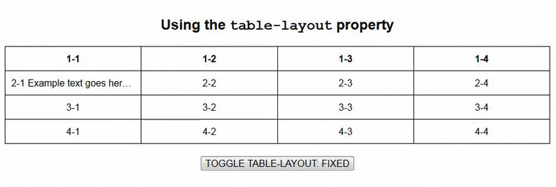
outline-offset property is the fact that it is supported by all browsers except Internet Explorer (even in IE 11 it is not).4. There is a table-layout property
Do not confuse this property with
display: table .Since
table-layout is not the easiest CSS trick to understand, let's turn to the specification first, and then look at the demo:With this approach, the vertical alignment of the table does not depend on the contents of the cell, but on the width of the table, the width of the column and the borders or indents between the cells.
Perhaps this is the first time in the history of the W3C specification when something is so difficult to understand.
But seriously, using the demo will help.
In the example above, the advantage of using the
fixed value for table-layout compared to the auto value is seen. Using this approach is not a panacea, but it is always good to be aware of this possibility when using tables with cells of different widths.Chris Coyier wrote a great article about using long rows in tables last year, in which this topic is very well revealed.
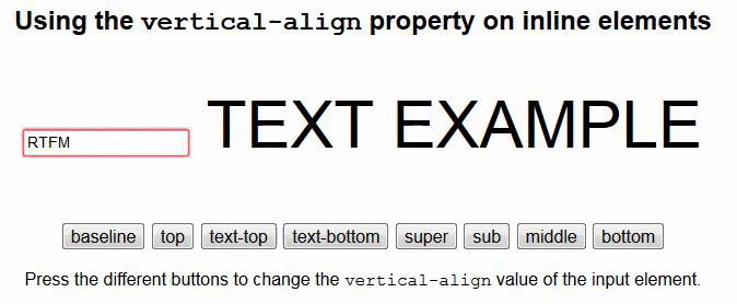
5. The vertical-align property works differently in table cells and other elements.
If you are developing websites from the mid-2000s or earlier, or you know quite a lot about HTML and email, then you probably assume that the
vertical-align property is a normal improvement to the old HTML4 attribute valign , which is now outdated and inappropriate. HTML5 .But the
vertical-align property in CSS doesn't work quite like that. But not in the tables. Which, in my opinion, is rather strange, but I suppose it is better than a property that does not work in tables at all.So, what is the difference when using this property in ordinary elements and table cells?
If
vertical-align is NOT applied to table cells, then it works according to the following rules:- Only applicable to
inlineorinline-blockelements; - Does not affect the content of the element, but only changes its position relative to other
inlineandinline-blockelements. - Text or font settings, such as
line-heightand the size of adjacentinlineandinline-blockelements, can affect properties.
Demo .
The
vertical-align property is set to the input input field. When you press the buttons, the value of the property changes. Please note that all these values are different.Bear in mind that this demo is just a superficial glance at vertical-align. A deeper consideration can be found here .
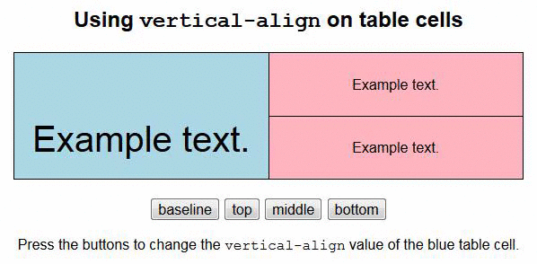
When
vertical-align is applied to a table cell, it works quite differently. In particular, this property applies to the contents of cells.Demo .
As shown in the example, for
vertical-align there are only 4 variants of the value, which are applicable to the table cells, besides the baseline value affects the cells of the same level as the cell to which the property is applied.6. The pseudo-element ::first-letter smarter than you think.
The pseudo-element
::first-letter allows you to style the first letter of an element (the translator's note — hello, captain! ), For example, to beautifully highlight it as in printed books many years ago.Browsers support the standard relatively well with respect to this “first letter”. For the first time I saw this pseudo-element in a tweet of Matt Andrews , although he obviously means that this is still a bad “trick”. Demo .
It's great that 4 large browsers display this pseudo-element in the same way, because, in my opinion, this is the correct display option. It would look strange if any symbol, such as a single parenthesis, was perceived as the “first letter” — rather, it could be considered the “first character” that is worthy of its own new pseudo-class.
7. You can use “invalid” characters as delimiters in the element class list.
This approach was discussed by Ben Edvard in 2013 , and I think it’s worth a closer look at this issue.
Ben wrote about using slash ("/") as a separator of HTML classes into groups in order to make the code more readable and easier to scan. The author points out that despite the fact that an unshielded slash is an “invalid” symbol, browsers simply ignore it and will not give an error.
Suppose you have this HTML code:
<div class="col col-4 col-8 c-list bx bx--rounded bx--transparent"> When using slash-it turns out the following:
<div class="col col-4 col-8 / c-list / bx bx--rounded bx--transparent"> You can use any character (valid or not) to get the same effect:
<div class="col col-4 col-8 ** c-list ** bx bx--rounded bx--transparent"> <div class="col col-4 col-8 || c-list || bx bx--rounded bx--transparent"> <div class="col col-4 col-8 && c-list && bx bx--rounded bx--transparent"> All of these options work fine, which can be seen by looking at the demo
Of course, these delimiters cannot be used in css-styles as classes. The following code is incorrect and will not apply to the element:
./ { color: blue; } If you are forced to use similar symbols in the names of your css-classes, then you can use this tool . Thus, the above code will work if you convert it to this:
.\/ { color: blue; } If we continue this topic, Unicode characters should not be escaped at all, and you can create various crazy things:
. { color: hotpink; } .★ { color: yellow; } <div class=" ★"></div> In addition, you can “escape” these characters too, instead of using them directly. The following css lines are similar to the previous ones:
.\2665 { color: hotpink; } .\2605 { color: yellow; } 8. The number of repetitions of animation can take fractional values.
When describing an animation, you can use the
animation-itereation-count property to specify how many times the animation will be played: .example { animation-iteration-count: 3; } The above code says that the animation will play 3 times. But perhaps you did not know that fractional values can be specified:
.example { animation-iteration-count: .5; } In this case, the animation will be lost only half of the first iteration. In the CodePen demo, the upper circle shows the number of iterations 1, and the lower one - .5
The duration of the iteration is not determined by the change in the values of the properties during the animation, but by the time and taking into account the smoothing. In the above example, a linear function of time is used -
linear .But in this example , anti-aliasing is already applied:
Notice that the second circle went more than half the way to a stop due to a different time function.
If you understand the various smoothing functions, you will notice that when using
ease-in-out second circle will take the same final position as when using linear .9. Animation recorded in short form may not work because of its name.
Some developers have noticed this by chance, although there is a corresponding warning in the specification. Let's look at the following animation:
@keyframes reverse { from { left: 0; } to { left: 300px; } } .example { animation: reverse 2s 1s; } Notice, I use the animation name
reverse . At first glance, everything is fine, but let's look at a living example .Animation does not work, because
reverse is a valid keyword for the animation-direction property. Also, the animation will not work when used in short form in the title of other keywords. But everything works well when using the “full” description form.The
animation-direction keyword-values that “break” animations also include keywords related to smoothing functions , as well as infinite , alternate , running , paused and so on.10. In the selector, you can specify a range of elements.
I don’t know who first started using it, but first I saw this demo from Gunnar Bittersmann . Suppose you have a list of 20 items and you need to select items 7 through 14 inclusive. This can be done like this:
ol li:nth-child(n+7):nth-child(-n+14) { background: lightpink; } Demo .
In Safari, because of a bug, this technique will not work. However, the solution is still there - Matt Pomaski fixed it. You just need to list the elements of the sample in a different order:
ol li:nth-child(-n+14):nth-child(n+7) { background: lightpink; } This code uses a chain of related pseudo-classes. Although the expression is a bit confusing, the key numbers 7 and 14 are used without change.
I will try to explain how it works. The first part of the expression says: “choose the seventh element, and then everything AFTER it”. And the second part - "choose the fourteenth element, and then everything is BEFORE it." Since the parts are connected, then at the intersection of the queries the required range is obtained.
For a more detailed discussion of this topic, it is recommended to read an earlier article .
11. Pseudo-elements can be applied to some “empty” elements.
Surely you tried to use pseudo-elements with images or input. But this does not work with "replaceable" elements (the translator's note - in the comments to this translation, SelenIT2 tried to explain what kind of a beast it is ). I think many developers assume that empty elements (those that do not have a closing tag) also fall into this category. But it is not.
You can use pseudo-elements along with some empty elements that are not “replaceable”. For example, <hr> in this demo .
The colored area is the <hr> tag and its two pseudo-elements
::before and ::after . Interestingly, this result could not be obtained from the <br> tag, which is also not “replaceable”.You can also use pseudo-elements with meta tags or <link>, if, of course, you are ready to apply the display: block property to them as in this demo .
12. Some attribute values are case-sensitive when used in selectors.
Finally, something incomprehensible. Suppose there is this HTML:
<div class="box"></div> <input type="email"> You can stylize both of these elements as follows:
div[class="box"] { color: blue; } input[type="email"] { border: solid 1px red; } It works great. And what about this?
div[class="BOX"] { color: blue; } input[type="EMAIL"] { border: solid 1px red; } The values of both attributes are written in upper case. In this case, the
.box element will not receive styling, since class attribute case-sensitive. The email input field, however, will be styled because The type attribute is case-insensitive. There is nothing innovative in this, but perhaps you have not noticed it before.Source: https://habr.com/ru/post/263169/
All Articles