7 rules for creating beautiful interfaces. Part 2
Recently, we have completed a design course from trydesignlab.com at I Love IP . And this is one of the most important articles that the mentor advised us in the process of learning. Today we publish the second part of the translation. You can see all our works from courses on VKontakte by tag # design101 @ iloveip .
We talked about the rules for creating clean and beautiful interfaces .
Here are the rules:
- Light falls from above ( Part 1 )
- First black and white ( Part 1 )
- Increase white space ( Part 1 )
- Learn how to overlay text on images.
- Learn to select and embed text
- Use only good fonts.
- Steal like an artist
')
Rule number 4: Learn to overlay text on images
There are only a few reliable ways to beautifully superimpose text on images. I will tell you five and one more as a bonus.If you want to be a good interface designer, you need to learn how to superimpose text on images so that it looks beautiful. This is something that every good interface designer can do, and does not know how bad. So after reading this article, you will already have an advantage!
Method number 0: Overlay text directly onto the photo
I didn’t even want to include this method, but it is technically possible to overlay the text directly on the photo so that it looks normal .

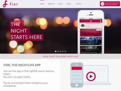
Otter Surfborads . Looks hipster and instagram. But the text is difficult to read.
In this way there are many problems and risks:
- The photo should be dark and not too contrast.
- The text should be white . Try to find a good opposite example. I'm serious . At least one.
- Test it on each screen / resolution to make sure the text is readable.
Clear? Fine! Now never change the text or photo, and everything will be fine.
I do not remember that at least once I used this method in my professional activity. But with it you can achieve a really cool result, just be careful.
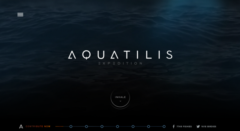
Expedition site Aquatilis . Be sure to look if you have not yet seen.
Method # 1: Dim the whole picture.
Probably the easiest way to superimpose text on a photo is to darken it. If the original photo is not dark enough, you can impose on it a translucent layer of black color.
Here is a modern colorful photo with blackout.

The Upstart site uses a 35% black filter.
If you enter the developer console and remove the filter, you will see that the photo itself is too bright and contrasting for the text to be readable. But with a dark filter - no problem !
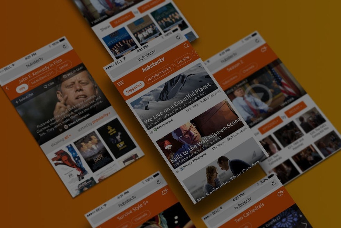
This method also works well for small images.
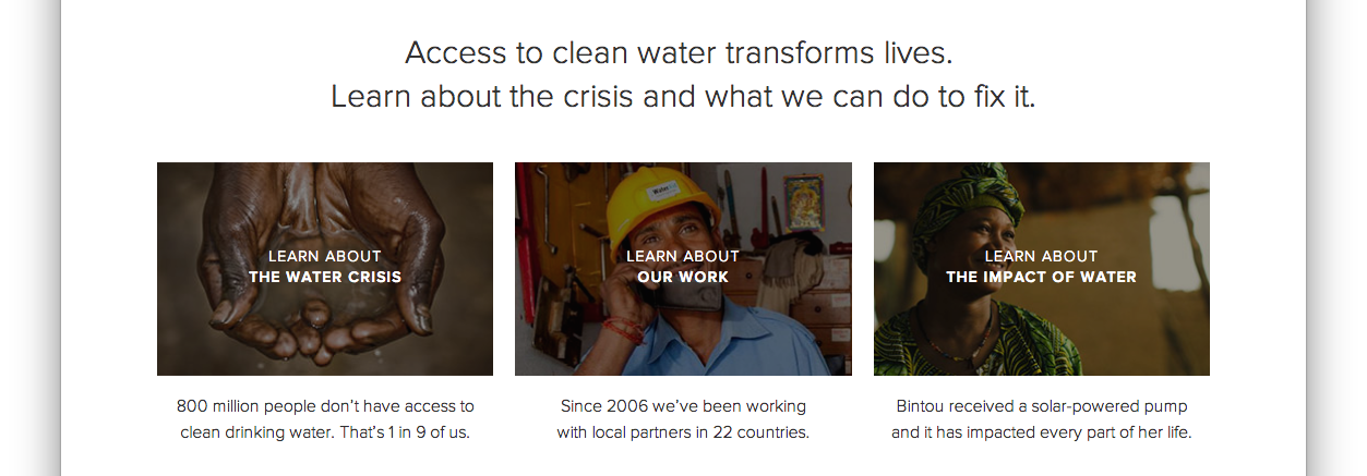
Thumbnails from charity: water
The black filter is the easiest and most versatile, but you can also use color filters.
Method number 2: Text-on-background
This is another simple and reliable way. Draw a slightly transparent black rectangle and place white text on it. If the rectangle is dark enough, then from below you can have almost any photo and the text will still be well read.

Concept application for the iPhone from Miguel Oliva Marquez
Here you can also use color, but within reason.
Concept in pink by Mark Conlan
Method number 3: Blur the image
Oddly enough, a good way to make the text readable is to blur part of the picture.

Snapguide blurred a large portion of the image. Notice that it is also blacked out.
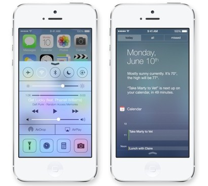
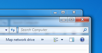
This method has become particularly popular after the release of iOS 7, although it was widely used back in Vista.
Instead of blurring, you can also use a part of the photo that is out of focus. But be careful - this option is not so dynamic. If the picture changes suddenly, make sure that the background remains blurred.

Teehan + Lax
I mean, just try reading the subtitle below.

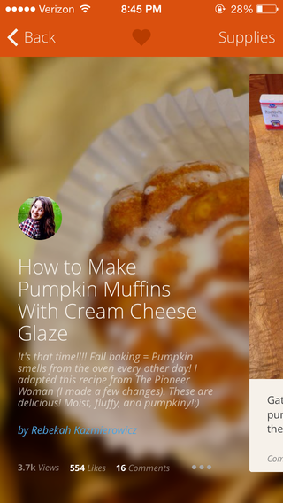
Method number 4: Dim the bottom
In this embodiment, the image is slightly darkened to the bottom and on top is white text . This is a very clever method, and I don’t know if anyone used it before Medium, but I saw it there.

It may seem to a casual observer that in the Medium collections the white text is applied directly to the image. But it is not so ! There is a subtle gradient of black color from the middle of the image to the bottom (with transparency from 0 to about 20%).
It is not so easy to notice, but it is definitely there, and it definitely improves the readability of the text.
Note that Medium uses a small shadow in the text when overlaying thumbnails of collections, which further enhances readability. Ultimately, Medium can superimpose any text on any image and get a good result.
You ask why the image needs to be darkened downwards? Read the answer to this question in Rule No. 1 - the light always falls from above. To look most natural to our eyes, the image must be slightly darker downwards, just like any other object we see .
Another advanced way: dim and blur ...
Bonus - Disguise Method
Why does the Elastica blog make readable headlines on each image? Pictures with this:
- not very dark
- relatively contrasting.

The answer is a scrim .
Scrim is a diffuser, a photography equipment that makes light softer. It is also a special technique in graphic design that helps “soften” the image and make the text more readable.
If you scale down the browser on the Elastica blog page, you can see what is happening there.
Around the title there is a translucent background with a slight dimming. ( Who knows how to do it? - note. I love PI .) It is easier to see on a solid blue background than on contrast photos.

This is perhaps the most delicate way to overlay a text, and I have not met it anywhere else (besides, it is quite tricky). But mark it for yourself; suddenly it will come in handy someday.
Rules number 5: Learn to highlight and embed text
The secret to making the text look beautiful and appropriate at the same time is to use contrast. For example, you can make it bigger, but thinner.I think that text design is one of the most difficult parts in creating a beautiful interface. But not because of the lack of possible options. If you have already completed elementary school, you are probably familiar with all the ways to select text. It:
- Size (text can be made larger or smaller).
- Color (you can increase or decrease the contrast; bright colors attract attention).
- Saturation (font can be thicker or thinner).
- Uppercase letters (text can be typed in lowercase or CAPITAL).
- Italic
- Discharging (or tracking ).
- Fields (technically they do not refer to the text itself, but can be used to attract attention, therefore they are also included in this list).

Here there are both color, and capital letters, and fields.
There are other ways, but I would not particularly recommend them:
- Underscore Nowadays, underscores are used exclusively for links.
- Colored background. This method is not as common, but 37signals has also used it to designate links for some time.
- Strikeout Welcome back to the 90s, you, the genius of CSS!
In my experience, if I cannot find the “right” style for the text, it’s not because I forgot to try uppercase or a darker color, but because the best solution is often the right combination of “opposite” styles .
Excretion and retention
All methods of text selection can be divided into two groups:
- Ways that increase the visibility of the text . This increase in size, saturation, the use of capital letters, etc.
- Ways to reduce text visibility . This reduction in size, contrast, margins, etc.
We will call them ways to "highlight" and "embed" the text. We will not call them "visual weight", so that is too boring.
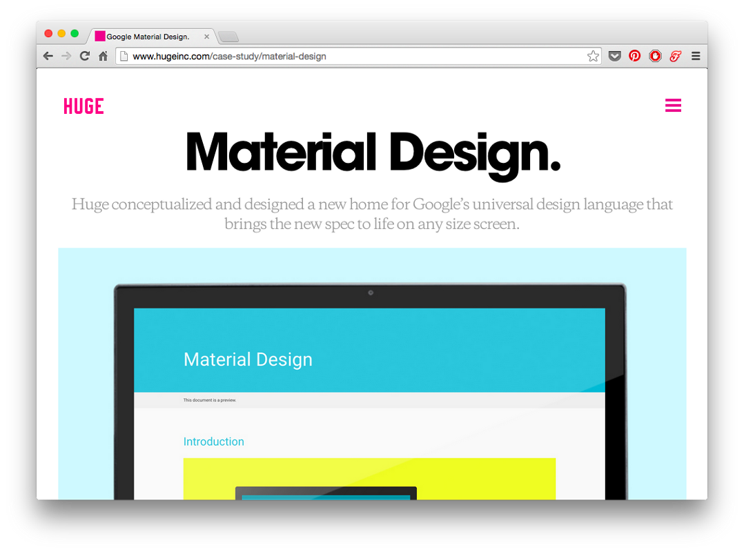
Hugeinc.com home page
The “Material Design” header is highlighted in a variety of ways. It is large , very contrast and highlighted by the bolt .

The text in the footer, on the contrary, is drowned. It is small , non-contrast and more subtle .
And now the most important thing.
The name of the pages is the only element on the site that you only need to select . The remaining elements must be selected and embedded simultaneously.
If you need to select an element, use the methods for highlighting and embedding text at the same time. This will help not to overload the interface, but at the same time will give different elements the visual weight they need.
The balance of visual styles.
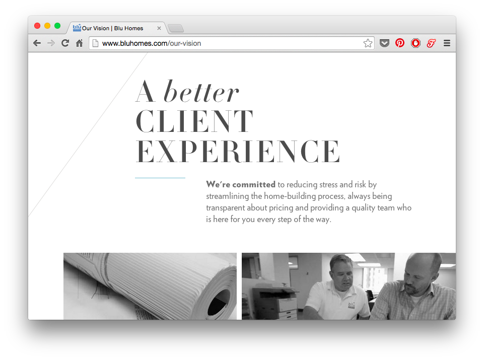
The site Blu Homes is an example of impeccable design. There is a big heading there, but the word on which the emphasis is placed is written in lowercase letters - too many selections would look redundant.

Numbers draw attention to themselves with size, color, and location — but notice that they are simultaneously recessed using a thinner font and a less contrasting color than dark gray.
Signatures under the numbers, despite the fact that they are gray and small, typed in capital letters and bold type .
It's all about balance.
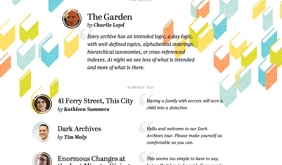
Contents Magazine is a good example of highlighting and embedding text.
- The title of the articles is the only item on a page that is not in italics . In this case, it is the lack of italics that attracts attention (especially in combination with a bold outline).
- The name of the author is highlighted with a bold - in contrast to the word "by", typed in regular font.
- The small, non-contrast signature “ ALREADY OUT ” does not bother anyone. But thanks to the capital letters, generous detente and large fields immediately attracts attention.
Active and selected items
The selection of active elements is a more complex round of the same game.
Usually, if you change the font size, its outlines or lowercase letters to uppercase, then the area occupied by the text will change . And this can lead to unexpected results.
What then to do?
Can be used:
- text color,
- background color,
- the shadows
- underscore
- a little animation (lift, lower, etc.).
Here is one proven way: try to make white elements colored or color elements white, but darkening the background.
The selected icon has become white, but has kept the contrast in relation to the background.
The conclusion is: to learn how to select text is very difficult. Every time something went wrong, I realized that I needed to be better. And to become better, you need to try.
Rule number 6: Use only good fonts.
Attention: in this section you will not find any secrets. I'll just list some good free fonts you can use.
Sites with a very distinctive character can use distinctive fonts . But for most interfaces you need something clean and simple .
I recommend only free fonts . Why? Because this article is for those who study . And among the free fonts there are many decent options. Why not use them?
So download them right now for your next project.
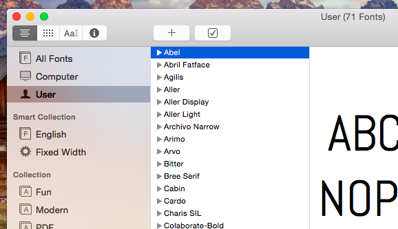
All fonts you downloaded can be found in the Fonts application in the User tab.

Ubuntu
Ubuntu has many styles. For some applications, it is too specific, for others it fits perfectly. You can download it on google fonts .

Open sans
Open Sans is a popular font, easy to read. Good for body text. You can download it on google fonts .
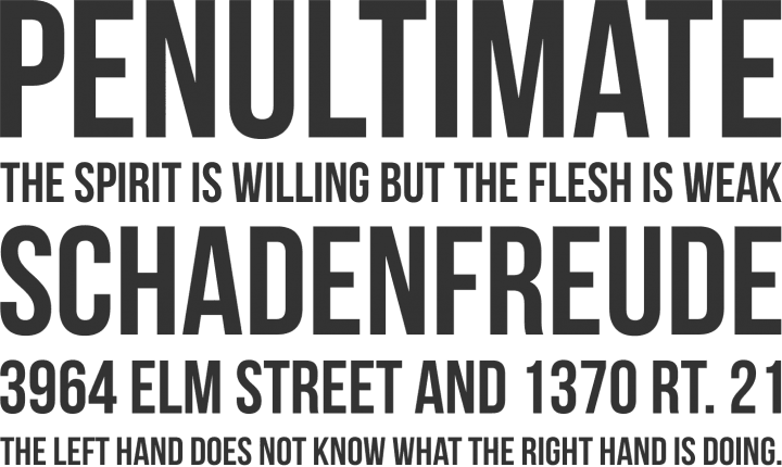
Bebas neue
Bebas Neue is great for headlines. It consists only of capital letters. You can download it on the Fontfabric website and see examples of its use there.
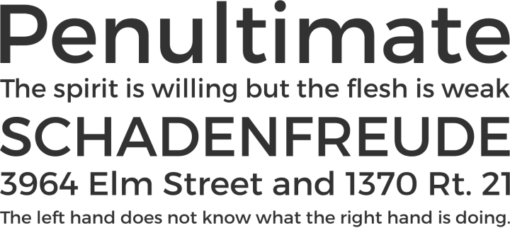
Montserrat
Montserrat is available only in two styles, but that is enough. This font is the best free alternative to Gotham and Proxima Nova, but it's not nearly as good as they are. You can download it on google fonts .
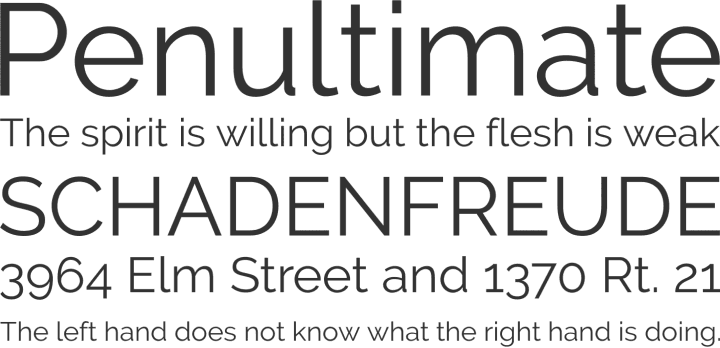
Raleway
Raleway is suitable for headings, perhaps a little too much for the main text (these “w”!). The Ultralight facet looks very nice (not in the picture). You can download it on google fonts .
Cabin
Cabin can be downloaded on Google Fonts .

Lato
Lato can be downloaded on Google Fonts .

PT Sans
PT Sans can be downloaded from Google Fonts .

Entypo Social
Entypo Social is the font of the icons and yes, it is everywhere . But the icons themselves are pure gold. Do you want to redraw all these social network logos on colored circles? So do I. You can download at Entypo.com .
Here are some more resources:
- Beautiful combinations of fonts from Google Fonts . This is a great gallery of how Google fonts can look beautiful. I constantly go to this site in search of inspiration.
- FontSquirrel . A collection of the best fonts for commercial use, absolutely free.
- Typekit If you have a subscription to Adobe Creative Cloud (Photoshop, Illustrator, etc.), then you have free access to a huge number of beautiful fonts , including Proxima Nova .
Rule number 7: Steal as an artist
When I first tried to design an interface — be it a button, a table, a graph, or something else — I understood how insignificant my knowledge was to make the elements beautiful.
But fortunately, I have never had to reinvent interface elements that have not yet existed. This means I can always see what others are doing and choose the best.
But where to look for these examples? Here are some sites that have been most helpful to me. In descending order.
1. Dribbble
This is a portfolio site for designers, which can be accessed by invitation only. Here you will find works of the highest quality . And almost any examples.
Here is my portfolio on Dribbble . And a couple more people to sign up for.
- Victor Erixon . He has a very special style - and this is awesome! Beautiful, clean, flat design. He has been designing for only three years and is already one of the best.
- Focus Lab . These guys are “stars of Dribbble”, and their work is consistent with this reputation. Very diverse and always top class.
- Cosmin Capitanu . Another cool designer. His work looks super futuristic, but not tasteless. It works very well with color. But it doesn’t focus too much on UX - although this is a dribbble problem in general.

Works Focus Lab and Cosmin Capitanu .
2. Flat UI Pinboard
I have no idea who “warmarc” is, but his Pinterest board with examples of mobile interfaces always helped me in search of a good design.
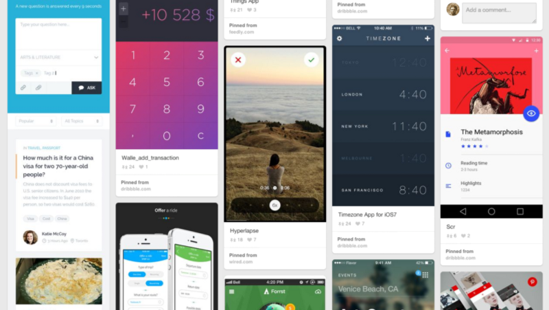
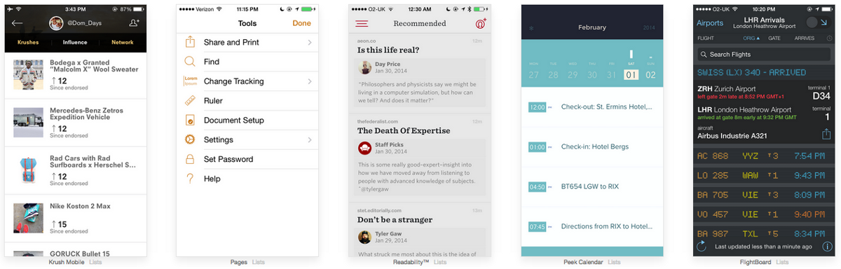
3. Pttrns
This is a gallery of screenshots of mobile applications. On Pttrns, the cool thing is that the whole site is organized in UX patterns. This makes it very easy to search, depending on which interface element you are working on, be it a registration page, personal account, search results, etc.
I am deeply convinced that every artist should copy until he can imitate the best works . And only then you can look for your style and create new trends.
In the meantime, steal as an artist.
The title of this section, by the way, is taken from a book of the same name, which I did not read, because I suspect that its main idea has already been disclosed in the title.

Conclusion
I wrote this article because I would like to read it myself a couple of years ago. I hope she helps you. If you're a UX designer , make a beautiful layout after you sketch out a prototype. If you are a developer , go to the next level and make your project look beautiful. You do not need to finish the Institute of Arts. It is enough to observe , imitate and tell friends what works and what does not .
In any case, this is just what I myself managed to learn. And I always remain a novice in this business.
Source: https://habr.com/ru/post/263061/
All Articles