How we worked on the Yandex.Money redesign
My name is Daria Kalinina, and in Yandex.Money I am responsible for the development of interfaces. Now we are fundamentally changing the look of our site for authorized users (we call this section of the site a wallet - in fact, this is our “Internet banking”). And I want to tell you about how and why we came to such visual solutions and what we plan to do next.
So far, the new view is only available to parts of users, but everyone who has a wallet can look at it for a direct link .
')
We began to redesign in early 2014 after a large study with usability testing and statistical analysis.
By 2014, Yandex.Money has greatly changed functionally: from an electronic wallet with a relatively narrow set of opportunities, we have evolved since the last redesign into a large service for payments on the Internet and offline, with our own “stores” and the ability to pay for various goods and services without registering and many others.
After receiving the results of the study, we were convinced that we need to recycle many processes and points of interaction with the user. A simple example: on the internal pages of the portal, authorized users in the wallet could not find one of the most sought-after sections - “Translations”: historically, it was not put into navigation and only lived on the main page.
In addition, without any research it was clear that the appearance of the site began to become hopelessly obsolete - and in Yandex, work was just completed on a new system of visual guidelines, which our designers began to actively use.
Another prerequisite was the move to a new framework (from xScript to Node.js) - one of the most serious changes in our development. In fact, together with the redesign, we rewrite the site from scratch - page by page and step by step. This is the main reason why Yandex.Money is redesigned gradually, and not in one fell swoop. Thanks to Node.js, it became easier for us to maintain the current implementation of the pages and make quick edits at the same time on the entire portal, rather than on each page separately, as it was before, when most of it was implemented in xScript.
Based on this, the goals of the redesign were formed: a fresh and modern appearance, simplification of scenarios and a shortening of the way to the necessary sections on the site - so that people would come more readily and would like to return. Work on the redesign began in the spring of last year, when the first sketches of concepts were drawn and new ideas were discussed, and now it continues. And now - first things first.
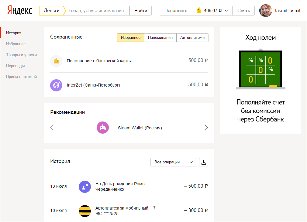
We wanted to give the user quick access to basic services and payment transactions, so we started with a navigation redesign. A wallet is a more complex system than just a user account, it has many additional properties and settings: management of linked and issued cards, several types of passwords, identification status and much more. We decided that it is necessary to divide navigation logically into two parts: in one - everything to control the settings of the wallet, and in the other - actions with money (pay, transfer, watch history, etc.).
Yandex services usually bring user preferences to the header. For example, the “My Music” button in the Yandex.Music header or “My Market” in Yandex.Market.


Therefore, in the first approach, the “My Wallet” button also appeared in the header. At the same time, the most important information for the user about the wallet - its balance - should have been visible. And the main operations that are directly related to the wallet - replenishment and withdrawal of money - should also be noticeable and easily found. The design quickly grew and became very cumbersome.

We decided to get rid of the “My Wallet” button: we combined it with a balance, which seems to be a wallet metaphor. Next to the balance, they placed a bank card icon - for users who have it linked to an account.

In this form, we launched a new header for users. But very quickly they realized that our metaphor with the balance did not work: nobody understood that it was necessary to press the balance in order to get into the settings of the wallet. Having conducted a small but very effective corridor usability testing, we did another iteration of the edits - we added a wallet icon next to the balance and an arrow indicating the drop-down menu.

It turned out that the arrow works wonders :) The number of questions about where to find the wallet number and other settings has decreased dramatically. We saw the same reduction in the statistics of search queries on the site.
Now we continue to improve this block: for example, for small screens, we collapse the “replenish” and “remove” buttons into neat “+” and “-”.

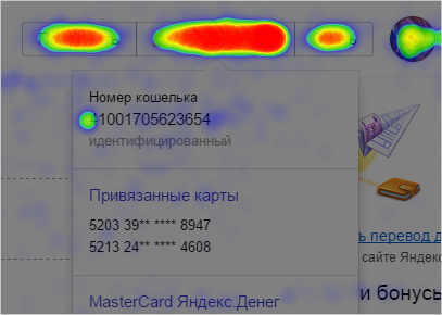
After analyzing the click-through map, we saw that in the drop-down menu with the settings of the wallet, they most often click on the beginning of the wallet number - obviously, in order to select it and copy it. Here we plan to add an automatic copy of the wallet number by clicking on it.
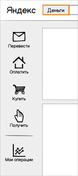
Developing the concept of logical division of navigation into two parts, in the left menu we brought out all the main services: transfers, payment for goods and services, tools for receiving payments.
In the first version of the concept, we displayed all menu items with icons.
Then they tried to separate the services and the history of user actions - they got another intermediate version.

At that moment, the search filters in Yandex search were also displayed with icons - having decided that this might confuse users, we still abandoned the icons and settled on the classic version with the text menu.
After the launch of the new navigation, the attendance of the site's nodal pages, on which we wanted to place the main accents, noticeably increased. The “Translations” link became the most clickable - we realized that the translation service can be developed as a separate entity, and free up space on the main page, previously occupied by the translation form, for other equally important blocks.
Conversion of visitors to our site into registered users is one of our main goals, so we strived to make the registration as short and simple as possible. Two years ago, the user went through three steps to successfully complete the registration, a year ago we reduced this path to two steps, now our registration takes one screen.
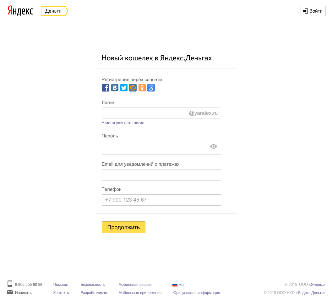
We removed the extra fields from the process, then we refreshed the visual part - we redrawed all the fields and controls in a new design. After analyzing the statistics, we found out that we are not paying enough attention to users with authorization through social networks - and raised the social authorization buttons to the very beginning - as a result, the number of registrations through social networks increased 5 times. In addition, the new registration has the opportunity to use the phone number as a login. The result - an increase in conversion in registration almost doubled.
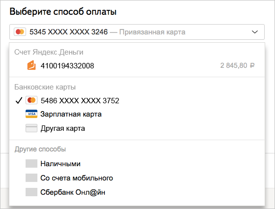
Here we would like to separately note that we are carefully reviewing each process that we redesign, we are looking for what else can be simplified for users. Payment service is a very extensive and complex mechanism with a large number of internal restrictions. Many of them are necessary to maintain safety at the proper level and to comply with legal and regulatory requirements. It is not always easy to implement solutions that are obvious to the user — and the designer — in such a system.
For example, in any transfer of money between individuals, we are obliged to request passport information - this is the law. To do this, we developed a whole system that determines where the user came from, what he pays for, what his payment history is, what identification status, whether he issued our bank card (where he may have entered passport data) - according to the results of the check decides whether to request additional information from him at a particular moment. As a result, the user on our site enters passport data not for every payment, but only once.
An example of security restrictions that are difficult for UX improvements can be a payment password: we request it for all critical actions in the wallet instead of remembering the one-click setting (and in addition we strongly recommend all customers to use one-time passwords from sms or application , instead of a simpler, but less secure, permanent password). But here, too, we are working on automating checks and confirmations that “you are you”, which ultimately will lead to simplification of interaction with the service while observing security requirements.
A separate project was the redesign of the page for beginners - those who first came to our service and want to understand what it is for and what they can do. After all, many people still believe that Yandex.Money is an electronic currency, and not an electronic payment service with many useful functions. It is clear that it is important for us to reverse the misconception.
The first version of the updated page was built on the principle “each service has its own screen”. We wanted to show the independence of each of our services: transfers, payment for services, receiving payments and, finally, a wallet, as a separate entity and aggregator of information about payments. For some services, even separate entry pages were made (for example, “City Payments” - a service for paying for services).
Having tested the page on a small percentage of the audience, we found out that such a solution does not give us any increase in registrations: the length will defocus users greatly. Then we removed from her all the excess and left only a direct transition to the registration and a brief description of the bonuses of the wallet. Transitions to other services (payment for services, transfers and acceptance of payments) were visually removed to the background.
The increase in registrations after the launch of the second version of this page was 8%. The results of the experiment confirmed the correctness of our approach to redesign: you do not need to try to show the user all the possibilities at the same time - you need to highlight the most important and correctly place accents.
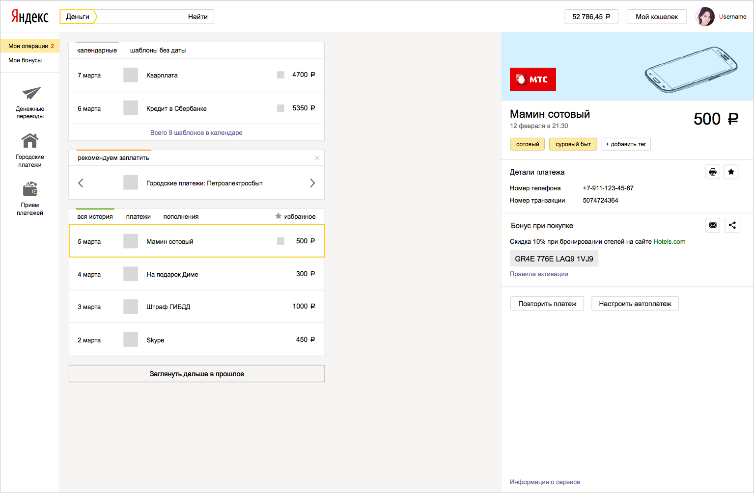
The next big step in the redesign was the main page for active users. For this project, we carefully studied the main ways the user moves through our site, the most frequent actions and visited pages. And then they brought to the fore all the most demanded: history, details of payment, saved payments with and without settings, all incoming cash transactions.
The main concept of the main page is reduced to the tape of payments, “timeline”. Below is the payment history in chronological order. Above - “future payments”: favorites, auto payments and payments, for which reminders are set. In the middle between them are recommendations based on the user's profile - “real”, what we want to offer the user right now.
In one of the first versions, we tried to divide these three blocks, changing the color of the line on which the timeline events are “strung”.
Looking at it, we realized that without titles, only we ourselves know which block is that, the user is unlikely to be obvious. We added the headings, combined all the blocks into one and highlighted the block “real” with color.
Here, however, we missed that this method of highlighting recommendations conflicts with the yellow highlighting of individual operations when the cursor is hovering over them - in the next approach we again divided the timeline blocks, but retained the headers.

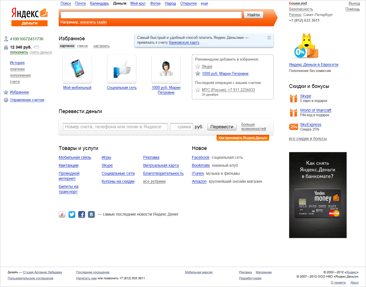
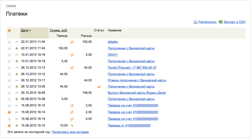
Simultaneously with the general structure of the page, we thought through the interaction of the user with the block of History. Old History was one big spreadsheet, similar to Excel.
We reformatted it into a compact tape, similar to the payment history in most modern Internet banking. Income and expense were separated by color, and the date was made more readable.
Previously, when clicking on a payment name, the user went to a separate page with payment details. In the new approach, we did not want to take the user off the main page, the task was to show all the payment details here. In the first approach, we used the solution proposed by Yandex.Disk — a column leaving the right with additional data. But unlike the Disk, the content of which is located across the entire width of the page, our information is concentrated on the left - having tried on this solution, we saw that on wide screens this situation looks at least strange.
In the second approach, we combined this column with the timeline - but being the same in width and mass, they began to compete with each other.

We also refused to show the details in the pop-up window, because such a window focused the user only on the details of the payment. And we wanted additional information not to interfere with the user to interact with the timeline.

The final version was another "island" next to the timeline, in which we compactly fit all the necessary information about the payment. It also carried all the target actions, which in the old details of the payment displayed invisible links.
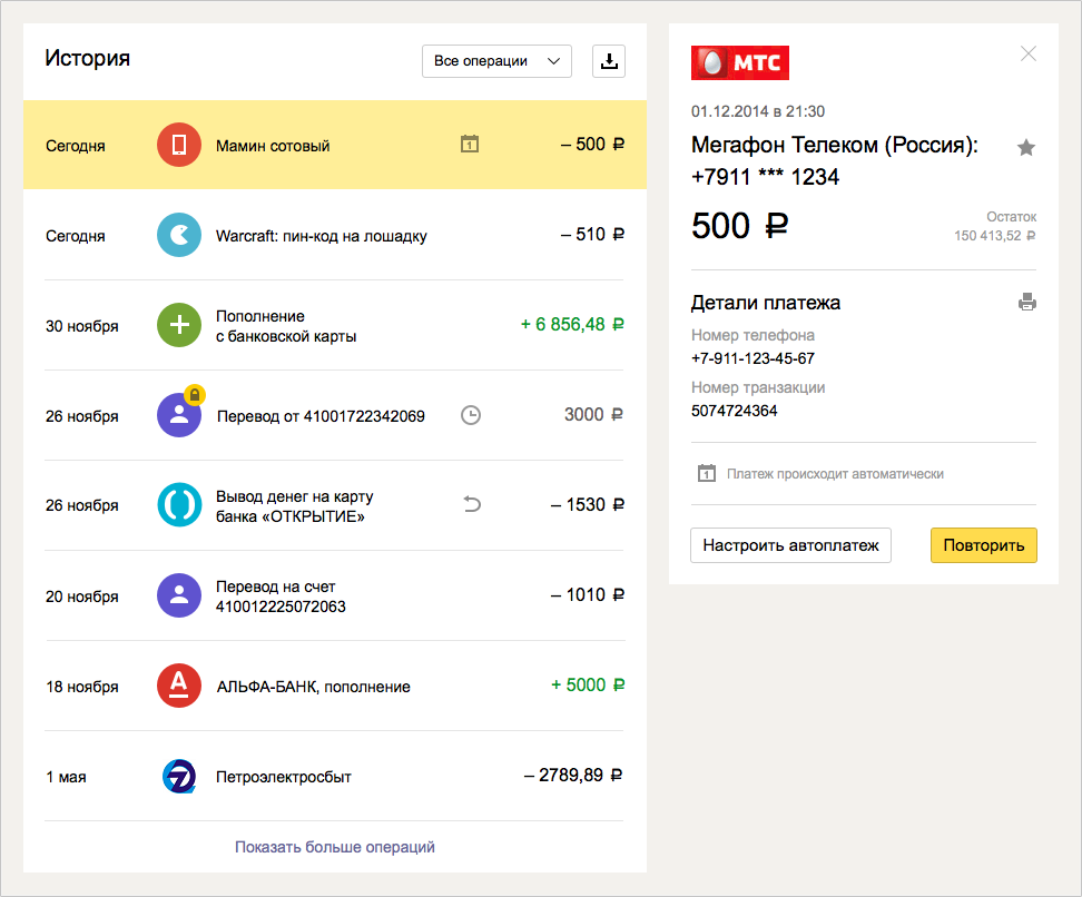
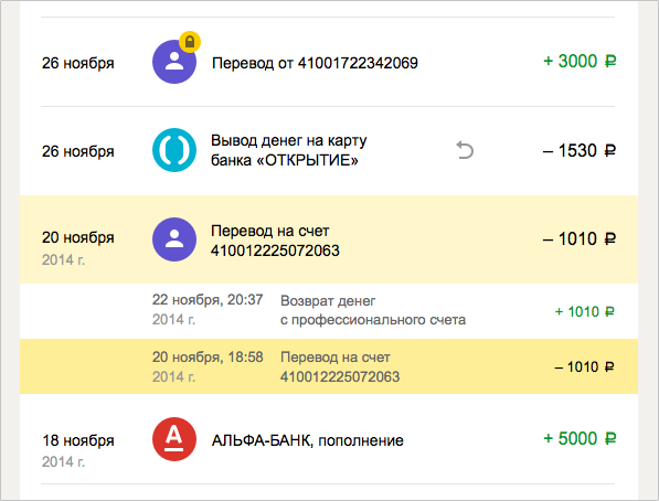
One of the first pieces that we came up with for the timeline was to combine related transactions (for example, payment and return) into chains, like “conversations” in the mail. In the Old Story, we implemented links through cross-references in the payment details, the links opened on a new page. Since in the new concept we tried to show all the details around the timeline and not lead the user anywhere, cross-references would have a strange effect: when you click on the link in the details of one operation, the timeline scrolls far back to the related operation in the past, the user literally falls into the past, losing focus on what I saw before clicking the link. Therefore, we have combined payments in chains: all related transactions are shown side by side, regardless of the time when they occurred.
“Gluing together” has allowed us, among other things, to relieve users of the confusion associated with the technical features of payments tied to the card. Such a payment is technically divided into two operations: replenishing the wallet with a card and payment from the wallet to the store. In the old story both operations were consistently displayed - and this confused many users. Now you can see the main payment in the timeline - to the store, and the technical account replenishment is hidden in a chain of related operations.
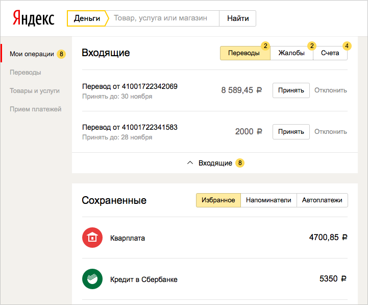
Another block that can appear on the timeline from time to time is incoming operations that require actions from the user: for example, a secure transfer that is pending confirmation of a protection code. On the main page we display them in an additional top block with a marker counter.

In parallel with the design of scenarios, we worked on a system of icons, drawing new interface elements, placing accents and rules for interaction between the blocks - here we mainly relied on the Yandex visual guideline system. For some difficult moments, our designers invented their own solutions, which then, in turn, offered other Yandex services. For example, many of our scenarios suggest filling out complex forms and the standard set of guideline form elements was not enough - this is how we got a “pseudo-field” (a field whose value is automatically filled in based on previous user actions, but the value can be corrected) or complex drop-down lists with icons and grouping.

For new users who still have no History, no recommendations, no reminders, we have made a separate navigator page - it helps to get comfortable in the wallet and introduces the most popular features.

Returning to the prerequisites and goals of the redesign, the updated wallet performs better the function of the user's personal space, focused on its settings, habits and payment patterns. And payment services that grew out of the wallet, were able to develop independently, taking into account the needs of all users - and those who use them from the wallet, and those who come to the site from the outside.
During this year we have come a long way from ideas and sketches to the full implementation of the redesign of the most significant part of our site. In addition to the above, we completely rewrote the form of transfers (a separate story can be made about it - there were so many disputes and approaches to this form!), The designer of payment acceptance solutions , launched the Yandex.Cash site and made many other small improvements supporting the future redesign.
Ahead is a redesign of forms of payment for all goods and services on the site, simplification of the payment process, revision of all non-payment processes, such as linking a card or restoring access to an account. The further we advance, the more complete and more convenient our updated service becomes. We will be glad to constructive feedback.
So far, the new view is only available to parts of users, but everyone who has a wallet can look at it for a direct link .
')
We began to redesign in early 2014 after a large study with usability testing and statistical analysis.
By 2014, Yandex.Money has greatly changed functionally: from an electronic wallet with a relatively narrow set of opportunities, we have evolved since the last redesign into a large service for payments on the Internet and offline, with our own “stores” and the ability to pay for various goods and services without registering and many others.
After receiving the results of the study, we were convinced that we need to recycle many processes and points of interaction with the user. A simple example: on the internal pages of the portal, authorized users in the wallet could not find one of the most sought-after sections - “Translations”: historically, it was not put into navigation and only lived on the main page.
In addition, without any research it was clear that the appearance of the site began to become hopelessly obsolete - and in Yandex, work was just completed on a new system of visual guidelines, which our designers began to actively use.
Another prerequisite was the move to a new framework (from xScript to Node.js) - one of the most serious changes in our development. In fact, together with the redesign, we rewrite the site from scratch - page by page and step by step. This is the main reason why Yandex.Money is redesigned gradually, and not in one fell swoop. Thanks to Node.js, it became easier for us to maintain the current implementation of the pages and make quick edits at the same time on the entire portal, rather than on each page separately, as it was before, when most of it was implemented in xScript.
Based on this, the goals of the redesign were formed: a fresh and modern appearance, simplification of scenarios and a shortening of the way to the necessary sections on the site - so that people would come more readily and would like to return. Work on the redesign began in the spring of last year, when the first sketches of concepts were drawn and new ideas were discussed, and now it continues. And now - first things first.
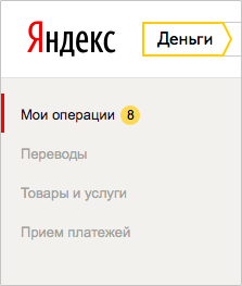
Navigation: restore order
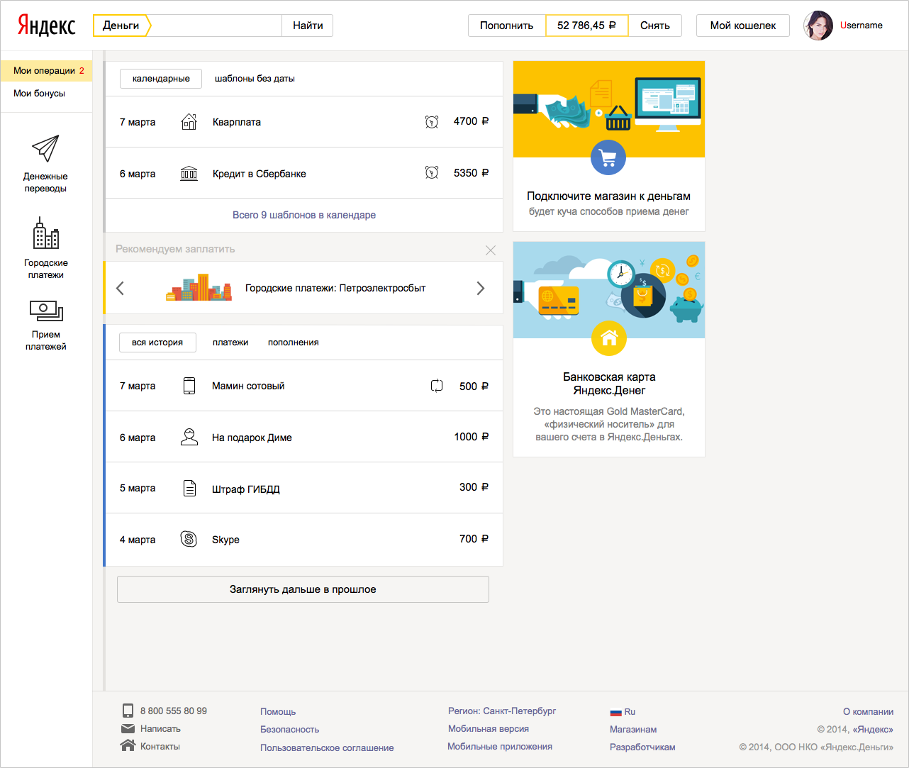
We wanted to give the user quick access to basic services and payment transactions, so we started with a navigation redesign. A wallet is a more complex system than just a user account, it has many additional properties and settings: management of linked and issued cards, several types of passwords, identification status and much more. We decided that it is necessary to divide navigation logically into two parts: in one - everything to control the settings of the wallet, and in the other - actions with money (pay, transfer, watch history, etc.).
Yandex services usually bring user preferences to the header. For example, the “My Music” button in the Yandex.Music header or “My Market” in Yandex.Market.
Therefore, in the first approach, the “My Wallet” button also appeared in the header. At the same time, the most important information for the user about the wallet - its balance - should have been visible. And the main operations that are directly related to the wallet - replenishment and withdrawal of money - should also be noticeable and easily found. The design quickly grew and became very cumbersome.
We decided to get rid of the “My Wallet” button: we combined it with a balance, which seems to be a wallet metaphor. Next to the balance, they placed a bank card icon - for users who have it linked to an account.
In this form, we launched a new header for users. But very quickly they realized that our metaphor with the balance did not work: nobody understood that it was necessary to press the balance in order to get into the settings of the wallet. Having conducted a small but very effective corridor usability testing, we did another iteration of the edits - we added a wallet icon next to the balance and an arrow indicating the drop-down menu.
It turned out that the arrow works wonders :) The number of questions about where to find the wallet number and other settings has decreased dramatically. We saw the same reduction in the statistics of search queries on the site.
Now we continue to improve this block: for example, for small screens, we collapse the “replenish” and “remove” buttons into neat “+” and “-”.
After analyzing the click-through map, we saw that in the drop-down menu with the settings of the wallet, they most often click on the beginning of the wallet number - obviously, in order to select it and copy it. Here we plan to add an automatic copy of the wallet number by clicking on it.
Developing the concept of logical division of navigation into two parts, in the left menu we brought out all the main services: transfers, payment for goods and services, tools for receiving payments.
In the first version of the concept, we displayed all menu items with icons.
Then they tried to separate the services and the history of user actions - they got another intermediate version.
At that moment, the search filters in Yandex search were also displayed with icons - having decided that this might confuse users, we still abandoned the icons and settled on the classic version with the text menu.
After the launch of the new navigation, the attendance of the site's nodal pages, on which we wanted to place the main accents, noticeably increased. The “Translations” link became the most clickable - we realized that the translation service can be developed as a separate entity, and free up space on the main page, previously occupied by the translation form, for other equally important blocks.
Registration: fewer steps, more options
Conversion of visitors to our site into registered users is one of our main goals, so we strived to make the registration as short and simple as possible. Two years ago, the user went through three steps to successfully complete the registration, a year ago we reduced this path to two steps, now our registration takes one screen.
We removed the extra fields from the process, then we refreshed the visual part - we redrawed all the fields and controls in a new design. After analyzing the statistics, we found out that we are not paying enough attention to users with authorization through social networks - and raised the social authorization buttons to the very beginning - as a result, the number of registrations through social networks increased 5 times. In addition, the new registration has the opportunity to use the phone number as a login. The result - an increase in conversion in registration almost doubled.
Here we would like to separately note that we are carefully reviewing each process that we redesign, we are looking for what else can be simplified for users. Payment service is a very extensive and complex mechanism with a large number of internal restrictions. Many of them are necessary to maintain safety at the proper level and to comply with legal and regulatory requirements. It is not always easy to implement solutions that are obvious to the user — and the designer — in such a system.
For example, in any transfer of money between individuals, we are obliged to request passport information - this is the law. To do this, we developed a whole system that determines where the user came from, what he pays for, what his payment history is, what identification status, whether he issued our bank card (where he may have entered passport data) - according to the results of the check decides whether to request additional information from him at a particular moment. As a result, the user on our site enters passport data not for every payment, but only once.
An example of security restrictions that are difficult for UX improvements can be a payment password: we request it for all critical actions in the wallet instead of remembering the one-click setting (and in addition we strongly recommend all customers to use one-time passwords from sms or application , instead of a simpler, but less secure, permanent password). But here, too, we are working on automating checks and confirmations that “you are you”, which ultimately will lead to simplification of interaction with the service while observing security requirements.
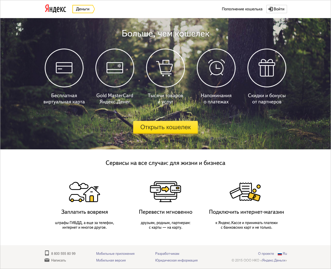
Home page for unauthorized users
A separate project was the redesign of the page for beginners - those who first came to our service and want to understand what it is for and what they can do. After all, many people still believe that Yandex.Money is an electronic currency, and not an electronic payment service with many useful functions. It is clear that it is important for us to reverse the misconception.
The first version of the updated page was built on the principle “each service has its own screen”. We wanted to show the independence of each of our services: transfers, payment for services, receiving payments and, finally, a wallet, as a separate entity and aggregator of information about payments. For some services, even separate entry pages were made (for example, “City Payments” - a service for paying for services).
Having tested the page on a small percentage of the audience, we found out that such a solution does not give us any increase in registrations: the length will defocus users greatly. Then we removed from her all the excess and left only a direct transition to the registration and a brief description of the bonuses of the wallet. Transitions to other services (payment for services, transfers and acceptance of payments) were visually removed to the background.
The increase in registrations after the launch of the second version of this page was 8%. The results of the experiment confirmed the correctness of our approach to redesign: you do not need to try to show the user all the possibilities at the same time - you need to highlight the most important and correctly place accents.
Payment timeline: we focus on user needs
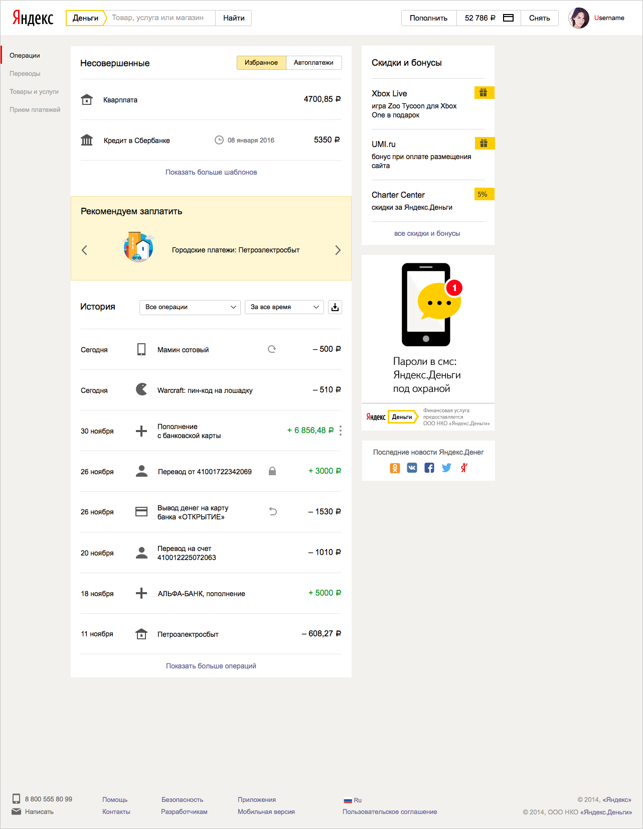
The next big step in the redesign was the main page for active users. For this project, we carefully studied the main ways the user moves through our site, the most frequent actions and visited pages. And then they brought to the fore all the most demanded: history, details of payment, saved payments with and without settings, all incoming cash transactions.
The main concept of the main page is reduced to the tape of payments, “timeline”. Below is the payment history in chronological order. Above - “future payments”: favorites, auto payments and payments, for which reminders are set. In the middle between them are recommendations based on the user's profile - “real”, what we want to offer the user right now.
In one of the first versions, we tried to divide these three blocks, changing the color of the line on which the timeline events are “strung”.
Looking at it, we realized that without titles, only we ourselves know which block is that, the user is unlikely to be obvious. We added the headings, combined all the blocks into one and highlighted the block “real” with color.
Here, however, we missed that this method of highlighting recommendations conflicts with the yellow highlighting of individual operations when the cursor is hovering over them - in the next approach we again divided the timeline blocks, but retained the headers.
Simultaneously with the general structure of the page, we thought through the interaction of the user with the block of History. Old History was one big spreadsheet, similar to Excel.
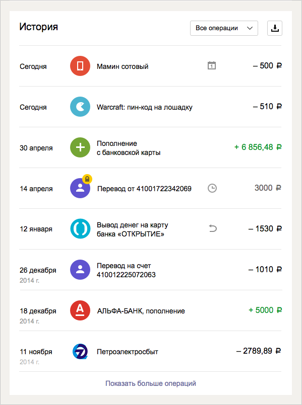
We reformatted it into a compact tape, similar to the payment history in most modern Internet banking. Income and expense were separated by color, and the date was made more readable.
Previously, when clicking on a payment name, the user went to a separate page with payment details. In the new approach, we did not want to take the user off the main page, the task was to show all the payment details here. In the first approach, we used the solution proposed by Yandex.Disk — a column leaving the right with additional data. But unlike the Disk, the content of which is located across the entire width of the page, our information is concentrated on the left - having tried on this solution, we saw that on wide screens this situation looks at least strange.
In the second approach, we combined this column with the timeline - but being the same in width and mass, they began to compete with each other.
We also refused to show the details in the pop-up window, because such a window focused the user only on the details of the payment. And we wanted additional information not to interfere with the user to interact with the timeline.
The final version was another "island" next to the timeline, in which we compactly fit all the necessary information about the payment. It also carried all the target actions, which in the old details of the payment displayed invisible links.
One of the first pieces that we came up with for the timeline was to combine related transactions (for example, payment and return) into chains, like “conversations” in the mail. In the Old Story, we implemented links through cross-references in the payment details, the links opened on a new page. Since in the new concept we tried to show all the details around the timeline and not lead the user anywhere, cross-references would have a strange effect: when you click on the link in the details of one operation, the timeline scrolls far back to the related operation in the past, the user literally falls into the past, losing focus on what I saw before clicking the link. Therefore, we have combined payments in chains: all related transactions are shown side by side, regardless of the time when they occurred.
“Gluing together” has allowed us, among other things, to relieve users of the confusion associated with the technical features of payments tied to the card. Such a payment is technically divided into two operations: replenishing the wallet with a card and payment from the wallet to the store. In the old story both operations were consistently displayed - and this confused many users. Now you can see the main payment in the timeline - to the store, and the technical account replenishment is hidden in a chain of related operations.
Another block that can appear on the timeline from time to time is incoming operations that require actions from the user: for example, a secure transfer that is pending confirmation of a protection code. On the main page we display them in an additional top block with a marker counter.
In parallel with the design of scenarios, we worked on a system of icons, drawing new interface elements, placing accents and rules for interaction between the blocks - here we mainly relied on the Yandex visual guideline system. For some difficult moments, our designers invented their own solutions, which then, in turn, offered other Yandex services. For example, many of our scenarios suggest filling out complex forms and the standard set of guideline form elements was not enough - this is how we got a “pseudo-field” (a field whose value is automatically filled in based on previous user actions, but the value can be corrected) or complex drop-down lists with icons and grouping.
For new users who still have no History, no recommendations, no reminders, we have made a separate navigator page - it helps to get comfortable in the wallet and introduces the most popular features.
What's next?
Returning to the prerequisites and goals of the redesign, the updated wallet performs better the function of the user's personal space, focused on its settings, habits and payment patterns. And payment services that grew out of the wallet, were able to develop independently, taking into account the needs of all users - and those who use them from the wallet, and those who come to the site from the outside.
During this year we have come a long way from ideas and sketches to the full implementation of the redesign of the most significant part of our site. In addition to the above, we completely rewrote the form of transfers (a separate story can be made about it - there were so many disputes and approaches to this form!), The designer of payment acceptance solutions , launched the Yandex.Cash site and made many other small improvements supporting the future redesign.
Ahead is a redesign of forms of payment for all goods and services on the site, simplification of the payment process, revision of all non-payment processes, such as linking a card or restoring access to an account. The further we advance, the more complete and more convenient our updated service becomes. We will be glad to constructive feedback.
Source: https://habr.com/ru/post/262769/
All Articles