Adaptation for various screens of Windows Store applications

I noticed that the developers have many questions about the adaptation of the application under the screens of various sizes. In order to be able to provide a link that has the necessary information, I decided to write this little material. I will consider not only applications under Windows 8.1, the development of Windows 10 UWP applications will also be affected.
It is not news to anyone that there are many devices with different screen sizes and resolutions. For a device with a small screen, but high resolution, an image of a different size and quality is needed than for devices with a large screen and the same resolution. This is due to the fact that the number of physical pixels of the device does not always coincide with the number of real pixels displayed by the system / application.
The scaling factor is the ratio of the real pixels of the device and the displayed ones. When calculating this coefficient, the standard distance from which users look at the device screen is also taken into account.
For Windows 8.1 applications, three scaling factors are supported: 100%, 140% and 180%. Windows Phone 8.1 applications have different scaling factors.
In the Windows Store emulator applications, when you change the screen resolution, you can see the resolution itself, and the value of the scaling factor next.

The process of image adaptation is similar to image localization. In order for various resolutions to take the correct version of the image, you must create 3 folders with the names inside the images folder: scale-100, scale-140, scale-180. Inside these folders already and add images with the same name.
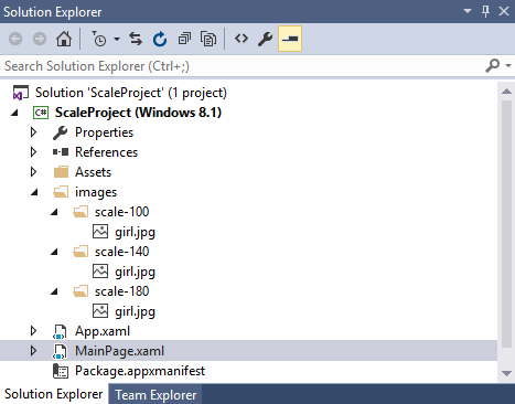
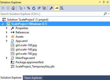
If you are going to store all the files in one folder, then you will need to add postfix files to the image files with an indication of the scaling factor.
Accordingly, you will need to create 3 versions of the image. If your standard image is 200 pixels wide, then to scale 140% you will need to multiply the width by 1.4. That is, you will need to create the same image 280 pixels wide. Well, to scale 180% you will need to have the same image width of 200 * 1.8 = 360 pixels.
During the execution of the application, the optimal image is automatically selected, depending on the resolution of the user.
If you specify an image file from a code, then the following official snippet can help you display the correct resolution, which, based on the value of DisplayInformation.GetForCurrentView (). ResolutionScale, determines the current screen scaling factor:
// Windows.Graphics.Display; ResolutionScale resolutionScale = DisplayInformation.GetForCurrentView().ResolutionScale; Uri uri = null; switch (resolutionScale) { case ResolutionScale.Scale100Percent: uri = new Uri("ms-appx:///images/scale-100/girl.jpg"); break; case ResolutionScale.Scale140Percent: uri = new Uri("ms-appx:///images/scale-140/girl.png"); break; case ResolutionScale.Scale180Percent: uri = new Uri("ms-appx:///images/scale-180/girl.png"); break; } image.Source = new BitmapImage(uri); Using these image scaling capabilities, you can create applications with flexible non-pixel layouts, for example, using a Grid and specifying proportional values of * * as cell sizes.
')
Adapt the layout of the application to the screen size
If the content of your application is placed in the Viewbox container element, then when you change the screen size, your content will be automatically stretched and scaled to fill all the available space. In order for raster images to look decent at this magnification, you need to add a few options of different sizes, as we just looked at.
Placing the application inside the Viewbox is one of the proposed options for adapting the application to different screens. Another option would be to hide application elements or resize them. Consider working with different sizes of the application on the example of the snap mode.
By default, a Windows 8.1 application can be at least 500 pixels wide. In case your application will look good even with a narrower form, or it may well be used with other applications, and also if you want to keep it as long as possible in the working position - you can set it to a minimum width of 320 pixels. This can be done by specifying a minimum width of 320 in the manifest editor or by adding the MinWidth attribute to the manifest code with a width320 value (by the way, in Windows 8 applications the snap mode was just 320 pixels)
<m2:ApplicationView MinWidth="width320" /> The simplest option to adapt an application for different widths can be an imperative setting of visibility / invisibility, as well as the width and height of controls in the screen size change event. You can do it like this:
public MainPage() { this.InitializeComponent(); this.SizeChanged += MainPage_SizeChanged; } /// void MainPage_SizeChanged(object sender, SizeChangedEventArgs e) { if (e.NewSize.Width < 500) { grdMain.Width = 475; txtField1.Visibility = Visibility.Collapsed; } else { grdMain.Width = 1000; txtField1.Visibility = Visibility.Visible; } } /// ... But this can be done in small applications, in which it will not be difficult for you to sort through all existing controls in C # code. For normal applications, it is best to keep changes to the appearance in XAML VisualState states. Thus, it is possible to provide the designer with the ability to comfortably change the layout in Blend. The following example contains the same changes as the previous code:
<Grid x:Name="grdMain" Background="Brown" Width="700"> <VisualStateManager.VisualStateGroups> <VisualStateGroup> <VisualState x:Name="DefaultLayout"> <!-- XAML--> </VisualState> <VisualState x:Name="MinimalLayout"> <Storyboard> <ObjectAnimationUsingKeyFrames Storyboard.TargetName="grdMain" Storyboard.TargetProperty="Width"> <DiscreteObjectKeyFrame KeyTime="0" Value="475"/> </ObjectAnimationUsingKeyFrames> <ObjectAnimationUsingKeyFrames Storyboard.TargetName="txtField1" Storyboard.TargetProperty="Visibility"> <DiscreteObjectKeyFrame KeyTime="0" Value="Collapsed"/> </ObjectAnimationUsingKeyFrames> </Storyboard> </VisualState> <VisualState x:Name="Portrait"/> <VisualState x:Name="Landscape"/> </VisualStateGroup> </VisualStateManager.VisualStateGroups> <TextBlock x:Name="txtField1" FontSize="28">gferg</TextBlock> <Image x:Name="image" Source="images/girl.jpg" /> </Grid> Now in the window resizing event we can go to the desired state (depending on the current screen size):
void MainPage_SizeChanged(object sender, SizeChangedEventArgs e) { if (e.NewSize.Width < 500) { VisualStateManager.GoToState(this, "MinimalLayout", true); } else { VisualStateManager.GoToState(this, "DefaultLayout", true); } } // , // if (e.NewSize.Width < e.NewSize.Height) Here, to get the screen size in width and height, we again used the SizeChangedEventArgs e parameter.
At any other moment of the program execution, the width and height of the visible application window (the so-called effective pixels that do not depend on the screen size of the device) can be obtained as follows:
double windowWidth = Window.Current.Bounds.Width; double windowHeight = Window.Current.Bounds.Height; In addition to effective pixels, there are also raw pixels (English raw - raw, unprocessed) - the actual number of pixels on the screen or physical pixels. For example, if the device's screen is 1080 pixels wide, then the number of raw pixels will be 1080 horizontally.To get the physical size of the application window in inches (if for some reason you suddenly needed this information), you can use the following trick:
double width = Window.Current.Bounds.Width * (int)DisplayInformation.GetForCurrentView().ResolutionScale / 100; double height = Window.Current.Bounds.Height * (int)DisplayInformation.GetForCurrentView().ResolutionScale / 100; double dpi = DisplayInformation.GetForCurrentView().RawDpiY; // , 0 DPI double screenDiagonal = Math.Sqrt(Math.Pow(width / dpi, 2) + Math.Pow(height / dpi, 2)); What about universal Windows platform applications?
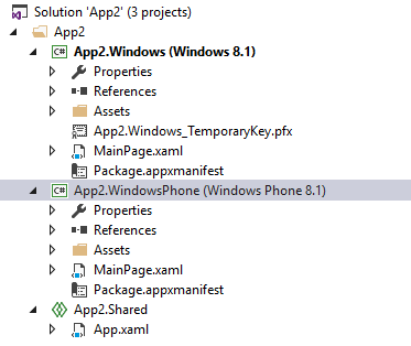
Universal Windows 8.1 applications already gave us the opportunity to make our own separate XAML layout for WP and for Store. The following screenshot shows two MainPage.xaml files:
In UWP applications, we will have the opportunity to create multiple XAML files with views of the application's appearance and select the desired one, depending on various factors (screen size, resolution, etc.). Let's try.
Create a DeviceFamily-Mobile directory in the project.
Click on it with the right mouse button and select the item Add new item
Of the options, we need to select the XAML View and name our view in the same way as the view that we want to replace. In the simplest case, this could be MainPage.xaml.
Now the XAML code that we enter into the MainPage.xaml file located in the DeviceFamily-Mobile folder will be displayed on mobile devices. On desktops and other devices, the design of the application from the main MainPage will be displayed.
RelativePanel
Now a new RelativePanel control has become available to us, which allows us to create position relationships between its children.
For example, the following code:
<RelativePanel> <TextBox x:Name="textBox1" Text="textbox" Margin="5"/> <Button x:Name="blueButton" Margin="5" Background="LightBlue" Content="ButtonRight" RelativePanel.RightOf="textBox1"/> <Button x:Name="orangeButton" Margin="5" Background="Orange" Content="ButtonBelow" RelativePanel.RightOf="textBox1" RelativePanel.Below="blueButton"/> </RelativePanel> sets the orange button to the position under the light blue:
An example is taken from here .
AdaptiveTrigger
Windows 10 applications not only support VisualState states, but also extend them with new functionality. Firstly, it is now possible to use triggers for UI. And secondly, the VisualStateManager now supports Setters. Now there is no need to create a 0-second animation (even more so - outdated). Thanks to this, the code becomes more readable. Compare the following example with the one we saw earlier:
<Grid x:Name="LayoutRoot"> <VisualStateManager.VisualStateGroups> <VisualStateGroup> <VisualState x:Name="WideState"> <VisualState.StateTriggers> <AdaptiveTrigger MinWindowWidth="600" /> </VisualState.StateTriggers> <VisualState.Setters> <Setter Target="LayoutRoot.Background" Value="Green" /> </VisualState.Setters> </VisualState> <VisualState x:Name="NarrowState"> <VisualState.StateTriggers> <AdaptiveTrigger MinWindowWidth="0" /> </VisualState.StateTriggers> <VisualState.Setters> <Setter Target="LayoutRoot.Background" Value="Red" /> </VisualState.Setters> </VisualState> </VisualStateGroup> </VisualStateManager.VisualStateGroups> </Grid> Pay attention to the line
<AdaptiveTrigger MinWindowWidth="600" /> Here you set the value of the minimum width of the application window at which the trigger will fire. Next, using the Setters sets the color for the state. All this code means that when you change the width of the application, in case the width becomes wider than 600 pixels, the Layout color becomes green.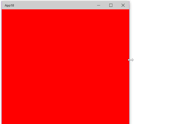
Wonderful article (English), from which I took this example is here .
Device preview toolbar
In Windows 10, application scaling is expected to expand. Already now you can test the display of the appearance of your XAML code on various devices using the device preview toolbar:

Pay attention to the screenshot. You may notice that Windows 10 applications support much more scaling factors than Windows 8.1 applications. Here is a tablet from the BUILD 2015 presentation comparing the scaling capabilities of various platforms:
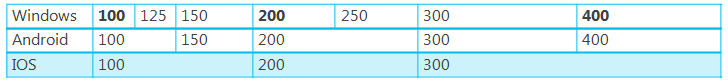
As you can see, Windows 10 applications are at their best - they are the most “rocky”.
Something else? We will find out very soon, after all, July 20 is not far off - the release date of Visual Studio 2015, and there until July 29th and the release of Windows 10 is already within reach.
Source: https://habr.com/ru/post/262747/
All Articles