Can email be rubber?
Whether you like it or not, it is impossible to deny the prevalence of HTML emails, as well as the transition of email to a mobile environment ( more than half of all discoveries now occur on mobile devices).
At the same time, the situation with the layout of letters can now be compared with the way things were on the web as long as the web standards did not become hmm ... standards. In short, it’s just a hell for a designer.
')
In this case, the creation of the mailing list does not have to be accompanied by pain, blood and tears. Yes, many people use tabular layout with media queries and inline-styles, but there are also “production leaders” who adapt the latest web design techniques to the archaic field of postal design.
The principles of responsive web design, formulated in the book by Ethan Marcott , can be applied to work with e-mails. And all this so that subscribers can normally read messages on different devices.
What is the value of HTML letters
Regardless of whether you like it or not, HTML letters are an important marketing tool for a huge number of businesses. Its effectiveness often far exceeds all other marketing channels (like social networks). In addition, the mailing list allows you to interact with a huge number of people at the same time, while maintaining the intimacy of personal communication.
Some companies do not use email for active communication with users, but one way or another regularly send them letters. Accounts, announcements of new product features, a link to a new technical blog post - there are many reasons to send a message to subscribers, and an email is suitable for this as well as possible.
Many developers and designers send plain text-letters to subscribers. They can be quite effective , moreover, they are easier to typeset, not to mention other important advantages (they load quickly, are displayed in any email client, etc.). At the same time, HTML-versions of letters have their advantages:
- Hyperlinks - it often happens that you need to send a letter from a user to some page, and without a built-in link it is more difficult to make (few people want to copy and paste something into the browser bar).
- Design - well-made HTML-letters look attractive and allow companies to convey their corporate identity even to the inbox.
- Hierarchy - Using HTML layout makes it easier to create a clear hierarchy and highlight important points in a message.
- Results Tracking — HTML allows you to use discovery tracking and engagement indicators — these are important information for optimizing marketing efforts.
If you have developed an application that has been licked to the smallest detail, but have “hammered” into your mailing list, then this results in three negative points: 1) the opportunity to work on building a strong brand is lost, 2) you know nothing about who, when and how generally reads your letters, 3) do not help users in any way and do not answer their questions outside the application.
Why html letters sucks
Traditionally, it is considered to be engaged in the development of HTML-mailings - the worst occupation for the designer and developer. It’s like getting into a time machine and heading straight into the “dashing nineties” tabular patterns, inline styles, non-semantic markup and hacks for each client application.
Here is a brief list of reasons why HTML emails hurt:
- There are no standards . Yes, everyone uses HTML and CSS, but not on the web. There are no real standards for how email clients should work. All this sometimes leads to the emergence of a truly insane code.
- Email clients . Mail programs like the same Outlook or Gmail render HTML differently, and often quite bizarrely. Which, in turn, leads to ...
- Needs hacks . For everything to work in different programs, you need to provide a lot of points that are important to display the letter in each of them.
- No javascript . One of the most popular web languages in email is missing as a class, because email clients cut out similar code for security reasons. So farewell to interactivity.
- Inline styles . Most email clients are forced to use inline styles and attributes for any reason.
There is no reason to hope for significant changes in this regard in the near future. However, among designers and developers of email campaigns, there is a whole movement of people who seek to bring more order from the web into their field of activity. These include members of a team of specialized email services, such as Litmus, MailChimp, Campaign Monitor, Pechkin-mail.ru , and individual professionals like Anna Yeaman , Nicole Merlin , Fabio Carneiro , Elliot Ross , Brian Graves and dudeonthehorse here in Habré.
Changing inbox
Like everything on the web, email goes to mobile. Now more than half of all letters read on the screens of mobile devices, and these numbers will only grow. The good news is that web browsers can adapt their existing skills and apply them to creating high-quality and user-friendly emails.
How does HTML layout work
Generally speaking, the creation of an HTML version of a letter can be compared to the layout of a web page in a world where nothing is known about web design standards . HTMl-layout in email is on three pillars: tables, HTML-attributes and inline-CSS. It is important to understand that due to the peculiarities of the work of different email clients, which support the same things in different ways (and do not support much at all), you have to work with a very limited set of HTML and CSS elements. Here is an excellent graph of what popular mail clients support from CSS.
Before studying the issues of rubber layout, take a look at the basic things. For example, let's analyze one of the Litmus templates ( github code ).
Tables
Most web designers use tags like div, header, section, article, nav and footer to structure web pages. Unfortunately, email designers do not have the luxury of using semantic elements. Instead, you * must * use HTML tables to create templates. And these tables insert one into the other ... many times.
In order to stylize these tables, you will have to use attributes that most people have never seen in their eyes for quite some time:
width , height , bgcolor , align , cellpadding , cellspacing and border . In combination with inline styles like padding , width and max-width , you can already achieve something.Below is a sample code of a well-composed table letter:
<table border="0" cellpadding="0" cellspacing="0" width="100%"> <tr> <td bgcolor="#333333"> <div align="center" style="padding: 0px 15px 0px 15px;"> <table border="0" cellpadding="0" cellspacing="0" width="500" class="wrapper"> <tr> <td>…Content…</td> </tr> </table> </div> </td> </tr> </table> It’s easy to see how the tables are nested and the
border , cellpsacing and cellpsacing attributes are used. At the cell level, bgcolor is used (this is a more reliable method than background or background-color , although the latter is applied).An interesting point: a
div used to center the nested table and ensure that there is indentation around the content. Along with using tables for structuring, a div is used to align content blocks. However, they cannot be used as a basic structure, since in many mail programs this will not work.Images
Using images in email is very similar to using them on the web, with the exception of one small point: a huge number of email programs disable pictures by default, showing “broken” letters to users:

There is no way to automatically turn on the display of pictures in mail programs (and thank God, in general), but the situation can be improved by using alt-text, which can convey some context of turned off images. Moreover, you can use inline styles and img-elements to stylize this alt-text and create some appearance of having a “design”:
<img src="img/fluid-images.jpg" width="240" height="130" style="display: block; color: #666666; font-family: Helvetica, arial, sans-serif; font-size: 13px; width: 240px; height: 130px;" alt="Fluid images" border="0" class="img-max"> Using our code, you can add a little more meaning to the displayed letter:
Calls to action
One of the main advantages of HTML-layout is the use of clickable hyperlinks. In addition to using them in the text, you can still make large attractive buttons that you really want to press.
Many designers use pictures for buttons, but there is another approach - the use of bulletproof buttons , which is to draw them using code. Thus, the button is shown even in clients where display of pictures is turned off by default.
Below is the code of a similar button, the table uses borders (border) - this makes it clear that the whole button is clickable, and not just the text on it:
<table border="0" cellspacing="0" cellpadding="0" class="responsive-table"> <tr> <td align="center"><a href="http://alistapart.com" target="_blank" style="font-size: 16px; font-family: Helvetica, Arial, sans-serif; font-weight: normal; color: #666666; text-decoration: none; background-color: #5D9CEC; border-top: 15px solid #5D9CEC; border-bottom: 15px solid #5D9CEC; border-left: 25px solid #5D9CEC; border-right: 25px solid #5D9CEC; border-radius: 3px; -webkit-border-radius: 3px; -moz-border-radius: 3px; display: inline-block;" class="mobile-button">Learn More →</a></td> </tr> </table> 
We have dealt with the basic things, now let's look at how you can make a letter truly “rubber”.
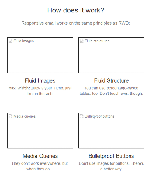
How does the "rubber" email-layout
As in the case of rubber websites, there are three main components of responsive writing: flexible images, flexible template and media queries. All the difference between the web and email only in their implementation.
In email design, we deal with a limited set of HTML and CSS elements. You cannot use properties and values that designers use for responsive websites on the Web, margin, float, em - all this does not work in most email clients. So you need to figure out how to get around this in each case.
Flexible images
“Liquid” pictures - not such a difficult thing. In some mail clients, even despite the use of a width of 100%, there are problems with rendering images in their estimated size, unless the width and height are specified with the appropriate attribute. Therefore, you need to register specific dimensions and show them in the appropriate case.
First of all, you need to make sure that everything is OK with the image code itself. Take a look at the code from the example above:
<img src="responsive-email.jpg" width="500" height="200" border="0" alt="Can an email really be responsive?" style="display: block; padding: 0; color: #666666; text-decoration: none; font-family: Helvetica, arial, sans-serif; font-size: 16px;" class="img-max"> Notice the
display property? This, like the border attribute, is only one of the many hacks that have to be used to work with treacherous email clients. Most web clients add space around images to fix possible size problems. Working with pictures at the cell level allows you to kill these indents and save the design.Now, in order to make the image truly flexible, you need to use the media query in the message header:
img[class="img-max”] { width:100% !important; height: auto !important; } Not every image should be “liquid”. Logos, icons of social networks and other similar elements may well be the same size on different devices, so the classes are used.
Since we will most often suppress inline styles and HTML image attributes, the declaration is important.
Now consider something more complicated.
Flexible templates
Most web designers are familiar with the technique of creating responsive pages using semantic elements with relative values like
em , re , percentage . Although it is possible to use percentages in email, they will be applied inline and subject to certain restrictions.Almost all of our tables have a percentage width. The only exception is the container table, which has a specific width specified in pixels that limits the overall size of the template in order to prevent it from “breaking” in mail clients that do not work well with percentages (for example, in all versions of Outlook).
Let's start with the container table:
<table border="0" cellpadding="0" cellspacing="0" width="500" class="wrapper"> <tr> <td>…Content…</td> </tr> </table> We used the
width attribute to limit the width of the table to 500 pixels.This container will contain all nested tables, in which percentages can already be used safely, since the common border is already rigidly set and equals 500 pixels.
But what good is flexible tables if the letter itself is always 500 pixels wide? Take a look at the container again. We have included the
wrapper class. This selector will be used to make the letter truly rubber using media queries.Email Media Requests
In email, media queries work just like on the web. By including them in the template header, you can activate attributes for a specific device and change styles accordingly.
For simplicity, in our example, we will aim at screen sizes with a max-width of 525 pixels and below. Then, using the
wrapper we will cancel the HTML attributes and inline styles, causing the container table to be displayed on the full width of the mobile device screen: @media screen and (max-width:525px) { table[class=“wrapper”] { width:100% !important; } } We can also force nested tables to do the same - content sections will effectively occupy the available space. It would be nice to increase the size of the text and buttons:
@media screen and (max-width:525px) { body, table, td, a { font-size:16px !important; } table[id=“responsive-table”] { width:100% !important; } } The main and rather large minus of media queries is that they are far from being supported everywhere. WebKit-based clients like iOS Mail and the default Android email application support them, but Gmail, Mail.ru, Yandex, Windows Phone 8 are not.
However, if the audience of a particular company mainly uses iOS and Android, everything is not so bad.
Conclusion
The techniques described above are just the beginning. Advanced email designers explore the possibilities of working with web fonts , SVG and CSS3 animations. Layout of e-mails is a complicated matter, in which everything constantly breaks, but various experiments make it possible to grope your way to creating truly high-quality, useful and informative mailings.
The main thing to forget about the need to test all that is possible. Email clients are much worse than browsers in terms of rendering and supporting HTML and CSS. It is necessary to test both on real devices and with the help of special preview services (for example, from Pechkin ).
In addition, it is necessary to test not only the display of the letter, but also to look for more effective versions of texts, content, distribution time (here is our post with important statistics on this subject).
In general, no need to put a cross on the email-design. Now this is a “necessary evil”, but over time this area of knowledge will become better. Various techniques are constantly being tested and updated and responsive design is one of them. If a company really cares about its product and its presentation on the web, then this fuse should be enough to work with e-mail, which, recall, is one of the most popular and valuable communication channels.
Source: https://habr.com/ru/post/262585/
All Articles