Slightly more adaptive site on 1C-Bitrix, analogue of visibility classes from bootstrap
As we all know, from April 21, 2015, Google will pessimize sites that are unsuitable for viewing on mobile devices when ranking. CSS frameworks like Bootstrap, CMS settings, in particular, 1C-BEAS of the latest versions help fight many troubles. But they all do not solve another, very important problem: it is not enough just to hide unnecessary content on certain devices, you need to prevent it from loading.
In this article I will talk about the extension of the site management that I wrote for 1C-Bitrix, which solves the problem announced above.
Google itself gives preference to responsive sites; one site is better than two identical in content but different in form. For studios and their clients, adaptive sites are also attractive from an economic point of view, an adaptive site will be cheaper in development and support than a dial-up and mobile version.
So, we have a site on 1C-Bitrix, an integrated layout on Bootstrap3 and a desire to help your mobile users.
')
Previously, to achieve a more or less decent-looking, adaptive version of the site, layout designers and content managers used remarkable visibility classes ".hidden-lg, .hidden-md, .hidden-sm, and .hidden-xs". This is enough to hide unnecessary blocks on those or other user screen resolutions.
- “But what about the resources?” Pictures and js were both loaded and loaded onto user devices. Sometimes these are megabytes of unnecessary traffic, and if we talk about mobile users, then expensive and slow traffic. Here, of course, you can brush it off - “there is a tag and checks in js!”, But we understand that the same content manager is not able to solve the problem with the help of these tools.
Reflecting on this, I came to the conclusion that classes of visibility are, of course, a good thing, but you need to make some more effective tool. The tool should allow you to cancel the download of any content on the user's device, in other words, the server itself should not give a specific piece of code so that it is not loaded by the user. At the same time, the tool should be as simple as possible, as visibility classes.
I started by searching for solutions that would allow us to determine the mobile user “still on the fly”, and not during the page rendering. This solution was the PHP library Mobile Detect (link in the basement). This PHP library allows you to determine the user of the smartphone / tablet / desktop, and also gives a lot of background information on the device user who came to the site. From the whole variety of the library, I chose only one method; he answered the question: “is this a mobile user or not?” Of course, it was possible to isolate more and tablets, but I grabbed them in a heap with smartphones.
A start has been made, we can separate mobile users from desktop, then we need to make the tool itself.
This is where the 1C-Bitrix API comes to the rescue, and specifically the OnEndBufferContent event (link in the basement). The method is called when displaying buffered content and allows them to manipulate.
Things are easy, we intercept the OnEndBufferContent event, connect the Mobile Detect library and find out if we are mobile. Further, depending on the answer, we throw out unnecessary blocks from the content, and transfer the rest to the user's output.
For content managers, I made the simplest version of the page layout. Content wrapped in <lg> </ lg> will only be displayed on desktops, and <xs> </ xs> only on mobile devices. Clear, simple and effective. Naturally, when catching unwanted blocks, the markup tags <lg> </ lg> <xs> </ xs> are cut out from the code, which makes it possible not to harm the layout semantics.
This could have been finished, but the project has a lot of studio, copying the code back and forth is inconvenient + you need to somehow be updated. Therefore, I wrapped my work in a module, and then in a separate extension for the Marketplace. During the work on the extension, it acquired the instructions for use, displayed in the administrative panel, as well as the API method that answers the same question “mobile?”. The last innovation allows you to use the module when writing your components and templates to them, here the flight of fancy is limitless, the component templates can be transformed and adjusted to the user, and most importantly, the whole thing is perfectly friendly with the built-in cache Bitrix.
As a result, I managed to create a fast and simple analogue of the visibility classes for 1C-Bitrix UT. The solution not only allows you to hide and display content for different types of users, but also significantly saves traffic, reduces page load time, unloads the processor of mobile devices without rendering js sliders that are complex and unnecessary on mobile phones and other delights of desktop versions of the site.
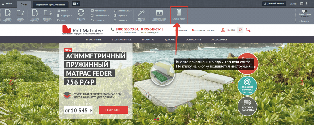
A couple of screenshots of what happened:

In this article I will talk about the extension of the site management that I wrote for 1C-Bitrix, which solves the problem announced above.
Google itself gives preference to responsive sites; one site is better than two identical in content but different in form. For studios and their clients, adaptive sites are also attractive from an economic point of view, an adaptive site will be cheaper in development and support than a dial-up and mobile version.
So, we have a site on 1C-Bitrix, an integrated layout on Bootstrap3 and a desire to help your mobile users.
')
Previously, to achieve a more or less decent-looking, adaptive version of the site, layout designers and content managers used remarkable visibility classes ".hidden-lg, .hidden-md, .hidden-sm, and .hidden-xs". This is enough to hide unnecessary blocks on those or other user screen resolutions.
- “But what about the resources?” Pictures and js were both loaded and loaded onto user devices. Sometimes these are megabytes of unnecessary traffic, and if we talk about mobile users, then expensive and slow traffic. Here, of course, you can brush it off - “there is a tag and checks in js!”, But we understand that the same content manager is not able to solve the problem with the help of these tools.
Reflecting on this, I came to the conclusion that classes of visibility are, of course, a good thing, but you need to make some more effective tool. The tool should allow you to cancel the download of any content on the user's device, in other words, the server itself should not give a specific piece of code so that it is not loaded by the user. At the same time, the tool should be as simple as possible, as visibility classes.
I started by searching for solutions that would allow us to determine the mobile user “still on the fly”, and not during the page rendering. This solution was the PHP library Mobile Detect (link in the basement). This PHP library allows you to determine the user of the smartphone / tablet / desktop, and also gives a lot of background information on the device user who came to the site. From the whole variety of the library, I chose only one method; he answered the question: “is this a mobile user or not?” Of course, it was possible to isolate more and tablets, but I grabbed them in a heap with smartphones.
A start has been made, we can separate mobile users from desktop, then we need to make the tool itself.
This is where the 1C-Bitrix API comes to the rescue, and specifically the OnEndBufferContent event (link in the basement). The method is called when displaying buffered content and allows them to manipulate.
Things are easy, we intercept the OnEndBufferContent event, connect the Mobile Detect library and find out if we are mobile. Further, depending on the answer, we throw out unnecessary blocks from the content, and transfer the rest to the user's output.
For content managers, I made the simplest version of the page layout. Content wrapped in <lg> </ lg> will only be displayed on desktops, and <xs> </ xs> only on mobile devices. Clear, simple and effective. Naturally, when catching unwanted blocks, the markup tags <lg> </ lg> <xs> </ xs> are cut out from the code, which makes it possible not to harm the layout semantics.
This could have been finished, but the project has a lot of studio, copying the code back and forth is inconvenient + you need to somehow be updated. Therefore, I wrapped my work in a module, and then in a separate extension for the Marketplace. During the work on the extension, it acquired the instructions for use, displayed in the administrative panel, as well as the API method that answers the same question “mobile?”. The last innovation allows you to use the module when writing your components and templates to them, here the flight of fancy is limitless, the component templates can be transformed and adjusted to the user, and most importantly, the whole thing is perfectly friendly with the built-in cache Bitrix.
As a result, I managed to create a fast and simple analogue of the visibility classes for 1C-Bitrix UT. The solution not only allows you to hide and display content for different types of users, but also significantly saves traffic, reduces page load time, unloads the processor of mobile devices without rendering js sliders that are complex and unnecessary on mobile phones and other delights of desktop versions of the site.
A couple of screenshots of what happened:
Materials used to create the solution
Source: https://habr.com/ru/post/262533/
All Articles