Facebook World Data Analysis
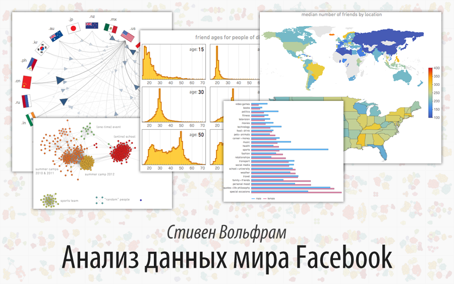
Translation of Stephen Wolfram's post " Data Science of Facebook World ".
I express my deep gratitude to Kirill Guzenko for his help in translating.
alizar wrote a short note about this article and the Wolfram | Alpha and Wolfram Language functional described in it. In our blog, we give a complete translation.
Millions of people are currently using our Wolfram | Alpha Personal Analytics for Facebook app. And, as part of our latest update , in addition to collecting some anonymous statistics, we launched a “data donation” program that allows people to share with us the detailed data we use for research and development purposes.
A few weeks ago we decided to analyze all this data. And I have to say that it was nothing more than a terrific example of the power of Mathematica and Wolfram language in data science (this is also good material for a course in data science that I started to prepare).
We have always planned to use the data we collect to improve our personal analytics system. But I could not resist my attempts at the same time and consider all this from a scientific point of view.
')
I have always been interested in people and their life paths. But I have never succeeded in combining this with my scientific interests. Up to this point. The past few weeks have been quite exciting in observing the results we got. Some were expected, while others were so unpredictable that I would never have suggested anything like that. And it all reminded of the phenomena from my work A New Kind of Science (New kind of science).
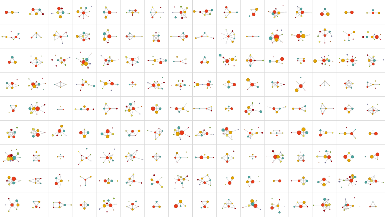
So what does the data look like? Below are the social networks of several data donors - groups of friends are broken down by color (anyone can find their own network using Wolfram | Alpha or the SocialMediaData function in Mathematica ( in the latest version of Wolfram Language this function supports Facebook, GooglePlus, Instagram, LinkedIn, Twitter - Ed. )).
The first quantitative question: how large are these networks usually? In other words, how many friends do people usually have on Facebook? Well, at least in relation to users from our sample, this question is easy to answer. The median is 342, and below is a histogram showing the distribution (the graph is built on the [0; 5000] segment, because this is the maximum number of friends on the Facebook page):

How typical are our users (in other words, how representative is our sample)? In many ways - as far as we can say - they look pretty typical. But there are certainly some differences. Here is the distribution of the number of friends not only for our users, but also for their friends (there is a mathematical subtlety in the separation of these sets of users, which I will discuss later):

We see that in this wider aggregate of Facebook users there are significantly more people who have almost no friends on Facebook. Whether it is necessary to include such people in examples is a moot point. However, judging by the results obtained, they do not have a particular impact (a sharp protrusion on 200 friends probably relates to the system of recommending friends on Facebook.)
So good. Let's see how the typical number of friends on Facebook changes with the age of a person. Of course, we all know how many people indicate their age. However, let's build a graph of the dependence of the number of friends of users on their age. The solid line indicates the average number of friends; consecutive bars indicate the corresponding sample octyls.

After rapid growth, there is a peak in the number of friends, which falls on young people a little younger than 20 years, after which there is a gradual decline. Why it happens? I suspect that this is due to both the behavior of people and the fact that Facebook does not exist for too long. Assuming that people do not remove friends after they add them, one would expect that the number of friends should increase with increasing age. And the data is consistent with the results for young people. But there is a limit to growth, because the number of years during which people have a Facebook profile is limited. And if we assume that it does not depend on age, then from the graphs it follows that people add less people with age.
But what friends do they add? Taking a person of a certain age, we can, for example, build a distribution of ages of his friends. Here are some results (the spasmodic nature of graphs, especially for 70 years, is a consequence of the limited amount of data we have):

And here is the animated version:
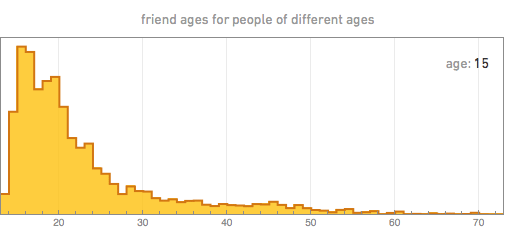
The first thing that catches the eye is that the age of friends always has a maximum near the age of the person himself, which probably reflects the fact that in modern society most friends appear in schools and are of the same age. In younger people, the peak of friends' ages is usually quite sharp. With age in people, the distribution gradually becomes wider.
We can summarize all this by building the age distribution of friends depending on the age of the person himself (the solid line shows the average age of friends):

There is an anomaly for the youngest ages, apparently due to children under the age of 13, who incorrectly indicate their age. But besides this, we see that young people, as a rule, have friends who are surprisingly close to them in age. The increase in the width of the distribution with increasing age of a person is probably due to the fact that in workplaces and in communities there is no such rigid relation to age as in educational institutions. And, from those graphs above, it turns out that by the middle of the fifth dozen people have a second peak in the younger age group, apparently because of their children, who are starting to use Facebook.
So what other information can you learn about people's lives? Here is a breakdown of the status of relationships specified in the profile, depending on age:

(from left to right: "lonely", "meets", "engaged", "married", "widowed", "other")
But in more detail, with the release of men (blue line) and women (purple line) (the “married +” group includes both “married”, and “in a civil marriage”, “divorced”, “widowed / widow” , etc.):

In children, there is some obvious absurdity (especially in girls) indicating that they are married. But in general, the trend is clear. The number of married people begins to increase in the third dozen, moreover a little earlier for women, and decreases at the end of the fourth dozen, when about 70% of people are already married. The share of those who are in a relationship has a peak around 24 years, and a small peak of engagement falls on 27 years. The proportion of people who indicated that they were married continues to grow quite linearly with age, reaching about 75% between 40 and 60 years, and the proportion of people who indicated their relationship status as single (single / single / no serious relationship; further - “not married” / not married ") continues to grow for women, while for men decreases.
I have to say that, looking at the graphs above, I am struck by their similarity to the graphs of physical processes like chemical reactions. It is as if people, in spite of the complexity of their behavior, are still in some way similar to molecules, which have a reaction rate for entering into relationships, marriage, and the like.
Of course, the above is true only for the Facebook world. And how does it relate to the world as a whole? Well, at least part of what we can find out in the Facebook world can also be learned from official censuses. Here is an example of how our results for married people at certain ages relate to the results of the official US census (US Census - full lines):

I am amazed at how they converge. Although, obviously, there are some differences. Since some users under 20 on Facebook are not credibly identified as being married. Older widowed women point themselves to Facebook as married. For people ages 20 and up, there is a slight systematic difference with people on Facebook — on average, they marry a couple of years later than the census suggests (as you would expect, if you exclude the rural population of the United States, the difference will be much smaller).
If we talk about the census, then we can ask the question - how does the aggregate of Facebook users in general correspond to the US population. And so, we get a rather expected roll of Facebook users in the direction of young people:

Good. Above, we looked at how a typical number of friends in a person depends on his age. What about sex? Perhaps this is somewhat surprising, but if we look at the graphs for men and women, we will not find a noticeable difference in the distributions of the number of friends. But if, instead, we consider the same depending on age, we can notice some differences:

Adolescent boys tend to have more friends than adolescent girls, perhaps because they are less selective about who to take as a friend. However, at the beginning of the third dozen, the difference between the sexes is rapidly reduced.
What is the impact of relationship status? Here are the data for men and women depending on age:

For older people, marital status, perhaps, does not have much impact. But for young people it has. Adolescents who (un) correctly identify themselves as married, on average, have more friends. And girls from the younger adolescent group, who identify themselves as “engaged” (perhaps to be able to indicate their best friends in status), as a rule, have more friends than those who indicate their status as “single”, or just "in a relationship."
It's a completely different story showing your location on Facebook - this data is much more reliable. And often you can see quite strong differences depending on the location. As in this comparison, the average number of friends in countries around the world (countries with insufficient data are shown in gray) and for the US states:

There are some curious moments. In countries such as Russia and China, the average number of friends is not particularly high, because Facebook is not widely used in them. And, perhaps, fewer friends in the western United States are due to low population density. But I cannot understand why in Iceland, Brazil, the Philippines and Mississippi there are higher average numbers of friends (there is, of course, some error due to people who unreliably indicate their position, but considering the size of our sample, I do not think they have a big impact).
On Facebook, people can specify both “hometown” and “city of current residence”. Here is how the probability that these items will be different with age:

What we saw was quite expected. For some part of the population there is a certain level of movements of a random nature, noticeable for younger ages. About 18 years there is a leap when people leave their home, going to school. Some come back later and decide what will be considered their hometown.
One might wonder where people come from and where they are going. Here is a graph showing the number of people in our Facebook user population moving between different US states and different countries:


There are still a huge number of demographic issues that can be considered. But let's go back to social networks. There is a general observation that people tend to be friends with people like themselves. Thus, in order to test this, we could, for example, find out whether people with a lot of friends are inclined to have people who are equally “friendly” as friends. Here is a graph of the average number of friends that our users have, as functions of the "friendliness" of their friends:

And the result is that the “friendliness” of people is positively correlated with the “friendliness” of their friends. Although it can also be noted that usually the “friendly” people have friends that are somewhat less “friendly”.
And based on this, you can discuss some of the subtleties that I mentioned earlier. The very first graph in this post shows the distribution of the number of friends that our users have. But what about the number of friends that their friends have? If we just take the data on all the friends of all our users, we can thus compare the distribution of the number of friends of our users with that of their friends:

It seems that the friends of our users always have more friends than our users themselves. But in fact, given the data from the past graph, we know that this is not so. So what happens? This is somewhat subtle, but a common phenomenon in social networks, known as the “paradox of friendship.” The important point is that when we looked at the friends of our users, we inevitably chose the space of all Facebook users in a very non-uniform way. In particular, if our users represent a homogeneous sample, then the frequency of selecting a friend will depend on how many friends they have, with the result that people with a large number of friends will be chosen more often, so the average number of friends will increase .
With this problem you can easily cope, taking friends weighed depending on how many friends they have - this is what we have previously done in this post. And if this is done, then we find out that in fact the friends of our users do not tend to have more friends than the users themselves are considering; it turns out that the average number of friends they have is 229 instead of 342.
It is worth noting that if we look at the distribution of the number of friends that we received for the totality of Facebook users, then we note that it is very well approximated by a power law with an index of -2.8. And this is the usual form for networks of various types, which can be understood as a consequence of the preferential attachment effect, in which, as the network grows, nodes that already have many connections have great advantages for obtaining new connections, which leads to limitations of scale-free networks. with power parameters.
So good. Let's now take a closer look at the social networks of individual users. I don’t actively use Facebook, so I don’t think my network will be interesting enough. However, my 15-year-old daughter Katerina was kind enough to provide her own network for consideration:

Each node of the network corresponds to Catherine's friend on Facebook, and the connection corresponds to the presence of a person in friends (there is no such node in the network that would correspond to Katerina, because she is already connected to everyone). The network is built (using the Wolfram language FindGraphCommunities function ) to highlight groups or communities of friends. And it’s quite surprising how this network “tells the story”. Each group corresponds to some part of Katerina’s life or her past.
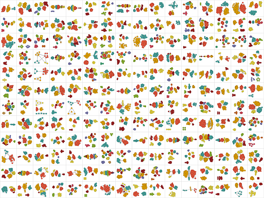
Here is a complete selection of our data donor networks:
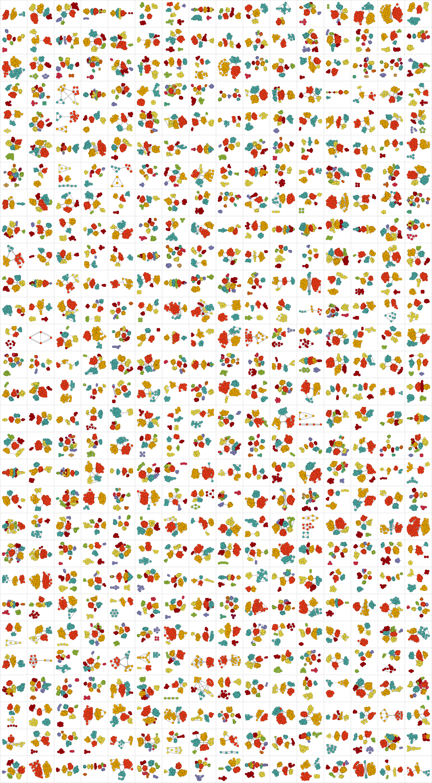
There is no doubt that each of these networks tells a different story. However, we can produce general statistics. Like, for example, here is a graph of how the number of groups of friends changes with age (with more data, we would have less noise):

Even at the age of 13, people have about three groups of friends (probably friends from school, district, and family). When they get older, they go to other schools, get a job, and so on, resulting in other groups. Now the maximum number is observed in the region of 30, probably largely due to the limited time of the existence of Facebook.
How large are these groups on average? The largest group usually contains about a hundred friends; the graph below shows the size versus age:

But how the proportion of the largest group changes with age in relation to the entire network:

What about more detailed network properties? Is there some kind of “periodic table” of network structures? Or a classification scheme similar to the one that I developed a long time ago for cellular automata?
The first step to find something distinctive in each network that we can do is to look at their cluster structure, ignoring the substructures. Here, for example, in this way we can simplify Katerina’s network (which proposed this idea) to the level of a cluster diagram:

Below is what we get by doing the same for data donor networks:
When creating these diagrams, we take for the cluster the group in which at least two friends. However, to obtain a more general structure, we can remove from consideration those clusters that contain less than 10% of the total number of friends. So, for example, Katerina’s network would then look like:

And now, for example, we can calculate the relative numbers of different types of structures that appear in all networks of data donors:

And we can consider how the proportion of each of the structures changes with age:

What did we learn from this? The most common structures consist of two or three main and interconnected clusters. But there are also structures in which the main clusters do not have any connections with each other - apparently, this is a reflection of the fact that a person has such aspects of life that have no connection with each other due to geographical reasons or their content.
Each person has a story behind the structure of his cluster diagram. And one might think that all this cannot be summarized by any single theory. In a sense, this is a bit like trying to develop a general theory of human history or ways of biological evolution. But what is interesting is that the Facebook world gives us much more data to form such theories.
And we should not just consider things like cluster diagrams, or even friendly networks - we can dig as deeply as you like. For example, we can analyze a lot of posts of people that they post on their walls on Facebook and sort them by topic (for this, a classifier of natural language content written in Wolfram language and trained in a large sample was used):

Each of these themes is characterized by certain, frequently encountered words:

And for each topic, we can figure out how its popularity depends on age (indicated on Facebook):

It is simply amazing how much information can be gleaned from this about the evolution of the typical interests of people. With age, people start talking less about video games and more about politics and the weather. Men tend to talk more about sports and technology than women, and, which surprised me a little, they also start talking more about movies, television and music. Women talk more about animals, family, friends, relationships, and, at least after they reach childbearing age, about health. It is not surprising that the peak age of talking about school and university is 20 years. People are less interested in talking about “special occasions” (mostly birthdays) during adolescence, but then interest in this topic rises. And in the third ten, people start talking much more about career and money. And so on and so forth.
Some things are frustratingly stereotypical. And most of them are not particularly surprising for those who know the natural differences of people of different ages. However, it is remarkable for me how clearly and in detail we can see on these graphs the reflections of people's thinking in the course of their life.
Of course, the graphs above are based on the completely anonymous data we collected. But if we start looking at individuals, we will see many other interesting things. For example, I personally am very curious to analyze my email archive for 25 years , and, perhaps, to predict things about myself based on a comparison with what happens to people in general.
For decades, I have constantly accumulated countless case studies about the trajectories of people's lives, from which I drew a number of general patterns. But what was striking for me about what we have been doing in the past few weeks is how much systematic information is possible at a time. What it all means, and what general theories of all this can be built - I do not know yet.
However, this is similar to the beginning of the creation of some powerful "computational telescope", exploring the "social universe". And this allows us to explore and discover a wide variety of phenomena. This has the potential to help us learn more about society and ourselves. And this, by the way, gives us excellent examples of what can be achieved with data science and with the technologies that I have been developing for so long.
Source: https://habr.com/ru/post/262445/
All Articles