Truly responsive letters. Part ... first again
The first post was written rather on emotions. Nicole's method seemed to me to be insolvent and cumbersome in places, but I have to admit that in many ways he surpasses my achievements and from now on I will gladly adopt her techniques. Nevertheless, Nicole made minor flaws that I fixed. I also remove extra rubbish and experiment with universal solutions for typical tasks during layout.
What we come to:
- Using external styles and the subsequent run of the code through the inliner . Due to the complexity of the code, it has become expedient.
- Improved semantics through class naming and code reduction
- Partial support for the Bat! Although Nicole scored on him.
- Full support for all mobile email clients
- Use of previously hazardous structures. Through diligent testing, problems are resolved.
')
Wrapper
Let's draw a new letter wrapper ( Github ):
Hidden text
<meta charset="utf-8"> <style> body { margin:0; } /* */ .content { background-color:#ffffff; padding:30px; } .newsletter { margin: 0 auto; max-width: 600px; } .wrapper { width: 100%; background-color:#f4f4f4; table-layout: fixed; -webkit-text-size-adjust: 100%; -ms-text-size-adjust: 100%; } @media only screen and (max-width: 400px) { /* */ } @media screen and (min-width: 401px) and (max-width: 600px) { /* */ } @media screen and (min-width: 600px) { .newsletter { width:600px !important; } } </style> <!--[if (gte mso 9)|(IE)]> <style> /* */ </style> <![endif]--> <div align="center" class="wrapper"> <!--[if (gte mso 9)|(IE)]> <table align="center" width="600" cellpadding="0" cellspacing="0" style="border-collapse:collapse;"><tr><td> <![endif]--> <table class="newsletter" align="center" width="100%" cellpadding="30" cellspacing="0"> <tr> <td class="content" style="width:600px !important;"> </td> </tr> </table> <!--[if (gte mso 9)|(IE)]></td></tr></table><![endif]--> </div> And now I will tell you what is in it and how:
- First of all, it is worth noting that we do not need doctype, head and body. Without a doctype, the behavior of letters is similar everywhere and brings no surprises. Head is just useless. Well, the body will still be cut by the majority of webmail mail. It is for this reason that we do not set the general background of the letter through the body.
- The .wrapper block is a common wrapper with an indication of the background color, therefore we set it a background and several css properties to avoid unpredictable behavior.
- Table .newsletter - directly centered letter. For its parent .wrapper, we specified the center value for the align attribute so that our table was centered at yahoo mail. It should be understood that in the future to align any tables you need to wrap them divas with the specified alignment. Do not forget to specify the alignment for the table itself. For .newsletter, we specified a width of 100% through the inline for fidelity, while specifying max-width: 600px to get adaptability. But this property does not work in Outlook and in the bat! To solve the problem with outluk, we have drawn an additional table, which is the parent of our .newsletter.
- The .content cell is already part of the letter. For it, we specified background-color: #ffffff in sss to set the white background of the letter as opposed to the gray background of the background. We explicitly specified width: 600px! Important; to solve the bat! problem, which does not support max-width, getting a 600px letter width in baht.
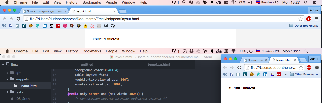
The result we see in the screenshot above. At the same time, we can safely pull the edges of the browser to test the adaptability of our layout.
Content
Now let's add some content to our letter ( Github )
Hidden text
<meta charset="utf-8"> <style> body { margin:0; } a { color:#0077cc !important; } a img { border:0; } a span { color:#0077cc; } table { border-collapse:collapse; } p { margin:1em 0; font-family: arial; font-size:14px; color:#666666; line-height:1.4em; text-align: left; } .paragraph { font-family:arial; font-size:14px; color:#666666; line-height:1.4em; text-align: left; } .button { display:inline-block; vertical-align:top; width:150px; } .button table { border-collapse: separate !important; border:#ffffff 5px solid; } .button div { font-family:arial; font-size:14px; } .button a, .button span { color:#ffffff !important; text-decoration:none; } .content { background-color:#ffffff; padding:30px; } .h1 { font-family: arial; font-size: 24px; color:#666666; line-height:1.2em; } .newsletter { margin: 0 auto; max-width: 600px; } .wrapper { width: 100%; background-color:#f4f4f4; table-layout: fixed; -webkit-text-size-adjust: 100%; -ms-text-size-adjust: 100%; } @media only screen and (max-width: 400px) { /* */ } @media screen and (min-width: 401px) and (max-width: 600px) { /* */ } @media screen and (min-width: 600px) { .newsletter { width:600px !important; } } </style> <!--[if (gte mso 9)|(IE)]> <style> /* */ </style> <![endif]--> <div align="center" class="wrapper"> <!--[if (gte mso 9)|(IE)]> <table align="center" width="600" cellpadding="0" cellspacing="0" style="border-collapse:collapse;"><tr><td> <![endif]--> <table class="newsletter" align="center" width="100%" cellpadding="30" cellspacing="0"> <tr> <td class="content" style="width:600px !important;"> <div class="h1">Paragraph Heading</div> <p><a href="#" target="_blank"><span>Lorem ipsum dolor</span></a> sit amet, consectetur adipiscing elit, sed do eiusmod tempor incididunt ut labore et dolore magna aliqua. Ut enim ad minim veniam, quis nostrud exercitation ullamco laboris nisi ut aliquip ex ea commodo consequat. Duis aute irure dolor in reprehenderit in voluptate velit esse cillum dolore eu fugiat nulla pariatur. Excepteur sint occaecat cupidatat non proident, sunt in culpa qui officia deserunt mollit anim id est laborum.</p> <div align="center"> <div class="button"> <table cellpadding="10" cellspacing="0"> <tr> <td bgcolor="#666666" style="padding:10px 20px; border-radius:50px;"> <div><b><a href="#" target="_blank"><span>Button Example</span></a></b></div> </td> </tr> </table> </div> <div class="button"> <table cellpadding="10" cellspacing="0"> <tr> <td bgcolor="#666666" style="padding:10px 20px;"> <div><b><a href="#" target="_blank"><span>Button Example</span></a></b></div> </td> </tr> </table> </div> <div class="button"> <table cellpadding="10" cellspacing="0"> <tr> <td bgcolor="#666666" style="padding:10px 20px; border-radius:50px;"> <div><b><a href="#" target="_blank"><span>Button Example</span></a></b></div> </td> </tr> </table> </div> </div> <br> <div class="h1">Markered List</div> <p>– Lorem ipsum dolor sit amet, consectetur adipiscing elit</p> <p>– Lorem ipsum dolor sit amet, consectetur adipiscing elit</p> <p>– Lorem ipsum dolor sit amet, consectetur adipiscing elit</p> <p>– Lorem ipsum dolor sit amet, consectetur adipiscing elit</p> </td> </tr> </table> <!--[if (gte mso 9)|(IE)]></td></tr></table><![endif]--> </div> 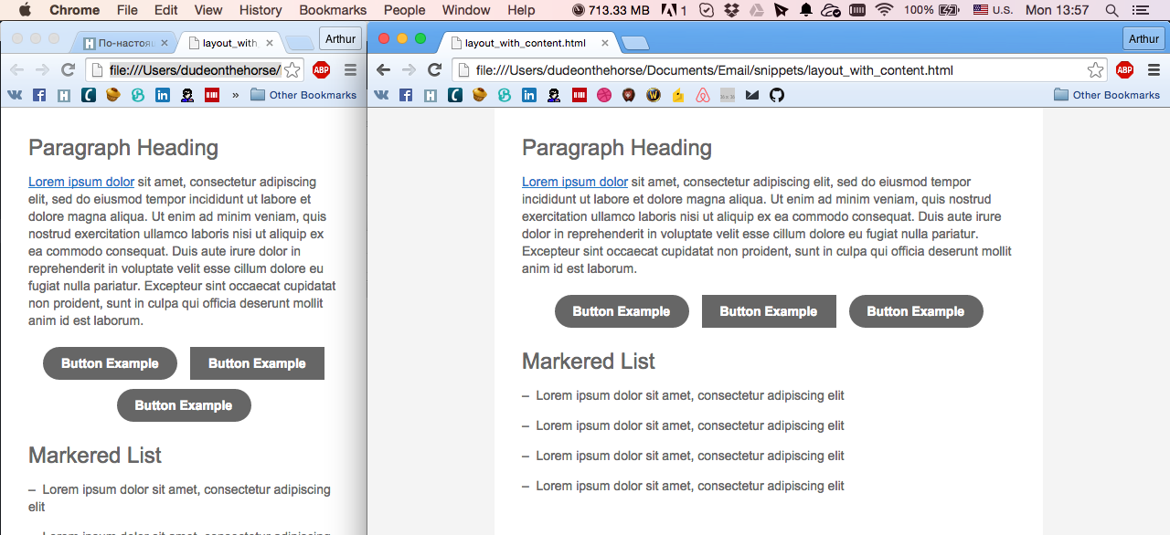
And analyze everything in order.
Headline
.h1 { font-family: arial; font-size: 24px; color:#666666; line-height:1.2em; } <div class="h1">Paragraph Heading</div> It uses exactly the div without setting the margin to avoid the appearance of extra padding for blocks that have the upper padding.
Paragraph
p { margin:1em 0; font-family: arial; font-size:14px; color:#666666; line-height:1.4em; text-align: left; } .paragraph { font-family:arial; font-size:14px; color:#666666; line-height:1.4em; text-align: left; } <p>Lorem ipsum dolor sit amet, consectetur adipiscing elit, sed do eiusmod tempor incididunt ut labore et dolore magna aliqua. Ut enim ad minim veniam, quis nostrud exercitation ullamco laboris nisi ut aliquip ex ea commodo consequat. Duis aute irure dolor in reprehenderit in voluptate velit esse cillum dolore eu fugiat nulla pariatur. Excepteur sint occaecat cupidatat non proident, sunt in culpa qui officia deserunt mollit anim id est laborum.</p> <div class="paragraph">Lorem ipsum dolor sit amet, consectetur adipiscing elit, sed do eiusmod tempor incididunt ut labore et dolore magna aliqua. Ut enim ad minim veniam, quis nostrud exercitation ullamco laboris nisi ut aliquip ex ea commodo consequat. Duis aute irure dolor in reprehenderit in voluptate velit esse cillum dolore eu fugiat nulla pariatur. Excepteur sint occaecat cupidatat non proident, sunt in culpa qui officia deserunt mollit anim id est laborum.</div> I draw attention to the fact that for the paragraph tag, we clearly specify the margin. This is necessary to recalculate indents in outlook.com. There they are radically different from the default. The paragraph tag is ideal for use with the previous title option.
The second version of the paragraph, which is made using the div is used much less frequently, but nevertheless sometimes necessary. This is all the same paragraph, which simply does not have vertical indents.
Link
a { color:#0077cc !important; text-decoration:underline; } a img { border:0; } a span { color:#0077cc; } <a href="#" target="_blank"><span>Lorem ipsum dolor</span></a> The link structure must always contain a span inside the link if the link is text. This is a crutch for Outlook. We set the link color and the same color for the internal span. An explicit task of decorating the color is necessary for mobile gmail, which removes underscores from links. For link images, we immediately set the border to zero.
Button
.button { display:inline-block; vertical-align:top; width:150px; } .button table { border-collapse: separate !important; border:#ffffff 5px solid; } .button div { font-family:arial; font-size:14px; } .button a, .button span { color:#ffffff !important; text-decoration:none; } <div class="button"> <table cellpadding="10" cellspacing="0"> <tr> <td bgcolor="#666666" style="padding:10px 20px; border-radius:50px;"> <div><b><a href="#" target="_blank"><span>Button Example</span></a></b></div> </td> </tr> </table> </div> The design of the button is a bit cumbersome, but nonetheless reinforced. First of all, our button is an inline, not a block element, which allows us to place several buttons next to each other. In order to be able to use an adequate border-radius for the button, the table inside the button must be separated. The rest of the example links. A little of the form and button is ready. Important note. Our button tends to collapse in two lines, if its name consists of two words, so I use an unbreakable space to treat this problem. Alternatively, you can use a fixed width of a table cell. To align the buttons, use the parent div with an explicit alignment.
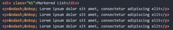
Finally, the list
I already wrote about it in the previous topic And I will not repeat the details. I just just show you how to make it the best way. No extra CSS. Everything is extremely simple.
Since habrapriser eats unicode characters, I will insert sample code with a screenshot.
On this note, I will finish “the first part again”, and in the next one I will tell you how to decorate other parts of the letter, as well as give examples of multicolumns. For those who say, “What the fuck? Indeed, in the previous article it was the same! ”I will answer that the difference is huge. To come to this approach, it took me a week of multiple tests, trial and error.
Stey Tund.
UPD: on the githaba you can, of course, find a more complete layout file, but I didn’t specifically give a link to it here, because many of its nuances may not be immediately clear. This is still an experimental version of the final technique. As they say, if you are interested, smoke yourself.
UPD2: Bugs surfaced in the mobile yahoo client. About the decision I will definitely write an update to this topic or in the following parts.
UPD3: Yahoo bugs resolved. The yahoo mobile application does not understand the cellpadding properties of the tables, so we must specify the indents of the cells through the styles. Also in the yahoo inline buttons shrank. A fixed width for the button is used as a panacea. Not as cool as I would like, but what to do.
As part of our material today, you need to add the following CSS
.content { padding:30px; } .button { width:150px; } Source: https://habr.com/ru/post/262427/
All Articles