Digest of grocery design, June 2015
For five years now I have been publishing regular reviews of fresh articles on the topic of interfaces, new tools and collections of patterns, interesting cases and historical stories. From the tapes of several hundred thematic subscriptions, approximately 5% of the worthwhile publications are selected that are interesting to share. Previous materials: April 2010-May 2015 .

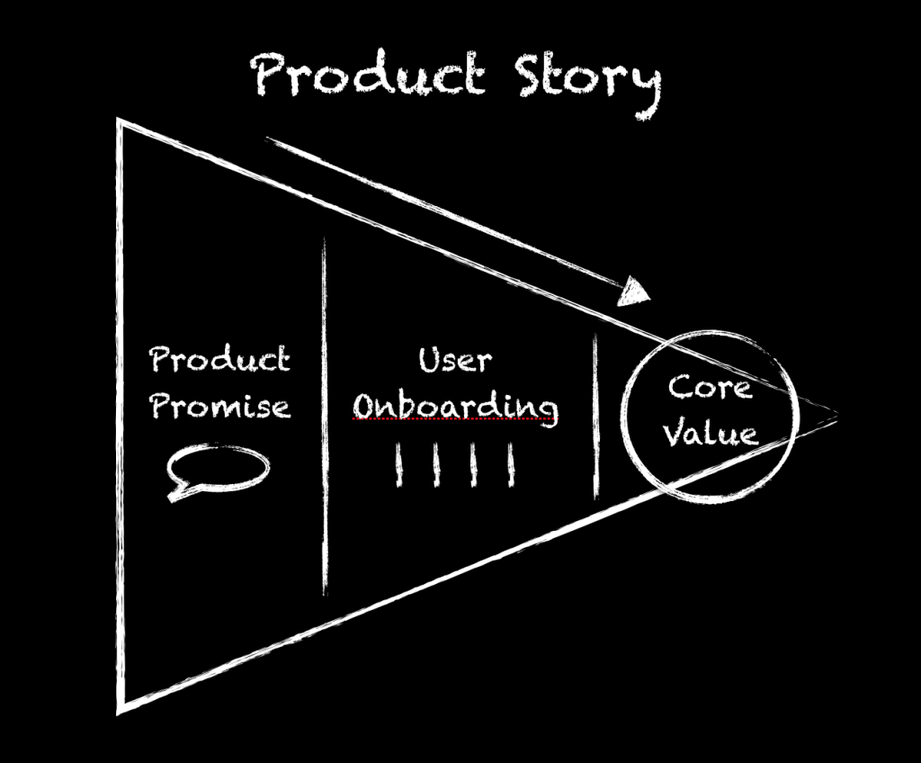
Understanding the Story of the Story to Build
One of the best and most useful articles on the topic of meeting new user from Dan Martell. He writes that welcome screens should be considered in relation to how the service activates the user - only this way will benefit the product, and not be a bothersome review of functions that are not needed now. Dan cites examples of such scenarios from well-known companies like Facebook, who found that if a user added 7 friends within 10 days after registering, he probably would not abandon the site.
')
Mailing Lists
Excerpts from the Baymard report
Web UI Design Techniques: Interaction Design & Animations
New book UXPin on interaction design, interactive stories and animation.
Why Users Miss Form Buttons Placed in the Action Bar
Anthony T advises to put the submit button on a mobile screen sticking to the bottom. Mobile guidelines tell about something else, but following them disrupts the flow of work with the form, and it is not so easy to find them. However, with sticking to the bottom of the screen there are problems in older browsers on Android, and the cancel button could be left in its usual place.
Parsing animation
The Homepage Exception
Johanna Bates writes about an interesting approach to creating the main page, which she tested on one of her projects. In CMS, it is written as a set of modules that the client can edit in a single form. This allows you to keep it up to date.
Use of links
Guidelines for Animation Timing
Percolate's Dominic Nguyen is trying to justify the optimal time for interface animation. This is 150-350 milliseconds - less than this number a person does not perceive, more than this - switches attention. Translation into Russian .
Apple iOS 9
The interface in the platform itself, little has changed, apparently the stability of work will finally be improved - this has become worse since the revolution in iOS 7.
One of the most interesting is the emergence of multitasking mode on the iPad , similar to Windows 8, as well as implemented in the Samsung TouchWiz shell, but with the addition of the picture-in-picture mode for watching videos. True, large tablets have recently been falling in sales due to 7 “versions and phablets, and the iPad, no matter how hard I tried, didn’t go very far beyond the consumption device, but having multiple windows would make it a little more useful. The application switching mode has also changed, and when a third-party keyboard is connected, the approach familiar to the desktop OS is shown. Windows 10 showed a universal solution for the entire line of devices, I wonder how Apple will come to this.
Among other interface patterns is an attempt to solve many problems of large screens in a new player: moving a significant number of controls down, using a swipe to switch between main sections like in WinPhone. Active use of round color category icons. A rounded input field from the old era reappeared in the search. It takes into account more nuances of the current context . The selection mode has become more sanity; a normal toolbar has appeared instead of a confusing context menu; with two fingers, the keyboard can be turned into a touchpad . And the replacement of Helvetica with San Francisco's own font , presented earlier in the clock, began. Farewell to the era of universal love for Helvetica?
In general, the updates mainly affected applications, all the interesting things need to be caught there. Especially cool with the news (replacement kiosk).
The Swift programming language, which is friendly to code-learning designers, has received a second version and open source . Continuing the theme:
Material design
New for Apple Watch
Go mockups
A large selection of patterns of devices in which the hands of different races are represented. They are paid, but allow better to get into the audience.
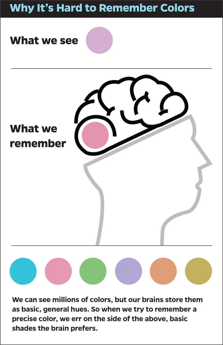
Try it: Memories of color are surprisingly vague
An interesting study by Jonathan Flombaum from Johns Hopkins University about color perception. He showed that people do not remember the exact or even more or less correct color, but rather the closest one to it. Continuing the theme:
Job Stories for Interface Design
Translation of the article by Alan Klement on why the person and User Story is yesterday and why you should use the Job Story. Another good reception that can make the work of the product team effective.
Use current context
Accessibility
Design for addiction
Adobe CC 2015
Adobe CC 2015 has been released. This is one of the largest Adobe updates of all time. It touched all the products of the company. Added several mobile applications and two new services: Adobe CreativeSync and Adobe Stock.

For the product designer, first of all, the new Photoshop is interesting. The guys from San Jose finally found out that for many years they have been creating not a photo editing tool, but rather an assistant designer. Plus, "suddenly" swallowed many designers Sketch. As a result, the product received a lot of new features and changed the strange behavior of the old ones:
Small video “ What's new for UI / UX designer ”. The remaining changes and new chips of other products on the official page .
Creating Advanced Animations In Photoshop
A small step-by-step tutorial on animation in Photoshop by Stephen Petrany. It is limited in possibilities, but almost always available tool.
Modern Design Tools: Adaptive Layouts
Josh Puckett from the Dropbox team talks about the challenges of modern design tools. Few of them are sharpened for adaptability at the level of the working area and he offers his own vision of the right solution. It seems that soon we will see the announcement of a fresh tool! Translation into Russian and continued, on the use of real data in prototypes .
The state of Interaction Design tools
At about the same time, Pasquale D'Silva made a very sensible and deep analysis of the state of modern design tools. In the first part, he talks about prototyping complex interactions and animations, offering interesting categorization. In the second one looks towards the game designers tools . It seems, and here we are waiting for the announcement of a new product :)
New for InVision
New to Sketch
New for Pixate
Macaw Scarlet - The Live Design Environment
A new generation of Macaw product, with much more features. Those who bought the first version will receive a discount.
New for Marvel
Introducing the AxShare App for iOS and Android
Axure has released AxShare applications for viewing prototypes on Android and iPhone. They will be available offline.
New to Proto.io
Skala
So far, the eponymous tool for designers in the work, initially a product under the Skala brand for previewing designs on mobiles has received a second version.
New for Tumult Hype 3 Pro
Getting to Know Conjoint Analysis
Memo Jeff Sauro on the consolidated analysis of products and interfaces, as well as its varieties.
7 Ways to Handle Missing Data
Jeff Sauro makes recommendations in case there are gaps in the data collected from user research. Incomplete data can be deleted or restored in several ways.
Yuri Vetrov - Platform Thinking
My presentation on platform thinking from the conference UX People 2015. How to stop producing documents and start living. All this burns a lot of time for paperwork - the forces go to polishing side documents, not the product. It is necessary to perceive the work on the product as the creation and development of a platform, and not a specific release.
I talked a little about this at the end of 2013 and 2014 . But there was an emphasis on specific cases, and in this presentation - step by step instructions for creating such a platform. By the number of slides, this is the “nightmare” level, but the task is really difficult.
At the end of the presentation, there is a long list of all those who made this picture stand together and began to be implemented in practice. The original idea was simple, the first prototype of the platform appeared in mid-2012. But as more and more services were transferred to it, the vision was corrected and expanded. We have a huge number of products and questions on each of them, so that we are still on the way. Therefore, the series will continue :)
Video performance . There, however, not all, and at a very fast pace.
Live guidelines and component systems
Protein
Protein synchronizes the components of the interface, their representation in the vector and back to the code. The team announced a project on FrontendConf in Moscow and Web Standards Days in St. Petersburg. Protein can convert any interface components to vector for use in Sketch or Adobe Illustrator and back. That is, changes from Sketch will fall back into the library as code — like Dropbox for interface components.
The authors say that this is a fundamentally different approach, which, as promised, will solve the problems of interaction between designers and developers. Designers can now use live components to create layouts and synchronize their code representation in the background. Just work on the design;) Now you will have one component library on which designers and developers will work. At the same time!
Protein turns the development upside down, primarily promoting the creation of components by the developer and then their use by the designer in the interface layouts. Facebook project page and presentation .
CSS Shapes
Web typography
Work with color
New scripts
JavaScript for designers
Work with SVG
Losing 80% of mobile users
Andrew Chen gives the average numbers on the return of users of Android-applications. The daily audience falls by 77% during the first three days, 90% during the month and 95% within three months. In this case, long-term retention of users is possible for those who were able to hook them to more or less regular launches during the first 3-7 days. To do this, you need not spam annoying notifications, but try to activate newbies.
We shall burn bright
My colleagues from the content project team launched a blog that tells about their experience with editorial metrics, submission formats, editorial tools and a journalist. They also have a Facebook group that publishes research, case studies, discussions and discussions. Some of the most interesting publications:

Measuring Customer Loyalty with a Repurchase Matrix
Jeff Sauro suggests using customer re-sales data to assess user loyalty. True, they often arrive with a delay and it is not so easy to calculate them. Continuing the theme:
Relay
The Relay service allows you to discuss design in Slack. This is a plugin that makes it easy to export layouts from Photoshop, Sketch or a browser for sharing. In a discussion on ProductHunt led a couple of analogs.

UX strategy
Building a design culture
New to Zeplin
Work with trainees
MVP
How google finally got design
Another powerful story about how radically changed the design of Google. Although initiatives to bring products in order began a long time ago, the revolution was largely due to Mathias Duarte, who built a new vision of design and processes, and thanks to close communication with Larry Page, he put all this into practice. Translation into Russian .

Uninvited Redesigns
Redesign Cases
What Killed The Infographic?
Mark Wilson ponders why the infographic boom is fading away. It looks like it just stopped being a wow thing and became another working tool. In addition, the need to adapt it for mobile strongly undercut expressive features.
The virtual reality
Interfaces to the cinema
Wearable device
Internet of things
Women Online Shop Online
Net-a-Porter is trying to build a social shopping concept on the Internet, i.e. shopping trip with girlfriends. In fact, this is something like Pinterest's own, but the initiative is interesting.
Patrick Mankins about the intricacies of creating such interfaces in the spirit of the film "Her".
Money for letters
Vlad Golovach announced an important initiative:
“Unfortunately, there are too few original materials about user interfaces and related topics in Russian (although there are relatively many translations and compilations, and even presentations and speeches are generally like mud). Sasha Belyshkin and I think this is wrong and even a bit shameful, so we came up with a foundation (and allocated a budget), which, without conditions, pays money for the original publications. Accordingly, if someone in your list of tasks for the future has the item “Get ready and finally write an article on [interface topic]”, know that you have a chance not only to write an article (and become more intelligent, smarter, learn how to write better, etc.), but also get 3000 rubles as a bonus. Only it is not necessary to postpone, because the budget is not forever.
PS This offer is especially luxurious for those who for some reason do not like Usethics, us. To deprive us and Sasha of personal savings should be not only useful, but inexplicably pleasant! ”

Ux hero
Tal Florentin comic UX Hero, dedicated to the life of the mythical product designer Jonathan Sketch. The first book is ready and available for free, for $ 39 you can get the first 6 issues. The format is larger than the long-known discoverer of the genre OK / Cancel.
Motion And Meaning - A podcast about motion design for digital designers
Cennydd Bowles and Val Head podcast about motion design and animation for designers. Record and text version of the first issue .
I Have No Idea
An article based on the latest Brad Frost speech on the features and design philosophy in the modern web. Many key ideas come together.
Product Designers
Sketchnotes
Excerpts from the book Khoi Vinh "How they got there"
Color Theory in Web UI Design: Practical Principles
New UXPin book on color theory for web interfaces. In a clip there is a little theory, trends, tools and examples on pieces from Mozilla, Squarespace ...
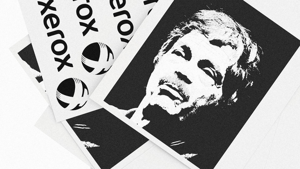
5 Steps To Re-create Xerox PARC's Design Magic (From The Guy Who Helped Make It)
It turns out that SAP launched the Communications Design Group research laboratory under the guidance of the legendary Alan Kay . Moreover, the team hired Bret Victor. Alan is thinking about how to replicate the atmosphere of the iconic laboratory Xerox PARC, which gave the basis of modern computers. It is extremely interesting that this will give SAP, has long been famous for one of the worst interfaces in the world.
Autodesk Hires Facebook's Director Of Product Design
Autodesk hired Maria Guidice, director of product design for Facebook. The company plans to unify hundreds of its products. In this thread will be collected news about interesting designations of designers. Continuing the theme:
The secrets of the chief design officer
Interestingly, on the eve of the appointment of Jony Ive on the site of the British Design Counsil published an article on the importance of the emergence of this position. It reworked and added The Guardian .
Shopping design studios by large companies
Series interviews from InVision
Upcoming Web Design Events (June-December 2015)
The main European and American events UX and web design of the second half of 2015.
UX STRAT 2014
Report on the third day of the conference UXSTRAT 2014, which was held September 7-9 in Boulder, Colorado (USA). Presentations with UX STRAT 2014 and UX STRAT Europe 2015 are also available .
UI19 Videos
Video from the UI19 conference, which was held on October 27-29, 2014 in Boston, USA, became available. True, for the money.
Fresh links can also be tracked in the Facebook group of the same name. Thanks to everyone who also publishes links in it, especially Gennady Dragun, Pavel Skripkin, Dmitry Podluzhny, Anton Artyomov, Denis Efremov, Alexey Kopylov, Taras Brizitsky and Yevgeny Sokolov. More and more materials in reviews appear thanks to them.
A letter arrives once a month.
Patterns and Best Practices
Understanding the Story of the Story to Build
One of the best and most useful articles on the topic of meeting new user from Dan Martell. He writes that welcome screens should be considered in relation to how the service activates the user - only this way will benefit the product, and not be a bothersome review of functions that are not needed now. Dan cites examples of such scenarios from well-known companies like Facebook, who found that if a user added 7 friends within 10 days after registering, he probably would not abandon the site.
')
Mailing Lists
- Another collection of mailing patterns, with a focus on the message itself .
- A good cheat sheet for the design and layout of mailing letters from Lee Munroe , including the features and limitations of mail clients.
- A small script that allows you to check how the letter will look in the mail client for the iPhone and the web version of Gmail .
Excerpts from the Baymard report
- Christian Holst says that it’s worth duplicating the selected filtering options in the main form and in a separate block . Most online stores do one thing.
- Christian Holst on the correct sorting by rating . Many online stores formally put up top-rated products, regardless of the number of users who rated it.
Web UI Design Techniques: Interaction Design & Animations
New book UXPin on interaction design, interactive stories and animation.
Why Users Miss Form Buttons Placed in the Action Bar
Anthony T advises to put the submit button on a mobile screen sticking to the bottom. Mobile guidelines tell about something else, but following them disrupts the flow of work with the form, and it is not so easy to find them. However, with sticking to the bottom of the screen there are problems in older browsers on Android, and the cancel button could be left in its usual place.
Parsing animation
The Homepage Exception
Johanna Bates writes about an interesting approach to creating the main page, which she tested on one of her projects. In CMS, it is written as a set of modules that the client can edit in a single form. This allows you to keep it up to date.
Use of links
Guidelines for Animation Timing
Percolate's Dominic Nguyen is trying to justify the optimal time for interface animation. This is 150-350 milliseconds - less than this number a person does not perceive, more than this - switches attention. Translation into Russian .
Platform guidelines and design templates for them
Apple iOS 9
The interface in the platform itself, little has changed, apparently the stability of work will finally be improved - this has become worse since the revolution in iOS 7.
One of the most interesting is the emergence of multitasking mode on the iPad , similar to Windows 8, as well as implemented in the Samsung TouchWiz shell, but with the addition of the picture-in-picture mode for watching videos. True, large tablets have recently been falling in sales due to 7 “versions and phablets, and the iPad, no matter how hard I tried, didn’t go very far beyond the consumption device, but having multiple windows would make it a little more useful. The application switching mode has also changed, and when a third-party keyboard is connected, the approach familiar to the desktop OS is shown. Windows 10 showed a universal solution for the entire line of devices, I wonder how Apple will come to this.
Among other interface patterns is an attempt to solve many problems of large screens in a new player: moving a significant number of controls down, using a swipe to switch between main sections like in WinPhone. Active use of round color category icons. A rounded input field from the old era reappeared in the search. It takes into account more nuances of the current context . The selection mode has become more sanity; a normal toolbar has appeared instead of a confusing context menu; with two fingers, the keyboard can be turned into a touchpad . And the replacement of Helvetica with San Francisco's own font , presented earlier in the clock, began. Farewell to the era of universal love for Helvetica?
In general, the updates mainly affected applications, all the interesting things need to be caught there. Especially cool with the news (replacement kiosk).
The Swift programming language, which is friendly to code-learning designers, has received a second version and open source . Continuing the theme:
- Inserted five kopecks for Zuckerberg Will call .
- The template for the new Photoshop with support for artboards .
- Winners of the Apple Design Awards 2015 .
- The new CarPlay is trying to crawl further than just an entertainment system - it offers automakers to integrate basic machine control functions like climate control. But Ford has clearly said recently that they do not want to repeat the fate of the manufacturers of computers and telephones, which are dominated by a third-party OS manufacturer.
Material design
- Google launched its ranking of Android apps with the best design . Among the winners is the Telegram messenger.
- The design team Google has launched a blog on Medium .
- The first part of the powerful Chrome redesign case under the new guidelines from Sebastien Gabriel .
- Overview of key interface elements of Android M and their properties .
- Taylor Ling writes about the importance of doing optical alignment for the icon inside the main floating button .
New for Apple Watch
- The Todoist team describes how they redesigned the app after the appearance of the real device .
- Visual tips on the design of applications for watches from Artem Dashinsky .
Go mockups
A large selection of patterns of devices in which the hands of different races are represented. They are paid, but allow better to get into the audience.
Understanding the user
Try it: Memories of color are surprisingly vague
An interesting study by Jonathan Flombaum from Johns Hopkins University about color perception. He showed that people do not remember the exact or even more or less correct color, but rather the closest one to it. Continuing the theme:
- Another study of perception, this time works of art . Why the mass audience loves blue and more classic examples - abstract art requires a greater cognitive load on perception.
Job Stories for Interface Design
Translation of the article by Alan Klement on why the person and User Story is yesterday and why you should use the Job Story. Another good reception that can make the work of the product team effective.
Use current context
Accessibility
Design for addiction
- Partly about the interfaces, partly general knowledge. The Verge article on the history and principles of slot machines , which largely refers to the book "Design for Addiction".
Design and design of interface screens
Adobe CC 2015
Adobe CC 2015 has been released. This is one of the largest Adobe updates of all time. It touched all the products of the company. Added several mobile applications and two new services: Adobe CreativeSync and Adobe Stock.
For the product designer, first of all, the new Photoshop is interesting. The guys from San Jose finally found out that for many years they have been creating not a photo editing tool, but rather an assistant designer. Plus, "suddenly" swallowed many designers Sketch. As a result, the product received a lot of new features and changed the strange behavior of the old ones:
- Artboards: assembly areas that allow you to create multiple screens of different sizes in one document, greatly facilitating the work, export and view layouts.
- Multiple styles of layers: it became possible to create several identical layer styles overlapping each other.
- New export dialog, replacing Save For Web.
- Libraries: create once, for example, toolbar. You use in other places, then you change the source code, it changes everywhere. The development of a smart object.
- Companion application for viewing design on devices (iOS already, Android on the way).
- Photoshop Design Space : a completely new interface for Photoshop specifically for designers.
- A lot of small tweaks from the point of view of both performance and interaction: one possibility to impose internal translucent Stroke is worth something! :-)
- Adobe Stock is a photo vector stock embedded in all products of the company.
- Adobe CreativeSync - a new approach to the exchange of all your design resources. It automatically synchronizes your files, fonts, photos, resources, settings, metadata, items from Adobe Stock for all your devices and programs.
Small video “ What's new for UI / UX designer ”. The remaining changes and new chips of other products on the official page .
Creating Advanced Animations In Photoshop
A small step-by-step tutorial on animation in Photoshop by Stephen Petrany. It is limited in possibilities, but almost always available tool.
Modern Design Tools: Adaptive Layouts
Josh Puckett from the Dropbox team talks about the challenges of modern design tools. Few of them are sharpened for adaptability at the level of the working area and he offers his own vision of the right solution. It seems that soon we will see the announcement of a fresh tool! Translation into Russian and continued, on the use of real data in prototypes .
The state of Interaction Design tools
At about the same time, Pasquale D'Silva made a very sensible and deep analysis of the state of modern design tools. In the first part, he talks about prototyping complex interactions and animations, offering interesting categorization. In the second one looks towards the game designers tools . It seems, and here we are waiting for the announcement of a new product :)
New for InVision
- InVision has released a comprehensive set of elements / screens for mobile applications: Sketch, Photoshop, support for high density screens, easy customization .
- The fifth version of InVision is on the way. The company blog began to describe the major improvements.
- They will also support the artboards mode in the new Photoshop - consider it will automatically assemble a prototype from it .
- Now from InVision you can immediately publish to Dribbble .
New to Sketch
New for Pixate
- There are team accounts to facilitate collaboration .
- Another simple tutorial on creating a simple screen with scrolling and pull-to-refresh .
Macaw Scarlet - The Live Design Environment
A new generation of Macaw product, with much more features. Those who bought the first version will receive a discount.
New for Marvel
Introducing the AxShare App for iOS and Android
Axure has released AxShare applications for viewing prototypes on Android and iPhone. They will be available offline.
New to Proto.io
Skala
So far, the eponymous tool for designers in the work, initially a product under the Skala brand for previewing designs on mobiles has received a second version.
New for Tumult Hype 3 Pro
User research and testing, analytics
Getting to Know Conjoint Analysis
Memo Jeff Sauro on the consolidated analysis of products and interfaces, as well as its varieties.
7 Ways to Handle Missing Data
Jeff Sauro makes recommendations in case there are gaps in the data collected from user research. Incomplete data can be deleted or restored in several ways.
Visual programming and browser design
Yuri Vetrov - Platform Thinking
My presentation on platform thinking from the conference UX People 2015. How to stop producing documents and start living. All this burns a lot of time for paperwork - the forces go to polishing side documents, not the product. It is necessary to perceive the work on the product as the creation and development of a platform, and not a specific release.
I talked a little about this at the end of 2013 and 2014 . But there was an emphasis on specific cases, and in this presentation - step by step instructions for creating such a platform. By the number of slides, this is the “nightmare” level, but the task is really difficult.
At the end of the presentation, there is a long list of all those who made this picture stand together and began to be implemented in practice. The original idea was simple, the first prototype of the platform appeared in mid-2012. But as more and more services were transferred to it, the vision was corrected and expanded. We have a huge number of products and questions on each of them, so that we are still on the way. Therefore, the series will continue :)
Video performance . There, however, not all, and at a very fast pace.
Live guidelines and component systems
- It turned out that 2GIS has an interesting Makeup control tool . It allows you to impose code on the layout and find discrepancies. You can also see what will happen to the block when displaying non-standard content into it. Demo site .
- Guidelines Envato Market .
- Translation of the Brad Frost article on the inventory of patterns into Russian .
Protein
Protein synchronizes the components of the interface, their representation in the vector and back to the code. The team announced a project on FrontendConf in Moscow and Web Standards Days in St. Petersburg. Protein can convert any interface components to vector for use in Sketch or Adobe Illustrator and back. That is, changes from Sketch will fall back into the library as code — like Dropbox for interface components.
The authors say that this is a fundamentally different approach, which, as promised, will solve the problems of interaction between designers and developers. Designers can now use live components to create layouts and synchronize their code representation in the background. Just work on the design;) Now you will have one component library on which designers and developers will work. At the same time!
Protein turns the development upside down, primarily promoting the creation of components by the developer and then their use by the designer in the interface layouts. Facebook project page and presentation .
CSS Shapes
Web typography
- Andrew Johnson on web interpolation capabilities .
- Cheat sheet to create an adaptive font grid using CSS pre-processor SASS .
- A powerful letterror studio experiment on working with adaptive fonts and interpolation on the web . When Just van Rossum spoke at the Silver Set 2014 conference about his desktop tool Robofont, he didn’t have a clear picture of how to present it on the web. And now, six months later, his own foundry showed a working example.
Work with color
- JS-library Vibrant.js allows you to recognize the brightest colors in the picture .
- An interesting experiment with the analysis of the color palette of the best sites on Awwwards, since 2009 .
- A set of CSS to create conical gradients .
- The script allows you to create stubs while loading images with gradients from the primary colors of the image .
New scripts
- Chris Coyier examines ways to work with the selection of text in the browser .
- Raindrops on pure CSS .
- Cheerful animation of the form submit button .
- A collection of scripts unfolding cards in the detailed information .
- A collection of scripts for scrolling page effects .
- An experiment in which the page can be edited by voice .
- The Dynamics.js library for creating animation that is close to a physical model .
JavaScript for designers
Work with SVG
- About SVG animations in the Greensock JS framework .
- A practical guide to the preparation and subsequent use of SVG on the web .
- Demo of graphic filters in SVG .
- An overview of the current state and ways to work with animation in SVG .
Metrics and ROI
Losing 80% of mobile users
Andrew Chen gives the average numbers on the return of users of Android-applications. The daily audience falls by 77% during the first three days, 90% during the month and 95% within three months. In this case, long-term retention of users is possible for those who were able to hook them to more or less regular launches during the first 3-7 days. To do this, you need not spam annoying notifications, but try to activate newbies.
We shall burn bright
My colleagues from the content project team launched a blog that tells about their experience with editorial metrics, submission formats, editorial tools and a journalist. They also have a Facebook group that publishes research, case studies, discussions and discussions. Some of the most interesting publications:
- The volume of traffic to a resource or material page does not say anything about the effectiveness of the editorial staff . In fact, if readers are not passionate about content, then traffic is useless. Good journalism cannot be measured by the amount of traffic and CTR header. But something else is possible.
- The main challenges of online journalism : the lack of "time for you"; reduced “attention time”.
Measuring Customer Loyalty with a Repurchase Matrix
Jeff Sauro suggests using customer re-sales data to assess user loyalty. True, they often arrive with a delay and it is not so easy to calculate them. Continuing the theme:
Management of interface projects, processes and teams
Relay
The Relay service allows you to discuss design in Slack. This is a plugin that makes it easy to export layouts from Photoshop, Sketch or a browser for sharing. In a discussion on ProductHunt led a couple of analogs.
UX strategy
- Philip Hodgson about 6 things that prevent the UX from having a noticeable impact on business, while remaining in serving roles, “dishwasher” for other disciplines. Starting from such capital things as the lack of sufficient support at the level of top management and the inability to train the organization about the value of UX, ending with the clinical cases of dragging of cargo-cults, excessive closure and academic character.
Building a design culture
New to Zeplin
Work with trainees
- Tips for yesterday's graduates and tomorrow's interns from renowned designers in the industry .
- Thomas Lockwood also gives advice to yesterday’s graduates and tomorrow’s interns .
- The second part of the Fred Beecher plan for the selection and training of "UX apprentices" .
Product management and analytics
MVP
- Michael Bamberger on the use of MVP in the corporate sector . It is difficult to use them cleanly because of the heaviness of the environment and bureaucracy, it is necessary to perceive them as MVE, i.e. experiments.
Cases
How google finally got design
Another powerful story about how radically changed the design of Google. Although initiatives to bring products in order began a long time ago, the revolution was largely due to Mathias Duarte, who built a new vision of design and processes, and thanks to close communication with Larry Page, he put all this into practice. Translation into Russian .
Uninvited Redesigns
Redesign Cases
- Raluca Budiu from NN / g on principles for calculating changes in UX-metrics during redesign .
- Sana Rao talks about working on a new Twitter profile page .
Trends
What Killed The Infographic?
Mark Wilson ponders why the infographic boom is fading away. It looks like it just stopped being a wow thing and became another working tool. In addition, the need to adapt it for mobile strongly undercut expressive features.
The virtual reality
- Overview of current collaborative initiatives of virtual reality platforms and filmmakers and producers .
- It turned out that for Cardboard Design Lab Google again attracted ustwo. In the blog, the studio talks about the principles of design for virtual reality embedded in the application. Considering how much they burn, one of the main candidates for the purchase of a large company :)
- Jon Wiley, chief search designer and co-author of the company's redesign, is now engaged in a virtual reality, including Cardboard .
Interfaces to the cinema
- FI Claudio Guglieri and David Navarro conducted a powerful study of cinema interfaces . Based on this, they come up with a large presentation; there are many details on this on the promotional site.
- An article on the dashboard of vehicles of all shapes and sizes in a fantastic movie . Translation into Russian .
Wearable device
- Although the idea of stuffing a simple device with a phone is controversial in itself, the Fast Co Design article contains a detailed description of the principles of interaction embedded in a T9-like keyboard for a watch .
Internet of things
Women Online Shop Online
Net-a-Porter is trying to build a social shopping concept on the Internet, i.e. shopping trip with girlfriends. In fact, this is something like Pinterest's own, but the initiative is interesting.
Patrick Mankins about the intricacies of creating such interfaces in the spirit of the film "Her".
For general and professional development
Money for letters
Vlad Golovach announced an important initiative:
“Unfortunately, there are too few original materials about user interfaces and related topics in Russian (although there are relatively many translations and compilations, and even presentations and speeches are generally like mud). Sasha Belyshkin and I think this is wrong and even a bit shameful, so we came up with a foundation (and allocated a budget), which, without conditions, pays money for the original publications. Accordingly, if someone in your list of tasks for the future has the item “Get ready and finally write an article on [interface topic]”, know that you have a chance not only to write an article (and become more intelligent, smarter, learn how to write better, etc.), but also get 3000 rubles as a bonus. Only it is not necessary to postpone, because the budget is not forever.
PS This offer is especially luxurious for those who for some reason do not like Usethics, us. To deprive us and Sasha of personal savings should be not only useful, but inexplicably pleasant! ”
Ux hero
Tal Florentin comic UX Hero, dedicated to the life of the mythical product designer Jonathan Sketch. The first book is ready and available for free, for $ 39 you can get the first 6 issues. The format is larger than the long-known discoverer of the genre OK / Cancel.
Motion And Meaning - A podcast about motion design for digital designers
Cennydd Bowles and Val Head podcast about motion design and animation for designers. Record and text version of the first issue .
I Have No Idea
An article based on the latest Brad Frost speech on the features and design philosophy in the modern web. Many key ideas come together.
Product Designers
- Sam Gerstenzang about what he learned in the Imgur team about the work of the designer with the product .
- Jesse Weaver writes that it is not necessary to go crazy and convert designers into developers and vice versa is harmful . Here is a deep understanding of the specifics of colleagues and empathy - this is yes.
Sketchnotes
Excerpts from the book Khoi Vinh "How they got there"
Color Theory in Web UI Design: Practical Principles
New UXPin book on color theory for web interfaces. In a clip there is a little theory, trends, tools and examples on pieces from Mozilla, Squarespace ...
People and companies in the industry
5 Steps To Re-create Xerox PARC's Design Magic (From The Guy Who Helped Make It)
It turns out that SAP launched the Communications Design Group research laboratory under the guidance of the legendary Alan Kay . Moreover, the team hired Bret Victor. Alan is thinking about how to replicate the atmosphere of the iconic laboratory Xerox PARC, which gave the basis of modern computers. It is extremely interesting that this will give SAP, has long been famous for one of the worst interfaces in the world.
Autodesk Hires Facebook's Director Of Product Design
Autodesk hired Maria Guidice, director of product design for Facebook. The company plans to unify hundreds of its products. In this thread will be collected news about interesting designations of designers. Continuing the theme:
The secrets of the chief design officer
Interestingly, on the eve of the appointment of Jony Ive on the site of the British Design Counsil published an article on the importance of the emergence of this position. It reworked and added The Guardian .
Shopping design studios by large companies
Series interviews from InVision
Conference proceedings
Upcoming Web Design Events (June-December 2015)
The main European and American events UX and web design of the second half of 2015.
UX STRAT 2014
Report on the third day of the conference UXSTRAT 2014, which was held September 7-9 in Boulder, Colorado (USA). Presentations with UX STRAT 2014 and UX STRAT Europe 2015 are also available .
UI19 Videos
Video from the UI19 conference, which was held on October 27-29, 2014 in Boston, USA, became available. True, for the money.
Fresh links can also be tracked in the Facebook group of the same name. Thanks to everyone who also publishes links in it, especially Gennady Dragun, Pavel Skripkin, Dmitry Podluzhny, Anton Artyomov, Denis Efremov, Alexey Kopylov, Taras Brizitsky and Yevgeny Sokolov. More and more materials in reviews appear thanks to them.
Subscribe to the newsletter
A letter arrives once a month.
Source: https://habr.com/ru/post/262077/
All Articles