"Pixel gallop - part two" - perspective, color, anatomy and applied exercises
“Gallop pixel”, part I - basic concepts, the stages of maturation, applied exercises ( link )
Gallop Pixel, Part II - Perspective, color, anatomy and applied exercises ( link )
“Gallop Pixel”, part III - Animation ( link )
“Gallop pixel”, part IV - Animation of light and shadow ( link )
"Gallop pixel", part V - Animation of characters. Walking ( link ) link)
The first article of this cycle was perceived warmly, as a result of which there was no point in delaying with the continuation, but, alas, it happened. Winter offensive choked and gradually turned into a summer campaign. At the end of the article I will explain why, I would not want to upset you from the very first lines. So. The audience expressed a desire to familiarize themselves with the subject deeper than originally intended. A large number of letters came to the post, along with regular poking on social networks. In this place, I recall one phrase - “be careful in your desires.”
')
Today we continue the dialogue about pixel art, its creation methods and techniques in working with it. Today's article will be a little more difficult to master, because we have already gone through the sources and got acquainted with the basic concepts. Today we will hit on the theory, with examples from the world of games, and touch on the specific techniques in working with pixel art. If you do not like theory and do not consider it an important part of training - boldly jump into the elevator and go down to the lower floors, with access to the levels of anatomy and color. Each floor is marked by the author's pixel art, do not miss.
Those who remained voluntarily, and those unfortunates who for some reason did not have enough space in the elevator, will find out why the previous publication did not touch upon - composition, perspective, anatomy and color, essences so important in the visual arts.
We will not hesitate. Take our pixel blades and move on to the enemy with a cohesive group. Perhaps, we will be lucky, and someone, having survived, will tell the descendants about another battle of the Theoretical troops near the town, which went down in the history of the network as Habrova Pad.

The previous time, we, like primitive people tens of thousands of years ago, imprinted on the rocks of our canvases some images that we thoughtlessly called petroglyphs. The micro-epochs of our narrative change quickly, and we do not have ten thousand years to master and practice. Therefore, blitzkrieg for us is the only chance to quickly capture several new lands and terms.
The main characters of our previous article were form, light and shadow. The corner trio. However, in art, in addition to them, there are terms such as composition and perspective. Technology transfer volume due to light and shade, which in turn are created by strokes and strokes, crowned on the queen of Color. Anatomy that combines knowledge about man and the animal world.
Why is none of this but the trio mentioned yet? They were not mentioned not because of forgetfulness, but because of their own untimelyness. Putting stuff in a pile is a sign of bad taste. Any learning, like world history, consists of stages of gradual evolution. This is an iterative process.
Petroglyphs of the previous article were based on small-sized silhouettes, which were then equipped with patches of light and shadow, equipped with a small portion of hatching (or even without it). We played our roles in the theater of minimalism, not claiming more, using the most primitive means. We moved along the river of time, from the CGA era to the later times. And although we have touched upon the previous chapters of the EGA and even the VGA era, the roots of all phenomena should be sought at the origins of the past.
Turn again to the story. Today, and tomorrow, and the day after tomorrow - she is our teacher. We will appeal to her regularly, because pixel art is not taught in universities. And we will turn to the history of the gaming industry (hereinafter referred to as III), with an eye on the traditional art, but not vice versa. For the game is not a special case of painting, but its own world, formed in some kind of detachment from it. The point where we send our “delorian” will again be Hill-Valley of the times of low resolutions and limited palettes.
Let's look at composition, perspective and anatomy to close this question, if not forever, then at least within a specific publication. True, first I would like to give the reader an explanation of why my articles are deprived of theory, with the exception of the most necessary. Why are so few traditional definitions, and why everything is so simple.
While you have not yet stepped beyond the threshold of our first chapter, I will give you two good advice. First, think with your head, not a stranger. This concerns not only the issues of pixel art, fine art, but also life in general. Secondly, feel free to question other people's words. In particular these. If I were faced with the question of choosing between two human states, faith and doubt, then I would choose the latter. Blind faith in anything but that which is called optimism disgusts me. I prefer the faith of the conscious.

Chapter I - Composite Casuistry
We will begin this chapter with the composition, which was deprived by us in the previous article. Today we will give her enough attention. I doubt it is true that from this narrative she will be able to emerge as equally portly a young lady, who she was in girlhood.
Composition is the organizing component of the artistic form, giving the work unity and integrity, which subordinates its elements to each other and the whole artist's plan.
(Source: Wikipedia. Author: I do not know)
Not that I questioned other people's wisdom. Not on your nelly. Nevertheless, in my work (and life) I try to follow the position that everything is complicated - a composition of simple and understandable elements. The complex wording is a source of sleep, but not trepidation. And all I want from the wording - just to understand what was meant.
Let's try to understand. In the formulation, there is a component that organizes the artistic form , giving the work unity and integrity. This component subordinates its elements to each other. Does not subordinate. Does not organize. Submits! Implicitly, I guess what the author wanted to say. Subordinate elements have a certain equality between themselves, in spite of universal slavery. And rightly, if I had heard this term at least once, I would have known that the wording reads:
Subordination - at the same time, on an equal basis, to subordinate several to someone, something to one, common.
The said component is not simple. He is also organizing. Organizing Component that holds the rest of the elements in captivity. He says to them - obey me! Submit to each other, but so that you are equal to each other. Do not dare to rise above others, for the main thing is me, and only me! Even if we leave aside these harem differences, then another nuance arises. The term “component”. He assumes that composition is part of some system, for:
Component (from the Latin. Componens , genitive componentis - component) - an integral part, an element of something.
We are not just a component. Our component is Organizing . Whom? Art form. That is, this component is dominant. This component is a key part of the design. It is not part of anything for pro forma. Not just a part of anything. This is the base component. Key. The cornerstone. It seems to me that all of the above could be arranged in the form of a simpler formulation:
Composition - one of the main components that form the artistic form, giving the product unity and integrity.
In my opinion, so much better. The phrase "One of the main" stresses the importance of, specifically this, single component. The term - “component”, in the plural, means that a composition consists of different components, not one, and that this component is the main one. Instead of the word “organizing”, there is an understandable word “forming”.
Note: To be honest, I don’t really understand why it is necessary to fence all this subordination to a subordinate executive subordinate to the subordinate council of Subordinating Persons of the Regional Subordinating Committee named after PodCo (SubPerCom) National trait all confusing? What is really there, let's equip everything with the same capacious and ergonomic descriptions. And on the basis of muddy formulations we will make a dozen terrible abbreviations. Rename "Good night, Kids" with Khryusha and Stepashka in SpokNochMalHryukStepNadzor. Well, why not? After all, this is a program for kids who need to sleep. For the kids obviously need to make sure that they go to sleep, therefore - need supervision. Well, and SpokNochMalHryukStep ... these are national standards for naming state organizations, which entail listing all the people involved.
The following is the analysis of the first formulation, which will lead you to a simplified understanding of the composition, which will look like this ...
And after all these fornication in definitions and formulations is far from the limit. I am often credited with the sin of graphomania. Maybe it is, but let me ask you: Did you open the textbooks? Have you read the texts of official documents? Did you manage to bypass the second and third chapters of textbooks without interruptions to a healthy sleep, and understand the texts of official documents without a lawyer?
I will not argue, my articles are pseudoscientific already on the fact of birth, for they are born “half-blood”. They do not use generally accepted formulations, they have little resemblance to the traditional approach to learning. But they do not need to cram. They are clear.
Familiarize yourself at leisure with a wealth of definitions of the term - Art form. In each dictionary, each writer exercises in his own way, giving birth to the mirrors of the same phenomenon. Mirrors of the same wording. Which one “But this science is still unknown” (the quote belongs to Professor Podguziev). Perhaps that is why in the history of mankind, since ancient times, there are such professions as the Interpreter. You can interpret everything. Terms Laws. Story. Religion. The same phenomenon for a thousand years. Anything. And, somehow.
At this point the chapter might end, but ... no. We will continue our research and again ask ourselves what is an art form? A great number of learned men clothed with remarkable minds agree only in one. The fact that it is the totality of something on the way to the creation of the work. Emotions. Understanding the importance of components and the ability to connect them together.
Art form is ...
... the conceptual essence of the subject, its entelechy (Aristotle)
... something cleared of accidents, essential in individual manifestation, forming the architectonic structure of the work (A. Hildebrand)
... the specific result of the immanent artistic will (A. Rigl)
... artistic unity of various stylistic devices (G. Wölflin)
... product of purposeful excitation of the human soul (V. Kandinsky)
... this is not a thing, not a material, but the relationship of materials (V. Shklovsky)
... it is a way of "isolating" the "event of being," removing it from the cognitive and ethical series (M. Bakhtin)
And which of these formulations should we stop at? I was kind to you, dear reader, and did not bring them all. And they are scattered around the world significantly more. I propose to return to our definition and continue its modification in order to facilitate understanding:
Composition - one of the main components forming the artistic form, giving the product unity and integrity.
What is unity and wholeness? Is not harmony? Why not make these two words easier, putting them on a higher order of magnitude?
Composition - one of the main components forming the artistic form, giving the product harmony.
In principle, it is clear that the components form something and are part of something. It is obvious. The engine is, or wing, or the pilot's cabin, stuffed with components to the fullest extent. Together they form the plane. It is theoretically possible to isolate the main component from an aircraft. You can equip it with the term "subordination". To make all the mechanics co-ordinate the on-board computer, for example. But, nevertheless, you wouldn’t choose which piece of the plane - it will not fly by itself. I will assume that the art form is arranged in the same way. It flies only with a full set of nuts on board, being fully equipped with the necessary components. This assumption will lead us to a new formulation.
Composition - one of the components of the artistic form, giving the product harmony.
Subjectively, such a formulation is less vague. It does not overload the brain and does not make you think about who and who conjugates, who controls whom, who of those who are hidden under control, to whom and how should you submit. The definition clearly indicates that the composition is one of the components of the artistic form. Our artistic form is something elusive and difficult to formulate (see citations of scholars above), while very important and describing some human actions that produce a result that is understandable to others and perceived by others as a work .
Let's go back to the art form. We have noticed that consensus is not. But there are all sorts of philosophical hodgepodge. We will risk putting aside “old songs about the main thing”, where every scholar throughout his life, necessarily contributed to history. What will we do? Sort of:
Composition - component giving harmony to the product.
Component of what? Something difficult-tangible? Togo from which we cowardly got rid of, rescuing the abyss of definitions? The essence that everyone described as he wanted, having done so throughout the history of mankind, disappeared. From it we have left only two words-associate, from the last subordinate, not yet executed by us. "Giving to the product." Execute, can not be pardoned! What will remain? Two terms. Component and Harmony . They form a new, fairly simplified definition of composition.
Composition - harmony component.
I think everyone will agree with the statement that composition is a multifactorial essence, consisting of different components. Whatever they may be, they must be in harmony. Only in this case they will say about the composition that it is good. For the sake of contrast, let's place it next to my plebeian definition, the definition is the same. The fruit of some wikiplod (I never found the author of this definition, and despite this, it is cited throughout the network, including on sites claiming seriousness):
Composition is the organizing component of the artistic form, giving the work unity and integrity, which subordinates its elements to each other and the whole artist's plan.
Why was this curtailment of the existing definition made? I believe that the term composition is familiar to many. He means work on the work. It does not matter, this musical work or product of the artist. It is important that even this single word, on a subconscious level, hints at the correct location of entities within it. It is important that the artist, working with the composition, is already working with his plan, as it is part of it. And if this is really an artist, it is assumed that the elements of his future work will follow his plan, otherwise, why all this? That is, in my understanding in the definition there is a large number of unnecessary and obvious thoughts.
Of course, if you find yourself in a university, you will have to go through forests and swamps of various kinds of definitions, formulations, sayings of the greats of this world. And in different schools they will extol their great ones. In the textbooks of different countries, as a rule, they mention the contribution of their leaders to the cause of state formation. The state, called art, is no different from real states that have geopolitical boundaries. There are their leaders, their pioneers, heroes and tyrants.
Of course, if you ask a passerby on the street the question “what is composition?”, Then at best you will be answered with “Well, like ... music of course.” Because the phrase “now we will listen to the composition ...” is also regular, like salt in winter on the streets of our city. The main thing is not to ask this question especially young. I believe that the Kama Sutra will be the most decent definition of what you heard, in the event that this treatise is, of course, familiar to them.
A note contributing to the further understanding of the material: At one of the segments of my life, I began to see the world around us through the eyes of the famous American comedian George Carlin. He always well described the far-fetchedness of certain verbal constructions created to give things serious and imaginary importance to simple and ordinary things. Also noteworthy is its peculiarity to resist the tenets of faith. Doubt, in principle. In words. In people. In the laws. Because of the habit of thinking and analyzing. Have your own, and not someone else's opinion.
I do not in any way deny the terminology of Aristotle or Kandinsky, but in my publications I prefer to use something simpler, thus illustrating the movement from simple to complex, but not vice versa. At the time of acquaintance with something or someone, using complex terms, you risk to tire your future passion, or to tire yourself, which inevitably leads to the same outcome - the end of the relationship. The world of pixel art, like the world of art, is amazing and interesting. , , - « ». . , — .
Composition - harmony component.
By the method of ruthless archiving we came to the conclusion that the composition is now nothing but the harmony of components. Since our material is educational and clearly illustrates the provisions of the article - we will ensure its visibility.
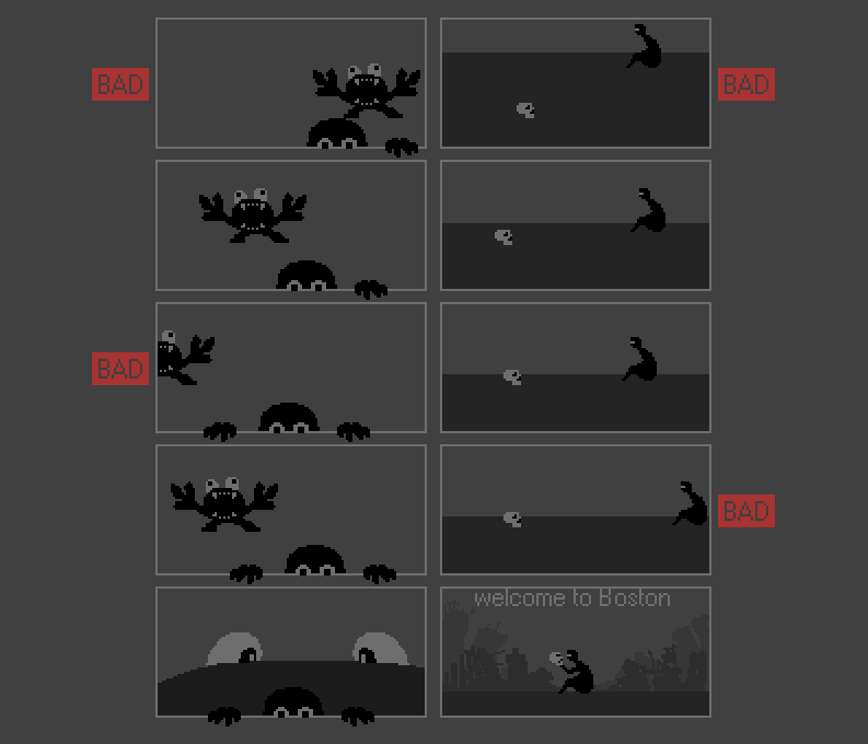
What it is?Nothing but a set of different compositions, correct in terms of presentation and not correct. We have already understood that harmony is important to us. There are laws of composition, for example - the law of integrity, vitality, contrasts, subordination, influence, and novelty. There are compositional techniques - centers, semantic and compositional, the golden section, rhythm, statics and dynamics, symmetry and asymmetry. What does all of this mean? How to deal with this?
No
All this exists, works and, no doubt - this is correct. But we can not help. We need simple cobblestones and simple roots, for which we could cling to, so that we are not blown away by the flow of knowledge. We will cling to the composition where:
• There is a certain image.
• The image is located so that it does not need to be searched in the picture, it is readable and easily recognizable.
• Objects are distributed on the scene evenly.
• Objects are not cropped by the edges of the picture.
• The key object is in the center of the meaningful composition.
Let us examine these points in a little more detail:
There is a certain image.An image is what you want to paint. Beautiful landscape, his girlfriend, his enemy, his salary in a small wallet. The image is your message to the viewer. That is why you picked up the pen tablet. So what you want to tell through graphics.
The image is readable and easily recognizable. There are key scene objects, and there are minor ones. There is what you wanted to tell the viewer, and minor elements. Opening the refrigerator, you see a bottle of beer and fresh Greek olives there. This is what you want most today. The fridge itself, its womb, and other food are secondary. The emphasis needs to be focused on the main thing.
Objects are distributed evenly throughout the scene.This is a banal angle selection. So that the main object was in the "center of the frame" and the secondary objects harmoniously framed it, as the frame framed the picture. When you photograph your girlfriend on the background of the cathedral, you try to take a photograph so that both the cathedral, the sky above it, and the horizon line fall into it. It is strictly forbidden to do so that the cathedral grows on her head like a carrot, take pictures of her legs or something else. It will already be a still life, most likely not very successful.
Objects are not cropped by the edges of the picture. A girl should get into the frame, if not entirely, then, at least, most of it and fit harmoniously into your work. If you then hear - “Well, why did you kill my head ?!”, most likely you should work better on the distribution of objects around the scene and perspective.
The key object is in the center of the semantic composition. This rule may be violated. In that case, if there are compensating elements. Counterweight. At the beginning you should be guided by this rule. After - you can do what you want. There are fewer rules in this world than many would like. You are free to choose your own path and method of visualization yourself. Well, if someone disagrees, refer to the opinion of the air Marshal Carlin.
Most likely, you at least once in your life took a photo. For most people, this happens much more often than drawing. Principles of photography work well in painting. The camera is a canvas photographer. In his work, he does everything the same as the artist, only instantly. Discussions about why then we need artists are not considered by me. It is an empty, boring and unproductive type of conversation, leading exclusively to loss of time.
Doing so that your girl in the photo (what an anachronism, now everything is already in digital form) organically fit into the environment - the first step in creating the composition. Then you can replace the girl with something else, making the predominant object on the stage any other object or group of objects. What else to remember? This is not a dead shot. This is your message. Emotions. The senses.
I wanted to show you one of my works. Title of work - "Accord". To explain what this piece of rust does in the article I will tell a little story. Those who do not like the work usually pass by. Units interested in something, like a name, a thought comes to mind ...
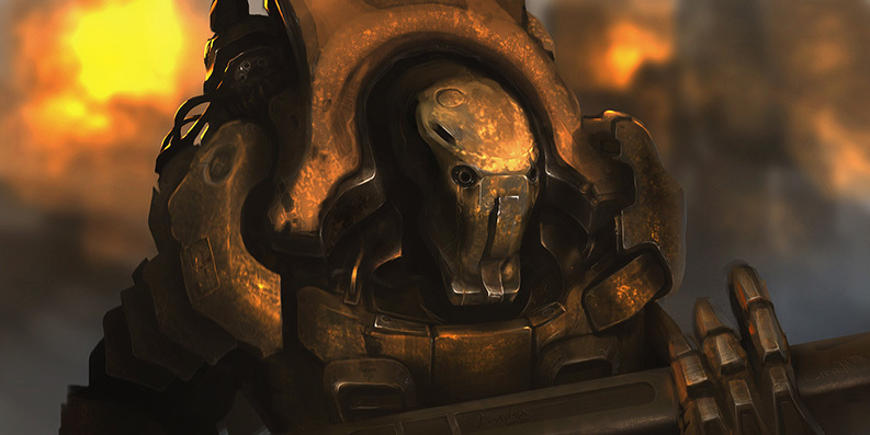
… ? , . , HD , «Fender», . - «» . -. . , :
- - , , .
- .
Probably there are other ways, but I do not know them. By the way today is not the only mention of our future with you. Below you will meet one old-old friend. And he will help us in anatomy.

Chapter II - Perspectives
Before starting the dialogue on perspective, I would like to draw your attention to the appearance of games before the appearance of three-dimensional graphics. From a visual point of view, the games with the block organization of the world (where the world consisted of platforms or blocks) were the most common. This block designer was divided into games with a top-down view (English - top-down view), games with a side view (English - side view) known as platform games, and isometric view (English isometric view). By isometry is meant an orthogonal perspective, where the lines are parallel to each other, which ultimately gives the next grid. Up to a certain point, the concept of linear perspective was absent in games (or was present, but in a limited form).
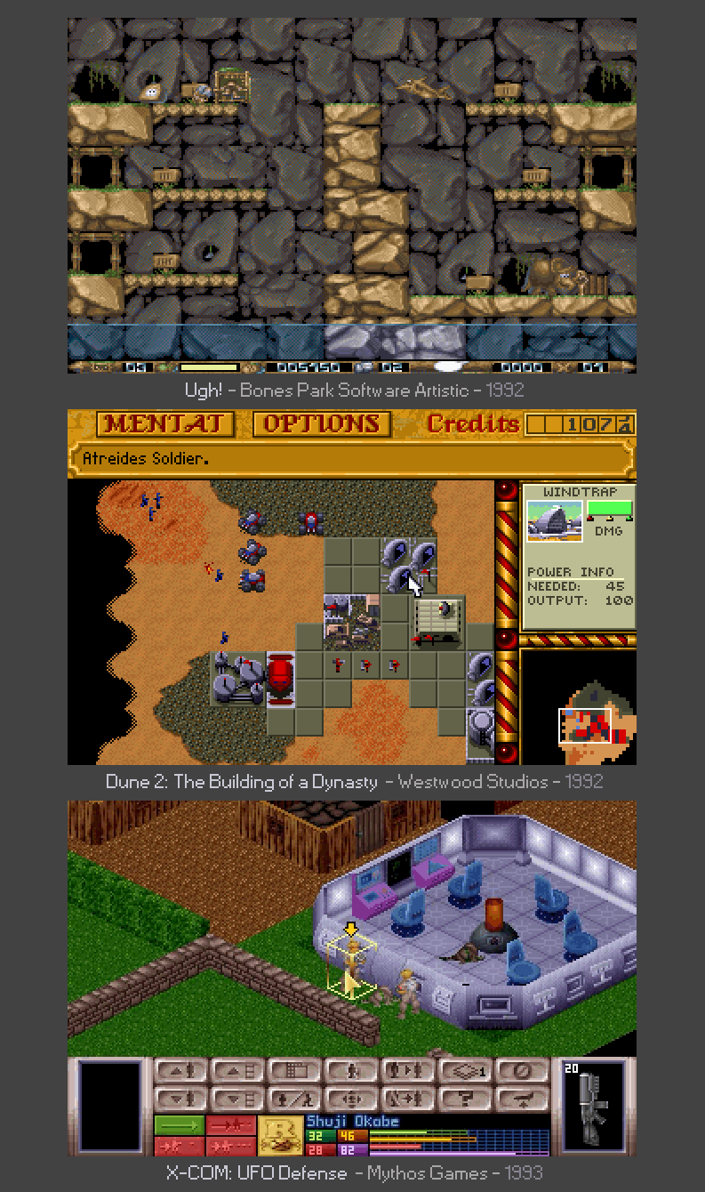
If you look at another popular adventure genre at that time (English - adventure), you will see that most of the backgrounds are also made from the side, without a pronounced perspective, although it could well be on static backgrounds. Let us ask ourselves the question “why is it not?” And we will answer it ourselves. Limitations of the working resolution of the game and the technical aspects of creating game content. The resolution of the screen did not prohibit the creation of a full-fledged perspective, but, nevertheless, the presence of any promising distortion would not allow repeated use of the same object in the body of a single game (any game composed of blocks, tiles and other repetitive elements). In addition, objects located at a sufficient distance from the player would cease to be read by the player as specific and recognizable.
What we have? Understanding that the diversity of games of ancient games was concentrated in three perspectives:
• Top View (TDV)
• Side view (SV)
• View in projection (IV)
Of course the games were different. Not only such, but most of them used such angles. Gradually, there were new solutions, experiments with visualization, but this happened iteratively. Gradually. Just like a child learns to walk. Initially, the first steps, but not running and not jumping. It is precisely because of this gradualness, due to logical evolution, as the "first steps" for creating large spaces, developers began to use blocks and tiles. Creating a small lot. Remember the definition of pixel art from the first publication? To transfer a lot to small. Tile, like the pixel itself, is a point on the canvas of the erected world. Just at the point of this contains much more graphic information.
To see the tile structure in old games, it is enough to pay attention to the grid cells from which the world is created. Pay attention to the ancient arcade Ugh! The world does not look repetitive, but looking closer, you can see the same cell. Base tile The minimum size of the grid of the world, below which the "earthly firmament" no longer falls. In the free interpretation, we can say that this is a pixel of the world. The ideology of the blocks from which the level is built is very similar to the principle of pixel art. At the expense of 30-40 blocks the whole canvas is created.
Maybe this canvas is also devoid of a linear perspective, but there are other types of perspectives, because perspective is not only lines in space aspiring to the point where it all began. Let's try to find them together. Perhaps we will not create a masterpiece today, but at least let's deal with the perspective in pixel art.
- What is interesting to us to know if it is not? - you ask.
- Everything has its time. Even the ancient worlds stood on three elephants, why not two, three or more perspectives in this world?
The article is large and we need to hurry, there is still fuel in the tanks, but will our blitzkrieg reach the final? Will he not choke halfway? We will keep a fast pace, while we can. Let's discuss the conditions for creating a tileset:
• We spend no more than 30 minutes on it.
• A dozen tiles to start is enough.
• Size 22x32.
• No more than four colors for the entire tileset, since at least the colors allow you to feel the shape better.
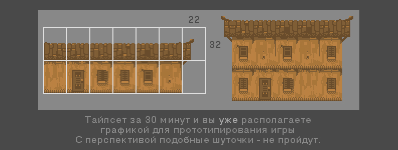
An important point in any game is diversity. This applies not only to the gameplay, or visual effects, the number of replicas or a variety of audio series. The game, like the art form, needs all the nuts, and not just a beautiful picture and a monetization scheme.
Let's collect a scene from three houses. One in the foreground and two in the background. One can be drawn, and the rest will be copied and then scaled. Still, we live in the 21st century; we know the operation of copying and pasting firsthand. On the basis of the original house, this is done in 6 minutes. Provided that you fall asleep as Stirlitz, but you knew that after 5 minutes you should wake up and reduce the house.
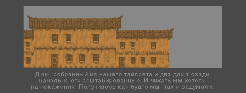
Something is missing. Maybe air? Add the color of the sky, and pick it up so that it does not strongly contrast with our homes.
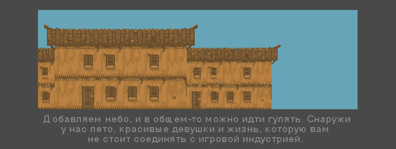
God knows that, but even the needy need the sky overhead and their own kind. Therefore, we first add the clouds, and then like-reverend. You have already noticed that I am not very generous with colors. This greed is for you. We must be able to do little. Therefore, we will allocate four colors to the clouds. One of us went to heaven, and four more to the houses.

A veto on greed. In the words of Jack Sparrow, - Pour everyone on the glass! And in the glass there will be four more colors with which we will replace the one-color sky with something richer in terms of taste sensations. Are there those who don't like the sky?
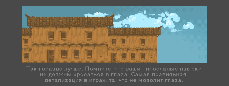
I am sure that we understand that the picture is still not enough air. Some sort of planing. Front and rear. Congratulations. We have come up with one of the first prospects. The fact is that the Family of Prospect is no less rich in offspring than the family of her cousin, the Art Form from the first chapter. Calm you. Perspective lady especially useful. This perspective is called air.
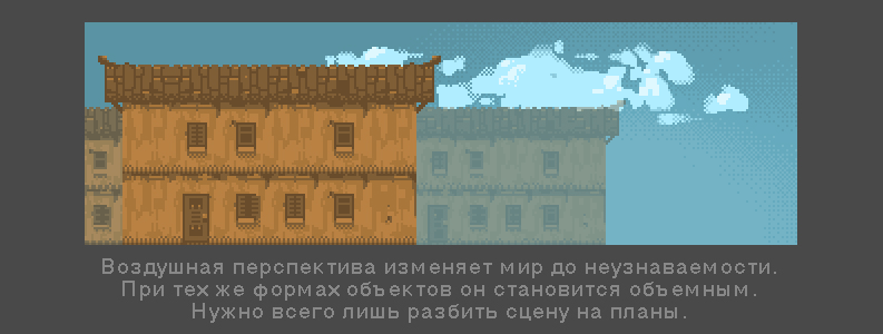
What happened? The objects seemed to have drifted away from us, air appeared between the houses, and even the houses themselves, to the left and to the right of the main thing, seemed to be divided. The air has worked. Aerial perspective. As you remove objects dissolve into the air. It is easiest to do this by changing the transparency of the layer so that it is invisible, closer to the sky. It's time to populate our town. And at the same time throw a little detail. A tray with apples and a canopy, for example. With a lantern.
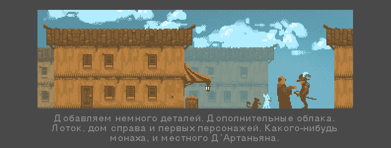
Let's use the reception from an aerial perspective once again, between the houses. Let's copy there a piece of the clouds created by us, and we will put under it the character. It should turn out well. This will move objects from behind even further.
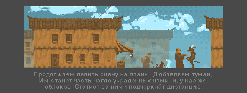
Don't you think that someone is breaking through our door? And right. This is the sister of aerial perspective. Tonal. The principles of tonal perspective first outlined by Leonardo da Vinci. It lies in the fact that objects close to the observer closer have a different color and contrast.

And true. The house jumped forward. Together with two characters, which I also brought to the fore. Why? Changed the contrast and saturation of a number of objects. At the same time, a new ring was added to the priest’s hand. And ... no, D'Artagnan's pose says that he is not going to kiss the claw extended to him. We will touch on the character development of the characters today, and not only anatomically. Well, we only have sweet. Saturate the scene with some small things. Different delicacies and small details.

The final of our pixel chanting today. We did not touch the linear perspective. We came to the aid of tonal and aerial perspectives. The sisters were much more compliant, and most importantly, they quickly provided us with a good result. In the case of a linear perspective, the development of such a canvas increases by several times. Any perspective distortion makes it extremely difficult to reuse the drawsets you draw. This is probably why the old developers did not bother with this. There was little sense, a lot of work, the size of the game would be too big, and the power of the then PC left much to be desired. And who would think to say that Dune 2, or for example, Ugh! not enough prospects? This is the same as the pictures of ancient masters compared with the work of modern shaders. Wildness, and only.
We will see similar execution of games still very and very long. And, perhaps, this is good. After all, plutonium of such methods can be used not only in the nuclear warheads of social and casual crafts that are bombed daily by the planets of our brains.
Total. With a side view (SV) and a top view (TDV) we have read. In fact, they are no different, because in either case, it is a grid of various kinds of “squares”, the simplest mosaic that the developer connects together. Should I touch isometry today? Isn't that the word that makes fans of old role-playing and radiation awaken? Old ghouls can sleep peacefully, we have anatomy and color ahead, we will find something to do. Isometry is a fundamental topic.
Summing up some of this chapter, we can say that even on the backgrounds of the adventure from the luminaries of the “Lucas Arts” genre, images for the most part lack prospects in those areas where the hero moves, and it is present only in the background, complementing the overall canvas. Games with a linear perspective were used where dynamic objects were three-dimensional, which allowed them to properly resize relative to the created scene. For example, Alone the Dark.
Of course, there were exceptions. For example, the technique used in the game Space Quest 5. However, the software reduction of the main character's sprite created porridge. In the case of a three-dimensional model, the object can be compressed to any size, while maintaining its appearance. For obvious reasons, reduced versions of the character were not manually created.
Note: Today’s developers actively use both isometry and “top view”. There are two reasons for this. The first is resource saving and ease of manufacture. To rivet houses for city builders (city builder) and farms is not a tricky business. The second reason is following the classics. To be honest, the second reason, with an eye on human history, should be omitted.
The fact is that a person rarely does anything without benefit for himself. The benefit in the case of a pipeline during the development process is obvious. Several thousand clones of the same size, made on the basis of proven technological solutions for decades. A classic bow only if this can be to benefit. It is necessary to draw money or popularity, and everyone begins to smash their foreheads in the blood, demonstrating love for the classics, but as soon as the power grows up, and three-dimensional graphics become popular on mobile phones, the knees will also disappear. An illustration of this can be seen in III. As soon as three-dimensional graphics became popular, everyone who wanted to survive, perekovali pixels on polygons and swore allegiance to the new ruler. His banners fly over the world to this day, each year changing the shader and millions of triangles on three-dimensional banners.
Likewise, one can observe how the preferences of the public change, and how the pace of the developers' dancing changes. Today is a lezginka, tomorrow is a polka butterfly. Not so long ago, all riveted exclusively "kazualki." Behind them, numerous social games came hand in hand with MMOs on the Niva igrostroy. After that, a continental-scale accident occurred, and cellular activity sensors noted an unprecedented surge of game developers for mobile platforms. Whatever the user wants - the developer is dancing to him. The main thing is to pour crowns, orenas, florenes and other full-weight coins.
Let us return from the petitions to the promising realities. To those who withstood the second chapter, I promise three whole DLC on this topic, which will be released immediately after the article of this cycle. We will touch all three classes of visualization, and no one will leave offended.
It's funny that the same DLC will be received by all the other readers, including those who have already fallen, never reaching these lines. Such is the strange lot of information in this world. Everyone gets everything, and no one owns anything unique. If we are not talking about a car under the order, an exclusive building or an island bought somewhere. I do not have any of the above, and even if I had, I would have left it to myself.
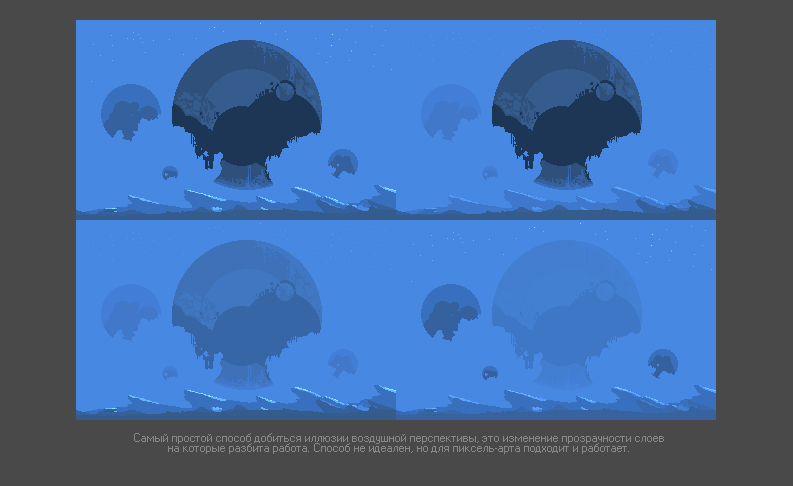
I recommend you to try a minimum aerial perspective. Reaching it is easy. Draw different plans - on different layers. To add to the work of air, you need to change the degree of transparency. Here is a small preparation consisting of such layers. See how easy it is to achieve completely different results, and how distance and sensation change from this. Objects then go back, then forward a few kilometers and fly back. What was big becomes small and vice versa. And all this with the immutability of the form and appearance of objects.
This is not a panacea, but enough for a start. Take a canvas 320x200 pixels in size and using eight (8) colors to create small sketches. Quick sketches. For each no more than 5-10 minutes. I call this exercise short. Or - shorty.
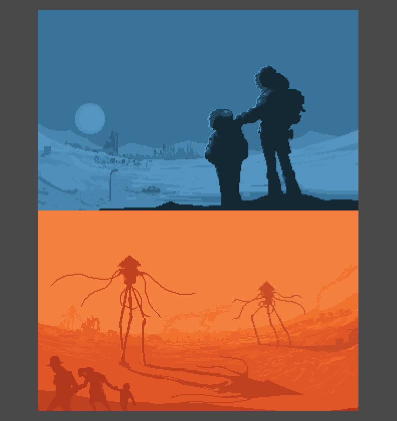
Note: This exercise helps to express thoughts graphically. Already 5-10 minutes a day you will find. If there is still no time - try to take it away from the social media tape or meaningless discourse on how fair it is, or vice versa, life is unfair. What to do with beer and fish? You can not spend time on school taking it away from really important things, and therefore - we take them with us. After all, every roach is sacred.
I just like many of you practice every day. Every day I learn something new, and every day I understand that the chasm of the unexplored only increases. Recently, I came to one small discovery on the basis of these very "little ones". Any artist laughs at my columbiada, but I was pleased to open this door myself. We will not, however, get ahead. A story about this awaits us at the very end of the chapter on anatomy.
We killed a whole roach to find out that we do not need a linear perspective, we met its sisters, tonal and aerial perspectives. We know that the world consists of blocks and tilesets - this is not scary. We have at our disposal “Shorty” as a tool for our own pumping. Now we know that we are waiting for three DLCs in which we will learn how to produce high-quality content for three types of angles - TDW, SW, IW. Well, besides spending 30 minutes on a tileset, we can easily create a whole world in a month! No amount of money and no budgets will give you such freedom. For a month worlds are not created. Even their bones. By the way ... do not we go to the bones?

Chapter III - Anatomical Almanac
I will tell you a terrible secret - pixel art is drawn even by those who have no idea about anatomy, and surprisingly, they get away with it. Want the second part of the mystery? I still get letters and rave reviews about my own animation. It turns out that there are people who believe that I am the dock in this matter. This is not true. I have not graduated from art universities, I have never attended drawing courses and have not studied anatomy (I sincerely regret the latter). We will complete the trilogy of secrets with another revelation. With constant practice, after a year you will be doing quite decent animations. And if you're lucky - in a couple of months. All you need is to read the articles in the series on animation. From simple to complex. And ... practice regularly. The key is not in this verbiage, and not in reading it, but in regular practice.
Anatomy of pixel art is simplified as well as perspective. Characters are drawn in perspective much less frequently, and, as a rule, are used in animation inserts. Characters are drawn in the atmosphere of color limits, to make it easier to make animations and, moreover, the character does not have a very large number of pixels. All this leads to the fact that on a hand two to three pixels thick, there is practically no need to designate such muscles as biceps or triceps. Even fingers of hands will look like a square of four or six pixels. All you need is to know the approximate structure of the human body.
To verify this, we will go through a series of exercises with you. Let's start as usual - with a silhouette. Your task together with me, and then without me, to create several expressive images. I can give advice. Before you give birth, think about what objects in this world have a well-recognized form. This will help you focus on the right part of the object.
Image development is the most important part in creating pixel art. And the pedigree of an object is no less important than its resolution or the number of colors with which this object will be created. If you can draw - draw a sketch. This will help you work out the character of the future hero. And on the basis of the sketch you will be much easier to create competent pixel art.
Now we will consider the case when a person does not know how to draw, or has serious limitations in this matter. I recommend to such people to use the technique of “verbal portraits”. By the way, this same technique allows you to learn how to correctly formulate your thoughts. If I asked about something similar to my children, I would have heard a large number of interjections, drawn-out "uh-uh ...", "well-yy ...", "well, in general, he, like ..." and so on. But you and I are adults. What is normal for children is no longer suitable for us, if we are sober. Today is one of those days. Most of us are in a firm mind and sound memory. Therefore, our verbal portraits will be clear and capacious.
Let's start with the names. Names should already reflect the essence of the future characters, at least for you. They must contain emotions. These are no longer just breasts of pixels, they are your acquaintances, friends, or enemies. Pixel art has no right to be unemotional.In the case of three-dimensional graphics or a large canvas, you can be saved by a technique, or a special touch, or even light (as is often the case in my case). But in the case of pixel art, if there is no emotion and no character, there is no character. He is faceless. And therefore, does not deserve attention. Our today's heroes are Pivnyuk, Baberon and Can.
Pivnuk. He loves beer. Has three chins and a heavy belly. Breathing hard. Clothes on it sits like a drum. Pivnyuk is kind, not young and always drunk. He had defaulting connections, and that was enough.
Bablon He likes to read notations to everyone who comes to hand. Sears life, bile and bad mood. She prefers black robes that hide her thinness. Hunchback Grumpy Everywhere wears his umbrella. Damning her connections did not have.
The can. , . . . . . , . . .
: , . , -. .
Let's start with the silhouettes. You all remember our past exercises. As we drew a black and white car and lights. The beginning of the local lesson is no different from that. First of all - silhouette. First of all - Petroglyph. After regular practice, you will learn how to make sketches based on three or four colors, immediately marking the lines of the visible body (face, hands, etc.) clothes and body kit (backpacks, shotguns, shovels and cans).
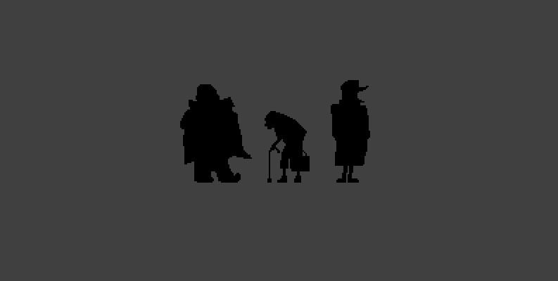
When it seems to you that every silhouette speaks for itself, it is worth trying to paint them. Oval of faces, silhouette of clothes, hand spots. About this begins any drawing. Not even from a silhouette, but from base spots denoting certain elements of objects and entities.
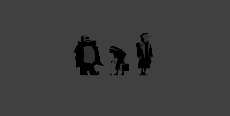
, , , , . - -. , , - . , . . . , , .
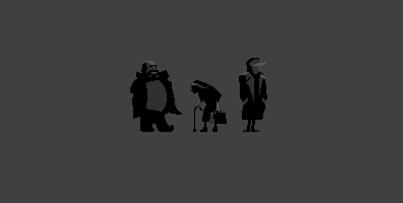
, , - . , , . , , , - , .
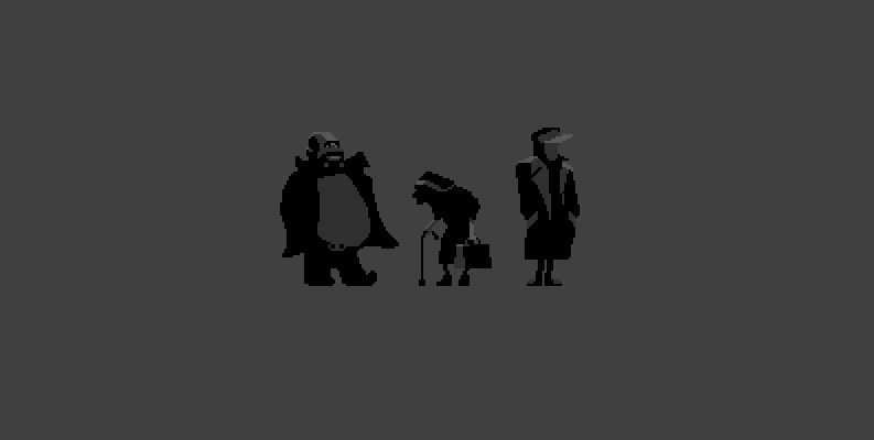
Now let's work on some clothes of our heroes. The said unbridledness, crookedness, and “arterialism” can be captured not only in the general structure of the figures, but also in fine details. Bribery - will become untidy, crookedness will be underlined by the sharp edges of the face of the mamzel, well, and the "armyiness" will consist in impeccable accuracy of the drawn image. This will help us the fourth color and a little work.
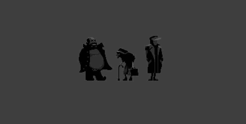
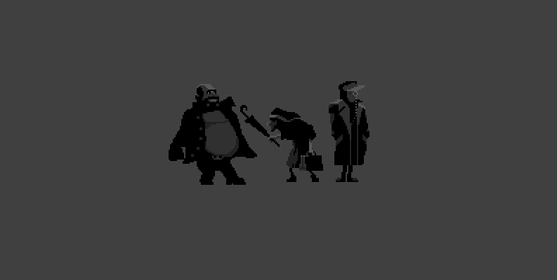
Already not bad, right? Already something is felt. Now we will issue each character on the key subject. A beer lover - a mug. A lover of poking is an umbrella, but a military lord is a golden monocle. It would be possible to give the phone, but I am afraid that in this scene they will only bump into one gentleman, the second will not be in business, and in general will try to ignore what is happening. He does not care for local drunks, and old, nosy grandmas. I had to sharpen poses a little. Add some action to statics.
Let's do some light work. Classically warm and cold. But let's start with the cold. Four colors, and the fifth color we denote the back stop. Make the background purple. More precisely, he would have to be blue, but given my color blindness, most likely, it will inevitably turn out to be purple.
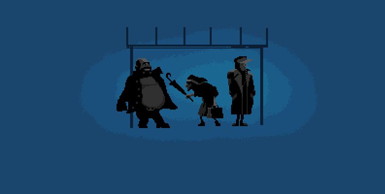
What we have?While the characters were on their own and in the center, everything was fine. But as soon as an object called a stop appeared, the center of the composition went upwards. She ceased to be harmonious. Remember the composition of the first chapter? All that you see, all the components of the scene must be in harmony with each other. Therefore, we need to achieve it. At least denoting the center of a new composition that includes a group of old objects, along with a new one. And let's add there a lantern with a sign.
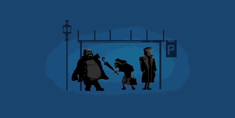
Now it is necessary to glaze the top of our stop and fill our characters with some color using the Overlay blending mode. We have already seen the readability of their silhouettes and must now fit them into the overall picture.
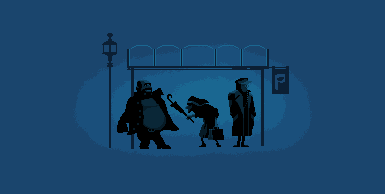
. . . . . -. . , -.
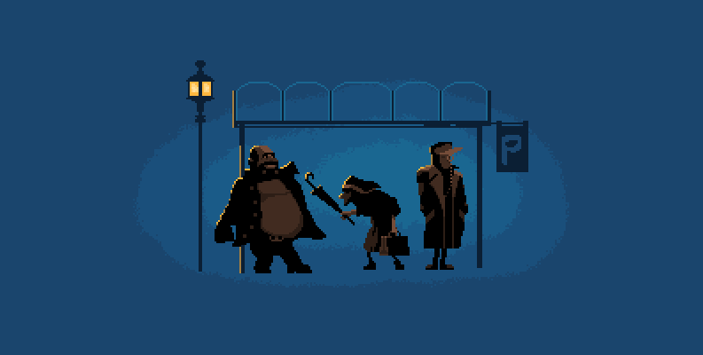
«», , – . , . And yes. . , . , . , . Those.from characters. Now we were prevented from snow and halo from the lantern. And yes, we had to cover our glazing with snow. Nothing wrong.But they trained and understood the shape of the object.

Some mood has already appeared. Let me draw your attention to the "Shorty" again. Remember the exercise from the previous chapter? If I used a lot of colors, I would start messing with snow and other little things. In a small number of colors you have to concentrate on the main thing.
I also want to note another important point. Working in a small resolution, changing the position of elements by 2-3 pixels at once you see how the composition returns to normal. How harmony returns to it. This is a good training before the big work. There, the movements of a few pixels you will not get off. The magnitude of the errors will be directly proportional to the size of your canvas.
What are we missing? Liveliness. The liveliness of the characters and a certain entourage. And we will find it in the details. After all, in life we love not for something huge. Like, I love him (her) for a big soul or an incredible brain size. Initially, we notice the little things. Something that makes a person stand out from the rest. Characteristic humor. Subtle smell. Funny squint or infectious laughter. Also with pixel art. Need something to highlight. To do otherwise. Add something of your own.
Let's work a little bit with the light. Let the snow begin to sparkle in the shadows and in the light, let the additional glare appear where it is needed. And let's add a second, cool color as reflected light on the characters and design. Smooth our characters along the contour where necessary. By the way, I suddenly noticed that we had sunk to 32 colors. And I also noticed that Pivniuk still does not have a mug. Correct this omission.
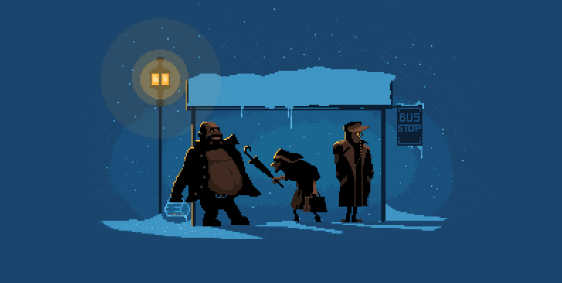
We supplied our heroes with everything they could. The final touches brought to work - snow, icicles and small polishing of characters. The sign “P” at the stop changed to a much more speaking one, a circle appeared, smoothing the characters around the perimeter.
Our little miniature is ready. We did not have the knowledge of anatomy, but we moved from a silhouette image. From some general form, gradually correcting their mistakes. We created a composition about which so much was said, in terms of the harmony of all the components present on the stage. Maybe we are not masters, may we not be able to boast of the crusts of any universities, but we can definitely create a certain mood, a certain message to the viewer clothed in a small piece. Pixel sonnet.
Bad is the material that demonstrates a pile of pictures and which does not take the trouble to go into details. Silhouettes can be a starting point in working with pixel art, but they do not bring people closer to understanding the structure of the human body. And it does not matter that many artists working within the framework of pixel art often ignore this structure. They know that there are bones under the flesh, they know the approximate location of the body parts, so they know where to chop off, and where on the contrary, to fit.
We do not know this. But as people who have come far we cannot stop. There is no turning back. We need to understand how we make our pixel people so that they look good and believable. This will help us one familiar to me Necromancer. Give him thanks, it was he who “raised” a certain amount of educational material for us.
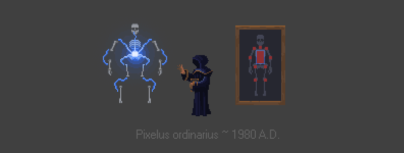
. , . ( Pixelus ordinarius 1980 ..) . . . . , .
In order to understand the pile of bones more subtly - let’s go over it with our roller of knowledge. To heighten understanding, we will represent the skeleton as a set of objects connected by hinges. Of course, we will reduce the number of joints and zones of these hinges. Sarah Connor, breaking the arm of Dr. Zilberman, mentioned that the human skeleton consists of 215 bones (this was the first and last lesson of anatomy I attended). By the way, here it is. I believe that you also were in this lesson:
Dr. Silberman: You broke my arm.
Sarah Connor: There are 215 bones in the human body. That's one.
. . 10 . , . , . – .
, , . , . . . . .
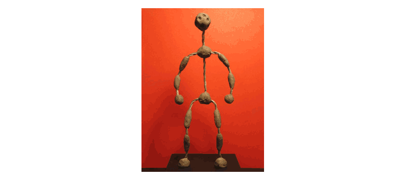
, . , , - , , , . — . « ». , , , .
Now let's increase the skeleton skin to make sure that the actual schemes for the real world work in pixel art. Even in a simplified form. I have a special skeleton for this. In fact, it is no different from Pixelus ordinarius. Moreover, it is created in the image and likeness. Some fifteen years and we ourselves will see it all. Model 101, T-800 series. It is a working prototype. Hang on it a few pounds of flesh. We are still far from serious and dangerous machines designed to deactivate the dislikes of our creativity, but we can already do something.
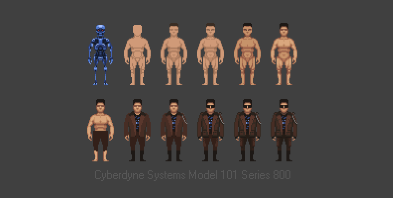
We can simply fill it with the desired color, grow the flesh in one color and mark the main muscles. You do not need to be a great artist. Muscles soften around the perimeter. Then the skin is painted on something more juicy. The lines of muscles that we inflicted are smoothed out so that they do not beat in the eyes, but are read. A little work with his face and hairdo, plus clothing, and if the resistance fighters are lucky, at least they will take him for a person from afar.
It is rather difficult to paint the pixel posting process without taking up the valuable place of publication, and without bothering the readers with unnecessary details. The fact that they are not needed - I am absolutely sure. If you do not practice, dozens of videos of creating something will not help. We are done with anatomy and now move on. In our last chapter. It will be rather short and will be devoted to color. This time we will not consolidate our acquired skills after the article, as it has already been done and shown sufficiently.
Anyway, any of your pixel creatures have a skeleton similar to what the Necromancer showed us. There is a main body block and hinges connecting the bones. And it is much easier than it might seem at first glance. It was much harder and longer to do an insane amount of illustrations.
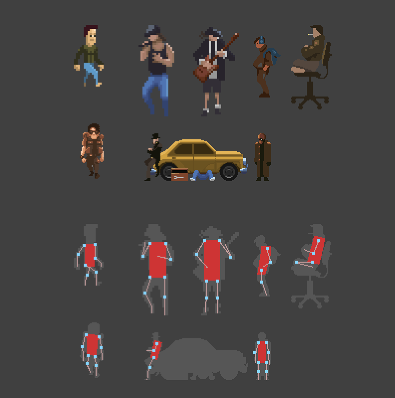
Do not forget about the data once promises. I promised to tell you about my discovery at the base of the “little ones”. You have noticed that the anatomy of pixel creatures is much simpler than the real anatomy because of its small size. The fact that in large resolutions would lead to gross errors, in the form of a group of pixels looks like an achievement and appropriate hypertrophy.
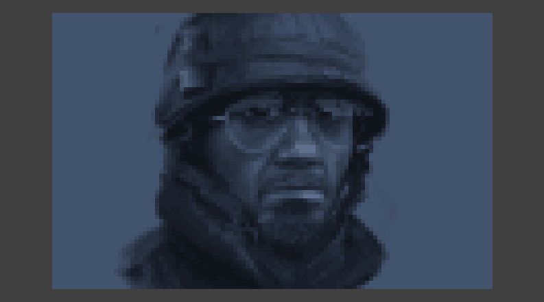
It seemed to me interesting to try to do the same trick with portraits. No, not pixel. Quite real portraits. Made on canonical canvas with a size of 320x200 pixel brush. It is unlikely that I would be able to do something similar in sizes of 6000x3000 pixels, which I usually use for my works.
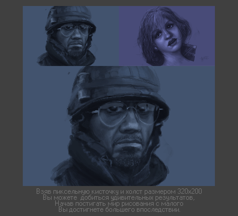
Robert Downey Jr. referred to extreme employment. Therefore, I had to contemplate on the second monitor only his photo, and a dozen times scroll the film known in the Russian box office as “Soldiers of Failure”. If you do not like Robert, you should look at him solely for the sake of Les Grossman. This character can not be forgotten.
Why did you manage to accurately reproduce these two characters? Why does everything look in the right place and even the suspicions that the author has depicted the photos are stolen? Everything is very simple.The small size of the canvas. Where there is a whole group of muscles that you need to know on this canvas is two or three pixels. Even making mistakes, you gradually come to the desired result, and the small size of the elements does not allow you to increase the size of your error. Drawing is more like a classic painting. Because you:
• Do not use any Undo stroking layer by layer.
• Draw on one layer.
• Paint with the same brush.
. . , . , , . .

, . -. - , . — OpenGL . .

IV –
, . . . . , , , , , , , , - .
, « , ». , ( , ). - , , -.
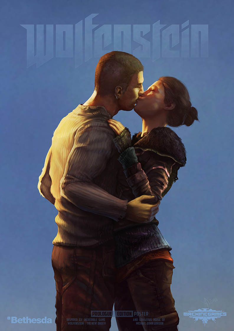
: - «Wolfenstein: The New Order
. . « » «Wolfenstein: The New Order». , , . , , . , , . ( , ). , . , — . , (, ).
— « , ?», , — « . . ». , . , , .

— « , ?», , — « . . ». , . , , .
. - . Overlay, .
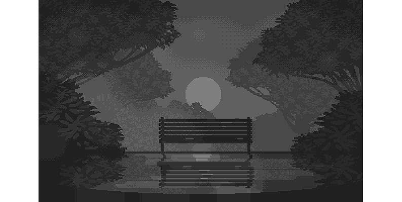
, (). , , . , , , – ?
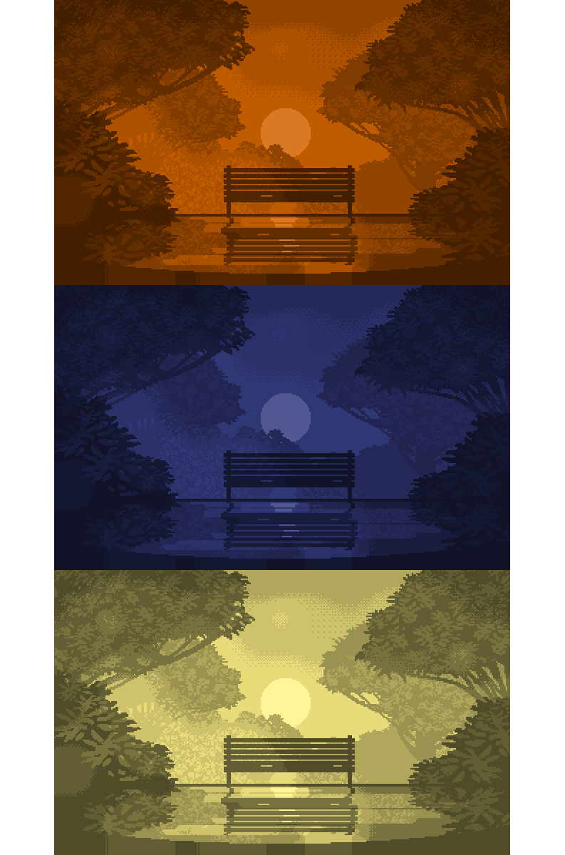
, — . , . .
If we add light changes to the color, the scene may change and become different. Add drops of water and circles from them, falling leaves, or morning haze. Use the tonal and aerial perspective, change the contrast and saturation of the different elements of the scene. Using these simple tools you change your work beyond recognition, breathe life into it and it will play with new colors.
Stroke, strokes and other elements forming an image are just servants at this ball. They are important, without them the image will not be rich, but their claims to the royal throne are groundless. They were not where unknown kingdoms and dynasties were born. And they can hardly be called the highest races. As I have already said - I consider light, shadow and the volume (form) formed by them as the firstborn. They can exist without colors, without elaborate strokes and strokes at the level of fills. There are excellent confirmations.
Chapter V - Epilogue
. , . , . , . - , . – . . , , .
Together, these entities are powerful tools. Pixel artists use these techniques every day. In various proportions, supplying all this with their own special only known secrets. You can understand them only by doing something, watching the outside world and analyzing the games of the past. Everything that is relevant for classical painting is also relevant for pixel art.
, . . . , . , , . , . . . ?
I will take the liberty of asking for your help. If you like my works, pixel art, articles and everything related to the gaming industry - please support me on the Patreon resource. This is a funny analogue of Kickstarter for those who are good with creativity, but incredibly bad with commerce. This is about me. Kommersant from me like a bullet. Guess what. All that I can guarantee in this case is that domestic readers will receive the material first. With the same attention to detail, with the same feelings and passion. I don’t attach links to Patreon, as it is considered bad form. However, there are no problems with finding this information, as they say - there would be a desire.
Thank you all for your attention and thank you for being there! Any scribbler without readers. And you have me. Your letters, questions and comments are a great illustration. Sorry for my request, but being in a difficult situation, I did not see a choice. Either return to the industry and again become someone's appendage, or find some other way out. One girl offered me to open a wedding dress shop. Apparently for this it was worth giving the industry 15 years. To finish trading in white rags.
See you again! And I hope that they will happen soon, because we have in our plans two articles on pixel-art animation, from simple to complex, plus three DLCs for the mentioned types of games display. In addition, there will be a separate article devoted to the development of content "as in Fallout". But not fashionable modern, but old. Total plans to write and provide content six articles. In general, this is only the tip of what I would like to tell you.
Well, those who barely stay on their feet (personally, my throat was dry doing the reading of this article, and this had to be done more than once) - welcome to have a rest in the Herr Text bunker and Infosphere .

Bunker Herr Text
, .
. 30 . . , , , . . . , , -. . , , . . , , . .
, .
, . , , , , . , . «» . , . , , .
, .
. , , . - . ? ? Time will tell.
, Patreon. . , , . . . .
— . (). , — . , , , . … .
, , !
. 30 . . , , , . . . , , -. . , , . . , , . .
, .
, . , , , , . , . «» . , . , , .
, .
. , , . - . ? ? Time will tell.
, Patreon. . , , . . . .
— . (). , — . , , , . … .
, , !
Infosphere
,
(George Carlin) ( - ) — , , , , . « » c « Pacifica Foundation. 1978 , , .
— — « » ( - ) — , ! « » ( - ). « -» 1992 (George Carlin: Jammin' in New York — 1992 ( Movie-DB rating page )).
: , . , . . , . , — . . -, , , , , . « » .
— — « » ( - ) — , ! « » ( - ). « -» 1992 (George Carlin: Jammin' in New York — 1992 ( Movie-DB rating page )).
: , . , . . , . , — . . -, , , , , . « » .
- Inspiration Shelter
. . . . , . , , , . 16 , . . NewRetroWave YouTube.
-, - - . . , , 77-. . , . — . . , — . .
: . . . . , . . , . , . . , , , . IT- . — .
-, - - . . , , 77-. . , . — . . , — . .
: . . . . , . . , . , . . , , , . IT- . — .
Last edited date in article: 07/10/2015 Time: 17:28
- — , , . — , « » ().
- — . . . .
- — . . For which many thanks to them. , . .
Source: https://habr.com/ru/post/261987/
All Articles